Golden Pistols or Why couldn’t Aeroflot be tricked?
For millennia, the wearing of a gold weapon, even decorated with precious stones, was a symbol of power, internal status, and a vivid demonstration of “for its own” level in the hierarchy. Today, in connection with the ban on the general carrying of weapons - its functions in Russia have slowly moved to the websites. We will talk about them.

Design will save the world. All forces - on design. All the best - to
Under these and similar slogans, the last five years have probably flown by. It seemed that happiness was near, that very soon no more efforts, research, and analytics would be necessary, for everything is design and everything will be in it. And the country was full of conferences and symposia, presentations and seminars. Everyone had to become a designer. Under this sauce managed to appear and several outspoken sects.
But with all this, the websites in their mass did not become another automatic seller-consultant working in 24/7 mode; but quickly degenerated into the subject of kitsch, the declaration of your own self.
')
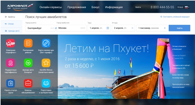
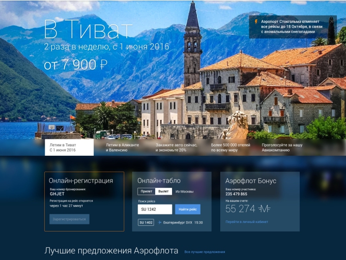
The brightest examples of such quasi-sites are two Aeroflot variants that participated in the survey.
All strictly according to Pelevin:
Here it is important to understand the reasons for the occurrence of a similar situation and to thoroughly understand what is the root of Aeroflot’s unwillingness to become the first hipster-carrier? Simply put: how could this all come to light? We will conduct a small investigation of our own, trying to understand the reasons for this situation and the motives of all the participants.
To begin with, suppose situation A:
Since this is said at each design symposium, suppose also that each of the two solutions was previously run-in on its own focus group, that is, both possible design options have photo and video confirmation of how people with joyful smiles will actively use this or another feature of the new site.
Do you think an experienced manager would become if he saw a lot of new money and customers, expressed in sound calculations and arguments - to pull for two weeks, having doubts, conducting surveys in runet and carefully and carefully calculating the results for a long time and scrupulously?
Personally, the situation to me And in this case it seems unlikely. Although it is precisely this approach to work that every and every (even provincial) studio shouts today. What went wrong? What prompted the management to check and recheck the ready-made design solutions offered by the eminent expert?
There is another option B: absolute distrust of both the most innovative design, and the methods of presentation and argumentation of their hypotheses. If the sole argument of the art director at the presentation is: “First of all, it is beautiful (stylish and fashionable youth)”, then business people rightly begin to think that they are trying to get ***. After all, they are not drawn into the whirlpool of universal admiration for design, as a self-valuable thing in itself.
In this scenario, I assume about the following questions on the presentation of the models:
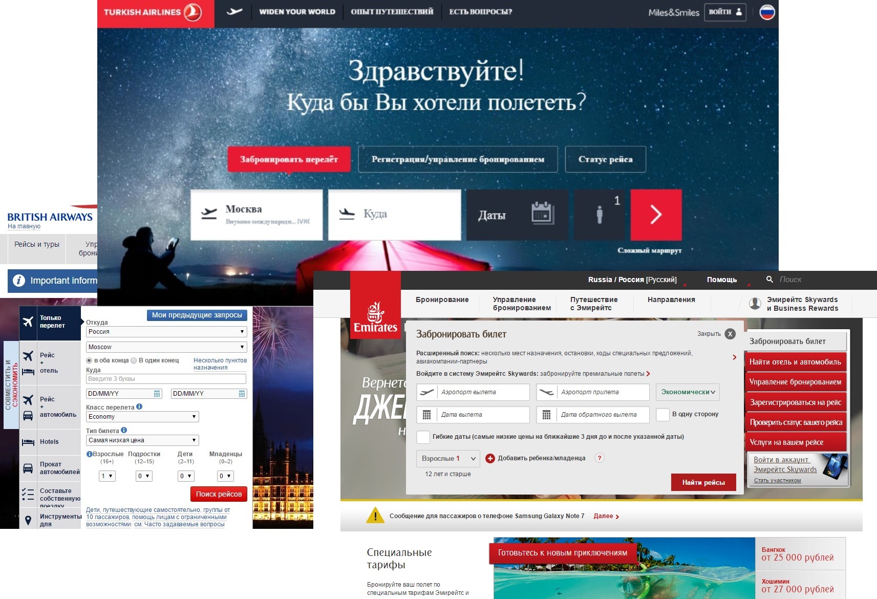
- Here, on the websites of Turkish Airlines or British Airways, the very first thing that catches your eye is the ticket order form. In your version, bright boats and icons take the most attention away from a similar narrow shape at the top. And how, with the help of your design technique, can I become a billion dollars richer?
Or, for example, is:
- Why was it decided to completely abandon the warm orange color of Pantone 158 in the first version of the redesign, and how this chip could lead a thousand new foreigners to rush to us?
Well, the worst thing:
- What if the user starts not from our Main Page, but lands inside of some Aviasales - what will appear to his look? Will he quickly understand and continue the difficult scenario started earlier on another site?
Of course, without analysis, figures, with one blurred picture, it is impossible to answer all these questions. And the figures, contrary to the commandments of Satin-Vetrov, the designers of the new layouts for some reason did not have this time. So it happened.
Then, it was at least for some numbers that the survey was created by the Aeroflot employees themselves — in essence, they did someone else’s work.
It sounds much more logical than the last version, is not it? And there is no doubt about the availability of logic from the Aeroflot management. So, the deduction method can be considered as a truly restored picture of what really happened: the highly respected Aeroflot tried to throw money with just one concept in two copies (with and without icons), even without bothering with any arguments in favor of the proposed solutions and the slightest predictions about the profit potential.
Judging by the clumsiness of the approach and the facelessness of this and other design options, here you feel the hand of a freelancer no older than 20 years at a rate of no more than 500 rubles per hour, without real experience in business, in working with large corporations and government agencies, and not understanding human desires and needs.
I cannot say for the board of directors of Aeroflot, but the needs of the average user, their client, are prohibitively simple:
He initially did not need a website, design, or other clicks and spells. He needs to save some time for the evening serials and not fool his head with an urgent acquisition of a certain “visual taste” for the possibility of a quick trip, a flight, and a trip to any point on earth.
And if, for example, tomorrow, in order to fight extremism, the Internet will be cut off altogether in the country - the end customer will suffer the least. Designers, art directors, and webinar organizers will suffer - but not ordinary people. This must be clearly understood.
People instantly recognize the hotline numbers and call their voice, calling the desired city and flight date. Or on the squares of all major cities, the healers will again appear:
- Two tickets to Phuket. One window seat. Fly in, hurry up with your last name ...
People have always been and will be fine. This is a design problem. And if the service itself is maximally demanded, people will order it with the site, and without the site, and in the squares, and closets, and even in darknets, and prevent them from getting what they want much more difficult than it seems.
More than 12 years ago, in JSC Russian Railways, the main personnel accounting tool was very weak in terms of the visual design of AWP Frames. In addition, he also had some technical problems of loading and unloading internal reports, which were not suspected of ordinary personnel.
The essence of the story is that very many companies at that time, and the world-famous SKB Kontur, among them, repeatedly tried to sell to the Russian Railways corporation their convenient stylish and most usable product of personnel registration.
I have forever remembered the questions on which “experienced” developers fell in front of our “stupid” managers:
- And how long does it take for your product to fill out from scratch one personal card together with an order for employment?
- For how many operations can 3,000 employees be transferred from one enterprise to another?
- How much time do you think it will take to introduce and train one personnel officer to all the basics of your program?
“We didn’t think, didn’t check, we don’t know, but we thought ...” - similar answers once and for all showed me that the real business and the sphere of IT services live on different planets and in two non-intersecting universes. And over the past 12 years, the situation has not changed a bit.
As a result, JSC RZD acquired a new personnel AWP, which is part of a vast and extensive system that takes into account, in addition, the movement of materials and depreciation of buildings, control of arrival and the procedure for creating personnel reserve, safety and access rights, and a thousand other things.
Of course, it took both expensive implementation and lengthy training, but now a single system replaces hundreds of separate handwritten programms with different data upload formats.
Now, when looking at the online educational systems everywhere, there is a similar feeling of inadequate immersion in the processes.
Without working out thousands of daily problems, without introducing electronic diaries of academic progress and unloading resumes for employers, disregarding people with disabilities, without internal communication and the possibility of paying for tuition through the VK payroll - each bright flash fades out after half a year and dissolves into nothing.
I would like to believe that such a refusal of Aeroflot from design for the sake of design is not a one-time event, but the launch of a long overdue trend, when hipsters who can move pixels are already finally replaced by ordinary people who can count money.
The widespread desire of customers to quickly return from the pretentious “golden pistols” to simple and “killer” methods is the best thing that can happen to runet in the last 10 years.
A simple accounting calculator should replace the sketch for literally everything, including even the competitions of young designers: it’s already long time that instead of the requirements for unfired students in the style: “draw a horse in a vacuum in the Material style”, there will be quite sane tasks:
Here you have a dumpling for 5 tables at the station, 30 thousand rubles, 3 days, two bartenders and one web illustrator. Show the text with the calculations, how to optimally manage this budget and human resource for maximum profit growth: a) following the results of the quarter b) in the perspective of the next 5 years.
Well, or something like that, mundane and interesting to mere mortals. And only in this way, finally, the grain will be separated from the chaff without the need to divert reputable airlines to constant doubts, polls and online campaigns in search of at least some measurable numbers ...
Hello, brave new world! Business people have been waiting for you!
Design will save the world. All forces - on design. All the best - to children designers.
Under these and similar slogans, the last five years have probably flown by. It seemed that happiness was near, that very soon no more efforts, research, and analytics would be necessary, for everything is design and everything will be in it. And the country was full of conferences and symposia, presentations and seminars. Everyone had to become a designer. Under this sauce managed to appear and several outspoken sects.
But with all this, the websites in their mass did not become another automatic seller-consultant working in 24/7 mode; but quickly degenerated into the subject of kitsch, the declaration of your own self.
')
The brightest examples of such quasi-sites are two Aeroflot variants that participated in the survey.
All strictly according to Pelevin:
Here it is important to understand the reasons for the occurrence of a similar situation and to thoroughly understand what is the root of Aeroflot’s unwillingness to become the first hipster-carrier? Simply put: how could this all come to light? We will conduct a small investigation of our own, trying to understand the reasons for this situation and the motives of all the participants.
To begin with, suppose situation A:
Experts come to Aeroflot's management and throughout the year they thoroughly familiarize themselves with the company's overall strategy, business development plans, best practices, study the entire structure of the company, describing it in IFEF0 along the way. The experts received the secret presentation “Aeroflot development prospects until 2025” by mail and went to the sauna three times with the entire marketing department.
That is how they find dozens of bottlenecks, reveal several typical problems and create at least a dozen hypotheses on how to deal with the leaks of profits found. After painstaking work from a dozen initial options, two completely different in concept and methods of converting website traffic into real money remain.
For example, one concept has been sharpened to demonstrate the diversity of flight directions and Aeroflot aircraft fleet, while the other focuses on family values - a special children's menu for lunch, toys and drinks, a steward-animator, help a lonely mother with a tame child still at the landing stage and other social sphere.
Then, with ready-made business plans for each unique concept, where using simple and clear calculations, charts and analysis of existing data, you are invited to choose the desired figure of expected profits, pointing the solution to the most clear to management.
Since this is said at each design symposium, suppose also that each of the two solutions was previously run-in on its own focus group, that is, both possible design options have photo and video confirmation of how people with joyful smiles will actively use this or another feature of the new site.
Do you think an experienced manager would become if he saw a lot of new money and customers, expressed in sound calculations and arguments - to pull for two weeks, having doubts, conducting surveys in runet and carefully and carefully calculating the results for a long time and scrupulously?
Personally, the situation to me And in this case it seems unlikely. Although it is precisely this approach to work that every and every (even provincial) studio shouts today. What went wrong? What prompted the management to check and recheck the ready-made design solutions offered by the eminent expert?
There is another option B: absolute distrust of both the most innovative design, and the methods of presentation and argumentation of their hypotheses. If the sole argument of the art director at the presentation is: “First of all, it is beautiful (stylish and fashionable youth)”, then business people rightly begin to think that they are trying to get ***. After all, they are not drawn into the whirlpool of universal admiration for design, as a self-valuable thing in itself.
In this scenario, I assume about the following questions on the presentation of the models:
- Here, on the websites of Turkish Airlines or British Airways, the very first thing that catches your eye is the ticket order form. In your version, bright boats and icons take the most attention away from a similar narrow shape at the top. And how, with the help of your design technique, can I become a billion dollars richer?
Or, for example, is:
- Why was it decided to completely abandon the warm orange color of Pantone 158 in the first version of the redesign, and how this chip could lead a thousand new foreigners to rush to us?
Well, the worst thing:
- What if the user starts not from our Main Page, but lands inside of some Aviasales - what will appear to his look? Will he quickly understand and continue the difficult scenario started earlier on another site?
Of course, without analysis, figures, with one blurred picture, it is impossible to answer all these questions. And the figures, contrary to the commandments of Satin-Vetrov, the designers of the new layouts for some reason did not have this time. So it happened.
Then, it was at least for some numbers that the survey was created by the Aeroflot employees themselves — in essence, they did someone else’s work.
It sounds much more logical than the last version, is not it? And there is no doubt about the availability of logic from the Aeroflot management. So, the deduction method can be considered as a truly restored picture of what really happened: the highly respected Aeroflot tried to throw money with just one concept in two copies (with and without icons), even without bothering with any arguments in favor of the proposed solutions and the slightest predictions about the profit potential.
Judging by the clumsiness of the approach and the facelessness of this and other design options, here you feel the hand of a freelancer no older than 20 years at a rate of no more than 500 rubles per hour, without real experience in business, in working with large corporations and government agencies, and not understanding human desires and needs.
I cannot say for the board of directors of Aeroflot, but the needs of the average user, their client, are prohibitively simple:
He initially did not need a website, design, or other clicks and spells. He needs to save some time for the evening serials and not fool his head with an urgent acquisition of a certain “visual taste” for the possibility of a quick trip, a flight, and a trip to any point on earth.
And if, for example, tomorrow, in order to fight extremism, the Internet will be cut off altogether in the country - the end customer will suffer the least. Designers, art directors, and webinar organizers will suffer - but not ordinary people. This must be clearly understood.
People instantly recognize the hotline numbers and call their voice, calling the desired city and flight date. Or on the squares of all major cities, the healers will again appear:
- Two tickets to Phuket. One window seat. Fly in, hurry up with your last name ...
People have always been and will be fine. This is a design problem. And if the service itself is maximally demanded, people will order it with the site, and without the site, and in the squares, and closets, and even in darknets, and prevent them from getting what they want much more difficult than it seems.
Transport - the artery of the state
More than 12 years ago, in JSC Russian Railways, the main personnel accounting tool was very weak in terms of the visual design of AWP Frames. In addition, he also had some technical problems of loading and unloading internal reports, which were not suspected of ordinary personnel.
The essence of the story is that very many companies at that time, and the world-famous SKB Kontur, among them, repeatedly tried to sell to the Russian Railways corporation their convenient stylish and most usable product of personnel registration.
I have forever remembered the questions on which “experienced” developers fell in front of our “stupid” managers:
- And how long does it take for your product to fill out from scratch one personal card together with an order for employment?
- For how many operations can 3,000 employees be transferred from one enterprise to another?
- How much time do you think it will take to introduce and train one personnel officer to all the basics of your program?
“We didn’t think, didn’t check, we don’t know, but we thought ...” - similar answers once and for all showed me that the real business and the sphere of IT services live on different planets and in two non-intersecting universes. And over the past 12 years, the situation has not changed a bit.
As a result, JSC RZD acquired a new personnel AWP, which is part of a vast and extensive system that takes into account, in addition, the movement of materials and depreciation of buildings, control of arrival and the procedure for creating personnel reserve, safety and access rights, and a thousand other things.
Of course, it took both expensive implementation and lengthy training, but now a single system replaces hundreds of separate handwritten programms with different data upload formats.
Now, when looking at the online educational systems everywhere, there is a similar feeling of inadequate immersion in the processes.
Without working out thousands of daily problems, without introducing electronic diaries of academic progress and unloading resumes for employers, disregarding people with disabilities, without internal communication and the possibility of paying for tuition through the VK payroll - each bright flash fades out after half a year and dissolves into nothing.
findings
I would like to believe that such a refusal of Aeroflot from design for the sake of design is not a one-time event, but the launch of a long overdue trend, when hipsters who can move pixels are already finally replaced by ordinary people who can count money.
The widespread desire of customers to quickly return from the pretentious “golden pistols” to simple and “killer” methods is the best thing that can happen to runet in the last 10 years.
A simple accounting calculator should replace the sketch for literally everything, including even the competitions of young designers: it’s already long time that instead of the requirements for unfired students in the style: “draw a horse in a vacuum in the Material style”, there will be quite sane tasks:
Here you have a dumpling for 5 tables at the station, 30 thousand rubles, 3 days, two bartenders and one web illustrator. Show the text with the calculations, how to optimally manage this budget and human resource for maximum profit growth: a) following the results of the quarter b) in the perspective of the next 5 years.
Well, or something like that, mundane and interesting to mere mortals. And only in this way, finally, the grain will be separated from the chaff without the need to divert reputable airlines to constant doubts, polls and online campaigns in search of at least some measurable numbers ...
Hello, brave new world! Business people have been waiting for you!
Source: https://habr.com/ru/post/313238/
All Articles