Okay, Google, how about optimizing the interface for working with a smartphone with one hand?

I recently completed a redesign for a client whose name is not the last in the field of mobile adblocking. They redid the android version completely on the guides of Google Material Design (hereinafter GMD) ... Of course, I had to follow the instructions thoroughly. Feelings are mixed: it seems to be a trend, but it seems that there are enough problems. However, I can calmly say about GMD - there is something to rethink and improve. There are certain things that can be made more convenient. And now, perhaps one of them ...
By the way, if you use Figma , I recommend paying attention to our ready-made design systems . They help freelancers complete more orders per month, programmers can create beautiful applications on their own, and the Timlids run sprints faster using ready-made design systems for teamwork.
And if you have a serious project, our team is ready to deploy a design system within the organization based on our developments and tailor it to specific tasks using Figma. Web / desktop, and any mobile. We are also familiar with React / React Native. Write to T: @kamushken
Hamburger menu! No, I will not retell some abstruse concepts again, rooted in the days of Xerox. I mean that the screens of mobile phones have grown and with your thumb in that corner will not get. And the icon with three lines is still in the old place. And the strangest thing is that Google does absolutely nothing about it. Some designers may have tried, but then hundreds of likes within communities didn’t go away, unfortunately.
Remember the times when nothing better was the Iphone 5? For various, of course, ratings. Then, without problems, the finger of one hand could get into the opposite left corner. And now the screens have grown and you have to resort to using a second hand. I suggest a few simple manipulations, so that regardless of the size of the “shovel”, it would still be convenient to work with one hand. And the concept of a hamburger menu becomes relevant again.
')
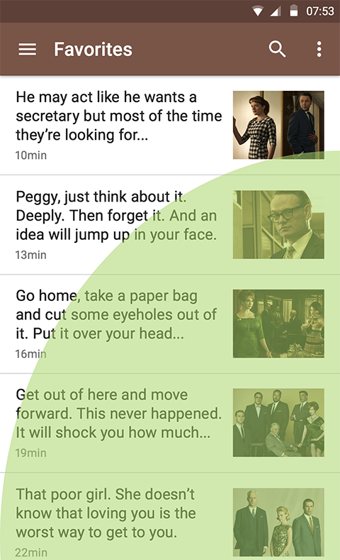
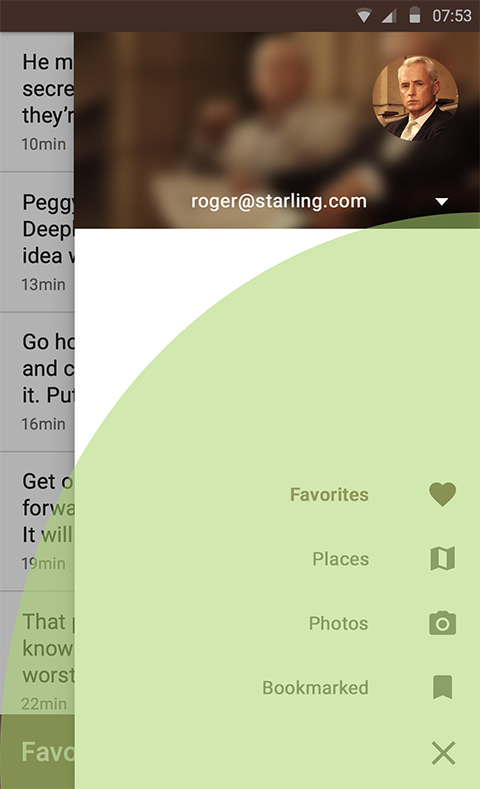
Now things are something like this. The green zone is an approximate zone to reach with a finger on the approximate Android. And no more. But one of you will say, “Wait, what about the swipe for the menu?”. I will answer you that svapaypit menu from right to left a little more convenient. This time. And two - alas, in order not to get back in any way, and we will not reach the arrow with one hand in the same way. It is generated in place of a GMD hamburger:

I believe that all this place ... Below! Okay, Google, can we just flip the action bar on the X and Y axes? For example, like this:
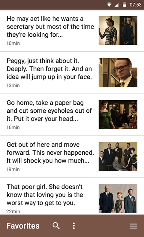
It turns out that we shifted all the important controls right into the zone of achievement. Even at the bottom, where within the X-axis is the largest area of coverage! See for yourself:
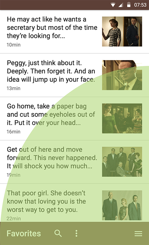
By the way, I’ve now held an old Chinese smartphone, Dexp, in my hands - the end of the thumb doesn’t go all the way round. Probably tall people here a little easier. Although the arrow back and for them too far. My height is about no more than 172cm. Okay, let's now tap on the hamburger or pull out the menu:
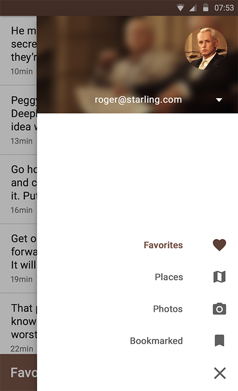
Of course, we also flip it along both axes. Well, how else? After all, with the current location of the icons as described in the menu on GMD, a similar problem arises. Now the menu icons are also reachable with one finger:
And maybe there’s no longer any sense in managing with one hand in our times? Are there so many functional essentials in our day that physically it does not fit all the bottom of the screen? Our attention sooner or later will still start jumping like a ball. Because quite often in GMD we come across controls on opposite sides of the screen. For example, remember about tabs. But after all, they can be “stuck” to the bottom:
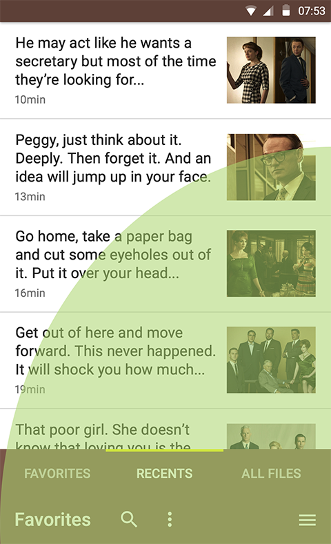
It seems everything is nothing, but someone will say that "the hierarchy is broken!". True, the first screen title to understand what it is about in general. Below is the content. And with a coup, this is weird. But if you compare the value of the hierarchy or the convenience of working with one hand, what would you choose?
upd: Ideally, of course it would be when you first start the system with a new phone to ask the user "In which hand is it convenient for you to hold the phone?". Based on the answer leave the hamburger left or right. But right below ...
By the way, there is an assembly of quite good resources for GMD
Once, when this project started, I gathered all the necessary resources for the designer within the GMD guidelines.
Source: https://habr.com/ru/post/313096/
All Articles