233 nuts for Cinderella: we select colors for the “perfect” palette
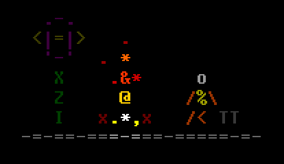
In the process of developing the game in text mode, I had to draw more than a hundred animated ASCII sprites. After the release, the game received unexpectedly good reviews and it was decided to continue. When drawing the sprites for the first part and having tried a dozen color choices and several dozen different palettes, I realized that I needed my own “perfect” color set for all times. For hundreds and hundreds of hours of drawing, the following criteria for the ideal palette have been formed:
- Brevity: a small amount of colors in the palette. The whole set of colors can be covered at a glance.
- Completeness: the colors of the palette should fill the color space evenly and tightly enough.
- Discretization: the colors of the palette should differ from each other by eye.
- Grouping: colors should be conveniently grouped to quickly find the right one.
It turned out that you can pick up a set of exactly 233 colors that will satisfy all these criteria.
Starting to select colors, take a look at all the color space. It can be represented as an RGB cube, cylinder / cone HSB - and these are only the most popular additive models.
')
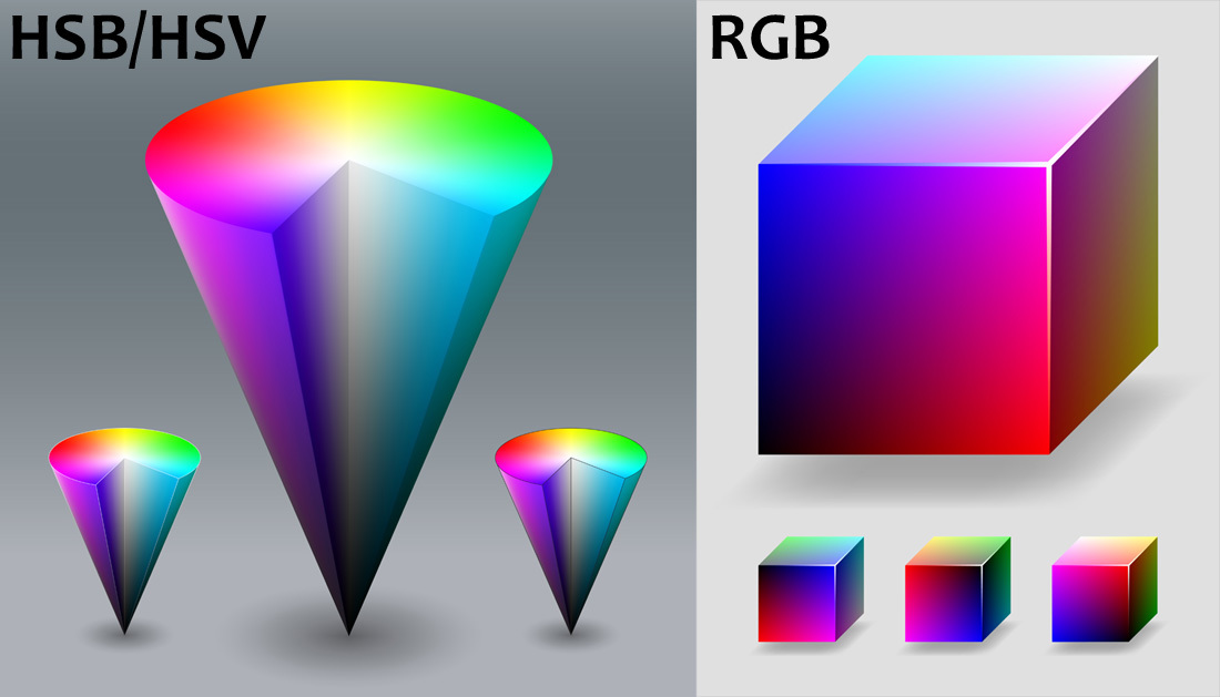
It is not convenient to choose a color from the “insides” of these three-dimensional figures. Therefore, graphic editors come up with various convenient and beautiful ways to choose a random color. But note that in each color model there are still at least three dimensions.
For ASCII graphics, this whole "continuum" of colors is not needed. Choosing a random color only makes editing difficult. The fact is that each character occupies a sufficiently large area on the screen and the characters usually do not touch. To notice the difference, the colors of the characters must be different by eye.
So, we need a discrete palette. Various palettes - a great many. These are both modern palettes and retro palettes that come from the past computer technology.
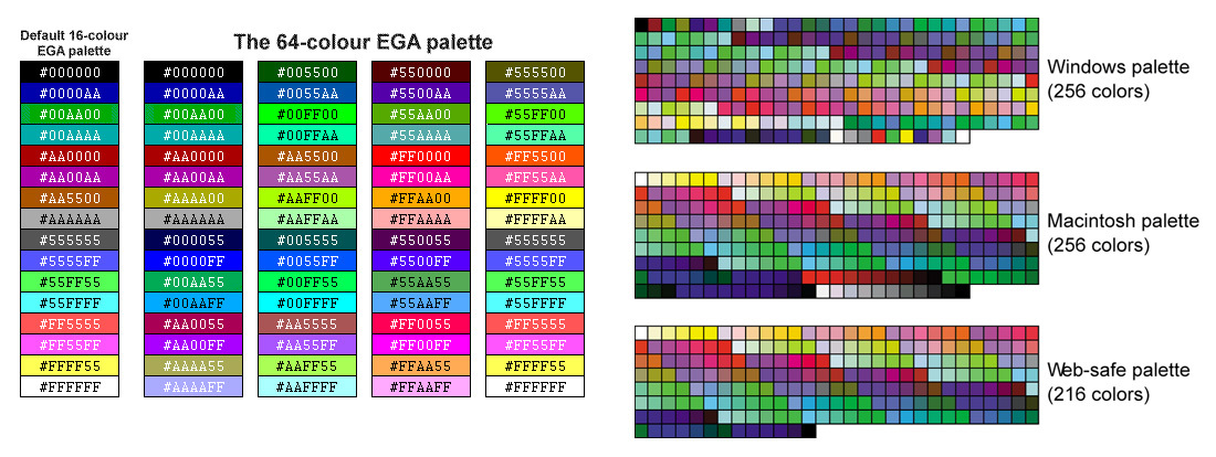
Despite all the variety, I did not find a palette that would satisfy my requirements. This is not surprising. Retro palettes were determined by the capabilities of iron. Modern palettes are composed, as a rule, for the purposes of implementing a certain style in design.
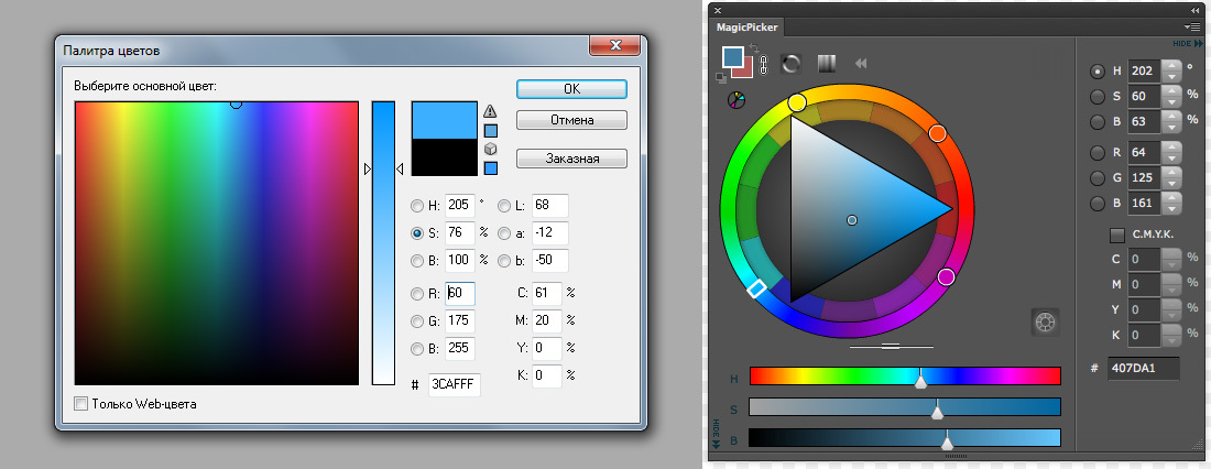
Most graphic editors allow you to create custom palettes. But the built-in capabilities of grouping colors on the palette were not enough for my purposes. So, I made the decision to assemble the palette myself.
Procedural palette?
What if you evenly distribute the color dots of the palette inside the color space? For example, each component of a color in an RGB model is divided into 6 parts. 216 flowers will turn out.
The problem is that a person perceives colors not linearly. The green shades of the palette will “merge”, and the blue ones will be too discrete. Here is an interesting material on flowers:
Poynton's Color FAQ
Only manual selection!
Developed in the 70s, the HSB model, which is a non-linear transformation of the RGB model, allows you to choose colors much more intuitively. The first component of the model is Hue - Color tone. What are the color tones? For example, as in the mnemonic phrase: "Every hunter wants to know where the pheasant sits."
7 color tones: Red, Orange, Yellow, Green, Blue, Blue, Purple
This is clearly not enough! And where, for example, pink or turquoise? A more complete set of 12 tones is given by the “dial” palette, where each hour on the dial has its own color.
12 color tones: Red, Orange, Yellow, Lime, Green, Aquamarine, Turquoise, Blue, Blue, Purple, Pink, Crimson
The resulting Hue values are still too discrete. I added several tones so that the difference in eye between adjacent tones was the same. Now the result gave me.
15 color tones: Red, Orange, Golden, Yellow, Lime, Green, Aquamarine, Turquoise, Blue, Blue, Ultramarine, Purple, Pink, Crimson, Scarlet

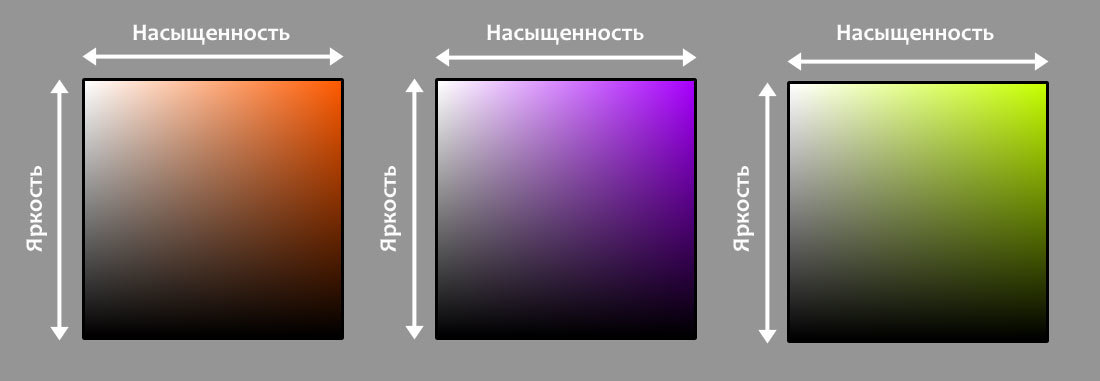
For each of the 15 color tones, you can set the components Saturation - Saturation and Brightness - Brightness. For example, here are sets of saturation and brightness values for orange, violet, and lime.
There is a well-known palette in which the components of saturation and brightness are drawn in one line.

It may seem that the whole color space is represented in this palette. Here it is - the perfect palette with well-grouped colors. But no, there are completely no colors with a single brightness and saturation. For example, the color of lilac, highlighted in the picture above - it is not possible to reduce its brightness in the framework of this palette.
Interestingly, the colors of this palette form the surface of a cylinder / cone model HSB. The colors from the inside of the cylinder / cone are absent.
Let's return to our 15 color tones. Construct for each discrete layout of the components of brightness and saturation. The values of the components will be uniformly selected as follows: 100%, 80%, 60%, 40%, 20%.
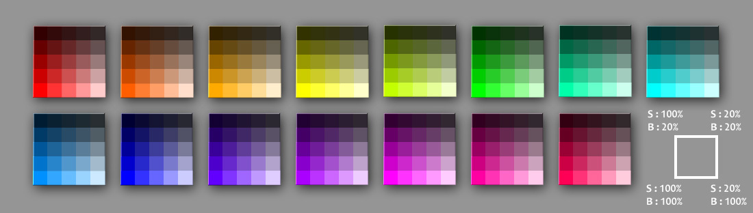
Often, the space of values of brightness and saturation is not presented in the form of a square, but in the form of a triangle. The fact is that the human eye is worse at distinguishing the change in saturation at lower brightness.
In our case, the triangle is obtained as follows: for a row with lower brightness, less saturation options are provided.

Not bad! Now we will start more fine-tuning. For each tone, the components of brightness and saturation were distributed evenly. But the human eye perceives brightness nonlinearly. Moreover, for different color tones, the perception of brightness is different.
One of the most commonly used formulas for assessing the brightness of a color is as follows:

It should be understood that the brightness of the color depends on the type of monitor and on the individual characteristics of a person’s view, and this formula was derived for CRT monitors. However, it reflects the fact that the contribution to the overall brightness of the blue component is less than the contribution of red, which, in turn, is less than the contribution of green. This can be seen with the naked eye, it is enough, for example, to compare blue with a brightness of 20% and green with a brightness of 20%. Blue is much darker!
In order to even out dark colors and make the visual dimming of the brightness more linear, I applied the following transformation:
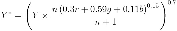
The formula looks a bit cumbersome, but in fact it is simple. The input is the level of brightness Y, color tone (r, g, b), as well as the number of gradations of brightness n. Inside the big brackets there is an alignment of dark colors depending on the tone. Raising a power of 0.7 makes the change in brightness more uniform visually. Degrees 0.15 and 0.7 I picked by hand, trying to achieve the best result.
To equalize the saturation, the following simple conversion was enough for me:
Degree 0.65 was also hand picked. The following GIF animation is an option before and after the conversion. I made the background black so that the dark colors could be seen better. Judge for yourself whether the colors in brightness and saturation are more evenly distributed. In my opinion - yes, it became better.

It remains to add shades of gray and group the resulting colors. The result was such a palette.
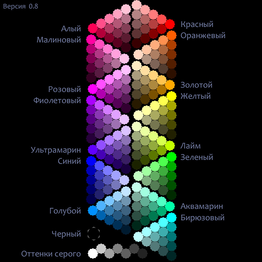
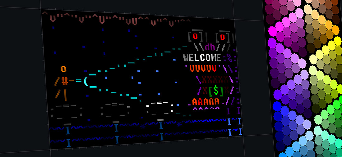
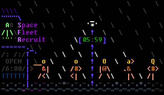
I got 233 nuts for Cinderella - 233 colors for the ASCII graphics editor, which is beautiful!
RGB color representation of the palette in the form of JSON
{ "": [ [ {"r": 255, "g": 0, "b": 85}, {"r": 179, "g": 0, "b": 59}, {"r": 131, "g": 0, "b": 43}, {"r": 91, "g": 0, "b": 30}, {"r": 54, "g": 0, "b": 18} ], [ {"r": 255, "g": 79, "b": 138}, {"r": 179, "g": 55, "b": 96}, {"r": 131, "g": 41, "b": 71}, {"r": 91, "g": 28, "b": 49} ], [ {"r": 255, "g": 124, "b": 168}, {"r": 179, "g": 87, "b": 118}, {"r": 131, "g": 64, "b": 86} ], [ {"r": 255, "g": 162, "b": 193}, {"r": 179, "g": 114, "b": 135} ], [ {"r": 255, "g": 195, "b": 215} ] ], "": [ [ {"r": 255, "g": 0, "b": 162}, {"r": 178, "g": 0, "b": 113}, {"r": 130, "g": 0, "b": 82}, {"r": 89, "g": 0, "b": 56}, {"r": 52, "g": 0, "b": 33} ], [ {"r": 255, "g": 79, "b": 191}, {"r": 178, "g": 55, "b": 133}, {"r": 130, "g": 40, "b": 97}, {"r": 89, "g": 27, "b": 67} ], [ {"r": 255, "g": 124, "b": 207}, {"r": 178, "g": 87, "b": 145}, {"r": 130, "g": 63, "b": 106} ], [ {"r": 255, "g": 162, "b": 221}, {"r": 178, "g": 113, "b": 154} ], [ {"r": 255, "g": 195, "b": 233} ] ], "": [ [ {"r": 255, "g": 0, "b": 255}, {"r": 177, "g": 0, "b": 177}, {"r": 129, "g": 0, "b": 129}, {"r": 87, "g": 0, "b": 87}, {"r": 50, "g": 0, "b": 50} ], [ {"r": 255, "g": 79, "b": 255}, {"r": 177, "g": 55, "b": 177}, {"r": 129, "g": 40, "b": 129}, {"r": 87, "g": 27, "b": 87} ], [ {"r": 255, "g": 124, "b": 255}, {"r": 177, "g": 86, "b": 177}, {"r": 129, "g": 63, "b": 129} ], [ {"r": 255, "g": 162, "b": 255}, {"r": 177, "g": 113, "b": 177} ], [ {"r": 255, "g": 195, "b": 255} ] ], "": [ [ {"r": 170, "g": 0, "b": 255}, {"r": 119, "g": 0, "b": 179}, {"r": 88, "g": 0, "b": 132}, {"r": 61, "g": 0, "b": 92}, {"r": 37, "g": 0, "b": 56} ], [ {"r": 196, "g": 79, "b": 255}, {"r": 138, "g": 56, "b": 179}, {"r": 102, "g": 41, "b": 132}, {"r": 71, "g": 28, "b": 92} ], [ {"r": 211, "g": 124, "b": 255}, {"r": 149, "g": 88, "b": 179}, {"r": 110, "g": 65, "b": 132} ], [ {"r": 224, "g": 162, "b": 255}, {"r": 158, "g": 114, "b": 179} ], [ {"r": 235, "g": 195, "b": 255} ] ], "": [ [ {"r": 98, "g": 0, "b": 255}, {"r": 70, "g": 0, "b": 182}, {"r": 52, "g": 0, "b": 136}, {"r": 37, "g": 0, "b": 98}, {"r": 24, "g": 0, "b": 63} ], [ {"r": 146, "g": 79, "b": 255}, {"r": 105, "g": 56, "b": 182}, {"r": 78, "g": 42, "b": 136}, {"r": 56, "g": 30, "b": 98} ], [ {"r": 174, "g": 124, "b": 255}, {"r": 124, "g": 89, "b": 182}, {"r": 93, "g": 67, "b": 136} ], [ {"r": 198, "g": 162, "b": 255}, {"r": 141, "g": 116, "b": 182} ], [ {"r": 218, "g": 195, "b": 255} ] ], "": [ [ {"r": 0, "g": 0, "b": 255}, {"r": 0, "g": 0, "b": 187}, {"r": 0, "g": 0, "b": 145}, {"r": 0, "g": 0, "b": 109}, {"r": 0, "g": 0, "b": 76} ], [ {"r": 79, "g": 79, "b": 255}, {"r": 58, "g": 58, "b": 187}, {"r": 45, "g": 45, "b": 145}, {"r": 34, "g": 34, "b": 109} ], [ {"r": 124, "g": 124, "b": 255}, {"r": 91, "g": 91, "b": 187}, {"r": 71, "g": 71, "b": 145} ], [ {"r": 162, "g": 162, "b": 255}, {"r": 119, "g": 119, "b": 187} ], [ {"r": 195, "g": 195, "b": 255} ] ], "": [ [ {"r": 0, "g": 145, "b": 255}, {"r": 0, "g": 100, "b": 176}, {"r": 0, "g": 72, "b": 128}, {"r": 0, "g": 49, "b": 86}, {"r": 0, "g": 27, "b": 48} ], [ {"r": 79, "g": 179, "b": 255}, {"r": 55, "g": 124, "b": 176}, {"r": 39, "g": 90, "b": 128}, {"r": 26, "g": 60, "b": 86} ], [ {"r": 124, "g": 198, "b": 255}, {"r": 86, "g": 137, "b": 176}, {"r": 62, "g": 99, "b": 128} ], [ {"r": 162, "g": 215, "b": 255}, {"r": 112, "g": 149, "b": 176} ], [ {"r": 195, "g": 229, "b": 255} ] ], "": [ [ {"r": 0, "g": 255, "b": 255}, {"r": 79, "g": 255, "b": 255}, {"r": 124, "g": 255, "b": 255}, {"r": 162, "g": 255, "b": 255}, {"r": 195, "g": 255, "b": 255} ], [ {"r": 0, "g": 173, "b": 173}, {"r": 62, "g": 173, "b": 173}, {"r": 97, "g": 173, "b": 173}, {"r": 127, "g": 173, "b": 173} ], [ {"r": 0, "g": 121, "b": 121}, {"r": 53, "g": 121, "b": 121}, {"r": 83, "g": 121, "b": 121} ], [ {"r": 0, "g": 78, "b": 78}, {"r": 44, "g": 78, "b": 78} ], [ {"r": 0, "g": 38, "b": 38} ] ], "": [ [ {"r": 0, "g": 255, "b": 170}, {"r": 79, "g": 255, "b": 196}, {"r": 124, "g": 255, "b": 211}, {"r": 162, "g": 255, "b": 224}, {"r": 195, "g": 255, "b": 235} ], [ {"r": 0, "g": 173, "b": 115}, {"r": 62, "g": 173, "b": 136}, {"r": 98, "g": 173, "b": 148}, {"r": 127, "g": 173, "b": 158} ], [ {"r": 0, "g": 122, "b": 81}, {"r": 53, "g": 122, "b": 99}, {"r": 83, "g": 122, "b": 109} ], [ {"r": 0, "g": 79, "b": 52}, {"r": 44, "g": 79, "b": 67} ], [ {"r": 0, "g": 40, "b": 26} ] ], "": [ [ {"r": 0, "g": 255, "b": 0}, {"r": 79, "g": 255, "b": 79}, {"r": 124, "g": 255, "b": 124}, {"r": 162, "g": 255, "b": 162}, {"r": 195, "g": 255, "b": 195} ], [ {"r": 0, "g": 174, "b": 0}, {"r": 62, "g": 174, "b": 62}, {"r": 98, "g": 174, "b": 98}, {"r": 128, "g": 174, "b": 128} ], [ {"r": 0, "g": 124, "b": 0}, {"r": 54, "g": 124, "b": 54}, {"r": 84, "g": 124, "b": 84} ], [ {"r": 0, "g": 81, "b": 0}, {"r": 46, "g": 81, "b": 46} ], [ {"r": 0, "g": 42, "b": 0} ] ], "": [ [ {"r": 196, "g": 255, "b": 0}, {"r": 214, "g": 255, "b": 79}, {"r": 224, "g": 255, "b": 124}, {"r": 233, "g": 255, "b": 162}, {"r": 241, "g": 255, "b": 195} ], [ {"r": 131, "g": 171, "b": 0}, {"r": 146, "g": 171, "b": 61}, {"r": 154, "g": 171, "b": 97}, {"r": 161, "g": 171, "b": 126} ], [ {"r": 91, "g": 119, "b": 0}, {"r": 104, "g": 119, "b": 52}, {"r": 110, "g": 119, "b": 81} ], [ {"r": 57, "g": 75, "b": 0}, {"r": 67, "g": 75, "b": 42} ], [ {"r": 27, "g": 35, "b": 0} ] ], "": [ [ {"r": 255, "g": 255, "b": 0}, {"r": 255, "g": 255, "b": 79}, {"r": 255, "g": 255, "b": 124}, {"r": 255, "g": 255, "b": 162}, {"r": 255, "g": 255, "b": 195} ], [ {"r": 170, "g": 170, "b": 0}, {"r": 170, "g": 170, "b": 61}, {"r": 170, "g": 170, "b": 96}, {"r": 170, "g": 170, "b": 125} ], [ {"r": 118, "g": 118, "b": 0}, {"r": 118, "g": 118, "b": 51}, {"r": 118, "g": 118, "b": 80} ], [ {"r": 73, "g": 73, "b": 0}, {"r": 73, "g": 73, "b": 41} ], [ {"r": 33, "g": 33, "b": 0} ] ], "": [ [ {"r": 255, "g": 170, "b": 0}, {"r": 255, "g": 196, "b": 79}, {"r": 255, "g": 211, "b": 124}, {"r": 255, "g": 224, "b": 162}, {"r": 255, "g": 235, "b": 195} ], [ {"r": 173, "g": 115, "b": 0}, {"r": 173, "g": 136, "b": 62}, {"r": 173, "g": 148, "b": 98}, {"r": 173, "g": 157, "b": 127} ], [ {"r": 122, "g": 81, "b": 0}, {"r": 122, "g": 99, "b": 53}, {"r": 122, "g": 109, "b": 83} ], [ {"r": 78, "g": 52, "b": 0}, {"r": 78, "g": 67, "b": 44} ], [ {"r": 39, "g": 26, "b": 0} ] ], "": [ [ {"r": 255, "g": 94, "b": 0}, {"r": 255, "g": 144, "b": 79}, {"r": 255, "g": 172, "b": 124}, {"r": 255, "g": 196, "b": 162}, {"r": 255, "g": 217, "b": 195} ], [ {"r": 175, "g": 64, "b": 0}, {"r": 175, "g": 104, "b": 63}, {"r": 175, "g": 127, "b": 99}, {"r": 175, "g": 146, "b": 129} ], [ {"r": 126, "g": 46, "b": 0}, {"r": 126, "g": 81, "b": 54}, {"r": 126, "g": 100, "b": 86} ], [ {"r": 83, "g": 30, "b": 0}, {"r": 83, "g": 60, "b": 47} ], [ {"r": 45, "g": 16, "b": 0} ] ], "": [ [ {"r": 255, "g": 0, "b": 0}, {"r": 255, "g": 79, "b": 79}, {"r": 255, "g": 124, "b": 124}, {"r": 255, "g": 162, "b": 162}, {"r": 255, "g": 195, "b": 195} ], [ {"r": 180, "g": 0, "b": 0}, {"r": 180, "g": 64, "b": 64}, {"r": 180, "g": 101, "b": 101}, {"r": 180, "g": 132, "b": 132} ], [ {"r": 133, "g": 0, "b": 0}, {"r": 133, "g": 57, "b": 57}, {"r": 133, "g": 90, "b": 90} ], [ {"r": 93, "g": 0, "b": 0}, {"r": 93, "g": 52, "b": 52} ], [ {"r": 57, "g": 0, "b": 0} ] ] } I will be glad to see you in my textpuzzlelab group on Facebook, where you can see how I apply the colors of this palette in ASCII-style images.
Work on the palette is not finished yet. Current version 0.8. One of the problems is that with a change in saturation, the discreteness criterion is not quite satisfied for yellow, lime, green, aquamarine, and turquoise. Not yet figured out how to be.
I will gladly accept comments and suggestions. One pair of eyes is good, but two or more is better!
Source: https://habr.com/ru/post/312826/
All Articles