Women and murder: is there a relationship here? [part 2 of 2]

R code ( gist ) to reproduce all the results
In the first part , caught up with inspiration and the desire to test hypotheses at once, I analyzed the relationship between sex ratio and the prevalence of homicides in European countries. The results did not confirm my expectations. It seems that in many respects the countries of Europe resemble the regions of one country with its periphery and its centers.
In the next iteration of my skepticism, the results of which you can read below, I test my hypothesis on the data of American counties, as well as the authors of the original article .
If you are too lazy to look into the first part of the article , here is a brief summary. The authors of a study published in the journal Human Nature claim that the sex ratio in the adult population affects the prevalence of serious crimes (in particular, murder): the more women, the more crimes. I still think that the whole thing is in the missing variable - centrality / peripherality (urban / rural) - which should explain both the increased share of women in the cities and the greater number of crimes in them.
I could not convincingly confirm my guesses on unpretentious European data. Let's try on the detailed American.
Data
A casket just opened (s)
Everything turned out to be much simpler than one would expect. Of course, I spent more than one hour wandering through different resources (good for the US data ... we would be like that). And so, when I was still painting myself with difficulties and keeping dozens of bookmarks for later, I came across this wonderful dataset . Dataset is freely downloadable after registration and acceptance of the terms of use.
The data are purposely collected for this kind of analysis, which leads to suspicions in the cycle-building specialization of the authors of the original article. Dataset contains an extensive list of variables for the counties of the United States for the period 2001-2006. Not so fresh data, like the authors, but one can hardly expect that human nature is changing over the decade. It contains all the variables of interest to us, in order to easily repeat the study and test the hypothesis of interest to us.
Exploratory data analysis
First, let's see if the differences in key indicators are large between central and peripheral counties. Our dataset has a classification of counties into 9 types (RuralUrban03, 2003 ERS Rural-Urban Continuum Code). The first three categories are city counties of various numbers. Categories 4–9 are rural, differences in population size and remoteness from the regional center.
Code Description
Metropolitan counties:
1 Counties in metro areas of 1 million population or more
2 Counties in metro areas of 250,000 to 1 million population
3 Counties in metro areas of less than 250,000 population
Nonmetropolitan counties:
4 Urban population of 20,000 or more
5 Urban population of 20,000 or more
6 Urban population of 2,500 to 19,999, adjacent to a metro area
7 Urban population of 2,500 to 19,999, not adjacent to a metro area
8 Completely rural or less than 2,500 urban population, adjacent to a metro area
9 Completely rural or less than 2,500 urban population, not adjacent to a metro area
On the map, it looks like this. The circles are given the state capitals (red) and major cities (golden).
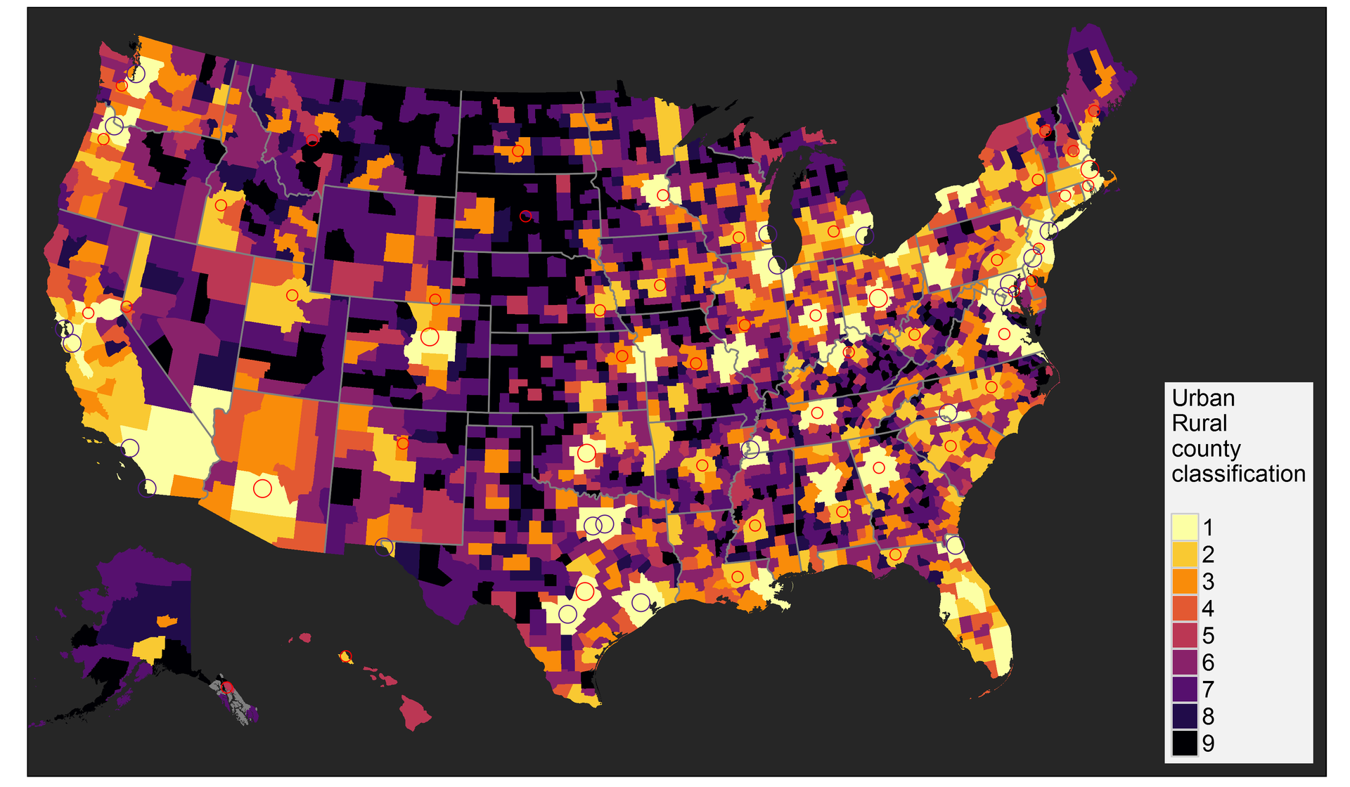
Figure 1. The classification of counties by centrality / peripherality.
Since it is inconvenient to work with 9 categories, in the further analysis I combined the first three - into the metro category, and the rest - into the non-metro category.
First, we are wondering whether the ratio of men and women really reflects the result of the Ravenstein immigration law - whether women are really more active in migrations over short distances, and more of them in cities. Let's look at the distributions of counties by the sex ratio in adulthood (Fig. 2).

Figure 2. Distribution of central and peripheral counties by sex ratio in adulthood.
It is clearly seen that among the counties with a higher sex ratio (dominated by men), there are more peripheral ones. The median index value for peripheral counties is 1.039; for central 1.016.
The map by county is very noisy, so I built a map by state comparing the average sex ratio for the central and peripheral counties (Fig. 3). There are practically no states in which the sex ratio would be higher in the central counties.

Figure 3. Average sex ratio in central counties versus peripheral.
Another obvious result of migration is always the median age of the population. On average, migrants are always younger than the local population. Therefore, migration redistributes the median age of the population, rejuvenating the central territories and accelerating the aging of the population in the periphery. Of course, this general rule is confirmed by American data (Fig. 4 and 5).
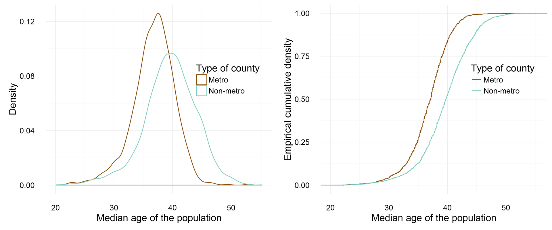
Figure 4. Distribution of central and peripheral counties by the ratio of the median age of the population.

Figure 5. The median age of the population by US county.
For a change, by the median age of the population built a map by county. It is still quite noisy, but you can catch a general pattern.
Finally, what about the murders in the city and in the countryside? Here the situation is curious (Fig. 6).

Figure 6. Distribution of central and peripheral counties in terms of homicides per 100K of population.
In 2004, when data were collected, the killings did not occur in 65.2% of the peripheral counties and 30.3% of the central counties. At the same time, when the crimes did occur in the peripheral territories, the coefficient turned out to be quite high due to the small population of the provincial counties. In general, of course, there are more murders in the cities. The value of the third quartile (75%) for cities is 55.4, and for the province there are 36.7 murders per 100K of population. If we aggregate data by state and county type (Fig. 7), then it is clearly seen that city crime is higher in almost all states.

Figure 7. The average homicide rate per 100K of the population in the central counties compared to the peripheral.
So, the initial premises are confirmed by the data. Let's see what the result of the simulation will be.
But first, let's look at a beautiful map of the share of the black population of the United States by county (Fig. 8), because after the authors we will use this variable as a control in the models.
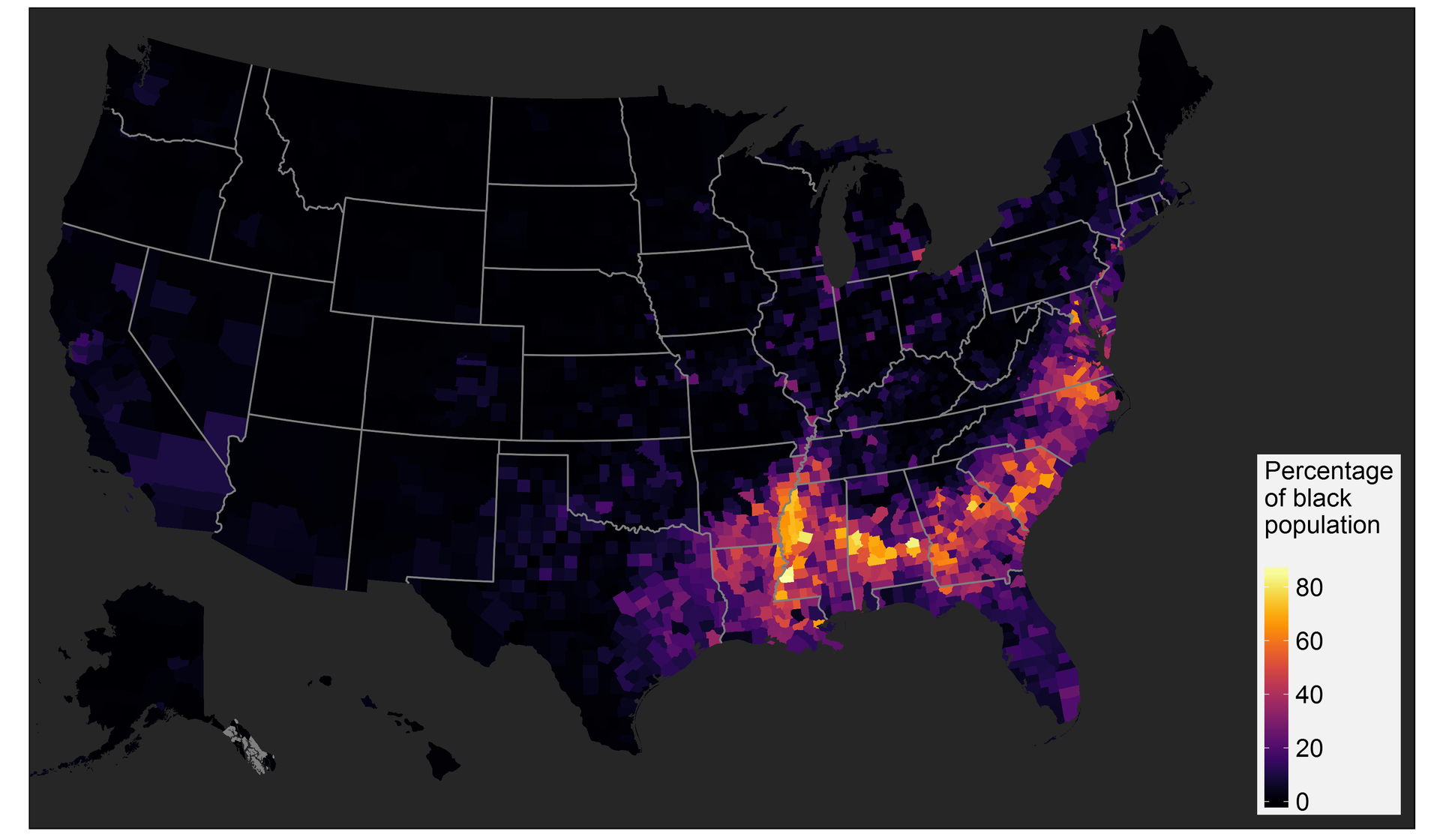
Figure 8. The proportion of blacks in the counties of the United States.
Models
So, using the Poisson regressions, we model the dependence of the homicide rate on the sex ratio and other additional variables. Enter the variables sequentially.
Laziness was to change the notation. In addition, they are quite talking.
asr - sex ratio in adulthood (15-44)
perstpov04 - sustainable poverty: the share of the county’s population is below the poverty line of at least 20% according to the last 4 censuses, 1970, 1980, 1990 and 2000
pctblack05 - the proportion of blacks
southSouth - dummy variable for southern states (South versus North)
metroNon-metro - centrality / peripherality (periphery versus center)
ruralurban03 - 9-step classification of centrality / peripherality
unemprate05 - unemployment
medianage05 - the median age of the population
Table 1. Homicide simulation results.
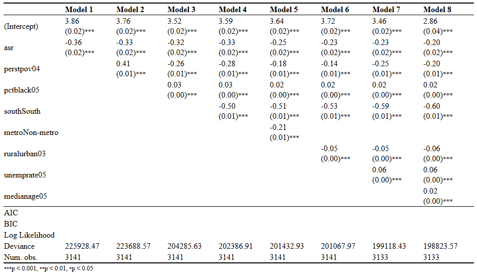
The results of models 1-4 are very similar to those given by the authors of the article in Human Nature. It is interesting here, perhaps, that in the transition from model 2 to model 3, the coefficient of the variable “permanent poverty” changes sign. It turns out that the proportion of the black population explains the variation in poverty.
We are also interested in comparing models 4 and 5. When we introduce centrality / peripherality as a control variable, the coefficient with the sex ratio becomes significantly less negative. That is, the differences in centrality / periphery explain a significant part of the revealed relationship between the frequency of homicides and the sex ratio. The remaining models are not so interesting, but left.
findings
The sensation did not happen. But, indeed, the centrality / periphery of the counties is almost half weakened by the relationship between the sexes and the crime rate identified by the authors. Other additional variables tested by me do not have the same significant effect. So my suspicion was confirmed by half. The status of the territory means a lot, but does not level the fully identified relationship. However, without a doubt, the authors of the original article missed one of the key variables.
Reproducibility
R code ( gist ) to reproduce all the results. Guaranteed to work when using R version 3.3.2 with packages as of 2016-11-10. In the case of package incompatibilities, use the checkpoint package, setting the appropriate date.
UPD 2018 : all materials on github .
')
Source: https://habr.com/ru/post/312694/
All Articles