Create good tables
Poor table. What is wrong with them?
At the beginning of the history of the web tables were the basis for displaying information. Over time, the developers found new, more fashionable ways of presenting data, and the tables faded into the background. Today, tables are used much less frequently, but they still collect and organize large amounts of information that we encounter daily.
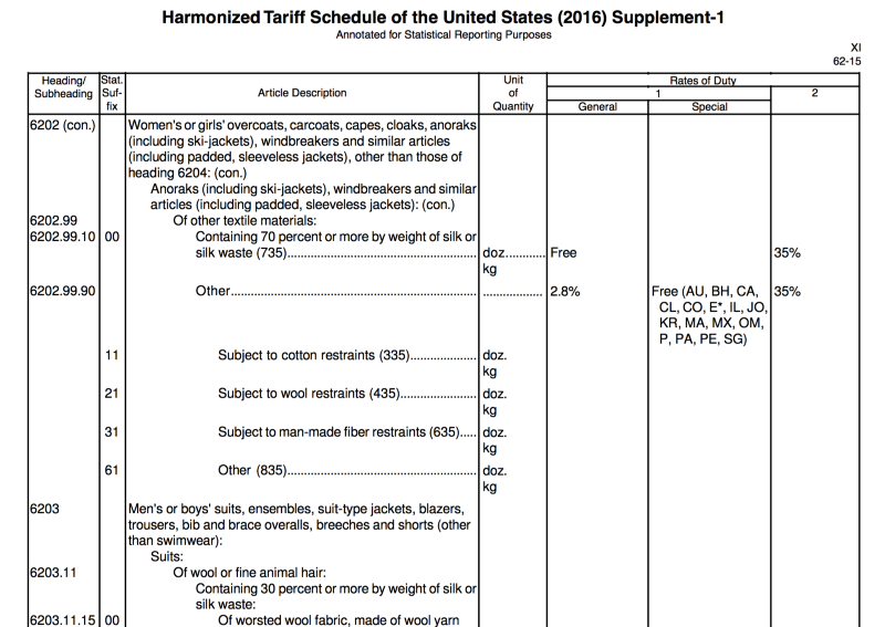
Here is an example that I call the table of all tables: The harmonized US tariff , which covers more than 3,550 pages. It contains a description of each product that can be imported into the United States, including such exciting positions as "Men's and children's coats, short coats, capes, jackets, anoraks (including ski suits), windbreakers and similar goods (including insulated vests).
So what is a short coat?
An illiterately designed table looks ugly. The design is the basis of the table: when done correctly, complex data is easy to view and compare. If the design is incorrect, the information ceases to be clear.
Let's see how to do it right.
Watch the numbers
Not all numbers are the same. I do not mean π (Pi) and ∞ (although I mention them at parties), but I talk about displaying figures divided into minuscule or muscular, and proportional or tabular.
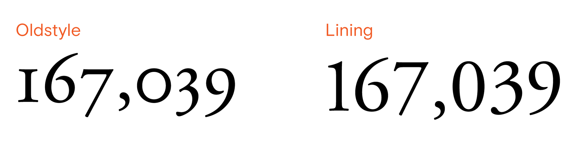
Minuscular and Muscular
Minusonic numbers look great in sentences, where they correspond to the size and padding of lowercase characters. Maximal figures are more uniform, which corresponds to the flat structure of the table.
The difference between proportional and tabular numbers is not so obvious:
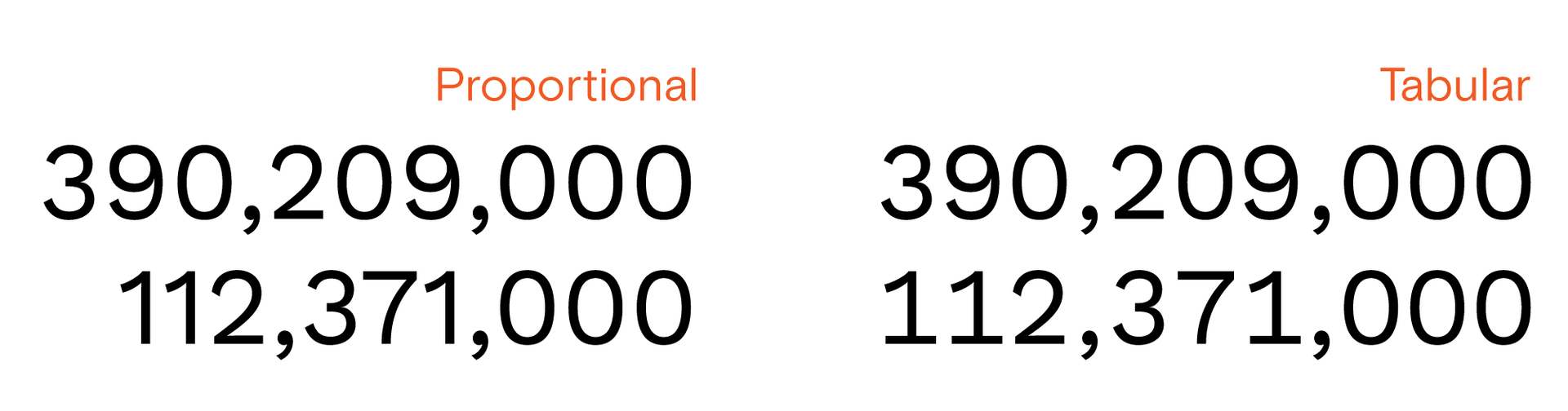
Proportional and table numbers
Proportional numbers are created to convey a shade - to fit the overall size and indent - the typeface. Tabular numbers are commensurate with each other, which allows aligning columns with numbers. Although the difference in the example of one or two lines is not so obvious, the use of table numbers makes it easier to view large tables and reduce the likelihood of read errors.
Technical note on tabular masculine figures
At the design stage, it is worth making sure that the numbers used are appropriate for you (tabular and muscular alignment is usually turned off by default). Adobe products include an “opentype” panel, with which the numbers are set to the correct setting. To include the corresponding property in CSS, you need to understand the slightly confusing syntax . Anyway, a few queries to Google will guide you on the right path.
Now the bad news: tabular table numbers are not available for all typefaces. Headsets that include them are usually expensive . There are a few exceptions: for example, the beautiful Work Sans is a free font with tabular mausculary numbers.
If it is difficult to find the right typeface, use a fallback option - fixed-width fonts. They look more like code, but they are always suitable for displaying numbers in a table. It is worth adding that San Francisco, the new default system font for Apple, contains tabular, mauscale numbers that display well for small sizes.
Remember alignment
Follow the 3½ rules:
1. Numeric data is aligned on the right side.
2. Text data is aligned to the left.
3. Headers are aligned in the same way as their data.
3½. Do not use center alignment.
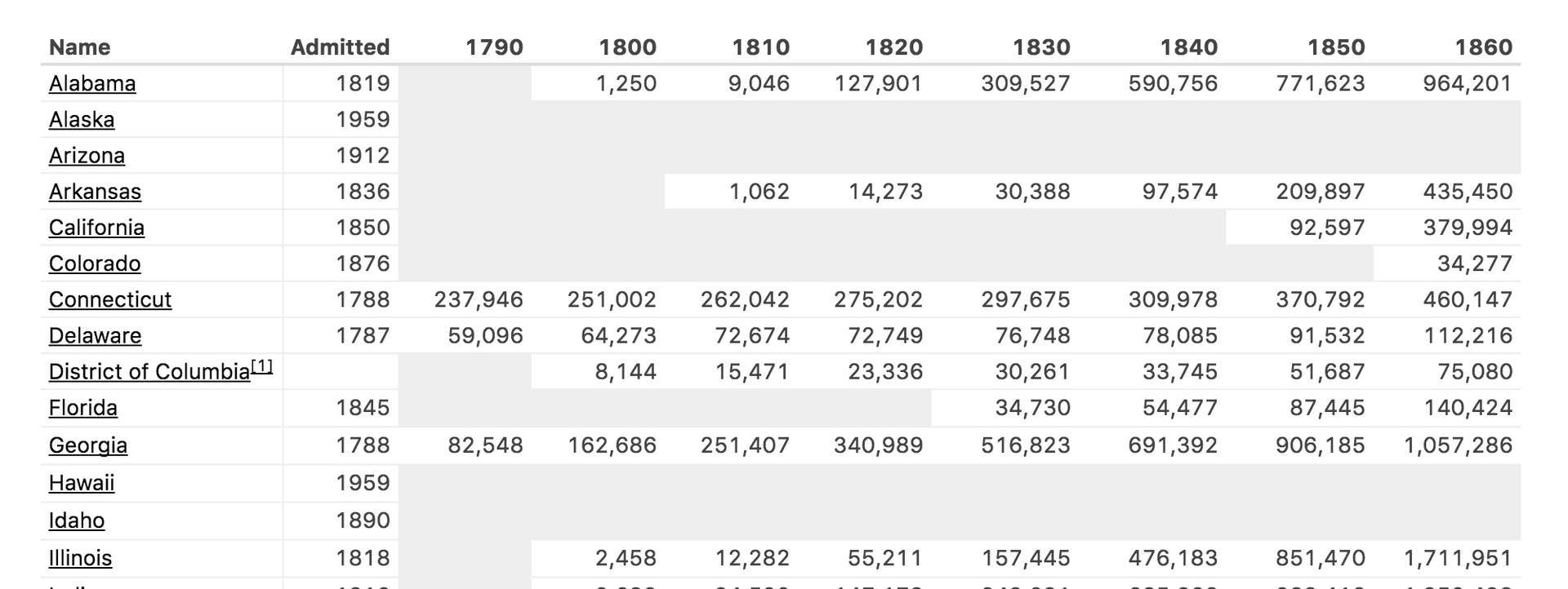
List of US States by Historic Population - Wikipedia
Numbers are read from right to left - when comparing numbers, we first look at the units, then at tens, hundreds, etc. This is the same way that people learn arithmetic - they start on the right and move to the left, collecting and grouping numbers as they are read [1] . Therefore, the tables must align the numerical data to the right.
Texts (in Russian) are read from left to right. Texts are usually compared in alphabetical order: if two lines start with one letter, the next one is compared, and so on. Trying to quickly run through text that is not aligned on the left side is extremely difficult.
Headers should preserve the alignment of their corresponding data. The vertical lines of the table in this case will look neat, and the data - whole and consistent.
When centered, the lines in the table appear jagged, making it difficult to view the contents. This often causes additional separators and graphic elements to be added to the table.
Matching significant digits = good alignment
A simple way to maintain proper table alignment is to maintain consistency in writing meaningful numbers . This usually means that within each column numbers must have the same number of decimal places. Meaningful numbers are a topic for a separate article, so I’ll leave here only a brief tip: the less significant numbers you can get by, the better.
Laconic, clear signatures
Signatures accompanying data are particularly important. These elements of the auxiliary context allow you to read the table to a wider audience, and under more different circumstances.

Mississippi Flood Forecast - NOAA
Title
This sounds like a given, but short and clear title is just as important to the table as the rest of the design. With a good title, tables become mobile - they can be transferred to many different contexts, and they can be easily referenced from external sources.
Units
The most common signature used in the tables is data units. Usually it is repeated in each individual cell of the table. To avoid repetition, it is enough to include the signature in the first line of each column.
Headlines
Keep headlines as short as possible. Table design should focus on data. Long caption labels will interfere with this, occupying a large part of the visual space.
As little ink as possible
When you decide how to stylize graphical elements in a table, you should always try to reduce the color saturation of the table without losing structure. Try to use as little “ink” as possible — that is, do not stylize elements when possible.

National League 2016 Batting Statistics - BaseballReference
Rulers
If you have correctly aligned the data in the table, there is no point in using rulers. The main advantage of the rulers is the ability to reduce the distance between the elements, at the same time separating them from each other. Even if you use rulers, try to make them inconspicuous so that they do not interfere with a cursory view.
The most useful horizontal rulers. They can significantly reduce the height of long tables, speeding up the comparison of a large amount of data or noting the trends of their change.
Also, I have a personal opinion about the lines: do not use the division into stripes on a zebra . This is bad practice. However, agree with me or not - you decide.
Backgrounds
Backgrounds are most useful for highlighting various data areas: for example, transitions from particulars to sums or average values.
Many elements can be distinguished without the use of backgrounds: highlighting values, additional context to the data, changes in values compared to previous periods. Use graphic elements, such as ✻, † (one of my favorites), or ▵.
In addition to this, the tables should be monochrome. The use of colors for organizational purposes or to add additional value increases the likelihood of misinterpretation or mistakes, causing problems for people with visual impairments.
Conclusion
Tables can be boring , but they are one of the main elements in information rich documents, so designers should not treat them dismissively. Efficient, transparent, readable tables will greatly facilitate the difficult process of perceiving large amounts of data.
Further reading and inspiration materials.
FiveThirtyEight has always been a great source of inspiration - the Decima Mono headset is used to display numeric data, which is specifically designed to display large data sets in a small space.
Butterick's Practical Typography is my reference for all typography issues. This is the type of resources for which you have a lot of links - there are so many useful articles there!
Finally, no data design article will be complete without an Edward Tufte article . His design letter is simply indispensable.
If you want to learn about other interesting approaches in arithmetic, see how Japanese children use Soroban or how grid multiplication works.
Original: Design Better Data Tables , by Matthew Ström.
Translation: aalexeev , Editing: Yana Kriklivaya, Chaika Chursina.
')
Source: https://habr.com/ru/post/312422/
All Articles