We design forms
Note: Luke Wroblewski is a senior interface designer at the National Supercomputer Application Center ( NCSA) , in which the first widely-used graphical browser, NCSA Mosaic, appeared . In this center, he designed interface solutions for Hewlett-Packard, IBM, and Kellogg's and participated in the joint development of the Interaction Environment for the Open Portal ( OPIE ). Below is a translation of his article on choosing the correct markup to display forms on web pages.
–HTML: the Definitive Guide
Now it is very rare to find a web application that would not actively use forms for data entry and settings. But not all web applications use this appropriately. A diverse arrangement of input fields , associated labels ( labels ), calls to action and surrounding visual elements can help or prevent the user from acting in a certain way.
')
If you need to reduce the development time of the form and the data collected is clear and close to most users (for example, you need to enter the name, address and payment information in the payment process), then it is best to use the vertical arrangement of the form fields and their names. The vertical proximity of the form field and its name and the sequential arrangement of both form fields and their names reduces the movement of the sight and filling time. From the user is required all the time to move in one direction: down.

In this markup, we recommend using a bold face for the form field names. This will visually increase their weight and bring the markup to the fore. Otherwise, the names may compete with the form fields for the user's attention, because visually they will have almost the same weight.
If the form data is unfamiliar to the user or does not break up so easily into successive groups (such as, for example, all the different parts of the mailing address), aligning the field names to the left makes it easier to view all the information relating to the form. Users can simply run their eyes over the left column of names up and down, and the form fields will not interfere with them. However, the distance between names and input fields often increases due to long names, as a result, the time it takes to fill out such a form can increase. Users have to “jump” from one column to another in order to understand the correct match of the name and the field before entering data.
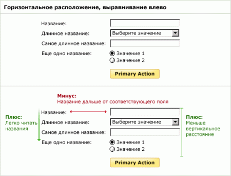
Alternatively, you can consider markup in which the titles are aligned to the right, so the connection between them and the form fields becomes more obvious. However, as a result, the left edge of the names becomes “ragged”, which reduces the pros from a quick view of all the form fields. Representatives of Western culture read the text from left to right, so the clear left border of the text is better suited to us.
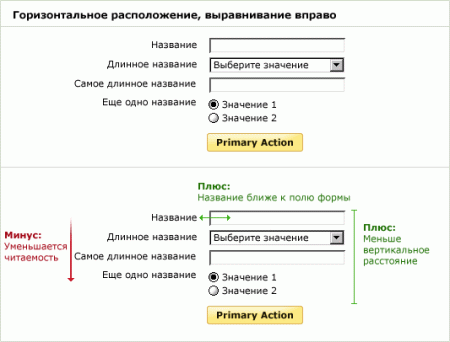
Considering the advantages of “left-aligned” markup (it is easy to read the field names and reduce the vertical space on the screen), you can try to correct its main drawback: separating the form fields from the corresponding names.
This approach reflects the following idea: the color of the background and the ruler can be used for additional formalization. Different background colors create a separate vertical block for field names and a separate one for the fields themselves. Horizontal ruler associate the corresponding name with the form field. It would seem that this approach is quite acceptable, but it still creates a couple of problems.
Through gestalt (our rules of visual perception ), an additional 15 elements were added to the markup: the center line, each separate background block and each horizontal line. These elements distract visual perception and make it difficult to focus on the most important elements in the markup: the names and fields of the form. As Edward Tufte points out: “Information consists of differences that give rise to meaning” ( “Information consists of differences that make a difference” ). In other words, any element that does not improve the markup spoils it. You can see this if you try to view the left column of titles: the eye is constantly decelerated on each horizontal line and block created by the line and background color.

Naturally, this does not mean that the background colors and rulers are completely unsuitable for use for shape marking. If it makes sense to select a related group of information for users, then a thin horizontal line or a light background color can visually combine similar information. Both of these techniques (rulers and background colors) could be very convenient for drawing attention to the active elements of the form calling for action.
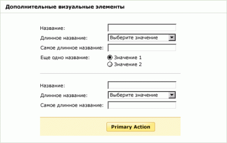
The main action with which the form is associated (in most cases, this is “Send” or “Save”) needs a stronger visual accent (in the example above it is a bright color, bold face, background color, etc.) than others form elements, and should be positioned vertically relative to the input fields. It guides the user and emphasizes natural actions to fill out the form.
If a form has several actions, for example, “Continue” and “Return”, it may be logical to reduce the visual selection of the secondary action. This will reduce the risk of possible user errors and will additionally indicate the correct path for the user to complete the input.
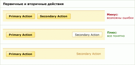
Although all of the considerations discussed are intended to improve the perception of the form for your particular case, any combination of markup, visual elements and content that you choose should be necessarily verified using user testing or analyzing the data (fill rate, characteristic errors, etc.) .
Note: the article is very much intersected with the author's presentation, laid out in the network this spring. On Habrahabr link to it is published here .
Thanks to everyone who has found the strength and read to the end. I hope the article was moderately interesting. I will be glad to any comments on this topic.
“Data entry fields should be organized into logical groups so that your mind can perceive the shape markup as a chain of interconnected fields”
–HTML: the Definitive Guide
Now it is very rare to find a web application that would not actively use forms for data entry and settings. But not all web applications use this appropriately. A diverse arrangement of input fields , associated labels ( labels ), calls to action and surrounding visual elements can help or prevent the user from acting in a certain way.
Markup forms
')
If you need to reduce the development time of the form and the data collected is clear and close to most users (for example, you need to enter the name, address and payment information in the payment process), then it is best to use the vertical arrangement of the form fields and their names. The vertical proximity of the form field and its name and the sequential arrangement of both form fields and their names reduces the movement of the sight and filling time. From the user is required all the time to move in one direction: down.

In this markup, we recommend using a bold face for the form field names. This will visually increase their weight and bring the markup to the fore. Otherwise, the names may compete with the form fields for the user's attention, because visually they will have almost the same weight.
If the form data is unfamiliar to the user or does not break up so easily into successive groups (such as, for example, all the different parts of the mailing address), aligning the field names to the left makes it easier to view all the information relating to the form. Users can simply run their eyes over the left column of names up and down, and the form fields will not interfere with them. However, the distance between names and input fields often increases due to long names, as a result, the time it takes to fill out such a form can increase. Users have to “jump” from one column to another in order to understand the correct match of the name and the field before entering data.

Alternatively, you can consider markup in which the titles are aligned to the right, so the connection between them and the form fields becomes more obvious. However, as a result, the left edge of the names becomes “ragged”, which reduces the pros from a quick view of all the form fields. Representatives of Western culture read the text from left to right, so the clear left border of the text is better suited to us.

Use visual elements
Considering the advantages of “left-aligned” markup (it is easy to read the field names and reduce the vertical space on the screen), you can try to correct its main drawback: separating the form fields from the corresponding names.
This approach reflects the following idea: the color of the background and the ruler can be used for additional formalization. Different background colors create a separate vertical block for field names and a separate one for the fields themselves. Horizontal ruler associate the corresponding name with the form field. It would seem that this approach is quite acceptable, but it still creates a couple of problems.
Through gestalt (our rules of visual perception ), an additional 15 elements were added to the markup: the center line, each separate background block and each horizontal line. These elements distract visual perception and make it difficult to focus on the most important elements in the markup: the names and fields of the form. As Edward Tufte points out: “Information consists of differences that give rise to meaning” ( “Information consists of differences that make a difference” ). In other words, any element that does not improve the markup spoils it. You can see this if you try to view the left column of titles: the eye is constantly decelerated on each horizontal line and block created by the line and background color.

Naturally, this does not mean that the background colors and rulers are completely unsuitable for use for shape marking. If it makes sense to select a related group of information for users, then a thin horizontal line or a light background color can visually combine similar information. Both of these techniques (rulers and background colors) could be very convenient for drawing attention to the active elements of the form calling for action.

Basic and additional actions
The main action with which the form is associated (in most cases, this is “Send” or “Save”) needs a stronger visual accent (in the example above it is a bright color, bold face, background color, etc.) than others form elements, and should be positioned vertically relative to the input fields. It guides the user and emphasizes natural actions to fill out the form.
If a form has several actions, for example, “Continue” and “Return”, it may be logical to reduce the visual selection of the secondary action. This will reduce the risk of possible user errors and will additionally indicate the correct path for the user to complete the input.

Although all of the considerations discussed are intended to improve the perception of the form for your particular case, any combination of markup, visual elements and content that you choose should be necessarily verified using user testing or analyzing the data (fill rate, characteristic errors, etc.) .
Note: the article is very much intersected with the author's presentation, laid out in the network this spring. On Habrahabr link to it is published here .
Thanks to everyone who has found the strength and read to the end. I hope the article was moderately interesting. I will be glad to any comments on this topic.
Source: https://habr.com/ru/post/31217/
All Articles