Dribbble: review of the most interesting interface designs for the past week
Hello. The week is almost over and during this time the Dribbble piggy bank has replenished with a bunch of designers from around the world. I suggest you rewind the timer back and see what is interesting this week for other UX / UI artists. As an independent observer
By the way, if you use Figma , I recommend paying attention to our ready-made design systems . They help freelancers complete more orders per month, programmers can create beautiful applications on their own, and the Timlids run sprints faster using ready-made design systems for teamwork.
And if you have a serious project, our team is ready to deploy a design system within the organization based on our developments and tailor it to specific tasks using Figma. Web / desktop, and any mobile. We are also familiar with React / React Native. Write to T: @kamushken
')
Nominees (works that are good, but could not take the top 3 positions for various reasons):
Introducing Mention | Instagram
by Thomas Michel
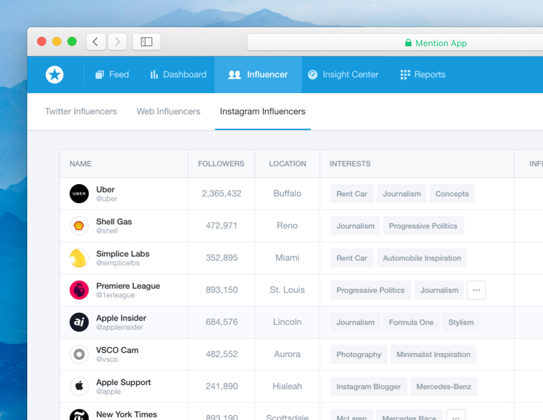
Potentially interesting beginning, but for some reason the designer ventured to show only a quarter of the layout. It's a pity. The gray tint was chosen poorly - most of the text was lost.
Schedule
by Natalie Kirejczyk
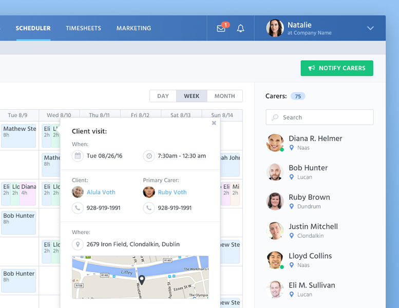
The situation is similar: it is impossible to evaluate the whole picture by fragment. Very tempting and correct guidelines sounded for the desktop product. But only a quarter was estimated. So by ...
Builder UI
by Yummygum
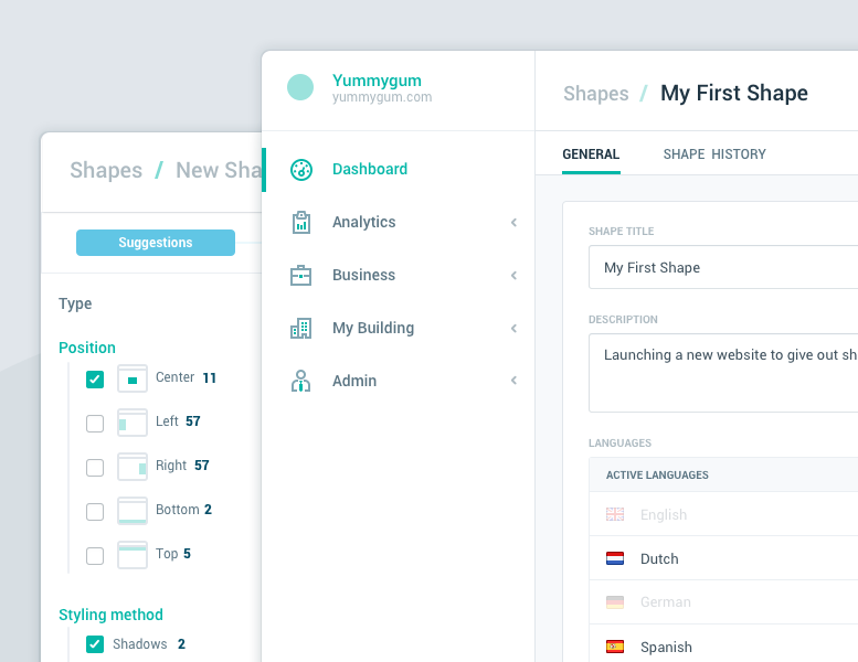
In general, a potential contender for second place. Could it be the worst case. In the best - first place. But we were shown a couple of pieces at all. Can abide by NDA? Anyway, Yummygum is a strong artist / team. I remember an excellent set of free icons from this author was walking on the network. In times already far skekomorfizm.
Edtwist dashboard
by Daniel Thomas
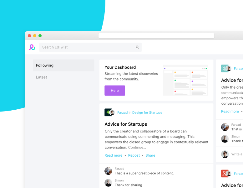
Oh, something very tempting such sounded. With a hint of iOS10 guidelines, which gradually merge with GMD. But in any case, cool! I would have a little carping at the colors and positioning of the search engine. But I will not, because we will not see the whole layout :( Therefore, next!
Harvest Team Profiles - Mobile, Desktop, Mac App
by Eric Hoffman
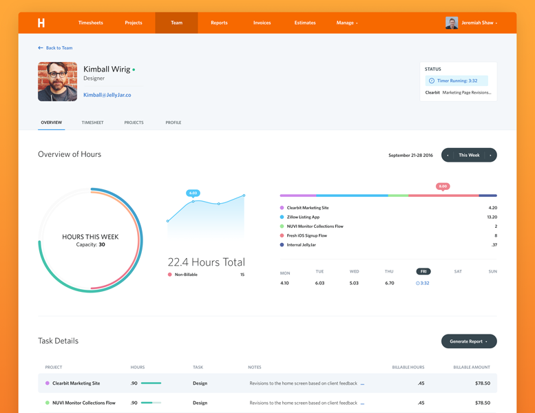
I would have slightly lost the general background to the layout. Too orange! I want a light gray background. Although full order with indents and a grid, but fonts pumped up. Great resonance between small and large inscriptions. Thanks to the author for attaching the full-screen version.
Scheduler
by Bagus Fikri
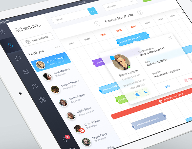
It seems that there is order everywhere, but it smells of echoes of previous years and trends. The gradient is rarely found in modern products, as, indeed, strongly blurred shadows.
MySeaTime: Dashboard Screens
by Naresh Kumar
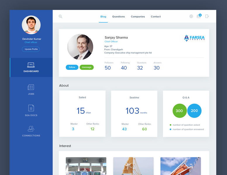
He would have a little more practice! I still have doubts that the world, that is, we are users, we want such large shadows on our devices. One feels non-optimal matching of font and dimensionality of fonts. When large indents and a lot of small text is a pain.
Listing page
by Mandeep Kundu
There are ambiguities in the icons, especially on the left. I personally see a more downward anchor there. But not the plus / minus icons. The menu somewhere was not there. In Israeli moved to the right. And so on. But nevertheless much in their places and does not cause questions.
Enough of those who failed. We turn to the finalists, and traditionally from the bottom position:
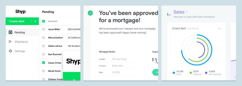
Third place!
You get a mortgage
by Ryan Johnson
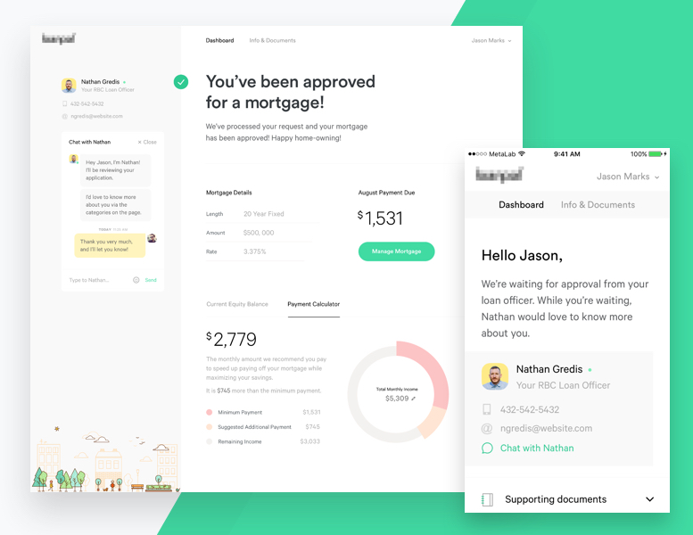
The least the best of the top three. Somehow inappropriate looks vector town in the lower left corner. What for? But the attempt is nevertheless successful.
Slightly balance the font size in conjunction with indents. It turns out that many have it lame.
Second place, or silver goes to:
Agile CRM - Home
by Balkan Brothers
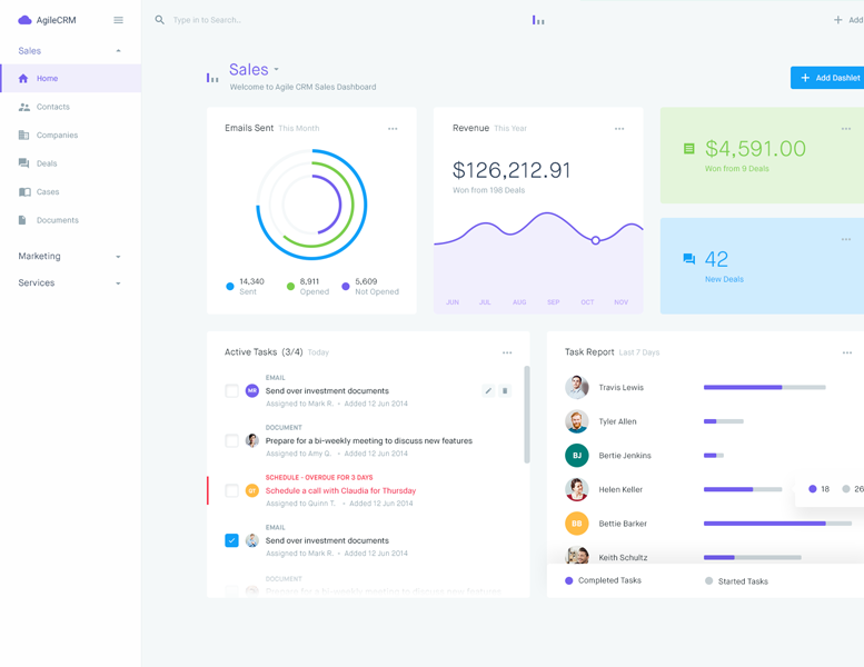
I would beat the colors and the dimension of the fonts a little. The ratio of the smallest type of text in the layout with the largest indentation, I would have done otherwise. And if not in favor of reducing indents, then definitely in favor of a small increase in small spellings. In general, by the way, I would lower all colors of fonts in illumination. But it should be noted that the team is strong. Looked at the rest of their work. It feels, nonetheless, that some solutions are of the same type, but also a high level. If this project is not from the “Unsolicited Design” section and they truly redesign Agile CRM, this is a level indicator. In general, I would recommend to see their other shots. You might catch inspiration.
And finally, the absolute winner of the week:
Shyp on Web
by Julia Khusainova
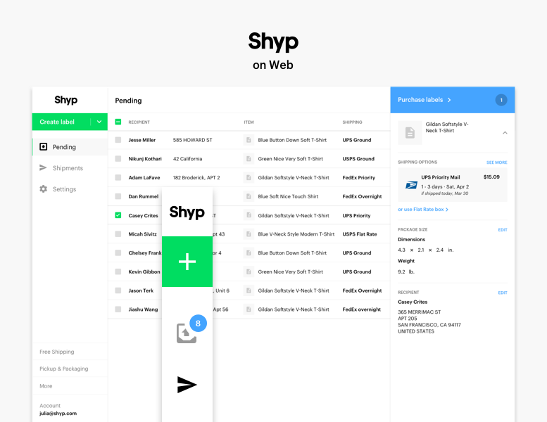
Perfect set of balanced indents. Absolutely uniquely prioritized text. It can be seen what is primary and what is secondary. The number of colors is optimal. It is a pity there is no attachment to view the entire layout on the monitor. Nothing extra. This is an interface where “no interface”. Incidentally, her profile has many other shots on the subject of this product. Everything is fine there: there is a description of the guides and the similarity of the ui kit. Our compatriot was the best!
That's all for today. Look at the Dribbble in a week. If there is something worthwhile, then I will tell you about it.
Thanks for reading. Well, if the post is useful to someone. Frankly, it was more necessary for me. It is worth keeping an eye on which way the design community looks and how this view correlates with the design departments of corporations. Keeping abreast, you can offer the best solutions. And if suddenly the material turned out to be useful to someone, then all is good!
Source: https://habr.com/ru/post/312114/
All Articles