A series of interface (un) updates - "Turn the post joins darkside"
While a couple of enthusiasts set about converting my ideas into a ready-made preset for Stylish, I had a motivating feeling to continue. Today we’ll go deep into the post, see how we can improve the visual perception of tree comments, in some places we will balance the styles. Vobschem happened what I feared most of all - the craving for improvisation curbed me and in some places I corrected not only colors. Since the interest to the darcula theme for Habr was palpable, I will allow myself to roll further with the “reversal” of color.
')
Let me remind you that in the previous post I turned the Main one inside out and if someone wants to join the enthusiasts and convert PSD> Stylish, then the source is laid out on the city drive (sorry for the mess in layers, but usually I'm diligent)
By the way, you can already take a sample. A comrade bano-notit was just a good guy, grabbed a pipette in his hands and began to pull the entire color straight from the png-nis. Download watch this preset for Stylish. Of course there may be inaccuracies, because he went further than the main one on his own initiative to decorate. Then I realized that we must continue the work begun so that he would not go astray.
Indeed, on the dark side, pictures with a white background can take on much more attention. A good solution was offered by comrade Rondo in the comments: all images should be reduced opacity (I would recommend up to 70% / 0.7), and onhover should be restored to 100%. Cool and efficient!
Bano-notit picks up the idea again, offering to make the effects smoother via css by:
Generally care about users!
So - turn. Let's see what's dark here:

There is nothing unusual here: the links, the color of karma and rating have already been identified in the first post. In the block below, he just allowed himself to remove the dividers, he added a 1px border, which visually strengthened the outlines a little. The selected area of the block is painted in the same color.

It seems that you just need to make a copy-paste. But no. For some reason in the original on Habré different dimension and intensity of a font both for headings "karma" and "rating", and for their values. I decided to save, suddenly Habr understood something, but I did not yet!

With them, everything is the same as with the Hubs on the main one. They just got away somewhere stripes (not me!). These are all some clever styles of Habr, do not ask me. I just by analogy with karma used a similar color for the number of comments to posts.

Based on a similar range as the above block, located on the right. The color of the plate with display filters is taken from the main tabs from the main page.

It is strange that in Habr in the original there is some kind of the most basic font style and not from this world. I propose to “pull” here a font-face similar to all headings. After all, this is the title ...

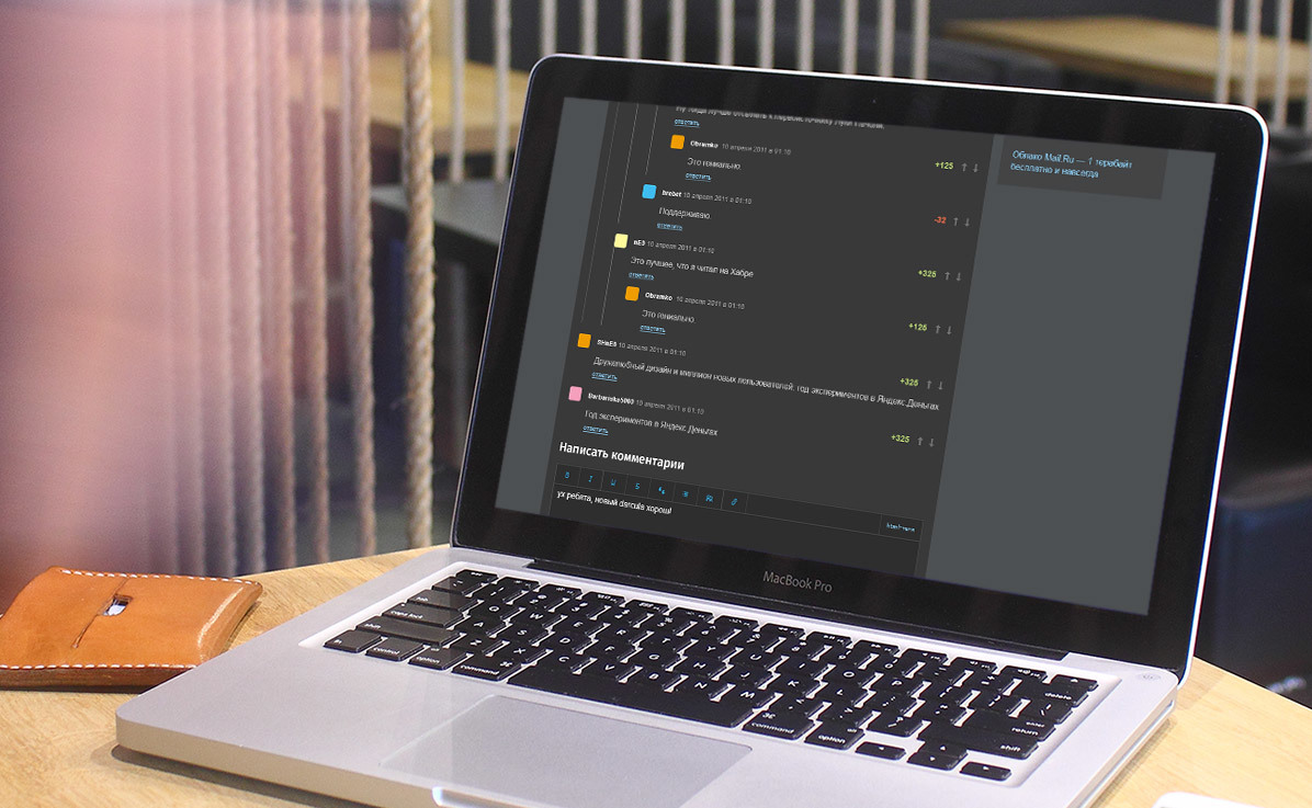
Trying to optimize the UX here. It seems to me that if a little “deepen” the steps of the tree of comments, then visually the hierarchy will be better read. Therefore, I leveled the body of the comment and “answer” not by the level of the avatar, but by the level of the nickname. Try to feel this at the bottom, when I show the whole picture.

And without me you know what sometimes hot skirmishes happen in the comments right up to the ninth level. Here again I try to slightly optimize the user experience by swiping a border-left for the response container (yes, I find myself able to inspect the elements in Chrome :). I think this is + N to the speed of awareness of the visual order. Specially complicated task itself, showing the version with the most colorful avatars. Although if you suppress the transparency of avatars to alpha = 0.7 like all images in darcul'e, then it is possible and + 2N ...

In general, of course, all these indistinct iconostases need to be changed to material ones, but it was Lenno. Excuse me. But it was not inconceivable to apply a similar style to the buttons as for the button for writing a post at the top. In the original, the styles of these buttons are different. This is a bit strange to me.
One to one with “Most read”. Well, after all, I was probably tired with fragments in separate ... Here, look at the “sheet” in its entirety:

Those who wish to download the PSD can proceed to the disk.
By the way, if you use Figma , I recommend paying attention to our ready-made design systems . They help freelancers complete more orders per month, programmers can create beautiful applications on their own, and the Timlids run sprints faster using ready-made design systems for teamwork.
And if you have a serious project, our team is ready to deploy a design system within the organization based on our developments and tailor it to specific tasks using Figma. Web / desktop, and any mobile. We are also familiar with React / React Native. Write to T: @kamushken
')
Let me remind you that in the previous post I turned the Main one inside out and if someone wants to join the enthusiasts and convert PSD> Stylish, then the source is laid out on the city drive (sorry for the mess in layers, but usually I'm diligent)
By the way, you can already take a sample. A comrade bano-notit was just a good guy, grabbed a pipette in his hands and began to pull the entire color straight from the png-nis. Download watch this preset for Stylish. Of course there may be inaccuracies, because he went further than the main one on his own initiative to decorate. Then I realized that we must continue the work begun so that he would not go astray.
Indeed, on the dark side, pictures with a white background can take on much more attention. A good solution was offered by comrade Rondo in the comments: all images should be reduced opacity (I would recommend up to 70% / 0.7), and onhover should be restored to 100%. Cool and efficient!
Bano-notit picks up the idea again, offering to make the effects smoother via css by:
.img {opacity: .1; transition: all 1s ease-out;} Generally care about users!
So - turn. Let's see what's dark here:
Post author
There is nothing unusual here: the links, the color of karma and rating have already been identified in the first post. In the block below, he just allowed himself to remove the dividers, he added a 1px border, which visually strengthened the outlines a little. The selected area of the block is painted in the same color.
Post author below
It seems that you just need to make a copy-paste. But no. For some reason in the original on Habré different dimension and intensity of a font both for headings "karma" and "rating", and for their values. I decided to save, suddenly Habr understood something, but I did not yet!
Related publications
With them, everything is the same as with the Hubs on the main one. They just got away somewhere stripes (not me!). These are all some clever styles of Habr, do not ask me. I just by analogy with karma used a similar color for the number of comments to posts.
Most read
Based on a similar range as the above block, located on the right. The color of the plate with display filters is taken from the main tabs from the main page.
Comment Title
It is strange that in Habr in the original there is some kind of the most basic font style and not from this world. I propose to “pull” here a font-face similar to all headings. After all, this is the title ...
Comments
Trying to optimize the UX here. It seems to me that if a little “deepen” the steps of the tree of comments, then visually the hierarchy will be better read. Therefore, I leveled the body of the comment and “answer” not by the level of the avatar, but by the level of the nickname. Try to feel this at the bottom, when I show the whole picture.
Hierarchy
And without me you know what sometimes hot skirmishes happen in the comments right up to the ninth level. Here again I try to slightly optimize the user experience by swiping a border-left for the response container (yes, I find myself able to inspect the elements in Chrome :). I think this is + N to the speed of awareness of the visual order. Specially complicated task itself, showing the version with the most colorful avatars. Although if you suppress the transparency of avatars to alpha = 0.7 like all images in darcul'e, then it is possible and + 2N ...
Textarea bottom
In general, of course, all these indistinct iconostases need to be changed to material ones, but it was Lenno. Excuse me. But it was not inconceivable to apply a similar style to the buttons as for the button for writing a post at the top. In the original, the styles of these buttons are different. This is a bit strange to me.
Interesting publications
One to one with “Most read”. Well, after all, I was probably tired with fragments in separate ... Here, look at the “sheet” in its entirety:
Those who wish to download the PSD can proceed to the disk.
Source: https://habr.com/ru/post/311984/
All Articles