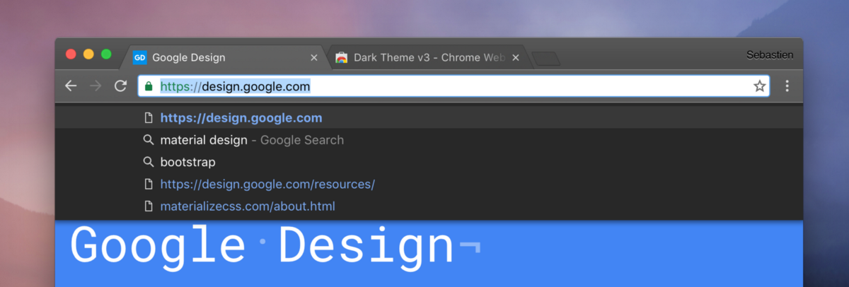
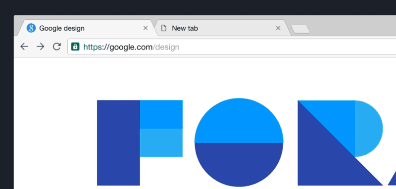
Chrome redesign on the desktop

At the beginning of this September in Windows, as part of the 53rd update, a new modified design of the main Chrome user interface appeared, the so-called. "Chrome MD" (Material design). It was the last stage of the three-step commissioning of the new design, which was launched in release 51 with Chrome OS and Linux and was continued in release 52 with macOS. Windows has become the high point of this process, and since Chrome will never end, it seems to me that now is the time to look back and reflect on this process, which took almost 2 years and which gave some knowledge and experience useful for you, too. .
If you read my previous Chrome for Android redesign article, you will see that this post is similar to it, although I tried (maybe not quite successfully) to use fewer technical details. In addition, now everything fits in one part. If you have not read the article called, then I would recommend to do this, since it is an integral part of thinking about the desktop computer (desktop) and Chrome, i.e. chronological predecessor of this article.
Little about general
I worked on Chrome’s browser and operating system for almost 5 years as a visual designer and designer. I had to divide the time between the browser and the operating system, but gradually, in the last year, I became involved only in the OS.
')
Back in 2012, one of my first major projects as a new member of the Chrome team was to make the newly redesigned main user interface of Chrome compatible with high-resolution displays, such as the first Macbook Pro Retina and the first Chromebook Pixel, which was lightweight by Google -version of the retina display. The release of the Chromebook Pixel was launched in February 2013 - a little later than the release of the Macbook Pro.
I was new to Google, and this experience introduced me to the complexity and complexity of designing a Chrome browser. He also allowed me to quickly become familiar with all the design decisions that had been made before.
Our goal at that time was not only to bring a new design to the displays in life with a new resolution and density ratio (1x and 2x), but also to rethink and facilitate the way of cooperation with developers, organizing our workflow and repositories of digital objects.
This need has arisen because of the growing need to make the Chrome design process more responsive to tomorrow. The speed with which Chrome grew after its appearance did not give time to refine various aspects along the way. The more we moved forward, the more difficult it became to fit into our previous work, which caused delays and so-called. debt design.
After a few months of hard work and effort after the appearance of a new design for screens with regular resolution, the excellent new high resolution finally went. It looked like this:
I took the opportunity to take an inventory of our entire repository of digital objects (approx. 1,200 raster images for the desktop) and organized it so that we can move faster in the future. I guess this will be useful in future developments.
This design remained approximately unchanged for 4 years - until April 2016, when Chrome MD for Chrome OS was released.
Synchronization and scheduling
Now that Chrome has supported high-resolution displays, and our process has been worked out and worked very efficiently, it's time to switch our attention to mobile devices.
At that time (early 2013), Chrome became the default browser on Android, there was no tablet version, and an iOS release just took place.
Mobile devices have been at the center of my attention since the beginning of 2013 and until the Chrome Android update based on Material design (MD) in 2015. However, this does not mean that nothing was done for the desktop computer.
Something very curious was emerging: we began to consider the transition of desktops and laptops to a state where the touchscreen was no longer an exclusive attribute of a mobile device, but became part of one of the more productive platforms, such as laptops. Although some attempts were made in previous years, it was the first time that the possibility of having a touchscreen on a laptop seemed like a reality, and not some sort of curiosity or experiment.
I had my own experience in this area, acquired on the first Chromebook pixel model, and the other points that caused my great interest at that time were Windows 8 and the exceptionally strong determination of Microsoft to deliver a very peculiar user interface to the new hybrid size with the Surface model as the main device.
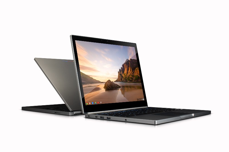
The first model of the Chromebook Pixel (2013) with a touchscreen display of high resolution

The first model of Microsoft Surface and Windows 8 "Metro mode"
The duality of the OS, as well as the ability to choose a user interface with significant touch functions for both touch and non-touch devices, made me think about the place of the Chrome user interface and the direction of its development in this type of environment.
We already had to deal with such issues on the first Chromebook Pixel and its touchscreen display, and the choice was made to rely on the touchscreen display only for scrolling content and for secondary interactions, and not as the main input method. Pixel's positioning as an essentially “enthusiastic” experimental device allowed us to slowly think about what should influence our user interface, how and why.
After a while, we decided to create what has become the forerunner of today's “hybrid look”: the touch look .
The touch view has become a modification of the usual Chrome main user interface, which allows key elements to be enlarged and more spaced apart, which reduces the likelihood of user touch errors.
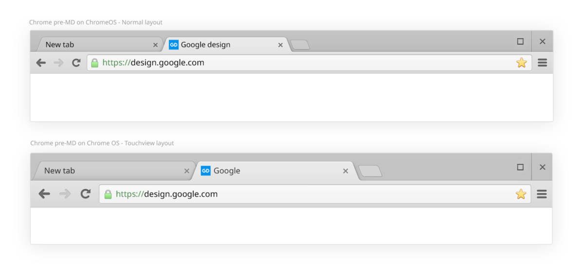
This view has been applied on some Chromebooks and on Windows 8.
It was an interesting experiment, and since it was short-lived, and the touchscreen view of the windows was quickly canceled and Windows 8 itself was rethought into what was going to be Windows 10, it was quite a brief introduction to what appeared on the horizon: the democratization of “hybrid” "Or" tunable "devices and a slow but steady blurring of the boundary between tablets and laptops.
Adaptation to a growing and growing device category: hybrids
Let's move quickly forward by the end of 2014. A lot has happened in the field of system design: Apple announced the release of the Yosemite operating system (Yosemite) with its user interface style, bridging the gap between macOS and iOS7, Google prepared the release of the Android operating system Lollipop using a new visual design language: Material design .

The design area has evolved, and while companies followed their own rules and regulations, a general theme emerged: the era of ske-morphism was ending, supplanted by a “lighter” user interface, characterized by an increase in white space, a decrease in the use of strong shadow and as a magnificent (or, on the contrary, shameful) “era of flat design”.
Windows acquired its “modern user interface”, Apple - its “iOS UI”, and Google - its “Material Design”. As part of this big update cycle, Chrome has upgraded its mobile devices — iOS and Android .
We said goodbye to our strong shadows, highlights and noise video effects on top of our gradients. We sharpened our tabs and chose a set of icons according to Google’s design guidelines. The new Chrome was here ... however, so far not on the desktop.
New Chrome MD on tablet
The future for the desktop user interface was slowly taking shape and a clearer idea appeared on this issue. Windows and Google, on the one hand, tried to deal with a design system that can work with displays of all sizes and formats simultaneously; Apple, on the other hand, with its unique layout directions, worked on the basis of fitting for each platform and for each format.
It was at that time — almost two years ago — that Chrome was redesigned for the desktop.
Hybrid layout type
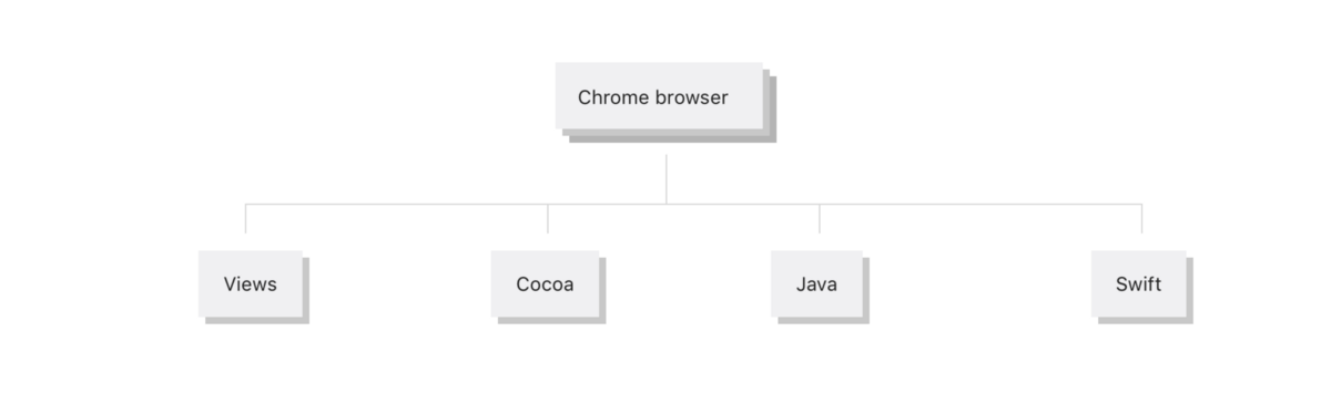
The constant, non-trivial matter that I have had to do all the years of working with Chrome and that most designers have to deal with is the management of digital objects. This was the reason for the ordering of the digital objects mentioned above, representing approx. 1,200 raster images for desktop. In addition to the fact that this process was incredibly exciting, it is simply necessary to work on different platforms.
Chrome from the development perspective of the interface part is distributed through 4 framework / code bases: Views , together with Windows, Chrome OS and Linux (our framework for building the user interface), Cocoa on macOS, Java for Android and Obj-C / Swift for iOS.
To ensure operability and improve long-term management of digital objects, we strive to make common to the platforms as much as possible design resources.
For example, Windows, Chrome OS and Mac have many common graphic objects. Their use may be different, but bitmaps are the same.
On mobile devices, we also strive to design and lay out digital objects so as to ensure cross-platform, although Chrome for Android and iOS differ in many ways. Chrome for tablets is a good example of this approach. When launched on an iPad or Android tablet, it looks very similar.
Chrome for Android Chrome for iOS 9 (MD)
Chrome for Android Tablet (MD)
Chrome for iPad (MD)
Of course, there are quite a few resources specific to a particular platform, but this fixed system of common elements reaches its limit, and when you have to deal with multipliers and frame sizes (or layout types), the situation becomes complicated.
Even before considering a hybrid it looks like this:
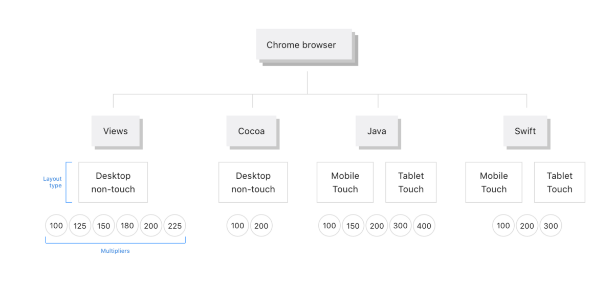
As you can see, there is a set of 2 types of layout: sensory and non-sensor . Among these two types of layout, there are 2 main multipliers (1x and 2x) with an expanded total of 5-6 multipliers for each platform:
- 100, 150, 200, 300, 400 for a mobile device
- 100, 125, 150, 180, 200, 225 for a desktop computer (desktop) (in extreme cases on Windows)
This requires the creation of such a number of multipliers and digital objects, that we have ceased to rely on scaling for odd multipliers, creating something that is inferior to perfect visualization.
In this context and in connection with the growing demand for sensory and tunable devices, we, inspired by the sensory appearance, faced the need to find a solution for tunable devices that we were going to call the “Hybrid”, introducing additional complexity into our existing structure:
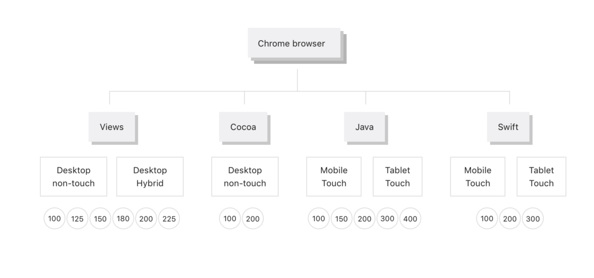
However, this approach had the potential to create a new set of digital objects for export and management, promoting our current process, based on bitmaps, far beyond its borders.
And then came the software visualization.
New layout type, new process
Chrome Hybrid View was originally developed for Chromebooks under the influence of our previous Touch View product. This time we were required to create a “hybrid” as part of the redesign, and not as some addition to the already existing user interface.
For this we needed two things:
- A fairly versatile design that can work with both a conventional look and a hybrid one. The usual view was originally to be deployed from the main part of our users.
- A way to create, export and enter our digital objects, which would have to elegantly fit into a wide layout type and pixel density area of a desktop computer.
Our second problem was solved by Peter Casting , Evan Steid and Terry Anderson (technical project manager).
I was initially not sure that the visualization of forms (especially Chrome tabs) and icons can be completely programmed to provide the level of detail that we could provide with .pngs. I was wrong.
Chrome uses the Skia graphics library . After several attempts, Peter found a way to perfectly visualize key elements of Chrome, such as tabs and omnibox, without using any type of bitmap. In turn, Evan made a converter capable of translating .svg code into Skia code. .svg, in essence, should work as a plan, some set of instructions for software visualization.
The transition from design to development was then defined as follows:
Designers create .svg of any size required as a template for visualizing Skia code. This applies to both shapes and pictograms. Such a template during development should be taken and placed in Chrome using Skia.
Here is the tab layout:
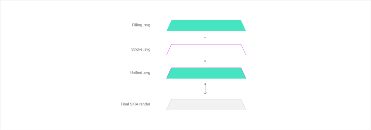
Tabs are made from one .svg to fill and another to stroke (lines). The developer then takes the .svg code and changes the paths to the SKIA code, adding the proper color and transparency.
The following is a code with an example of an icon using an automatic conversion tool generated by Evan.
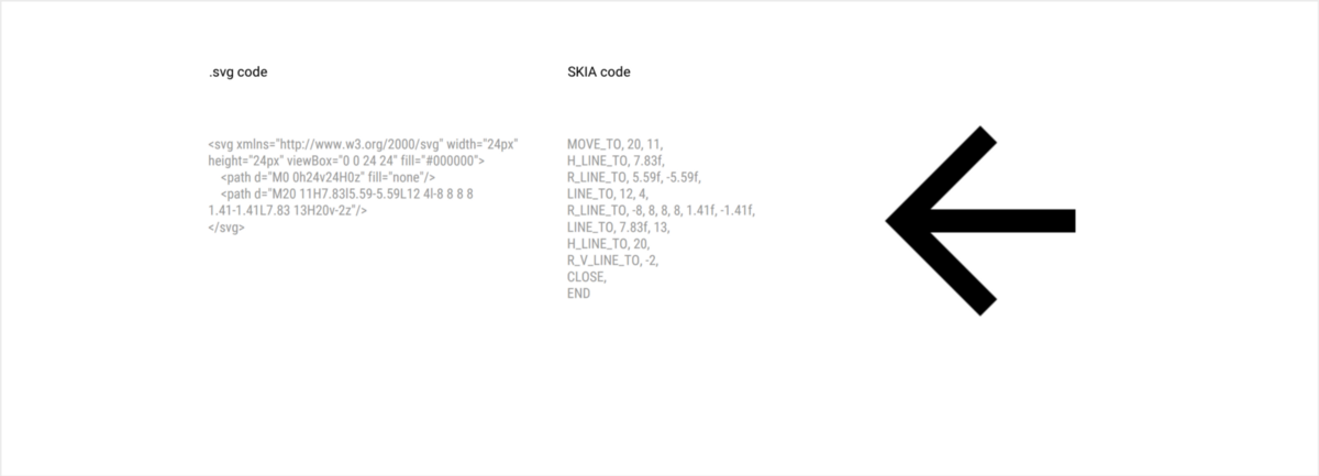
This method has led to a huge reduction in the use of bitmaps in Chrome - from about 1,200 to 0!
It should be borne in mind that each version of the buttons is now processed through the code, which effectively eliminates any duplicates for the speaker / pressed state, as well as any need to apply color directly on the object. All this is now processed in code.
An additional and huge advantage of using .svg directly is that we are able to control the visualization of each element based on each number of dots per inch (PPI). This means that, if necessary, you can create an icon slightly different from 1x and 2x. This is a great thing, as the desktop still has mostly 1x. In addition, we can control the visualization for fractional multipliers, such as 1.5, 1.25, etc., making Chrome look almost the same as can be obtained in all configurations with an odd PPI.
With this new awesome tool and ready-to-use process, it's time to develop and implement a new user interface.
Visual consistency and design details
The redesign of the user interface of the desktop was not to make it all over again, but to bridge the gap between our new design language on mobile devices and our aging visual objects on the desktop.
The question that I believe all Chrome visual designers had at the time was: “What exactly are the features of Chrome?” .
There is a lot that makes Chrome what it is, but at the same time our role is to be invisible in the background of the content or, in other words, to be present, but not stand in the way.
The key elements in our main user interface are tabs and icons. Chrome on mobile devices has already used the new sharp edges of tabs on tablets, as well as a new icon system from the Material design (MD) manuals. In this context, our goal was:
- Introduce new tab forms on the desktop.
- Introduce a new set of icons from MD, using the dimensions of the desktop.
- Coordinate and simplify our color palette and our theme system. Optional: enter into the desktop a new theme "dark" ("dark") in the "incognito" mode.
- Start the upgrade of the elements of the secondary user interface, such as buttons, toolbars, drop-down labels, etc.
- Create a more touchable version of Chrome for tunable devices.
- Create a set of rules to ensure consistency with a third-party OS.
- Introduce MD animation whenever possible.
The overall layout and size of the user interface
When developing the basic layout of Chrome, you need to remember one key aspect: the size of the user interface . It represents the number of pixels used to display our user interface or, in other words, taken away from the content.
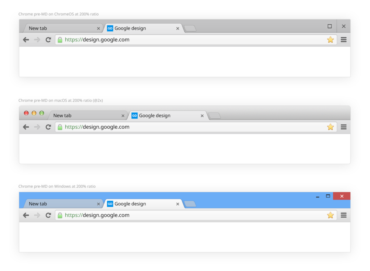
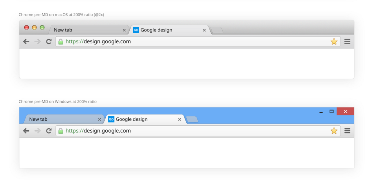
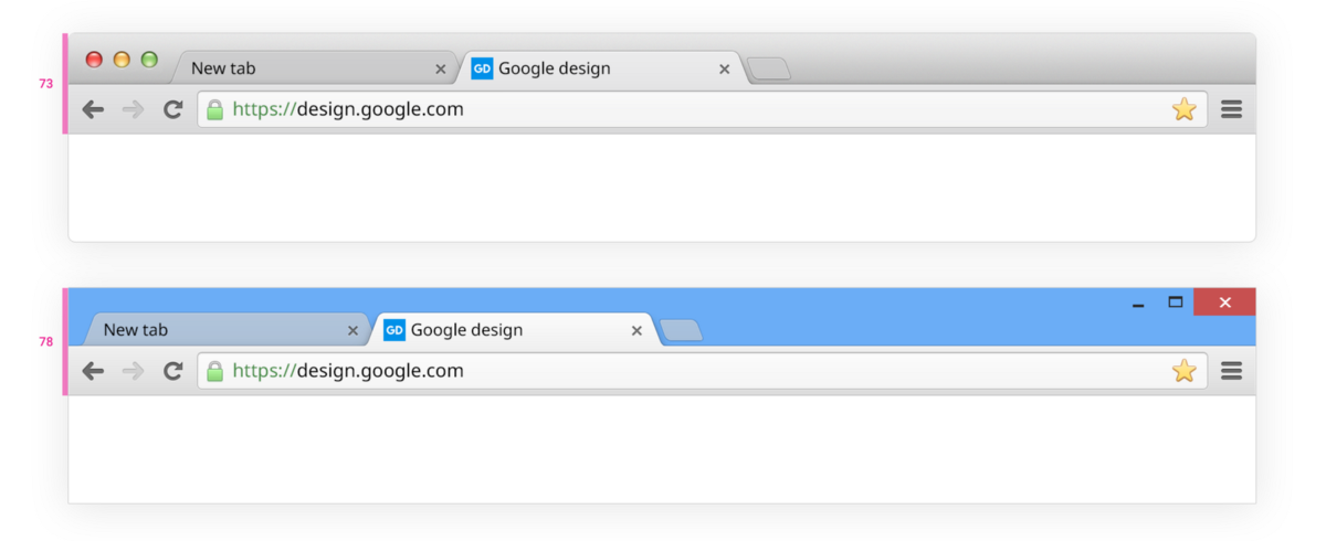
The height of the pre-MD design without showing the bookmarks bar was 73 pixels for ChromeOS and macOS (including the window frame) and 78 pixels for Windows (including the frame).
The original frame for Windows is higher than the frame for ChromeOS and macOS. Larger size makes it easier to click on the frame and capture. See comparing macOS with Windows below, pre-MD:
This previous version of the Chrome toolbar layout was created when high pixel density displays did not exist, so it was optimized for rendering on a 100% scale using odd numbers, making it possible to center the element on a full pixel.
The first thing that needed to be done was the use of an even grid, which facilitates the transfer of the layout through various multipliers. In this case, the icons could be located on the pixel grid more often than on a design grid based on an odd number.
Material design (MD) uses a square of 8 points in its baseline grid. We use half the square: 4 points .
Defining the grid and positioning elements in 4-point increments has extremely helped to get a good balance and maintain the consistency of the layout, typography and everything associated with the pictograms. For balance, we divided the user interface in half: tabs + window frame / toolbar.
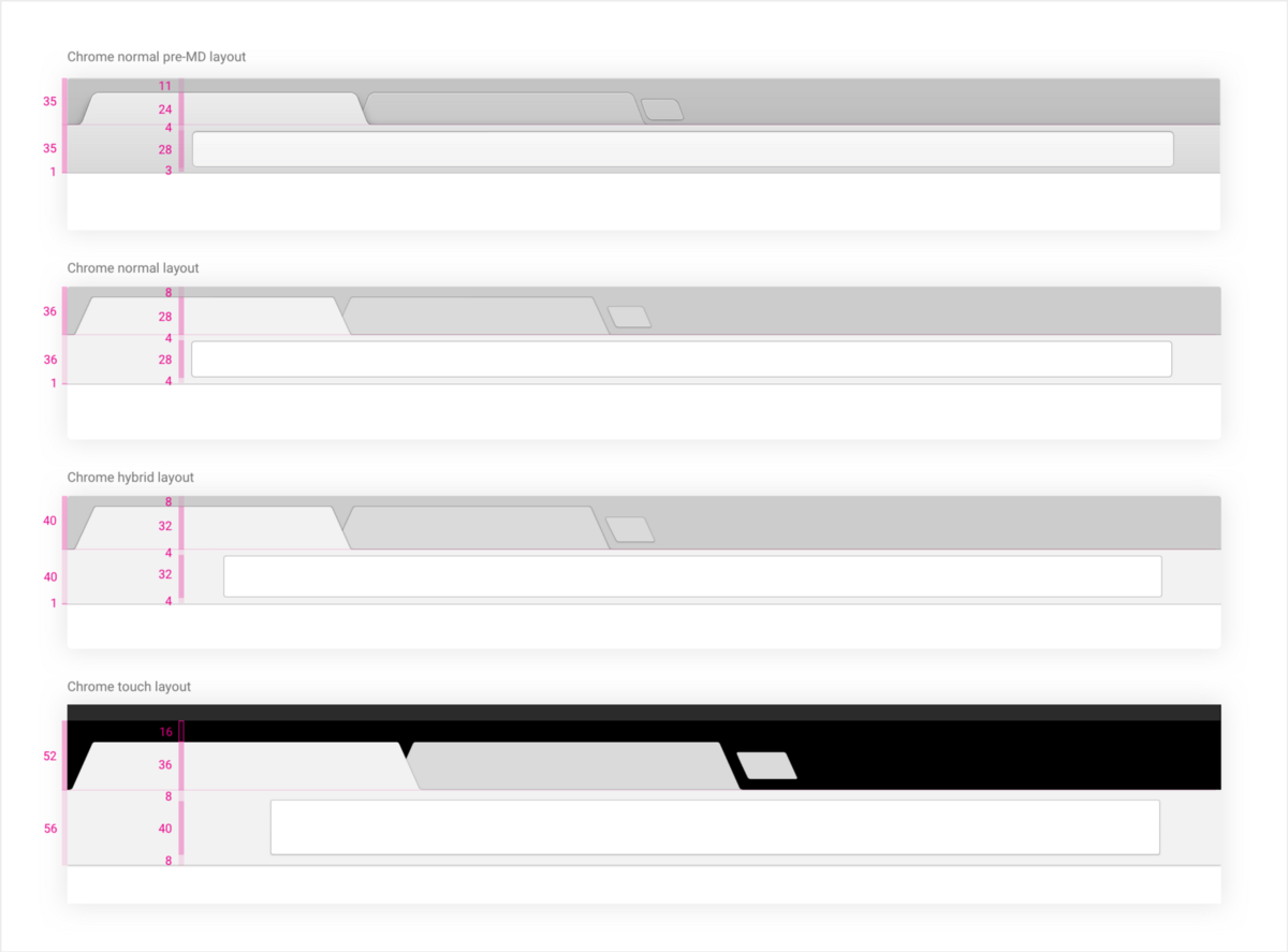
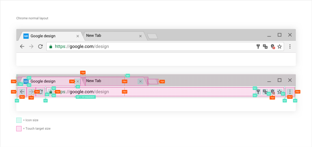
Here is what it looks like for a regular user interface :
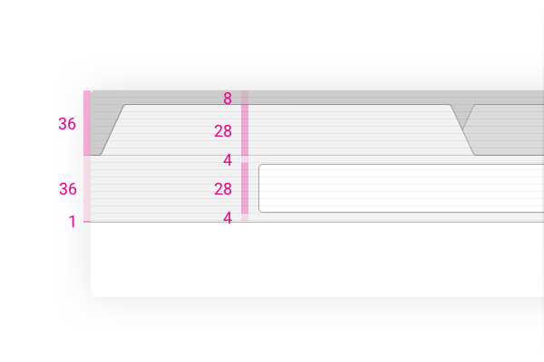
As you can see in this picture 200% (or 2x) Chrome MD in Chrome OS, the toolbar is divided into two parts with 36 points each. Each key element is based on a grid with a square of 4 points.
Tabs have a height of 28 points, as well as an omnibox. We left the top fill at 8 points between the tabs and the top of the frame.
If you look closely, you can see that the omnibox lines are not aligned on the grid in this picture. The reason is that we use 1 pixel per line thickness, regardless of PPI, which gives a lighter interface with subtle lines.
The disadvantage of this method is to always remember that the space that was supposed to be filled with a thicker line (2 pixels) is now empty.
You can also see that we visualize the line by adding 1 point at the bottom of the toolbar, rather than typing it out of balance, actually adding 1 point to the full height of 36 + 36 points.
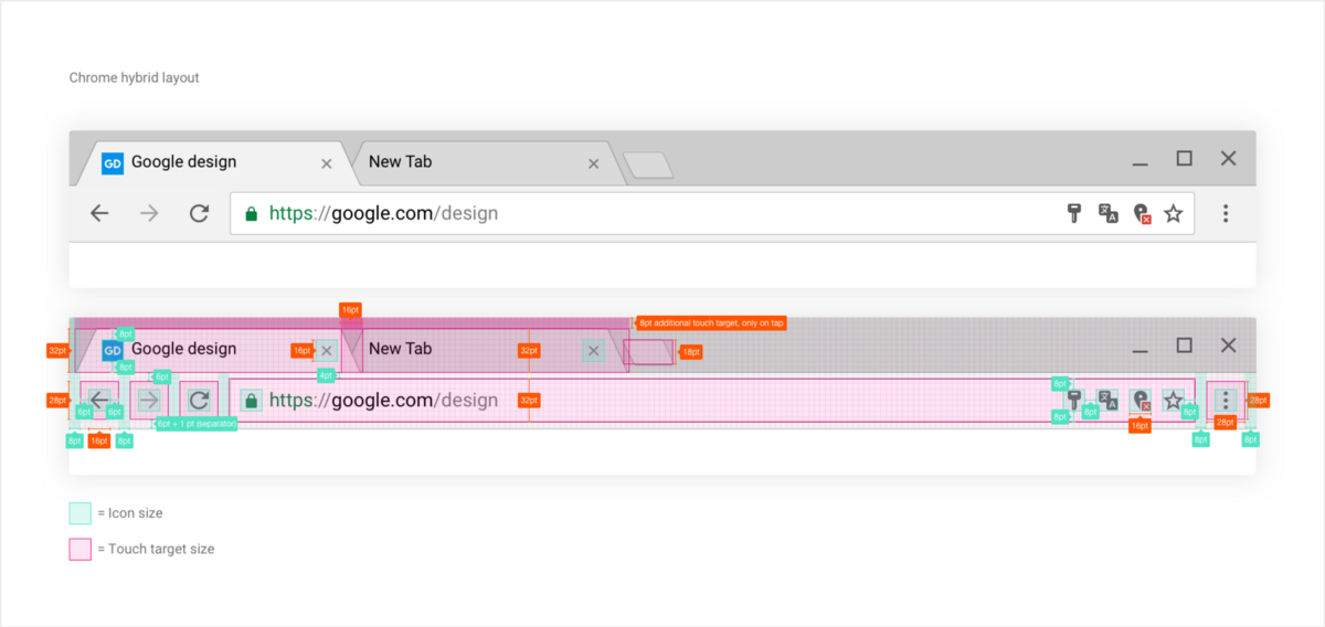
Below is our hybrid user interface .

In the hybrid, we saved the frame fill (8 points), increasing the size of the tabs and toolbars by 4 points. The result was a more spacious layout of 40 + 40.
It may seem strange here, why we simply do not use recommendations on touch pads for Android or iOS (48 and 44, respectively) to make the elements more comfortable to touch with a finger. In fact, we tried it, but such direct use goes against what the hybrid is trying to achieve.
We strive for some well-balanced compromise between full-touch and non-touch interfaces, seeking a balance between minimizing the number of user touch errors and preserving the performance aspects expected from the layout of the laptop.
On the desktop, each pixel in the account, so the installation of the tablet interface on a laptop was not considered.
Below are the different layouts - Chrome pre-MD, Chrome MD regular, hybrid, and finally for the tablet; all rendered at 200% (xhdpi for Android).
In fact, the size of a conventional MD layout (including the window frame) is 2 pixels smaller than the pre-MD size of ChromeOS / macOS (71 vs. 73). However, since we shifted the user interface up by 3 pixels in the window frame, the new interface, without taking into account the window frame, was actually 5 pixels larger (60 vs. 65).
Each pixel has exceptional value in Chrome, and each pixel is registered. During the redesign, each decision on the size was taken with consideration of the following factors: the current user interface, the adoption of a new grid and the overall balance of the interface.
The same logic applied to the pictograms ...
Aspects related to pictograms
The selection of a set of pictograms for use was made quickly.
We needed to update numerous key interface icons, as well as all the characteristics and properties icons for the entire product, and the material design icon repository from Material design offers them. Thus, they will completely coincide with the icons on our mobile products - both iOS and Android.
However, there was one problem: the size of the grid. The grid with a square of 24x24 points did not match the rather dense interface that we intended to create (even considering the hybrid). In the end, they were offered for mobile devices.
We needed to get a mesh that would fit our new conventional and hybrid interfaces.
To ensure this and fit into the 4-point grid at the same time, we used icons based on 16x16 points, as shown below:
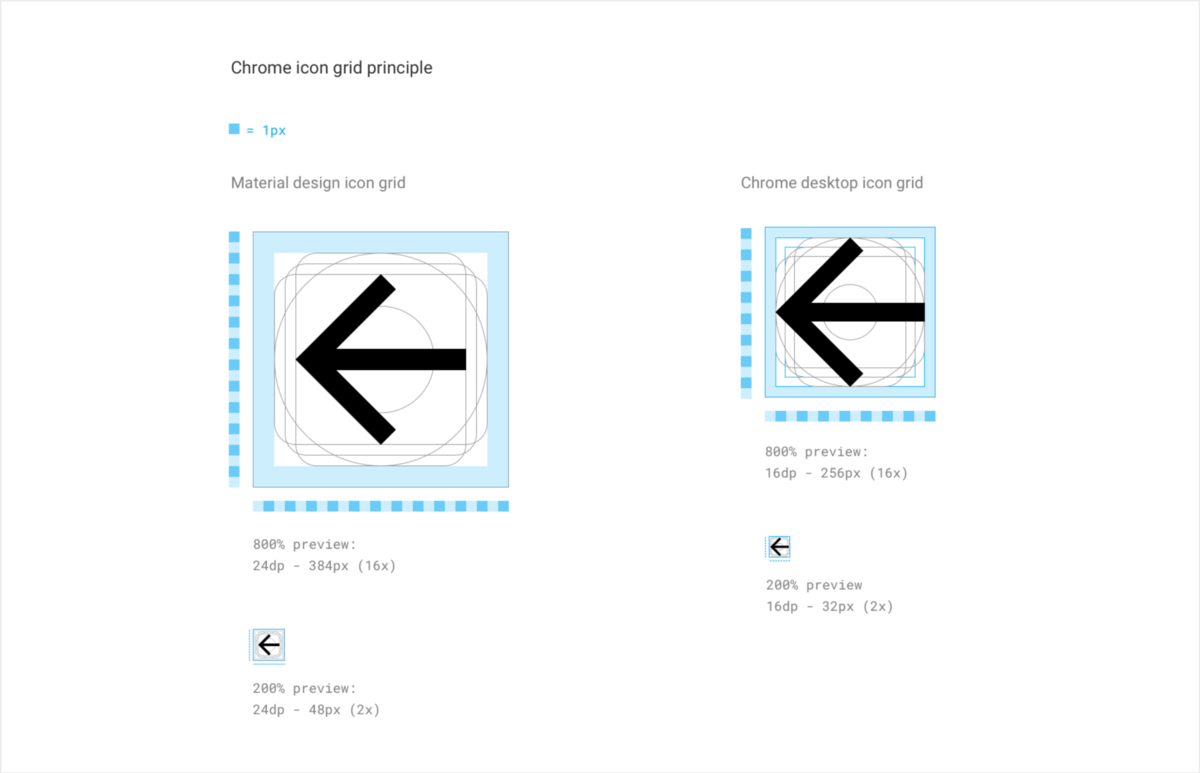
We reduced the container from 24 points to 16 and added some flexibility regarding the original internal filling: replacing 2 points by 1-2 points depending on the pictogram for the Chrome pictogram grid. The reason for this flexible filling is that, taking into account the wide variety of pictograms we were going to use, some of them may require additional space to ensure the visual operation of their contours at small sizes.
The advantage of this size reduction by as much as 33% was that we were able to also use scaling directly from the Material icons. This should allow us to significantly improve our icon delivery time and increase scalability - while some icons are rendered outside the grid, and therefore the icon is a bit blurry.
Although this would be completely acceptable on secondary pictograms, the visualization of all of our most significant pictograms should be correct and extremely perfect in pixels. Therefore, we have to create (recreate) them so that we can eliminate any pixels outside the grid, especially at low PPI values (dots per inch). See our back icons below:
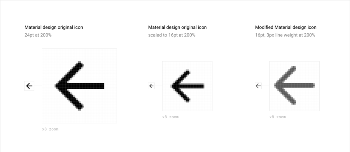
As you can see, since we control the visualization for any given PP value, we remove the thumbnail blur caused by scaling.
We also made the line of the pictogram slightly thinner (2 pixels at 100% and 3 pixels at 200% compared to the original 2 pixels at 100% and 4 pixels at 200%), because I thought that the thickness was somewhat overstated. Because of this, they have become more elegant and balanced on our user interface.
The technique used, which gives both flexibility and the ability to control our digital objects, has reduced our costs of servicing visual objects. Using the already existing huge set of digital objects helped our team, engaged in pictograms of characteristics and properties, save a lot of time, since it was possible to repeat the corresponding pictogram without waiting for the designer to create it. In addition, this technique has allowed to achieve consistency of the interface elements of mobile and desktop devices.
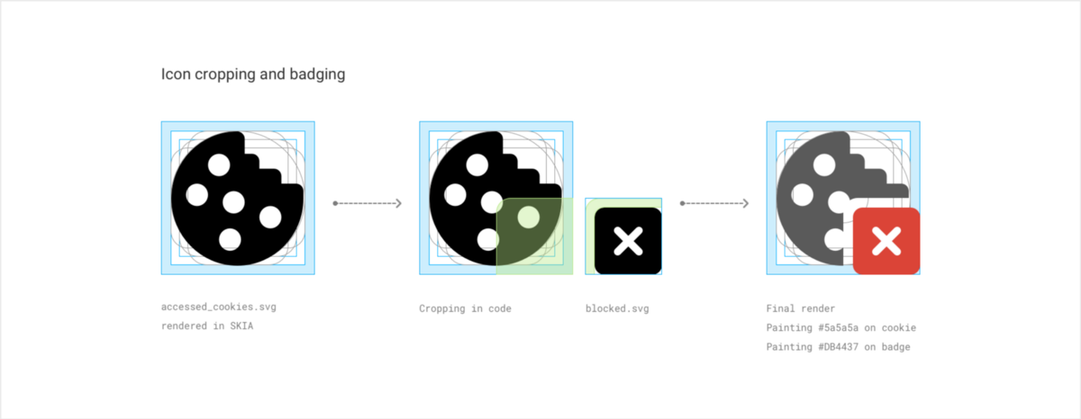
Since the visualization is done programmatically, we could also eliminate all duplication for color states; we are only required to provide black .svg and specify the required color in the code.
A nice added bonus to software rendering is that we can now - if necessary - cut and paste icons (for blocked extensions and permissions, for example) instead of exporting the locked and unlocked version as separate bitmaps.
See the process shown below:
Cutting and pasting icons
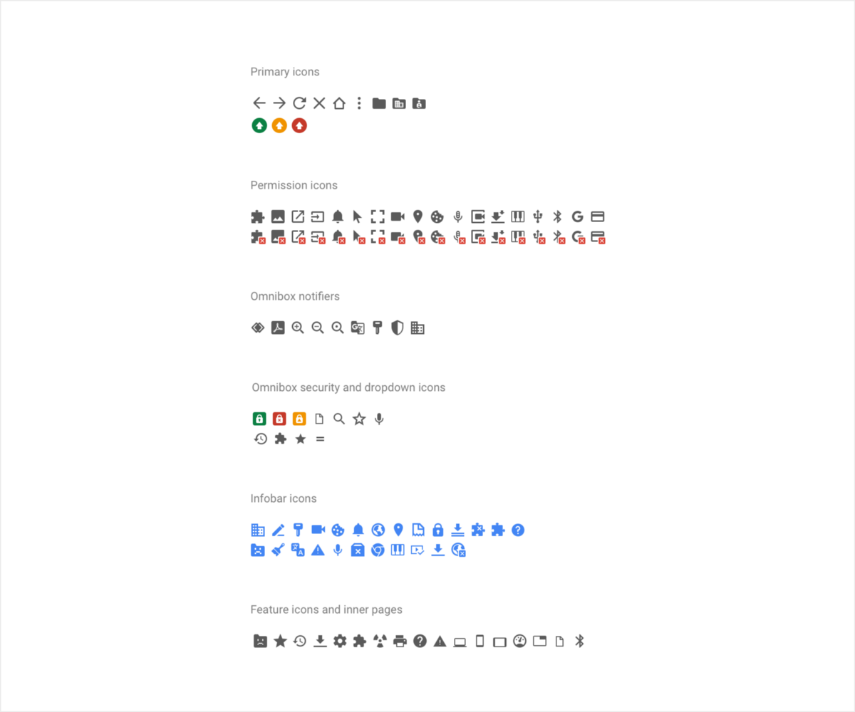
Below shows a new unified system of icons with color and insert versions. It gives an idea of the system as a whole.
Now everything related to the process of creating icons, settled. Let's see how they fit into the user interface.
Touch pads and layout
Since the icons are based on a 16x16 dots layout that fits perfectly into the 4-point grid defined earlier, their distribution and location in the interface was, in fact, the task of choosing the proper size of touch or click areas for both normal and hybrid views. .
In the usual form, we adopted touch pads of 28x28 pixels, keeping the icons of 16x16 pixels. Of course, further positioning runs sequentially through all the usual Chrome layouts, regardless of platform.
Chrome on ChromeOS is shown below:
For the hybrid, it was necessary to determine how acceptable it was for us to increase the user interface. We wanted to offer the user more space while maintaining a compact layout, which explains why some elements have to be removed from the grid, as can be seen below.
Since we still tried to bring the theory under this arrangement, we were a little more conservative. During the preparation of this layout, I repeated to myself repeatedly that it would not inconvenience the user, if he would use it only with the mouse, it would not be wasted space.
We first focused on the height of the elements, for which we have already identified the most sensitive points: tabs and omnibox.
For both, the height was increased from 32 points to 28. Additionally, we used a method that increased the touch surface of the tab in the frame itself, which added 8 points to the size of the touch pad.
While the icons retained their touch pads of 28x28 points, we increased their surrounding border to 8 points, which gave the interface more space and reduced the likelihood of user errors when touching. The same principles apply to pictograms inside the omnibox (extensions and resolutions), as well as pictograms of extensions.
You may notice that while the layout changes, the icons retain their size. We consistently use the size of 16x16 pixels for pictograms. This minimizes the number of digital design objects that require maintenance, which simplifies further scaling and reuse of some characteristics and properties.
Below is the full hybrid main user interface view:
When a layout is conceived and implemented from scratch, it is easy to see, returning to it through the years, that the cost of initial planning and organization paid off because nothing is lost or overloaded.
Bringing all the icons into one size extremely simplified our service and design process and made the design itself more uniform and elegant.
Previously, the creation of non-MD icons continued over the years, which made it extremely difficult to maintain a consistent set of sizes. This time we even updated our requirements for the extension icon for 16x16 pixels instead of 19x19. We also redefined the insertion method using the same clipping technique that we used for the blocked resolution.

Finally, for users who want to always see their bookmarks bar, we have corrected it so that it no longer causes a visual imbalance or shift in both layouts.
Below, see the example on a Mac for a normal layout, on Windows and Chrome OS for a hybrid.
Regular Chrome macOS layout - a bookmark bar is shown
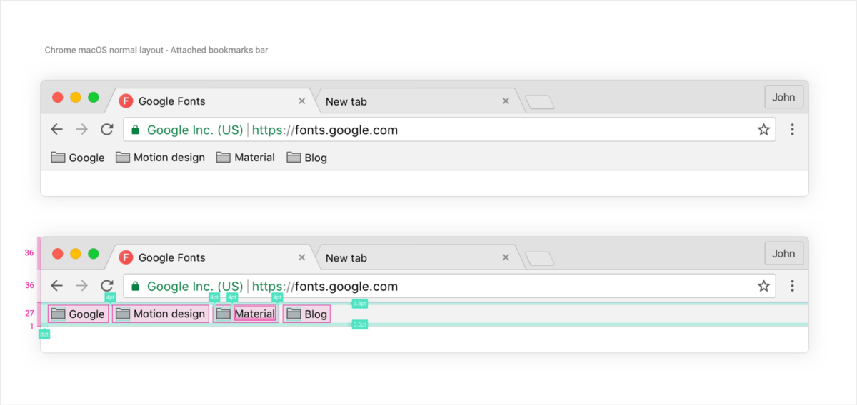
In Mac, 28 dots are added to its normal size to fit the touch pads of the 28x28 dots toolbar buttons.
Windows and Chrome OS in a normal or hybrid layout work a little differently.
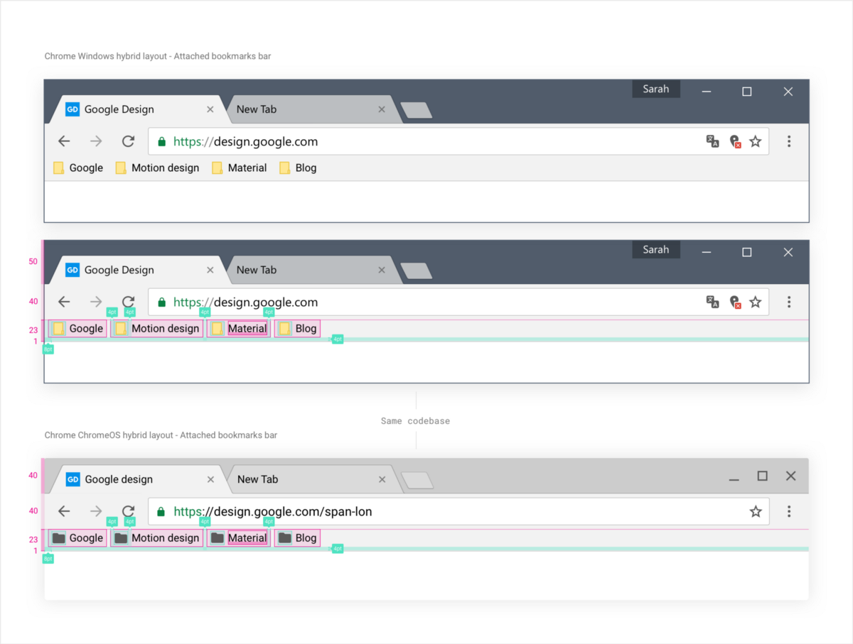
We added a 24-point bookmark bar to balance the extra height of the Windows frame. Since ChromeOS uses the same implementation as Windows, we have the same size.
We continue to experiment with this layout on ChromeOS. Time will tell whether the desire to obtain the proper balance between the sensory and non-sensory arrangements has been justified. Therefore, until we get a deeper understanding of the habits and needs of our users on the Windows platform, we will continue to ship the usual default layout to all Windows devices. However, touch devices with ChromeOS will receive a hybrid layout by default.
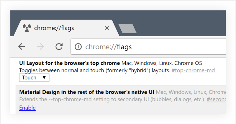
If you want to try it yourself, just go to the Chrome checkboxes (chrome: // flags) and select the “UI Layout in the browser's top chrome” checkbox (“Layout of the user interface at the top of the Chrome browser”) on “Touch” (“ Touch ").
Omnibox, drop down sign with the result and security indicators
There are two requirements for the design of the omnibox and drop-down layout:
- Pay special attention to the status of security.
- Provide the user with quick access to information or URL.
Omnibox is probably the most important feature of Chrome. It represents the gateway to Google search results, to the network, as well as to their own bookmarks and archive. It is also the only place where we can clearly show the security status of a domain, try to effectively protect the user from numerous network threats using active blocking, passive indication and training.
To this end, visual designer Max Walker worked together with Alex Ainsley , the head of Chrome UX, and the Chrome security service to add a security indicator to our omnibox. The following has been done:
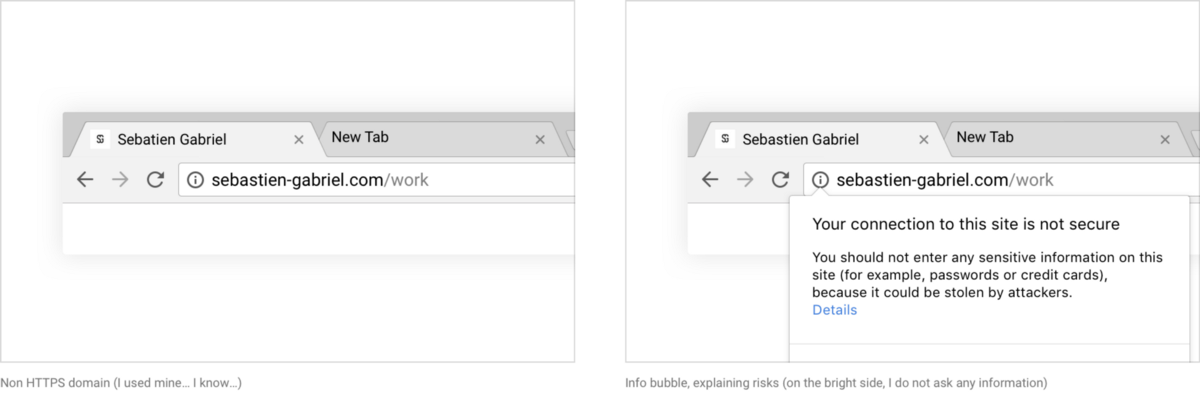
- «» , , , . HTTP-.
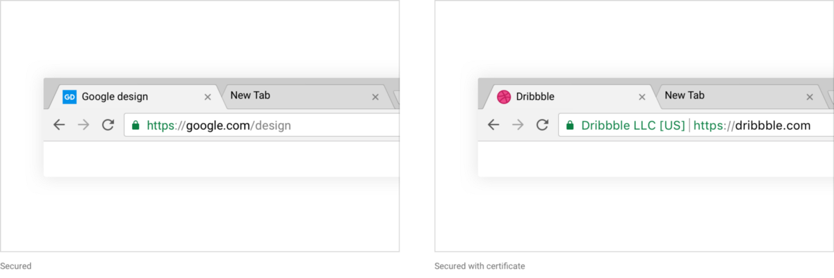
- «» « » HTTPS-. , .
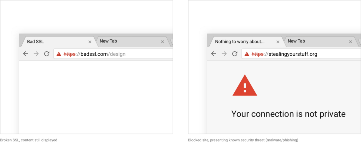
- , Chrome . https . , , .
Max coordinated the typography of our certification with URL text and used a new color scheme. He also modified our locks, giving them a more pleasant look.
A drop-down omnibox table is directly related to this (a container with results that you get after entering a query). The plate has not changed significantly with the alteration under consideration. We have changed a lot about the icons, as well as the color scheme, but the main ones are the following two changes: the new layout for the hybrid and, more importantly, the built-in answers.
Embedded AnswersAlso called “proactive responses”, they represent a display, mainly by Google or Chrome, of the information you are looking for before you actually click “Enter” to confirm the request. For example, if you enter "weather in los ang" into the omnibox, then Chrome will offer you the following:
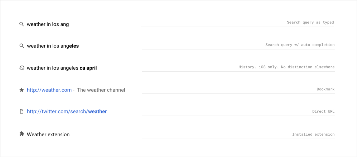
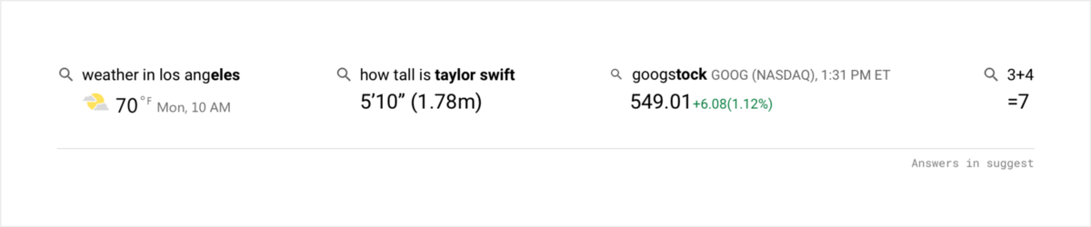
Now, using proactive answers, if we are sure that there is an answer that you are looking for, we output it as part of the results. As can be seen below, this applies not only to the weather, but also to quick queries, stock searches, as well as calculations.
So this query looks in the usual layout:
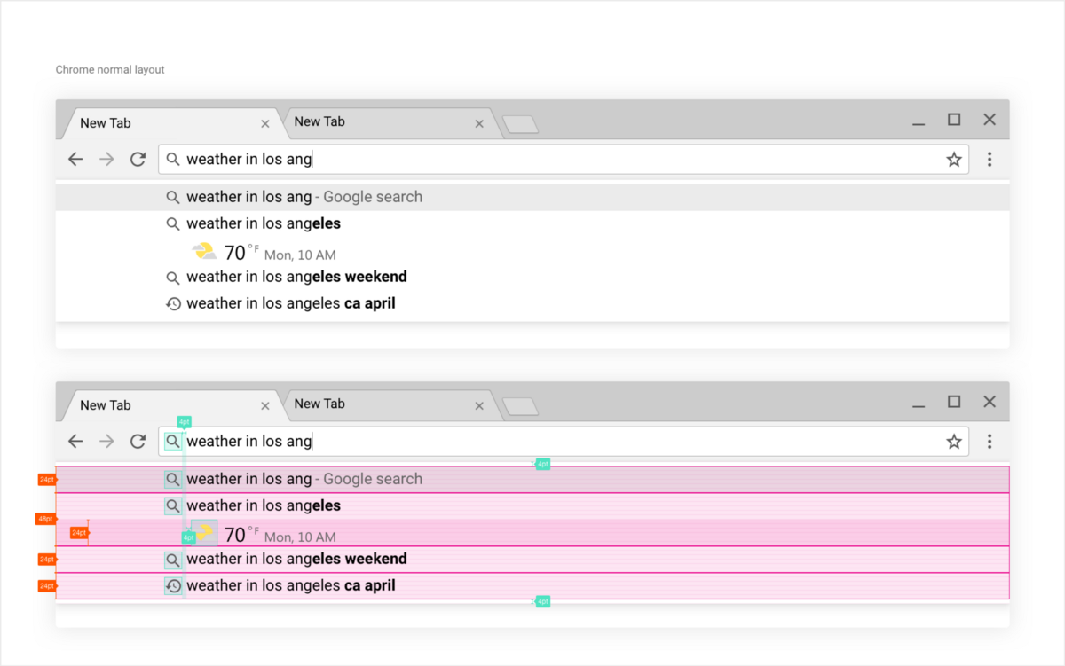
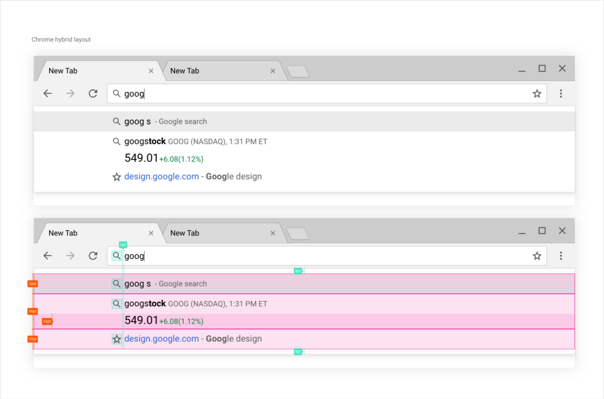
And here on another query (this time on stocks) you can see the difference of the hybrid layout with increased line height to improve the touch.
The drop-down omnibox tablet on the desktop always offers very narrow lines regardless of the platform. It is a compromise between information density, clarity and ease of use, so that the user after the request received the result as soon as possible.
Hybrid layout - as well as with respect to other characteristics of the user interface - is focused on reducing the likelihood of user touch errors, for which the height of each line is increased; at the same time, high information density is maintained in order to reduce the number and path of movement of the user's eyes and, accordingly, the access time to the content.
Colors and availability
In addition to the density of the layout, another important element is color.
Chrome MD for the desktop has gone through the same changes as the earlier Chrome for Android. We needed a more unified color guide and a consistent and, more importantly, affordable color scheme.
Of course, the most noticeable change that catches the eye when opening Chrome is the very color change of the interface.
Balancing the color of the main user interface turned out to be a task that required some refinement more than it seemed to me at first.
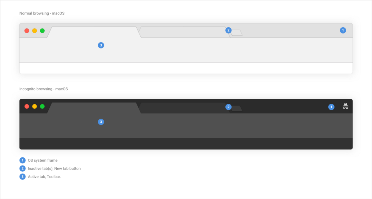
The main user interface consists of three key elements:
- The frame created by the OS itself, depending on the platform base.
- Active tab and toolbar. This includes the selected tab attached to the omnibox and controls.
- Inactive tab (s).
For normal operation, these three elements must have proper contrast. The difficulty with which it was not easy to cope was how to give the design a more uniform, more modern look with a rather strong limit on contrast.
Another thing I had to think about was the topic. The desktop computer, in contrast to mobile devices, supports the theme. We had to take this into account and improve it if possible.
Finally, I really wanted to make the “incognito” look really different, and not just enter the themeization through the frame; I wanted to completely change this global theme by doing it very dark - exactly as it looks on a mobile device.
Below is a three-level Chrome structure for both types:
Our main user interface color system is as follows:

Macs and Chrome OS are fairly simple, as we manage the color of the OS frame directly by simply adding a blur to the background on the Mac.
With Windows, the situation is somewhat more complicated. The user or system can set almost any color as the frame color. Therefore, we continued what we have done so far, playing with opacity to blend our color with what the system gives out.
See the comparison below: while in mac and Chrome OS inactive tabs use opaque coloring, for Windows we reduce the filling of inactive tabs and the new tab buttons to 78%.
Coloring the usual main interface in macOS, Windows and Chrome OS
To balance the new color theme, we largely rely on the use of the line. Since the line is 1 pixel thick regardless of pixel density, its transparency was slightly corrected so that the lines did not look too dark with 1x or too light with 2x. This is the case for both regular and incognito.
Chrome macOS at 200% and 100%. Both lines are 1 pixel thick.
Accessibility has always been part of the Chrome network architecture, whether it concerns the a11y side of content or the user interface side.
In the past two years, efforts in this direction have become even more. True, on the visual side, our color scheme requires a new pass to make it simpler and conforms to the WCAG 2.0 rules for good contrast.
We made sure that all our typography, as well as everything related to icons, has a level of at least AA or a contrast ratio of 4: 5: 1:
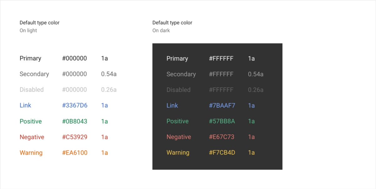
I recommend a great tool for testing contrast ratio: leaverou.imtqy.com/contrast-ratio
Directly related to this, our programmable visualization allows us to color icons dynamically based on the contrast ratio, which not only means improving the appearance of the themes created for Chrome, but also improving their accessibility.
As you can see below, setting the theme “Dark theme V3” (“Dark theme V3”) switches the icons to the white mode, and the drop-down tablet automatically switches to the dark one.
This is a direct positive result of the programmable visualization and the introduction of our incognito mode.
Animation
Animation is a big part of what people think about when describing Material Design, especially on mobile devices. A well-designed animation on this frame size can, indeed, give the application a special charm and expand the possibilities for more efficient use. Provided that you as a designer will not be excessive, you can give users pleasure, as well as help and spatial awareness, using light hints and a kind of clear movement of the interface.
But when it comes to the desktop computer and the mouse and keyboard priority approach on the large display, the situation changes somewhat.
A desktop is a platform where interaction usually takes much longer than on mobile devices, using, as a rule, tools designed to increase productivity, involving a significant number of application programs as opposed to fast, on-the-go or relying on existing experience prevailing on mobile devices.
With all our desire that the sensory and non-sensory platforms be more consistent in their concept and properties, some features that seem necessary and attractive on a mobile device may be inconvenient or even interfere with solving your task on a desktop computer.
Chrome desktop has always been focused on efficiency and speed. It is unacceptable that some kind of movement, some kind of animation interfered with the execution of your task, so most of the images displayed by the user interface appear on the display without delay or with minimal movement.
Take for example our drop down omnibox table. At first, a bit of animation might seem like a good thing, but if you call this sign a hundred times a day, you will quickly hate the designers in seconds, taken from you to, say, sliding animation with a gradual appearance of the image.
Therefore, the label appears instantly, as well as the menu.
So how do you introduce some kind of “material design” charm associated with movement onto a platform that seems to be rather hostile to the animation? It can be added to such elements of the user interface, the work of which it can not affect negatively; That is why we experimented with a “ripple effect” on our buttons.
On the desktop, a mouse click can trigger many actions, and they become even more when combined with the sensory abilities of hybrid devices. Some of these states do not even exist on mobile devices. These include the following:
- Highlighted state
- Active state
- Single click / touch (onClick-release)
- Single click / touch to activate (the button changes to the “active” state after release)
- Long click (press and hold the right mouse button) / touch to activate (only for elements that show options in response to this operation)
We used for all our animation a diverging splash of ripples from Material design . A simple splash of color diverges from the click of a mouse or touch.
Since the states of selection are absent in the MD specification, the first thing we needed to do was combining them with ripples. We made a ripple of ripples diverging square state of isolation, shifting its boundaries outward. In the case of a simple selection + single click when inactive, the picture looks like this:

Here is how it looks in the toolbar:
For the “single click to activate” and “long click / clicked to activate” operations , we had to combine the ripple with the usual end state of the button, the active state, which is a gray rounded rectangle similar to our selection state.
To this end, we, together with the Material design team, have developed a specific ripple morph. The implementation on the mobile device is shown below:
On the desktop, with the “single click to activate” operation , we save the spreading of the ripples as it expands, however, when the ripples reach their highest point, we transform it into a square instead of continuing the “burst”. It looks like this:
The result of the “long click / touch for activation” operation is very similar to that described above, but in this case we slow down the expansion of the ripples.
Finally, for our bookmarks bar, we entered flooded ripples. This type of ripple is an expanding ellipse that fills a limited surface. In our case, we combine the ripples with a state of selection to create a selected state of our bookmarks, as shown below:
Short note: we decided not to transfer the “ripple effect” to macOS, since it seems superfluous on this platform. We chose here what is inherent in the OS.
From the standpoint of development, Ben Rutsig was late in implementing the modernization of the ripple system from scratch on our desktop platforms.
From a design perspective, the initial preliminary animated images and specifications were quickly brought together using Hype 3 .
The videos shown above were made with this tool. The very high level of fundamentals laid down in this type of modeling allowed us to quickly switch to real code, without losing time for iterative cycles when developing prototypes. We used modeling as the main direction together of some specific specifications. Since the code changes significantly when moving from the network to C, the possibility of direct input during development and debugging in the early stages was simply invaluable.
With this type of animation work, the developer acted like a real designer.
What's next?
After completing the entry-ready specifications and layouts for the main user interface, I tried a little bit in the Chrome secondary user interface.
We include in this category all those Chrome elements that are not located on the surface, namely: menus, dialogs, drop-down tablets, information panels, browser tab find-in-page and the download shelf. Some seem to have already appeared, some will probably appear soon:
A new information panel that uses buttons that are not recommended right now.
New shelf download available in Windows
I’m not going to show it here, so as not to weaken the impression of future updates, but if you're an avid Chrome user, then you may have included several checkboxes showing that the Chrome team is working hard to bring improved new interaction to the secondary user interface, as well as in the internal pages of Chrome, as shown below:
New internal history page
New internal page "Downstream downloads"
Since my participation in the Chrome browser ends with this project of the main user interface, I would be happy to see what the Chrome team has for the future of Chrome on the desktop and mobile device.
Lessons learned and first feedback on the issue
To conclude, I would like to share some of the lessons that I learned during this project, as well as some reaction to the release, both internal and external; I hope that this will be useful to you in your projects.
1. Developers - great designers and designers.
We discuss in our design circles a lot of arguments about whether the designer-designer should program. There are many different opinions on this issue, and the reason is that there is no simple definition of the role of the designer-designer.
However, we almost do not say the opposite: should the developer be engaged in design-design?
Ultimately, it is he who is the manufacturer and, to a certain extent, the “designer” of your product, the one who turns this product into the real thing. Sometimes, as a designer-designer, I feel that everything we do is an attempt to “fake” or “imitate” the final result. As quickly as possible the transition to the main point - to checking the product in a real environment, in real code - is of great importance.
In this project, many of my proposals were rejected by the developers, who not only gave better solutions, but also implemented and worked them out in fact better than I could have done. I mean, above all, programmable visualization (Peter Casting achievement) and animation design (led by Ben Rutsig). Their programming knowledge was extremely important for understanding the project, so that not only the design was changed, but the essence of the project itself was changed - from a visual improvement of the user interface to a reworking of the base.
Each is a designer designer. Ideas are not limited by post. If you are lucky enough to work with a motivated and interested developer, then you can see that such a person can sometimes be a better designer / designer than you.
2. Get developers involved as early as possible.
In this case, they were brought in from the very beginning and were an integral part of the design and concept development process. As I mentioned earlier, their interest to give the best design through the best technical solutions led to the product that is today. Maintaining constant contact was a key element of the project.
You do not need to understand the programming process, it is more important to understand the people who do it.
3. You need to understand when you need to be tough, and when you can relax
Performing work that is extremely accurate in terms of characteristics is necessary, however, in some cases, open your work time for feedback; new ideas can take your project to another level. As long as your final project remains true to its original purpose or intention, let other people enter your process and improve your project.
4. Beware of not accepting changes.
When you modify a product, especially if it already exists for some time, then you will encounter what many of us have encountered: the rejection of changes. Then be careful. Sometimes your project may not really be important, but in most cases, a simple change of something is enough to initiate the very different - from moderate to extreme - the reaction of users.
She is often extremely difficult to obtain, and extremely difficult to fight with her. In this design change, the addition of a few pixels caused long discussions and disputes.
I will not tell a lie - I have no magic solution, but there is something that can be done to minimize the rejection of change:
- Chat with your audience. Always be prepared to explain your vision to those who would like to hear, especially if they are your stakeholders.
- Be persistent. It is very useful for business to firmly believe in your choice. Do not be stubborn, but remain confident.
- Always be well prepared. When someone wants to discuss some of your design decisions, be prepared to support them with facts, research results (when possible), or past experience. If you find yourself in a situation where you will not find that to argue, then, perhaps, it is worth thinking about the above opinion.
- Remember that some cases take time. Probably the most disturbing and most disturbing aspect of me was the fact that some things just take time to change them. The larger the product, the longer it takes to change it. Find happiness in small victories and understand that your creation will never be completed to the end.
5. Manage your expectations.
When the update came to life, the hardest feedback I received was: “What is this?” . This is a fair feedback, in my opinion. The project took time, and it did not become a visual revolution. I would like to think that if you look at the details, you will probably see how much attention and effort we have put in.
The biggest improvements made by this redesign project are inside. This is, above all, a technical achievement.
I hope that the benefits will be felt for a long time, both in our team and without users, because Chrome has never before been so flexible and consistent on our supported platforms.
Properly finding satisfaction with your work and its outcome is more important than seeking recognition of this from others. If you are truly and honestly satisfied with what you have done, then you are fine.
Source: https://habr.com/ru/post/311968/
All Articles