Friendly design and a million new users: a year of experiments in Yandex.Money
Yandex.Money continues a large-scale redesign of the service, started two years ago - we first talked about the first results in Habré. The feedback received during this time from the community and regular users confirmed our hypothesis: to make the service convenient for a new audience, you need to repeat the mantra “I am not representative” and look at the devices.
In this post, I will tell you how, with a series of experiments, we helped product designers to move from the “improve” paradigm to the “experiment with the new → measure → repeat” cycle.
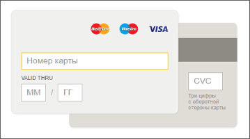
Before delving into the theory, I suggest that all readers have a vivid experiment: in the picture below - two options of the card data entry form. Try to guess which one gives a big conversion. The correct answer is in the text. By the way, we play such a game inside the company after each experiment - and on average 75% of colleagues do not guess the right one.
')
A small historical digression: Yandex.Money has existed since 2002, and the first ten years — that is, most of the life — our audience was very similar to the Habr audience: experienced Internet users who work in IT and related industries. Even if the necessary action is hidden in four clicks from the main page (this is not necessary, of course), they will cope because they came to the service with a clear goal and strong motivation.
In the early 2010s, the audience of online payments has changed rapidly: office workers and housewives pay bills on the Internet and order food delivery, schoolchildren spend pocket money to buy game valuables, parents throw off money for school and kindergarten, philanthropists use wallets to collect donations, etc. The level of Internet literacy, age, habits of the "new" are very different. And a completely new type of motivation and research services: in the polls of visitors of the Yandex.Money site to the question "why?" We increasingly get the answer: "just like that, without any purpose, out of curiosity."
Having by the end of 2014 a dozen of millions of open wallets, we are faced with the fact that new users behave quite differently: they are lost in our interface and with great difficulty mastering a growing set of wallet capabilities. It was obvious to me that attracting new users to this narrowing funnel is becoming less and less effective - you need to completely change the concept of onboarding (accompanying the user from the first meeting to the first payment).
The service had to say from the doorway: everything is easy and understandable here, it’s safe here and you can pay for everything you need, in one or another convenient way. With priority, we decided to make the most popular products of the masses, and add the rest gradually and unobtrusively. How to achieve this at the product level?
- focus the interface on the target action;
- write short and capacious texts;
- remove all that does not apply to the target action;
- add something that will help you quickly and easily get used to the service.
We tested the experiments with the implementation of new priorities on different pages, I will tell you in detail about the first two, which directly determine the quality of onboarding:
• On the “novice snout” (“snouts” we call all the main pages of the service) a person decides to open the wallet and registers it.
• On the “animating face” he sees all the possibilities of the service and makes the first replenishment and payment.
To measure the result, we estimated the growth in the number of registrations, and, most importantly, the first payments after registration. And also the volume of issue of bank cards and identifications.
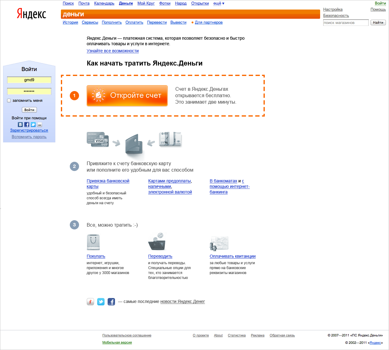
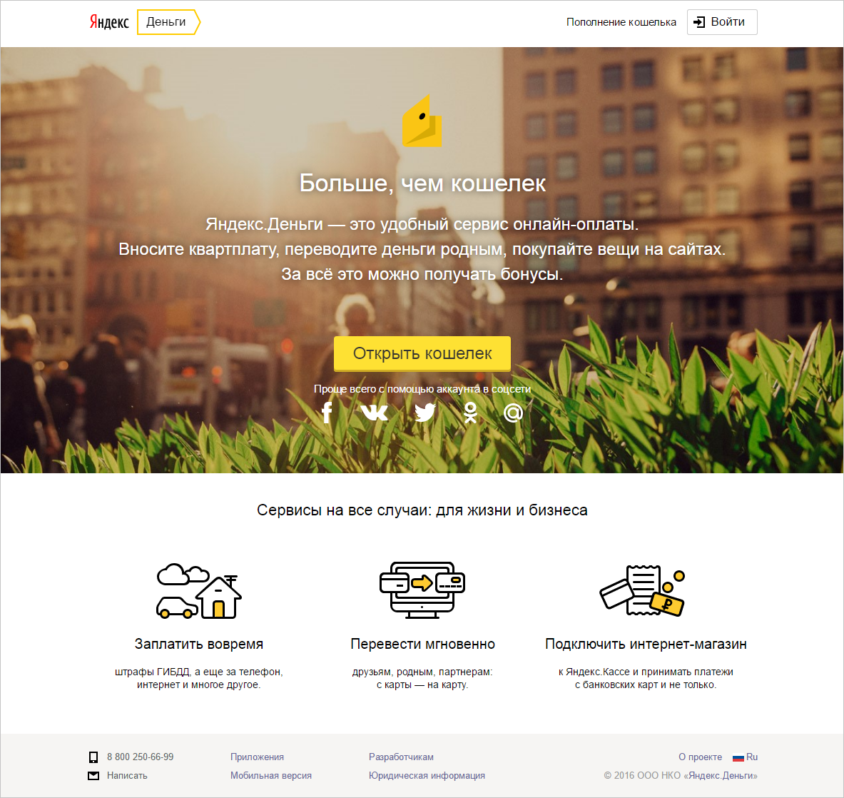
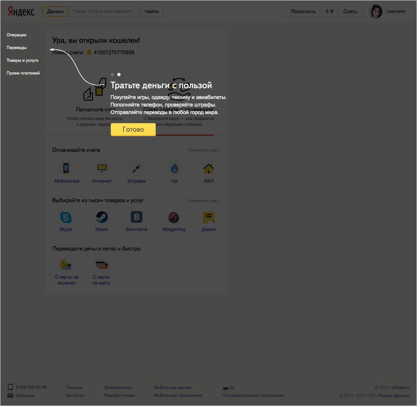
Beginner muzzle in 2013
In 2013, people met this page. It was well suited for interaction with experienced users who came to the wallet with already formed expectations. For a wider audience, it was complicated: many links, icons and few incentives to move on.
We removed everything that was not connected with the decision to open the wallet, added a short description of the new features (bank card issue, auto payments, reminders) and motivators that are relevant to most of the resulting requests (like "transfer money" or "check the fine").
The intermediate version of the novice snout in 2015 - “Forest”
Those who came to the experiment with the forest muzzle, when they met, took me by the sleeve and asked what the deep meaning of the image was, why it was the forest. There is no deep meaning: we tested several random contrast backgrounds, and this one turned out to be the most effective. After the first experiment, the conversion from registration of the wallet to further use (replenishment, card binding and payments) increased by 8%.
We continued to finish the page using multivariate testing: the picture has changed, the main motivator block has become more compact, social network icons and business options have been added. This affected the growth of another indicator - the conversion to registration, which increased by 6%.
The result - the current "novice muzzle"
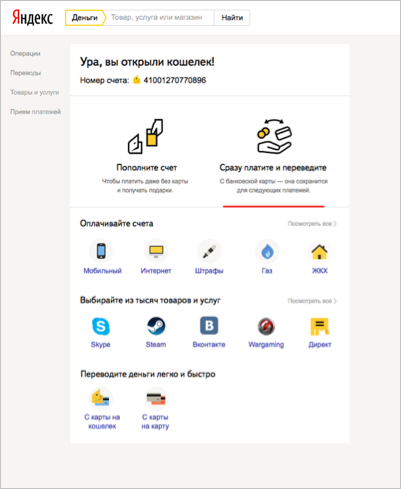
The first page of Yandex.Money, which is seen by users who have just opened the wallet, looked like this before the redesign:
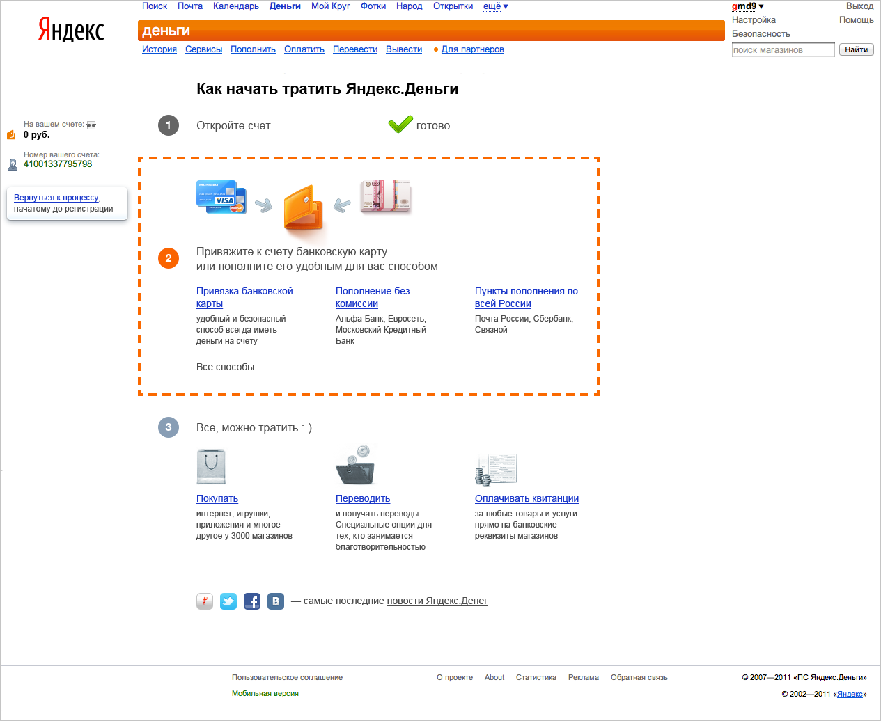
After analyzing user behavior, we found three flaws on this page:
1. Functional: she reported on the following steps, but did not allow them to be done right there - for each you need to go to the next page.
2. Compositional: there were 50 multi-colored links on the page, pictures and a lot of text - it is difficult to focus.
3. Motivational: the newcomer is not clear from the threshold, why do everything he was offered on this page.
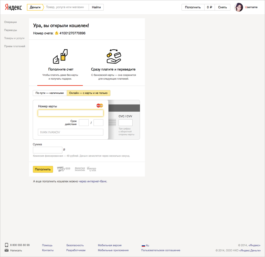
New animating face we have designed from scratch. The focus was on two targeted actions: 1) replenish the wallet and 2) immediately pay for the necessary service.
We put these tasks in two tabs: the first one offered to instantly replenish the wallet from a bank card or find the nearest offline replenishment point; the second gave out payment buttons for the most popular service providers (mobile operators, games, social networks, housing and utilities companies, taking into account geo-targeting).
The first version of the "animating muzzle"
In addition, in order to make it easier for people to get used to the unusual interface, on the first visit we showed them “veil” - a translucent cape on the screen with hints.
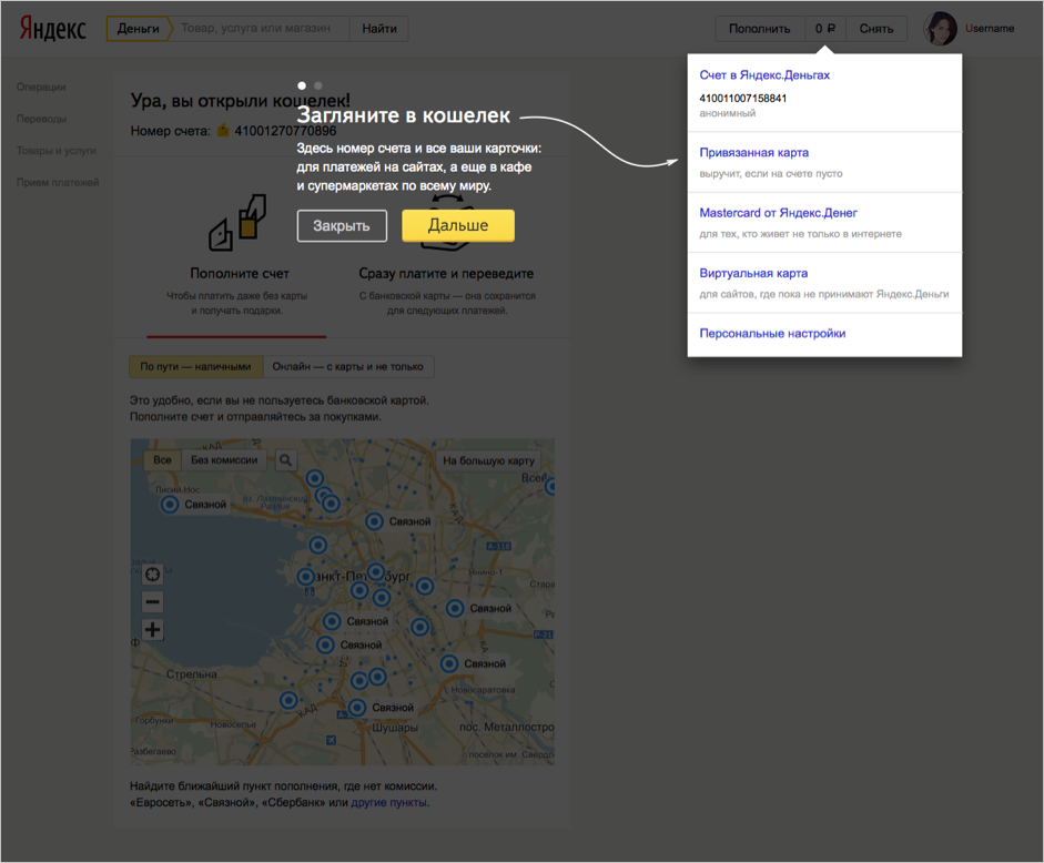
One of the versions of the screen with the "veil" and tips
After that, the revitalization, that is, the payment activity after the registration of the wallet, increased by 7%.
Then we tested six options for the contents of the "reviving muzzle" during the first visit to it:
1. first tab - offline replenishment points map
2. the first tab is to replenish the wallet from a bank card
3. The first tab - products and services that can be paid on the site.
Each version was tested with and without the “burqa”.
The best indicators of the return and replenishment of the purses were in option 3 with the “veil” and logo icons of popular services that can be paid for.
We came to the conclusion: seeing the “product face”, users moved to adjacent tabs much more actively - replenish the wallet and bind a bank card: the return increased by almost 10%. In addition, people have become more interested in other features of the service - we have seen a noticeable increase in the release of Yandex.Money bank cards and account identification.
So far we have tested individual pages. Having achieved good results on each individual, we turned to the UX-laboratory to test the entire path from entering the novice face to the first successful payment.
And they found that they were largely mistaken - here are some examples:
- as one of the motivators on the novice snout, we talked to the user about discounts and bonuses available to the wallet owner, but there was not a word about the animating
- the burqa informed the user that a bank card could be tied to a wallet and paid directly from it, but it was difficult to find a link in the interface;
- the huge buttons “Deposit funds” and “Pay immediately and transfer” were not perceived as buttons - people did not understand that they could be clicked;
- in the mini-catalog of services there were only the most popular categories of payments, but users perceived it as full - they did not immediately find what they were looking for, they left;

We decided to break up the improvements into iterations, each of which was supposed to confirm or disprove one of our hypotheses.
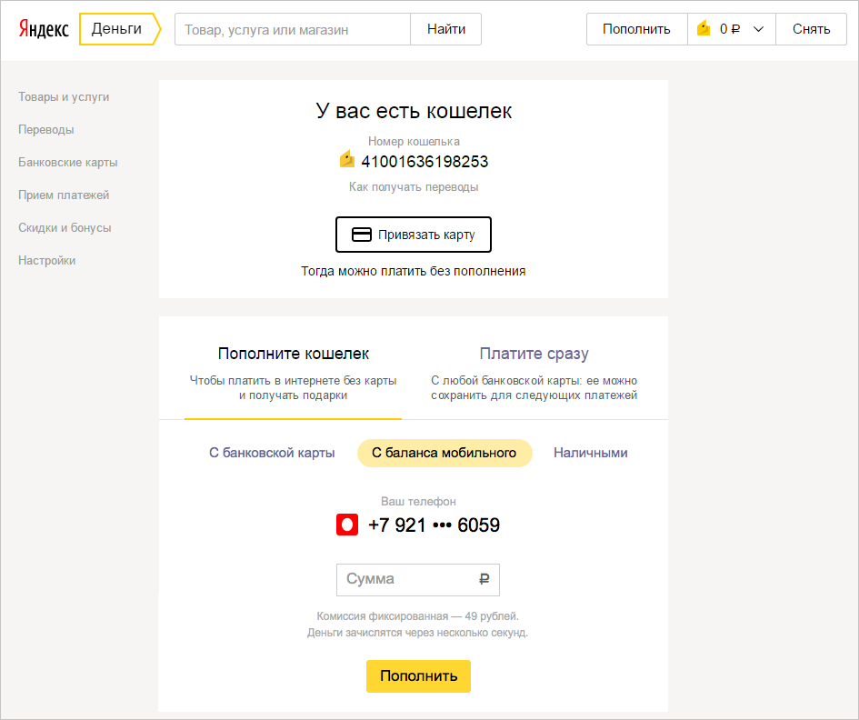
In the first iteration, they added a link to the business card page to the animating face to receive money transfers and the map binding button. By the way, initially it seemed to us that, since the card can be tied to the wallet directly in the payment process, there is no need for a special button. But it turned out that it is important for users to understand in advance how and what they will pay.
In the second iteration, the purse replenishment block was completely redrawn: they carried three of the most sought-after methods on their faces. By that time, there was another way to instantly replenish the account - from a mobile, so the task was not only the design - to make the buttons distinguishable and encouraging to action, but also functional - to add a new replenishment method, moreover so that the page did not “burst” .
When we tested the card data entry form, a dispute arose as to which one was better: double or single. Checking, we found that it is more convenient for people to use the double form, because in life you really need to turn the map over to see CVV: the double form in the conversion had a maximum - on average, it increased by 3%. This is the answer to the question I asked at the beginning.

Option 1: single form
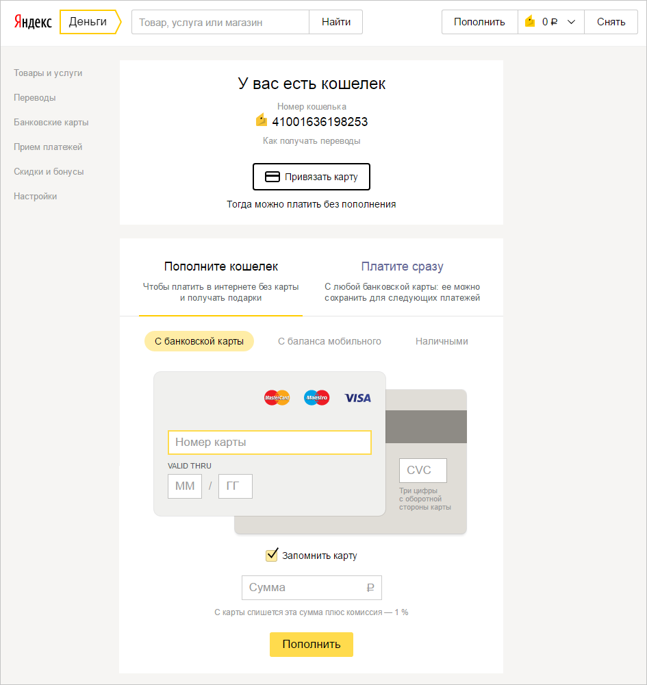
Option 2: double form
In the third iteration, we experimented with different variants of the mini-catalog of services that can be paid in the wallet.
Option 1: suppliers only

Option 2: many providers and services

Option 3: service categories and discounts
I won the last option, which immediately made it clear that on the service site you can pay for the widest range of services.
We also tried to set up automatic targeting of selected providers according to users of Metrics - but a simple directory turned out to be more efficient in terms of conversion, and saved us the resources needed to manage the content in this block. This experiment was one of the most valuable lessons: big data analysis and complex heuristics sometimes solve a problem worse than simple and inexpensive solutions.
In total, it took a year to complete the processing of onboarding — from the first page meeting the new user to the first payment. As a result, the service began to meet users warmer - more targeted, less verbose and more understandable. And users pay us reciprocate.
In this post, I will tell you how, with a series of experiments, we helped product designers to move from the “improve” paradigm to the “experiment with the new → measure → repeat” cycle.
Before delving into the theory, I suggest that all readers have a vivid experiment: in the picture below - two options of the card data entry form. Try to guess which one gives a big conversion. The correct answer is in the text. By the way, we play such a game inside the company after each experiment - and on average 75% of colleagues do not guess the right one.
')
A small historical digression: Yandex.Money has existed since 2002, and the first ten years — that is, most of the life — our audience was very similar to the Habr audience: experienced Internet users who work in IT and related industries. Even if the necessary action is hidden in four clicks from the main page (this is not necessary, of course), they will cope because they came to the service with a clear goal and strong motivation.
In the early 2010s, the audience of online payments has changed rapidly: office workers and housewives pay bills on the Internet and order food delivery, schoolchildren spend pocket money to buy game valuables, parents throw off money for school and kindergarten, philanthropists use wallets to collect donations, etc. The level of Internet literacy, age, habits of the "new" are very different. And a completely new type of motivation and research services: in the polls of visitors of the Yandex.Money site to the question "why?" We increasingly get the answer: "just like that, without any purpose, out of curiosity."
Having by the end of 2014 a dozen of millions of open wallets, we are faced with the fact that new users behave quite differently: they are lost in our interface and with great difficulty mastering a growing set of wallet capabilities. It was obvious to me that attracting new users to this narrowing funnel is becoming less and less effective - you need to completely change the concept of onboarding (accompanying the user from the first meeting to the first payment).
The service had to say from the doorway: everything is easy and understandable here, it’s safe here and you can pay for everything you need, in one or another convenient way. With priority, we decided to make the most popular products of the masses, and add the rest gradually and unobtrusively. How to achieve this at the product level?
- focus the interface on the target action;
- write short and capacious texts;
- remove all that does not apply to the target action;
- add something that will help you quickly and easily get used to the service.
We tested the experiments with the implementation of new priorities on different pages, I will tell you in detail about the first two, which directly determine the quality of onboarding:
• On the “novice snout” (“snouts” we call all the main pages of the service) a person decides to open the wallet and registers it.
• On the “animating face” he sees all the possibilities of the service and makes the first replenishment and payment.
To measure the result, we estimated the growth in the number of registrations, and, most importantly, the first payments after registration. And also the volume of issue of bank cards and identifications.
Step One: The “muzzle” should not be beautiful, but a contrast
Beginner muzzle in 2013
In 2013, people met this page. It was well suited for interaction with experienced users who came to the wallet with already formed expectations. For a wider audience, it was complicated: many links, icons and few incentives to move on.
We removed everything that was not connected with the decision to open the wallet, added a short description of the new features (bank card issue, auto payments, reminders) and motivators that are relevant to most of the resulting requests (like "transfer money" or "check the fine").
The intermediate version of the novice snout in 2015 - “Forest”
Those who came to the experiment with the forest muzzle, when they met, took me by the sleeve and asked what the deep meaning of the image was, why it was the forest. There is no deep meaning: we tested several random contrast backgrounds, and this one turned out to be the most effective. After the first experiment, the conversion from registration of the wallet to further use (replenishment, card binding and payments) increased by 8%.
We continued to finish the page using multivariate testing: the picture has changed, the main motivator block has become more compact, social network icons and business options have been added. This affected the growth of another indicator - the conversion to registration, which increased by 6%.
The result - the current "novice muzzle"
Step Two: Revitalizing the Muzzle - Show Where to Click
The first page of Yandex.Money, which is seen by users who have just opened the wallet, looked like this before the redesign:
After analyzing user behavior, we found three flaws on this page:
1. Functional: she reported on the following steps, but did not allow them to be done right there - for each you need to go to the next page.
2. Compositional: there were 50 multi-colored links on the page, pictures and a lot of text - it is difficult to focus.
3. Motivational: the newcomer is not clear from the threshold, why do everything he was offered on this page.
New animating face we have designed from scratch. The focus was on two targeted actions: 1) replenish the wallet and 2) immediately pay for the necessary service.
We put these tasks in two tabs: the first one offered to instantly replenish the wallet from a bank card or find the nearest offline replenishment point; the second gave out payment buttons for the most popular service providers (mobile operators, games, social networks, housing and utilities companies, taking into account geo-targeting).
The first version of the "animating muzzle"
In addition, in order to make it easier for people to get used to the unusual interface, on the first visit we showed them “veil” - a translucent cape on the screen with hints.
One of the versions of the screen with the "veil" and tips
After that, the revitalization, that is, the payment activity after the registration of the wallet, increased by 7%.
Then we tested six options for the contents of the "reviving muzzle" during the first visit to it:
1. first tab - offline replenishment points map
2. the first tab is to replenish the wallet from a bank card
3. The first tab - products and services that can be paid on the site.
Each version was tested with and without the “burqa”.
The best indicators of the return and replenishment of the purses were in option 3 with the “veil” and logo icons of popular services that can be paid for.
We came to the conclusion: seeing the “product face”, users moved to adjacent tabs much more actively - replenish the wallet and bind a bank card: the return increased by almost 10%. In addition, people have become more interested in other features of the service - we have seen a noticeable increase in the release of Yandex.Money bank cards and account identification.
Step Three: UX Lab - how people really think
So far we have tested individual pages. Having achieved good results on each individual, we turned to the UX-laboratory to test the entire path from entering the novice face to the first successful payment.
And they found that they were largely mistaken - here are some examples:
- as one of the motivators on the novice snout, we talked to the user about discounts and bonuses available to the wallet owner, but there was not a word about the animating
- the burqa informed the user that a bank card could be tied to a wallet and paid directly from it, but it was difficult to find a link in the interface;
- the huge buttons “Deposit funds” and “Pay immediately and transfer” were not perceived as buttons - people did not understand that they could be clicked;
- in the mini-catalog of services there were only the most popular categories of payments, but users perceived it as full - they did not immediately find what they were looking for, they left;
We decided to break up the improvements into iterations, each of which was supposed to confirm or disprove one of our hypotheses.
In the first iteration, they added a link to the business card page to the animating face to receive money transfers and the map binding button. By the way, initially it seemed to us that, since the card can be tied to the wallet directly in the payment process, there is no need for a special button. But it turned out that it is important for users to understand in advance how and what they will pay.
In the second iteration, the purse replenishment block was completely redrawn: they carried three of the most sought-after methods on their faces. By that time, there was another way to instantly replenish the account - from a mobile, so the task was not only the design - to make the buttons distinguishable and encouraging to action, but also functional - to add a new replenishment method, moreover so that the page did not “burst” .
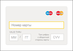
When we tested the card data entry form, a dispute arose as to which one was better: double or single. Checking, we found that it is more convenient for people to use the double form, because in life you really need to turn the map over to see CVV: the double form in the conversion had a maximum - on average, it increased by 3%. This is the answer to the question I asked at the beginning.
Option 1: single form
Option 2: double form
In the third iteration, we experimented with different variants of the mini-catalog of services that can be paid in the wallet.
Option 1: suppliers only
Option 2: many providers and services
Option 3: service categories and discounts
I won the last option, which immediately made it clear that on the service site you can pay for the widest range of services.
We also tried to set up automatic targeting of selected providers according to users of Metrics - but a simple directory turned out to be more efficient in terms of conversion, and saved us the resources needed to manage the content in this block. This experiment was one of the most valuable lessons: big data analysis and complex heuristics sometimes solve a problem worse than simple and inexpensive solutions.
In total, it took a year to complete the processing of onboarding — from the first page meeting the new user to the first payment. As a result, the service began to meet users warmer - more targeted, less verbose and more understandable. And users pay us reciprocate.
Source: https://habr.com/ru/post/311956/
All Articles