Buttons in interface design: style evolution and recommendations

The button is the simplest everyday interaction design element. Although the buttons appear to be simple UI elements, their design has changed dramatically over the past decades. But always in the direction of improving recognition and clarity.
In the article, we will look at the evolution of buttons and decide which of the examples are best followed in order to create effective buttons.
')
Style evolution
3D button
From the early days, operating system buttons were based on emulation of relief and shadow, to distinguish them from the surrounding elements. This design decision was based on a simple principle - using edges, gradients and shadows makes an element out of the background, and it becomes easy to recognize as an element that supports pressing.

The Windows 95 dialog box used thick shadows and highlighting to create a three-dimensional effect that helped users define the visual hierarchy and recognize interactive elements.

Skevomorphic buttons
In design, skevomorphism is understood as a technique in which elements of the UI are made as real objects, do they copy the real texture or do the buttons look like real buttons. Skevomorphism should help users understand how to use the new interface through the application of existing experience. The calculator example helps users transfer existing knowledge about physical calculators to a digital environment.

Flat buttons
One of the major changes in modern design was the departure from skeporphism to flat elements. Flat design explores the digital world without trying to imitate the physical. As a result, he removes the thick hints, traditionally used as prompts, that this element can be clicked or clicked.


But if everything is flat, how to understand where the buttons are?
Users require visual details to recognize places that can be clicked or clicked. As a result, color plays a big role in a flat design, since when using flat buttons it will be one of the main features of the interactive element.
Almost flat design and floating buttons
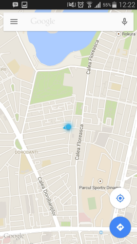
An almost flat design is an ultra-flat development. It is almost completely flat, but uses barely visible shadows, highlights and layers to return some depth to the design. Google's Material Design language is an example of a nearly flat design with priorities correctly placed, and it introduces a new type of button — floating active buttons. They are on a layer located on top of the main interface and draw attention to the recommended or main actions.
Maps application from Google - an example of the correct application of the PACK. Basically, users get a route from the cards, so it makes sense that PAK does just that.
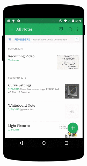
Another example of using PACK in UI is Evernote. Despite the almost flat design, the application uses barely visible shadows in the navigation plate and a floating button.
Ghost button
In 2014, ghost buttons were one of the most influential design trends. These are transparent empty buttons of a simple form, rectangular or square. They were also called “empty”, “bare” or “hollow”. They are often surrounded by a very thin line, and inside they contain only text.
Their roots grow from the revolution of flat design, and they became popular with the release of iOS 7. Many buttons of this design are ghostly. Simple rectangular shapes along with a good font look good with a flat design.

Most often, these buttons contain a call to action. Specular website offers a good example of using such buttons.

Simple recommendations for creating buttons
Before you start working on your own buttons, you need to think about how the design invites the user to work with him. How do users understand that an item is a button? You most likely need:
• To make the buttons look like buttons (Form).
• To make it easier for the user to work with them (Size and indent).
• Sign buttons (shortcuts).
• Use color contrast for a call to action (Color).
Remember to maintain consistency in the interface so that the user can recognize the elements of your application or site.
The form
It will be most effective to make the buttons rectangular, possibly with rounded corners, depending on the style of the site or application. Rectangular buttons appeared in the digital world for a long time, and users are familiar with them.
Some studies suggest that rounded corners improve information processing and attract the eyes to the center of the element.

You can turn on the creative start and use other forms - circles, triangles or even your own forms, but the latter option looks more risky.

Size and indent
Button sizes also play a key role in helping users. It is necessary to pay attention to the size of the buttons and the intervals between clickable elements.
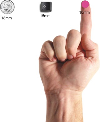
Size When the touch screen is usually used to work with the interface, you can rely on research from the MIT Touch Lab to select the correct button size. The study found that, on average, the finger pads are between 10 and 14 mm in size, and the tips are between 8 and 10. In this regard, 10x10 is a good minimum target size.
This does not guarantee you that the target will not miss, but the number of errors can be minimized to a practically acceptable level, while maintaining a balance with other important characteristics (such as informational screen density).

When the mouse and keyboard are the basic input methods, the size of the buttons can be made smaller, relying on a more dense UI.
Indentation . The distance between the buttons separates the controls and allows them to "breathe."

Shortcuts
You must select the correct names for the buttons. Words are chosen according to the principle of least amazement: if the name of the button is puzzling, it should be changed. A simple rule - call the buttons the words for their actions. Add a simple explanation of what happens after pressing, or reflect its action with the help of active verbs.
In the example, you can see a dialog box that appears when a user uploads a file to Dropbox via a web application. The message offers one button that says “Fucking awesome!”. And this name can confuse users, because it is completely incomprehensible where it will lead to clicking on it.

Colour
When choosing a palette, remember how colors help users navigate and understand actions:
- Use color and contrast to help the user see and understand the contents of the application, interact with the necessary elements, understand the meaning of actions. In the example, we are using red for the button causing the potentially destructive action.

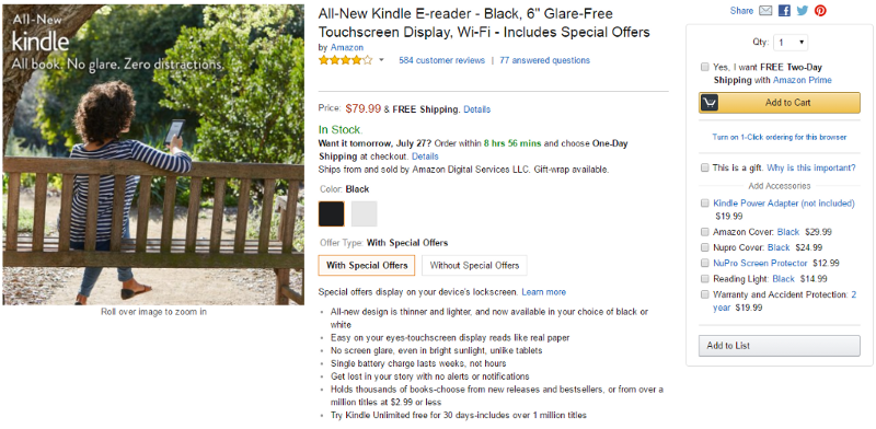
- Make the most important button the most important in appearance. For example, Amazon uses a contrasting yellow button, attracting the user to the desired action.
Conclusion
Each button should cause the user to perform the action that you need from him. Imagine that a website or application is a conversation with a busy user. Buttons play a key role in the conversation - trouble-free interaction supports the conversation, and glitches (for example, the inability to find the right button) create obstacles.
Thanks to all!
Source: https://habr.com/ru/post/311838/
All Articles