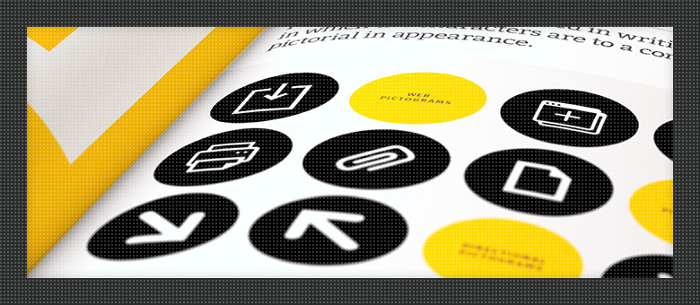
Design as a coder

Your designer is a true genius and his product is perfect. He is valiant in the unequal struggle against TK and always comes out the winner. But now the fifth coder, swearing, makes some kind of crap out of his layouts? Do not rush to look for the sixth. Most often, the reason is easily removable - you just have to tell your genius about several mundane rules and ask him to follow them.
In this article I tried to collect some recommendations for designers who make the world a little brighter. Ask the coder about his problems, send this article to the designer. For perfection there is no limit.
The problem has always existed, how much I remember myself as an IT person. When the design of interfaces was only a beautiful phrase, the meaning of which was understood only by real pros, the design was responsible for at least two-thirds of the user's impression of the site. Now it is a little simpler, UI-design is increasingly separated from the design, although it is sometimes made by the same person. In any case, it is the web designer that transforms vague images or dry prototypes into something with which the user then interacts. And it is very important that the designer put this design on the web as accurately as possible. It is desirable - without any changes. Pixel by pixel Ask any designer how often the final layout completely suits him? I am sure the answer will be sad, if not sharp.
')
You can talk about the reasons for this for a long time, but most often blame the typesetter. It is understandable: the design is, the design is good, be like a design. But besides simple copying, there is a whole heap of responsibilities on the coder. It should make the site responsive, fast, easy. Its layout should be semantic, images should be compressed or vector, and the forms should be sharpened under the backend. Yes, a frontend developer is generally a lot of things and to whom he should, if he is good (as a design). So our hero takes some kind of framework to speed up and optimize work - and it doesn’t matter whether it is combine bootstrading or your own bike, with grids on flexboxes. Opens the layouts and starts to sculpt. And here, there, he has to deviate a little from the design. Or inflate the style sheets, making them difficult to read and unnecessarily large. The result is always not very: the designer is not happy, the fender is not happy, the world has become a bit darker.
But this is only if our designer, while creating layouts and passing them further along the chain, did not take into account several important points, which I am going to talk about. Of course, I can hardly describe here everything that interferes with the correct interaction of the designer with the coder. Yes, and the problems that arise in this bundle, it happens, do not at all relate to the professional qualities of the parties. But following the recommendations outlined below will definitely not hurt either the project or its developers.
The text below is for the designer and, a little bit, for the front end user. So, drove.
Unify the elements
Imagine that there are fifty different buttons on the site. From the banal “read more” to “calculate the cost of treatment for the first half of the year”. And there are still round buttons with icons and button lists. And on each page they are slightly different: somewhere the button is 5 pixels wider than the rest, somewhere the icon has moved to the right side, somewhere the radius of the corners is slightly different ... It looks, of course, very cool. And the differences in design layouts are not even striking. But in fact, this attitude to the elements turns into several problems:
- make harder, longer and more expensive;
- the probability increases that the layout designer will use only one of the visually almost identical elements throughout the site;
- the user has to “get used” every time to a new type of element (although he himself may not be aware of this);
- with the development of the project, most likely, it will turn out a leapfrog from assorted buttons, inputs and so on.
The solution is simple. Dear designers, create a single document in which you place all the typical elements. Titles, lists, paragraphs, links, buttons, form fields, controls, image thumbnails, and more. This dock is called the "UI Style Guide" or "Frontend Style Guide" - who is used to it. Usually this is just a layered source like this . And everywhere in the project, use only these elements and only in the form in which they are imprinted here. Have you got a new multi select? Add it to the style guide.
And you should not be limited to elements only. Create a set of main colors of the interface - this is also useful. In some cases, we even make a list of the main indents used in layouts.
If the coder is experienced, he will immediately make himself the same “stylegide” on the web, from where he will simply copy the elements. And in general, the advantages of the “stackables” are darkness: from convenience in the development of the project to speeding up the work of all those involved in the frontend.
Learn the basics of layout
One of the most controversial recommendations, perhaps. Many will object to me, and this is normal. But a web designer who understands at least the most basic principles of HTML and CSS, in my experience, is more expensive and more pleasant to work with. Such a designer understands that there are six types of headings, that a paragraph is usually indented from the bottom, that lists can be nested, and so on. And here it’s not just about typography - it’s important that the layout is not only beautiful, but also realizable, light (we'll talk about speed below).
It is not difficult, believe me. For a couple of weeks of daily hourly classes, you can acquire a basic understanding of basic HTML tags and CSS features. No one asks you, dear creators, to become techies and delve into the wilds of pseudo-elements. But you should understand which of your decisions can be implemented on the web, and for which you will need to form an alliance with evil forces.
Learn to work on grids
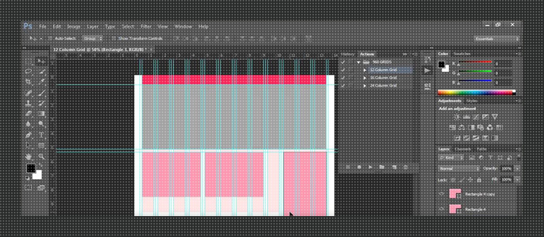
Grids, mesh, speakers - the essence is one. If to simplify, the modular grid for the designer is a conditional division of the layout into vertical columns of the same width, with certain indents between them. It is worth once to distribute the elements of the layout inside these columns, and the
The habit of working on the grid is one of the most useful (after morning runs, separate feeding and use of hotkeys). It allows you to organize the visual structure of the document, easily reuse blocks, accelerating the development of both design and layout. In addition, it is on grids that popular front-end frameworks are built along with adaptability, and this is important - and I will come back to this.
For a designer, grids are also good because when transferring his layout to the layout, the chance of exact “coincidence” increases many times. For the coder as a whole, everything is simplified. An experienced front-end vendor will simply create exactly the same columns in his project, and he will not waste time on comparing individual blocks per pixel by pixel, not to mention adaptability.
For those who work in Photoshop, I can offer even a small selection of templates . For those who prefer Sketch such a thing, I, alas, no - but it is in Google.
Remember about adaptability

In the previous paragraph, it is mentioned twice already for a reason. Ignoring mobile traffic now is a real crime, for which you need to enter the flogging. For two years now, as I have ceased to fall projects in which it would not be necessary to implement the correct display of the site on the screens of mobile devices. However, many designers continue to create only one design option - the main, the widest.
What happens after that? The layout designer who has received such a layout has several options:
- request the missing page layout, under the other permissions;
- do only what was sent to him - that is, non-adaptive layout;
- try to independently adapt the existing design.
The first option is often unrealistic, because the designer has already received his money, and the customer is a redneck (for example). The second option is no longer necessary, because then the front-end man becomes an accomplice and risks being punished. Most often, in this case, the third option is worked out. And it turns out so-so, because the coder, even a very good one, is not a designer. Exceptions are extremely rare.
So, designers. I beg you, make several versions of layouts for different resolutions. This will save you time to develop and increase the chances of putting the project in the portfolio, because for its implementation will not be ashamed. Well, once again prove your own professionalism.
And to the word about grids. The use of modular grid in the design greatly simplifies the design of adaptability. For example, the following steps (layout widths) are already familiar to me: 1440px, 1200px, 960px, 768px, 600px and 320px. Sometimes I replace 600 with 480, but these are already project personalities. When you go to each step, the width of the column decreases, but the distance between them remains the same. You can find ready-made templates by clicking the link in the paragraph above.
Keep up to date with trends
In general, banal advice. But just the other day I discovered a designer who was not familiar with the principles of material design. Well, that is, he had a general understanding of the concept, but he had never heard of the "guidelines" of the material . Of course, studying experienced projects in almost any direction does not take much time, but sometimes ignorance of the basics can prevent you from receiving a tasty and interesting order.
However, in addition to the directions in design as such, there are also popular front-end frameworks. Their task is to simplify and accelerate the development of the external part of the site, including layout, js and more. If you, the designer, work in a team that prefers to use a specific framework, the study of its basic features will save time and nerves of the whole team. And it's not just about the color scheme or the layout of the blocks, you should not drive yourself into an overly rigid framework, you are the creator. Speech, rather, about the basic elements or features of the animation. For example, in some frameworks, the sidebar that appears on small screens overlaps the content, rather than shifts it. And to change this behavior sometimes costs considerable sacrifices. So do not hesitate to communicate with frontend-developers at the very first stages, learn about frameworks and their features.
From popular I can name:
- Bootstrap . Does not need special presentation. Almost everything you need at the start is out of the box. Most popular in the world.
- Foundation . Flexible, modern, real combine. A worthy alternative to bootstrap.
- Materialize . Sharpened under the material design, as the name implies. Includes also animation in style material.
- Material Design Lite . In fact, the previous brother. It has everything you need to quickly create a project in the style of material.
- Ionic . A framework for creating mobile applications based on cordova. In essence, it is implemented with the same HTML layout, and then compiled for different platforms.
- Mobile Angular UI . Same as the previous one, but uses the bootstrap layout.
Frontend-frameworks of darkness, I will not enumerate everything. If necessary, google yourself.
Consider site loading speed

Yes, the speed of loading and operation of the site is largely laid at the design stage. I know for someone it will be news. But it is worth pondering - and it becomes obvious. What determines the download speed of the site? Eliminate the server and the curve hands of the fronteders. Statics. Images, scripts, styles.
With pictures, it seems, everything is clear - the fewer and smaller they are, the faster the user will see the site in the form you expect. But this is not a reason to abandon the background images, right? Modern technology allows designers to substitute different images at different resolutions. So why on the screens of mobile devices to pull the same megabit backgrounds as on desktops? Prepare several background options for different resolutions - at least just in layouts, the layout designer will take them out from there. Well, or provide the coder with a ready-made folder with backgrounds, if you are very holy.
If possible, use vector graphics for icons or simple images — it weighs less and looks better.
Scripts are not at the mercy of design, this is obvious. But if, during the design, parallaxes, animated appearance of blocks and other whistles are pushed into every square centimeter of the site, someone will never load the site. I beg you, dear designers, do not get carried away with animation, if that does not require TK.
I already wrote about styles at the very beginning. If there is no unification of elements in the layout, and the layout designer is honest and diligent, the size of the style sheet will be comparable to the size of the images on the site. And all this will have to drag the browser until it caches all this mess. In one project I met a file of styles the size of a small kitten - 17 megabytes. And it is in minifitsirovanny form. Still nightmares are dreaming.
Finally study vector graphics.
My most beloved and at the same time hated item. It was he who first came to my mind when I was going to write this article. I ask designers to take it seriously.
This, of course, about SVG. This is a vector image format that has recently been spoken about more and more. And I will not produce the essence, talking about its benefits. I will talk about the problem that is associated with it.
To myself, I call her "pseudo-SVG." This is when the designer gives the designer a SVG file, but he cannot use it anywhere. A very common phenomenon. The reason is simple - the designer, working in Photoshop, simply exports the icon as SVG (by ctrl + shift + alt + w), although it is raster. Inside such useless esvageshek usually lies the text with:
<image xlink:href="data:img/png;base64... Such an image will not be able to scale, and in fact there is no difference between it and the raster.
This happens because the designer does not really understand what an SVG is and does not know how to use it correctly. For such I would recommend, nevertheless, to study the format. If you work in Photoshop, then try to create such images with “feathers”. Or use ready-made icon sets. Sketch users are easier here - their vector is obtained by default. In any case, if you want to be a “designer of the future,” you need to know SVG. Here are some useful resources in Russian: one , two , three .
To reduce the number of requests to the server (hello, HTTP / 2), and just for ease of use, all SVG icons on the site are very often combined into sprites — sort of combined files. There are three ways to create an SVG sprite:
- manually copying the contents of each SVG into one common file;
- programmatically, with the help of various libraries;
- through special online services.
-
The first way is to leave to people who have a lot of free time. With the second, everything is clear - it is used by the coder and requires certain skills. But the third way can come to the designer. For example, if he leads a developing project and regularly adds new icons to it. Then the designer can independently change the SVG sprite, for example, through this service and send the finished file to the frontend. Trifle, but nice.
Attach fonts
Any designer, I think, is familiar with the list of "safe" web fonts . However, they are often not enough. When I was doing layout, I regularly came across layouts with proprietary or just rare fonts, at the sight of which Photoshop was torn from the rage by the warning windows. Of course, many designers, sending the final layout, attach to it and an archive with fonts (and many do not apply). But even with the “on hand” required font in the .ttf or .otf format, it is not always possible to correctly embed it in the layout.
I want to open a little secret to designers. At least those of them who are not familiar with her yet. Each font that you want to use in the layout (if it is not included in the list of "safe"), must be presented in at least four formats: ttf, eot, woff (or woff2, but better both) and svg. And if you use a proprietary font, its use on the web can be somewhat complicated. And not entirely legal.
I always advise you to select a font from Google Fonts , after looking, if he has the support of the Cyrillic alphabet. If this option is not suitable, then it is worth checking the propriety of the font or immediately prepare an archive with all the necessary formats. Convert them with the kind assistance of this service (do not forget to switch to the “EXPERT ...” mode and in the “Subsetting” section, ticking “Custom Subsetting ...”, tick the box next to “Cyrillic”).
For there is no more reliable way to win the heart of the coder, than to give him a ready-made set of fonts for integration into the web.
Epilogue
Of course, many moments are ignored here: the hierarchy and the imposition of layers in the source code, typography, icon sets, and much, much more. However, the article and so it turned out to be voluminous, and most of what I did not write about, is well located on the Internet at the request of “advice to the designer. Here, for example, more recommendations from Spaceoddity : habrahabr.ru/post/173271
And yes, about the meaning. If this post reconciles at least one pair of designer with coder, or saves a dozen or two man hours, it means that the time for writing it was not wasted.
Thank you
I thank our permanent designer Andrianka for the advice and selection of images for this post, as well as God’s front-end HtmlMak for a competent summary and hints.
Source: https://habr.com/ru/post/311800/
All Articles