FreeType 2.7 - excellent quality Linux fonts
In the first decade of September , FreeType version 2.7 was released without any fanfare, and this event, without a doubt, can be called a holiday on the street for users of Linux, FreeBSD, NetBSD, ReactOS and other comrades. Let's try to figure out from what we have such unbridled fun.
FreeType is an open source C library that is used to rasterize and manipulate fonts. The new version uses the default algorithm for processing instructions TrueType v40.
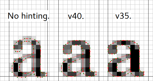
This made it possible to achieve high-quality sub-pixel anti-aliasing of fonts, as in Microsoft DirectWrite/ClearType , but in fact no sub-pixel anti-aliasing is used . In addition, the v40 algorithm Infinality faster Infinality , which was used in the previous algorithm v38, while the end result is not worse.
Infinality, patents and SHG
Historically, there were two problems with fonts in Linux. First , this is the minefield of Microsoft and Apple patents, which is why developers have painfully walked around. Partially, this problem was solved by the Infinality patch Infinality , but the price was low speed and overly complicated code. In addition, according to the maintainer, FreeType developer Infinality lost interest in his project.
Let's take a closer look at these patents in more detail. Since May 10, 2010, three Apple patents on the bytecode antialiasing of TrueType fonts have expired. Now there is no need to disable its use by default.
Patent US5155805:
Method of apparatus for moving control points
Patent US5159668:
Typeface on raster output devices
Patent US5325479:
Method of apparatus for moving control points
But 9 more patents on Microsoft ClearType remain in force.
Patent US6239783:
Weighted mapping
Patent US6243070:
Method of apparatus for detecting and reducing color artifacts in images
Patent US6282327:
Advance widths
Patent US6307566:
Rendering and rasterization operations
Patent US6393145:
Rendered on patterned display devices
Patent US6421054:
Grid cutting and hinting operations
Patent US6624828:
Reference information
These patents can be divided into three conditional categories:
- displaying pictures when information is displayed at the level of individual LCD subpixels, instead of solid pixels
- showing the same pictures after applying various filters, for example, to suppress color boring artifacts
- processing sizes and distances in the colorful world of subpixels
And that's not all, there are other patents. The beauty of the situation is that Microsoft and Apple have signed an agreement on cross-licensing , while the developers of FreeType and their open-source software colleagues must heroically overcome the OG obstacles.
The value of these patents is highly questionable. Immediately after Microsoft patented ClearType, doubts arose about their legitimacy and novelty, and they wrote about it in the New York Times , not on an unknown random forum. Steve Gibson, one of the active exposers, writes on his webpage that ClearType is a well-forgotten technology that Steve Wozniak patented 20 years ago for the Apple II. There is no significant breakthrough in technical thought, and there is no intellectual property .
Thus, Microsoft’s “ClearType” application is not a valid subject for intellectual property acquisition.
Unfortunately, American patent law is arranged in such a way that all this remains a conversation in favor of the poor . Good or bad, but there is a patent, which means that the rest have to pay money for its use.

Beg a little pathos. So far, Microsoft is in no hurry to give ClearType patents to the open source community, as Adobe did with the OpenType/CFF engine. This is a good idea to remember when we once again see Microsoft’s slogan , the Linux heart . Following the example of US President Reagan, I would like to exclaim: "Mr. Nadella, if Microsoft loves Linux, destroy these patent walls!"
New rendering for TrueType
The legacy of software font rendering algorithms for CRT monitors of the 90s of the last century is the second Linux problem with fonts. The TrueType family of fonts was born in the era of granular cathode-ray tube monitors. In the screenshots of Windows 95 from the text and climb pixels. Each individual glyph was tightly knocked into a grid of pixels. Microsoft has invested a lot of man-hours in this business, calculating and optimizing the glyphs for all possible sizes, so that the main web fonts ( Arial, Times New Roman, Courier New , etc.) looked decent on the screen.
Sisyphean labor however had consequences. A new era of LCD monitors has arrived and it turned out that the old TrueType instructions need to be reprogrammed in order to use these new features, or at least so that the fonts are displayed correctly. There is no need to clip each glyph to the grid of full pixels; instead, they can be attached to one of the three subpixels, even to a part of them, and to achieve a much better image , thanks to such subpixel smoothing. Soberly judging that rewriting all the old TrueType baggage instructions is unrealistic, MS came up with asymmetric oversampling and compatibility mode , which used many dashing tricks and crutches from the instructions of old fonts. Thus, old fonts could to some extent take advantage of the increased multiple of the horizontal resolution.
The FreeType developers decided not to fence this garden and ignored the compatibility mode . This of course had consequences. New fonts, coached on the crutch compatibility mode and asynchronous oversampling, looked crooked.
However, there was a hero who went the hard way and implemented in Infinality all the aforementioned spaghetti of old and new instructions. For a while, FreeType included a v38 interpreter - a set of Infinality patches, but then the code was removed in favor of the v35 interpreter. Infinality developer truly took on an impossible mission - to make fonts look better than in Windows, and so that they can be fine-tuned.
Direct-to-Clear / ClearType-on-Windows on Windows: There is a secret to making it possible. Shock. The code simply ignores all horizontal hinting instructions.
In the end, removing Infinality , the Infinality FreeType opted for simplicity and cleanliness of the code . This is how the algorithm for processing TrueType v40 instructions appeared. Its principle is simple as a penny - completely ignoring all instructions for horizontal smoothing . No subpixel smoothing. Much less labor, and the result is almost the same. At the same time, the problem is solved with the glyph pitch and the inter-character spacing in old untrained fonts.
How to achieve font harmony with FreeType 2.7
The good news is that you don't need to do anything to do this, the updates themselves will appear in the repository of your Linux or BSD distribution. Just upgrade to the new version and restart the X.Org Server. Customize FontConfig to taste. And the bad news is that I want to right now, and sometimes it’s hard to wait a few days or weeks. Well, especially impatient users themselves can build a new version from source or install it with the help of a regular package installer. In my Gentoo FreeType 2.7 has not yet stabilized.
$ eix freetype $ [I] media-libs/freetype : (2) 2.5.5^d 2.6.3-r1^d ~2.6.5^d ~2.7-r1^d {X +adobe-cff auto-hinter bindist bzip2 (+)cleartype_hinting debug doc fontforge harfbuzz infinality png static-libs utils ABI_MIPS="n32 n64 o32" ABI_PPC="32 64" ABI_S390="32 64" ABI_X86="32 64 x32"} For conservative Debian, you will probably have to wait for the next release, and Ubuntu users are already good with fonts, they have no hurry.
')
Source: https://habr.com/ru/post/311462/
All Articles