A series of interface (un) updates - "Habrahabr joins darkside"
Today I present my product fantasy of the Habrahabra interface update. I decided to “turn inside out” Habr and offer the programmers, who are the majority here, to remain in their working color scheme. From now on, read your favorite resource, conceptually turned to the dark side. In more detail, as I reached this point, you can read under the cut.
')
As an independent interface design expert for many of my clients, I often act as a product designer. Perhaps a little mysterious wording. Products? Designer? “Are you making cheese and sausage designs?” No. In simple terms, the product designer comes up with the overall appearance of the product, based on business goals or a specific audience of the resource. Last is just on a subject of this article about Habr and my color concept.
It is difficult to argue with the convenience of reading black on white, but if the product line for developers is the other way round, then this is no accident. Having studied the series of products in which the code is written, I noticed some patterns in the use of colors. Below, I’ll just take Darcul over my favorite resource and tell you how it is :)
I liked this gamma from intellij IDEA:

I also looked at Python, Microsoft Visual Studio, etc. Everywhere, plus or minus the same approach.
The logo quickly turns inside out. Then I pull up the levels in Photoshop so that it becomes “whiter”. Change the blending mode and voila. Fira sans was already installed on my system:

Traction to the improvement and forces to make the button more visible and calling for writing a post:
But I can not consider myself smarter than the developers of Habr, so I leave everything in the current key. We already perfectly remembered everything, where this button moved to. Save the edging, build a small flashlight:

I hook up the gray color of the tabs from the java-programming environment (screen above). The background for inactive tabs is similar. In the original range of Habr, it is noticeable that the links “Interesting, everything, ...” uses a shade of unsaturated blue, but so far I maintain everything in b / w:
So that the block does not take much attention to itself, I apply the same background as in inactive tabs. I noticed that in Microsoft Visual Studio blue is used as the color of the active elements. I apply this color for links, making it a little lighter:

Similar essence. Soryan to those who “cut off”, if you're still here. Somewhere there is already the edge of the screen. Mint greens for the top 3 contributors were picked up from the java-environment:

This is perhaps the only innovation: a slightly darker background has been introduced for the block with posts. Just as the code is written in a darker block in almost all programmer products. The links already have their own color, the rating is colored the same as the contribution to the “Authors”. Hubs - let them be purple. With care for your eyes - the text has the color not white #FFFFFF, but light gray #CDCDCD. I added side margins so that the posts sink inside the container:
I know I know. I tired you with these pieces. That's what happened in the end:
The probability is colossal! Therefore, we are doing somewhere in the cap a tool for switching from a dark theme to a default one:
What is the potential profit of this venture? If you stayed at work until the evening, and it was dark outside, they just clicked on the switch to a dark theme. Sit yourself and read by the light of a desk lamp. Enjoy!
Of course, I didn’t cover many questions: the bottom of an open post, comments, forms, profiles, etc ... I’ll touch on if the concept is viable.
PS: a little backstage, or “as a pixel to get into a pixel”:
Pps: friends, I am not a member of the Habr team. This post is a set of fantasies of an independent interface designer, nothing more ... But if we all together ask for;)
By the way, if you use Figma , I recommend paying attention to our ready-made design systems . They help freelancers complete more orders per month, programmers can create beautiful applications on their own, and the Timlids run sprints faster using ready-made design systems for teamwork.
And if you have a serious project, our team is ready to deploy a design system within the organization based on our developments and tailor it to specific tasks using Figma. Web / desktop, and any mobile. We are also familiar with React / React Native. Write to T: @kamushken
')
As an independent interface design expert for many of my clients, I often act as a product designer. Perhaps a little mysterious wording. Products? Designer? “Are you making cheese and sausage designs?” No. In simple terms, the product designer comes up with the overall appearance of the product, based on business goals or a specific audience of the resource. Last is just on a subject of this article about Habr and my color concept.
It is difficult to argue with the convenience of reading black on white, but if the product line for developers is the other way round, then this is no accident. Having studied the series of products in which the code is written, I noticed some patterns in the use of colors. Below, I’ll just take Darcul over my favorite resource and tell you how it is :)
I liked this gamma from intellij IDEA:
I also looked at Python, Microsoft Visual Studio, etc. Everywhere, plus or minus the same approach.
Cap
The logo quickly turns inside out. Then I pull up the levels in Photoshop so that it becomes “whiter”. Change the blending mode and voila. Fira sans was already installed on my system:
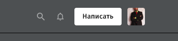
Traction to the improvement and forces to make the button more visible and calling for writing a post:
But I can not consider myself smarter than the developers of Habr, so I leave everything in the current key. We already perfectly remembered everything, where this button moved to. Save the edging, build a small flashlight:
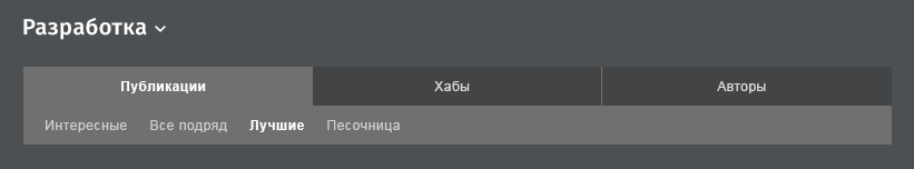
Tabs
I hook up the gray color of the tabs from the java-programming environment (screen above). The background for inactive tabs is similar. In the original range of Habr, it is noticeable that the links “Interesting, everything, ...” uses a shade of unsaturated blue, but so far I maintain everything in b / w:
Hubs
So that the block does not take much attention to itself, I apply the same background as in inactive tabs. I noticed that in Microsoft Visual Studio blue is used as the color of the active elements. I apply this color for links, making it a little lighter:
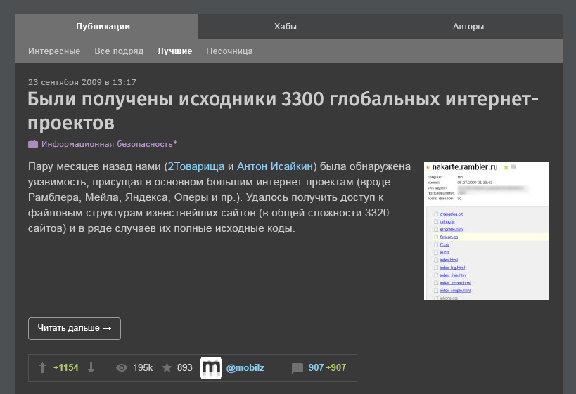
The authors
Similar essence. Soryan to those who “cut off”, if you're still here. Somewhere there is already the edge of the screen. Mint greens for the top 3 contributors were picked up from the java-environment:
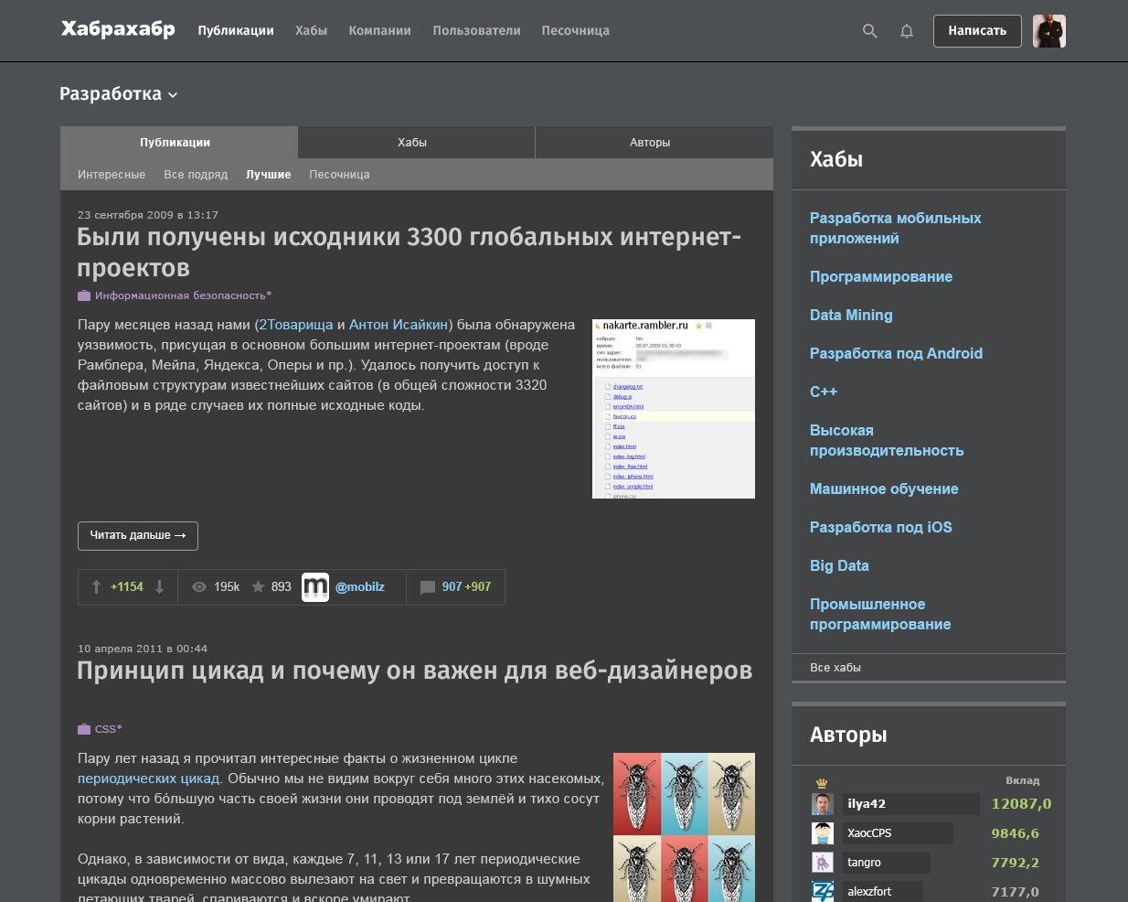
Main container
This is perhaps the only innovation: a slightly darker background has been introduced for the block with posts. Just as the code is written in a darker block in almost all programmer products. The links already have their own color, the rating is colored the same as the contribution to the “Authors”. Hubs - let them be purple. With care for your eyes - the text has the color not white #FFFFFF, but light gray #CDCDCD. I added side margins so that the posts sink inside the container:
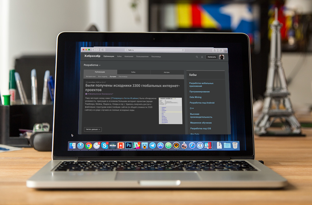
General form
I know I know. I tired you with these pieces. That's what happened in the end:
And if the bomb?
The probability is colossal! Therefore, we are doing somewhere in the cap a tool for switching from a dark theme to a default one:
What is the potential profit of this venture? If you stayed at work until the evening, and it was dark outside, they just clicked on the switch to a dark theme. Sit yourself and read by the light of a desk lamp. Enjoy!
Of course, I didn’t cover many questions: the bottom of an open post, comments, forms, profiles, etc ... I’ll touch on if the concept is viable.
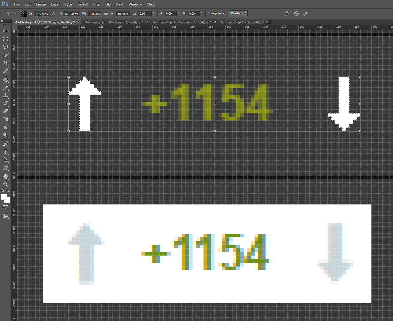
PS: a little backstage, or “as a pixel to get into a pixel”:
Pps: friends, I am not a member of the Habr team. This post is a set of fantasies of an independent interface designer, nothing more ... But if we all together ask for;)
Source: https://habr.com/ru/post/311426/
All Articles