Prototyping iOS animations with Framer
I offer Habrahabr readers a translation of the article “Using Framer to Prototype iOS Animations” from raywenderlich.com .
Static, fixed prototypes, to put it mildly, sucks. With static prototypes, you can show a visual design, but not an interaction design.
Reflecting on the importance of interaction design for applications, we can say that a static prototype is like a puzzle with missing pieces. So why shouldn't everyone create interactive prototypes instead of all this? Well, using tools like After Effects prototyping can take too much time. And the prototype itself may not be needed.
')
Try Framer: A utility for designers and developers is quite easy to use.
In this Framer tutorial, we will create an animated menu created by Voleg :
Focus on the most interesting part - prototyping the animation of folding and expanding the menu.
First, download and install the following programs (you can use free trial versions for this lesson):
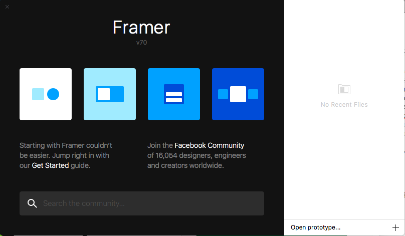
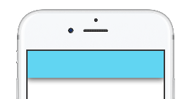
Open Framer. A welcome screen will appear:
Click on Animate (the left-most icon) and see a sample project.
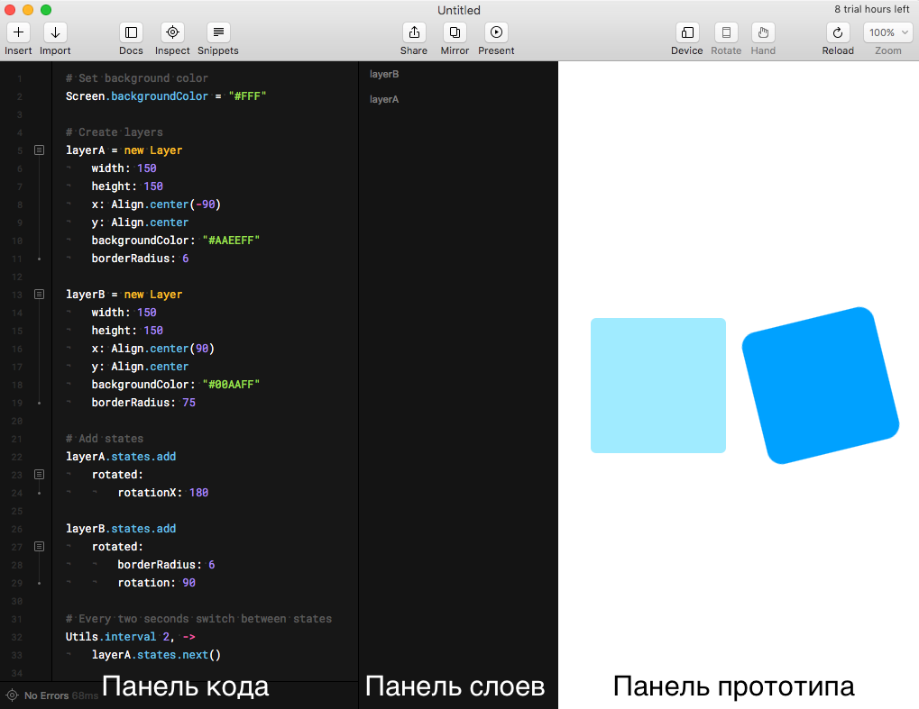
On the left is the Code Panel, on the right is the Prototype Panel. Between them is the Layers Panel.
Wander through the code, try to figure out what it does. Do not worry if something remains incomprehensible.
Close this project. We will create our own.
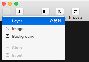
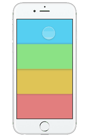
Create a new file in Framer: File -> New . Next - Insert -> Layer to create a new layer.
Click on an empty place in the code editor to cancel the viewing of layer attributes. Now we can see a new layer in each panel:
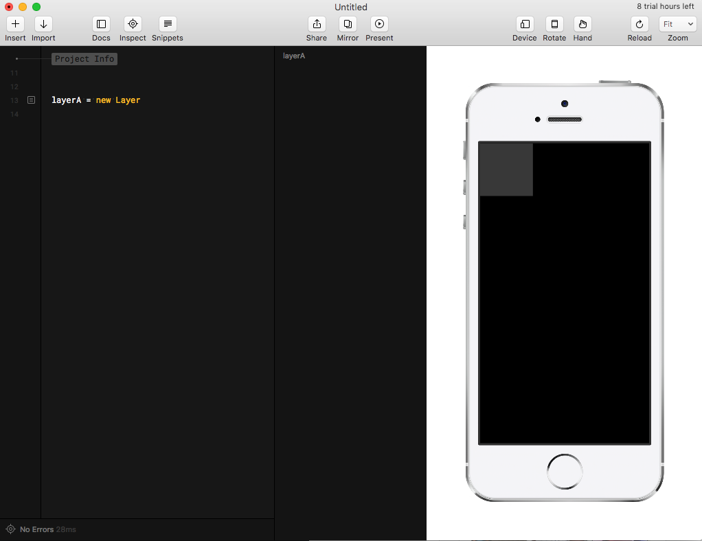
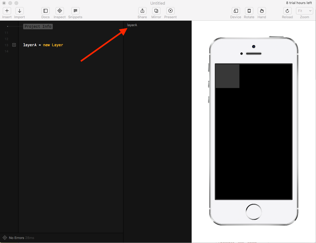
Mouse over the layer name in the Layers Panel to see its location on the prototype.
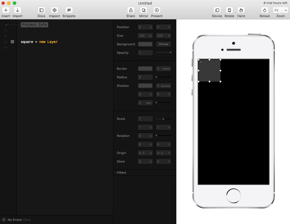
Change the name to square in the code panel.

Click on the box to the left of the line with the code to view and change the layer attributes in the Layers Panel and move it around the Prototype Panel.
Drag the square to the center of the prototype, and look at the changes in the Code and Layers Panels.
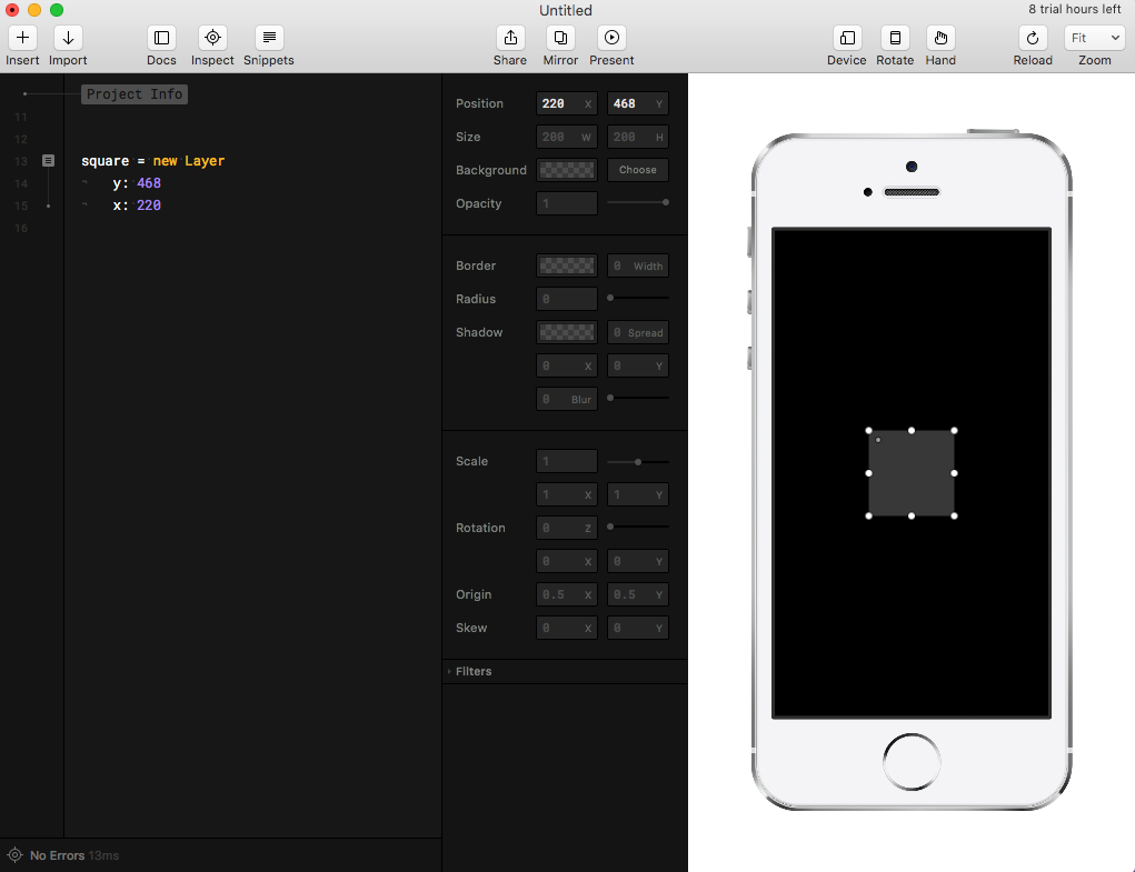
Changes in the layer by interacting with the prototype are immediately displayed in the code - and vice versa. The ability to use both the code and the visual editor to make changes gives the huge advantage of prototyping in Framer as opposed to Xcode and Swift.
Delete the existing code, and enter the following.
And again, everything changed in the prototype. Pretty neat, isn't it?
Comment. You write code in Framer using CoffeeScript , a simple language that compiles to Javascript. Do not worry if you have never used it - you can learn a lot about its syntax from this lesson.
Note that indents have meaning in CoffeeScript. So make sure your indenting is the same as mine, otherwise the code will not work. CoffeScript indentation replaces {}.
Tabs and spaces are not the same thing. Framer uses tabs by default, so if you see code with spaces like this:
Remove spaces to the very beginning of the line and replace them with a tab:
When you copy the code and go to a new line, always delete everything before the beginning of the line. Otherwise, your code can be interpreted as part of something else.
It is time for magic. We make the red square turn into an orange circle by pressing. Add a blank line after the layer description, then paste the following:
The greatest advantage of prototyping with Framer over Xcode and Swift is the ability to interact with the prototype immediately after making changes. The lack of costly building and running a project in Xcode greatly increases the speed of prototyping.
Well, I know what you're thinking. It would be necessary to slow down the animation - the transition is too sudden, and the user can not go back to the red square. It is easy to fix.
Instead of specifying what should happen to the square after clicking, we will add a new state.
Replace the code you just added with this one:
Let's see.
Click on the square to see the new transition.
The shape now animates into the orangeCircle state and back to the original state. That's because we added a state to the layer's state loop, so the next state after orangeCircle is the default state.
Let's try to add one more state. Add this line after section 1:
Now click on the square in the Prototype Panel. You will see a cycle of all three states.
With just a few lines of code and almost no installation, we created a smooth (slick) animation.
I think now we can move on to something more complicated and cooler, like, for example, UI.

Take another look at the animation we will be creating:
The most important part in creating an animation is to break it down into simple components. This will help not only in understanding the animation, but also in creating step-by-step instructions for yourself. There are three problems to be solved in this animation: selected state, deselected, and the transition between them.
What the user initially sees:
What the user sees after clicking on the banner:
The user chooses a transition between two states. In the deselected state, the user drops on one of the color banners. In the selected-state - on the top panel.
Here is what happens at the time of the transition:
Now that the entire animation is broken, you can proceed to the fun part - its construction.
Comment. Specifically, this animation was easy to break, but it is usually quite useful to record the animation using QuickTime and then slow it down with After Effects or Adobe Photoshop to highlight the small details. For example, this technique helped me to recognize whether the disappearance of the icon should be done immediately by tap on the banner, or it should occur gradually.
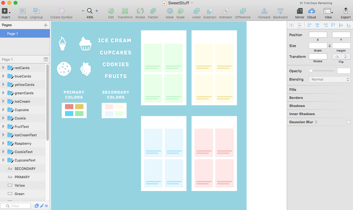
First, download a set of pictures for the lesson. The archive contains everything you need to create an animation - icons, font, text and views. Install the Archive font . This is important to do before opening the sketch file, otherwise it will not display correctly. Next, open SweetStuff.sketch and see what we have created.
Go back to Framer and create a new file File → New . Next - Import .

Leave the size @ 1x and click Import again. See the following:
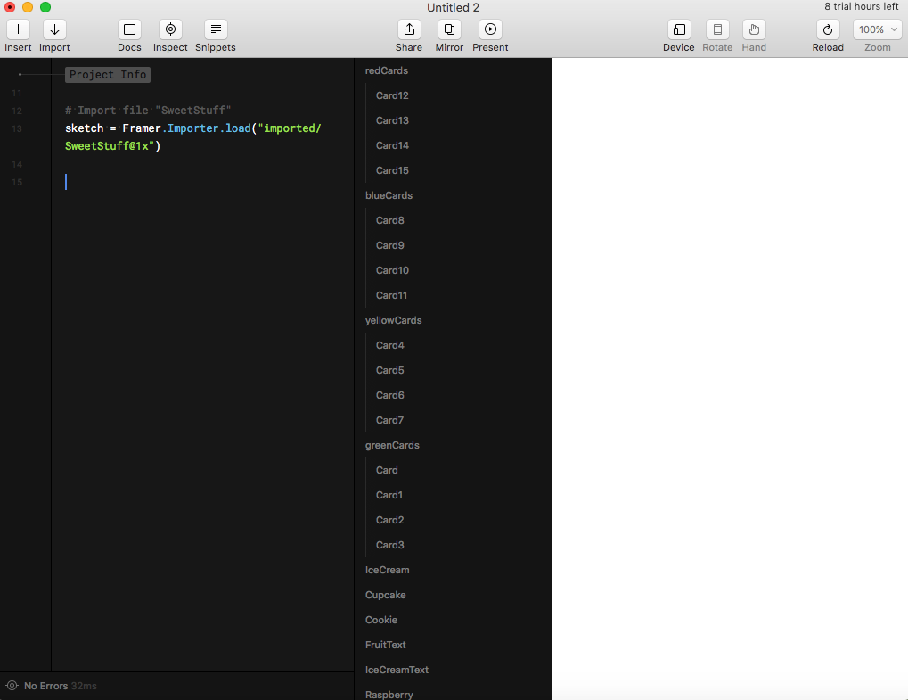
Framer created a sketch variable that contains links to all layers in our sketch file. In the Layers panel you can see them all.
Comment. Make sure the sketch file was open before clicking Import , otherwise Framer will not be able to recognize it.
Our prototype should work on multiple devices. Therefore, we will create the device variable as a link to the selected device, and we will arrange everything that is necessary relative to its screen size.
Add the following after the sketch variable:
For simpler use, add constants for colors.
Next, create a layer container for storing everything else.
Here we create the container layer and set the size equal to the size of the device screen. Then set the backgroundColor to white - this will be the background for the views. All other layers will be added to this layer. By setting the clip to true , we indicate that nothing outside the container will be shown.
Start by installing the deselected screen.
Layers menu. Since we know the width and height of each layer, we define them as constants:
Add the code below and see what happens.
Here we create a new layer for the menu with cookies, set the blue background, x, y-coordinates and height with width.
Now you need to do the same with the rest of the menus, but remember - the y-coordinate starts from the end of the previous layer: y: prevousMenu.y + previousMenu.height .
Now add shadows to create the illusion that each menu starts on top of another.
At the end of each layer description, add the following:
Hooray! But stop, it is not so displayed. All because the layers were added on top of each other from top to bottom, with iceCreamMenu at the top, and not vice versa.
Create a function to change the position of the menu and display them in the correct order. The signature for defining a function in Framer is as follows:
Add the following function to rearrange the menu after defining the layers:
The repositionMenus function takes no arguments and moves the menu layers upwards from bottom to top. Next comes the function call.
Look at the Prototype Panel - the shadows are now displayed in the correct order.
Let's start with cookieMenu . Add the following lines of code at the end of our file:
Two variables are created here: cookieIcon and cookieText , which are initialized with the corresponding objects from Sketch - Cookie and CookieText . Then we assign the cookieMenu layer to the superLayer property .
The next task is to arrange these layers. The cookieIcon should be located in the center of the parent layer (superLayer), and the cookieText is aligned horizontally in the center, but vertically offset downward from the parent layer by 4/5.
Register to center the icon:
To establish the position of the text, add the following:
Now just repeat all this for the remaining menu items.
Now it’s more or less like the deselected state.
However, looking back, we understand that somehow there is too much code on the screen.

Just think about how cumbersome the code will be when you have to write all the states in detail.
Instead of creating for each menu item a separate layer, icon and text, to simplify readability and accuracy, we will write a function.
Replace everything we wrote after defining the menuHeight and menuWidth to the following:
What this code does:
And that, ladies and gentlemen, is the clean code. Go ahead.
The first step is to add a new state called collapse to the main loop with menuItems . Think it over. What needs to be done with each menuItem when it goes into a collapse state?
You need to make the transition from the expanded state to the collapsed state.
Review of upcoming changes:
For a start, focus on simple things: the height and the y-coordinate of the menu item . Comment out 2 lines in the for loop, but do not delete - they will be needed later.
Comment. To comment out the line, type Command + / .
Add the collapsedMenuHeight constant to the other constants after the container layer.
Add a collapsed state in front of menuItems.push (menuItem) :
Now we need to make menuItems respond to a push event. Announce an event for each menuItem , immediately after the loop, before repositionMenus .
Each time you press menuItem , the loop goes through all menuItems items and translates each of them into its next state. This.bringToFront () puts the selected menu item on top of the other layers. Later events can be easily changed, since we declared them separately from each other.
Comment. The keyword this can be useful when you need to refer to the object currently being processed, instead of using its name directly. It is cleaner, in most cases shorter, and improves the readability of the code.
Check out how clicks work.
It remains to return the icons and headers, and fix a few problems. To do this, we need to track when the menu item has been selected. Add a variable after the loop, before the onTap events.
Initialize selected to false , because at first nothing is selected.
Now we can write a function to switch between selected and deselected states. Before the function repositionMenus add the following:
Now you can use this function in the implementation of onTap . For each menu item, change onTap :
Cool. Now, if you look closely, you will notice that when the menu items are compressed, the shadow looks somehow too bold. All because all four shadows from layers overlap each other.
To fix, in the menuStateChange, change the cycle:
If the layer is not selected, the shadow is removed when the layers are compressed. Even now, the animation looks pretty cool, but two things are missing: an icon and a title. Uncomment those two lines in the menu loop menuItems (make sure they are the last lines in the loop).
Remember when we added names to child layers in addIcon and addTitle ? Now it is useful. These names will help us distinguish the layers in the menuItem .
Add the following lines to compress the menu, after menuStateChange () :
Let's go through the code.
Now add another function, immediately after the previous one added.
Add calls to the collapse () and expand () functions in the menuStateChange () .
Check out the Prototype Panel - animating icons and titles works as expected.
We are almost done. Left a little! :]
In Framer, any layer can be animated. The animation setting is determined by the following parameters:
Curve and Survey options look quite confusing, aren't they? They can be used to create a prototype of an animation curve with options from the Framer.js Animation Playground.
Since we have not defined an animation curve for our prototype, Framer uses the easy curve by default :
Looks tough and unnatural. The spring curve is more suitable for us - it will allow better control over everything that happens at the transition step.
Now we will translate all of the above into the curveOptions settings .
Curve spring (spring) requires the following parameters:
Even if you do not know these numbers, just play around with them. In our prototype, I would like to see two animations with different speeds:
Animation of the menu: starts slowly, accelerates significantly and slows down dramatically.
Animation of icons and titles: the size of the icon varies from 100% to 0%, and the animation is quite sudden. It starts quickly, but dies out sharply. Compared to the previous animation, this one has less tension, and transitions between different speeds occur faster. Add the following
before menuItems.push (menuItem) :
Here we assign spring-animation to the menu items and set tension = 200, friction = 25, velocity = 8. Now the animation moves faster than icons and headings.
Find all sublayer.animate , and add the following after the time line in the properties section :
This will add the same spring animations for headings and icons.
We will add this code four times: twice in the collapse and twice in the expand for icons, and for titles. To compare the results - the sample function:
Here is how it looks in the end:
Everything worked out!Congratulations on the first prototype of Framer. The project can be downloaded here . It goes a little further than this lesson — it shows how to display the views in each menu item. A complete project with the same prototype, created in Xcode + Swift.
Static, fixed prototypes, to put it mildly, sucks. With static prototypes, you can show a visual design, but not an interaction design.
Reflecting on the importance of interaction design for applications, we can say that a static prototype is like a puzzle with missing pieces. So why shouldn't everyone create interactive prototypes instead of all this? Well, using tools like After Effects prototyping can take too much time. And the prototype itself may not be needed.
')
Try Framer: A utility for designers and developers is quite easy to use.
In this Framer tutorial, we will create an animated menu created by Voleg :
Focus on the most interesting part - prototyping the animation of folding and expanding the menu.
Start
First, download and install the following programs (you can use free trial versions for this lesson):
Open Framer. A welcome screen will appear:
Click on Animate (the left-most icon) and see a sample project.
On the left is the Code Panel, on the right is the Prototype Panel. Between them is the Layers Panel.
Wander through the code, try to figure out what it does. Do not worry if something remains incomprehensible.
Close this project. We will create our own.
Create a new prototype
Create a new file in Framer: File -> New . Next - Insert -> Layer to create a new layer.
Click on an empty place in the code editor to cancel the viewing of layer attributes. Now we can see a new layer in each panel:
- As code in the Code Panel
- As a link in the Layers Panel
- Like a gray square in the Prototype Panel
Mouse over the layer name in the Layers Panel to see its location on the prototype.
Change the name to square in the code panel.
Click on the box to the left of the line with the code to view and change the layer attributes in the Layers Panel and move it around the Prototype Panel.
Drag the square to the center of the prototype, and look at the changes in the Code and Layers Panels.
Changes in the layer by interacting with the prototype are immediately displayed in the code - and vice versa. The ability to use both the code and the visual editor to make changes gives the huge advantage of prototyping in Framer as opposed to Xcode and Swift.
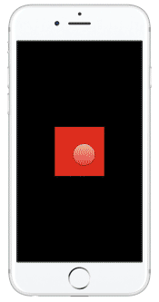
Delete the existing code, and enter the following.
square = new Layer x: 250 y: 542 height: 250 width: 250 backgroundColor: "rgba(255,25,31,0.8)" And again, everything changed in the prototype. Pretty neat, isn't it?
Comment. You write code in Framer using CoffeeScript , a simple language that compiles to Javascript. Do not worry if you have never used it - you can learn a lot about its syntax from this lesson.
Note that indents have meaning in CoffeeScript. So make sure your indenting is the same as mine, otherwise the code will not work. CoffeScript indentation replaces {}.
Tabs and spaces are not the same thing. Framer uses tabs by default, so if you see code with spaces like this:
Remove spaces to the very beginning of the line and replace them with a tab:
When you copy the code and go to a new line, always delete everything before the beginning of the line. Otherwise, your code can be interpreted as part of something else.
First Framer Animation
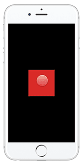
It is time for magic. We make the red square turn into an orange circle by pressing. Add a blank line after the layer description, then paste the following:
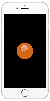
square.onTap -> square.backgroundColor = "rgba(255,120,0,0.8)" square.borderRadius = 150 The greatest advantage of prototyping with Framer over Xcode and Swift is the ability to interact with the prototype immediately after making changes. The lack of costly building and running a project in Xcode greatly increases the speed of prototyping.
Well, I know what you're thinking. It would be necessary to slow down the animation - the transition is too sudden, and the user can not go back to the red square. It is easy to fix.
Instead of specifying what should happen to the square after clicking, we will add a new state.
Replace the code you just added with this one:
# 1 square.states.add orangeCircle: backgroundColor: "rgba(255,120,0,0.8)" borderRadius: 150 # 2 square.onTap -> square.states.next() Let's see.
- This describes the new orangeCircle state for square . This new state sets the backgroundColor attribute to orange and borderRadius to 150. The full list of properties can be seen in the framer.js documentation .
- This is where the event is configured - a click, in which square goes to the next state.
Click on the square to see the new transition.
The shape now animates into the orangeCircle state and back to the original state. That's because we added a state to the layer's state loop, so the next state after orangeCircle is the default state.
Let's try to add one more state. Add this line after section 1:
square.states.add greenRounded: backgroundColor: ("green") borderRadius: 50 Now click on the square in the Prototype Panel. You will see a cycle of all three states.
With just a few lines of code and almost no installation, we created a smooth (slick) animation.
I think now we can move on to something more complicated and cooler, like, for example, UI.
Use Framer to create animation.
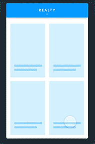
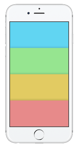
Take another look at the animation we will be creating:
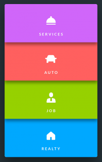
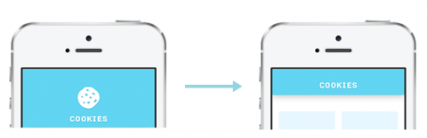
The most important part in creating an animation is to break it down into simple components. This will help not only in understanding the animation, but also in creating step-by-step instructions for yourself. There are three problems to be solved in this animation: selected state, deselected, and the transition between them.
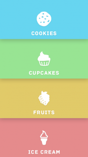
Deselected
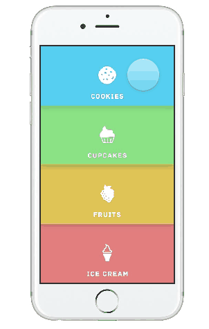
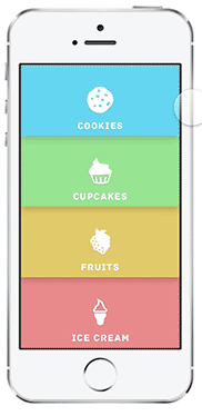
What the user initially sees:
- 4 banners that you can tap.
- Each banner has its own color, icon and title.
- Each banner casts a shadow on the banner below.
Selected
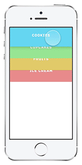
What the user sees after clicking on the banner:
- Top bar with color, caption and small icon.
- White background.
- The top panel casts a shadow on the bottom layer.
- Four evenly distributed representations below - two above, two below them.
- The color of the views depends on the selected banner.
The user chooses a transition between two states. In the deselected state, the user drops on one of the color banners. In the selected-state - on the top panel.
Moving from deselected to selected
Here is what happens at the time of the transition:
- All four banners expand and move down so that one begins where the next ends. Each banner eventually takes up a quarter of the screen.
- Banners are always ordered, so a clicked banner does not affect how banners appear in the deselected state .
- The banner expansion animation starts slowly, then accelerates significantly, and ends with attenuation.
- Each banner has its own shadow.
- Icons expand from 0 to 100% of its size. Animation begins quickly, ends with fading.
- Text moves 4/5 down an expanding banner.
Now that the entire animation is broken, you can proceed to the fun part - its construction.
Comment. Specifically, this animation was easy to break, but it is usually quite useful to record the animation using QuickTime and then slow it down with After Effects or Adobe Photoshop to highlight the small details. For example, this technique helped me to recognize whether the disappearance of the icon should be done immediately by tap on the banner, or it should occur gradually.
Arrangement
First, download a set of pictures for the lesson. The archive contains everything you need to create an animation - icons, font, text and views. Install the Archive font . This is important to do before opening the sketch file, otherwise it will not display correctly. Next, open SweetStuff.sketch and see what we have created.
Go back to Framer and create a new file File → New . Next - Import .
Leave the size @ 1x and click Import again. See the following:
Framer created a sketch variable that contains links to all layers in our sketch file. In the Layers panel you can see them all.
Comment. Make sure the sketch file was open before clicking Import , otherwise Framer will not be able to recognize it.
Our prototype should work on multiple devices. Therefore, we will create the device variable as a link to the selected device, and we will arrange everything that is necessary relative to its screen size.
Add the following after the sketch variable:
device = Framer.Device.screen For simpler use, add constants for colors.
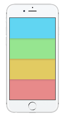
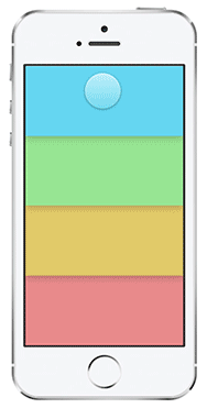
blue = "rgb(97,213,242)" green = "rgb(150,229,144)" yellow = "rgb(226,203,98)" red = "rgb(231,138,138)" Next, create a layer container for storing everything else.
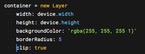
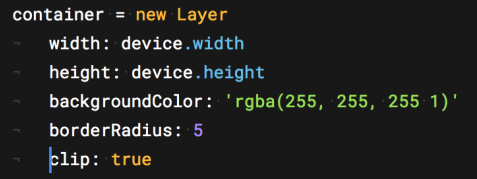
container = new Layer width: device.width height: device.height backgroundColor: 'rgba(255, 255, 255 1)' borderRadius: 5 clip: true Here we create the container layer and set the size equal to the size of the device screen. Then set the backgroundColor to white - this will be the background for the views. All other layers will be added to this layer. By setting the clip to true , we indicate that nothing outside the container will be shown.
Deselected state
Start by installing the deselected screen.
Layers menu. Since we know the width and height of each layer, we define them as constants:
menuHeight = container.height/4 menuWidth = container.width Add the code below and see what happens.
cookieMenu = new Layer height: menuHeight width: menuWidth x: 0 y: 0 backgroundColor: blue Here we create a new layer for the menu with cookies, set the blue background, x, y-coordinates and height with width.
Now you need to do the same with the rest of the menus, but remember - the y-coordinate starts from the end of the previous layer: y: prevousMenu.y + previousMenu.height .
cupcakeMenu = new Layer height: menuHeight width: menuWidth x: 0 y: cookieMenu.y + cookieMenu.height backgroundColor: green fruitMenu = new Layer height: menuHeight width: menuWidth x: 0 y: cupcakeMenu.y + cupcakeMenu.height backgroundColor: yellow iceCreamMenu = new Layer height: menuHeight width: menuWidth x: 0 y: fruitMenu.y + fruitMenu.height backgroundColor: red Now add shadows to create the illusion that each menu starts on top of another.
At the end of each layer description, add the following:
shadowY: 2 shadowBlur: 40 shadowSpread: 3 shadowColor: "rgba(25,25,25,0.3)" Hooray! But stop, it is not so displayed. All because the layers were added on top of each other from top to bottom, with iceCreamMenu at the top, and not vice versa.
Create a function to change the position of the menu and display them in the correct order. The signature for defining a function in Framer is as follows:
functionName = ([params]) -> Add the following function to rearrange the menu after defining the layers:
repositionMenus = () -> iceCreamMenu.bringToFront() fruitMenu.bringToFront() cupcakeMenu.bringToFront() cookieMenu.bringToFront() repositionMenus() The repositionMenus function takes no arguments and moves the menu layers upwards from bottom to top. Next comes the function call.
Look at the Prototype Panel - the shadows are now displayed in the correct order.
Add icons and titles
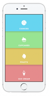
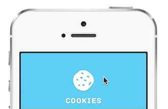
Let's start with cookieMenu . Add the following lines of code at the end of our file:
cookieIcon = sketch.Cookie cookieIcon.superLayer = cookieMenu cookieText = sketch.CookieText cookieText.superLayer = cookieMenu Two variables are created here: cookieIcon and cookieText , which are initialized with the corresponding objects from Sketch - Cookie and CookieText . Then we assign the cookieMenu layer to the superLayer property .
The next task is to arrange these layers. The cookieIcon should be located in the center of the parent layer (superLayer), and the cookieText is aligned horizontally in the center, but vertically offset downward from the parent layer by 4/5.
Register to center the icon:
cookieIcon.center() To establish the position of the text, add the following:
cookieText.centerX() cookieText.y = cookieText.superLayer.height * 0.8 Now just repeat all this for the remaining menu items.
cookieIcon = sketch.Cookie cookieIcon.superLayer = cookieMenu cookieIcon.center() cookieText = sketch.CookieText cookieText.superLayer = cookieMenu cookieText.centerX() cookieText.y = cookieText.superLayer.height * 0.8 cupcakeIcon = sketch.Cupcake cupcakeIcon.superLayer = cupcakeMenu cupcakeIcon.center() cupcakeText = sketch.CupcakeText cupcakeText.superLayer = cupcakeMenu cupcakeText.centerX() cupcakeText.y = cupcakeText.superLayer.height * 0.8 fruitIcon = sketch.Raspberry fruitIcon.superLayer = fruitMenu fruitIcon.center() fruitText = sketch.FruitText fruitText.superLayer = fruitMenu fruitText.centerX() fruitText.y = fruitText.superLayer.height * 0.8 iceCreamIcon = sketch.IceCream iceCreamIcon.superLayer = iceCreamMenu iceCreamIcon.center() iceCreamText = sketch.IceCreamText iceCreamText.superLayer = iceCreamMenu iceCreamText.centerX() iceCreamText.y = iceCreamText.superLayer.height * 0.8 Now it’s more or less like the deselected state.
Refactoring
However, looking back, we understand that somehow there is too much code on the screen.
Just think about how cumbersome the code will be when you have to write all the states in detail.
Instead of creating for each menu item a separate layer, icon and text, to simplify readability and accuracy, we will write a function.
Replace everything we wrote after defining the menuHeight and menuWidth to the following:
# 1 menuItems = [] colors = [blue, green, yellow, red] icons = [sketch.Cookie, sketch.Cupcake, sketch. Raspberry, sketch.IceCream] titles = [sketch.CookieText, sketch.CupcakeText, sketch.FruitText, sketch.IceCreamText] # 2 addIcon = (index, sup) -> icon = icons[index] icon.superLayer = sup icon.center() icon.name = "icon" # 3 addTitle = (index, sup) -> title = titles[index] title.superLayer = sup title.centerX() title.y = sup.height - sup.height*0.2 title.name = "title" # 4 for menuColor, i in colors menuItem = new Layer height: menuHeight width: menuWidth x: 0 y: container.height/4 * i shadowY: 2 shadowBlur: 40 shadowSpread: 3 shadowColor: "rgba(25,25,25,0.3)" superLayer: container backgroundColor: menuColor scale: 1.00 menuItems.push(menuItem) addIcon(i, menuItem) addTitle(i, menuItem) repositionMenus = () -> menuItems[3].bringToFront() menuItems[2].bringToFront() menuItems[1].bringToFront() menuItems[0].bringToFront() repositionMenus() What this code does:
- We declare arrays for storing menu items, colors, icons, and headers.
- This feature adds icons to each layer of the menu item.
- Same with headlines only.
- Here we loop through each menu item, create a new layer and call our functions to add icons and captions. Notice that these layers are stored in the menu array menuItems for quick access in the future.
And that, ladies and gentlemen, is the clean code. Go ahead.
Transition to selected state
The first step is to add a new state called collapse to the main loop with menuItems . Think it over. What needs to be done with each menuItem when it goes into a collapse state?
You need to make the transition from the expanded state to the collapsed state.
Review of upcoming changes:
- The y-coordinate of the layer becomes 0.
- The height is reduced from ¼ of the screen to 1/9 of the screen.
- The icon gradually disappears.
- The y-coordinate of the text changes so that it moves up.
- Only the shadow of the selected menu item is visible .
For a start, focus on simple things: the height and the y-coordinate of the menu item . Comment out 2 lines in the for loop, but do not delete - they will be needed later.
# addIcon(i, menuItem) # addTitle(i, menuItem) Comment. To comment out the line, type Command + / .
Add the collapsedMenuHeight constant to the other constants after the container layer.
collapsedMenuHeight = container.height/9 Add a collapsed state in front of menuItems.push (menuItem) :
menuItem.states.add collapse: height: collapsedMenuHeight y : 0 Now we need to make menuItems respond to a push event. Announce an event for each menuItem , immediately after the loop, before repositionMenus .
#onTap listeners menuItems[0].onTap -> for menuItem in menuItems menuItem.states.next() this.bringToFront() menuItems[1].onTap -> for menuItem in menuItems menuItem.states.next() this.bringToFront() menuItems[2].onTap -> for menuItem in menuItems menuItem.states.next() this.bringToFront() menuItems[3].onTap -> for menuItem in menuItems menuItem.states.next() this.bringToFront() Each time you press menuItem , the loop goes through all menuItems items and translates each of them into its next state. This.bringToFront () puts the selected menu item on top of the other layers. Later events can be easily changed, since we declared them separately from each other.
Comment. The keyword this can be useful when you need to refer to the object currently being processed, instead of using its name directly. It is cleaner, in most cases shorter, and improves the readability of the code.
Check out how clicks work.
Finishing touches
It remains to return the icons and headers, and fix a few problems. To do this, we need to track when the menu item has been selected. Add a variable after the loop, before the onTap events.
selected = false Initialize selected to false , because at first nothing is selected.
Now we can write a function to switch between selected and deselected states. Before the function repositionMenus add the following:
# 1 menuStateChange = (currentItem) -> # 2 for menuItem in menuItems menuItem.states.next() # 3 if !selected currentItem.bringToFront() # 4 else repositionMenus() # 5 selected = !selected - Takes the currentItem parameter - the menu item menuItem pressed .
- Passes through all menuItems and puts each item into the next state.
- If no menuItem has been selected, then selected is false , so we set currentItem forward.
- If the menuItem was selected, then selected is true , so you need to return the menu to its original state through the repositionMenus () function.
- Finally, selected assign the opposite of the current value.
Now you can use this function in the implementation of onTap . For each menu item, change onTap :
menuItems[0].onTap -> menuStateChange(this) Cool. Now, if you look closely, you will notice that when the menu items are compressed, the shadow looks somehow too bold. All because all four shadows from layers overlap each other.
To fix, in the menuStateChange, change the cycle:
for menuItem in menuItems if menuItem isnt currentItem menuItem.shadowY = 0 menuItem.shadowSpread = 0 menuItem.shadowBlur = 0 menuItem.states.next() If the layer is not selected, the shadow is removed when the layers are compressed. Even now, the animation looks pretty cool, but two things are missing: an icon and a title. Uncomment those two lines in the menu loop menuItems (make sure they are the last lines in the loop).
addIcon(i, menuItem) addTitle(i, menuItem) Remember when we added names to child layers in addIcon and addTitle ? Now it is useful. These names will help us distinguish the layers in the menuItem .
Add the following lines to compress the menu, after menuStateChange () :
collapse = (currentItem) -> # 1 for menuItem in menuItems # 2 for sublayer in menuItem.subLayers # 3 if sublayer.name is "icon" sublayer.animate properties: scale: 0 opacity: 0 time: 0.3 # 4 if sublayer.name is "title" sublayer.animate properties: y: collapsedMenuHeight/2 time: 0.3 Let's go through the code.
- Enumerate all menuItems elements.
- For each menuItem, iterate through its child layers ( subLayers ).
- If the icon layer gets caught, we animate to scale = 0, opacity = 0, for 0.3 seconds.
- If the title layer is caught, we animate the Y-coordinate to the center of the current menu item.
Now add another function, immediately after the previous one added.
expand = () -> # 1 for menuItem in menuItems # 2 for sublayer in menuItem.subLayers # 3 if sublayer.name is "icon" sublayer.animate properties: scale: 1 opacity: 1 time: 0.3 # 4 if sublayer.name is "title" sublayer.animate properties: y: menuHeight * 0.8 time: 0.3 - We iterate over the menuItems elements.
- We iterate over the child layers of each menuItem .
- If the child layer is icon , animate the scale to 100%, the opacity to 1, for 0.3 seconds.
- If the child layer is a title , animate the Y-coordinate to menuHeight * 0.8 .
Add calls to the collapse () and expand () functions in the menuStateChange () .
menuStateChange = (currentItem) -> # remove shadow for layers not in front for menuItem in menuItems if menuItem isnt currentItem menuItem.shadowY = 0 menuItem.shadowSpread = 0 menuItem.shadowBlur = 0 menuItem.states.next() if !selected currentItem.bringToFront() collapse(currentItem) else expand() repositionMenus() selected = !selected Check out the Prototype Panel - animating icons and titles works as expected.
We are almost done. Left a little! :]
Animation settings
In Framer, any layer can be animated. The animation setting is determined by the following parameters:
- properties: width, height, scale, borderRadius , etc. The width, height, scale, and radius of the border, respectively. The layer is transformed from any state to the one that you set up here.
- time: how long the animation lasts.
- repeat: how many times to repeat the animation.
- delay: whether you need a pause before the animation, and how long it should last.
- curve: the speed of the animation.
- Survey options: fine-tune the speed for the animation curve.
Curve and Survey options look quite confusing, aren't they? They can be used to create a prototype of an animation curve with options from the Framer.js Animation Playground.
Since we have not defined an animation curve for our prototype, Framer uses the easy curve by default :
Looks tough and unnatural. The spring curve is more suitable for us - it will allow better control over everything that happens at the transition step.
Now we will translate all of the above into the curveOptions settings .
Curve spring (spring) requires the following parameters:
- tension . What "material" is it supposedly made of? The greater the number - the greater the speed and rebound.
- friction . The magnitude of the resistance. The greater the number - the faster the animation will fade.
- velocity . The initial speed of the animation.
Even if you do not know these numbers, just play around with them. In our prototype, I would like to see two animations with different speeds:
Animation of the menu: starts slowly, accelerates significantly and slows down dramatically.
Animation of icons and titles: the size of the icon varies from 100% to 0%, and the animation is quite sudden. It starts quickly, but dies out sharply. Compared to the previous animation, this one has less tension, and transitions between different speeds occur faster. Add the following
before menuItems.push (menuItem) :
menuItem.states.animationOptions = curve: "spring" curveOptions: tension: 200 friction: 25 velocity: 8 time: 0.25 Here we assign spring-animation to the menu items and set tension = 200, friction = 25, velocity = 8. Now the animation moves faster than icons and headings.
Find all sublayer.animate , and add the following after the time line in the properties section :
curve: "spring" curveOptions: tension: 120 friction: 18 velocity: 5 This will add the same spring animations for headings and icons.
We will add this code four times: twice in the collapse and twice in the expand for icons, and for titles. To compare the results - the sample function:
collapse = (currentItem) -> for menuItem in menuItems for sublayer in menuItem.subLayers if sublayer.name is "icon" sublayer.animate properties: scale: 0 opacity: 0 time: 0.3 curve: "spring" curveOptions: tension: 120 friction: 18 velocity: 5 if sublayer.name is "title" sublayer.animate properties: y: collapsedMenuHeight/2 time: 0.3 curve: "spring" curveOptions: tension: 120 friction: 18 velocity: 5 Here is how it looks in the end:
Where to go next?
Everything worked out!Congratulations on the first prototype of Framer. The project can be downloaded here . It goes a little further than this lesson — it shows how to display the views in each menu item. A complete project with the same prototype, created in Xcode + Swift.
- 1. You can learn more about Framer in the official documentation and their lessons.
- The layers in Framer can react to many other events, such as pan-, swipe- and pinch-gestures. Learn more about such events here .
- What can be done with the states .
- You can read the curves in Framer's Easing Curves in the Animate section.
- animation curves Framer .
- .
- , Swift Xcode iOS Animations by Tutorials .
Source: https://habr.com/ru/post/311294/
All Articles