Complex Data Visualization Algorithm
During the three years of its existence, the Data Lab has released about thirty interactive visualizations, in the format of custom-made, own projects and free tips. We in the laboratory visualize financial and scientific data, data from the urban transport network, the results of the races, the effectiveness of marketing campaigns and much more. In the spring, we received a bronze medal at the prestigious Malofiej 24 award for visualizing the results of the Moscow Marathon.
For the last six months I have been working on a data visualization algorithm that systematizes this experience. My goal is to give a recipe that allows you to decompose any data on the shelves and solve data visualization problems as clearly and consistently as mathematical tasks. In mathematics it is not important to put apples or rubles, to distribute rabbits into boxes or budgets for advertising campaigns - there are standard operations of addition, subtraction, division, etc. I want to create a universal algorithm that will help to visualize any data, while taking into account their meaning and uniqueness.
I want to share with Habr's readers the results of my research.
')
The purpose of the algorithm: to visualize a specific data set with maximum benefit for the viewer. The primary data collection remains behind the scenes, we always have data at the input. If there is no data, then there is no data visualization task.
Typically, data is stored in tables and databases that combine multiple tables. All tables look the same, like pie / bar charts based on them. All data is unique, it is endowed with meaning, subject to the internal hierarchy, permeated with connections, contain patterns and anomalies. The tables show slices and layers of a complete holistic picture, which is behind the data - I call it the reality of the data.
Data reality is a collection of processes and objects that generate data. My recipe for high-quality visualization is to transfer the reality of data to an interactive web page with minimal losses (inevitable due to media limitations), to build on the visualization from the full picture, and not from a set of slices and layers. Therefore, the first step of the algorithm is to imagine and describe the reality of the data.
Example description:
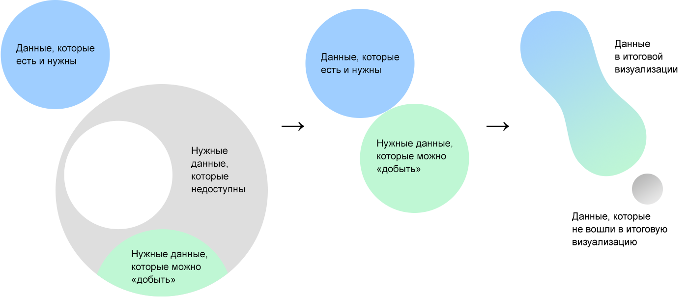
The data we start work with is just a starting point. After exploring them, we present the reality that gave rise to them, where there is much more data. In the reality of data, without regard to the initial set, we select data from which we could make the most complete and useful visualization for the viewer.
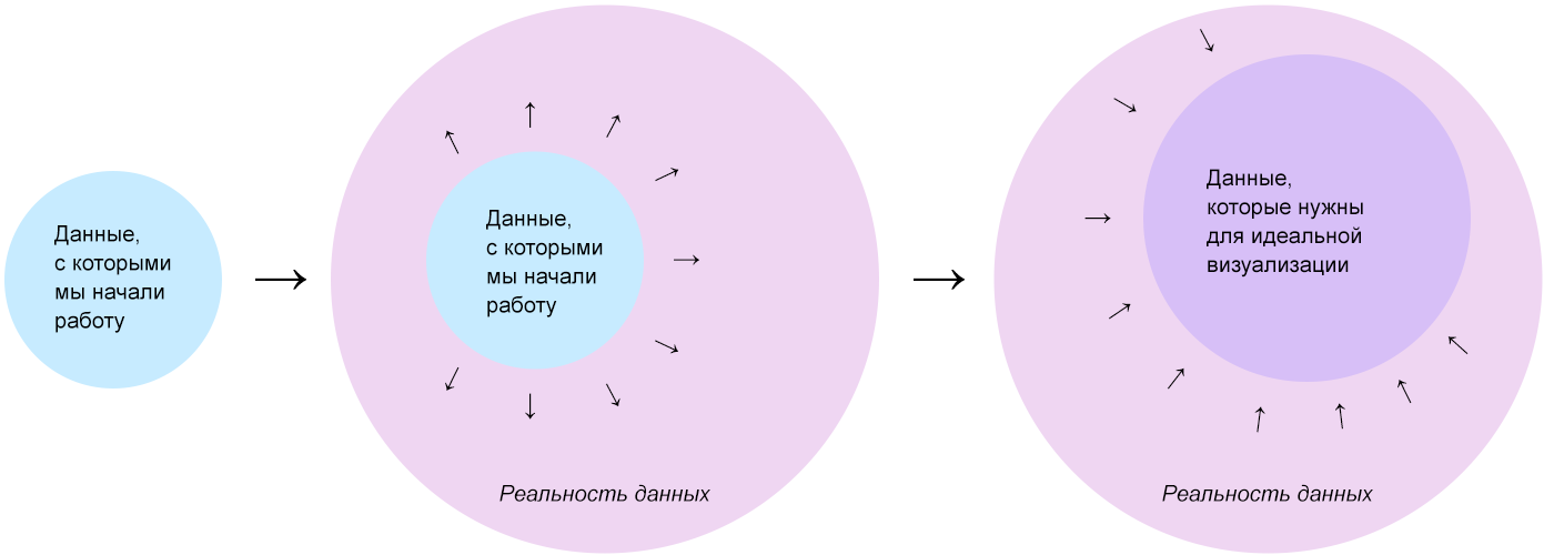
Some of the data of the ideal set will be unavailable, so we are “mining” - we are looking for in open sources or counting on - those that can be “extracted” and working with them.
My biggest discovery and central idea of the algorithm is Δλ in dividing the visualization into a mass of data and a frame. The frame is rigid, it consists of axes, guides, areas. The framework organizes a blank screen space, it transmits a data structure and is independent of specific values. Mass data - a concentrate of information, it consists of elementary particles of data. Due to this, it is plastic and "clings around" any given frame. The data mass without a frame is a shapeless pile, the frame without a mass of data is a bare skeleton.
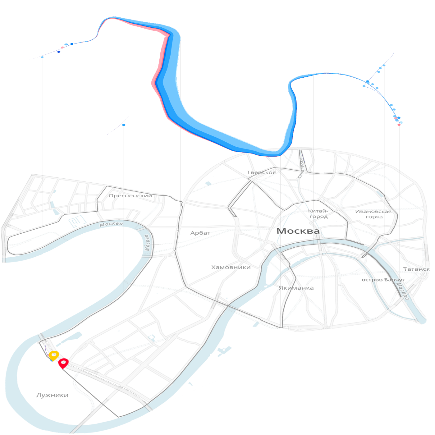
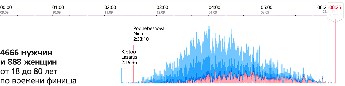
In the example of the Moscow Marathon , the elementary particle of data is a runner, the mass is a crowd of runners. The skeleton of the main visualization is a map with a race route and a temporary slider.
The same mass on the frame formed by the axis of time gives a finish chart:
This is an important visualization feature, as it serves as a starting point for finding ideas. A mass of data consists of particles of data that are easy to see and isolate in the reality of data.
An elementary particle of data is an entity large enough to have the characteristic properties of the data, yet small enough so that all data can be disassembled into particles and collected anew, in the same or a different order.
Search for an elementary particle of data on the example of the city budget:
After answering the question of what is the elementary particle of data, think about how best to show it. An elementary particle of data is an atom, and its visual embodiment must be atomic. The main visual atoms are pixel, point, circle, line, square, cell, object, rectangle, line segment, line and mini-chart, as well as cartographic atoms - points, objects, areas and routes. The better the visual conveys the properties of a particle of data, the clearer the final visualization will be.
In the example with the city budget, the deduction has two key parameters - the sum (quantitative) and the appointment - the qualitative. For these parameters, a rectangular atom with a unit width is well suited: the height of the bar encodes the amount, and its color is the purpose of the payment. The picture similar to our visualization of the personal budget will turn out :

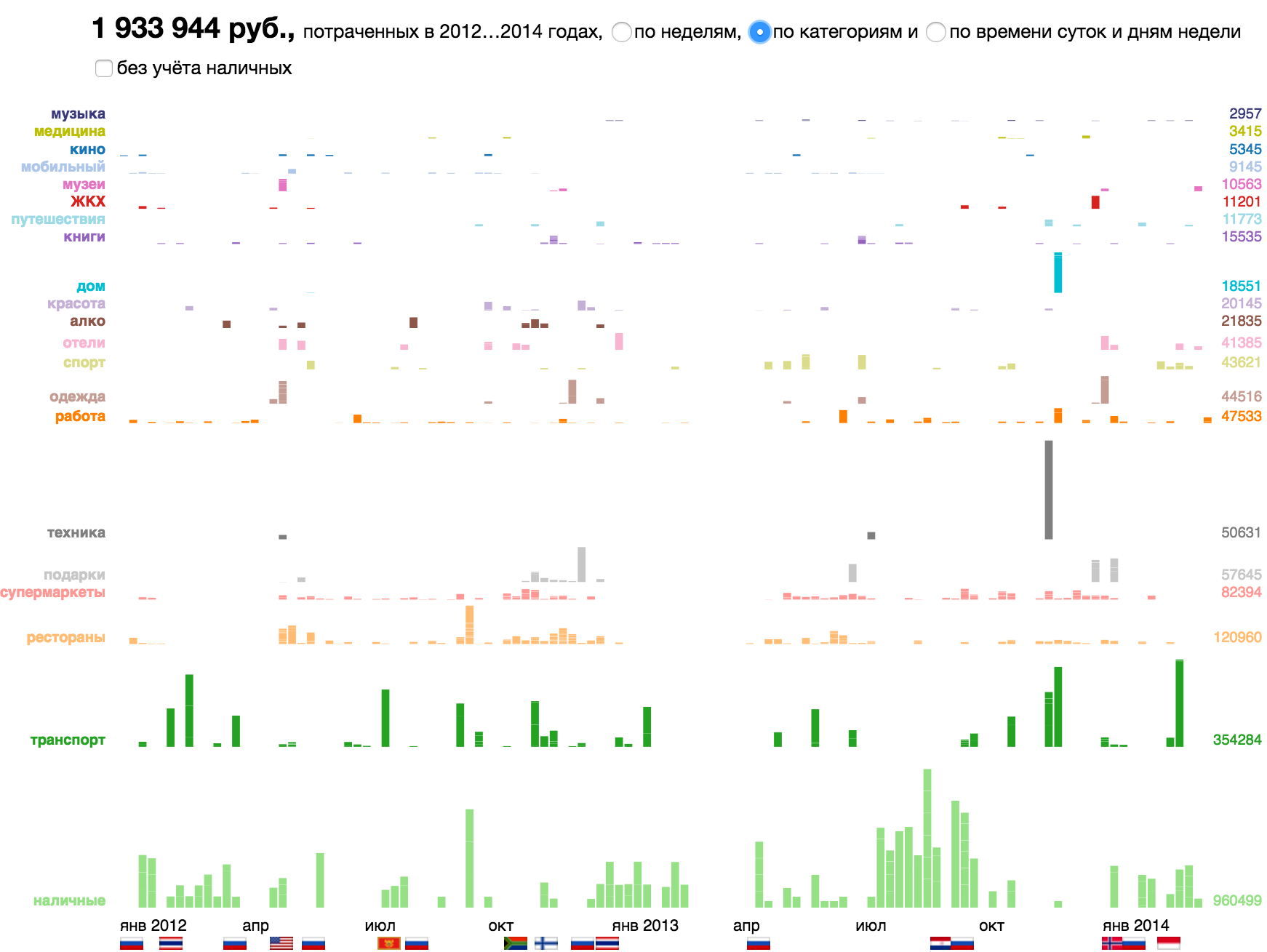
The same particle on different frameworks: along the time axis, by category or in the axes of the time of day / day of the week.

Here are other examples of data particles and their corresponding visual atoms.
The earthquake in the history of earthquakes , the visual atom is a cartographic point:
Dollar and its degrees on a logarithmic money gram , atom - pixel:

The soldier and the civilian in the visualization of the losses "Fallen.io" , atom - object - the image of a man with a gun and without:
Flag on flag visualization, atom - object - flag image:

The hour of the day (activity or sleep) on the diagram of the rhythm of urban life , the atom is a cell with two-color coding:
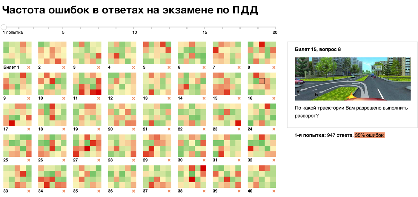
Attempt to answer the question in the statistics of the SDA simulator , the visual atom is a cell with a traffic light gradient:
Company on the chart of tax rates spread , atom - circle:
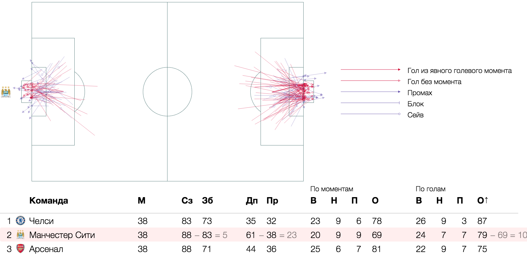
Goal and scoring chances in football analytics , atom - segment - the trajectory of the impact on the football field:
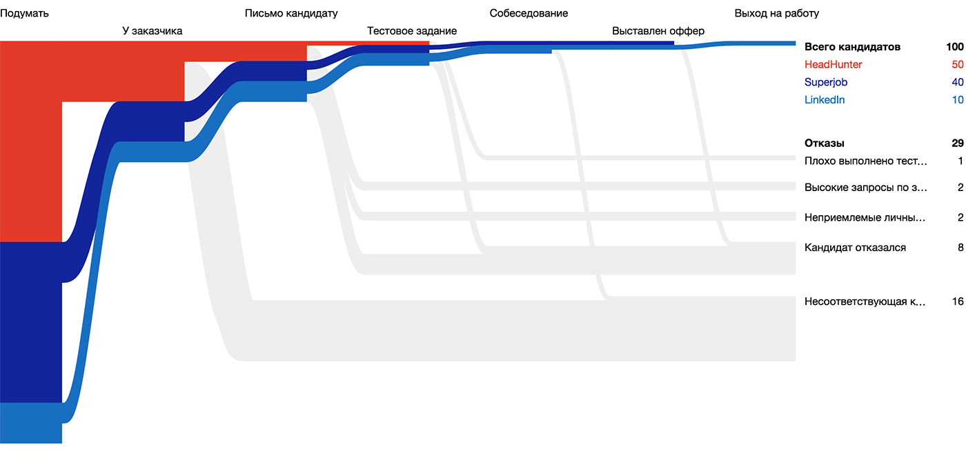
Candidate for the visualization of the “Huntflow” hiring process , atom - a line of unit thickness - the candidate's path through the funnel:
A state that changes its political mood , an atom is a line with thickness:
The segments between stations on the routes of Swiss trains, the atom is a cartographic line with a thickness of:

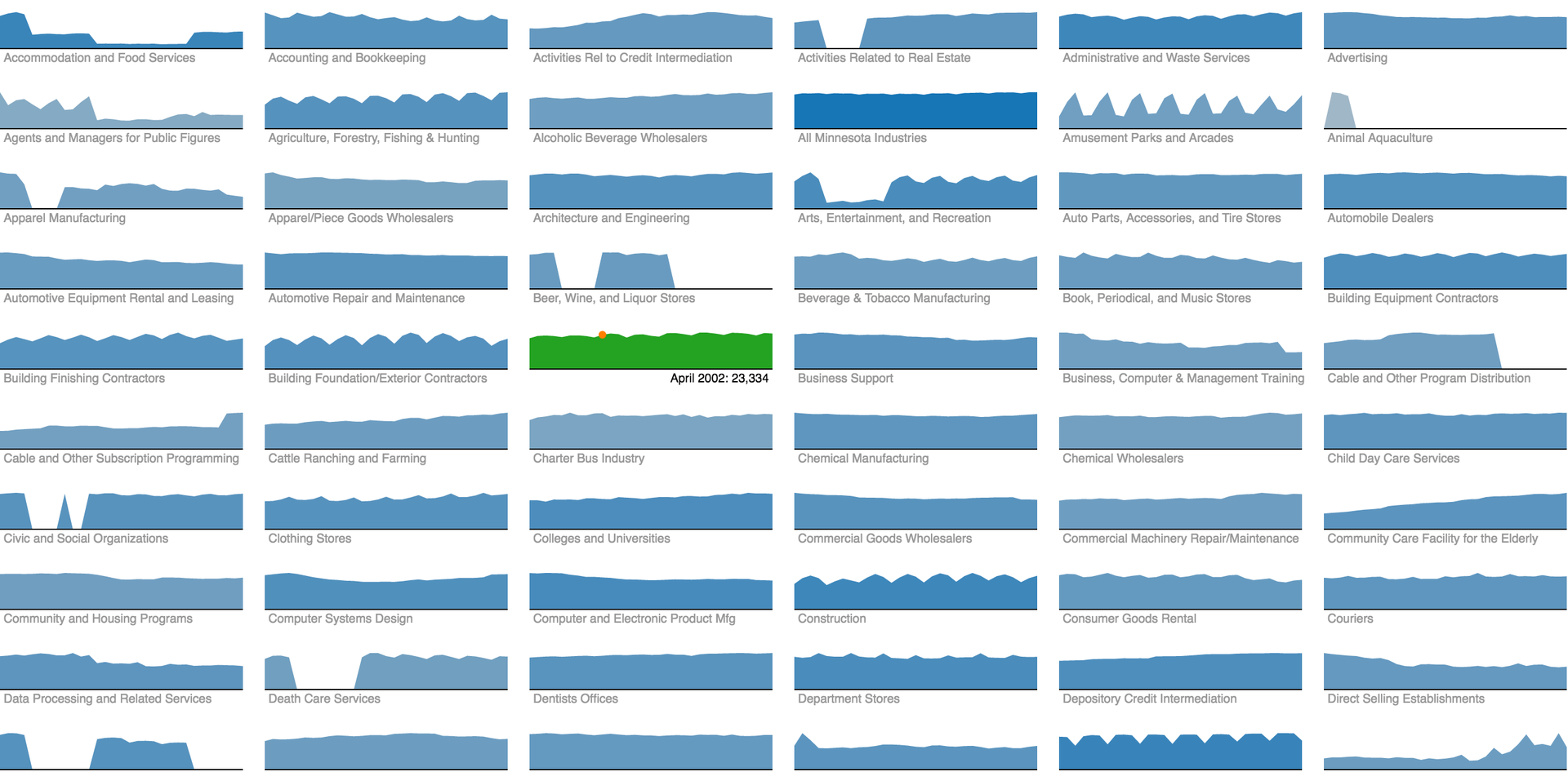
Employment dynamics in various industries of Minnesota residents, atom - mini-chart:
Read more about visual atoms and their properties here .
Interactive visualization lives in two dimensions of the screen plane. It is these two dimensions that give the mass of data "rigidity", systematize the visual atoms and serve as a visualization framework. How these two dimensions are used depends on how interesting, informative and useful the visualization will be.
On a good visualization, each dimension corresponds to an axis that expresses a meaningful data parameter. I divide the axes into continuous (including the axes of space and time), interval, layered and degenerate.
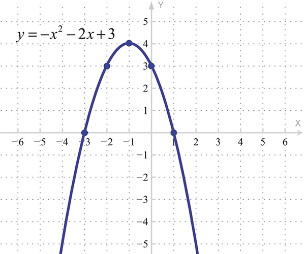
We get acquainted with continuous axes at school when we build parabolas:
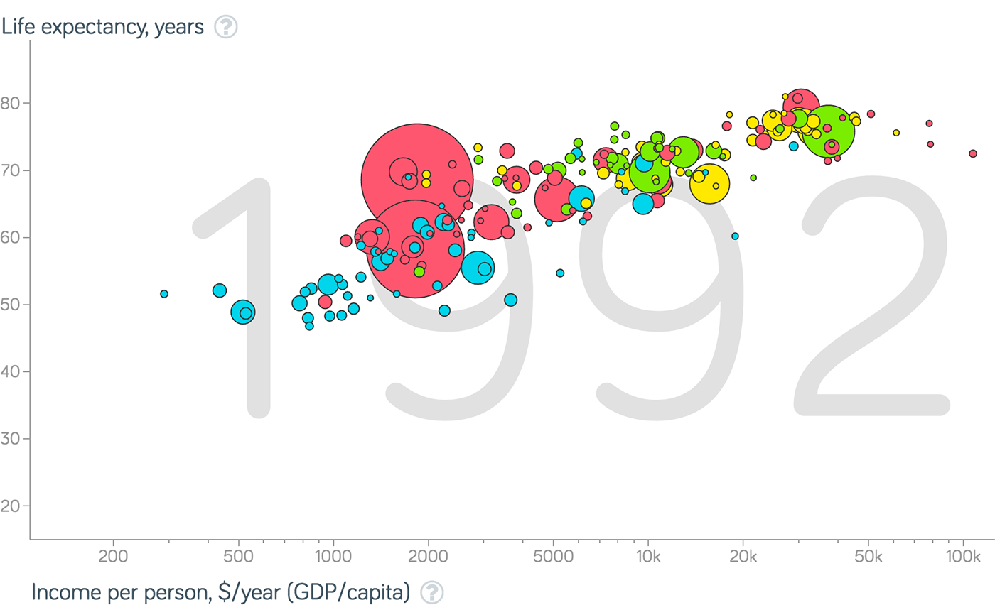
In general, under the schedule usually understand just such a frame - from two continuous axes. Often, the graph shows the dependence of one quantity on another, in which case, according to the established tradition, the independent quantity is postponed horizontally, and supposedly dependent - vertically:
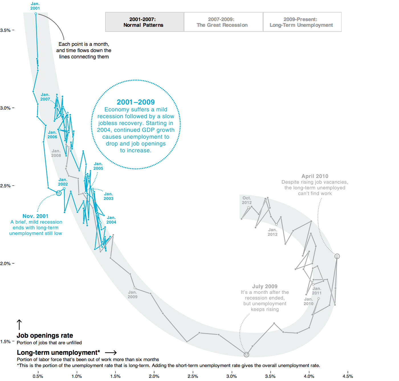
A graph of two continuous axes with object points:
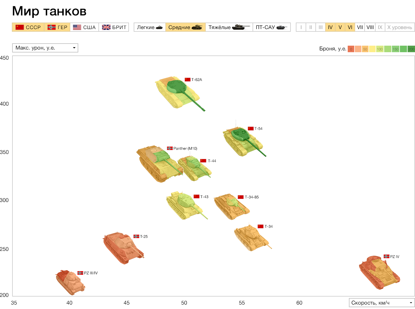
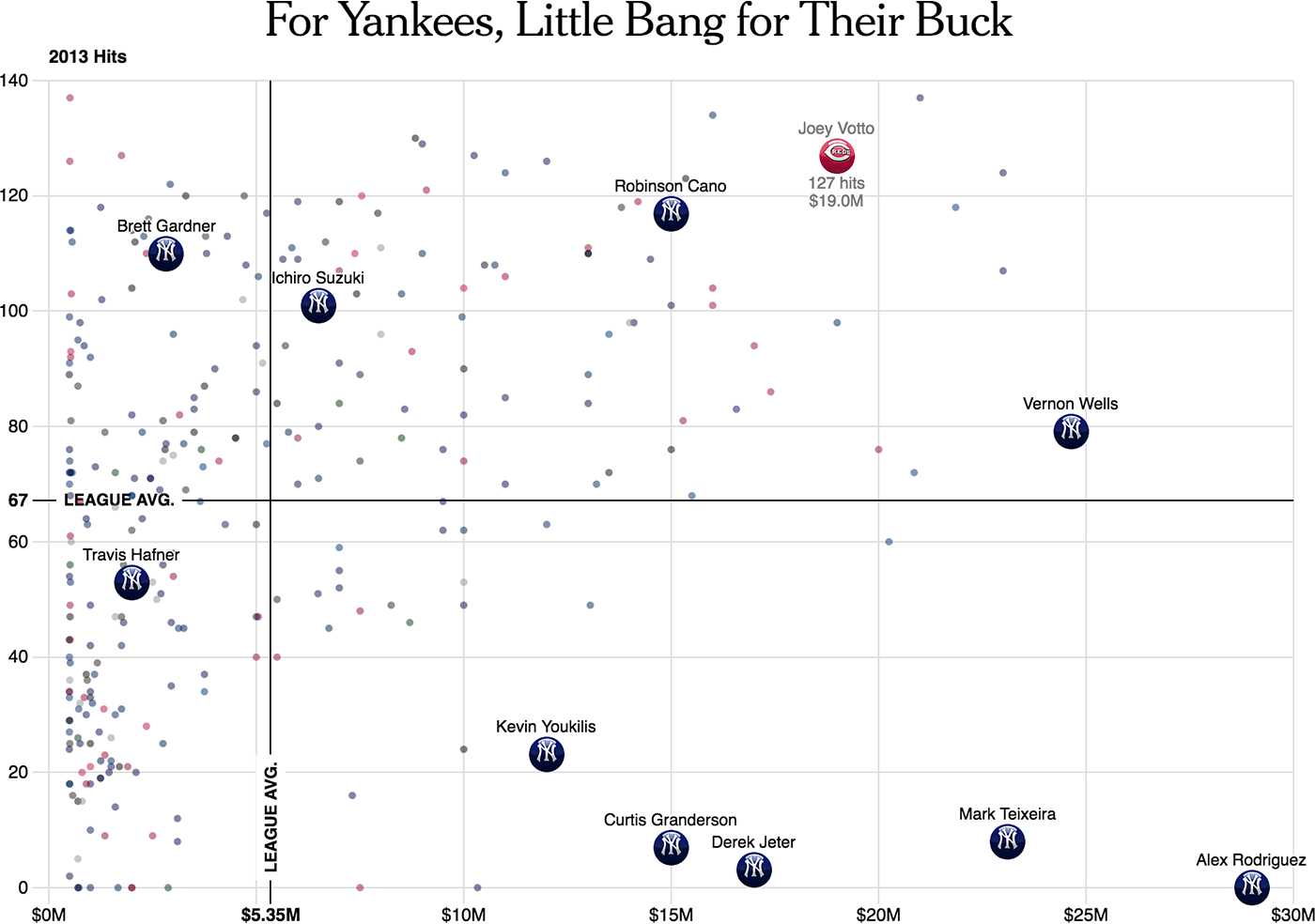
Sometimes, average values are marked on the axes, and the graph is divided into meaningful quadrants (“dear scoring players”, “cheap scoring”, etc.):
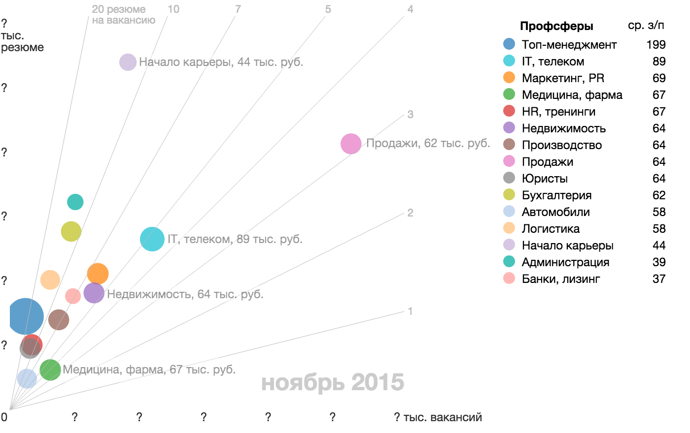
Also on the chart you can draw the rays, they will show the ratio of the parameters plotted along the axes, which in itself can be a significant parameter (in this case, competition in the industry):
For visual display of the parameter with a large spread of values, an axis with a logarithmic scale is used:

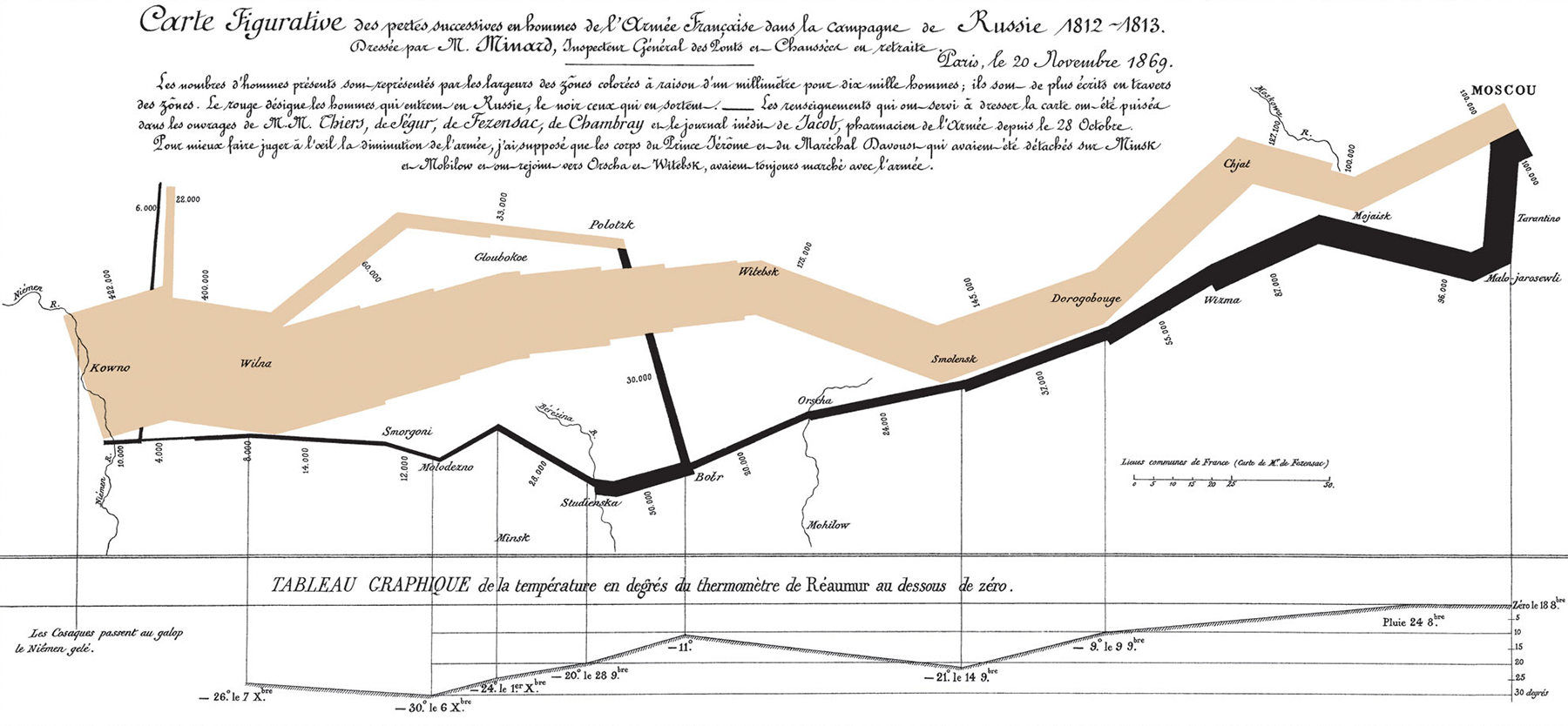
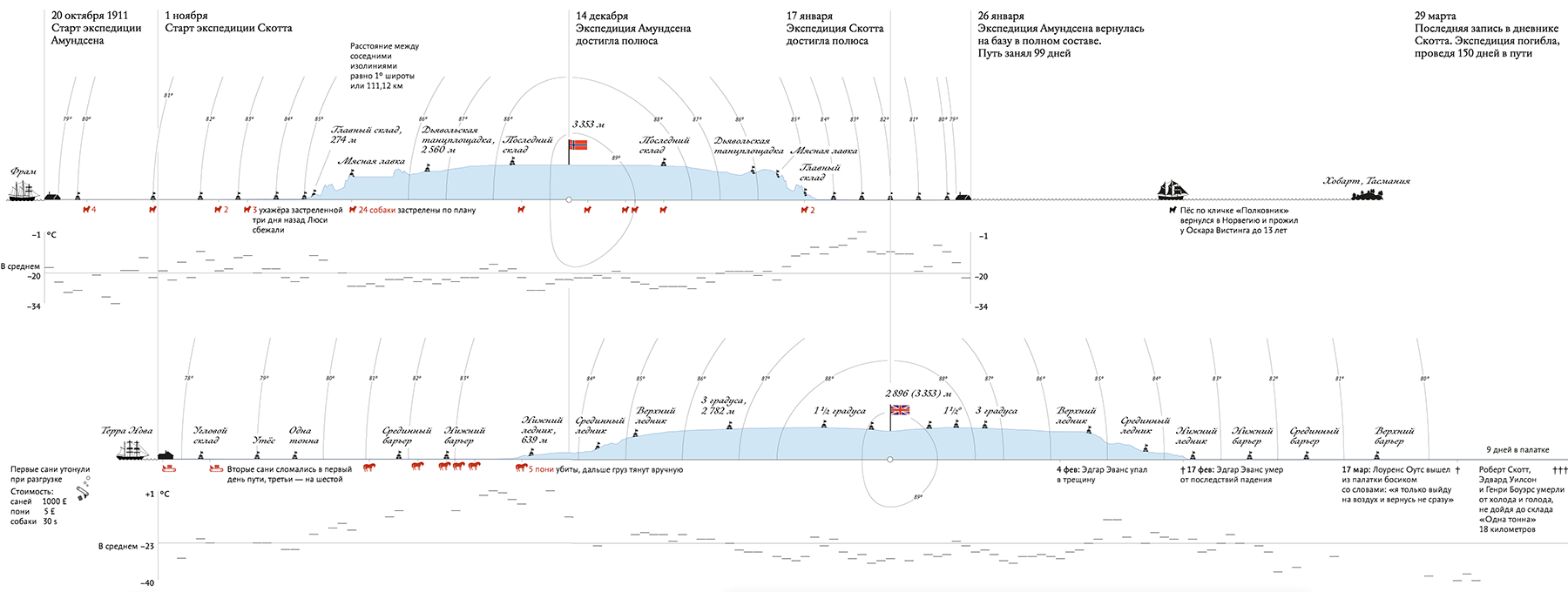
An important special case of continuous axes is the axis of space and time , for example, a geographical coordinate or a time line. A map, a type of football field or basketball court, a production scheme are examples of the combination of two spatial axes.

Charts with a temporary axis are the first abstract graphs that marked the beginning of data visualization:
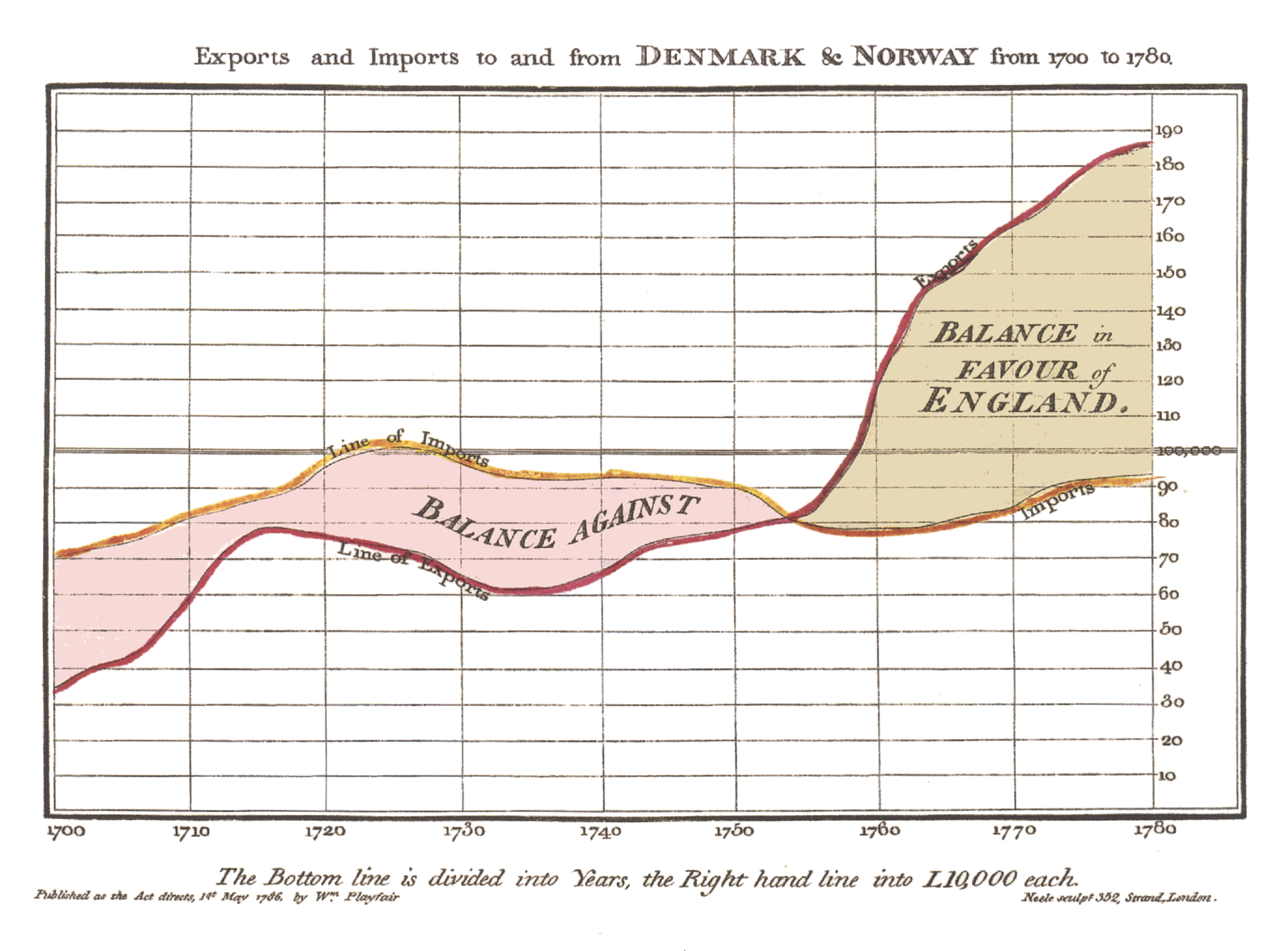
And they still apply with success:
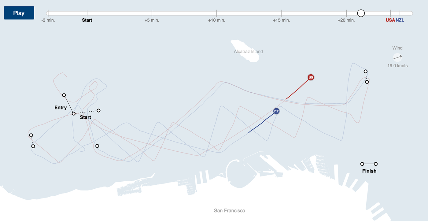
Another way to show the time dimension is to add a slider to the spatial picture:
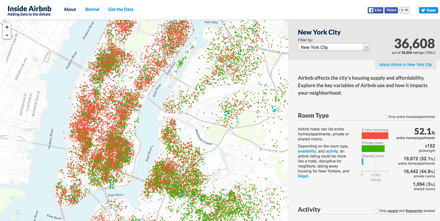
In exceptional cases, space and time can be combined on a flat map or along the same spatial axis:
The interval axis is divided into segments (equal or unequal), to which the value of the parameter is assigned according to certain rules. The interval axis is suitable for both qualitative and quantitative parameters.
Hitmep is a classic example of a combination of two interval axes. For example, the number of cases of the disease by state and year, shown on the corresponding frame:

The bar chart is an example of a combination of interval (time span) and continuous (value) axis:
Two interval axes are not required to turn into a hitmap:
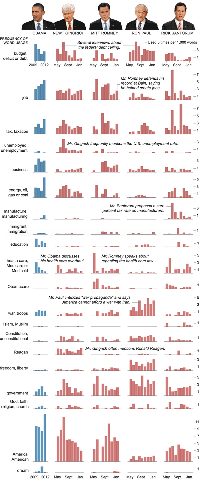
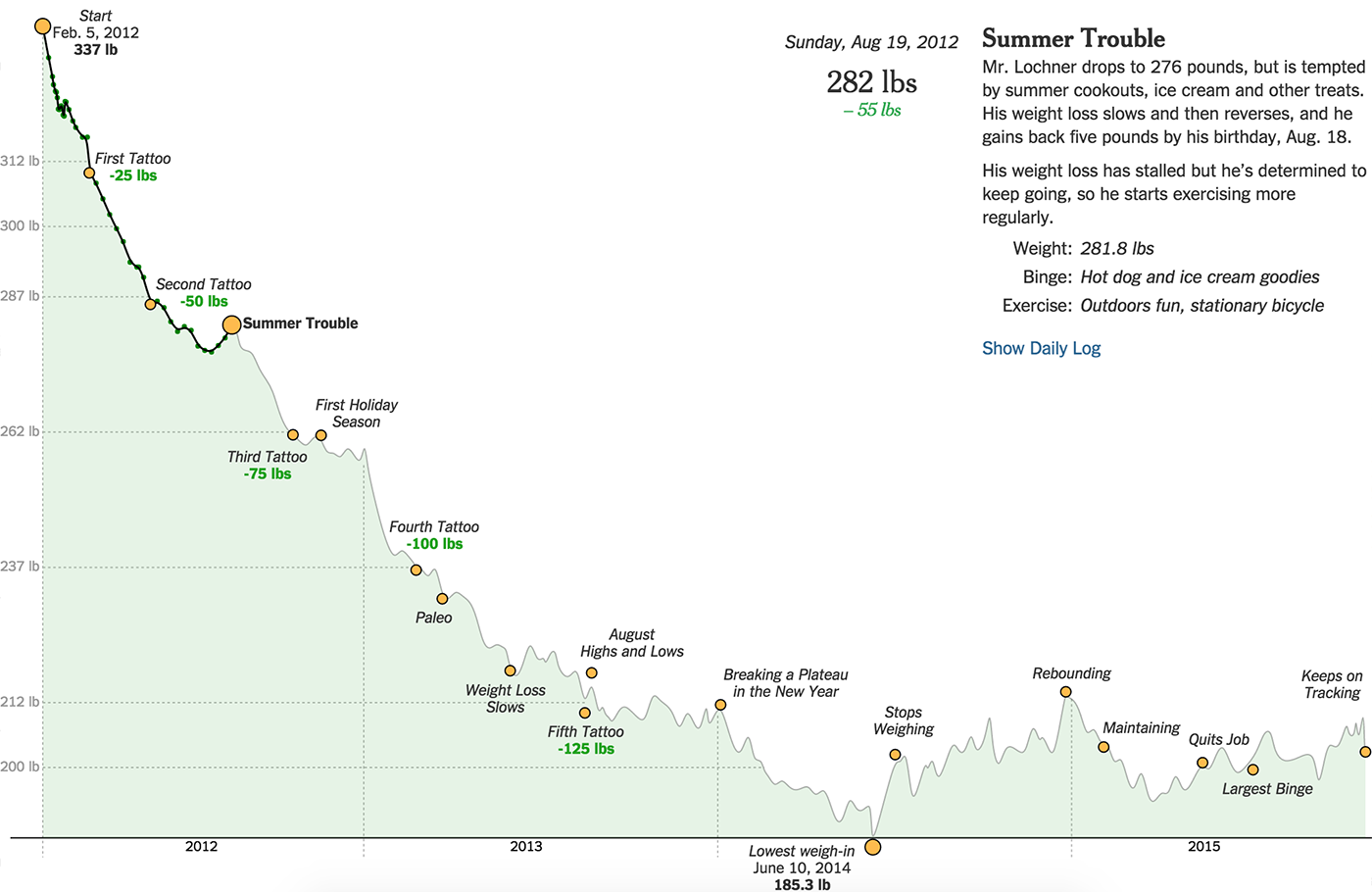
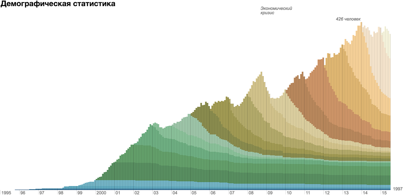
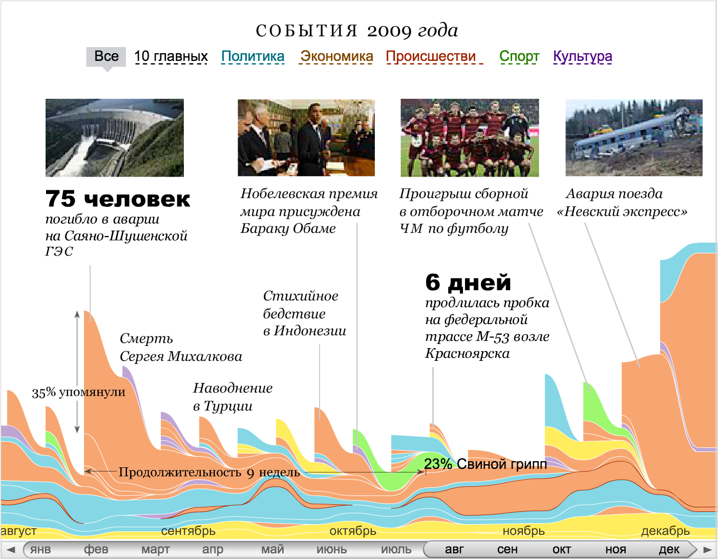
The layered axis lays at once several parallel axes (continuous and interval) in one dimension. Most often, this technique works with Timelans, when layers of data, texts and graphics are superimposed on one time axis:
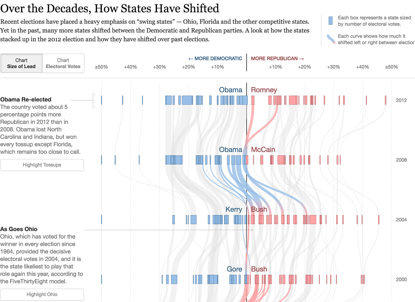
Sometimes visualization requires a degenerate axis to which a specific parameter is not tied, or on which only two values are shown. Most often this happens when the visualization illustrates the connection - to show the connection, the space between the objects is necessary.
The “was-become” data most often requires a degenerate axis:
But it does not necessarily “eat up” the on-screen measurement:
A degenerate axis is valid if it reveals the important features of the data and thus “pays for” the loss of the whole screen measurement. But it is worth using it only as a last resort. Unfortunately, in spectacular popular infographic formats, one or even both screen axes are often degenerate.
Another way to use screen space is to fill it with successive blocks of a uniform grid . Objects inside the grid are ordered linearly, for example, alphabetically:
Or the size of the city:
The grid adapts to the size of the screen and has no pronounced horizontal and vertical guides.
In most cases, the visualization framework is made up of the axes listed above. A rare exception is the three-dimensional visualization, even more rare - successful examples of them:

In cases where the choice of the frame is not obvious, I combine the axes with important parameters more or less randomly, formulate what question a particular axis combination answers, choose the most successful combinations. Interesting pictures are obtained at the interface of supposedly dependent data parameters:
The behavior of countries on analytical graphs "Hepmeinder"
And from the distribution of data particles along different axes:
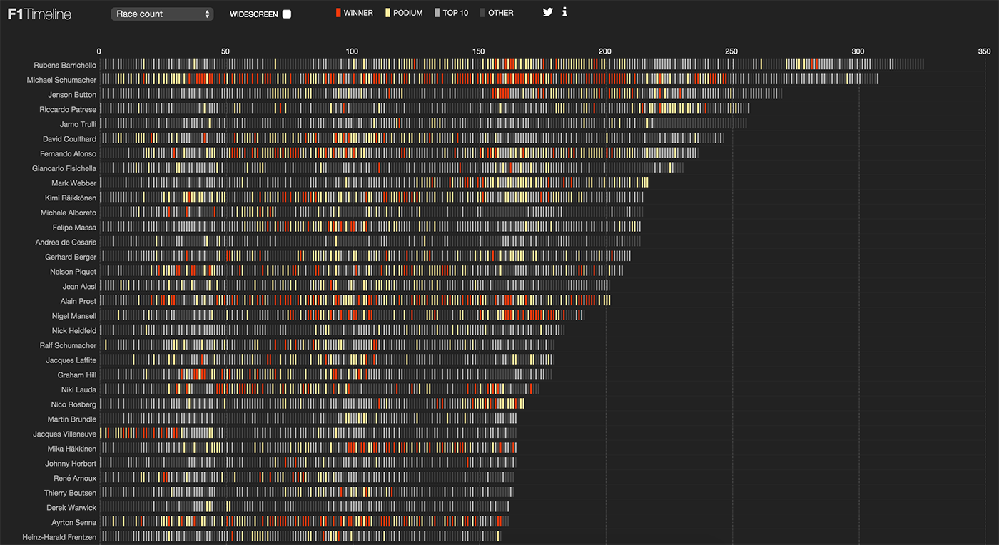
Results of Formula 1 pilots by time, number of races and age of pilots
In interactive combinations of simple frames, truly powerful visualizations are born. Timeline + map:
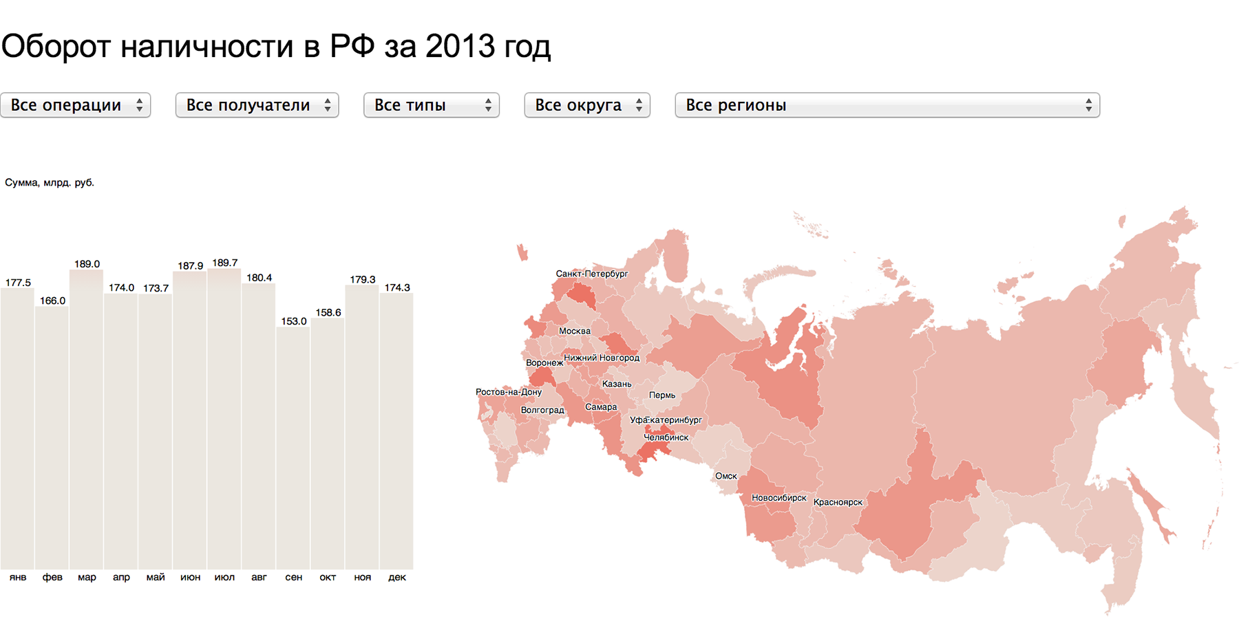
Cash turnover in the Russian Federation
Map + HitMap:
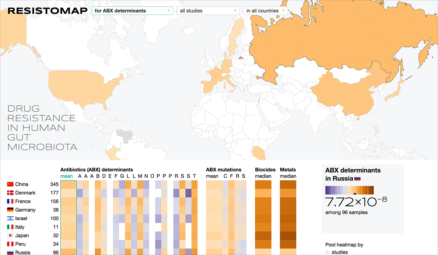
Resistance map for SRI FHM
Several graphs of the same type:
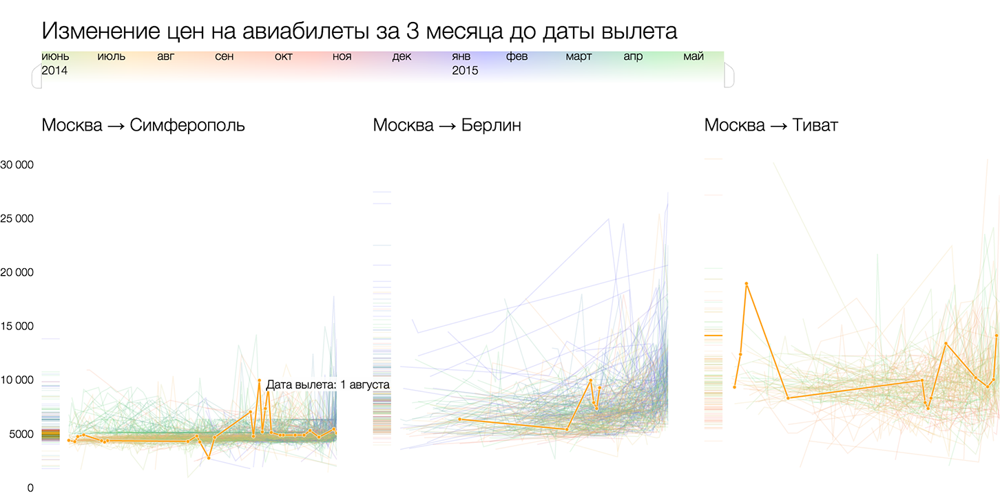
Analysis of ticket prices for Tutu.ru
So, this is how I see the process of creating a visualization from beginning to end.
1. Move from tables and slices to data reality.
2. Find the particle or particles of data from which the mass of data is built.
3. To pick up visual atoms for the embodiment of data particles. Visual atoms are selected in such a way as to fully and clearly disclose the properties of a particle of data. The closer the visual embodiment to the physical meaning of the attribute, the better.
4. On the screen, the mass of data is expressed by the visual mass. It happens that individual atoms are distinguishable in the visual mass, in other cases they are averaged and added.
5. In addition to the mass of data, in reality, data is a set of dimensions in which the data live.
6. These measurements on the screen collapse into a flat frame. The framework systematizes the visual atoms, gives the mass of data "stiffness" and reveals it from a certain side.
7. Visualization is supplemented with an interface for controlling a mass of data (for example, sampling and search) and a frame (for example, setting axes).
Algorithm Δλ while in the process of work, constantly updated, supplemented and improved. I tried to present it succinctly and consistently, but the framework of one habrapost for this is cramped, and much remains behind the scenes. I will be happy to comment, happy to explain incomprehensible moments and answer questions.
To get acquainted with the algorithm "first-hand" and learn how to use it, come to the course on data visualization , which I will conduct in Moscow, on October 8 and 9. In addition to the algorithm, the participants familiarize themselves with D3.js, a powerful tool for implementing non-standard data visualization solutions.
For the last six months I have been working on a data visualization algorithm that systematizes this experience. My goal is to give a recipe that allows you to decompose any data on the shelves and solve data visualization problems as clearly and consistently as mathematical tasks. In mathematics it is not important to put apples or rubles, to distribute rabbits into boxes or budgets for advertising campaigns - there are standard operations of addition, subtraction, division, etc. I want to create a universal algorithm that will help to visualize any data, while taking into account their meaning and uniqueness.
I want to share with Habr's readers the results of my research.
')
Formulation of the problem
The purpose of the algorithm: to visualize a specific data set with maximum benefit for the viewer. The primary data collection remains behind the scenes, we always have data at the input. If there is no data, then there is no data visualization task.
Data reality
Typically, data is stored in tables and databases that combine multiple tables. All tables look the same, like pie / bar charts based on them. All data is unique, it is endowed with meaning, subject to the internal hierarchy, permeated with connections, contain patterns and anomalies. The tables show slices and layers of a complete holistic picture, which is behind the data - I call it the reality of the data.
Data reality is a collection of processes and objects that generate data. My recipe for high-quality visualization is to transfer the reality of data to an interactive web page with minimal losses (inevitable due to media limitations), to build on the visualization from the full picture, and not from a set of slices and layers. Therefore, the first step of the algorithm is to imagine and describe the reality of the data.
Example description:
Buses transport passengers along public transport routes. The route consists of stops, a day on the route runs several flights. The route schedule for each flight is set by the arrival time at the stop. At each moment, the coordinates of each “car” are known, the speed and number of passengers on board, as well as which route it takes, and which driver is driving.
The data we start work with is just a starting point. After exploring them, we present the reality that gave rise to them, where there is much more data. In the reality of data, without regard to the initial set, we select data from which we could make the most complete and useful visualization for the viewer.
Some of the data of the ideal set will be unavailable, so we are “mining” - we are looking for in open sources or counting on - those that can be “extracted” and working with them.
Mass data and frame
My biggest discovery and central idea of the algorithm is Δλ in dividing the visualization into a mass of data and a frame. The frame is rigid, it consists of axes, guides, areas. The framework organizes a blank screen space, it transmits a data structure and is independent of specific values. Mass data - a concentrate of information, it consists of elementary particles of data. Due to this, it is plastic and "clings around" any given frame. The data mass without a frame is a shapeless pile, the frame without a mass of data is a bare skeleton.
In the example of the Moscow Marathon , the elementary particle of data is a runner, the mass is a crowd of runners. The skeleton of the main visualization is a map with a race route and a temporary slider.
The same mass on the frame formed by the axis of time gives a finish chart:
This is an important visualization feature, as it serves as a starting point for finding ideas. A mass of data consists of particles of data that are easy to see and isolate in the reality of data.
Data particles and visual atoms
An elementary particle of data is an entity large enough to have the characteristic properties of the data, yet small enough so that all data can be disassembled into particles and collected anew, in the same or a different order.
Search for an elementary particle of data on the example of the city budget:
Search for an elementary particle start from the bottom up: look for different potential particles and try them on the data. “Money?” Is a good start, a unit of measure for the budget, a ruble, but too universal. It is suitable if we do not find something more characteristic of the city budget. “Events” are not suitable, because not all budget spending is associated with activities, there are other expenses, and the elementary particle must describe the whole mass of data. “Institutions?” - on the one hand, yes, all budget money can be broken down into deductions to a particular budget institution. On the other hand, this is already too large a unit, because there can be several transactions within an institution, including periodic ones. If we take an institution as an elementary particle, then we will only operate with the general budget of this institution and lose the time slice, as well as the possible slice for the intended purpose of the funds.
In my reasoning, an elementary particle has already flashed several times - deduction, a one-time transfer of budget funds in a certain amount (the same rubles) to a certain organization for specific purposes (for example, events) linked to time. Deductions are periodic and irregular, the goal may consist of several levels of hierarchy: for an event → for organizing a concert → an artist's fee. From deductions consists the entire expenditure item of the city budget, while deductions can be added together, compare, track the dynamics. If you need to visualize the arrival of the budget, use the twin particle - receipt. From receipts it is possible to make a picture of the formation of the city budget just as from deductions - a picture of its use.
Start from the bottom (from the units of measurement), try on the role of the data particle all the larger entities and reason why this or that entity is suitable or not suitable. In the reasoning, new entities and hints on a particle of data will certainly appear. For the particle found, be sure to select the appropriate word or term, so it is easier to think about it later and solve the problem.
After answering the question of what is the elementary particle of data, think about how best to show it. An elementary particle of data is an atom, and its visual embodiment must be atomic. The main visual atoms are pixel, point, circle, line, square, cell, object, rectangle, line segment, line and mini-chart, as well as cartographic atoms - points, objects, areas and routes. The better the visual conveys the properties of a particle of data, the clearer the final visualization will be.
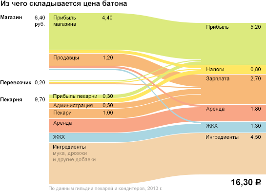
In the example with the city budget, the deduction has two key parameters - the sum (quantitative) and the appointment - the qualitative. For these parameters, a rectangular atom with a unit width is well suited: the height of the bar encodes the amount, and its color is the purpose of the payment. The picture similar to our visualization of the personal budget will turn out :
The same particle on different frameworks: along the time axis, by category or in the axes of the time of day / day of the week.
Here are other examples of data particles and their corresponding visual atoms.
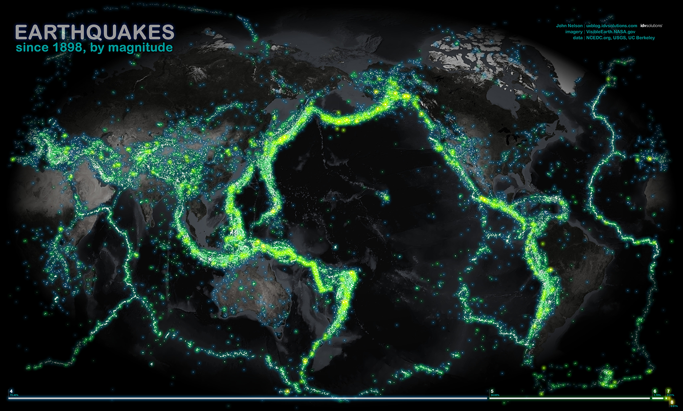
The earthquake in the history of earthquakes , the visual atom is a cartographic point:
Dollar and its degrees on a logarithmic money gram , atom - pixel:
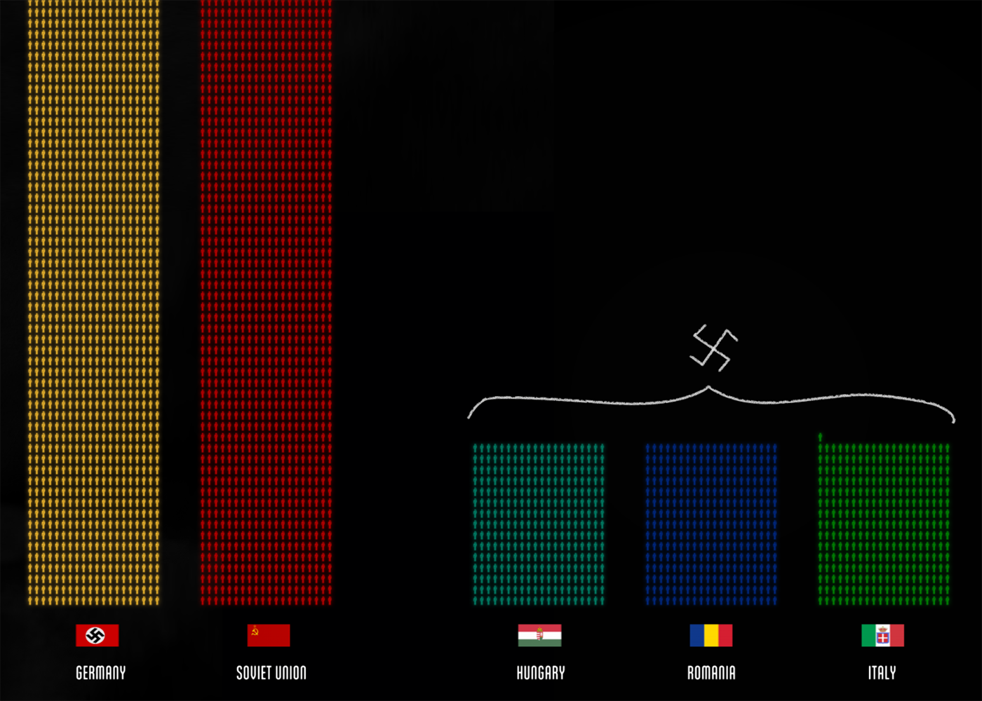
The soldier and the civilian in the visualization of the losses "Fallen.io" , atom - object - the image of a man with a gun and without:
Flag on flag visualization, atom - object - flag image:
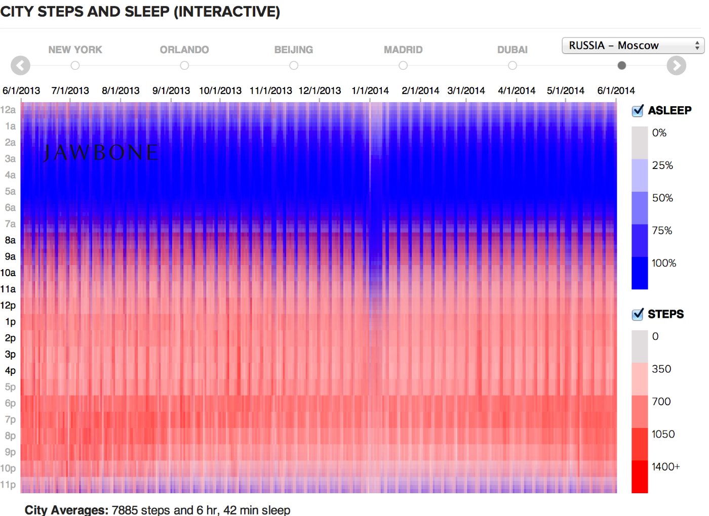
The hour of the day (activity or sleep) on the diagram of the rhythm of urban life , the atom is a cell with two-color coding:
Attempt to answer the question in the statistics of the SDA simulator , the visual atom is a cell with a traffic light gradient:
Company on the chart of tax rates spread , atom - circle:
Goal and scoring chances in football analytics , atom - segment - the trajectory of the impact on the football field:
Candidate for the visualization of the “Huntflow” hiring process , atom - a line of unit thickness - the candidate's path through the funnel:
A state that changes its political mood , an atom is a line with thickness:
The segments between stations on the routes of Swiss trains, the atom is a cartographic line with a thickness of:
Employment dynamics in various industries of Minnesota residents, atom - mini-chart:
Read more about visual atoms and their properties here .
Frame and axles
Interactive visualization lives in two dimensions of the screen plane. It is these two dimensions that give the mass of data "rigidity", systematize the visual atoms and serve as a visualization framework. How these two dimensions are used depends on how interesting, informative and useful the visualization will be.
On a good visualization, each dimension corresponds to an axis that expresses a meaningful data parameter. I divide the axes into continuous (including the axes of space and time), interval, layered and degenerate.
We get acquainted with continuous axes at school when we build parabolas:
In general, under the schedule usually understand just such a frame - from two continuous axes. Often, the graph shows the dependence of one quantity on another, in which case, according to the established tradition, the independent quantity is postponed horizontally, and supposedly dependent - vertically:
A graph of two continuous axes with object points:
Sometimes, average values are marked on the axes, and the graph is divided into meaningful quadrants (“dear scoring players”, “cheap scoring”, etc.):
Also on the chart you can draw the rays, they will show the ratio of the parameters plotted along the axes, which in itself can be a significant parameter (in this case, competition in the industry):
For visual display of the parameter with a large spread of values, an axis with a logarithmic scale is used:
An important special case of continuous axes is the axis of space and time , for example, a geographical coordinate or a time line. A map, a type of football field or basketball court, a production scheme are examples of the combination of two spatial axes.
Charts with a temporary axis are the first abstract graphs that marked the beginning of data visualization:
And they still apply with success:
Another way to show the time dimension is to add a slider to the spatial picture:
In exceptional cases, space and time can be combined on a flat map or along the same spatial axis:
The interval axis is divided into segments (equal or unequal), to which the value of the parameter is assigned according to certain rules. The interval axis is suitable for both qualitative and quantitative parameters.
Hitmep is a classic example of a combination of two interval axes. For example, the number of cases of the disease by state and year, shown on the corresponding frame:
The bar chart is an example of a combination of interval (time span) and continuous (value) axis:
Two interval axes are not required to turn into a hitmap:
The layered axis lays at once several parallel axes (continuous and interval) in one dimension. Most often, this technique works with Timelans, when layers of data, texts and graphics are superimposed on one time axis:
Sometimes visualization requires a degenerate axis to which a specific parameter is not tied, or on which only two values are shown. Most often this happens when the visualization illustrates the connection - to show the connection, the space between the objects is necessary.
The “was-become” data most often requires a degenerate axis:
But it does not necessarily “eat up” the on-screen measurement:
A degenerate axis is valid if it reveals the important features of the data and thus “pays for” the loss of the whole screen measurement. But it is worth using it only as a last resort. Unfortunately, in spectacular popular infographic formats, one or even both screen axes are often degenerate.
Another way to use screen space is to fill it with successive blocks of a uniform grid . Objects inside the grid are ordered linearly, for example, alphabetically:
Or the size of the city:
The grid adapts to the size of the screen and has no pronounced horizontal and vertical guides.
In most cases, the visualization framework is made up of the axes listed above. A rare exception is the three-dimensional visualization, even more rare - successful examples of them:
In cases where the choice of the frame is not obvious, I combine the axes with important parameters more or less randomly, formulate what question a particular axis combination answers, choose the most successful combinations. Interesting pictures are obtained at the interface of supposedly dependent data parameters:
The behavior of countries on analytical graphs "Hepmeinder"
And from the distribution of data particles along different axes:
Results of Formula 1 pilots by time, number of races and age of pilots
In interactive combinations of simple frames, truly powerful visualizations are born. Timeline + map:
Cash turnover in the Russian Federation
Map + HitMap:
Resistance map for SRI FHM
Several graphs of the same type:
Analysis of ticket prices for Tutu.ru
Summary
So, this is how I see the process of creating a visualization from beginning to end.
1. Move from tables and slices to data reality.
2. Find the particle or particles of data from which the mass of data is built.
3. To pick up visual atoms for the embodiment of data particles. Visual atoms are selected in such a way as to fully and clearly disclose the properties of a particle of data. The closer the visual embodiment to the physical meaning of the attribute, the better.
4. On the screen, the mass of data is expressed by the visual mass. It happens that individual atoms are distinguishable in the visual mass, in other cases they are averaged and added.
5. In addition to the mass of data, in reality, data is a set of dimensions in which the data live.
6. These measurements on the screen collapse into a flat frame. The framework systematizes the visual atoms, gives the mass of data "stiffness" and reveals it from a certain side.
7. Visualization is supplemented with an interface for controlling a mass of data (for example, sampling and search) and a frame (for example, setting axes).
Algorithm Δλ while in the process of work, constantly updated, supplemented and improved. I tried to present it succinctly and consistently, but the framework of one habrapost for this is cramped, and much remains behind the scenes. I will be happy to comment, happy to explain incomprehensible moments and answer questions.
To get acquainted with the algorithm "first-hand" and learn how to use it, come to the course on data visualization , which I will conduct in Moscow, on October 8 and 9. In addition to the algorithm, the participants familiarize themselves with D3.js, a powerful tool for implementing non-standard data visualization solutions.
Source: https://habr.com/ru/post/311210/
All Articles