UWP beginner: Responsive Design (VB.NET + C #)
We continue the story of the development of a universal Windows platform (UWP). The topic of this article was born because of a large number of questions about it to the author from independent UWP application developers. For some, it may seem quite obvious, but we hope that you will find in the article a useful life hack on adaptive design in UWP.
The article was prepared jointly with an active member of the Microsoft Developer community, Alexey Plotnikov , and a manager for working with technical audiences, Stas Pavlov .

The first truth that any UWP application developer should remember is “thoughts as a user”. The second truth is that “without adaptive design, the application is doomed to a slow and painful death,” since the number of devices and screen extensions is simply enormous. The first and most common solution for creating an adaptive design that immediately comes to mind is adaptive triggers (AdaptiveTrigger).
')
Of course, it’s not worth writing another article about them, but for an understanding of further reasoning, a small reference will not hurt. Take the most common example of using adaptive triggers:
Run the project and see how the color will change from green to red and back as the window width changes.

If you do not understand what is happening here, then first you need to get acquainted with the concept of adaptive triggers. A good course on responsive design and responsive triggers is available at the Microsoft Virtual Academy. By the way, it will not be superfluous to go through it all - it will significantly expand your knowledge in the matter of developing UWP applications.
A nice feature of adaptive triggers is that we do not need to perform any actions in the code and this simplifies the division of labor between the designer and the developer, and in addition makes the project independent of the programming language used (C # or VB.Net).
At first glance, everything may seem extremely simple and obvious, but when you begin to apply the knowledge obtained above, you will encounter a number of arising questions and difficulties. The first thing that comes to mind is, “What is the width of the window to choose in order to see a suitable layout on the phone screen?” This question may seem silly, and the answer is quite simple - choose the highest value from the minimum. For example, in the code above, a width of 600 px is set, and in other examples and similar articles, 720 px is often found. Let's set 720 px, and then all devices whose screen width will be either less or equal to 720 px will have the presentation we need. And you will be right exactly until you turn your device to a horizontal position (remember the first truth?). For some, it may be a discovery, but there are devices in which the screen height is less than 720 px. Turning the device to a horizontal position, the height will become wide, the trigger will give us an idea for a narrow window that will completely break our layout.
To fully understand the picture, consider the example above with the following modification:
Run the project on the very first emulator from the Mobile Emulator 10.xxx debug list. WVGA 4 inch 512MB ”and put it in horizontal mode. As you can see, the StackPanel remained in the vertical orientation, although it would be more logical to see the horizontal one. The trigger did not work, because the width and height of the device in our case is less than 720 px.
Well, then let's choose a smaller value for the trigger, for example, 500. But even here we get the same problem, but on modern devices, where the screen width in the vertical orientation is more than 500. In fact, to reproduce the problem, we do not even need emulator device with low resolution. It is enough to run the application on a PC and make the window size as small as possible, and then reduce the width until it reaches the value from the trigger. StackPanel again does not look like we would like. By the way, if this problem seems insignificant to you, then remember that in Windows 10 on a PC we were able to fix four windows on the screen at once, which gives them just such proportions.

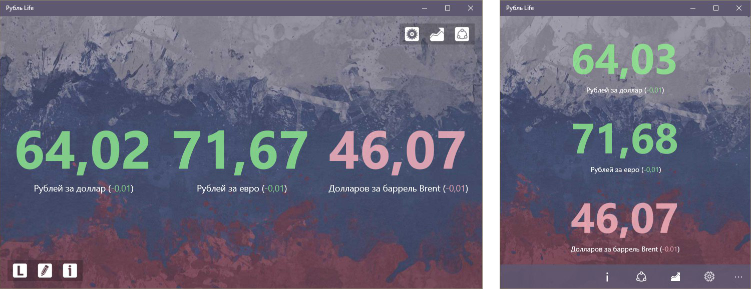
We turn to the solution. The StackPanel example shown above is not just an example for the sake of example, but the main part of a working draft, in which the indicated problem was the cornerstone. To understand what is at stake, consider the application "Ruble Life" from the co-author of the article, which displays currency rates in real time.
The application shows the position of the ruble in three main indicators - the rate against the dollar, the rate against the euro and the price for oil. It is logical to assume that for these purposes StackPanel is used, the orientation of which adjusts to the orientation of the device or the aspect ratio of the window. More precisely, it is under the aspect ratio. The advantage of the approach is that regardless of which device we use or in which position it is, the StackPanel has the appropriate orientation and it is convenient for the user to receive data.
How is such a campaign implemented in practice? Pretty simple. All you need to do is respond to the resize event in the head Grid and save the change to a variable / property, which we will then use when building the layout.
VB.NET
C #
In this example, the corresponding value is assigned to the property of its own class. Next, all you need is to bind the Orientation property of the StackPanel to the corresponding property in our class. You can also save the benefits of setting values in XAML and instead of setting the class properties, navigate to the desired visual state using
It is worth noting another trick that turns this solution into an ideal solution for such projects. In order not to guess the font sizes for different devices and screen resolutions, it is enough to wrap the StackPanel in the Viewbox and then on any device, from the smallest phones to large TVs, you will see a nice picture.
By the way, when studying the application "Ruble Life", you can also notice that when the aspect ratio changes, there are other changes in the interface. For example, if you run the application on a PC and deploy it to full screen, the application buttons will be located above and below, occupying free space, and if you compress the window, the buttons will disappear and the CommandBar will appear with a set of the same actions. On the contrary, if you run the application on the phone, we first see the view with the CommandBar, and turning the phone, the view with the buttons. This approach is truly universal and allows the user to get the preferred version of the interface, simply by changing the window size or turning the device.
What about StackPanel really works, you say, but what about more complex interfaces? You'd be surprised, but this approach can also be applied on more complex interfaces by combining the reaction to a change in the aspect ratio and the use of adaptive triggers. For example, you have a group of objects that forms a height of 600 px. No matter how you react to changes in the aspect ratio, it will not help you to make this group of objects convenient for perception if the height of the window or the screen height of the phone in a horizontal position is less than 600 px. For such situations adaptive triggers are needed. You can rebuild the group so that the objects begin to occupy a lower height, or hide / move less significant objects.
In conclusion, it is worth adding that the main idea of building an interface in response to a change in the aspect ratio is based on the fact that we do not always need to drastically change the interface for different types of devices and sometimes it’s enough to create two variants of the representation for situations that we called “horizontal” vertical "window / device location. For example, the standard Windows 10 application “Mail” has different XAML files for the version for PCs and phones, while the concept described above would also look quite logical. In particular, in the version for phones, turning the device to a horizontal position, the interface will not change, whereas there is enough space to display both the list of letters and the content of the letter according to the type of version for PC. In future articles, we will constantly resort to examples of the use of such a strategy, which will allow you to consolidate this material, or, alternatively, develop your own method of constructing universal and adaptive interfaces.
The first article in the UWP beginner series: The title of the window in applications .
The article was prepared jointly with an active member of the Microsoft Developer community, Alexey Plotnikov , and a manager for working with technical audiences, Stas Pavlov .
The first truth that any UWP application developer should remember is “thoughts as a user”. The second truth is that “without adaptive design, the application is doomed to a slow and painful death,” since the number of devices and screen extensions is simply enormous. The first and most common solution for creating an adaptive design that immediately comes to mind is adaptive triggers (AdaptiveTrigger).
')
Of course, it’s not worth writing another article about them, but for an understanding of further reasoning, a small reference will not hurt. Take the most common example of using adaptive triggers:
<Grid x:Name="LayoutRoot"> <VisualStateManager.VisualStateGroups> <VisualStateGroup> <VisualState x:Name="WideState"> <VisualState.StateTriggers> <AdaptiveTrigger MinWindowWidth="600" /> </VisualState.StateTriggers> <VisualState.Setters> <Setter Target="LayoutRoot.Background" Value="Green" /> </VisualState.Setters> </VisualState> <VisualState x:Name="NarrowState"> <VisualState.StateTriggers> <AdaptiveTrigger MinWindowWidth="0" /> </VisualState.StateTriggers> <VisualState.Setters> <Setter Target="LayoutRoot.Background" Value="Red" /> </VisualState.Setters> </VisualState> </VisualStateGroup> </VisualStateManager.VisualStateGroups> </Grid> Run the project and see how the color will change from green to red and back as the window width changes.
If you do not understand what is happening here, then first you need to get acquainted with the concept of adaptive triggers. A good course on responsive design and responsive triggers is available at the Microsoft Virtual Academy. By the way, it will not be superfluous to go through it all - it will significantly expand your knowledge in the matter of developing UWP applications.
A nice feature of adaptive triggers is that we do not need to perform any actions in the code and this simplifies the division of labor between the designer and the developer, and in addition makes the project independent of the programming language used (C # or VB.Net).
At first glance, everything may seem extremely simple and obvious, but when you begin to apply the knowledge obtained above, you will encounter a number of arising questions and difficulties. The first thing that comes to mind is, “What is the width of the window to choose in order to see a suitable layout on the phone screen?” This question may seem silly, and the answer is quite simple - choose the highest value from the minimum. For example, in the code above, a width of 600 px is set, and in other examples and similar articles, 720 px is often found. Let's set 720 px, and then all devices whose screen width will be either less or equal to 720 px will have the presentation we need. And you will be right exactly until you turn your device to a horizontal position (remember the first truth?). For some, it may be a discovery, but there are devices in which the screen height is less than 720 px. Turning the device to a horizontal position, the height will become wide, the trigger will give us an idea for a narrow window that will completely break our layout.
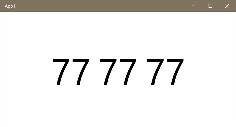
To fully understand the picture, consider the example above with the following modification:
<Grid x:Name="GlobalGrid"> <VisualStateManager.VisualStateGroups> <VisualStateGroup> <VisualState x:Name="WideState"> <VisualState.StateTriggers> <AdaptiveTrigger MinWindowWidth="720" /> </VisualState.StateTriggers> <VisualState.Setters> <Setter Target="MyStackPanel.Orientation" Value="Horizontal" /> </VisualState.Setters> </VisualState> <VisualState x:Name="NarrowState"> <VisualState.StateTriggers> <AdaptiveTrigger MinWindowWidth="0" /> </VisualState.StateTriggers> <VisualState.Setters> <Setter Target="MyStackPanel.Orientation" Value="Vertical" /> </VisualState.Setters> </VisualState> </VisualStateGroup> </VisualStateManager.VisualStateGroups> <StackPanel x:Name="MyStackPanel" HorizontalAlignment="Center" VerticalAlignment="Center"> <TextBlock Text="77" FontSize="100"/> <TextBlock Text="77" FontSize="100"/> <TextBlock Text="77" FontSize="100"/> </StackPanel> </Grid> Run the project on the very first emulator from the Mobile Emulator 10.xxx debug list. WVGA 4 inch 512MB ”and put it in horizontal mode. As you can see, the StackPanel remained in the vertical orientation, although it would be more logical to see the horizontal one. The trigger did not work, because the width and height of the device in our case is less than 720 px.
Well, then let's choose a smaller value for the trigger, for example, 500. But even here we get the same problem, but on modern devices, where the screen width in the vertical orientation is more than 500. In fact, to reproduce the problem, we do not even need emulator device with low resolution. It is enough to run the application on a PC and make the window size as small as possible, and then reduce the width until it reaches the value from the trigger. StackPanel again does not look like we would like. By the way, if this problem seems insignificant to you, then remember that in Windows 10 on a PC we were able to fix four windows on the screen at once, which gives them just such proportions.
We turn to the solution. The StackPanel example shown above is not just an example for the sake of example, but the main part of a working draft, in which the indicated problem was the cornerstone. To understand what is at stake, consider the application "Ruble Life" from the co-author of the article, which displays currency rates in real time.
The application shows the position of the ruble in three main indicators - the rate against the dollar, the rate against the euro and the price for oil. It is logical to assume that for these purposes StackPanel is used, the orientation of which adjusts to the orientation of the device or the aspect ratio of the window. More precisely, it is under the aspect ratio. The advantage of the approach is that regardless of which device we use or in which position it is, the StackPanel has the appropriate orientation and it is convenient for the user to receive data.
How is such a campaign implemented in practice? Pretty simple. All you need to do is respond to the resize event in the head Grid and save the change to a variable / property, which we will then use when building the layout.
VB.NET
Private Sub GlobalGrid_SizeChanged(sender As Object, e As SizeChangedEventArgs) If e.NewSize.Height > e.NewSize.Width Then MyApplicationData.Orientation = Vertical Else MyApplicationData.Orientation = Horizontal End If End Sub C #
private void GlobalGrid_SizeChanged(object sender, SizeChangedEventArgs e) { if (e.NewSize.Height > e.NewSize.Width) MyApplicationData.Orientation = Orientation.Vertical; else MyApplicationData.Orientation = Orientation.Horizontal; } In this example, the corresponding value is assigned to the property of its own class. Next, all you need is to bind the Orientation property of the StackPanel to the corresponding property in our class. You can also save the benefits of setting values in XAML and instead of setting the class properties, navigate to the desired visual state using
VisualStateManager.GoToState() .It is worth noting another trick that turns this solution into an ideal solution for such projects. In order not to guess the font sizes for different devices and screen resolutions, it is enough to wrap the StackPanel in the Viewbox and then on any device, from the smallest phones to large TVs, you will see a nice picture.
By the way, when studying the application "Ruble Life", you can also notice that when the aspect ratio changes, there are other changes in the interface. For example, if you run the application on a PC and deploy it to full screen, the application buttons will be located above and below, occupying free space, and if you compress the window, the buttons will disappear and the CommandBar will appear with a set of the same actions. On the contrary, if you run the application on the phone, we first see the view with the CommandBar, and turning the phone, the view with the buttons. This approach is truly universal and allows the user to get the preferred version of the interface, simply by changing the window size or turning the device.
What about StackPanel really works, you say, but what about more complex interfaces? You'd be surprised, but this approach can also be applied on more complex interfaces by combining the reaction to a change in the aspect ratio and the use of adaptive triggers. For example, you have a group of objects that forms a height of 600 px. No matter how you react to changes in the aspect ratio, it will not help you to make this group of objects convenient for perception if the height of the window or the screen height of the phone in a horizontal position is less than 600 px. For such situations adaptive triggers are needed. You can rebuild the group so that the objects begin to occupy a lower height, or hide / move less significant objects.
In conclusion, it is worth adding that the main idea of building an interface in response to a change in the aspect ratio is based on the fact that we do not always need to drastically change the interface for different types of devices and sometimes it’s enough to create two variants of the representation for situations that we called “horizontal” vertical "window / device location. For example, the standard Windows 10 application “Mail” has different XAML files for the version for PCs and phones, while the concept described above would also look quite logical. In particular, in the version for phones, turning the device to a horizontal position, the interface will not change, whereas there is enough space to display both the list of letters and the content of the letter according to the type of version for PC. In future articles, we will constantly resort to examples of the use of such a strategy, which will allow you to consolidate this material, or, alternatively, develop your own method of constructing universal and adaptive interfaces.
The first article in the UWP beginner series: The title of the window in applications .
Source: https://habr.com/ru/post/311130/
All Articles