Development of user interaction with mobile devices - key principles
The most important thing to remember when developing a mobile application is that it should be both useful and intuitive . If the application is not useful, then it has no practical value for the user, and there is no motivation to use it. If the application is useful, but learning to work with it requires a lot of time and effort, then people will give up on it.
Good UI design solves both these design problems:
')
- To be useful, the mobile application must be completely user oriented . That installs your application because it needs to solve the problem that is urgent for it. Thus, the application has a well-defined "understanding of the goal." Think about what your users are trying to accomplish, focus on their key goals, and remove all obstacles from the path leading to them .
- The user interface must be very clear . To effectively use the interface you have developed, it must be easy to understand what it is for and how to use it. There simply should not be the slightest place for any confusion.
Below are 9 principles of development, which, in my opinion, are key in ensuring, indeed, high-quality user interaction.
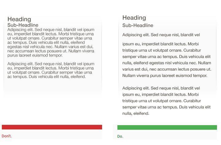
1. Do not overload
Attention of the user is a valuable resource and must be distributed accordingly. Cluttering up the interface overloads your user with information: every added button, image and text line complicate the picture on the screen.
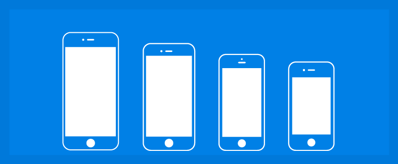
Congestion is a flaw in a desktop application or website, but on a mobile device it has even more serious consequences. Image received from ftrain
There is a famous statement by the writer Antoine de Saint-Exupéry: "Perfection is achieved not when nothing can be added, but when nothing can be removed." In the interface of the mobile application, it is important to get rid of everything that is not absolutely necessary ; reduced workload improves understanding.
A simple rule of thumb: there should be only one main action in each window . Each window you develop for an application should support only one single action that is valuable to the user. This makes it easy to learn, use and add, or embed when needed. Having a hundred well-thought-out windows is better than having one clogged up to the limit.
Take Uber for example. Uber knows that the purpose of the user of this application is to order a taxi. Therefore, the application does not load the user with other information: it automatically determines the location of the calling device based on satellite data, and the user must select only the end point of the route.

One of the main rules for ensuring good user interaction is to reduce the amount of user effort on the way to the desired result.
2. Provide intuitive navigation
User assistance in navigation should be prioritized for each application. Good navigation should be felt as an invisible hand guiding the user along his path. In the end, even the coolest thing or the most attractive content is useless if people can't find it. The principles of good navigation in the application for a mobile device:
- Navigation should be clear . Proper symbols (correct visual images) must be used so that navigation does not require any explanations, and care should be taken that each navigation element (such as an icon) leads to a proper destination.
- Navigation in the mobile app must be consistent throughout the app. Do not allow the location of navigation controls on different pages in different places or, in general, their absence. This will greatly complicate the user's actions.
- Navigation should provide the user with information about his current location in the application . The absence of such an indication is probably one of the most common errors found in many application menus. “Where am I?” Is one of the main questions that users need to answer when navigating.
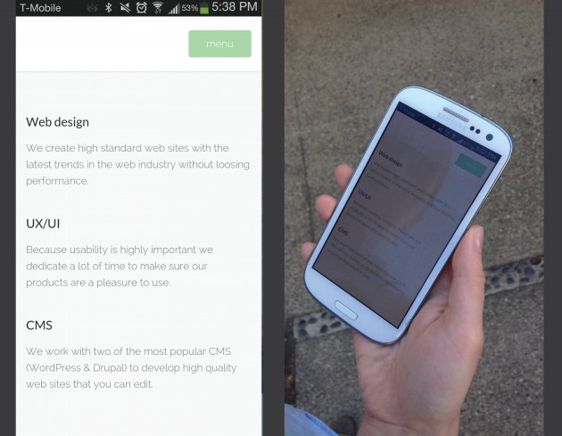
3. Provide thoughtful interaction
You can not think about the development of navigation in the application for a mobile device in isolation. Creating thoughtful interaction between mobile, desktop and tablet devices is of great importance to your users.

Apple Music
Take Apple Music as an example. You can put a playlist on your Mac, and it will immediately become available on your iPhone. Apple recognizes that, while the structure of a mobile application is extremely important, thoughtful interaction between the iPhone, Mac and iPad is also important for users.
4. Develop touch controls that are finger-friendly.
It is easier for users to handle large sensor controls than small ones. When developing interfaces for mobile devices, it is better to make controls large enough to make it easier for them to get through.
The dimensions of the control should be 7-10 mm, so that the finger can precisely cover it. This element allows the user to conveniently position the finger inside it. The edges of the element will be visible from under the finger. This provides the user with clear feedback indicating that contact with the control is assured.

User interface controls should be large enough to clearly register fingertip contact, without interfering with user inappropriate response and small size. Image received from Apple.
It is also necessary to ensure sufficient distance between the sensor elements.
5. Texts should be readable.
Smartphone screens are small compared to desktop computers, so one of the problems with developing their applications is to place the required information on a small interface. It is tempting to squeeze everything to ensure the maximum amount of information. But do not give in to this temptation.
Mobile rule of thumb: text must be at least 11 points in size so that it can be readable at a typical viewing distance without magnification.
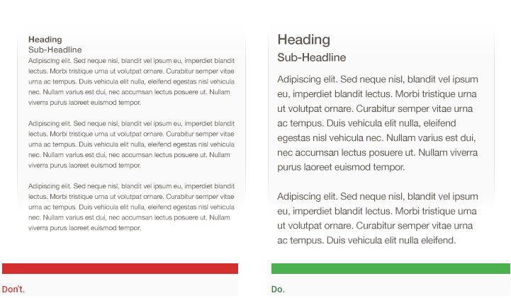
Image received from Apple.
It is necessary to improve readability by increasing the height of lines or the spacing between characters. A good average gap can make some of the hard-to-read interfaces attractive and simple.
A good user interface looks spacious. Image received from Apple.
6. Make the interface elements well visible.
Use color and contrast to help users see and understand your content. Choose primary, secondary and accent colors for your application so that they maintain ease of use. Provide sufficient color contrast between the elements so that visually impaired users can see and use your application.
Provide a contrast between the font color and background so that the text is readable. The W3C recommends the following contrast values for body text and image text:
- Small text should have a contrast of at least 4.5: 1 relative to the background.
- Large text (starting at 14 points for bold and 18 points for normal) should have a contrast of at least 3: 1 relative to the background.

Text that does not meet the guidelines for color contrast is difficult to read. Image received from Apple.
It is extremely important to have sufficient contrast on a mobile device: when outdoors, the contrast can be low due to ambient light.
The neutral gray color of this page looks good indoors, but when outdoors, the impression is different. Image received during testing.
Pictograms or other critical elements should also use the contrast values recommended above.

Pictograms that do not meet the recommendations for color contrast are difficult to distinguish from the background. The image is derived from the Material Design instructions.
7. Develop controls based on hand position.
Stephen Huber in his study on the use of mobile devices showed that 49% of people rely only on the thumb to carry out some operations on their phones. In the figure below, the areas shown on the screens of mobile phones color roughly inform which areas of the screen a user can reach with his thumb to interact with them.
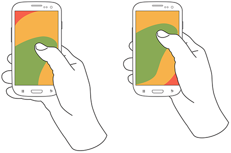
Comfortable zones to control your smartphone with one finger. Image received from uxmatters .
Green areas can be easily accessed by the user; yellow areas require some tension, and to get the red areas the user must change the position of the device in his hand. Hand positions and grip should be considered when placing mobile device controls:
- It is important to locate the top-level menu, frequently used controls and elements of typical actions in the green area of the screen, since they can then be conveniently reached with one finger.
Typical actions of a tambler. Image received from Capptivate .
- Critical actions (such as, for example, deleting or erasing) should be placed in a hard-to-reach red zone to prevent them from starting accidentally.
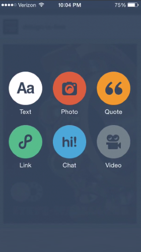
8. Minimize keyboard input.
Keyboard entry on a mobile device is a slow process in which errors occur easily. Therefore, it is better to always try to minimize the amount of keyboard input required to use a mobile application:
- Forms must be extremely short and simple and contain only absolutely necessary fields.
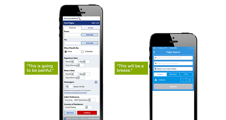
There are no people who would love to fill out forms. And the longer or more complex the form seems, the less likely it is that the user will enter it and start filling out forms. Image received from Lukew .
- Use autocomplete and personalized data where appropriate, so that the user is required to enter only some minimum information.
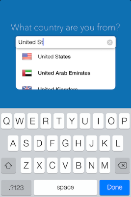
AutoFill field for country
9. Test your development
Extremely often, a mobile application looks great on the big screen of a desktop computer, but it turns out to be just several times worse when tested on a real mobile device. Even it seems that the product of interaction with the user, thoroughly worked out, will eventually contain some defect, which will manifest itself in the conditions of actual use. Therefore, it is extremely important to test your application with real users on a variety of mobile devices . You must ask real users to perform their regular tasks; only after that it will be possible to understand how well your development really works. Consider your application as a constantly evolving object , using data from analytics and user feedback to continually improve interaction.
Conclusion
Just as with any other elements of the development, the above tips are only a starting point for reflection. Connect and align these ideas with yours to get the best results. Always remember that any project is intended, first of all, not for developers, but for users .
Source: https://habr.com/ru/post/310956/
All Articles