A series of interface updates "Habrahabra" and Geektimes
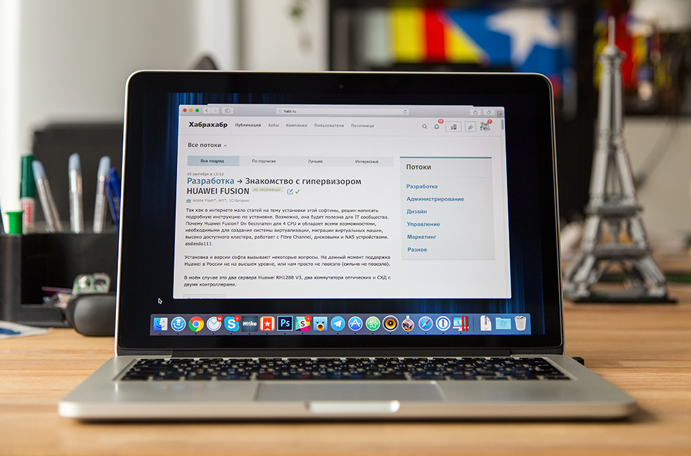
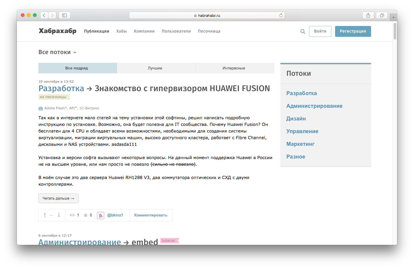
Today we present the first of the three stages of the interface updates "Habrahabr" and Geektimes. We decided to return the old interface solution for navigating the site and abandoned the vertical menu in favor of the traditional horizontal one. You can read more about this update, as well as about our plans to work on the interface under the cat.

From the very beginning on "Habré" there was a classic horizontal navigation menu. A few years ago we decided to try another solution that allowed us to make Habr more like a classic reader. Over time, it became clear that this approach does not work as we would like, so we decided to roll back and return the old horizontal navigation menu.

In the process of working on the update, we were very enthusiastic and thought out many other solutions. In order not to stretch the development process and redesign smoothly, we decided to move in small iterations. Today you can see the first result - we have expanded the vertical navigation menu and made it horizontal. In addition to many undoubted advantages, the rejection of such a solution also allows solving important tasks:

At the second stage, we will update the second level menu, work with filters and sorting publications in the feed. The purpose of this iteration is to improve the work with content sorting. The functionality similar to the main tapes will be added to each stream, with which you can customize the issue of posts to your taste. For example, it will be possible to see the best publications in the “Administration” stream for the past month - now it is possible only with the main tape, without breaking down into streams.
At the third stage, we will touch on the content part, namely the visual component of the tape and the publication page. Plans include working on typography, a fixed width of the content part, comments and other elements. This update aims to make the process of reading publications more comfortable.
We plan to unload the second and third stage of updates by the end of the year. If you have suggestions and comments on improvements, you can write about it in the comments, we will definitely read and discuss within the team.
* UPD * If post headers and other text elements of the site are not displayed in your browser, install the Fira Sans font in the system.

From the very beginning on "Habré" there was a classic horizontal navigation menu. A few years ago we decided to try another solution that allowed us to make Habr more like a classic reader. Over time, it became clear that this approach does not work as we would like, so we decided to roll back and return the old horizontal navigation menu.

In the process of working on the update, we were very enthusiastic and thought out many other solutions. In order not to stretch the development process and redesign smoothly, we decided to move in small iterations. Today you can see the first result - we have expanded the vertical navigation menu and made it horizontal. In addition to many undoubted advantages, the rejection of such a solution also allows solving important tasks:
- The main sections of the site are now in sight again;
- Due to a slight refinement of the site grid, we took the first steps towards the fixed width of the content part: its maximum width decreased from 1000px to 780px, the minimum - increased from 584 px to 640 px;
- The “Up” scroll button now occupies the entire left area of the site;
- Site search is now in the header'e again on all pages (and is available by hotkey "/");
')
- When viewing the full version of the site from mobile devices, the space previously allocated to the menu is now used for content;
- We gave up an extra click to go to the “Tracker” section, which, in essence, is also the first step towards its improvement;
- Administrators of corporate blogs will have a separate button to quickly jump to the company's blog;
- Everything related to the user account, as usual, remains in a separate menu item. The control buttons are scaled according to the size of the window.

At the second stage, we will update the second level menu, work with filters and sorting publications in the feed. The purpose of this iteration is to improve the work with content sorting. The functionality similar to the main tapes will be added to each stream, with which you can customize the issue of posts to your taste. For example, it will be possible to see the best publications in the “Administration” stream for the past month - now it is possible only with the main tape, without breaking down into streams.
At the third stage, we will touch on the content part, namely the visual component of the tape and the publication page. Plans include working on typography, a fixed width of the content part, comments and other elements. This update aims to make the process of reading publications more comfortable.
We plan to unload the second and third stage of updates by the end of the year. If you have suggestions and comments on improvements, you can write about it in the comments, we will definitely read and discuss within the team.
* UPD * If post headers and other text elements of the site are not displayed in your browser, install the Fira Sans font in the system.
Source: https://habr.com/ru/post/310592/
All Articles