Layout: display custom content
By user content in this article, we mean any text on a page authored by the user. Most often these are comments, user posts “on the wall” in the microblogging, information “about yourself” in the profile and all that sort of thing. The task is not that very difficult, but it requires attentiveness and a good understanding of the basics of typesetting. This article attempts to put together the most important thing you need to know about the layout, including custom text.

User content is different from the usual in that it is unpredictable. User can:
All this we must take into account and correctly display on the page. For us, this turned out to be especially important in the process of working on the Layout Designer for Light Client 8, which includes a set of universal web controls. The presentation of the card is made up of these controls, respectively, they are almost entirely filled with user-generated content and must be correctly displayed in any context, in any combination with each other.
')
First of all, it should be said that if there is a user text somewhere on the page, then it is necessary to provide a case when it will be too long. Here, as a rule, everything is solved in one of two ways:
1. Trimming excess text with dots,
2. Transfer to a new line (here it is often desirable to preserve the original text formatting - spaces and line breaks).
Both cases have their own nuances, but the main problem both there and there is the correct limitation of the width of the block containing custom text. Our plan is as follows: first, we’ll understand how to make ellipses work and how to display multi-line content correctly, and then see what causes problems with restricting the width of the block and how to solve them effectively.

Making the ellipsis simple is as easy as one-two-three:
1. Limit the width of the block (see later in this article);
2. Set the rules for this block (specifically for it):
3. The element containing the text inside the block (if the text is in nested elements), as well as all its parents, up to the block, must have display: inline . In addition to the text in the block, there may be other non-inline-elements, it is only important that the text itself and its parents are inline.
If the ellipsis does not work, then the debugging algorithm is simple:
1. In DevTools we look at the width of the text, and the width of all its parents in turn;
2. Find an element that should limit the width, and if it “spreads out”, then we force it to return to the frame;
3. Check that all CSS properties given above are set in it;
4. We check that all elements from the block to the text have display: inline.
If you have a global service focused on the whole world, then it is necessary that the "points" of ellipsis appear on the right side for Arabic and other languages with the opposite direction of the text.
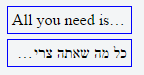
To do this, you need to programmatically determine the direction and set the corresponding value of the direction property in css, or the value of the HTML attribute dir. In the twitter library RTLtextarea , for example, the text direction is defined like this:
The logic of specifying the direction of the text is convenient to put in the directive in the case of using AngularJS or in the stateless component in the case of ReactJS.
And, of course, if you decide to cut the text with the help of dots, then it is important not to forget to add a tooltip with the full content of the element:
Or give the user the opportunity in some other way to see the entire text.

For the line wrapping option, the main problem is long words and formatting. Preparing the material for this article, I decided to see how it is solved on the advanced sites focused on user content. This includes facebook, twitter, vk, linkedin, livejournal, classmates, g +, youtube, yandex market, instagram, commenting systems hyper comments, disqus, intense debate, cackle, livefyre, and of course, habr.
When I finished making this table, I had only one impression:

As you can see, preprocessing is used almost everywhere (programmatic replacement of line breaks with tags <br> <br> spaces with & nbsp; and breaking long words with <wbr>). At the same time, often spaces in user messages are simply lost. This is quite sad, given the fact that there is a simple and effective solution to the problem, which consists in: a) limiting the width of the block and b) adding only two rules:
Or, if you prefer not to break long words into several lines, but cut with dots:
Or, if you still specifically want to remove the text formatting:
It works in all browsers up to IE8 and beautifully solves the problem of long words and formatting. However, for some reason, only twitter, classmates, youtube and cackle resorted to this method. Mayakovsky just turns over in his grave, when, for example, you try to post in vk something like:
Mayakovsky - Sergei Yesenin (excerpt)
I sincerely hope that the vk command will see this article and replace the preprocessing with just such a piece of code in their styles (they already use word-wrap: break-word):
And, of course, you should remember to process url in user messages, replacing them with links. The problem is not trivial, but there are many good ready-made solutions for it .
Particular difficulties in keeping the element within the prescribed limits arise when using multi-line text containing long words. It often happens that the layout behaves well with normal content, but it is worth adding a long word - and everything creeps loosely :

This must be remembered and always test this case in different browsers before you finish the work.
The fight against the spread of elements is specific for each type of element (block, inline-block, etc.). Therefore, when debugging such cases, it is necessary to run up through the parents of the problem element and find the “weak link”. Consider each of the types of elements separately.
1) display: block;
This is the most friendly option for the typesetter, because he always holds firm within the parent. If the parent is limited, then for such an element you don’t even need to specify anything further. If you set the width or max-width, then it will behave as we expect.
2) display: inline-block;
Such elements are less strong in spirit and can easily indulge in ugly liberties regarding their width. However, it is worth asking for them the width or max-width, as everything falls into place. In general, add
never hurts. It is pretty safe and usually breaks nothing. But it gives you a guarantee that the inline-block will always be within the limits of its parent.
3) float
When an element is suspended on a float, then even a block loses all its confidence and is likened to a weak-willed inline-block. Setting the width or max-width returns its orthodoxy, and also max-width: 100% is a good idea here. This is generally so a good rule that I would make 100% the default value for the max-width property. In the end, we decided to do the default min-width: auto in the flexbox specification, which is much more dangerous. But more about that later.
Changing block behavior with float is all you need to know about float. The remaining elements already require the limitation of their width, and nothing changes for them.
4) display: table;
This is perhaps the most out of the "loose" elements. The table will stubbornly stretch the content , ignoring all the width and max-width, and nothing will shake its liberal views. Until the following rule is added:
It immediately teaches the table, and a simple width or max-width solves all problems with width.
5) display: flex;
Flexbox is incredibly cool, and allows you to do in a simple way what is otherwise very difficult, or impossible at all. However, using it to display custom content is not yet the best idea. At least, if you intend to correctly handle long words and support IE10.
If you do not take into account the IE10, then everything is fine. You just need to know a couple of features and properly configure flexbox. The flexbox container (where display: flex is given) does not interest us in this case, since there are no problems with it. Problems arise with the elements of the container, and here it is necessary to observe the following rules:
1. First, the shrink-factor (the second parameter of the flex property) must be greater than zero in order for the browser to take over the compression of our element.
2. Secondly, you need to reset to 0 the notorious property min-width. Its auto value was introduced specifically for flexbox , and also made the default. For me personally, this has always been a source of flexbox's unpredictable intuitive behavior until I knew about it. In particular, long words will stretch flex-elements instead of being carried over break-word (similar to white-space: nowrap ). And, which is especially sad, they don’t write about it anywhere. None of the “full manual” on flexbox says a word about this trap. I once found out about this by chance, having gotten through a search on the Firefox bugtracker, where developers, explaining browser behavior, referred to the specification (Firefox implemented this part of the specification before Chrome, so some considered it a Firefox bug, because min-width: auto "flexbox behaves differently than expected).
3. It seems that the first two rules should have been enough, but in practice, to compress long words, browsers also need to specify flex-basis (the third parameter of the flex property), which is different from auto. Accordingly, it is important that grow-factor (the first parameter of the flex property) be greater than zero, since otherwise, our element will shrink to flex-basis (for example, to zero if flex-basis: 0).
Thus, in order to work properly with long words, it is necessary to set the following two rules:
Notice that the third value in the flex property is set to units. This is a bug in IE11, and nothing works without it. In addition, for some reason it is better to use 0% instead of 0px (thanks to the monochromer for the link). Instead of zero, you can, of course, specify something else (besides auto), and instead of units for grow and shrink factors, anything but 0.
However, unfortunately, this doesn't work in IE10 - long words ruthlessly stretch elements, no matter what. You can, of course, set the width or max-width, but in the case of flexbox, as a rule, this can not be done, because the width of the element is unknown in advance (or it will not be a flexbox anymore). For example, a simple layout: the icon and text on the right . The icon occupies a certain width, and the text - the entire remaining space of the container. If you can get this example to be displayed in IE10 by means of flexbox in the same way as in IE11, please write in the comments. Check here .
That's all, if something is missed, write in the comments. Have a nice layout!
PS Special thanks to Vadim Makeev , Web standards manager and editor for the technical review of the article.
User content is different from the usual in that it is unpredictable. User can:
- enter the whole sentence where a couple of words were expected,
- use very long words (most often it’s a url, but maybe something like hundreds of exclamation marks),
- use old browsers,
- use a language with a different text direction,
- insert url and expect them to become links,
- and with all this, expect to preserve the formatting of their messages.
All this we must take into account and correctly display on the page. For us, this turned out to be especially important in the process of working on the Layout Designer for Light Client 8, which includes a set of universal web controls. The presentation of the card is made up of these controls, respectively, they are almost entirely filled with user-generated content and must be correctly displayed in any context, in any combination with each other.
')
First of all, it should be said that if there is a user text somewhere on the page, then it is necessary to provide a case when it will be too long. Here, as a rule, everything is solved in one of two ways:
1. Trimming excess text with dots,
2. Transfer to a new line (here it is often desirable to preserve the original text formatting - spaces and line breaks).
Both cases have their own nuances, but the main problem both there and there is the correct limitation of the width of the block containing custom text. Our plan is as follows: first, we’ll understand how to make ellipses work and how to display multi-line content correctly, and then see what causes problems with restricting the width of the block and how to solve them effectively.
Single line text
Making the ellipsis simple is as easy as one-two-three:
1. Limit the width of the block (see later in this article);
2. Set the rules for this block (specifically for it):
overflow: hidden; text-overflow: ellipsis; white-space: nowrap; // direction: rtl; ? 3. The element containing the text inside the block (if the text is in nested elements), as well as all its parents, up to the block, must have display: inline . In addition to the text in the block, there may be other non-inline-elements, it is only important that the text itself and its parents are inline.
If the ellipsis does not work, then the debugging algorithm is simple:
1. In DevTools we look at the width of the text, and the width of all its parents in turn;
2. Find an element that should limit the width, and if it “spreads out”, then we force it to return to the frame;
3. Check that all CSS properties given above are set in it;
4. We check that all elements from the block to the text have display: inline.
If you have a global service focused on the whole world, then it is necessary that the "points" of ellipsis appear on the right side for Arabic and other languages with the opposite direction of the text.
To do this, you need to programmatically determine the direction and set the corresponding value of the direction property in css, or the value of the HTML attribute dir. In the twitter library RTLtextarea , for example, the text direction is defined like this:
// . https://github.com/twitter/RTLtextarea/blob/master/src/RTLText.module.js function getDirection(plainText) { var rtlChar = /[\u0590-\u083F]|[\u08A0-\u08FF]|[\uFB1D-\uFDFF]|[\uFE70-\uFEFF]/mg; return plainText.match(rtlChar) ? "rtl" : "ltr"; } The logic of specifying the direction of the text is convenient to put in the directive in the case of using AngularJS or in the stateless component in the case of ReactJS.
And, of course, if you decide to cut the text with the help of dots, then it is important not to forget to add a tooltip with the full content of the element:
Or give the user the opportunity in some other way to see the entire text.
Multiline text
For the line wrapping option, the main problem is long words and formatting. Preparing the material for this article, I decided to see how it is solved on the advanced sites focused on user content. This includes facebook, twitter, vk, linkedin, livejournal, classmates, g +, youtube, yandex market, instagram, commenting systems hyper comments, disqus, intense debate, cackle, livefyre, and of course, habr.
| Resource | Long words | Line breaks | Spaces |
| habr (comments) | overflow: hidden | preprocessing | are lost |
| facebook (posts and comments) | word-wrap: break-word | preprocessing | are lost |
| twitter (tweets) | word-wrap: break-word | white-space: pre-wrap | white-space: pre-wrap |
| vk (posts and comments) | word-wrap: break-word | preprocessing | are lost |
| linkedin (posts and comments) | word-wrap: break-word | white-space: pre-line | are lost |
| livejournal (posts) | preprocessing (<wbr>) | html | html |
| livejournal (comments) | preprocessing (<wbr>) | preprocessing | are lost |
| classmates (notes) | word-wrap: break-word | white-space: pre-wrap | white-space: pre-wrap |
| classmates (comments) | word-wrap: break-word | preprocessing + white-space: pre-wrap (?) | white-space: pre-wrap |
| g + (posts and comments) | word-wrap: break-word | preprocessing | preprocessing |
| youtube | word-wrap: break-word | white-space: pre-wrap | white-space: pre-wrap |
| Yandex Market (discussions) | bug (stretched outwards) | preprocessing | are lost |
| Yandex Market (reviews) | word-wrap: break-word | preprocessing | are lost |
| instagram (comments) | word-wrap: break-word | input restriction | are lost |
| hyper comments | word-wrap: break-word | preprocessing | are lost |
| disqus | overflow: hidden | preprocessing | are lost |
| intense debate | overflow: hidden | preprocessing | are lost |
| cackle | word-wrap: break-word | white-space: pre-wrap | white-space: pre-wrap |
| livefyre | word-wrap: break-word | preprocessing | preprocessing |
When I finished making this table, I had only one impression:
As you can see, preprocessing is used almost everywhere (programmatic replacement of line breaks with tags <br> <br> spaces with & nbsp; and breaking long words with <wbr>). At the same time, often spaces in user messages are simply lost. This is quite sad, given the fact that there is a simple and effective solution to the problem, which consists in: a) limiting the width of the block and b) adding only two rules:
word-wrap: break-word; white-space: pre-wrap; Or, if you prefer not to break long words into several lines, but cut with dots:
overflow: hidden; text-overflow: ellipsis; white-space: pre-wrap; Or, if you still specifically want to remove the text formatting:
word-wrap: break-word; white-space: normal; It works in all browsers up to IE8 and beautifully solves the problem of long words and formatting. However, for some reason, only twitter, classmates, youtube and cackle resorted to this method. Mayakovsky just turns over in his grave, when, for example, you try to post in vk something like:
 For fun
            our planet
                        little equipped.
 Need to
     pull out
            joy
                   at the coming days.
 In this life
             to die
                     not difficult.
 Make a life
              much harder.
Mayakovsky - Sergei Yesenin (excerpt)
I sincerely hope that the vk command will see this article and replace the preprocessing with just such a piece of code in their styles (they already use word-wrap: break-word):
.wall_post_text { white-space: pre-wrap; } And, of course, you should remember to process url in user messages, replacing them with links. The problem is not trivial, but there are many good ready-made solutions for it .
Item width limit
Particular difficulties in keeping the element within the prescribed limits arise when using multi-line text containing long words. It often happens that the layout behaves well with normal content, but it is worth adding a long word - and everything creeps loosely :
This must be remembered and always test this case in different browsers before you finish the work.
The fight against the spread of elements is specific for each type of element (block, inline-block, etc.). Therefore, when debugging such cases, it is necessary to run up through the parents of the problem element and find the “weak link”. Consider each of the types of elements separately.
1) display: block;
This is the most friendly option for the typesetter, because he always holds firm within the parent. If the parent is limited, then for such an element you don’t even need to specify anything further. If you set the width or max-width, then it will behave as we expect.
2) display: inline-block;
Such elements are less strong in spirit and can easily indulge in ugly liberties regarding their width. However, it is worth asking for them the width or max-width, as everything falls into place. In general, add
max-width: 100%; never hurts. It is pretty safe and usually breaks nothing. But it gives you a guarantee that the inline-block will always be within the limits of its parent.
3) float
When an element is suspended on a float, then even a block loses all its confidence and is likened to a weak-willed inline-block. Setting the width or max-width returns its orthodoxy, and also max-width: 100% is a good idea here. This is generally so a good rule that I would make 100% the default value for the max-width property. In the end, we decided to do the default min-width: auto in the flexbox specification, which is much more dangerous. But more about that later.
Changing block behavior with float is all you need to know about float. The remaining elements already require the limitation of their width, and nothing changes for them.
4) display: table;
This is perhaps the most out of the "loose" elements. The table will stubbornly stretch the content , ignoring all the width and max-width, and nothing will shake its liberal views. Until the following rule is added:
display: table; table-layout: fixed; It immediately teaches the table, and a simple width or max-width solves all problems with width.
5) display: flex;
Flexbox is incredibly cool, and allows you to do in a simple way what is otherwise very difficult, or impossible at all. However, using it to display custom content is not yet the best idea. At least, if you intend to correctly handle long words and support IE10.
If you do not take into account the IE10, then everything is fine. You just need to know a couple of features and properly configure flexbox. The flexbox container (where display: flex is given) does not interest us in this case, since there are no problems with it. Problems arise with the elements of the container, and here it is necessary to observe the following rules:
1. First, the shrink-factor (the second parameter of the flex property) must be greater than zero in order for the browser to take over the compression of our element.
2. Secondly, you need to reset to 0 the notorious property min-width. Its auto value was introduced specifically for flexbox , and also made the default. For me personally, this has always been a source of flexbox's unpredictable intuitive behavior until I knew about it. In particular, long words will stretch flex-elements instead of being carried over break-word (similar to white-space: nowrap ). And, which is especially sad, they don’t write about it anywhere. None of the “full manual” on flexbox says a word about this trap. I once found out about this by chance, having gotten through a search on the Firefox bugtracker, where developers, explaining browser behavior, referred to the specification (Firefox implemented this part of the specification before Chrome, so some considered it a Firefox bug, because min-width: auto "flexbox behaves differently than expected).
3. It seems that the first two rules should have been enough, but in practice, to compress long words, browsers also need to specify flex-basis (the third parameter of the flex property), which is different from auto. Accordingly, it is important that grow-factor (the first parameter of the flex property) be greater than zero, since otherwise, our element will shrink to flex-basis (for example, to zero if flex-basis: 0).
Thus, in order to work properly with long words, it is necessary to set the following two rules:
flex: 1 1 0%; min-width: 0; Notice that the third value in the flex property is set to units. This is a bug in IE11, and nothing works without it. In addition, for some reason it is better to use 0% instead of 0px (thanks to the monochromer for the link). Instead of zero, you can, of course, specify something else (besides auto), and instead of units for grow and shrink factors, anything but 0.
However, unfortunately, this doesn't work in IE10 - long words ruthlessly stretch elements, no matter what. You can, of course, set the width or max-width, but in the case of flexbox, as a rule, this can not be done, because the width of the element is unknown in advance (or it will not be a flexbox anymore). For example, a simple layout: the icon and text on the right . The icon occupies a certain width, and the text - the entire remaining space of the container. If you can get this example to be displayed in IE10 by means of flexbox in the same way as in IE11, please write in the comments. Check here .
That's all, if something is missed, write in the comments. Have a nice layout!
PS Special thanks to Vadim Makeev , Web standards manager and editor for the technical review of the article.
Source: https://habr.com/ru/post/310544/
All Articles