Who, where and why they go: trends in mobile design 2016
In the world of mobile development, approaches to creating interfaces are particularly often subject to change and rethinking. This happens not only because of the latest fashion trends, but also from purely practical considerations, as well as with the development of the technologies themselves. We decided to analyze the most notable current trends in mobile design and compile a list of useful tools and blogs for interface designers at the end of the article.
Multilayer interfaces
The main difference between computers and mobile devices is the physical dimensions of the display. The lack of space on the screen for a long time was one of the reasons why the interfaces of mobile applications remained extremely simple (if not to say primitive), in comparison with PC programs.
By 2016, this difference is partially compensated by the use of multi-layer interfaces, in their device resembling a software stack or a stack of papers (which is closer to which analogy). The essence of this approach is to provide the user with one functional window at a certain point in time, while maintaining easy and quick access to all other windows.
')
In the construction of multilayer interfaces are often used:
- Tab bars . As in PC browsers or other familiar applications, the purpose of this element is to “pack” a large amount of information into a single interface element (tab). When using tabs, a good principle is “one tab = 1 window”.
- Dropdown lists . Used to implement the menu. Usually the lists are large, up to almost full screen fill. They contain a certain set of necessary options at the moment, which can be further divided into categories, which are nested drop-down lists, a sort of cascade approach.
- Fixed menu . Sets of the most frequently used and necessary functions. The purpose of this menu is to always remain visible on the screen and to guarantee the user the fastest access to the most important actions. To move such a menu from the usual places is highly undesirable.
- Modal windows . As in the desktop design, they are used to overlap all other windows. Thanks to this, all the user's attention is drawn to their content.
To enhance the visual differences between the layers of the interface, darkening effects are often used - only the active layer remains 100% visible, and all the others are hidden by applying a translucent mask.
Card layout
This trend has recently migrated from web design (where it was popularized, in particular, Facebook and Twitter), but has already won quite a few supporters.
The organization of the interface in the form of blocks of fixed size (usually rectangular or quadratic) has its advantages - this approach makes it easier to adapt the design to different screen resolutions. The entire reorganization of the UI to another resolution is reduced to sorting and resizing blocks based on the available working area. A rough idea of how this works in practice can be obtained by simply opening a Windows Explorer window and looking at how its contents are rebuilt when the window is resized.
The grid is the standard and easiest way to organize blocks of card designs. The main space for experiments is connected with the organization of the blocks. For example, you can replace a simple curly grid, or using different lengths and widths of columns, or dynamically change the distance between the elements - there are many opportunities to make the application unique.
As for the content itself, usually the block of card design combines the following elements:
- Headline
- Background image of the card.
- Control buttons.
- Text content (abbreviated, with the ability to expand).
- Secondary text (date, author, content size, etc.).
Today, this one is quite widely used in a variety of applications that work with many similar data types. Often, even the menu is implemented on the basis of card blocks.
Design for large devices
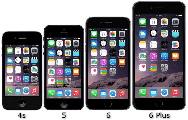
Recently, manufacturers have produced a lot of mobile devices with fairly large screens. For example, the display diagonal of the iPhone 6 Plus is 5.5 inches, which is quite a lot for a smartphone, to put it mildly.
A significant problem with such devices is the inconvenience of one-handed control. While in smaller smartphones most of the screen is within easy reach of the thumb, with large screens a comfortable area can be only about 1/4 of the area, depending on the user's hand. And if the application displays an important interface element, for example, in the center or at the top of the screen, then it is not very convenient when using devices with a large diagonal.
Therefore, interface developers are trying to take into account such situations. For example, they place controls only at the bottom of the screen, or use a more dense layout, so that users have to drag less if the interface is scaled.
IPhone ruler display size comparison:
Meaningful animation
It is not only and not so much about animating the interface for the sake of increasing attractiveness, but rather about improving usability and adding interactivity.
Various transformations of elements, highlighting, smooth transitions, the effects of zooming in, moving, hiding - all this, with proper and moderate use, emphasizes user actions, makes the interface more responsive and memorable. Many probably remember that in good video games you can “feel” this or that action - it is the high-quality and relevant animation effects that can form a very rich user experience.
However, one should not forget about possible “pitfalls” - no matter how high-quality and elaborate the animation itself, any visually noticeable “brakes” (caused by poor code optimization or weakness of hardware) nullify the positive effects. To avoid such problems, it is reasonable to provide the user with the option to disable the specials. effects.
Evolution in the use of gestures
Using gestures when working with touch screens is one of the most natural methods of navigation. Now there is a tendency to complicate gestures, when deployed combinations are lined up instead of the simplest movements. Being thought out and honed, they can significantly simplify interaction with the application and enhance management capabilities in general.
At the same time, experimenting with movements, it is worth remembering that introducing new gestures is justified only when they improve one of the already existing forms of interaction, simplify it or make it more natural. Otherwise, you can cause discontent of the user, because gestures, though capable of providing convenience, unattainable when using conventional interfaces, but harder to master them. In light of this, it is recommended to create “branded gestures” based on movements already familiar to the user.
Common gestures:

New tricks in navigation
Popularity is gained by modular, parallax and hidden scrolling, as well as endless scrolling. Until recently, these types of navigation were relatively rare in mobile design, although they compare favorably against the background of classic horizontal and vertical scrolling.
- Modular scrolling allows the user to navigate within one interface region without affecting anything else. This type of scrolling is well suited for applications that operate with a large amount of content presented in several independent areas of the screen.
- Parallax is a well-known effect in computer graphics. With it, you can draw the user's attention to certain elements, as well as use scroll animations.
- Hidden scrolling is the most invisible and is designed to save screen space - the scrolling elements appear only during its execution, and after some time disappear again. Suitable for scrolling in applications that display large content - slides, photos, etc.
- Infinite scrolling is widely known for its use in social networks. Often used when there is a large amount of information in the application, allowing you to keep the user's attention for a long time, increasing the depth of interaction.
Color and typography
The fashion for “coloring apps” is a product of the trend of flat design. In a flat design, white is most often used as a background color, but today designers are increasingly trying to stand out using less predictable colors.
An interesting practical point regarding color design: according to the results of testing conducted by Greenbot, using black in the interface (# 000000) results in significant battery saving on devices with AMOLED displays. However, on conventional LCD displays, this dependence is not observed.
As for the typographic trend, its importance is difficult to overestimate. In conditions of limited screen space, alignment and formatting of text and individual interface elements helps to convey maximum information in a well-structured form. Not surprisingly, now designers are trying to focus on the techniques of typographic layout.
Typography with a focus on colors:
Features and patterns of current trends
In general, design trends in 2016 are updated and optimized versions of trends and approaches in other segments that have already taken place. At the same time, the tendency of inheritance from the sphere of web design is clearly seen - approaches are borrowed, both in desktop and mobile versions of sites.
According to the degree of impact on the result (appearance, usability of the application), trends in design can conditionally be trends for key and secondary. The first always act in the foreground and remain in the focus of attention of the user. A secondary are rather individual strokes in addition to the overall picture. Users are less likely to give them a conscious assessment, but application developers should not underestimate the secondary functionality, since attention to detail is one of the components of good design.
In addition, it is worth mentioning the transition from Flat Design to Material Design: the first is extremely minimalist and is built on several basic colors, and the second is the same Flat, but using animation, shadows, transitions and other effects, the combination of which gives it more similarities with classical approaches (in particular, skevomorphism ). Flat Design has been widely used since 2010, when Microsoft began to introduce the so-called metro-design in its products. Then it was a new trend, a deliberately simplified and functional picture compared to the skeuomorphic and overloaded graphic effects interfaces. In 2014, Google went further and introduced a number of principles into Flat Design, thanks to which it “turned” into Material Design. Basically, the changes concerned not the graphic component, but the construction and interaction of the elements, their behavior. Today, Material everywhere shifts Flat from the pedestal of the “most progressive” design in the mobile segment.
Another curious trend, which has already practically turned into a design must have, is the layout in the style of Pixel Perfect, when the page layout is adjusted to a specific resolution with pixel accuracy. On the one hand, this allows you to avoid problems when scaling and automatically adapting layouts for a variety of resolutions that occur in the mobile segment. But this approach has significant drawbacks: difficulty in maintaining, in making changes, etc.
Trends in real-world applications
Google Play Music
It’s hard to imagine that Google applications do not reflect current trends in mobile design, given the fact that Google itself is often their founder.
In the application for listening and downloading music, the company's designers used both a card design and a multi-layered interface. Modular scrolling is also present.
Cards in the interface:

Modal window and fixed menu of the multilayer interface:

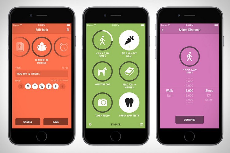
Streaks
One of the applications awarded the 2016 Apple Design Award. Streaks has earned the attention of users and high marks, largely due to the appropriate use of modern design approaches. It combines strict minimalism and an emphasis on color design. As a result, the interface was very simple and intuitive for most users.
Color scheme and design of controls:
All in one Gestures
This Android application is notable for the implementation of new products in the field of gesture management. As a utility, expanding the functionality of the device, it is well demonstrates the benefits of "manual" control.

Useful toolkit
Material Design Specifications from Google:
" Https://material.google.com/
Apple design information:
» Https://developer.apple.com/design/
Selection of services for building prototypes:
» Https://spark.ru/startup/componentix/blog/4781/20-instrumentov-dlya-dizajnera-mobilnih-prilozhenij
Blogs for UX designers:
» Https://www.smashingmagazine.com/category/uxdesign/
" Http://theuxintern.com/
" Http://uxmyths.com/
" Http://boxesandarrows.com/
" Http://usabilitygeek.com/
" Http://uxmovement.com/
Source: https://habr.com/ru/post/310358/
All Articles