MaterialViewPager - an example of creating a unique application
I recently decided to write an interesting application with which you can view news from Internet resources and the question arose how to make the application interface. Ideas of the sea, but I was most surprised by the work of one developer with GitHub and its work is called Material ViewPager. In use, it is very simple and here is a great installation guide.
After add MaterialViewPager to our acivity_main.xml file.
The developer added a number of settings with which you can customize the interface in its own discretion. Here are a couple of examples of these, but for the rest, through trial and error, you can view others:
- The degree of transparency of the rear background header image.
')
- Turn on and off the hide toolbar when scrolling.
- Animation of hiding a plotting image when scrolling
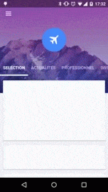
The frame for the header image can be made as shown below, or you can do something of your own.
layout / header_logo.xml
Style
Of course, one should not forget about the file in which you need to set the necessary parameters for the correct display of the MaterialViewPager. In fact, it is necessary to remove the ActionBar, simply because it does not look as aesthetically pleasing as we want it.
Colors
And another file for colors.xml. Here you can play for fame and create individuality for the application.
Filling
What exactly you would like to fill in your sections is up to you, but I’ll show you an example with RecyclerView & CardView so we create XML and fill it with empty CardView
fragment_recyclerview.xml
layout / list_item_card.xml
Pages are created and now we write the code for RecyclerViewFragment.java. As I understood from the tutorial, this way is Fragment ViewPager, in which you just specify the next fragment that we need RecyclerView. In this file you can specify all the necessary functions for downloading your content and its further transfer to RecyclerView. At first, everything looks haemorrhoid, but if you read other articles already on RecyclerView, then all this is easier to watch, but for now my backside is to create at least a demonstration.
Next we are doing the file and it contains our RecyclerView and we are working with onBindViewHolder, but since CardView is empty, we don’t add anything.
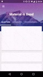
Next up is the MainActivity setting. Here we set the number of pages, the title, as well as the header image for each of the pages, as well as the background header and its color as a whole.
Actually, everything you need to know to use this interface.

Thanks for attention!
Initialization
compile ('com.github.florent37:materialviewpager:1.2.0@aar'){ transitive = true } After add MaterialViewPager to our acivity_main.xml file.
<com.github.florent37.materialviewpager.MaterialViewPager android:id="@+id/materialViewPager" android:layout_width="match_parent" android:layout_height="match_parent" app:viewpager_logo="@layout/header_logo" app:viewpager_logoMarginTop="100dp" app:viewpager_color="@color/colorPrimary" app:viewpager_headerHeight="200dp" app:viewpager_headerAlpha="1.0" app:viewpager_hideLogoWithFade="false" app:viewpager_hideToolbarAndTitle="true" app:viewpager_enableToolbarElevation="true" app:viewpager_parallaxHeaderFactor="1.5" app:viewpager_headerAdditionalHeight="20dp" /> The developer added a number of settings with which you can customize the interface in its own discretion. Here are a couple of examples of these, but for the rest, through trial and error, you can view others:
- The degree of transparency of the rear background header image.
')
app:viewpager_headerAlpha="0.6" - Turn on and off the hide toolbar when scrolling.
- Animation of hiding a plotting image when scrolling
app:viewpager_hideLogoWithFade="true" Header_logo
The frame for the header image can be made as shown below, or you can do something of your own.
layout / header_logo.xml
<?xml version="1.0" encoding="utf-8"?> <FrameLayout xmlns:android="http://schemas.android.com/apk/res/android" xmlns:tools="http://schemas.android.com/tools" android:id="@+id/headerLogo" android:layout_width="80dp" android:layout_height="80dp" android:background="@drawable/circle"> <ImageView android:id="@+id/headerLogoContent" android:layout_width="40dp" android:layout_height="40dp" tools:src="@drawable/tennis" android:layout_gravity="center"/> </FrameLayout> Style
Of course, one should not forget about the file in which you need to set the necessary parameters for the correct display of the MaterialViewPager. In fact, it is necessary to remove the ActionBar, simply because it does not look as aesthetically pleasing as we want it.
<resources xmlns:tools="http://schemas.android.com/tools"> <style name="AppBaseTheme" parent="@style/Theme.AppCompat.Light"> </style> <!-- Base application theme. --> <style name="AppTheme" parent="AppBaseTheme"> <item name="android:textColorPrimary">@android:color/white</item> <item name="drawerArrowStyle">@style/DrawerArrowStyle</item> <item name="android:windowTranslucentStatus" tools:targetApi="21">true</item> <item name="android:windowContentOverlay">@null</item> <item name="windowActionBar">false</item> <!-- Toolbar Theme / Apply white arrow --> <item name="colorControlNormal">@android:color/white</item> <item name="actionBarTheme">@style/AppTheme.ActionBarTheme</item> <!-- Material Theme --> <item name="colorPrimary">@color/colorPrimary</item> <item name="colorPrimaryDark">@color/colorPrimaryDark</item> <item name="colorAccent">@color/accent_color</item> <item name="android:statusBarColor" tools:targetApi="21">@color/statusBarColor</item> <item name="android:navigationBarColor" tools:targetApi="21">@color/navigationBarColor</item> <item name="android:windowDrawsSystemBarBackgrounds" tools:targetApi="21">true</item> </style> <style name="AppTheme.ActionBarTheme" parent="@style/ThemeOverlay.AppCompat.ActionBar"> <!-- White arrow --> <item name="colorControlNormal">@android:color/white</item> </style> <style name="DrawerArrowStyle" parent="Widget.AppCompat.DrawerArrowToggle"> <item name="spinBars">true</item> <item name="color">@color/drawerArrowColor</item> </style> </resources> Colors
And another file for colors.xml. Here you can play for fame and create individuality for the application.
<?xml version="1.0" encoding="utf-8"?> <resources> <color name="blue">#303F9F</color> <color name="green">#4CAF50</color> <color name="purple">#673AB7</color> <color name="cyan">#00BCD4</color> <color name="orange">#e95609</color> <color name="accent_color">@color/blue</color> <color name="colorPrimary">@color/blue</color> <color name="colorPrimaryDark">@color/blue</color> <color name="statusBarColor">@color/blue</color> <color name="navigationBarColor">@android:color/black</color> <color name="drawerArrowColor">@android:color/white</color> </resources> Filling
What exactly you would like to fill in your sections is up to you, but I’ll show you an example with RecyclerView & CardView so we create XML and fill it with empty CardView
fragment_recyclerview.xml
<?xml version="1.0" encoding="utf-8"?> <android.support.v7.widget.RecyclerView xmlns:android="http://schemas.android.com/apk/res/android" android:id="@+id/recyclerView" android:layout_width="match_parent" android:layout_height="match_parent" /> layout / list_item_card.xml
<?xml version="1.0" encoding="utf-8"?> <FrameLayout xmlns:android="http://schemas.android.com/apk/res/android" xmlns:app="http://schemas.android.com/apk/res-auto" android:layout_width="match_parent" android:layout_height="wrap_content"> <android.support.v7.widget.CardView android:id="@+id/card_view" android:layout_width="match_parent" android:layout_height="200dp" app:cardCornerRadius="2dp" app:cardElevation="2dp" android:layout_marginBottom="@dimen/cardMarginVertical" android:layout_marginLeft="@dimen/cardMarginHorizontal" android:layout_marginRight="@dimen/cardMarginHorizontal" android:layout_marginTop="@dimen/cardMarginVertical" app:cardPreventCornerOverlap="false" app:contentPadding="0dp"/> </FrameLayout> Pages are created and now we write the code for RecyclerViewFragment.java. As I understood from the tutorial, this way is Fragment ViewPager, in which you just specify the next fragment that we need RecyclerView. In this file you can specify all the necessary functions for downloading your content and its further transfer to RecyclerView. At first, everything looks haemorrhoid, but if you read other articles already on RecyclerView, then all this is easier to watch, but for now my backside is to create at least a demonstration.
public class RecyclerViewFragment extends Fragment { private RecyclerView mRecyclerView; private RecyclerView.Adapter mAdapter; public static RecyclerViewFragment newInstance() { return new RecyclerViewFragment(); } @Override public View onCreateView(LayoutInflater inflater, @Nullable ViewGroup container, @Nullable Bundle savedInstanceState) { return inflater.inflate(R.layout.fragment_recyclerview, container, false); } @Override public void onViewCreated(View view, @Nullable Bundle savedInstanceState) { super.onViewCreated(view, savedInstanceState); mRecyclerView = (RecyclerView) view.findViewById(R.id.recyclerView); //permet un affichage sous forme liste verticale RecyclerView.LayoutManager layoutManager = new LinearLayoutManager(getActivity()); mRecyclerView.setLayoutManager(layoutManager); mRecyclerView.setHasFixedSize(true); //100 faux contenu List<Object> mContentItems = new ArrayList<>(); for (int i = 0; i < 100; ++i) mContentItems.add(new Object()); //penser à passer notre Adapter (ici : TestRecyclerViewAdapter) à un RecyclerViewMaterialAdapter mAdapter = new RecyclerViewMaterialAdapter(new TestRecyclerViewAdapter(mContentItems)); mRecyclerView.setAdapter(mAdapter); //notifier le MaterialViewPager qu'on va utiliser une RecyclerView MaterialViewPagerHelper.registerRecyclerView(getActivity(), mRecyclerView, null); } } Next we are doing the file and it contains our RecyclerView and we are working with onBindViewHolder, but since CardView is empty, we don’t add anything.
public class TestRecyclerViewAdapter extends RecyclerView.Adapter<RecyclerView.ViewHolder> { List<Object> contents; public TestRecyclerViewAdapter(List<Object> contents) { this.contents = contents; } @Override public int getItemCount() { return contents.size(); } @Override public RecyclerView.ViewHolder onCreateViewHolder(ViewGroup parent, int viewType) { View view = LayoutInflater.from(parent.getContext()) .inflate(R.layout.list_item_card, parent, false); return new RecyclerView.ViewHolder(view) { }; } @Override public void onBindViewHolder(RecyclerView.ViewHolder holder, int position) { } } Next up is the MainActivity setting. Here we set the number of pages, the title, as well as the header image for each of the pages, as well as the background header and its color as a whole.
public class MainActivity extends ActionBarActivity { MaterialViewPager materialViewPager; View headerLogo; ImageView headerLogoContent; @Override protected void onCreate(Bundle savedInstanceState) { super.onCreate(savedInstanceState); setContentView(R.layout.activity_main); // final int tabCount = 4; // @layout/header_logo headerLogo = findViewById(R.id.headerLogo); headerLogoContent = (ImageView) findViewById(R.id.headerLogoContent); //le MaterialViewPager this.materialViewPager = (MaterialViewPager) findViewById(R.id.materialViewPager); //remplir le ViewPager this.materialViewPager.getViewPager().setAdapter(new FragmentStatePagerAdapter(getSupportFragmentManager()) { @Override public Fragment getItem(int position) { //je créé pour chaque onglet un RecyclerViewFragment return RecyclerViewFragment.newInstance(); } @Override public int getCount() { return tabCount; } // @Override public CharSequence getPageTitle(int position) { switch (position) { case 0: return getResources().getString(R.string.divertissement); case 1: return getResources().getString(R.string.sports); case 2: return getResources().getString(R.string.technologie); case 3: return getResources().getString(R.string.international); default: return "Page " + position; } } }); // this.materialViewPager.getViewPager().setOffscreenPageLimit(tabCount); //relie les tabs au viewpager this.materialViewPager.getPagerTitleStrip().setViewPager(this.materialViewPager.getViewPager()); } } Actually, everything you need to know to use this interface.
Thanks for attention!
Source: https://habr.com/ru/post/309860/
All Articles