Digest of grocery design, August 2016
For six years now I have been publishing regular reviews of fresh articles on the topic of interfaces, new tools and collections of patterns, interesting cases and historical stories. From the tapes of several hundred thematic subscriptions, approximately 5% of the worthwhile publications are selected that are interesting to share. Previous materials: April 2010-July 2016 .
Mixed Parts
Mixed Parts community that collects articles, presentations, tools, and interface animation examples.
')

Here's What May Sound Like a Crazy Idea
Kevin Goyena's interesting thoughts on how hardcore solutions of old command line interfaces can help modern products. He refers, among other things, to ancient ticket booking services, where the operator had to remember the short but complex request format. Similar ideas will be useful to speed up the filling of complex forms, provided that the operator does this often.
Does Improving Website Navigation Pay Off?
Jeff Sauro reflects on whether it is possible to estimate the return on investment in site navigation. Many focus on the checkout process, but the user still has to walk to it.
5 Design Principles for eHealth
Brett Warren gives you five tips for working with healthcare interfaces. Users do not always have the opportunity to learn how to work with the product, or it happens a few months before use, you need to pay special attention to information design and decision-making assistance.
Mailing letters
We have a password problem, or what is happening now in the area of identification
Translation of the article by Drew Thomas, in which he describes modern methods of authorization to replace the usual login and password. He compares them in terms of reliability and implementation complexity.
What Analyzing 50 Brand Guides Taught Us About Building a Lasting Company
SketchDeck team analyzed design guidelines for 50 companies. They describe differences in size, structure, and basic messages, depending on the size, age, and type of company.
Design systems news:
Product vs Marketing Illustration
Chic article by Meg Robichaud from Shopify on the difference between product and marketing illustrations. She examines the five main categories of illustrations and how they are useful in both types.

Why design principles shape stronger products
Jessie Chen shows an example of the description of design principles for a CRM system. They are tied to a pyramid similar to the model of Maslow.
Android Wear
iOS 10
The size guide!
Updated detailed crib on the size of graphic elements on social networks from Adsvise. They also added templates for Photoshop and Sketch.
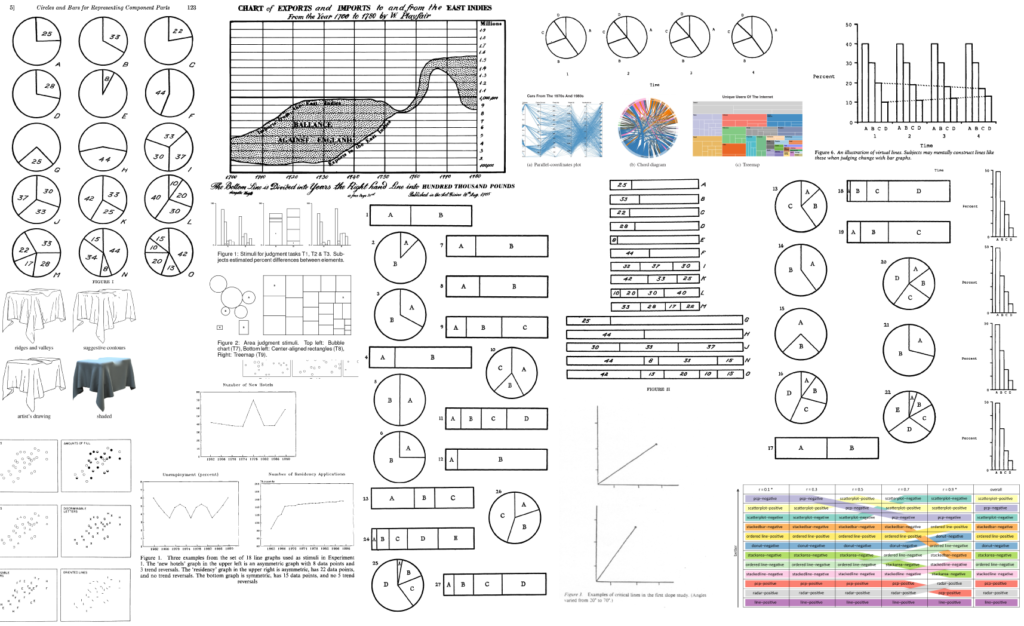
39 studies about human perception in 30 minutes
Insanely cool article by Kennedy Elliott about the features of the perception of different types of infographics. For each item, she refers to good research and gives recommendations on when and where to use them.
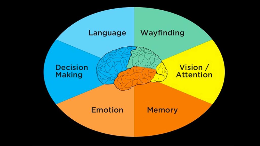
The Six Minds of UX Design
Sheena Lyonnais excellent review article on six UX factors to consider when designing interfaces. This is a job in visual presentation and attention, orientation, memory and semantics, language, emotions, and decision making.
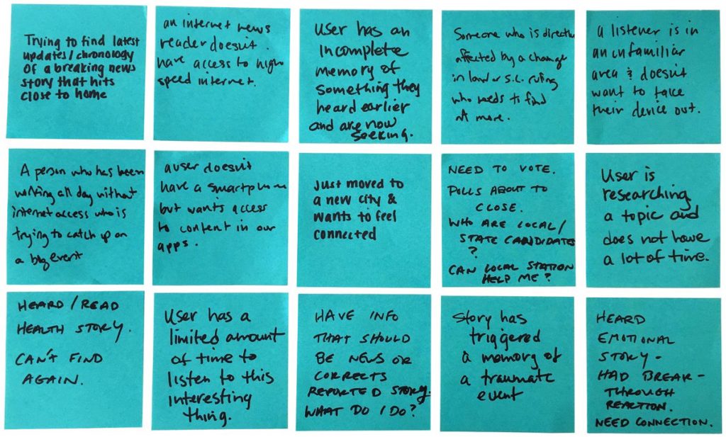
Designing News Products With Empathy - 50 Stress Cases To Consider
Libby Bawcombe from NPR conducted a user study of news readers and made up 50 stressful situations in which users work with news sites.
Designing Desirable Experiences
Arindam Roy talks about the advantages of products, the interfaces of which are not just utilitarian, but desired by users. Often, the sensations from using such products are better in comparison with full functional analogues, but less attractive.
Accessibility
The Mysterious Student, Dieter Rams, and Cracking Global Markets
Interesting psychological calculations on the topic of why it is important to correctly localize products.
User Memory Design - How To Design For Experiences That Last
Viget's Curt Arledge is not the first to write about the psychology of user experience, but it turned out to be more useful for practice. He shares how the event was experienced and what remains in the memory. And gives advice on improving products with this in mind.
Place in Space (AKA "How to Design A Concept Model")
A great presentation by Stephen P. Anderson on how to create conceptual models. A complex topic is chewed up by steps.
Customer Journey Map
The Four Dimensions of Tone of Voice
A good reminder of the Nielsen / Norman Group for choosing the tone of interface texts. They offer 4 grades: cheerful — serious, formal — easy, respectful — frivolous, enthusiastically — dry.
Making a case for a letter case
Dropbox's John Saito from the English language interface examines situations when you need to write a headline with capital letters. The language rules say that headers should be capitalized, but iOS and Android guidelines say different things.
C4 Studio
New tool C4 Studio to work on the interface animation. So far this is an alpha version, but they promise to import layouts from Sketch, and the code in Xcode is output. The product has a clever promo video about communication designer and developer troubles.
Pixel-Perfect Specifications Without The Headaches
Nikolay Babich compares in detail the tools for transferring layouts and resources to developers. It describes the interface and capabilities of Avocode, Sympli and Zeplin.
Compare Adobe Illustrator to Affinity Designer and Sketch in 2016
Detailed comparison of Adobe Illustrator, Affinity Design and Sketch from the perspective of the icon designer. Iconfinder did the same comparison a couple of years ago, but since then the tools have been greatly updated.
Designing for Television, part 1
Memo on the design of interfaces for the TV from Molly Lafferty of This Also.
Pattern
Pattern application for prototyping on iPad. Interesting solutions, although the process itself looks worn out with respect to plain paper and pens.
Principle
Sketch
Figma
Marvel
Invision
PNG optimization
The Bjango team talks about optimizing PNG and how the most popular programs for designers give results by default.
dummi
Content generator for layouts and prototypes Dummi provides lists of users, cities, books and articles in JSON.
Modern Publishing Tools
Reviews and comparisons of prototyping tools
Planning usability testing
My colleague Natalia Sprogis wrote a detailed instruction on planning usability testing. The formulation of questions and the choice of methods, the definition of metrics, the preparation of tasks and features of the conduct The second part .

Going Beyond the Obvious
Excellent article by Philip Hodgson from UserFocus on how to put questions for user research. This will help to find really valuable insights, and not just tick off the project phase. Philip refers to the book of the zoologist Niko Tinbergen, who put forward four principles of observing animals - they are applicable to the study of human behavior.

10 Practical Tips for Increasing Your Impact of Your Research Insights
Groupon's Mike Katz advises researchers on how best to communicate user research results to the product team so that improvements can be added to the product.
How many respondents are needed
13 Things to Consider When Offering Survey Incentives
Jeff Sauro gives advice on paying for the time of user research respondents. Although the specifics of many different from domestic, they will still be useful.
Ways To Reduce Content Shifting On Page Load
Michael Scharnagl examines ways to optimize page code, which reduces jerkiness when loading media objects and other data.
Framer
Webflow
CSS animation
Web typography
CSS shapes
Trym - Beautiful Small App for MacOS
Application for viewing, optimizing and converting SVG files. After installation, it becomes the default SVG viewer. Depending on the color of the icon, the interface theme changes between light and dark (standard viewers show a white image on a white background). Icons can be optimized to reduce the size (for example, Sketch leaves a lot of garbage when exporting), and also to change the size and in one click convert to PNG in different sizes for web, iOS and Android. Other tools for working with SVG:
New scripts
Mobile App Analytics - The 12 Most Important Metrics to Measure
Yael Tolub lists key metrics that measure mobile app success.
 Peter Merholz & Kristin Skinner - Org Design for Design Orgs
New book from Peter Merholz and Kristin Skinner about managing a team of product designers. The electronic version is already available, for the paper version there is a pre-order (50% discount code for O'Reilly e-books is easy to find on the Internet). Blog books with current articles .
Other materials about managing design teams:
An Inside Look at Facebook's Method for Hiring Designers
Julie Zhuo talks in detail about the process of finding, interviewing and integrating new designers. Many useful tips on all stages of the process.
The future of UX design
Topical issues of UX development as a direction, and of every professional who thinks about development.
Refinement of the professional standard "Graphic and User Interface Designer"
The professional standard “Graphic and User Interface Designer” is being actively developed and the initiative group is conducting a survey - to understand what is the responsibility of UX-professionals in Russia and the CIS countries. The survey is anonymous, it will take about 15 minutes. His results will be published.
Are Successful App Redesigns Even Possible?
Daniel Sands conducted an interesting study of reviews of the latest mobile app redesigns. It doesn't matter if the team did a good job or not, users are always unhappy. But it turned out that after a few weeks the hype subsides and the estimates are returned, and later.

Other cases of redesign:
Algorithmic design
An invisible interface - 6 things we learned from designing for voice
The Vox Media design team talks about their experience in creating a voice assistant for Amazon Echo. Useful tips for those who try to create voice interfaces.
Messengers
Interfaces to the cinema
The virtual reality
Symbol For Context
Joe Blau offers a universal icon to indicate the context in which the computer takes over part of the user's actions. With the proliferation of personal assistants, unmanned vehicles and other products that perform a more active role, it is important to show that the computer has taken over the control.
Graphic means
A Graphic Means documentary on how designers worked in the pre-digital era and how work changed after the advent of computers was being prepared for release. The authors interviewed a couple of dozen well-known specialists like Tobias Frere-Jones, Ellen Lupton and Dan Rhatigan. They promise by the end of the year.
Intellectual Property & UX Design - Preceding Year and the Next Decade
An interesting presentation by Rob Tannen on the history and practice of applying design patents. Examines in detail, including the famous Apple and Samsung litigation.
UX Chat - Daily UX Bear UX Conversations
The uxdesign.cc blog team and Adrian Zumbrunnen have launched a bot that tells product design news. It is based on the recent concept of the personal site Adrian.

Transitioning from support to UX - A year in perspective
Kylea Parker talks about how she moved from Shopify user support to a UX designer. Advice for those who also retrain.
Font for state
AIC, together with Artem Geller's laboratory and the ParaType team (at the design development stage - represented by Alexandra Korolkova), is starting to work on a font for the state. We need our own font, which can become the basis of a single ecosystem of all official Internet resources. Modern, free, public. The whole family of fonts with different parameters, which is in the public domain.
Artyom Geller asks the community to answer a few questions:
The project to improve digital interaction with the state is initiated by people for people, and the team wants to reflect these aspirations. The result of the first discussions and a cursory analysis of state fonts of different countries: the basis is taken by the modern Dutch grotesque - humanistic and friendly. Like Peter I - take an example from the Dutch masters.
Practical ux design
Scott Faranello's book Practical UX Design was released in April. UXMatters publishes the second chapter of it, devoted to the open and closed state of the designer's work.
Grocery designer
Jokes about designers for 400
Google Analytics In Real Life - Online Checkout
If Google Analytics worked offline.
The Best Medium Publications from Design Teams to Follow
Fabricio Teixeira has compiled a list of blogs of design companies and teams on Medium.

Other news of famous design teams:
Design.blog
The design team Automatic (created by WordPress) has launched a blog with the ingenuous title Design blog. The initiative came largely thanks to John Maeda, who recently joined the company from KPCB . His position is “global head of computational design and inclusion” ( what exactly it will do ).
Adobe Design
Airbnb Design
UX STRAT 2015
Report on master classes at the conference, which was held on September 8-10 in Athens, Georgia (USA). It is dedicated to the design strategy and gathers a powerful composition of thematic speakers.
AIC Design School
AIC opens a set of online school. Design and tools in the digital environment are developing rapidly - it is only necessary to describe the trends and rules as they become obsolete. The only way to learn is to plunge into the environment of the leading studio and understand the principles in practice. The site is already possible to enroll in the school.
Fresh links can also be tracked in the Facebook group of the same name or received once a month by mail . Thanks to everyone who also publishes links in it, especially Gennady Dragun, Pavel Skripkin, Dmitry Podluzhny, Anton Artyomov, Denis Efremov, Alexey Kopylov, Taras Brizitsky, Evgeny Sokolov and Anton Oleinik. More and more materials in reviews appear thanks to them.
Subscribe to the newsletter ! A letter arrives once a month.
Patterns and Best Practices
Mixed Parts
Mixed Parts community that collects articles, presentations, tools, and interface animation examples.
')
Here's What May Sound Like a Crazy Idea
Kevin Goyena's interesting thoughts on how hardcore solutions of old command line interfaces can help modern products. He refers, among other things, to ancient ticket booking services, where the operator had to remember the short but complex request format. Similar ideas will be useful to speed up the filling of complex forms, provided that the operator does this often.
Does Improving Website Navigation Pay Off?
Jeff Sauro reflects on whether it is possible to estimate the return on investment in site navigation. Many focus on the checkout process, but the user still has to walk to it.
5 Design Principles for eHealth
Brett Warren gives you five tips for working with healthcare interfaces. Users do not always have the opportunity to learn how to work with the product, or it happens a few months before use, you need to pay special attention to information design and decision-making assistance.
Mailing letters
- Lee Munroe's latest mailing list design tips . The popularity of email clients, features of display on smart watches and much more.
- An interesting analysis of a large selection of mailing lists for how they place the main action buttons .
We have a password problem, or what is happening now in the area of identification
Translation of the article by Drew Thomas, in which he describes modern methods of authorization to replace the usual login and password. He compares them in terms of reliability and implementation complexity.
Guidelines for platforms and companies
What Analyzing 50 Brand Guides Taught Us About Building a Lasting Company
SketchDeck team analyzed design guidelines for 50 companies. They describe differences in size, structure, and basic messages, depending on the size, age, and type of company.
Design systems news:
- Pinterest developers Android talk about their mobile design system . They have an interesting approach to the grid and padding - the grid module changes depending on the size of the device, but the number of columns is preserved. Video performance .
- A story about how the Trivago ticket reservation service goes to the design system .
- Nathan Curtis concepts of real application of the design system on products that are useful to do at the beginning of work on it .
- Nucleus framework for creating live guidelines .
- Christian Miller's very correct thoughts about the power of parametric design . This approach makes it easier to make simple decisions, so the designer can focus on the product.
- The Patternry framework has been updated to create live guidelines .
Product vs Marketing Illustration
Chic article by Meg Robichaud from Shopify on the difference between product and marketing illustrations. She examines the five main categories of illustrations and how they are useful in both types.
Why design principles shape stronger products
Jessie Chen shows an example of the description of design principles for a CRM system. They are tied to a pyramid similar to the model of Maslow.
Android Wear
- Luigi Notaro parses changes to the guidelines in Android Wear 2.0 . Google revised the color palettes - they became darker in order to save the battery and not distract the user once again. A rather interesting formula is used to calculate colors relative to the main one.
iOS 10
The size guide!
Updated detailed crib on the size of graphic elements on social networks from Adsvise. They also added templates for Photoshop and Sketch.
Understanding the user
39 studies about human perception in 30 minutes
Insanely cool article by Kennedy Elliott about the features of the perception of different types of infographics. For each item, she refers to good research and gives recommendations on when and where to use them.
The Six Minds of UX Design
Sheena Lyonnais excellent review article on six UX factors to consider when designing interfaces. This is a job in visual presentation and attention, orientation, memory and semantics, language, emotions, and decision making.
Designing News Products With Empathy - 50 Stress Cases To Consider
Libby Bawcombe from NPR conducted a user study of news readers and made up 50 stressful situations in which users work with news sites.
Designing Desirable Experiences
Arindam Roy talks about the advantages of products, the interfaces of which are not just utilitarian, but desired by users. Often, the sensations from using such products are better in comparison with full functional analogues, but less attractive.
Accessibility
- A little bit about how Facebook makes its products accessible . Interestingly, they are trying, among other things, to explain the essence of the pictures to those who cannot see them.
- Ruby Zheng describes the social aspects of accessibility that allow respecting users with disabilities.
The Mysterious Student, Dieter Rams, and Cracking Global Markets
Interesting psychological calculations on the topic of why it is important to correctly localize products.
User Memory Design - How To Design For Experiences That Last
Viget's Curt Arledge is not the first to write about the psychology of user experience, but it turned out to be more useful for practice. He shares how the event was experienced and what remains in the memory. And gives advice on improving products with this in mind.
Information architecture, conceptual design, content strategy
Place in Space (AKA "How to Design A Concept Model")
A great presentation by Stephen P. Anderson on how to create conceptual models. A complex topic is chewed up by steps.
Customer Journey Map
- Explanatory and capacious memo on the customer's journey map from the Nielsen / Norman Group .
- Review article from the Realtime Board based on materials from the internal library and run-in on users . From process to comparison with similar tools.
The Four Dimensions of Tone of Voice
A good reminder of the Nielsen / Norman Group for choosing the tone of interface texts. They offer 4 grades: cheerful — serious, formal — easy, respectful — frivolous, enthusiastically — dry.
Making a case for a letter case
Dropbox's John Saito from the English language interface examines situations when you need to write a headline with capital letters. The language rules say that headers should be capitalized, but iOS and Android guidelines say different things.
Design and design of interface screens
C4 Studio
New tool C4 Studio to work on the interface animation. So far this is an alpha version, but they promise to import layouts from Sketch, and the code in Xcode is output. The product has a clever promo video about communication designer and developer troubles.
Pixel-Perfect Specifications Without The Headaches
Nikolay Babich compares in detail the tools for transferring layouts and resources to developers. It describes the interface and capabilities of Avocode, Sympli and Zeplin.
Compare Adobe Illustrator to Affinity Designer and Sketch in 2016
Detailed comparison of Adobe Illustrator, Affinity Design and Sketch from the perspective of the icon designer. Iconfinder did the same comparison a couple of years ago, but since then the tools have been greatly updated.
Designing for Television, part 1
Memo on the design of interfaces for the TV from Molly Lafferty of This Also.
Pattern
Pattern application for prototyping on iPad. Interesting solutions, although the process itself looks worn out with respect to plain paper and pens.
Principle
- The second version of Principle has been released . Appeared working with components.
- Reony Tonneyck on how to implement parallax in Principle .
Sketch
- Crystal application for viewing Sketch layouts on Android phones .
- Mike Mariano's coolest series of articles on how to create plug-ins for Sketch . Step by step instructions, starting with the most basic things.
- How to create infographics in Sketch .
- Application Icon Template for Android and iOS in Sketch .
Figma
Marvel
Invision
PNG optimization
The Bjango team talks about optimizing PNG and how the most popular programs for designers give results by default.
dummi
Content generator for layouts and prototypes Dummi provides lists of users, cities, books and articles in JSON.
Modern Publishing Tools
Reviews and comparisons of prototyping tools
User research and testing, analytics
Planning usability testing
My colleague Natalia Sprogis wrote a detailed instruction on planning usability testing. The formulation of questions and the choice of methods, the definition of metrics, the preparation of tasks and features of the conduct The second part .
Going Beyond the Obvious
Excellent article by Philip Hodgson from UserFocus on how to put questions for user research. This will help to find really valuable insights, and not just tick off the project phase. Philip refers to the book of the zoologist Niko Tinbergen, who put forward four principles of observing animals - they are applicable to the study of human behavior.
10 Practical Tips for Increasing Your Impact of Your Research Insights
Groupon's Mike Katz advises researchers on how best to communicate user research results to the product team so that improvements can be added to the product.
How many respondents are needed
13 Things to Consider When Offering Survey Incentives
Jeff Sauro gives advice on paying for the time of user research respondents. Although the specifics of many different from domestic, they will still be useful.
Visual programming and browser design
Ways To Reduce Content Shifting On Page Load
Michael Scharnagl examines ways to optimize page code, which reduces jerkiness when loading media objects and other data.
Framer
Webflow
- The second version of the Interactions tool has been released inside Webflow . Expanded animation for sites on the platform.
CSS animation
- Nash Vail parses the features of motion curves in CSS .
- José Rosário tells how to achieve high FPS in CSS animation .
Web typography
- Tim Brown from Typekit talks about how to make fully responsive text . Font size, interline and interparagraph distance depend on the width of the browser window.
- The CSS font-display property has appeared in Chrome, which makes it easier to load custom fonts . As its distribution will be possible to refuse solutions based on JavaScript.
- Great thoughts Marchin Wichary from Medium about the difficulties of following the principles of classical typography on the web .
CSS shapes
Trym - Beautiful Small App for MacOS
Application for viewing, optimizing and converting SVG files. After installation, it becomes the default SVG viewer. Depending on the color of the icon, the interface theme changes between light and dark (standard viewers show a white image on a white background). Icons can be optimized to reduce the size (for example, Sketch leaves a lot of garbage when exporting), and also to change the size and in one click convert to PNG in different sizes for web, iOS and Android. Other tools for working with SVG:
- The SVGsus for Mac application makes it easy to work with SVG . Organization of a set of icons, their optimization and preparation of resources.
New scripts
- How to use the “writing-mode” CSS property for page layout .
- Scroll indicator on pure CSS .
- The in-view.js library reports when a particular DOM element appears in the viewport . Good solution for dynamic promotional sites.
Metrics and ROI
Mobile App Analytics - The 12 Most Important Metrics to Measure
Yael Tolub lists key metrics that measure mobile app success.
UX strategy and management
Peter Merholz & Kristin Skinner - Org Design for Design OrgsNew book from Peter Merholz and Kristin Skinner about managing a team of product designers. The electronic version is already available, for the paper version there is a pre-order (50% discount code for O'Reilly e-books is easy to find on the Internet). Blog books with current articles .
Other materials about managing design teams:
- Margaret Gould Stewart, vice president of product design for Facebook, writes about an unusual question that the manager asked her - where does the design process not work? If everything goes too smoothly, then there is too much micro-management.
- Tom Harman talks about the new design process Buzzfeed , which has been introduced since the end of spring. They launched a sample script for design tasks.
- Interview with Rochelle King, vice president of insights and design at Spotify . The company recently united designers with analysts and researchers - a sensible, but not very common move. She tells how it helps to move the product forward.
- Vivienne Kay from Shopify writes about how to develop empathy not only with users, but also with colleagues on the product team .
An Inside Look at Facebook's Method for Hiring Designers
Julie Zhuo talks in detail about the process of finding, interviewing and integrating new designers. Many useful tips on all stages of the process.
The future of UX design
Topical issues of UX development as a direction, and of every professional who thinks about development.
Methodologies, procedures, standards
Refinement of the professional standard "Graphic and User Interface Designer"
The professional standard “Graphic and User Interface Designer” is being actively developed and the initiative group is conducting a survey - to understand what is the responsibility of UX-professionals in Russia and the CIS countries. The survey is anonymous, it will take about 15 minutes. His results will be published.
Cases
Are Successful App Redesigns Even Possible?
Daniel Sands conducted an interesting study of reviews of the latest mobile app redesigns. It doesn't matter if the team did a good job or not, users are always unhappy. But it turned out that after a few weeks the hype subsides and the estimates are returned, and later.
Other cases of redesign:
- As a service, Nextdoor reduced manifestations of racism in a service for communicating neighbors . Interesting experiments with the interface and texts.
Trends
Algorithmic design
- Oliver Roeder reflects on the role of the designer in the era of algorithms . He believes that the essence does not change - it's just another tool in the arsenal.
An invisible interface - 6 things we learned from designing for voice
The Vox Media design team talks about their experience in creating a voice assistant for Amazon Echo. Useful tips for those who try to create voice interfaces.
Messengers
- Nielsen / Norman Group conducted WeChat usability testing . The interface is rather mediocre, the bots are not particularly clever, and in general it is often not a dialogue in natural language, but a walk through the menu. It is popular due to the integration of everything and everything, as well as the ease of payments.
Interfaces to the cinema
The virtual reality
- Unity's Greg Madison debunks three big virtual reality myths . He is skeptical of films, used for long-term work and the use of classical input methods like a mouse and keyboard, and generally believes that with time everything will turn into augmented reality.
Symbol For Context
Joe Blau offers a universal icon to indicate the context in which the computer takes over part of the user's actions. With the proliferation of personal assistants, unmanned vehicles and other products that perform a more active role, it is important to show that the computer has taken over the control.
For general and professional development
Graphic means
A Graphic Means documentary on how designers worked in the pre-digital era and how work changed after the advent of computers was being prepared for release. The authors interviewed a couple of dozen well-known specialists like Tobias Frere-Jones, Ellen Lupton and Dan Rhatigan. They promise by the end of the year.
Intellectual Property & UX Design - Preceding Year and the Next Decade
An interesting presentation by Rob Tannen on the history and practice of applying design patents. Examines in detail, including the famous Apple and Samsung litigation.
UX Chat - Daily UX Bear UX Conversations
The uxdesign.cc blog team and Adrian Zumbrunnen have launched a bot that tells product design news. It is based on the recent concept of the personal site Adrian.
Transitioning from support to UX - A year in perspective
Kylea Parker talks about how she moved from Shopify user support to a UX designer. Advice for those who also retrain.
Font for state
AIC, together with Artem Geller's laboratory and the ParaType team (at the design development stage - represented by Alexandra Korolkova), is starting to work on a font for the state. We need our own font, which can become the basis of a single ecosystem of all official Internet resources. Modern, free, public. The whole family of fonts with different parameters, which is in the public domain.
Artyom Geller asks the community to answer a few questions:
- What character should the font have for government systems?
- Should it be as official as the state itself?
The project to improve digital interaction with the state is initiated by people for people, and the team wants to reflect these aspirations. The result of the first discussions and a cursory analysis of state fonts of different countries: the basis is taken by the modern Dutch grotesque - humanistic and friendly. Like Peter I - take an example from the Dutch masters.
Practical ux design
Scott Faranello's book Practical UX Design was released in April. UXMatters publishes the second chapter of it, devoted to the open and closed state of the designer's work.
Grocery designer
- Anton Lovchikov tells how he did the application Rememba . First, just as a designer, and then engaged in the development.
Jokes about designers for 400
Google Analytics In Real Life - Online Checkout
If Google Analytics worked offline.
People and companies in the industry
The Best Medium Publications from Design Teams to Follow
Fabricio Teixeira has compiled a list of blogs of design companies and teams on Medium.
Other news of famous design teams:
Design.blog
The design team Automatic (created by WordPress) has launched a blog with the ingenuous title Design blog. The initiative came largely thanks to John Maeda, who recently joined the company from KPCB . His position is “global head of computational design and inclusion” ( what exactly it will do ).
Adobe Design
- The Adobe design team is now simply called Adobe Design instead of Adobe Experience Design (so as not to be confused with the tool of the same name). They made a new identity for themselves.
- AMA with Adobe Design Team .
Airbnb Design
Conference proceedings
UX STRAT 2015
Report on master classes at the conference, which was held on September 8-10 in Athens, Georgia (USA). It is dedicated to the design strategy and gathers a powerful composition of thematic speakers.
AIC Design School
AIC opens a set of online school. Design and tools in the digital environment are developing rapidly - it is only necessary to describe the trends and rules as they become obsolete. The only way to learn is to plunge into the environment of the leading studio and understand the principles in practice. The site is already possible to enroll in the school.
Fresh links can also be tracked in the Facebook group of the same name or received once a month by mail . Thanks to everyone who also publishes links in it, especially Gennady Dragun, Pavel Skripkin, Dmitry Podluzhny, Anton Artyomov, Denis Efremov, Alexey Kopylov, Taras Brizitsky, Evgeny Sokolov and Anton Oleinik. More and more materials in reviews appear thanks to them.
Subscribe to the newsletter ! A letter arrives once a month.
Source: https://habr.com/ru/post/309180/
All Articles