OK Google, what about good interfaces?
Not everyone loves Google products, but almost everyone who has a smartphone / computer / laptop uses them. It is amazing how a company founded by two students has gained a huge market share, has become one of the most attractive employers and continues to surprise us every year with highly innovative ideas. But even more striking is that a giant with sixty thousand employees cannot afford a good user interface.
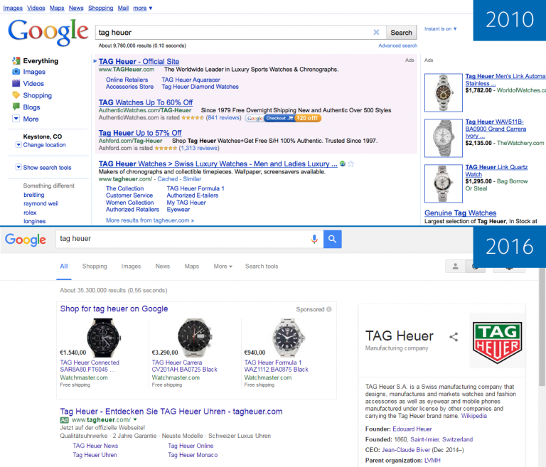
 As a designer and perfectionist, I love to get aesthetic pleasure from the products I use. Google, it seems, never tried to please us with visual appeal. Wow effect? No, not heard. The Google search interface looks much better than six years ago, but the first word that comes to my mind when looking at it is “sterile.”
')
You can say that the Google interface is simple, intuitive and easy to use, but is it really so? In Centigrade , the company where I work, designers review each other's work to identify what can be improved. I want to bring to your attention a review of the user interface of Google-search, as the most famous and used product. Let's see if it was possible to do something different?
But back to the buttons, they really cause a lot of questions. This is the first thing you see on the main page, but why are they there? You can't even click on them. No, really! Try it! You can click on “Google search” and “I'm feeling lucky” when the search field is empty, but the first button is useless in this case, as pressing will not bring any results, and the second will lead you to the page with doodles, that is, not at all wherever you were going. And as soon as you start typing something in the search field, you are taken to the results page, where these buttons are simply missing.
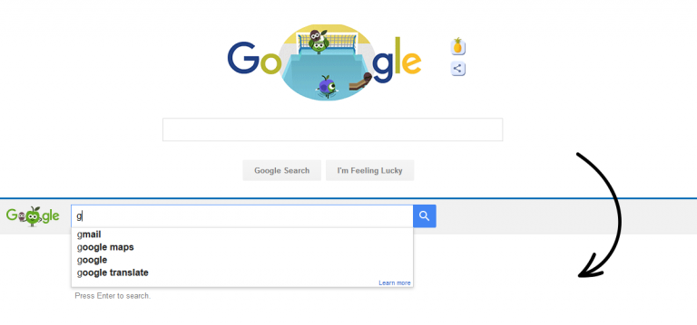
Yes, and since we are talking about this, why not switch from one page to another to use trendy animation, which is so beautifully painted in the material design guide?

And even if you do not use the "Live Search", you still can not click on these buttons, because as soon as you start to enter a query into the search bar, they will be blocked by other similar buttons from the drop-down list of tips.

So why are they needed?
Of course, all these are very specific moments, but there are actually many more such moments, I have cited only the most obvious ones with a quick revision of the search. In general, Google's interfaces are intuitive and easy to use, but as they say, the devil is in the details. And although the winners are not judged, I also believe that there is no limit to perfection, and I hope that one day I will go to google.com and get aesthetic pleasure. For me, this will mean that they are finally the best in everything they do.
')
You can say that the Google interface is simple, intuitive and easy to use, but is it really so? In Centigrade , the company where I work, designers review each other's work to identify what can be improved. I want to bring to your attention a review of the user interface of Google-search, as the most famous and used product. Let's see if it was possible to do something different?
General problems
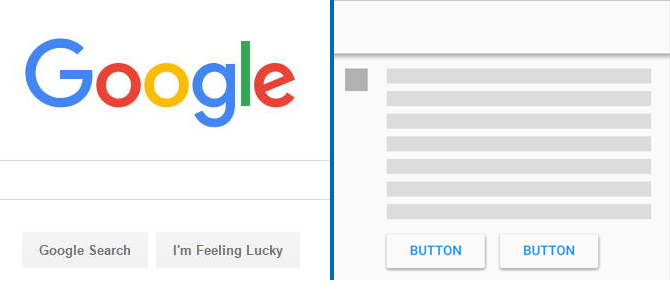
- Is this material design? I am a big fan of Google’s material design and try to use its principles in my work wherever possible. But why is Google not guided by its styles ? For example, I am sure that it was possible to use the raised buttons here (Raised buttons):
- Accessibility. It is obvious that these buttons lack contrast and readability. Let's check this with WebAIM — an excellent text / background color contrast checking tool according to the Web Content Accessibility Guidelines (WCAG) 2.0

No comments. And this concerns not only the buttons, the contrast is rather low everywhere, the fonts are too small.
“Google search” and “I'm feeling lucky” buttons
But back to the buttons, they really cause a lot of questions. This is the first thing you see on the main page, but why are they there? You can't even click on them. No, really! Try it! You can click on “Google search” and “I'm feeling lucky” when the search field is empty, but the first button is useless in this case, as pressing will not bring any results, and the second will lead you to the page with doodles, that is, not at all wherever you were going. And as soon as you start typing something in the search field, you are taken to the results page, where these buttons are simply missing.
Yes, and since we are talking about this, why not switch from one page to another to use trendy animation, which is so beautifully painted in the material design guide?
And even if you do not use the "Live Search", you still can not click on these buttons, because as soon as you start to enter a query into the search bar, they will be blocked by other similar buttons from the drop-down list of tips.
So why are they needed?
Search results page
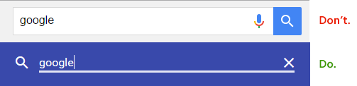
- Search string You can not delete a search query with one click. I am not kidding. The “Clear” button in the search query input field is today the de facto standard in interface design, but not for Google search. There is no such button. But if you manage to get to the help / help section (and this is not so easy to do, because Google reliably hides this secret information), you will have a completely different beautiful world where everything looks material, in the search box there is a “Clear” button and humanity has hope.
- Mysterious controls. If you log in to your account, on the search results page in the upper right corner you will see three (only if on the search settings page is marked “Show personal results”) the buttons - man, globe and gear. It took me some time to understand their purpose. I'm not an advanced Google user, but I am an interface designer and have some experience with buttons. For several minutes I tried to understand which of them is inactive, which is selected and which is in its normal state. There is a difference between these states, but it is insignificant.

The action of the “Gear” button is clear - it brings up a drop-down menu. But a couple of other buttons look weird. The first, “All Results” looks inactive. But you can click on it and it has a tooltip. The question is, if the button is not active, why can you click on it? And if she is active, then why is her style different from the “Gear” button? The button "Personal results are hidden" seems selected, but you can also click on it. Already when I was working on the translation of this article, I guessed that a pair of these buttons is a switch. A switch that looks like regular buttons. - Company card. You will get it if you enter the name of the company in the search bar. For example, try “Google”:
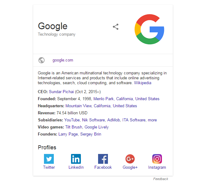
Looks great and almost tangible. Well organized interesting information. The only thing that worries me is the “more” link (more) in the “Subsidiaries” line. The problem is not even that it looks like the names of subsidiaries, but rather in a strange interaction. If you think that the link will simply expand the expanded list, you will be surprised that in fact it will reload the page for no reason (the content will remain the same) and add a huge black slider at the top of the page. But the most unexpected thing is that you cannot close this slider, no matter how much you dislike it. And you can still click the "more" link, because it is still there, even if you already have a VERY noticeable list of subsidiaries.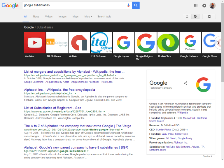
Of course, all these are very specific moments, but there are actually many more such moments, I have cited only the most obvious ones with a quick revision of the search. In general, Google's interfaces are intuitive and easy to use, but as they say, the devil is in the details. And although the winners are not judged, I also believe that there is no limit to perfection, and I hope that one day I will go to google.com and get aesthetic pleasure. For me, this will mean that they are finally the best in everything they do.
Source: https://habr.com/ru/post/309058/
All Articles