Interfaces in the real world: user error insurance
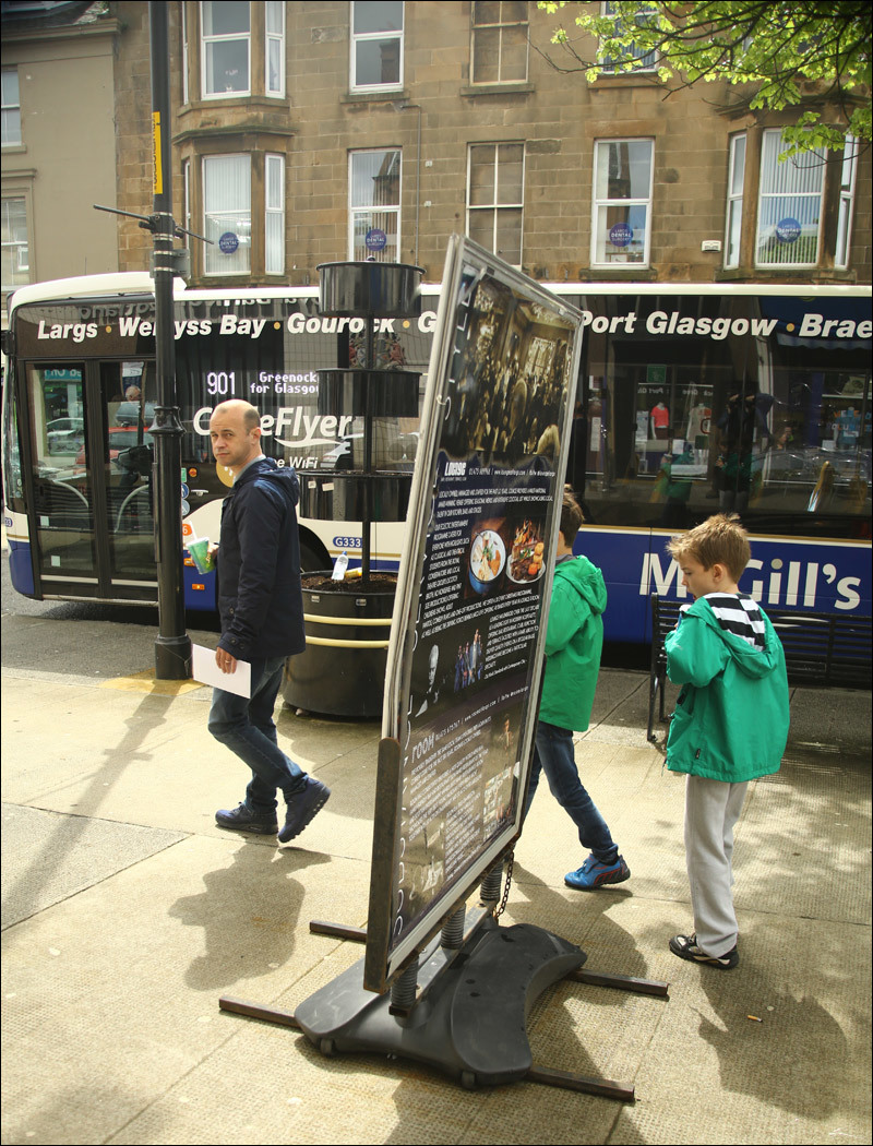
In Yekaterinburg, in one of the buildings for international conferences there is a problem with "a little stupid" foreigners. They say the same machines began to be put in Moscow.
"User is drunk" - the basic principle of the designer. Another user is inhumanly inventive, clever and picky, but right now drunk. The same goes for the transfer of information. Now I will show the physical restrictions on user interface errors.
')
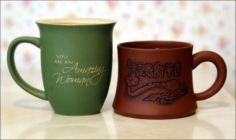
Let's start with a special keyboard cup.
So, look at these two profiles here (and how they harmoniously match, although dishes from different countries and decades). Here are two different priorities. The green cup is made for people: the right amount of fingers is slitted into the handle, the girth of the upper part corresponds to the hand. But she has a fatal flaw - she falls. The second cup, on the other hand, will almost never fall - but the creator had to sacrifice the convenience of the handle and the grip in general. What has its more than reasonable price, if this cup at least once will save your keyboard (or better - the laptop motherboard, which is under the keyboard).
And here is the third type of security:

This is thermal insulation. Although, of course, in this case, both cups on the back for real security work much better - because it is better to grab a hand hotter than pour it inside your head.
In the example, there is a gap between the security of using the interface and its convenience. In fact, of course, this should not be so - you can come up with dozens of designs that will combine both qualities. I’ve once described a simple example with a teapot on a Chinese train: its neck is simply closed until you lift it by the handle. Only then can you pour.
There are cases when errors are critical, and the need to follow the rules is the essence of the interface :
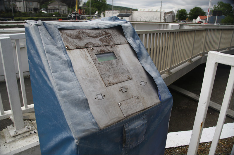
Here the operator must stand exactly facing the control panel and the road while raising the bridge. Plus, he should not stick out different parts of the body for the remote. Therefore, when the drive is working, you need to hold two buttons at the same time - or it will immediately turn off. Similar protection is on various machines. Especially those where you can quickly crawl hand under the press something to correct. Here the inconvenience is done deliberately - the user has no chance of not performing safety precautions. In the same way, cars "persuade" the driver to buckle up - to turn off the vile signal, you need to do as instructed.
Here is another example of how the user is left with only one option: do it by the rules. Meet the hardware protection against crossing double solid:

By the way, it helps a lot to pedestrians as well - there are two orders of magnitude more deserters in the wrong place.
But the principle of combining convenience and security. When you buy bottles in Scotland, you are given a special container. It costs a penny (almost like a bag for the same bottles), but then you will carry it all.
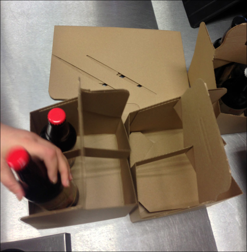
They fold it right at the checkout from a flat sheet. The store is still a benefit - it is one of the few types of alcohol advertising with social proof (after all, you are not carrying it in a package).
Here is another very cool thing - a soft recommendation on how to fold and fold the card.

Nothing more convenient, I have not yet met.
The next thing is a remote assistant, he is a radio device that can be “ignited” remotely. I saw the coolest use at the Kangerlussaak airport in Greenland - there after the landing of the Boeing there began a DDoS attack on the canteen. So that you understand the essence of the problem, Kangerlussaak is a special city for this airport. The arriving plane doubles the population for several hours, until everyone is scattered around the island by helicopters and motor planes such as our LI-2, only more modern. So here. In the dining room they give you this thing. You can walk around the airport and the surrounding field or sit at a table. The order is ready - it lights up and beeps. You go and change your "number" for food.

Obviously, this appliance not only removes typical errors (took the wrong order, constantly got questions when it was ready), delaying the work of the dining room, but also, in general, improves the user experience. The reverse side of the medal - this thing still needs to be learned to use, and the questions “What is this” can also delay the work.
The next principle is that if you want the user not to be confused, restrict his choices to him. If the instruments do the same thing, then differentiation often wins. One device - one function. In this case, look at the phone, which hangs near the usual city machine:
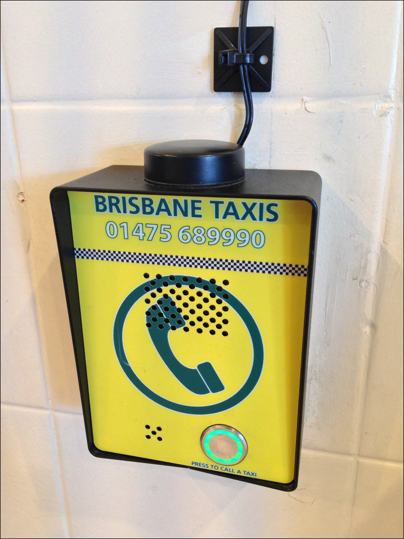
They are found in almost all former colonies of England and in the community itself. The point is that even if you make a call to a taxi for free on a city (taking the local equivalent of our number 8-800), you have to explain to the person that the call is free, that you need to dial the number, and so on. And next to hang a poster the size of this phone. And here - pressed the button and called. Everything. Now pay attention to the fact that there is no tube to reduce the cost, only the built-in speaker. See how they have solved the question with a cool icon? Thanks to her, it is immediately clear what it is.
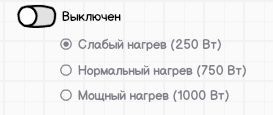
If you are still not very clear about why simplifying the increase in the number of elements works, look at this thing here:
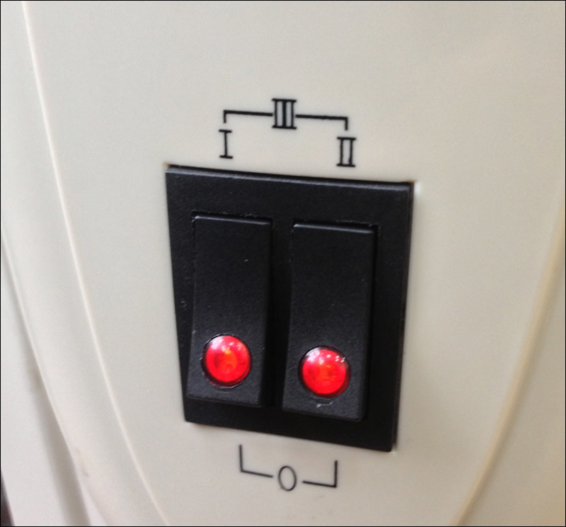
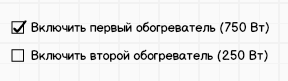
These are two heating circuits of one oil system, both 750 watts each. You can turn on the left, you can right, you can both. Indication from above is trying to convey to us that I + II = III. Even if I and II have different power in other models, you need to make it easier. See, this is what it is now:

If the heaters were different in power, it could be improved like this:
Go ahead, you can implement this radio buttons, as they often do in fans.
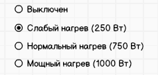
It is bad here that the modal state is “off” along with the rest (just like the mentioned fans, the backlight is along with other radio buttons). You can do this by changing the control speed to protect against errors:
But even better to make the usual good old twist with LED-on indicator, - because the user experience on other devices perfectly tells you how to work with it.
Here is an example of a device that looks overloaded, but generally works. Because only one action can be made to the end user:
As you can see in the examples earlier, it is very important to understand in appearance what is happening with the object and how. This is one of the most important subtypes of protecting users from errors - correct information about the status (the same works in navigation - the important questions are not only “Why not go there”, and not only “Where should I go”, but also “Where I am now” and "How much is left"). An example of the correct approach is the mailbox:
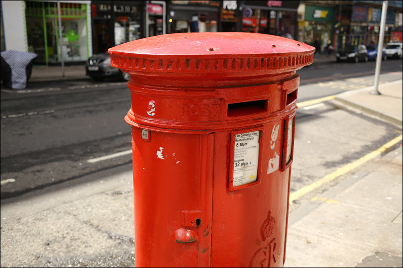
On it there is a special figovina for the schedule (on paper), which shows when mail is taken from it. Ours also have this in the form of "dredging on Tuesdays and Fridays", for example. The important point here is that another sign shows when the last excavation was in fact. That is, even a very suspicious user knows before sending that the box is working (recently updated), and in the evening he will see that his letter has really been taken away.
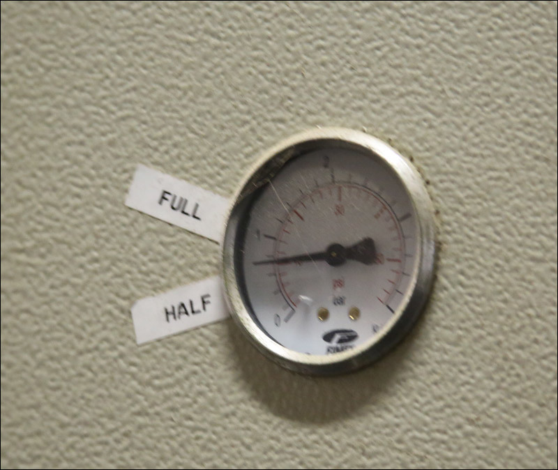
And here is an example of a status error (I’m generally delighted with this signature):
What was it, cap?
But the crutch, but very useful clarification of the values of pressure numbers for the tank:
Here are the typical protections for different opening elements, they are also very instructive:
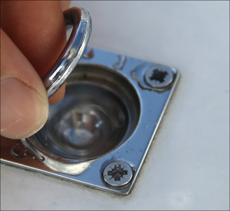
To open the seat, you need to lift the ring with a click. A similar control in iOS6 is valid for deletion: first, unlock the feature, then do:

This is the gateway for the sheep in front of the pasture: you will not be able to open both doors at the same time so that the cattle run out:

Constipation there is no less remarkable:

Here is a wonderful indication right on the spot that only disabled people, pregnant women and mothers with children can sit here. In Soviet transport, another principle is used: a sign from above, so that everyone can see that the bull has taken the place of a disabled person.

Do not believe it, but the same principle can be applied to the cook. See which one:
And here is a beautiful indication of the depth of the pit from my native Astrakhan (I took the photo from the group of motorists):
In the rain, this pit is closed by water for half a block, and its depth is exactly such that immediately after it the crew with striped sticks stand on duty to fix the dead cars, then to sue the road builders. Now, it seems, already sprinkled it.
Here is an excellent use of irrelevant protocol elements to convey a message. Here in the mail could be info @, but did much cooler:

Here is an example of the indication of how to get up to the ferry most quickly, to occupy a minimum of space, not to push and to get in the fastest. Requires a special mentality, explaining that order is order:

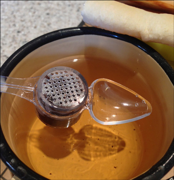
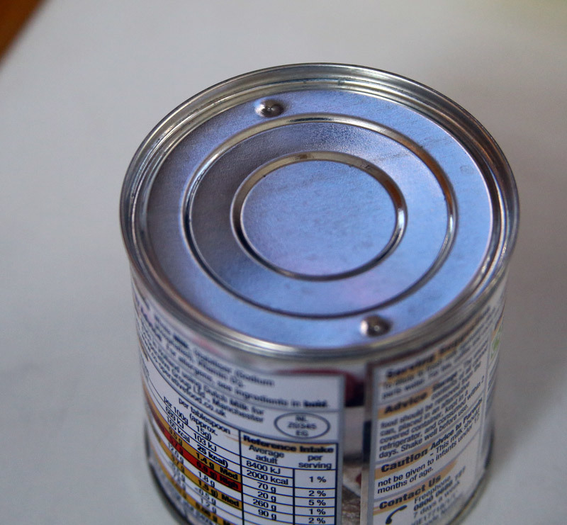
Let's go over the placer of various insurances. Here is a tin without your opening tool, but with protection from your can opener slipping. Very comfortable:
Uford on the drive. The battery logo on the battery is very cool. It is immediately clear from it where the top is where the bottom is (the “tail” of the upper cell is especially useful - with a quick glance you can see that the charge is full).

On my second bank, there are just four LEDs, on the third one there is one LED, but the more often it flashes, the greater the charge is generally terrible.
A crutch for those who do not know how to put devices in open long boxes:
In this sink, you will never burn because water suddenly became too hot. But we use it with you very, very strange:
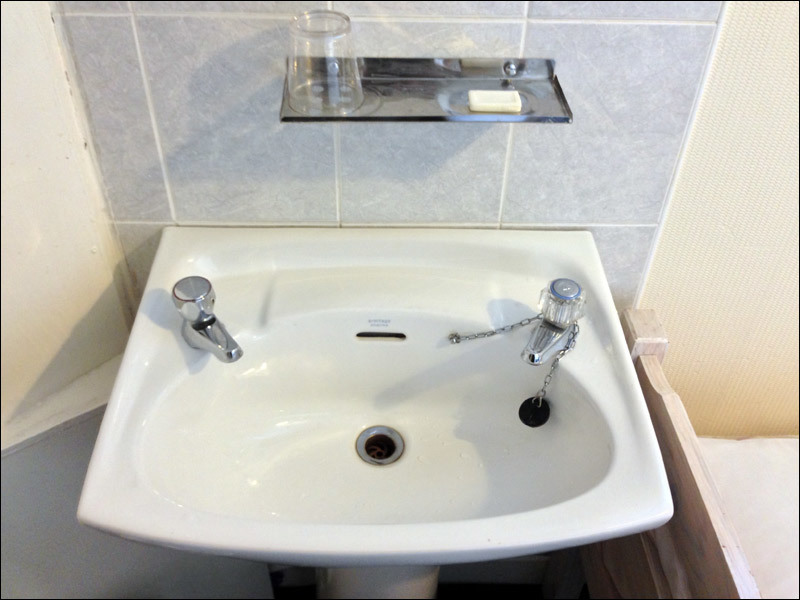
In England, the correct scenario is to close the cork, mix the water of the desired temperature, splash, flush.
Two beautiful machines at the exit from the shopping center:

A city with a very large number of pensioners - hence the most convenient delivery of heavy things.
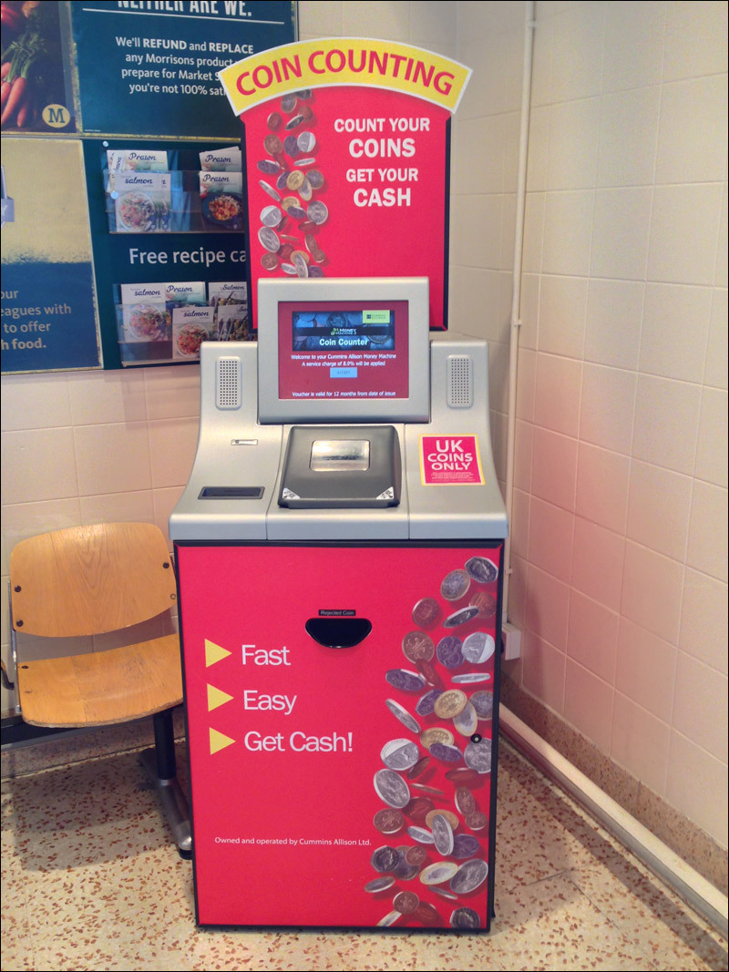
Pour a trifle, get paper money
Very strange thing:
It seems to be windy here.
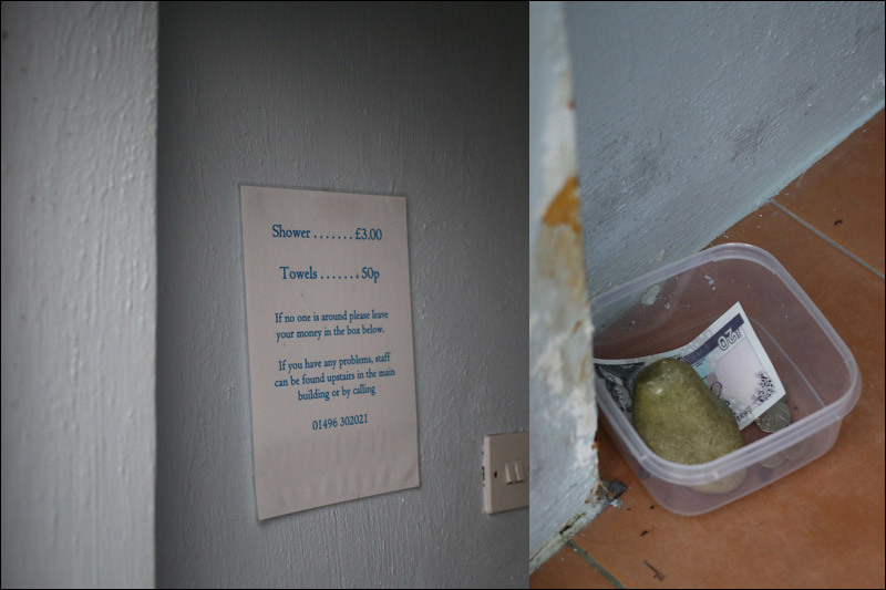
But self-service machine in Port Ellen:
Moscow, parking, with its very form showing how to use it (this is bad, but there are just as normal where the bike clings to the frame):

Just a crazy find from Elista - the reconstruction of Mongolian chess. The field is made of felt, inserted into the case, low figures of stone are poured on top. Clearly more convenient than ordinary boards on the road.

We have the closest analogue - the big "Beehive" and its road version: a box and a bag
And, finally, a small masterpiece:

The white stone under the luminous marker of the entrance to the marina (bay) is very prudent and thoughtful.
Here are the previous three series .
Source: https://habr.com/ru/post/308656/
All Articles