1 second loading acceleration gave a 10% conversion increase: case Staples
Staples is one of the world's largest chain of stationery stores, with more than 2,000 stores in 26 countries. The company conducts business also online, its online store is one of the largest in terms of turnover in the United States. The company has always recognized that the UX of the site is extremely important, and that the speed of loading the site is one of the main factors affecting the UX.
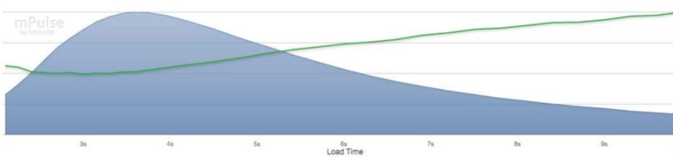
By the time Staples decided to pay more attention to speeding up its own website, data was already known that with increasing site loading time, the bounce rate increases (according to mPulse / Soasta and Airy.rf):
')
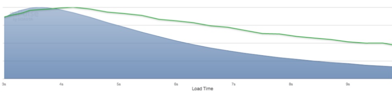
And conversion falls:
To work on the site’s speed, the company created a cross-functional team consisting of representatives from several divisions:
The work began with the fact that all the various functionalities that are supported on the site were cataloged.
The company established a regulation: every week the team gathered and discussed 1-2 site functionality. The speaker was the so-called "owner" of this functionality, that is, the person from the company, on whose business tasks it works. The team discussed these functionalities from the point of view of speeding up the download and the justification of abandoning it or of some of its aspects in order to speed up the site loading.
One of the important decisions that needed to be made was whether to consider the target KPI to be full load time (FPL - Full Page Load) or to focus on improving the time before the user can interact with the page (Time To Interactive). The team eventually decided to focus on full load time, as this is a more specific indicator. While the indicator “time to the possibility of interaction with the site” is somewhat vague and allows for different interpretations in terms of what opportunities should be available to the user at this moment.
The site used a lot of banners, and in many cases they were too “heavy”, and the image optimization parameters were chosen arbitrarily by different designers.

Very similar visual images, different versions of the same banner could “weigh” 25 KB in one case, and 250 KB in the other.
The team further optimized existing banners and implemented a banner creation process to avoid this problem in the future.
The practice of conducting A / V testing in the company was ineffective. The company used two different A / V testing tools, each of which added its own script to the site with external calls.
The team abandoned one of the A / B testing tools, and also implemented the process of ending the experiment to make sure that the testing script no longer needed is removed from the pages where the testing has ended.
It was necessary to bring order to a decent number of calls to third-party services, which were a lot on the site: analytical services, advertising systems, recommendation and feedback services, social networking buttons / widgets.
The team removed some of them, but notes that further optimization is still possible in this regard.
Some pages of the site produced 200 hits to the database. The team optimized them to 10 per page.
The script code on the site has been significantly rewritten, their size in the volume decreased by 48%, and in the lines of the code - by 52%.
The styles on the site have also been optimized, in volume they have been reduced by 83%, and in lines - by 88%.
Initially, the team tried to work on the model of "sprint" and with each new release of the version of the site to make some improvements. However, it turned out that such minor improvements were almost imperceptible. There was a feeling that the work was being done, but there was little or no result.
At the same time, due to the ideology of the “sprint”, there was no time left for making really extensive changes that could give significant, significant results. As a result, the team switched to introducing major changes, even if not immediately and not with each release.
Pretty soon, the team realized that in order to achieve significant results, you need to focus on specific pages that are visited by most users - the main one, product card, search, login, basket.
Note on the interpretation of results from experts from Soasta, the authors used in the optimization of the tracking tool for the behavior of users of mPulse:
These results do NOT mean that ALL users began to load the main page 1 second faster.
For some, acceleration did not happen. Since the site is visited by thousands of users with a variety of device configurations and network connections, the variation in loading time of the main page for different users is quite significant. Therefore, the median load time is used in this case as an indicator of the total acceleration.
It also does NOT mean that ALL users are converting 10% better.
Those users for whom the pages actually loaded faster, resulted in such a good conversion that on average for all users it improved by 10%.
In conclusion, we add that such a case is not unique or unusual. UX-professionals and conversion optimization experts point out that this is a fairly stable result when reducing the download speed of the site leads to an improvement in conversion.
Here are some studies that confirm this statement:
Therefore, if the download speed of the site is within your competence, pay close attention to this indicator. Perhaps you will be the very person who will ensure the growth of the revenue of your company right now.
By the time Staples decided to pay more attention to speeding up its own website, data was already known that with increasing site loading time, the bounce rate increases (according to mPulse / Soasta and Airy.rf):
')
And conversion falls:
To work on the site’s speed, the company created a cross-functional team consisting of representatives from several divisions:
- Management: its representatives determine what functionality from the user's point of view should be present on the site.
- IT: defines the ways in which the required functionality will be implemented and its subsequent implementation.
- Marketing: responsible for the design and optimization of used images and videos.
- Merchandising: determines how the product will be visually presented on the site.
- Analytics: links everything together and provides data analysis.
The work began with the fact that all the various functionalities that are supported on the site were cataloged.
The company established a regulation: every week the team gathered and discussed 1-2 site functionality. The speaker was the so-called "owner" of this functionality, that is, the person from the company, on whose business tasks it works. The team discussed these functionalities from the point of view of speeding up the download and the justification of abandoning it or of some of its aspects in order to speed up the site loading.
Progress
One of the important decisions that needed to be made was whether to consider the target KPI to be full load time (FPL - Full Page Load) or to focus on improving the time before the user can interact with the page (Time To Interactive). The team eventually decided to focus on full load time, as this is a more specific indicator. While the indicator “time to the possibility of interaction with the site” is somewhat vague and allows for different interpretations in terms of what opportunities should be available to the user at this moment.
Banners on the site
The site used a lot of banners, and in many cases they were too “heavy”, and the image optimization parameters were chosen arbitrarily by different designers.
Very similar visual images, different versions of the same banner could “weigh” 25 KB in one case, and 250 KB in the other.
The team further optimized existing banners and implemented a banner creation process to avoid this problem in the future.
A / b testing
The practice of conducting A / V testing in the company was ineffective. The company used two different A / V testing tools, each of which added its own script to the site with external calls.
The team abandoned one of the A / B testing tools, and also implemented the process of ending the experiment to make sure that the testing script no longer needed is removed from the pages where the testing has ended.
Appeals to other third-party services
It was necessary to bring order to a decent number of calls to third-party services, which were a lot on the site: analytical services, advertising systems, recommendation and feedback services, social networking buttons / widgets.
The team removed some of them, but notes that further optimization is still possible in this regard.
Access to databases
Some pages of the site produced 200 hits to the database. The team optimized them to 10 per page.
Javascript
The script code on the site has been significantly rewritten, their size in the volume decreased by 48%, and in the lines of the code - by 52%.
CSS
The styles on the site have also been optimized, in volume they have been reduced by 83%, and in lines - by 88%.
Lessons learned
1. Fixed on significant changes
Initially, the team tried to work on the model of "sprint" and with each new release of the version of the site to make some improvements. However, it turned out that such minor improvements were almost imperceptible. There was a feeling that the work was being done, but there was little or no result.
At the same time, due to the ideology of the “sprint”, there was no time left for making really extensive changes that could give significant, significant results. As a result, the team switched to introducing major changes, even if not immediately and not with each release.
2. Pay attention to specific pages.
Pretty soon, the team realized that in order to achieve significant results, you need to focus on specific pages that are visited by most users - the main one, product card, search, login, basket.
results
- The median load time of the home page has decreased by 1 second
- Download time has been reduced for 98% of users. For the "slowest" users, it was reduced by 6 seconds.
- Conversion increased by 10%
Note on the interpretation of results from experts from Soasta, the authors used in the optimization of the tracking tool for the behavior of users of mPulse:
These results do NOT mean that ALL users began to load the main page 1 second faster.
For some, acceleration did not happen. Since the site is visited by thousands of users with a variety of device configurations and network connections, the variation in loading time of the main page for different users is quite significant. Therefore, the median load time is used in this case as an indicator of the total acceleration.
It also does NOT mean that ALL users are converting 10% better.
Those users for whom the pages actually loaded faster, resulted in such a good conversion that on average for all users it improved by 10%.
In conclusion, we add that such a case is not unique or unusual. UX-professionals and conversion optimization experts point out that this is a fairly stable result when reducing the download speed of the site leads to an improvement in conversion.
Here are some studies that confirm this statement:
- The study of the company Soasta showed that the acceleration of loading the site for mobile users gives a conversion rate of up to 27%.
- Tests conducted by Radware showed that just 2 seconds of an additional delay in loading during the ordering process gave an increase in the percentage of pending transactions to 20%.
- According to a BlueTriangle survey , the acceleration of loading a product card in online stores by 0.1 seconds results in a 1.2% to 3.5% increase in revenue.
Therefore, if the download speed of the site is within your competence, pay close attention to this indicator. Perhaps you will be the very person who will ensure the growth of the revenue of your company right now.
Source: https://habr.com/ru/post/308516/
All Articles