5 UI chips for modern Android applications. Code, ideas and a live example
In this article I want to share the "chips" that I used when creating my last application. Basically, it is a set of useful functions and small components for creating a modern user interface. Each "chip" will be accompanied by a sample code, a picture and a small description. I believe that it is much more interesting to learn from living examples, so at the end of the article there will be a link to the repository of the real application, which uses all the “chips” described in the article.
The article does not aim to teach how to design a user interface or explain the inner meaning of Material design, but I hope these examples will inspire you to experiment with the design of your applications.
')
1. Extract the dominant color from the image.
Sometimes you want to add a little variety to the color scheme of the application, for example, to select colors dynamically, depending on a particular picture. Especially for such cases there is a library from Google - Palette . Let's look at one of the examples of its use:
// Palette build.gradle : // compile 'com.android.support:palette-v7:+' public static int getDominantColor(Bitmap bitmap) { List<Palette.Swatch> swatchesTemp = Palette.from(bitmap).generate().getSwatches(); List<Palette.Swatch> swatches = new ArrayList<Palette.Swatch>(swatchesTemp); Collections.sort(swatches, new Comparator<Palette.Swatch>() { @Override public int compare(Palette.Swatch swatch1, Palette.Swatch swatch2) { return swatch2.getPopulation() - swatch1.getPopulation(); } }); // - , return swatches.size() > 0 ? swatches.get(0).getRgb() : getRandomColor(); } public static int getRandomColor() { Random rnd = new Random(); int color = Color.argb(255, rnd.nextInt(256), rnd.nextInt(256), rnd.nextInt(256)); return color; } 2. Generate multicolored squares with letters directly in the code
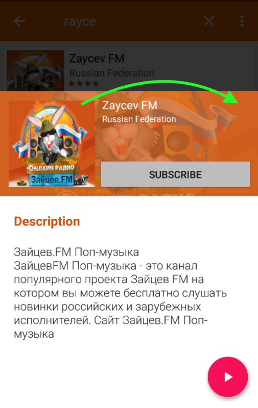
Such squares are often found in popular applications. They can be easily created right in the code, in the form of a regular Bitmap, with no additional graphics or xml layouts. I used them as a “stub” when the original image is missing. To create them you will need only one class LetterBitmap . An example of its use and the final result below:
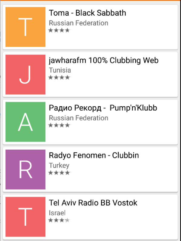
int COVER_IMAGE_SIZE = 100; //in pixels LetterBitmap letterBitmap = new LetterBitmap(context); Bitmap letterTile = letterBitmap.getLetterTile("string for letter", "string for color", COVER_IMAGE_SIZE, COVER_IMAGE_SIZE); ImageView imgAnyImageView = (ImageView) view.findViewById(R.id.imgAnyImageView); imgAnyImageView.setImageBitmap(letterTile); 3. Scale image on the fly
Quite an interesting feature, you can combine with transparency, and if you put a translucent background over a stretched image, you get an effect that resembles a “blur” filter. If the image is large, it is better to perform scaling in the background stream so as not to block rendering. Examples of both options are below:

// public static Bitmap createScaledBitmap(Bitmap bitmap, float scaleFactor) { Matrix m = new Matrix(); m.setRectToRect(new RectF(0, 0, bitmap.getWidth(), bitmap.getHeight()), new RectF(0, 0, bitmap.getWidth() * scaleFactor, bitmap.getHeight() * scaleFactor), Matrix.ScaleToFit.CENTER); return Bitmap.createBitmap(bitmap, 0, 0, bitmap.getWidth(), bitmap.getHeight(), m, true); } // : float COVER_SCALE_FACTOR = 2f; final Bitmap scaledBitmap = UIHelper.createScaledBitmap(regularBitmap, COVER_SCALE_FACTOR); // new Thread(new Runnable() { @Override public void run() { final Bitmap scaledBitmap = UIHelper.createScaledBitmap(regularBitmap, COVER_SCALE_FACTOR); getActivity().runOnUiThread(new Runnable() { @Override public void run() { anyImageView.setImageBitmap(scaledBitmap); } }); } }).run(); And this is a link to the Gist with the above examples + an example for the popular image uploading library - Glide.
4. Programmatically change the text color of the search field inside the toolbar
I spent a lot of time trying to change the color of the standard search string inside the Toolbar without creating a separate layout. Most advise you to customize the theme styles in styles.xml, sometimes it helps for Androd 5.0+, but does not work on earlier versions. Therefore, I offer a simple and universal software solution:

public static void changeSearchViewTextColor(View view, int color) { if (view != null) { if (view instanceof TextView) { ((TextView) view).setTextColor(color); return; } else if (view instanceof ViewGroup) { ViewGroup viewGroup = (ViewGroup) view; for (int i = 0; i < viewGroup.getChildCount(); i++) { changeSearchViewTextColor(viewGroup.getChildAt(i), color); } } } } // : Toolbar toolbar = (Toolbar) findViewById(R.id.your_toolbar); MenuItem searchMenuItem = toolbar.getMenu().findItem(R.id.action_search); SearchView searchView = (SearchView) searchMenuItem.getActionView(); setSearchViewStyle(searchView); changeSearchViewTextColor(searchView, Color.WHITE); 5. Buttons with rounded edges.
I decided to complete the top five with an example of layouta for buttons with rounded edges, such buttons were used in one of the latest versions and Google Play and I really liked them. It is possible, and you can find use for them in your application:

For Android 5.0+:
<?xml version="1.0" encoding="utf-8"?> <ripple xmlns:android="http://schemas.android.com/apk/res/android" android:color="?attr/colorControlHighlight"> <item> <shape xmlns:android="http://schemas.android.com/apk/res/android" android:shape="rectangle"> <corners android:radius="@dimen/rounded_btn_radius" /> <solid android:color="@color/indigo_800" /> </shape> </item> </ripple> For earlier versions:
<?xml version="1.0" encoding="utf-8"?> <selector xmlns:android="http://schemas.android.com/apk/res/android"> <item android:state_focused="true"> <shape xmlns:android="http://schemas.android.com/apk/res/android" android:shape="rectangle"> <corners android:radius="@dimen/rounded_btn_radius" /> <solid android:color="@color/indigo_500" /> </shape> </item> <item android:state_pressed="true"> <shape xmlns:android="http://schemas.android.com/apk/res/android" android:shape="rectangle"> <corners android:radius="@dimen/rounded_btn_radius" /> <solid android:color="@color/indigo_500" /> </shape> </item> <item> <shape xmlns:android="http://schemas.android.com/apk/res/android" android:shape="rectangle"> <corners android:radius="@dimen/rounded_btn_radius" /> <solid android:color="@color/indigo_800" /> </shape> </item> </selector> To use, lay out the XML files in the drawable and drawable-v21 folders, respectively, and then simply set the background for any button.
PS As promised, I leave a link to the repository of the application, which used all the above "chips" - Github
Source: https://habr.com/ru/post/308378/
All Articles