Books on typography: everything you need to know about the art of fonts
Typography is the art of making the text beautiful, easy to read, reflecting the informational message or the nature of the publication in the shape of the letters. This art brings visual harmony to any textual material. The art of expressing meaning not only through words, but also through their display. Typography is not limited to the choice of fonts and indents - it is a deeper, more complex and interesting discipline. And our book collection will help you to master it.

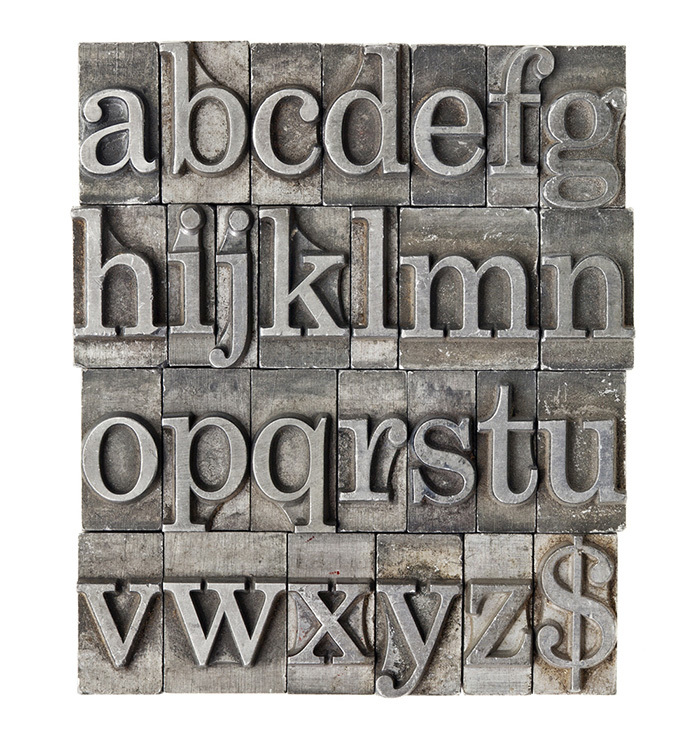
Y. Gordon. The book about the letters from Aa to Yaya
For more than three hundred years, professionals have been looking for options for the harmonious design of the letters of the Russian alphabet (Cyrillic). Among them - and Yuri Gordon. Gordon's book is an extensive study of our alphabet. The author, a professional type designer, designer and illustrator, wonders what Cyrillic is and why it looks that way.
Gordon’s book is the least history book. Almost a fifth of the work is devoted to historical examples. Rather, it is a living and visual aid for thoughtful type designers, designers and designers: about the technique of the execution of letters, about the production of fonts. Each sign of the Cyrillic alphabet has its own section. Also worth noting is the rich illustration of the book.
The task of any type designer is to work out a font that is perfect in its beauty and readability. And Yuri Gordon helps to solve it.
')

R. Bringhurst. Typography style typography
The book by Robert Bringhurst, an American poet, writer and typographer, was first published over a quarter of a century ago. The author’s solid approach, reliance on the classical tradition, a serious study of the topic, and an awareness of the importance of a practical approach to solving typography issues immediately made this book a better, fundamental, classical one. For a person without special education, the book should become a desktop. To achieve the perfect result in the design of the text - this is the challenge that Bringhurst poses.
The author is available and professionally, consistently and logically leads the reader along the winding paths of font art: the letter - the word - the line - the paragraph - the strip. The author discusses rhythm and proportion, harmony and counterpoint, forms and ways of structuring, non-alphabetical signs and much more.
The book is superbly published, she herself is a vivid embodiment of the principles about which Bringhurst argues. And while in it there is nothing superfluous: only the necessary information, submitted as artistically as possible. This is not a reference book, this is exactly - Text, Book with a capital letter.
English version (The Elements of Typographic Style): Amazon .

Ya chihold The look of the book
The name of Jan Chihold, a German typographer of the mid-twentieth century, is known to every self-respecting type designer and designer. His books - clear, clear, logical, aesthetically verified - continue to be relevant, despite the fact that often the typographic solutions of a brilliant German are already outdated.
"The look of the book" is a collection of essays from different years. The author asks key questions typography and looking for answers to them. Chikhold is primarily a critic. Telling how “no need”, he from the contrary develops an impeccable aesthetic theory. The author considers harmony as the highest value: there is no harmony - there is no good book. To achieve harmony allow competent proportions. According to Chikhold, a pendulum swinging from harmony to disharmony, in fact, moves from a “good” to a “bad” book.
"The appearance of the book", like most of the work of Chikhold, will be of interest not only to professionals, but also to a wide circle of readers - to all people who love the book.

Ya chihold New typography. Guide for the modern designer
The book was first published in Germany in 1928. In a study that is as innovative as possible for its time, the author analyzes the theory of social criticism and the history of art, and also discusses, for example, the increasing importance of photography in graphic design. The theoretical block helps to understand the basics of typography and link it with other forms of art (architecture, etc.). But in the practical section, the author, with truly German rigor, proposes rules for the design of printed materials and practical guidelines on the imposition of business documents.
Skeptics will say that Chikhold is outdated: the standards described in the book have not been applied for a long time, and he himself later abandoned his ideas. Yet the magic of the great books lies in their everlasting actuality, in their timeless meaning. Chikhold need to read. Professionals continue to recognize the “New Typography” as one of the main books of the twentieth century and recommend it not only to specialists, but also to all those interested in the topic.

D. Felici. Typography: font, layout, design
The book of James Felici is entirely devoted to typography: the art of design of printed materials with the help of recruitment and layout. This is the basis, the basis, the Bible - call it what you want. Without a book, Felici’s typography simply has nothing to do.
A huge historical and theoretical base of research is served not divorced from life. Knowledge of this base is the first step towards aesthetically perfect design of the book. The author draws attention to computer fonts and describes the basics and subtleties of work in the main programs for the layout, as well as information about web typography. The successful combination of classical ideas and modern look will allow the book Felici to take a worthy place on the desktop of a professional type designer, designer or designer.
There is a lot of information in the book, but the reader is not drowning in it: it is perfectly structured, and the author elegantly balances between the basics of typographic art and attention to trifles, which are sometimes responsible for the overall impression of the publication. Good design is impossible without a competent font set, Felici is sure. It is this beauty that the author teaches us.

E. Spikerman. About font
Representing the professional community of Eric Shpikerman is a thankless job: too well known. His universal book, published in Russian in 2005, is called modestly and simply - “About the font” - and still remains a never-fading classic. The author talks about new font technologies, about modern fonts (paying attention to web typography and computer fonts).
The main question that is solved in the work of Spikerman: how to choose the right font to give the information in the book beautifully and at the same time accessible. Please note that for the Russian edition most of the font examples are revised taking into account the Cyrillic alphabet. Also in the book you will find samples of Cyrillic headsets and a unique informative reference material: information about the used fonts, bibliography and much more.
English version (Stop Stealing Sheep & Find Out How Type Works): Amazon .
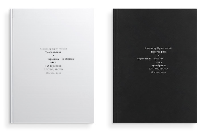
V. G. Krichevsky. Typography in terms and images. Volume 1 and Volume 2
In 2000, this work of art historian and designer Vladimir Krichevsky won the competition “The Best Editions of the XIII MIBF” in the nomination “The Book of the Year”. "Typography in terms and images" - without exaggeration, one of the most important books for type designers and designers. This strange and beautiful edition will turn your ideas about typography.
The two-volume work on the art of decorating texts looks very original. The first volume is a reference book of 158 articles arranged in alphabetical order. In turn, you will learn everything about the paragraph, poster, letterhead, booklet ... And "everything" means really everything! Calmly and unemotionally, logically and thoughtfully, paying equal attention to the basics and details, Krichevsky tells about all Russian typographical terms. Surprised that there are no “pictures” in the design book (not at all!), You will go to the second volume. And there ... there is no text! Only pictures that illustrate concepts from the first volume. A detailed and extensive system of references will help you to represent typography in all its variety of manifestations.

A. Korolkova. Living typography
The book by Alexandra Korolkova was released in 2007 and has since gone through five editions. A popular, sought-after, important and interesting book - “student”. And by the tone of presentation, and by the author, and by the way of writing (as a result of the teaching work of the school of graphic design). A lively, dynamic language simplifies the understanding of typographic concepts (but not the concepts themselves!). The work does not claim the title of "best", "bible", "research work" - not at all. This is a lively and vivid textbook, perhaps the first step to get acquainted with typography. A definite plus: the book is completely built on Russian material, refers to the Cyrillic font. Examples from translated books of famous typographers, unfortunately, are often not applicable to the “Russian soil”.
For students and novice designers, “Living Typography” is an excellent choice: it will not scare away a serious subject, it will introduce it into the circle of basic concepts and terms. And it will make it really lively and exciting.

L. Pronenko. Calligraphy for everyone
Calligraphy - the art of writing beautifully - captivates people, and the possession of this art is one of the hallmarks of a culture of communication. Leonid Pronenko, Honored Artist of Russia and calligrapher, fascinatingly tells about his craft. In the book you will find a brief history of calligraphy, information about tools and materials for writing. You will catch the admiration of the author and will certainly follow his advice on mastering type culture.
The book on calligraphy is simply obliged to be aesthetically perfect, and Pronin succeeded. The edition is richly illustrated. Both beginners and professionals will certainly pay attention to the works of famous artists from all over the world, presented in “Calligraphy for all”.
Pronin does not just tell you about the wonderful art of calligraphy. He invites you to become an adherent of this art.

E. Ruder. Typography. Design guide
The “typography” of the Swiss Emil Ruder is a classic, a base, “Mast Read”. The book, without the knowledge of which to exist in the modern typographical community is simply unacceptable. The work was published more than half a century ago, but still does not lose relevance. The secret, apparently, is how harmoniously Ruder managed to connect theory with practice. The author, speaking of the dual nature of typography (technical and aesthetic side), says: there is no such type designer who would not be a designer. The uniqueness of the book is given by experiments and examples of the author’s fonts: this is the art of design, and not a craft, it is the highest example to which one should strive. Illustrative examples of the highest quality allow us to understand the "dry theory".
Brand "Swiss Typography" - the merit exclusively Ruder. In the field of typography, he really - "our everything."
In the compilation, I collected all the important books for those who want to dive into typography. As you can see, there are not so many of them and they do not go out too often. But if you have something to add, write in the comments.
Source: https://habr.com/ru/post/308376/
All Articles