Modern approach to visual identification of the brand
The nature of trends * The world has become different * The swear words * Good-bye, familiar logo * End-to-end visual identification system - what is it? * Decisive "no" palmistry * Open to the imagination * Learn to understand the client
The world of domestic graphic design and visual branding is symbolic in its pursuit of trends. It is dominated by the tendencies of blind copying and imitation of the misunderstood. Most designers, marketers, creatives in our country, unfortunately, are people with no education and no roots. Anyone can become a prophet in the fatherland if the true nature of things remains open only to a few — people who aspire to knowledge.
')
How far we have gone in the visual culture, it is easy to see on examples of print advertising twenty-five years ago.
what a fresh and bold approach ... adidas - 2007, shiny entertainment - 1994
The origins of most modern trends and genres are extraordinarily simple: the “glamor” genre is a deep retouch of initially poor photos taken with the participation of poor stylists and mediocre models by curviline photographers. Just a few years - and now we almost never imagine portraits without silly facial expressions and deep retouching, which does not preserve any signs of life on the face. And only a few, big brands, expensive magazines do differently. Why? Yes, because to make a thin, inconspicuous retouching you need a good shot and not weak knowledge of anatomy, it is more difficult than writing a portrait. While "glamorous" retouching can be taught to anyone in three hours. The main thing is not to smear the nose and eyes! The rest of the ride for style ...
1990s ad units
The “grunge” genre is a collage of bad materials, the trend of “technical design” is a gloss that is induced by hopelessness — drawing in photoshop from pictures stolen from the Internet is a technique that anyone can easily master in 3 months. The highest peak is to read two chapters from the textbook on drawing, as for light and shade and glare. Did you know that the average age of beautiful technical designers (including fashionable and popular on the Internet) is 19-22 years old? Wet floor, diagonal highlights and gradients on everything in a row are the quintessence of what is now fashionable to call "web style two -zero".
The situation is even worse in visual identification.
Looking back on classic logos? The time when the Apple logo could become recognizable is over. We love and remember Coca-Cola's lettering, because we see it daily from early childhood. Most often, even designers forget to think about it. I will tell you in secret - it is worth looking at any logo that has been used for many years - bounty there, or tick-so from a professional point of view, and you notice that this is a very poor-quality work. But we got used to it so much that we don’t notice all this. The classic logos shown in each marketing textbook are not always good, they are just familiar.

correct shadows and beautiful “icons”, which again became a trend in technical design 7 years ago
A square or a circle as a logo is a very cool minimalism, but it has no chance to stand out, be remembered ...
Designers and art directors are closing in on their society and circle, they dream of a perfect world - their best work is for ideal people ... Ordinary people simply won't notice them! Subtleties and nuances in the ligatures of the logoized name are available only to those who understand what is written at the beginning of the sentence ...

paranoid restyling of the “first national”
So, we try, we do a perfect, excellent job, but they don’t notice it? Exactly! The best brand identification system is such that it can be overlooked, but at the same time, it is impossible not to know and not to be confused, even subconsciously.
Conscious marketing and advertising for over a hundred years. But still only twenty years ago, no one could have imagined that the images of visual communication would go beyond the limits of leaflets and print advertising in newspapers and move to television, the Internet, electronic boards, flash-videos. Even full-color printing was not so long a difficult and expensive process, no one had heard about four-color printing presses at that time ... Not so long ago the logo was the symbol that could be drawn in 3 seconds and spread on any material by any replication. Like a stamp. Something simple, tech.

A similar situation is created in the minds of the average consumer ...
Today, modern methods of communication, the Internet, video, allow goods to have an image that reveals itself with the help of the richest ways of visual transmission of information. The logo, color and font are an infinitely small part of the system of visual identification of the brand in today's competitive environment. Globalization and the merger of large markets impose new requirements for recognition and internal content of the brand. Standards of visual identification are becoming comprehensive, they define the key principles of stylistic and ideological unity of all visual aspects of brand communication.
And, most importantly, in the “beautiful new world” - the market is so saturated with visual images of brands that it became very difficult to compete on it. And this is just the tip of the iceberg. In Ukraine, there is no visual culture of branding. Most logos and identification systems frankly copy Western designs or even their closest competitors. Every day a consumer is buried under a wave of visual garbage - the product of vital activity of unqualified designers and near-market marketers. All this reduces the receptive level of the selective perceptual filter, or, in simple terms, causes a person to ignore 90% of the efforts to identify a brand.
Also a frequent and dangerous tendency is unreasonable branding - the introduction of a new style and a higher level of guarantees and promises without any changes in the real work of the business. An example from life: standing in a stuffy room, in a 40-degree heat, without air conditioning and a fan, waiting in line at the cash desk for 30 minutes, knowing that a boorish cashier will meet you in the window, it is difficult to perceive the projection of the warm and friendly image of Nadra Bank. And for some reason, I don’t even want to follow the call on the poster “if you think that the level of service does not correspond to the level of quality and service, please contact the head of the department and you will have a pleasant surprise”. I saw this boss repeatedly. No pleasant surprises can be expected from her ...
- I can't stop wondering.
Since when is the change of the logo and corporate identity
started to be called rebranding?
- since then, when our businessmen literate
competitors pricing (without markups of 100-200%),
started calling "dumping" :)
(from comments on the site adme.ru)
From most of my fellow designers, branding consultants over the years, I hear, in fact, the same thing: in our country (and in Russia in general) there is no visual identification, there is no visual branding - there is only “corporate identity” . My signature style is a striped shirt. And mine is all red! And my - that's how he ...
Compare the sound of the phrase "Corporate Identity" and "The system of standards for visual identification of the brand." There is a difference? The first is the designer “feint with ears”, the style of the new collection is dresses from garbage bags. The second is the declaration of a system of standards, rules, norms, restrictions and receptions.
The word “brandbook” has now become no less “obscene”. Along with the word "brand" is a term that explains in different ways everyone who uses it. The word "brandbook" often denotes everything. In Ukraine, for example, no one needs a collection of dummies and two pages of “bla-bla” from the authors. Abroad - the “brand book” - a lot of “blah blah” about the essence of the brand, its internal idea, approach to creative work with the brand, the nature of graphics and communications, decorated with beautiful pictures. In Odessa (purely regional specificity) - the development of standards for visual identification (apparently not to use the phrase "corporate identity"), sometimes comes to the "clinic": "Can you make us a brand book? Well, as expected, with the name, with the logo, with company colors? ... ".
The developers are afraid to use this alternative to the term - “a guide on the implementation of visual identification standards”, “a brand visualization guide for designers” - it is clear that these are serious documents, writing of which requires no less effort than writing a good textbook. It is clear that this can not be done for 5 000 UAH. But the market demands affordable prices ...
Increasingly, the logo is losing its dominant role at the top of the chain of graphic images. The era of branding only food products and financial organizations has passed. More and more tasks arise in the service sector, trade, information-intensive industries. Where the logo in its pure form is found in visual communication is extremely rare. Yes, according to the tradition bordering on the ritual, it is put in a corner or on the back of a leaflet, it hangs in the right corner of the video, in the bottom line of the billboard is a small one, forgotten by everyone, unnecessary. And for food, it almost lost its meaning - logos are everywhere, brands, sub-brands, satellites, generics - five logos for one package, 100 each - for one shelf in a supermarket. Any FMCG branding specialist will tell you that a consumer has long perceived the packaging of a product entirely - with a color spot. Therefore, some unfortunate experts even began to call in the textbooks on marketing the packaging of goods "combined trademark" ...
The era of the “clean mark” is passing swiftly - trying to save an old friend, the designers put glass effects, glare, shadows, gradients on him - trying to prolong his life. Even the giant "Apple" did not escape this fate, confirming the well-known thesis that this logo created today would not work ...
Dubai International Airports
Branding imposes other requirements on the logos of the new generation - plasticity, natural dynamism (everyone is tired of animation sucked from the finger in logos where it is not provided - but video, flash and other media require dynamics from the logo), ease of adjustment for any composition, without loss of the role of the mark in it ...
The train of simple forms left a long time ago. Twenty years ago, they probably issued a patent for the last standing hatch. All further experiments in this area are the deliberate failure of the task of creating recognition and competition of images.

All logos are created in 2008, aha :)
That is why I say “goodbye, familiar logo”. The logo of the new generation is completely different. Often, it is three-dimensional, often it is a non-existent figure or a figure with a complex topology — there’s only one thing in common — it is easily impressed, recognizable, and does not look far-fetched.
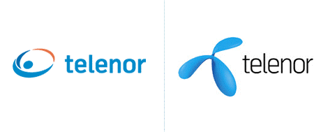
“Goodbye, familiar logo” - restyled telenor - Wollf & Oliins
We often say “a modern system of visual identification of a brand should be integral and end-to-end”, but what does this mean in practice? In general, everything is simple - the end-to-end identity is pervasive - it is plastic, easily transformed for the needs of any visual, circulation. Sufficient and redundant system of images and rules, which does not crowd out the meaning, but does not lose itself. To better understand what this means - let's look at typical mistakes.
A sure sign of a bad logo is a self-sufficient, proud icon that rejects any neighborhood that feels comfortable only in the middle of a large white sheet.
A sure sign of the presence of "corporate identity" is when all that a designer can do is to stick a logo on the whole sheet, under a cutout or to duplicate it, making it a "water sign". Twice or three times even repeated logo is not an identification system.

Partners International corporate identity - Panic Design.
If you remove “graphic trash” from it in the form of a repeating logo on the background and a yellow strip, the logo will remain in the left corner.
Corporate color and corporate block (free applications to the “no less corporate” style) - how much these sounds are for the heart of the Russian ... To begin with, about the concept of the “corporate block” - everything is simple and understandable here - to assemble a stable logo composition, addresses with phone, some striped with ryushikom and jot down on all layouts. Ctrl + C, Ctrl + V - simple, convenient, brand, stylish ... Whether it helps to create a sustainable identification system - hardly ... A consumer like this block instantly learns to ignore - a selective filter, a white spot on the retina if you want. The same story about the “logo in the left corner” style well-known in designer circles.
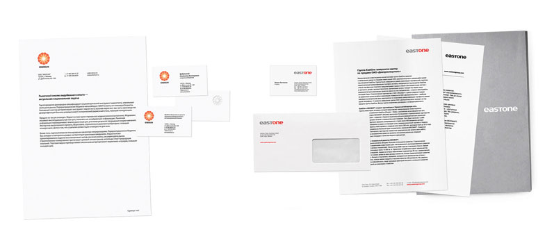
Enersun - JollyForm Studio; EastOne - KARANDASH DESIGN
AN Onyx Group - design band Guess Who; Alternative rebranding of Russian Railways - Oleg Lukyanov

Ukrinvest - Art. Lebedev Studio; Kovalenko Brothers - Mikhail Mukovoz Studio
Each young designer sooner or later comprehends the great Tao - he fills the entire sheet in red and puts on it a small white logo, or fills the sheet in green - and the logo makes gold - it makes no difference, the main thing that looks inexpressibly cool: concisely, restrained, stylishly. Even the client can not keep his “aah” ... Only one trick - corporate color, even when there is a lot of it, is not enough for identification - it does not allow it to stand out. On the contrary, it opens the slab above the mass grave of the same victims of the “corporate lack of style”.
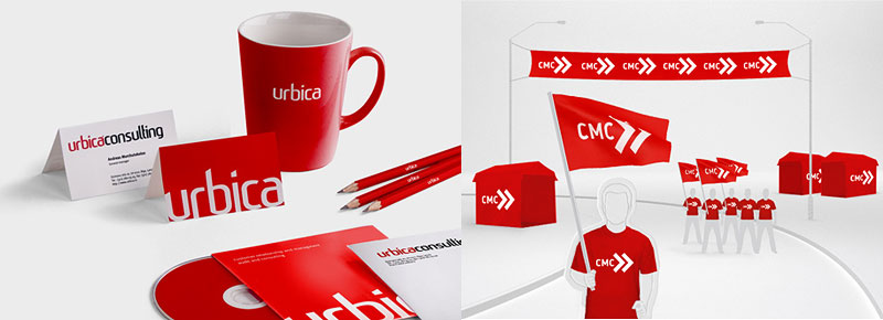
Urbica - Nile Studio; Union of Young Socialists - Konovalov XCLV
Kit Computers - Lobachev; Brand Klitschko - Konovalov XCLV

You will not compete with the giants ... Cola-Cola - Turner Duckworth
Or here - rounded corners, another painful trend of modern design.

TEL - Nile Studio; Hitec - Art. Lebedev Studio; mcg - The Consult
One of the most important tasks of a modern system of visual identification is to make all its elements, starting from logos, meaningful and applicable. The situation when the sign should be large and central to the composition, otherwise it is not needed and not visible, should not arise in principle. Also with secondary elements - they have no place on the back of the composition. I call it the "organicity of the system."

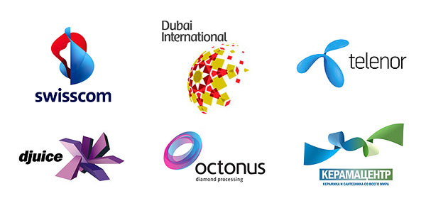
djuice - Wollf & Oliins

Convenience adjustment elements of the sign for the composition,
djuice - Wollf & Oliins
The goal of a pass-through identity is to identify a message, an instant, subconscious, unmistakable definition of the message, layout, carrier to a specific brand. That is why any message, any visual should consist of more than 50% of the elements of the identification system. Primary and secondary elements, characteristic features in layout and fonts, color dominant. In motion, the consumer has 5 seconds to consider the affiliation of the appeal - this is decisive in deciding whether he is interested in it. It is due to the immediate reading of the accessories that the identification system works in the slice of the long-term branding effect and the imprinting effect. Regardless of whether the respondent is interested in the message - he remembers the brand.
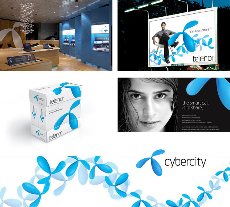
Modern logo, as the only sign of visual identification. telenor - Wollf & Oliins

Octonus - Oleg Korshunov, Jam Studio
Octonus - Color coding and the use of graphic elements in the corporate style make any printed products recognizable.

Octonus - Oleg Korshunov, Jam Studio
The brand is more primary than the essence of fractional communications. The deeper the penetration of the identification system into the essence of the primary components of visual communication, the better. Simply put, the more simple elements in a layout or video says about the brand - the more significant the designers' victory. Today, it is absurd to talk about an identification system that does not describe and does not penetrate into website design, video advertising and presentation content. The main thing is not to bend the stick ...
"Freaked out the stick" - Zhitlobud, Art. Lebedev Studio. The identification system easily penetrates into any communication, completely displacing from there all the information and common sense.

Proof of this is the real billboards I recently met near Kiev. I did not have time to take pictures - I drew it in memory.
Palmistry - this is the science of reading the lines on the hands. It seems like the whole past, future, all diseases are written on the hands of a man ...
The same chiromancy is told by pseudo-marketers and pseudo-designers about their logos - this line symbolizes growth, this spot is our aspirations, and the seagull hints at the lofty intentions ... Familiar?
Understand - the consumer does not want to "read" your logo. He is not going to guess by it, predict the fate and calculate the mission of your business. In general, he does not even want to read your advertising printing, but the logo ... Dismiss! The task of the system of visual identification is not to explain the meaning of the logo. The logo of a ceramic tile shop should say something about a store, without a video series, without titles? Not! The meaning of the logo is to be remembered and cause associations associated with the store! Select a store from the general flow, associate with certain emotions.

Aurora - KARANDASH Design - try to “read” this logo
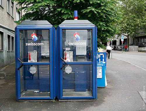
It is easy to guess that the image of the phone in the logo will not help the easy identification of the telephone company simply because the affiliation of the logo identifies the caption "Telephone company Uraltelecom", for example. And if in advertising, forms and boards there will be no caption - this is a huge mistake. The phone in the logo is just superfluous, it is the surest way to get safely lost among hundreds of other telephones and handsets ...

Swisscom - Moving Brands - phone company without a phone number in the logo

Swisscom - Moving Brands - On the Move
And in life - very noticeable. Photo by Artemy Lebedev.

Swisscom brand identification - Moving Brands

Swisscom brand identification - Moving Brands
Conservatism in the approaches to identification has already spawned a traditional problem - we remember advertising, but we do not remember what was advertised. The thing is that within the system of visual standards, there is often no room for imagination. All that a designer can do on these guidelines is to hang a ribbon on the top and a striped bottom. This will not hook the consumer, and therefore the main action takes place just between the style-building elements, pushing them to the second and even third plan - so people get used to not noticing the brand following the appeal ...

One of the first breakthroughs in our market was made by the British Wollf & Oliins and their identity Beeline. Extremely simple. Black and yellow stripes, but not below or at the top of the layout and not even around the letters - everywhere! On items, in a video, on a website, inside images, in a logo ... A penetrating system, pervasive visual signs of a brand. We were expecting a wave of imitators, but nothing like this happened. Beeline brand has been recognizable for 5 years now.
A similar story occurred with the notorious rebranding of UMC in MTS. Quickly aware of the mistakes at the stage of the withdrawal of the brand and eliminating the “egg” accent from communication and philosophy, MTS is rapidly gaining momentum and now has perfect recognition. Significantly higher than the recognition of UMC, even at the peak of its "promotion".
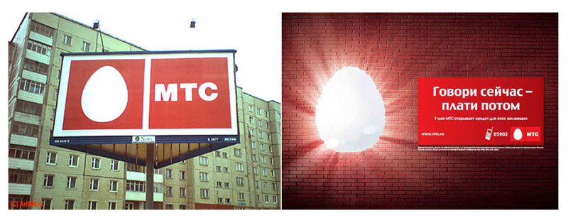
“Egg attack” at the start of rebranding
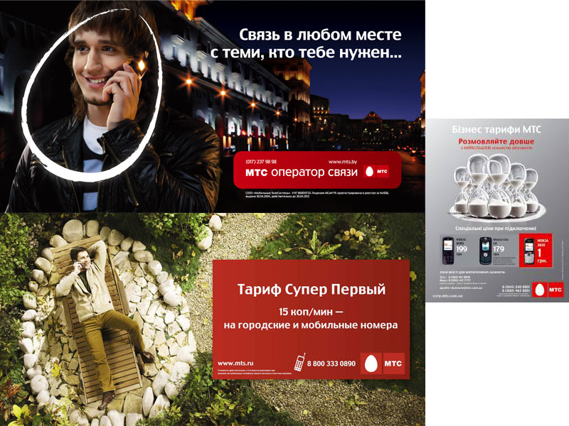
Significant reduction of the logo in mock-ups, shift of emphasis and the introduction of the corporate image in the illustration after the “egg protest”
Both of these examples are textbooks, because the creators of these identification systems have not forgotten about the scope for fantasy.

Unilever by Wolff & Oliins - a space for fantasy
A customer or a consumer is the first violin in any marketing orchestra. All efforts are directed at him.
The 21st century is in the courtyard and it’s worth remembering that, even before starting work on brand identity, it’s worth thinking about where the consumer will have to meet with our works most often. After all, if this is a small shop - then the carriers - the signboard, the packaging, the price tags, the packages - are limited in size and expressive means. If a business is a law firm, then living on a logo only on business cards and on letterheads with folders is quiet and inconspicuous. And if a large supermarket chain - then who will see her business cards and forms? Billboards, video, Internet, partisan media, interior and exterior, navigation system and corporate magazine are carriers of style, creating a huge scope, which we are obliged to use. If the restaurant: carriers - menus, interiors, postcards, branded clothing, outdoor advertising.
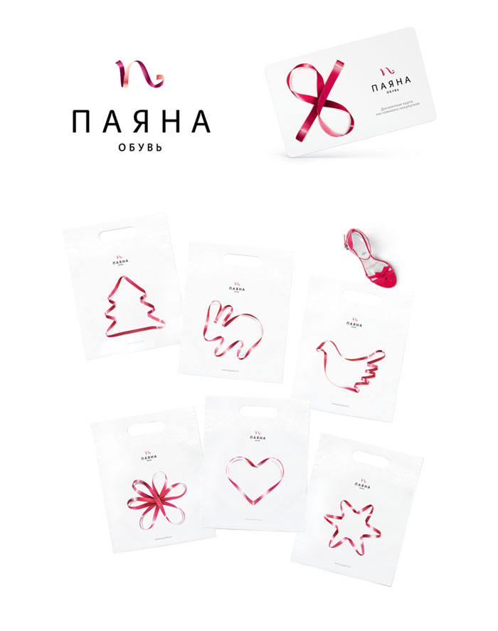
Payana - Art. Lebedev Studio. The zone of application of the identification system - packaging, packages, discount cards, television and the Internet - a plastic, full-color, material image was chosen.
Increasingly, tasks arise when the traditional, monochrome logo is not needed in principle. For example, business is conducted online - this is an information portal - a social network. Advertise only on TV and on rich-media in the network, only electronic forms for sending by e-mail. Fantasy? Reality!
Understanding the consumer means not only knowing and using where we encounter him. This is, first of all, to understand what he wants to see.If he doesn’t need your logo and style, if you are the best search engine optimization company in the city, for example, you don’t need to advertise at all. Your clients come on the recommendation - you do not need any identity system. Your identity is you! It can be quite limited to a beautiful inscription on business cards and letterheads of commercial offers ...
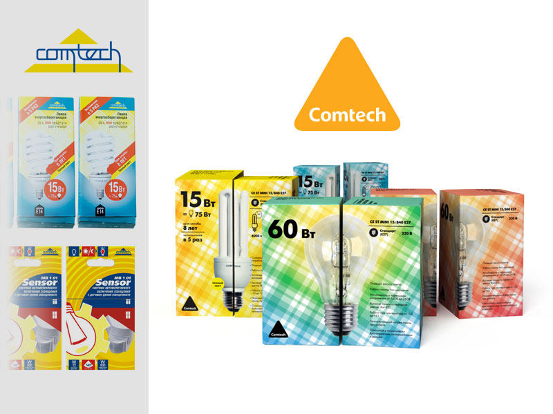
Comtek - restyling, ONY studio. The identification system is built with a clear understanding that its main carrier is packaging.
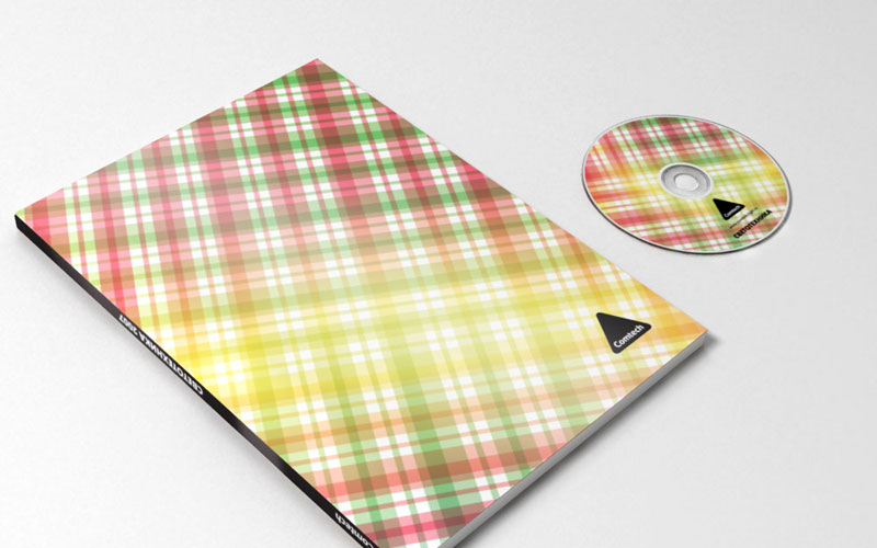
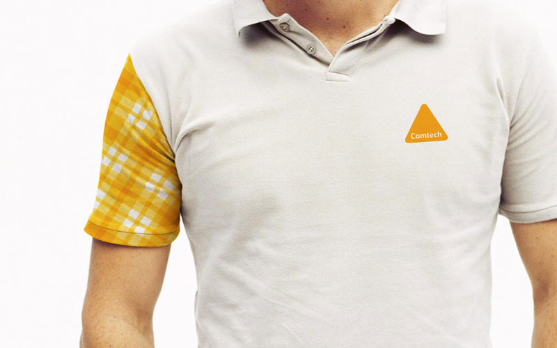
Comtek, Studio ONY - Multicolor pattern as a central element of the identification system. Correct determination of the zone of applicability of the identification system.
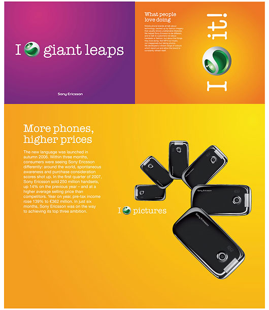
SonyErricson, Wolff&Oliins — — , , «».

Woman Journal — — „” , .
— Identica, achtungdesing.
«» — , iji-design.
. .

Stefan — .
,

— inspire advertising. .
, , , . , .
, , . , , .
Yaroslav Trofimov , inspire advertising / inspire branding. Specialist in branding and graphic design. Founder and artistic director inspire advertising. Author and co-author of more than 80 brands, among which at least 10 have signs of brands. Marketing and branding consultant for many large Ukrainian companies. Winner of the contests “Golden Bee-2008” (nomination for efficiency), KIAF, Creative Games, etc.
Nature of trends
The world of domestic graphic design and visual branding is symbolic in its pursuit of trends. It is dominated by the tendencies of blind copying and imitation of the misunderstood. Most designers, marketers, creatives in our country, unfortunately, are people with no education and no roots. Anyone can become a prophet in the fatherland if the true nature of things remains open only to a few — people who aspire to knowledge.
')
How far we have gone in the visual culture, it is easy to see on examples of print advertising twenty-five years ago.
what a fresh and bold approach ... adidas - 2007, shiny entertainment - 1994
The origins of most modern trends and genres are extraordinarily simple: the “glamor” genre is a deep retouch of initially poor photos taken with the participation of poor stylists and mediocre models by curviline photographers. Just a few years - and now we almost never imagine portraits without silly facial expressions and deep retouching, which does not preserve any signs of life on the face. And only a few, big brands, expensive magazines do differently. Why? Yes, because to make a thin, inconspicuous retouching you need a good shot and not weak knowledge of anatomy, it is more difficult than writing a portrait. While "glamorous" retouching can be taught to anyone in three hours. The main thing is not to smear the nose and eyes! The rest of the ride for style ...
1990s ad units
The “grunge” genre is a collage of bad materials, the trend of “technical design” is a gloss that is induced by hopelessness — drawing in photoshop from pictures stolen from the Internet is a technique that anyone can easily master in 3 months. The highest peak is to read two chapters from the textbook on drawing, as for light and shade and glare. Did you know that the average age of beautiful technical designers (including fashionable and popular on the Internet) is 19-22 years old? Wet floor, diagonal highlights and gradients on everything in a row are the quintessence of what is now fashionable to call "web style two -zero".
The situation is even worse in visual identification.
Looking back on classic logos? The time when the Apple logo could become recognizable is over. We love and remember Coca-Cola's lettering, because we see it daily from early childhood. Most often, even designers forget to think about it. I will tell you in secret - it is worth looking at any logo that has been used for many years - bounty there, or tick-so from a professional point of view, and you notice that this is a very poor-quality work. But we got used to it so much that we don’t notice all this. The classic logos shown in each marketing textbook are not always good, they are just familiar.
correct shadows and beautiful “icons”, which again became a trend in technical design 7 years ago
A square or a circle as a logo is a very cool minimalism, but it has no chance to stand out, be remembered ...
Designers and art directors are closing in on their society and circle, they dream of a perfect world - their best work is for ideal people ... Ordinary people simply won't notice them! Subtleties and nuances in the ligatures of the logoized name are available only to those who understand what is written at the beginning of the sentence ...
paranoid restyling of the “first national”
So, we try, we do a perfect, excellent job, but they don’t notice it? Exactly! The best brand identification system is such that it can be overlooked, but at the same time, it is impossible not to know and not to be confused, even subconsciously.
The world has become different
Conscious marketing and advertising for over a hundred years. But still only twenty years ago, no one could have imagined that the images of visual communication would go beyond the limits of leaflets and print advertising in newspapers and move to television, the Internet, electronic boards, flash-videos. Even full-color printing was not so long a difficult and expensive process, no one had heard about four-color printing presses at that time ... Not so long ago the logo was the symbol that could be drawn in 3 seconds and spread on any material by any replication. Like a stamp. Something simple, tech.
A similar situation is created in the minds of the average consumer ...
Today, modern methods of communication, the Internet, video, allow goods to have an image that reveals itself with the help of the richest ways of visual transmission of information. The logo, color and font are an infinitely small part of the system of visual identification of the brand in today's competitive environment. Globalization and the merger of large markets impose new requirements for recognition and internal content of the brand. Standards of visual identification are becoming comprehensive, they define the key principles of stylistic and ideological unity of all visual aspects of brand communication.
And, most importantly, in the “beautiful new world” - the market is so saturated with visual images of brands that it became very difficult to compete on it. And this is just the tip of the iceberg. In Ukraine, there is no visual culture of branding. Most logos and identification systems frankly copy Western designs or even their closest competitors. Every day a consumer is buried under a wave of visual garbage - the product of vital activity of unqualified designers and near-market marketers. All this reduces the receptive level of the selective perceptual filter, or, in simple terms, causes a person to ignore 90% of the efforts to identify a brand.
Also a frequent and dangerous tendency is unreasonable branding - the introduction of a new style and a higher level of guarantees and promises without any changes in the real work of the business. An example from life: standing in a stuffy room, in a 40-degree heat, without air conditioning and a fan, waiting in line at the cash desk for 30 minutes, knowing that a boorish cashier will meet you in the window, it is difficult to perceive the projection of the warm and friendly image of Nadra Bank. And for some reason, I don’t even want to follow the call on the poster “if you think that the level of service does not correspond to the level of quality and service, please contact the head of the department and you will have a pleasant surprise”. I saw this boss repeatedly. No pleasant surprises can be expected from her ...
Curse words
- I can't stop wondering.
Since when is the change of the logo and corporate identity
started to be called rebranding?
- since then, when our businessmen literate
competitors pricing (without markups of 100-200%),
started calling "dumping" :)
(from comments on the site adme.ru)
From most of my fellow designers, branding consultants over the years, I hear, in fact, the same thing: in our country (and in Russia in general) there is no visual identification, there is no visual branding - there is only “corporate identity” . My signature style is a striped shirt. And mine is all red! And my - that's how he ...
Compare the sound of the phrase "Corporate Identity" and "The system of standards for visual identification of the brand." There is a difference? The first is the designer “feint with ears”, the style of the new collection is dresses from garbage bags. The second is the declaration of a system of standards, rules, norms, restrictions and receptions.
The word “brandbook” has now become no less “obscene”. Along with the word "brand" is a term that explains in different ways everyone who uses it. The word "brandbook" often denotes everything. In Ukraine, for example, no one needs a collection of dummies and two pages of “bla-bla” from the authors. Abroad - the “brand book” - a lot of “blah blah” about the essence of the brand, its internal idea, approach to creative work with the brand, the nature of graphics and communications, decorated with beautiful pictures. In Odessa (purely regional specificity) - the development of standards for visual identification (apparently not to use the phrase "corporate identity"), sometimes comes to the "clinic": "Can you make us a brand book? Well, as expected, with the name, with the logo, with company colors? ... ".
The developers are afraid to use this alternative to the term - “a guide on the implementation of visual identification standards”, “a brand visualization guide for designers” - it is clear that these are serious documents, writing of which requires no less effort than writing a good textbook. It is clear that this can not be done for 5 000 UAH. But the market demands affordable prices ...
Goodbye familiar logo
Increasingly, the logo is losing its dominant role at the top of the chain of graphic images. The era of branding only food products and financial organizations has passed. More and more tasks arise in the service sector, trade, information-intensive industries. Where the logo in its pure form is found in visual communication is extremely rare. Yes, according to the tradition bordering on the ritual, it is put in a corner or on the back of a leaflet, it hangs in the right corner of the video, in the bottom line of the billboard is a small one, forgotten by everyone, unnecessary. And for food, it almost lost its meaning - logos are everywhere, brands, sub-brands, satellites, generics - five logos for one package, 100 each - for one shelf in a supermarket. Any FMCG branding specialist will tell you that a consumer has long perceived the packaging of a product entirely - with a color spot. Therefore, some unfortunate experts even began to call in the textbooks on marketing the packaging of goods "combined trademark" ...
The era of the “clean mark” is passing swiftly - trying to save an old friend, the designers put glass effects, glare, shadows, gradients on him - trying to prolong his life. Even the giant "Apple" did not escape this fate, confirming the well-known thesis that this logo created today would not work ...
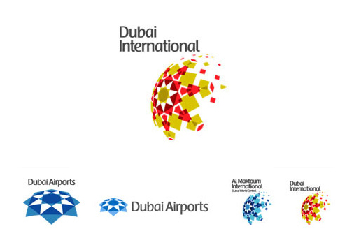
Dubai International Airports
Branding imposes other requirements on the logos of the new generation - plasticity, natural dynamism (everyone is tired of animation sucked from the finger in logos where it is not provided - but video, flash and other media require dynamics from the logo), ease of adjustment for any composition, without loss of the role of the mark in it ...
The train of simple forms left a long time ago. Twenty years ago, they probably issued a patent for the last standing hatch. All further experiments in this area are the deliberate failure of the task of creating recognition and competition of images.
All logos are created in 2008, aha :)
That is why I say “goodbye, familiar logo”. The logo of the new generation is completely different. Often, it is three-dimensional, often it is a non-existent figure or a figure with a complex topology — there’s only one thing in common — it is easily impressed, recognizable, and does not look far-fetched.
“Goodbye, familiar logo” - restyled telenor - Wollf & Oliins
End-to-end visual identification system - what is it?
We often say “a modern system of visual identification of a brand should be integral and end-to-end”, but what does this mean in practice? In general, everything is simple - the end-to-end identity is pervasive - it is plastic, easily transformed for the needs of any visual, circulation. Sufficient and redundant system of images and rules, which does not crowd out the meaning, but does not lose itself. To better understand what this means - let's look at typical mistakes.
A sure sign of a bad logo is a self-sufficient, proud icon that rejects any neighborhood that feels comfortable only in the middle of a large white sheet.
A sure sign of the presence of "corporate identity" is when all that a designer can do is to stick a logo on the whole sheet, under a cutout or to duplicate it, making it a "water sign". Twice or three times even repeated logo is not an identification system.
Partners International corporate identity - Panic Design.
If you remove “graphic trash” from it in the form of a repeating logo on the background and a yellow strip, the logo will remain in the left corner.
Corporate color and corporate block (free applications to the “no less corporate” style) - how much these sounds are for the heart of the Russian ... To begin with, about the concept of the “corporate block” - everything is simple and understandable here - to assemble a stable logo composition, addresses with phone, some striped with ryushikom and jot down on all layouts. Ctrl + C, Ctrl + V - simple, convenient, brand, stylish ... Whether it helps to create a sustainable identification system - hardly ... A consumer like this block instantly learns to ignore - a selective filter, a white spot on the retina if you want. The same story about the “logo in the left corner” style well-known in designer circles.
Enersun - JollyForm Studio; EastOne - KARANDASH DESIGN
AN Onyx Group - design band Guess Who; Alternative rebranding of Russian Railways - Oleg Lukyanov
Ukrinvest - Art. Lebedev Studio; Kovalenko Brothers - Mikhail Mukovoz Studio
Each young designer sooner or later comprehends the great Tao - he fills the entire sheet in red and puts on it a small white logo, or fills the sheet in green - and the logo makes gold - it makes no difference, the main thing that looks inexpressibly cool: concisely, restrained, stylishly. Even the client can not keep his “aah” ... Only one trick - corporate color, even when there is a lot of it, is not enough for identification - it does not allow it to stand out. On the contrary, it opens the slab above the mass grave of the same victims of the “corporate lack of style”.
Urbica - Nile Studio; Union of Young Socialists - Konovalov XCLV
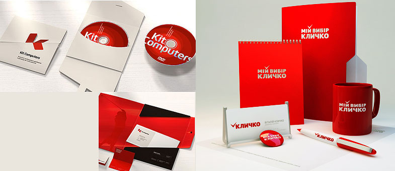
Kit Computers - Lobachev; Brand Klitschko - Konovalov XCLV
You will not compete with the giants ... Cola-Cola - Turner Duckworth
Or here - rounded corners, another painful trend of modern design.
TEL - Nile Studio; Hitec - Art. Lebedev Studio; mcg - The Consult
One of the most important tasks of a modern system of visual identification is to make all its elements, starting from logos, meaningful and applicable. The situation when the sign should be large and central to the composition, otherwise it is not needed and not visible, should not arise in principle. Also with secondary elements - they have no place on the back of the composition. I call it the "organicity of the system."
djuice - Wollf & Oliins
Convenience adjustment elements of the sign for the composition,
djuice - Wollf & Oliins
The goal of a pass-through identity is to identify a message, an instant, subconscious, unmistakable definition of the message, layout, carrier to a specific brand. That is why any message, any visual should consist of more than 50% of the elements of the identification system. Primary and secondary elements, characteristic features in layout and fonts, color dominant. In motion, the consumer has 5 seconds to consider the affiliation of the appeal - this is decisive in deciding whether he is interested in it. It is due to the immediate reading of the accessories that the identification system works in the slice of the long-term branding effect and the imprinting effect. Regardless of whether the respondent is interested in the message - he remembers the brand.
Modern logo, as the only sign of visual identification. telenor - Wollf & Oliins
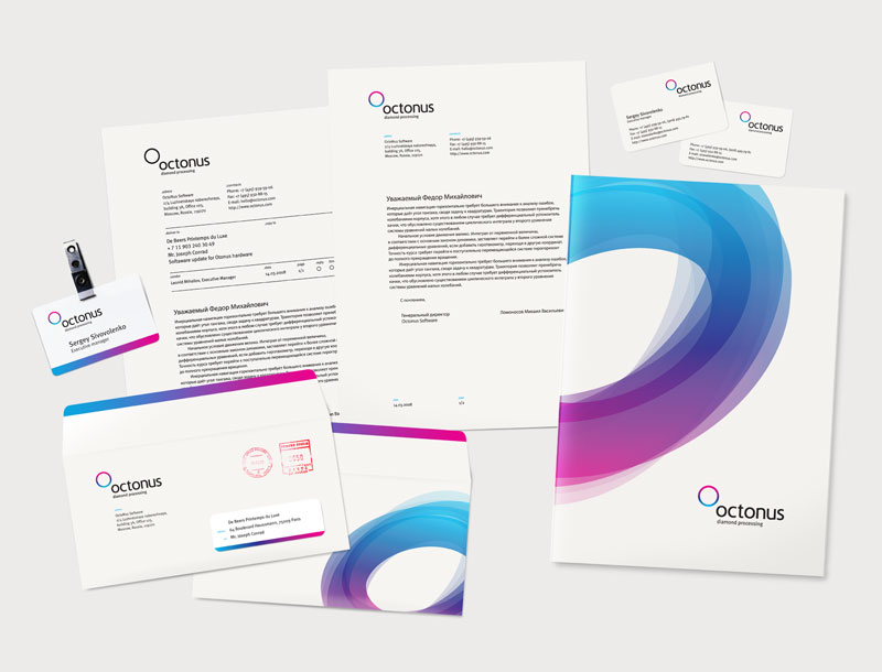
Octonus - Oleg Korshunov, Jam Studio
Octonus - Color coding and the use of graphic elements in the corporate style make any printed products recognizable.
Octonus - Oleg Korshunov, Jam Studio
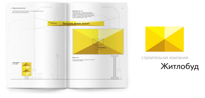
The brand is more primary than the essence of fractional communications. The deeper the penetration of the identification system into the essence of the primary components of visual communication, the better. Simply put, the more simple elements in a layout or video says about the brand - the more significant the designers' victory. Today, it is absurd to talk about an identification system that does not describe and does not penetrate into website design, video advertising and presentation content. The main thing is not to bend the stick ...
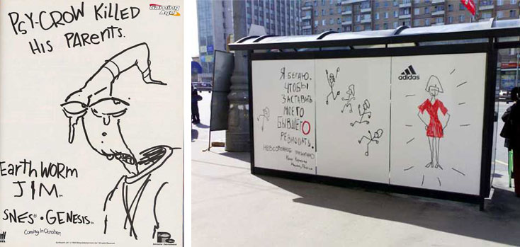
"Freaked out the stick" - Zhitlobud, Art. Lebedev Studio. The identification system easily penetrates into any communication, completely displacing from there all the information and common sense.
Proof of this is the real billboards I recently met near Kiev. I did not have time to take pictures - I drew it in memory.
A decisive “no” to palmistry.
Palmistry - this is the science of reading the lines on the hands. It seems like the whole past, future, all diseases are written on the hands of a man ...
The same chiromancy is told by pseudo-marketers and pseudo-designers about their logos - this line symbolizes growth, this spot is our aspirations, and the seagull hints at the lofty intentions ... Familiar?
Understand - the consumer does not want to "read" your logo. He is not going to guess by it, predict the fate and calculate the mission of your business. In general, he does not even want to read your advertising printing, but the logo ... Dismiss! The task of the system of visual identification is not to explain the meaning of the logo. The logo of a ceramic tile shop should say something about a store, without a video series, without titles? Not! The meaning of the logo is to be remembered and cause associations associated with the store! Select a store from the general flow, associate with certain emotions.
Aurora - KARANDASH Design - try to “read” this logo
It is easy to guess that the image of the phone in the logo will not help the easy identification of the telephone company simply because the affiliation of the logo identifies the caption "Telephone company Uraltelecom", for example. And if in advertising, forms and boards there will be no caption - this is a huge mistake. The phone in the logo is just superfluous, it is the surest way to get safely lost among hundreds of other telephones and handsets ...
Swisscom - Moving Brands - phone company without a phone number in the logo
Swisscom - Moving Brands - On the Move
And in life - very noticeable. Photo by Artemy Lebedev.
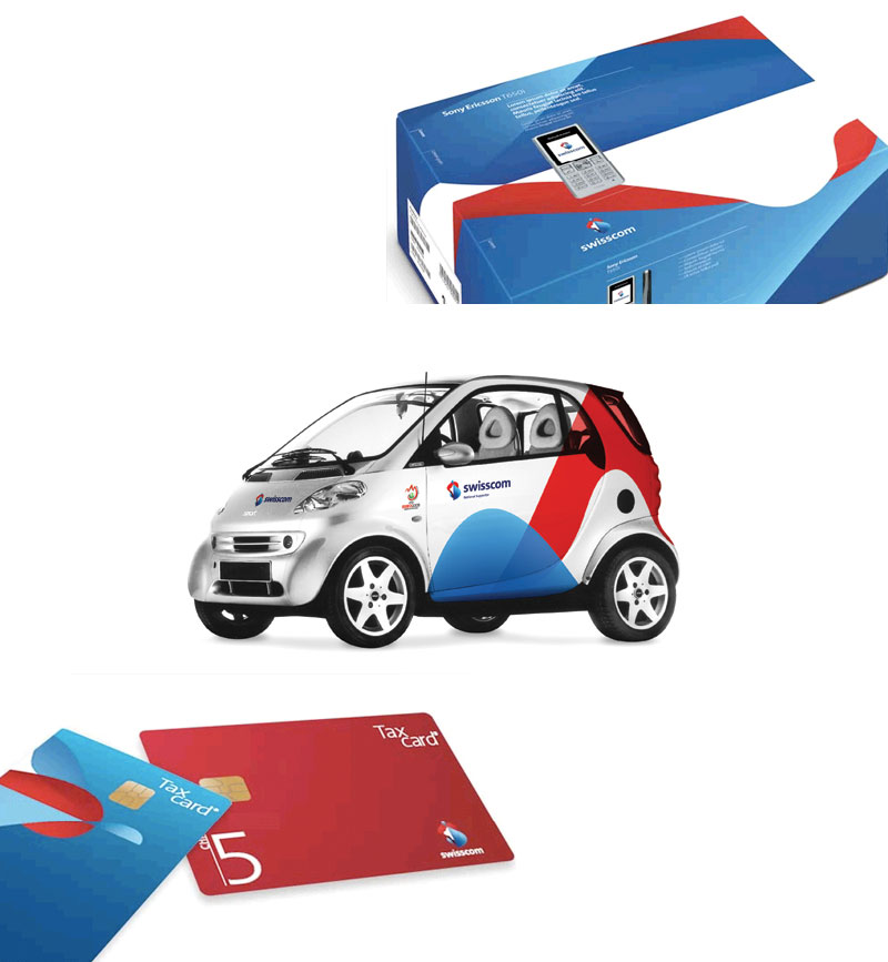
Swisscom brand identification - Moving Brands
Swisscom brand identification - Moving Brands
Open to fantasy
Conservatism in the approaches to identification has already spawned a traditional problem - we remember advertising, but we do not remember what was advertised. The thing is that within the system of visual standards, there is often no room for imagination. All that a designer can do on these guidelines is to hang a ribbon on the top and a striped bottom. This will not hook the consumer, and therefore the main action takes place just between the style-building elements, pushing them to the second and even third plan - so people get used to not noticing the brand following the appeal ...
One of the first breakthroughs in our market was made by the British Wollf & Oliins and their identity Beeline. Extremely simple. Black and yellow stripes, but not below or at the top of the layout and not even around the letters - everywhere! On items, in a video, on a website, inside images, in a logo ... A penetrating system, pervasive visual signs of a brand. We were expecting a wave of imitators, but nothing like this happened. Beeline brand has been recognizable for 5 years now.
A similar story occurred with the notorious rebranding of UMC in MTS. Quickly aware of the mistakes at the stage of the withdrawal of the brand and eliminating the “egg” accent from communication and philosophy, MTS is rapidly gaining momentum and now has perfect recognition. Significantly higher than the recognition of UMC, even at the peak of its "promotion".
“Egg attack” at the start of rebranding
Significant reduction of the logo in mock-ups, shift of emphasis and the introduction of the corporate image in the illustration after the “egg protest”
Both of these examples are textbooks, because the creators of these identification systems have not forgotten about the scope for fantasy.
Unilever by Wolff & Oliins - a space for fantasy
We learn to understand the client
A customer or a consumer is the first violin in any marketing orchestra. All efforts are directed at him.
The 21st century is in the courtyard and it’s worth remembering that, even before starting work on brand identity, it’s worth thinking about where the consumer will have to meet with our works most often. After all, if this is a small shop - then the carriers - the signboard, the packaging, the price tags, the packages - are limited in size and expressive means. If a business is a law firm, then living on a logo only on business cards and on letterheads with folders is quiet and inconspicuous. And if a large supermarket chain - then who will see her business cards and forms? Billboards, video, Internet, partisan media, interior and exterior, navigation system and corporate magazine are carriers of style, creating a huge scope, which we are obliged to use. If the restaurant: carriers - menus, interiors, postcards, branded clothing, outdoor advertising.
Payana - Art. Lebedev Studio. The zone of application of the identification system - packaging, packages, discount cards, television and the Internet - a plastic, full-color, material image was chosen.
Increasingly, tasks arise when the traditional, monochrome logo is not needed in principle. For example, business is conducted online - this is an information portal - a social network. Advertise only on TV and on rich-media in the network, only electronic forms for sending by e-mail. Fantasy? Reality!
Understanding the consumer means not only knowing and using where we encounter him. This is, first of all, to understand what he wants to see.If he doesn’t need your logo and style, if you are the best search engine optimization company in the city, for example, you don’t need to advertise at all. Your clients come on the recommendation - you do not need any identity system. Your identity is you! It can be quite limited to a beautiful inscription on business cards and letterheads of commercial offers ...
Comtek - restyling, ONY studio. The identification system is built with a clear understanding that its main carrier is packaging.
Comtek, Studio ONY - Multicolor pattern as a central element of the identification system. Correct determination of the zone of applicability of the identification system.
SonyErricson, Wolff&Oliins — — , , «».
Woman Journal — — „” , .
— Identica, achtungdesing.
«» — , iji-design.
. .
Stefan — .
,
— inspire advertising. .
, , , . , .
, , . , , .
about the author
Yaroslav Trofimov , inspire advertising / inspire branding. Specialist in branding and graphic design. Founder and artistic director inspire advertising. Author and co-author of more than 80 brands, among which at least 10 have signs of brands. Marketing and branding consultant for many large Ukrainian companies. Winner of the contests “Golden Bee-2008” (nomination for efficiency), KIAF, Creative Games, etc.
Source: https://habr.com/ru/post/30826/
All Articles