Development for SailfishOS: menu
Hello! The next continuation of the series of articles on the development of a mobile platform SaifishOS. This time I want to talk about how to implement various types of menus in the application. This topic deserves a separate article, because the menus in SailfishOS themselves look quite interesting and do not look like menus in other mobile platforms.
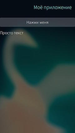
Actually, the main menu view in Sailfish is the menu that is displayed on top of the screen. Since the platform itself places great emphasis on gestures and quick control with their help, then to show this menu a gesture is used - swipe your finger from top to bottom. It looks like this: if the menu is available on the screen in the application, a light bar appears at the top of the screen:
Even on a full-sized screenshot, this strip is poorly distinguishable, but on a real device it is noticeable. For comparison, below is a screenshot of the same screen, but without the menu and, accordingly, with the missing bar.
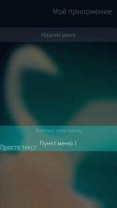
If you pull down on the screen, that menu will appear:
')
An interesting feature of the interaction with the menu in SailfishOS is that you can select a menu item in two ways. You can simply make the svayp down until the menu appears completely (as in the screenshot above). Then it will remain on the screen and you can just poke into the desired menu item. And you can not pull down to the end and then as the menu appears, its items will be highlighted, as in the screenshot below:

If at this moment to remove a finger from the screen, then the highlighted menu item will be selected.
The implementation of such a menu in Sailfish is quite simple. For this, the PullDownMenu component is present in Sailfish Silica. However, this component has a number of features that you need to know before you start using it.
Firstly, since the menu itself is invoked using a swipe gesture, then PullDownMenu can only be used inside containers that allow this gesture. In Sailfish Silica, such containers are:
Secondly, the contents of the PullDownMenu must be components of the type MenuItem or MenuLabel (actually not, see the text below). The first is an interactive menu item and has a number of the following properties:
In addition to these properties, MenuItem also contains a fairly large number of properties of the font type . to set the font of the menu item (you can read about them in the documentation ) and the onClicked () signal handler, which defines the actions that must be performed when you select this menu item.
MenuLabel is a static menu item that simply displays some text and cannot be pressed. Such items are used, for example, as a menu title or as separators between interactive menu items. Naturally, MenuLabel has fewer properties than PullDownMenu :
UPD: Of course, the contents of PullDownMenu , like the other menus discussed in this article, can be any component, not just MenuItem or MenuLabel . However, in the case of using other components, the developer will have to implement the entire interaction logic himself. Yes, and this menu will look no longer native and, therefore, use such opportunities is only in rare cases. In standard situations, MenuItem and MenuLabel are sufficient , so the use of other components within the menu in this article will not be discussed.
A minimal example of a page with PullDownMenu will look like this:
The menu itself will look like this:
It is worth noting here that the menu items inside PullDownMenu are not defined in the order of their appearance on the screen during the swipe gesture, but in the order of their presence in the menu itself, from top to bottom. This feature at first may seem unusual. In addition, it is worth noting that the example above is provided for informational purposes only, but in real applications you should not use too many menu items, much less MenuLabel components.
PullDownMenu contains a number of properties that allow you to customize its appearance and behavior. For example, component indents can be configured using the following properties:
An interesting feature of the last property ( bottomMargin ) is that its default value changes depending on the contents of the menu. If the lowest menu item is MenuLabel , then the property value is 0. Otherwise, the property value is equal to the height of the MenuLabel component. You can see the difference in the examples below:
As seen in the screenshots, this feature allows you to always have the same menu height, regardless of the presence or absence of a title in it, which in turn allows you to save the user experience when using different types of menus.
In addition to dimensions, you can also change other appearance parameters of PullDownMenu using the following properties:
You can change the colors in the menu from the example above to the following:
Then you get a menu of the following form:

It looks, of course, scary, but it shows how these properties work. And using background and menuIndicator, you can set, for example, pictures as a background and menu indicator.
The above properties can be useful if you want to make the menu, as well as the entire application, be executed, for example, in corporate colors. In addition to these properties, the PullDownMenu component also contains properties that allow you to get menu status or easily change its behavior:
Finally, PullDownMenu contains two methods. After selecting any menu item, this menu closes and the closing animation plays. You can cancel this animation using the cancelBounceBack () method, for example, if you call it in the onClicked () handler of the desired menu item. This can be useful in rare cases when closing a menu can interfere with the execution of an action assigned to a menu item.
The close () method allows you to manually close the menu. In this case, you can specify true as an argument to this method and then the menu will close instantly, without animation. For example, in the code below, when you select the menu item "Menu item 2", the menu closes without animation:
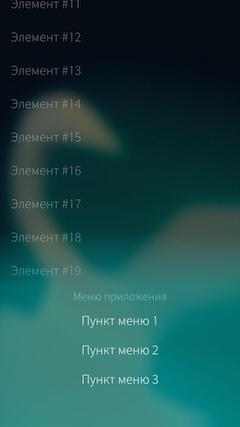
Another type of menu - PushUpMenu - is the same PullDownMenu , with the only difference that this menu appears not at the top of the screen, but at the bottom and, accordingly, the swipe is activated with a gesture from the bottom up. PushUpMenu looks the same as PullDownMenu and all its properties and methods are similar to those of PullDownMenu , so they do not need a separate mention in this article.
However, it is worth noting that since PushUpMenu (as well as PullDownMenu ) has to be inside the container, which allows swipe gestures, the activation of this menu occurs only after all the content of the container has been scrolled to the end. In other words, if you put PushUpMenu on a page with a list, then this menu will be activated only after the user has scrolled through the entire list.
In the code, such an example would look like this:
As a result, you can get to the menu only if you scroll through the entire list to the end:
The last type of menu in SailfishOS, which will be discussed in this article, is the context menu. It is implemented using the ContextMenu component and is a pop-up menu that can be associated with any element of the user interface. The contents of this menu are described in the same way as for PushUpMenu and PullDownMenu , using the MenuItem and MenuLabel components .
Most often, such menus are used to implement the context menu of list items. For this, the ListItem component, which is used to describe the list of delegates, has a special menu property. So you can add a context menu to the list items from the last example. To do this, you will have to slightly change the delegate so that it is implemented via the ListItem , and add the menu itself to it:
Now, with a long tap on the list item, a context menu will appear below it:
When you select items in this menu, the text style of the list item changes:
The context menu closes if you select one of the menu items or simply tap it outside this menu. However, the ListItem component also contains the hideMenu () and showMenu () methods, which allow you to hide or show the context menu manually. As a parameter, the last method can be passed a list of ContextMenu component properties that will be applied to the menu (the properties of the ContextMenu component will be discussed a little later). In addition, the standard behavior for the context menu of a list item can be changed by setting the ListItem component's showMenuOnPressAndHold property to false . In this case, the context menu will not appear with a long tap on the element. Finally, you can find out whether the context menu is shown or not using the ListOtem component's menuOpen property .
The context menu can also be shown outside the list by associating them with ordinary interface elements. For this, the ContextMenu component has a show () method, to which an element is passed as an argument, relative to which the menu should be shown. In this case, the menu will be attached to the lower boundary of this element, and will be shown upwards when shown. The minimal example with such a menu might be:
This page looks like this:
And when you click on the button, the menu leaves the bottom edge of the label:
It should be noted here that it was no coincidence that the height of the inscription was made so large (half a page). The point is that the context menu is shown inside the component specified in the show () method, and if the menu is larger than this element, it will be simply cut off. To demonstrate this feature, you can make the usual height in the example above the caption, and place a white rectangle between the button and the caption:
Then the page will look like this:

And the menu when opened will be cut off:

UPD: As noted by several people, the examples above are not entirely successful. In real projects, in cases where the context menu is larger than the element to which it belongs, it is worth resizing the elements depending on whether the menu is open or not. The code example above, in this case, should be changed by making the height of the Label component dependent on the menu:
Then the page itself will look like this:
And when you press the menu button, you will visually leave the inscriptions below:

You can close the context menu using the hide () method, and find out whether it is open or not using the active property. In addition, the ContextMenu component also contains the closeOnActivation property, with which you can set whether the menu should be closed when selecting any of its items. And the hasContent property will help you find out if the menu has any content. This property is used by the system itself: if the value of hasContent is false , the menu will not be shown, even when calling the show () method.
Finally, the ContextMenu contains an onActivated () signal handler, which is called every time a menu item is selected. The argument of the handler is the index of the selected menu item.
That's all. In this article, I described 3 basic standard types of menu in SailfishOS, told how they can be implemented, as well as what features each type has.
The author: Denis Laure
UPD: The text of the article has been updated, all sent comments have been taken into account. Thanks to everyone who sent comments and comments.
Actually, the main menu view in Sailfish is the menu that is displayed on top of the screen. Since the platform itself places great emphasis on gestures and quick control with their help, then to show this menu a gesture is used - swipe your finger from top to bottom. It looks like this: if the menu is available on the screen in the application, a light bar appears at the top of the screen:
Full size screenshot
Even on a full-sized screenshot, this strip is poorly distinguishable, but on a real device it is noticeable. For comparison, below is a screenshot of the same screen, but without the menu and, accordingly, with the missing bar.
Full size screenshot
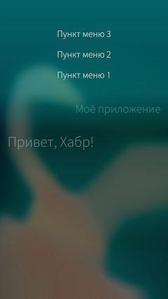
If you pull down on the screen, that menu will appear:
')
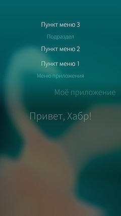
An interesting feature of the interaction with the menu in SailfishOS is that you can select a menu item in two ways. You can simply make the svayp down until the menu appears completely (as in the screenshot above). Then it will remain on the screen and you can just poke into the desired menu item. And you can not pull down to the end and then as the menu appears, its items will be highlighted, as in the screenshot below:
If at this moment to remove a finger from the screen, then the highlighted menu item will be selected.
Pulldownmanu
The implementation of such a menu in Sailfish is quite simple. For this, the PullDownMenu component is present in Sailfish Silica. However, this component has a number of features that you need to know before you start using it.
Firstly, since the menu itself is invoked using a swipe gesture, then PullDownMenu can only be used inside containers that allow this gesture. In Sailfish Silica, such containers are:
- SilicaFlickable is the most basic container that allows you to scroll the screen if the content does not completely fit into the frame of the screen. This component inherits the standard QML component Flickable and should be used when you need a menu on the application page, but none of the containers listed below are suitable.
- SilicaListView is a component that displays a list of elements that inherits the standard QML ListView component.
- SilicaGridView - just like the previous component, is used to display a list of items, but not as a vertical list, but as a grid. Inherits the standard QML component of the GridView .
- SilicaWebView , a component for displaying web content, inherits the standard QML component of WebView .
Secondly, the contents of the PullDownMenu must be components of the type MenuItem or MenuLabel (actually not, see the text below). The first is an interactive menu item and has a number of the following properties:
- text - directly the text of the menu item.
- color - the color of the text defined in the previous property.
- horizontalAlignment - horizontal text alignment of the menu item. It can be one of the following values: Text.AlignLeft , Text.AlignRight , Text.AlignHCenter (used by default) or Text.AlignJustify .
- down - the value of this property is true when the menu item has been selected.
In addition to these properties, MenuItem also contains a fairly large number of properties of the font type . to set the font of the menu item (you can read about them in the documentation ) and the onClicked () signal handler, which defines the actions that must be performed when you select this menu item.
MenuLabel is a static menu item that simply displays some text and cannot be pressed. Such items are used, for example, as a menu title or as separators between interactive menu items. Naturally, MenuLabel has fewer properties than PullDownMenu :
- text - the text of the menu item.
- color - the color of the text defined in the previous property.
- verticalOffset - vertical indent.
UPD: Of course, the contents of PullDownMenu , like the other menus discussed in this article, can be any component, not just MenuItem or MenuLabel . However, in the case of using other components, the developer will have to implement the entire interaction logic himself. Yes, and this menu will look no longer native and, therefore, use such opportunities is only in rare cases. In standard situations, MenuItem and MenuLabel are sufficient , so the use of other components within the menu in this article will not be discussed.
A minimal example of a page with PullDownMenu will look like this:
Page { id: page SilicaFlickable { anchors.fill: parent contentHeight: column.height PullDownMenu { MenuItem { text: qsTr(" 3") onClicked: console.log(" ") } MenuLabel { text: qsTr("") } MenuItem { text: qsTr(" 2") onClicked: console.log(" ") } MenuItem { text: qsTr(" 1") onClicked: console.log(" ") } MenuLabel { text: qsTr(" ") } } Column { id: column width: page.width spacing: Theme.paddingLarge PageHeader { title: qsTr(" ") } Label { text: ", !" width: page.width horizontalAlignment: Text.AlignHCenter font.pixelSize: Theme.fontSizeExtraLarge } } } } The menu itself will look like this:
It is worth noting here that the menu items inside PullDownMenu are not defined in the order of their appearance on the screen during the swipe gesture, but in the order of their presence in the menu itself, from top to bottom. This feature at first may seem unusual. In addition, it is worth noting that the example above is provided for informational purposes only, but in real applications you should not use too many menu items, much less MenuLabel components.
PullDownMenu Properties
PullDownMenu contains a number of properties that allow you to customize its appearance and behavior. For example, component indents can be configured using the following properties:
- spacing - the distance between the bottom edge of the menu and the top border of the page content. By default, this value is zero.
- topMargin - the distance between the top edge of the menu (the same as the top screen tap) and the top edge of the topmost menu item. By default, this value is Theme.itemSizeSmall .
- bottomMargin - the distance between the bottom edge of the lowest menu item and the bottom edge of the menu itself.
An interesting feature of the last property ( bottomMargin ) is that its default value changes depending on the contents of the menu. If the lowest menu item is MenuLabel , then the property value is 0. Otherwise, the property value is equal to the height of the MenuLabel component. You can see the difference in the examples below:
 | |
As seen in the screenshots, this feature allows you to always have the same menu height, regardless of the presence or absence of a title in it, which in turn allows you to save the user experience when using different types of menus.
In addition to dimensions, you can also change other appearance parameters of PullDownMenu using the following properties:
- background - allows you to describe the component that will be used as the background of the menu.
- backgroundColor is the background color of the menu. It is noteworthy that the system itself applies the gradient to the specified color.
- highlightColor - the highlight color of the selected menu item, as well as the menu indicator displayed on top of the screen when the menu itself is closed.
- menuIndicator - allows you to describe the component that will be used as an indicator of the menu displayed on top of the screen when the menu itself is closed.
You can change the colors in the menu from the example above to the following:
backgroundColor: "red" highlightColor: "green" Then you get a menu of the following form:
It looks, of course, scary, but it shows how these properties work. And using background and menuIndicator, you can set, for example, pictures as a background and menu indicator.
The above properties can be useful if you want to make the menu, as well as the entire application, be executed, for example, in corporate colors. In addition to these properties, the PullDownMenu component also contains properties that allow you to get menu status or easily change its behavior:
- active is a property of logical type, the value of which is true if the menu is fully or partially present on the screen.
- busy is also a boolean type property. If its value is set to true , then the menu indicator at the top of the screen will “pulse”. At the same time the menu itself will still be available. This property is useful if you need to show the user that a process is still running.
- flickable - using this property you can specify a flickable component with which the menu will be activated. Those. instead of placing the PullDownMenu inside any container, you can simply specify that container with the value for this property.
- quickSelect is a logical type property that allows you to enable quick selection for a menu. This feature only works on a menu with just one item. If this function is activated, then at any scrolling of the menu (including to the end) its single item will be automatically selected.
Finally, PullDownMenu contains two methods. After selecting any menu item, this menu closes and the closing animation plays. You can cancel this animation using the cancelBounceBack () method, for example, if you call it in the onClicked () handler of the desired menu item. This can be useful in rare cases when closing a menu can interfere with the execution of an action assigned to a menu item.
The close () method allows you to manually close the menu. In this case, you can specify true as an argument to this method and then the menu will close instantly, without animation. For example, in the code below, when you select the menu item "Menu item 2", the menu closes without animation:
PullDownMenu { id: menu MenuItem { text: qsTr(" 2") onClicked: menu.close(true) } MenuItem { text: qsTr(" 1") onClicked: console.log(" ") } } PushUpMenu
Another type of menu - PushUpMenu - is the same PullDownMenu , with the only difference that this menu appears not at the top of the screen, but at the bottom and, accordingly, the swipe is activated with a gesture from the bottom up. PushUpMenu looks the same as PullDownMenu and all its properties and methods are similar to those of PullDownMenu , so they do not need a separate mention in this article.
However, it is worth noting that since PushUpMenu (as well as PullDownMenu ) has to be inside the container, which allows swipe gestures, the activation of this menu occurs only after all the content of the container has been scrolled to the end. In other words, if you put PushUpMenu on a page with a list, then this menu will be activated only after the user has scrolled through the entire list.
In the code, such an example would look like this:
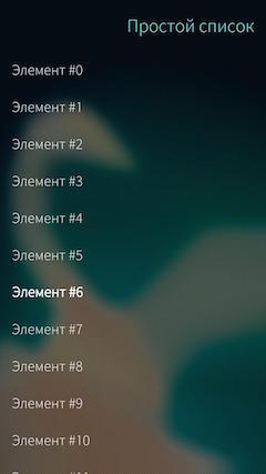
Page { id: page SilicaListView { PushUpMenu { MenuItem { text: qsTr(" 3") onClicked: console.log(" ") } MenuItem { text: qsTr(" 2") onClicked: console.log(" ") } MenuItem { text: qsTr(" 1") onClicked: console.log(" ") } MenuLabel { text: qsTr(" ") } } id: listView model: 20 anchors.fill: parent header: PageHeader { title: " " } delegate: BackgroundItem { id: delegate Label { x: Theme.paddingLarge text: " #" + index anchors.verticalCenter: parent.verticalCenter color: delegate.highlighted ? Theme.highlightColor : Theme.primaryColor } } VerticalScrollDecorator {} } } As a result, you can get to the menu only if you scroll through the entire list to the end:
 |  |
Contextmenu
The last type of menu in SailfishOS, which will be discussed in this article, is the context menu. It is implemented using the ContextMenu component and is a pop-up menu that can be associated with any element of the user interface. The contents of this menu are described in the same way as for PushUpMenu and PullDownMenu , using the MenuItem and MenuLabel components .
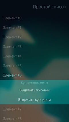
Most often, such menus are used to implement the context menu of list items. For this, the ListItem component, which is used to describe the list of delegates, has a special menu property. So you can add a context menu to the list items from the last example. To do this, you will have to slightly change the delegate so that it is implemented via the ListItem , and add the menu itself to it:
delegate: ListItem { id: delegate Label { id: label x: Theme.paddingLarge text: " #" + index anchors.verticalCenter: parent.verticalCenter color: delegate.highlighted ? Theme.highlightColor : Theme.primaryColor } menu: ContextMenu { MenuLabel { text: " " } MenuItem { text: " " onClicked: label.font.bold = !label.font.bold } MenuItem { text: " " onClicked: label.font.italic = !label.font.italic } } } Now, with a long tap on the list item, a context menu will appear below it:
When you select items in this menu, the text style of the list item changes:
 |  |
The context menu closes if you select one of the menu items or simply tap it outside this menu. However, the ListItem component also contains the hideMenu () and showMenu () methods, which allow you to hide or show the context menu manually. As a parameter, the last method can be passed a list of ContextMenu component properties that will be applied to the menu (the properties of the ContextMenu component will be discussed a little later). In addition, the standard behavior for the context menu of a list item can be changed by setting the ListItem component's showMenuOnPressAndHold property to false . In this case, the context menu will not appear with a long tap on the element. Finally, you can find out whether the context menu is shown or not using the ListOtem component's menuOpen property .
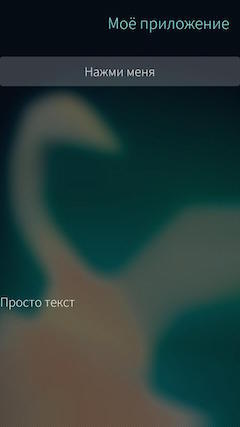
The context menu can also be shown outside the list by associating them with ordinary interface elements. For this, the ContextMenu component has a show () method, to which an element is passed as an argument, relative to which the menu should be shown. In this case, the menu will be attached to the lower boundary of this element, and will be shown upwards when shown. The minimal example with such a menu might be:
Page { id: page SilicaFlickable { id: flickab anchors.fill: parent contentHeight: column.height Column { id: column width: page.width spacing: Theme.paddingLarge PageHeader { title: qsTr(" ") } Button { id: button text: " " width: page.width onClicked: contextMenu.show(label) } Label { id: label height: page.height / 2 text: " " verticalAlignment: Text.AlignBottom } } ContextMenu { id: contextMenu MenuLabel { text: " " } MenuItem { text: qsTr(" 1") onClicked: console.log(" ") } } } } This page looks like this:
And when you click on the button, the menu leaves the bottom edge of the label:
It should be noted here that it was no coincidence that the height of the inscription was made so large (half a page). The point is that the context menu is shown inside the component specified in the show () method, and if the menu is larger than this element, it will be simply cut off. To demonstrate this feature, you can make the usual height in the example above the caption, and place a white rectangle between the button and the caption:
Button { id: button text: " " width: page.width onClicked: contextMenu.show(label) } Rectangle { color: "white" height: page.height / 2 width: parent.width } Label { id: label text: " " } Then the page will look like this:
And the menu when opened will be cut off:
UPD: As noted by several people, the examples above are not entirely successful. In real projects, in cases where the context menu is larger than the element to which it belongs, it is worth resizing the elements depending on whether the menu is open or not. The code example above, in this case, should be changed by making the height of the Label component dependent on the menu:
Label { id: label text: " " height: contentHeight + (contextMenu.visible ? contextMenu.height : 0) } Then the page itself will look like this:
And when you press the menu button, you will visually leave the inscriptions below:
You can close the context menu using the hide () method, and find out whether it is open or not using the active property. In addition, the ContextMenu component also contains the closeOnActivation property, with which you can set whether the menu should be closed when selecting any of its items. And the hasContent property will help you find out if the menu has any content. This property is used by the system itself: if the value of hasContent is false , the menu will not be shown, even when calling the show () method.
Finally, the ContextMenu contains an onActivated () signal handler, which is called every time a menu item is selected. The argument of the handler is the index of the selected menu item.
That's all. In this article, I described 3 basic standard types of menu in SailfishOS, told how they can be implemented, as well as what features each type has.
The author: Denis Laure
UPD: The text of the article has been updated, all sent comments have been taken into account. Thanks to everyone who sent comments and comments.
Source: https://habr.com/ru/post/308102/
All Articles