What do experts and users think about the new design of VKontakte?
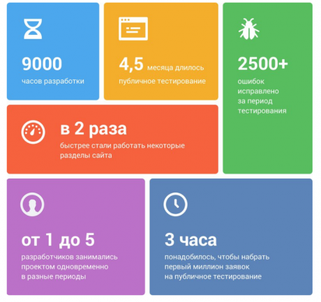
On April 1, 2016, the social network Vkontakte introduced a redesign of its website. A new design was then launched in test mode. Work on it was carried out a year and a half. August 17 there was a final transition. All users of the social network were forcibly transferred to a new design.
According to the lead developer, Vadim Dorokhov, the social network began to work much faster. The site has become visually wider and easier to read. The developers rewrote each element, simplified navigation and made many features more accessible. In addition, the social network has become more accessible for people with visual impairments.
')
Opinions, as always, are divided. While experts and users express their will. What conclusions from this will make the developers of new design?
However, a “slice of public opinion” looks like this:
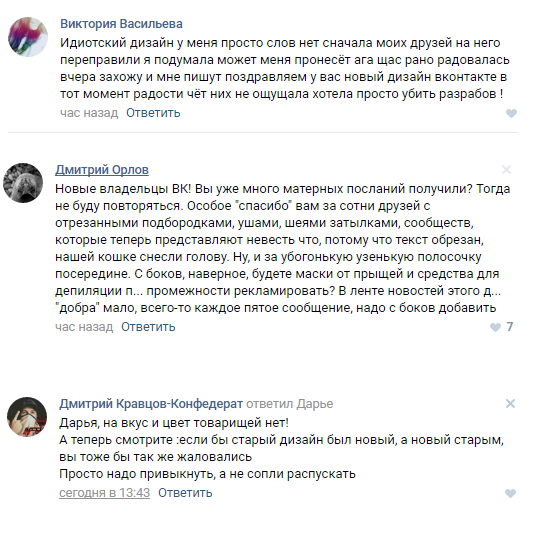
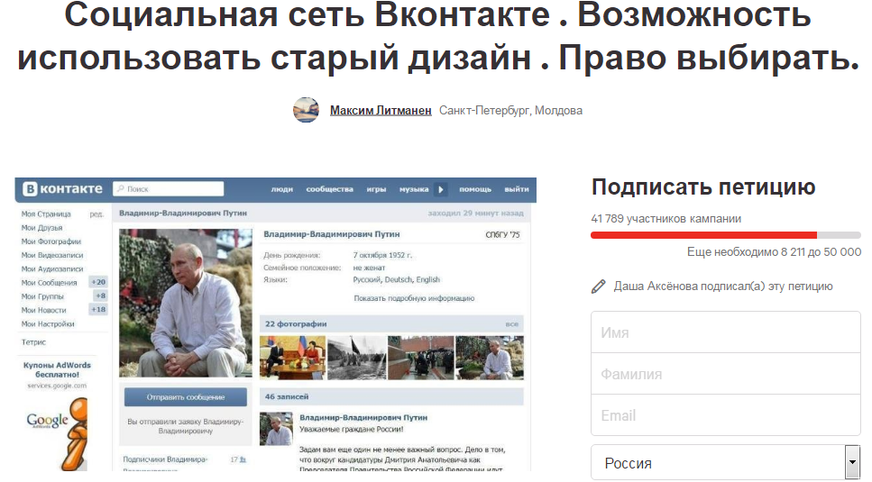
Moreover, negative reviews are much more. On the platform change.org, a petition appeared in defense of the old site design.
“We do not impose and do not force this gesture to abandon the new design. However, a person should have an alternative - to choose what to use and what to ignore, ”writes the petition author Maxim Litmanen. The petition was signed by more than 41 thousand people (as of 17:00 Moscow time, Thursday).
"Durov, return yourself!"
Pavel Durov, who has not taken the position of general director of the social network for quite a long time, criticized the new design.
1. The main section of the site - News - has already become. Paradoxically, the need for redesign was justified by the desire to more effectively use the screen. In fact, if you compare the width of the records in the old and the new version, the news only narrowed by 28px.
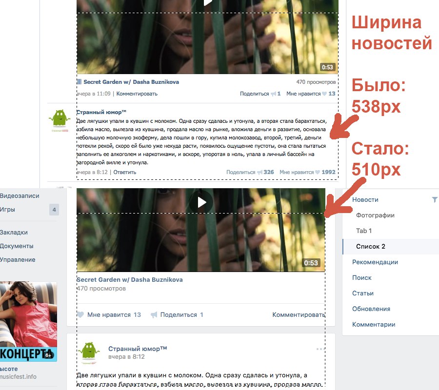
2. News - like all other sections - are down 42px. Due to the fixed caps, the vertical space of the site has become less, you need to scroll more. This is a serious change for the worse: it is the vertical scroll that represents the deficit on most displays.
3. When viewing the main section of the site - News - the focus on content is lost. In the new version, visual garbage appeared in the form of a rarely used fixed right column. Given the fixed caps and narrow widths, viewing the news has become doubly cluttered.
However, even in April there were positive reviews.
Pavel Shumakov, product designer at Badoo, former designer of VKontakte

Wider. It is better. Functional. This is a really welcome event. And users will undoubtedly be rewarded for such a long wait. They are waiting for a new, I would say, clean design. The new site “VKontakte” is a big step for both the company and users. New features, new sections. Attentive user will pay attention to the new font, which organically fit into the new design. I can not say that the choice was simple. But I am confident in the correctness of the decision, and I can vouch for it.
It may seem that there are not enough contrasts. The design looks more than homogeneous. But this gives the design team flexibility to put emphasis on future work.
The user may be annoyed by changing the width in the transition to messages. This could be avoided by making the site adaptive, and depending on the width of the screen, the content width could also be increased. The problem with the footer was not solved, on pages with constantly loaded content it becomes unavailable. On the left, under the menu, he would always be visible and available on all pages.
In my opinion, the design of today's “VKontakte” is something that many other content or large classroom projects can equal. I was glad to participate in the design project of VKontakte and I am very proud of the result.
Dmitry Provotorov, Project Manager, IT Production & Graphic Design Manufactory

Super interesting little things:
• Audio player occupies a dominant place. Everyone knows why people love VKontakte. I wonder how many users listen to music there? I think that the majority, if the player took such an important place.
• On the screenshots in the blog is a very correct thing - a link to the "Advertising" section took a convenient place on the left of the menu. But why didn't they do it in the interface? She stayed in the basement. I directly feel the gnashing of the teeth of thousands of users who are trying to “catch” it in sections with endless scrolling. I think more screwed up.
• Reorganize the menu. “News” and “Messages” won “Friends”, “Groups” and all the rest.
• In the "News" I see two inscriptions "Search". I guess what the differences are, but guessing is not very good for the interface.
• “Interesting first” is a soft transition to a new type of news feed? That there was no "Durov, return the wall!"?
• The "Join Testing" button of the new interface is very good. Highly. I beg you, join me. I want it myself. No, you are not forcing me.
Cool. Like on my iPad. It is high time. I will continue to move to small changes in small steps, I am sure.
We took comments from other experts and asked them our questions.
Denis Shumov, art director m18.ru
Do you agree that you had to give users a choice between the old and the new design?
Yes, this is a normal practice while testing a new version. The threshold of entry into the interface is different for everyone, the transition should be smooth, you can not "chop off the ends." In this case, the final transition to the new version should take place without the possibility of choice, otherwise the Old Believers will never get used to the new shell, plus the content and support of two versions at once wildly burn the company's resources.
How justified is the time spent developing a new design? Do you think the time-result ratio is optimal?
Optimally, it cannot be assumed that the new design was developed for 10 years. VK is a gigantic system with an extensive infrastructure, any changes should come smoothly. Ideally, the new version should be an upgrade of the old one; therefore, it is hardly necessary to look for differences in design and count man-hours.
Do you approve of new designs in general? In terms of ease of use? In terms of appearance?
I am a lover of redesigns, in principle, such a professional deformation. So I very easily switched to the new interface from beta. The only thing that confused is the double screen of dialogs, but this problem is solved in the settings.
What categorically do not like?
There are no such things.
Ilya Bozhko, designer of the company TM

Do you agree that you had to give users a choice between the old and the new design?
No, I do not agree, the VC developers did the right thing by launching the open beta test of the new interface, preparing the user for the update. Maintaining two styles is very difficult.
How justified is the time spent developing a new design? Do you think the time-result ratio is optimal?
Now it is difficult to say, the result will be visible only after a while.
Do you approve of new designs in general? In terms of ease of use? In terms of appearance?
In general, yes. There are moments that require improvement, but in general, the redesign was a success.
What categorically do not like?
I do not like the choice of fonts: size, color, use in general. Round avatars. I don’t like that the important controls (I like, Share) on the left side - on the right side were transferred.
What design elements seem successful?
More thought-out controls, notification icons and audio in the header, message page.
Dmitry Chuta, CEO / Founder at Chapps
Do you agree that you had to give users a choice between the old and the new design?
If you ask about temporary testing, when some users started using the new version and with their feedback they helped fix most of the problems, then, of course, my answer is “yes”. But if we are talking about the choice of the old / new post-final release, which took place yesterday, then of course not.
On the one hand, the existence of two versions reduces the number of negative reactions from users, on the other hand, it creates much more difficulties for support and analytics of the site. In the end, we know that many users will always dislike something. Remember how the "wall" turned into a blog? There was a lot of noise, but VK would not have survived to this day, if it had left everything as it was and listened to the opinions of users.
How justified is the time spent developing a new design? Do you think the time-result ratio is optimal?
The numbers, of course, at first glance seem too high, but only for those who have not worked with large projects with millions of very different and active users. Big data is always difficult. I have such experience and I will try to explain. For example, the designer wanted to change the size of the avatar, for a site with 5,000 users - this is not a problem. But to make a server resize 400 million avatars (how many users are there today in VK?) - this is resource intensive.
And if I say that we also need to make ten additional resize to optimize the load ... did you catch it? Work on the design of such a project always has a lot of limitations that designers need to face and often come up with very non-standard solutions. I even find it difficult to name such designers, as they spend more time with developers and marketers than on drawing layouts. Users will always judge the work superficially, and there is nothing to be done.
Do you approve of new designs in general? In terms of ease of use? In terms of appearance?
In general, yes. In terms of convenience - no radical changes. This redesign is about adaptability under the modern web. Of course, I would like more radical changes, but I understand that it needs more time and do it in stages and carefully, which I think they will do in the near future, when everything calms down and users begin to get used to it.
What categorically do not like?
Purely subjective, I want to return the "Notifications", as it was before: without displaying them in the hotel icon with dropdown, and also to do more search field and make the search itself better and smarter.
What design elements seem successful?
As I have already said, there are no radical changes in design, and the most successful solutions are always invisible, even to me.
For many, dramatic changes evoke a clean slate and hope for the best. But some are ready to write this blank sheet with arguments about how good the old version is, and to demand to return everything to full circle.
Often such criticism is really reasoned and useful. In exceptional cases, the developers decide to return the old version. And sometimes the opposite - public opinion is completely ignored, and this, oddly enough, leads to positive results. We will follow further developments.
Source: https://habr.com/ru/post/308066/
All Articles