Like clockwork, or animated at 60 FPS on CSS 3
Images and text belong to their authors.
Animation of elements in mobile applications is easy. Proper animation can also be simple ... if you follow the tips presented in the article.
Today, whoever does not use CSS 3 animation in their projects, however, not only everything, but very few people can do it correctly. Even the so-called “best practices” are described, but people continue to do everything in their own way. Most likely because they simply do not understand why everything is arranged that way and not otherwise.
The range of mobile devices only does what expands, so if you do not optimize your code with this in mind, such an approach will sooner or later make itself felt in the form of application brakes that your users will encounter.
Remember: in spite of the fact that there are several flagship devices in the world, constantly pushing the progress forward, people use their favorite antiques, with which they are reluctant to part.
Using CSS 3 correctly will eliminate some of the problems, so we want to help you understand some things.
Taming time
What does the browser do when rendering and managing all these elements on the page? The answer is this simple timeline, called CRP (Critical Rendering Path).

To achieve smooth animations, we need to focus on changing the properties that affect the Composite step.
Styles

The browser starts counting styles to apply them to the elements.
Frame
')
At this stage, the browser generates and determines the position of elements on the page. It is at this point that the browser sets page attributes, such as width, height, indents, and others.
Drawing

The browser forms the elements as separate layers, applying properties such as box-shadow , border-radius , color , background-color, and so on.
Overall picture
It is at this stage that your magic will be needed, since right now the browser draws all the formed layers on the screen. Modern browsers perfectly animate four kinds of properties, in terms of transformation and translucency.
- Position. transform: translateX ( n ) translateY ( n ) translateZ ( n );
- Scaling. transform: scale ( n );
- Turn. transform: rotate ( n deg);
- Translucency. opacity: n ;
How to reach 60 FPS
Let's start with HTML and create a simple structure for the application menu inside the .layout container.
<div class="layout"> <div class=”app-menu”></div> <div class=”header”></div> </div> 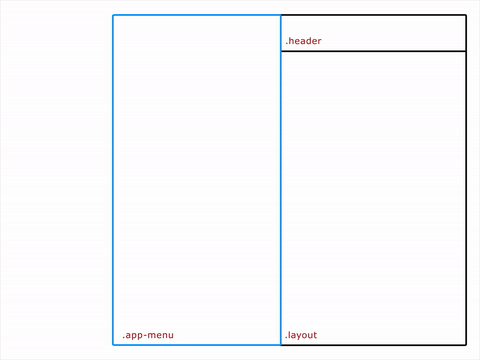
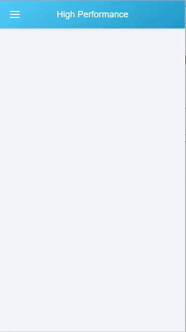
Wrong Way
.app-menu { left: -300px; transition: left 300ms linear; } .app-menu-open .app-menu { left: 0px; transition: left 300ms linear; } Notice which properties we change? You should avoid using transformations with the properties left / top / right / bottom . They do not allow you to create a smooth animation, because they force the browser to reassemble the layers each time, and this will affect all the children.
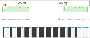
The result is something like this:
The animation slows down. We checked the DevTools timeline to see what was really going on, and here’s the result:

The picture clearly shows the instability of the FPS and, as a result, poor performance.
Use transformations
app-menu { -webkit-transform: translateX(-100%); transform: translateX(-100%); transition: transform 300ms linear; } .app-menu-open .app-menu { -webkit-transform: none; transform: none; transition: transform 300ms linear; } In contrast to the above properties, transformations are applied to already drawn blocks, that is, at the Composite stage. In the example above, we kind of tell the browser that before the start of the animation, all the layers will already be drawn and ready for manipulation.

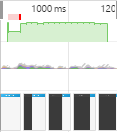
The timeline shows that the FPS has become more even, so the animation will look somewhat smoother.
GPU Animation
Everything could be even better. For this we will use a graphics accelerator.
.app-menu { -webkit-transform: translateX(-100%); transform: translateX(-100%); transition: transform 300ms linear; will-change: transform; } While translateZ () or translate3d () is still required by some browsers as a kind of hack, the future behind the will-change property. It tells the browser to move the elements into a separate layer so that it then does not check the entire frame for assembly or rendering.
See how smooth the animation has become? Timeline confirms this:
FPS has become even more stable, but still there is one slow segment of the animation at the beginning. Based on the menu structure, JS usually writes something like this:
function toggleClassMenu() { var layout = document.querySelector(".layout"); if(!layout.classList.contains("app-menu-open")) { layout.classList.add("app-menu-open"); } else { layout.classList.remove("app-menu-open"); } } var menu = document.querySelector(".menu-icon"); menu.addEventListener("click", toggleClassMenu, false); The problem is that by adding a class to the container .layout , we force the browser to recalculate styles again, and this affects the speed of layout and rendering.
Like clockwork
But what if the menu was located behind the scope? By doing this, we would use only the element that really needs to be animated, that is, our menu. For clarity, the HTML structure is:
<div class="menu"> <div class="app-menu"></div> </div> <div class="layout"> <div class="header"></div> </div> Now we can control the status of the menu a little differently. We will manage the animation through a class that is deleted after the animation ends using the transitionend event.
function toggleClassMenu() { myMenu.classList.add("menu--animatable"); myMenu.classList.add("menu--visible"); } function onTransitionEnd() { myMenu.classList.remove("menu--animatable"); } var myMenu = document.querySelector(".menu"), menu = document.querySelector(".menu-icon"); myMenu.addEventListener("transitionend", onTransitionEnd, false); menu.addEventListener("click", toggleClassMenu, false); Well, now all together. Your attention to the full example of CSS 3, where everything is in its place:
.menu { position: fixed; left: 0; top: 0; width: 100%; height: 100%; overflow: hidden; pointer-events: none; z-index: 150; } .menu—visible { pointer-events: auto; } .app-menu { background-color: #fff; color: #fff; position: relative; max-width: 400px; width: 90%; height: 100%; box-shadow: 0 2px 6px rgba(0, 0, 0, 0.5); -webkit-transform: translateX(-103%); transform: translateX(-103%); display: flex; flex-direction: column; will-change: transform; z-index: 160; pointer-events: auto; } .menu—-visible.app-menu { -webkit-transform: none; transform: none; } .menu-—animatable.app-menu { transition: all 130ms ease-in; } .menu--visible.menu—-animatable.app-menu { transition: all 330ms ease-out; } .menu:after { content: ''; display: block; position: absolute; left: 0; top: 0; width: 100%; height: 100%; background: rgba(0,0,0,0.4); opacity: 0; will-change: opacity; pointer-events: none; transition: opacity 0.3s cubic-bezier(0,0,0.3,1); } .menu.menu--visible:after{ opacity: 1; pointer-events: auto; } 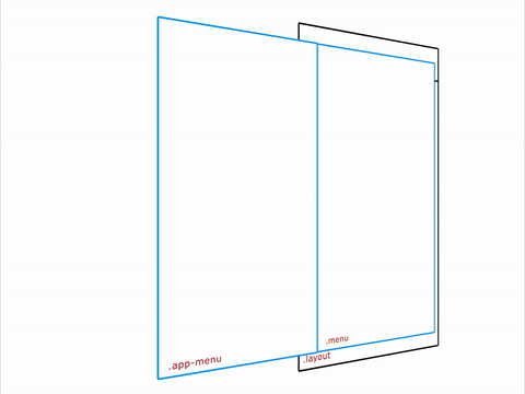
And what does the timeline show?

Something like this.
Source: https://habr.com/ru/post/308006/
All Articles