10 major news media redesigns in 2016
This year, the design changed RBC, Ria Novosti, Life.ru restarted. We have collected in one material the main redesigns of the Russian and Western news sites. With pictures of “Before” and “After” and comments of the teams about why they changed the site.
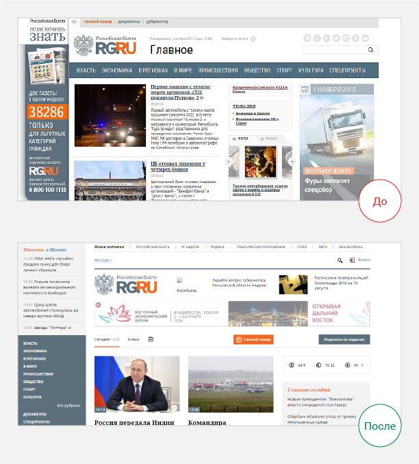
The new design of Rossiyskaya Gazeta is based on data on the behavior of visitors and takes into account the features of the newspaper’s audience.
')
The team responsible for the WG redesign analyzed the audience by education, income level, news consumption style, political beliefs, and so on. Including they built the intersection of the readers of a paper newspaper, a website from a computer and mobile devices:
“Based on the research results, we described portraits of five key characters, which illustrate the types of readers of the RG. First of all, they differ in reader and consumer behavior, in the second - in persuasion and socio-demographic characteristics. ”

To keep readers on the site, in the design considered:
- 35% of transitions to the site come from site aggregators, readers fall on specific material. Therefore, now the reader receives an information picture of the day from the news page.
- After reading one material, the readers leave. To keep visitors, the latest news is now placed on the first screen of the publication page.
- In order for readers to remain on the site and navigate to other news pages, “Read also” and “People like you are reading” blocks appeared on the pages.
- Added a subscription to notifications on a specific topic.
- In order for readers to comment on the news more actively, added the ability to follow the dialogue, receiving alerts in your account.

The Russia Today Media Group presented the ria.ru website design as “brighter, more dynamic and convenient.”
The main bid was made to simplify the graphic language:
- RIA Novosti has changed the structure of the main page, highlighting multimedia blocks;
- removed the sub-browser navigator, which now opens only when you hover the cursor on the main heading, without distracting the user from the text;
- In the online broadcast added another level of navigation, which allows users to search for text, photos and video, integrated into the broadcast.
Kirill Kiryanov, Chief Editor of RIA Novosti:
“We set the goal to make the site easier and more understandable, and at the same time focus on those products that traditionally are the pride of the agency - infographics, photo-tapes, high-quality author texts, which people often did not get to the old design - they were“ sinking ”into the sea of another content. The goal is that the user, visiting our website, could, firstly, quickly understand what is happening in the world, and secondly, he wanted to stay on it a little longer to learn the details of a particular story. ”
A year ago, RIA Novosti switched from manual selection of content recommendations to Relap.io algorithms, increasing the CTR of recommendation blocks by 100% .

One of the oldest Russian online news publications Newsru.com changed design for the first time in 16 years . In general, this information is impressive in itself.
“We really want our readers to like the new version of the site. At the same time, we are not going to deprive our audience of the version to which it has become accustomed over the past 16 years. Our classic version will be updated as before at classic.newsru.com . ”

Novaya Gazeta spoke about the changes on a special page of the site .
The publication began redesign with improvements to the mobile version of the site. New design of NG suggests a two-level rubrication - genres have been added to the sections.
The old collections were replaced with “packages” from the main materials on the topic that the editor creates. Short summaries are attached to the publications for quick familiarization with the material.
“Completely rewritten, otherwise structured and well traced site. Fast (we paid special attention to this). Protected (we will continue to act as a platform for petitions). Nice. And comfortable. Now we can better tell you stories, explain a topic, share your opinion and listen to yours. We have where to put it all. ”
On the main domain of the site, an old version of the design opens, but you can switch to a new one by clicking on the banner at the top of the site.

Director of b2c-products of RBC Kirill Titov told about the redesign of the VC.ru edition .
Each significant change on rbc.ru is first tested on a small audience share and only if it meets a number of criteria is implemented by 100% of readers.
What changed?
Created thematic blocks with interesting materials:
“We assumed that the reader did not initially come to RBC for auto, sport or real estate news, but only goes to the thematic pages if he is hooked by the headline. Following this logic, we replaced the blocks divided by subjects with a single block in which the editors collect the most interesting materials. According to the results of testing, the growth in the capacity of advertising inventory at the bottom of the page increased about three times with a simultaneous increase in its CTR.
Reduced the number of ad formats, increasing the effectiveness of advertising:
“Reduced the number of advertising formats on the pages of materials. This increased the efficiency of the remaining formats, including the premium ones. Interestingly, the increase in efficiency was obtained against the background of a significant increase in the capacity of formats caused by the overall increase in the depth of visits. For example, the return on blocks of contextual advertising has grown by more than 20%. ”
Entered endless scrolling on the pages of materials:
"During the test period, we gained a 15% increase in the depth of the visit, a 6% decrease in refusals, a 8% increase in time spent on the site and no audience churn."

Editions Lifenews.ru and Super.ru merged and restarted as new news media Life.ru.
This is not a story about redesign, how much about a large-scale restart of the product. On Life.ru an analyst, a section on culture and science, a longrid, entertainment content from the former Super.ru have been added to the news.
Aram Gabrelyanov, CEO of News Media media holding in RBC comments :
"This will be a huge portal about life - if you take Western counterparts, something like Buzzfeed."
“In short, we are the first to let people watch, read, listen, write, comment, etc. - everything is exclusive! #Together".

The English edition of The Times redesigned and included The Sunday Times in the main site. The changes affected the frequency of publication: now three times a day.
Influence columnist Stephen Shepperson-Smith voiced observations about this:
- The Times is still in the readers' news agenda, although it does not publish hot news instantly.
Stephen cited the example of a familiar journalist who publishes news on Sundays so that there is less competition for the attention of readers.
- The value of digital content is growing. The Times will publish more content on Facebook and Instagram, and more often.
- The fact of the merger of the sites The Times and The Sunday Times - the nail in the coffin of the latter. Life has changed, and even if we really have more time to read on weekends, the idea of a Sunday newspaper is outdated for both readers and advertisers.
- The power passes to the authors. For their video about the redesign The Times has chosen stellar journalists. It has long been discussed the idea that the distribution of a paid subscription will shift the focus from publishers to content producers. The way The Times presents its restart shows that we are moving in that direction. Now the authors can greatly influence the marketing policy of the publication.

The previous redesign of Sports IlLustrated was made in 2014, then new realities of content consumption were taken into account. But the site began to slow down. The scrolling of the materials worked poorly, and it was almost impossible to read the mobile version of the site.
Columnist Deadspin Kevin Draper wrote a column "Finally, our protracted nightmare ended: Sports Illustrated changed the design . "
“The problem of the old design (2014. - Ed.) Is that it sucked. If you are lucky - the site just terribly slowed down, most of the visitors because of him hanging computers.
If you meet someone from a Sports Illustrated employee, give him five or give him a beer. They hated this site more than all of us. ” <
Now the site is faster. SI.com optimized the mobile version of the site, changed the navigation menu, launched the Sports Illustrated app, and updated its website for children .

In 2015, the media holding Vox Media absorbed the news IT edition of Recode, and in the summer of 2016 he re-started it in a new design.
The Vox Media team described in detail the Recode rebranding process and explained how what was done and why.
“We paid close attention to how competitor websites look to understand the strategic differences between brands. We discussed niches, markets, desires and needs that are in a common competitive environment. We compared the desktop and mobile sites: download speed, corporate colors, social networking pages, video channels and podcasts. ”
Here is an example of comparing the corporate colors of competitors' sites, which the team made before the Recode redesign


In 2016, The Sun rethought the development strategy , focusing on increasing the volume and speed of materials produced. As part of the new strategy was made redesign.
In January, Keith Poole took up the position of digital editor for The Sun, at that time there were 25 news items per day on the site, now it’s 250.
Keith Poole on The Sun's new strategy:
“We focus on volume and speed. In the world of free internet, you need to make a lot of noise, because this is quite a big place. We want our content to see as many people as possible. If we attract visitors, I think we can turn them into loyal readers. ”
Also, emphasis was placed on attracting traffic from social networks.
After the redesign, traffic to the main page increased by 25%. The loading time of the image and title has decreased from 2.8 to 1 second. The whole page is now loaded in 11 seconds, whereas before the redesign was loaded in 15.8 seconds.
Russian newspaper
The new design of Rossiyskaya Gazeta is based on data on the behavior of visitors and takes into account the features of the newspaper’s audience.
')
The team responsible for the WG redesign analyzed the audience by education, income level, news consumption style, political beliefs, and so on. Including they built the intersection of the readers of a paper newspaper, a website from a computer and mobile devices:
“Based on the research results, we described portraits of five key characters, which illustrate the types of readers of the RG. First of all, they differ in reader and consumer behavior, in the second - in persuasion and socio-demographic characteristics. ”
To keep readers on the site, in the design considered:
- 35% of transitions to the site come from site aggregators, readers fall on specific material. Therefore, now the reader receives an information picture of the day from the news page.
- After reading one material, the readers leave. To keep visitors, the latest news is now placed on the first screen of the publication page.
- In order for readers to remain on the site and navigate to other news pages, “Read also” and “People like you are reading” blocks appeared on the pages.
- Added a subscription to notifications on a specific topic.
- In order for readers to comment on the news more actively, added the ability to follow the dialogue, receiving alerts in your account.
RIA News
The Russia Today Media Group presented the ria.ru website design as “brighter, more dynamic and convenient.”
The main bid was made to simplify the graphic language:
- RIA Novosti has changed the structure of the main page, highlighting multimedia blocks;
- removed the sub-browser navigator, which now opens only when you hover the cursor on the main heading, without distracting the user from the text;
- In the online broadcast added another level of navigation, which allows users to search for text, photos and video, integrated into the broadcast.
Kirill Kiryanov, Chief Editor of RIA Novosti:
“We set the goal to make the site easier and more understandable, and at the same time focus on those products that traditionally are the pride of the agency - infographics, photo-tapes, high-quality author texts, which people often did not get to the old design - they were“ sinking ”into the sea of another content. The goal is that the user, visiting our website, could, firstly, quickly understand what is happening in the world, and secondly, he wanted to stay on it a little longer to learn the details of a particular story. ”
A year ago, RIA Novosti switched from manual selection of content recommendations to Relap.io algorithms, increasing the CTR of recommendation blocks by 100% .
Newsru.com
One of the oldest Russian online news publications Newsru.com changed design for the first time in 16 years . In general, this information is impressive in itself.
“We really want our readers to like the new version of the site. At the same time, we are not going to deprive our audience of the version to which it has become accustomed over the past 16 years. Our classic version will be updated as before at classic.newsru.com . ”
New Newspaper
Novaya Gazeta spoke about the changes on a special page of the site .
The publication began redesign with improvements to the mobile version of the site. New design of NG suggests a two-level rubrication - genres have been added to the sections.
The old collections were replaced with “packages” from the main materials on the topic that the editor creates. Short summaries are attached to the publications for quick familiarization with the material.
“Completely rewritten, otherwise structured and well traced site. Fast (we paid special attention to this). Protected (we will continue to act as a platform for petitions). Nice. And comfortable. Now we can better tell you stories, explain a topic, share your opinion and listen to yours. We have where to put it all. ”
On the main domain of the site, an old version of the design opens, but you can switch to a new one by clicking on the banner at the top of the site.
RBC
Director of b2c-products of RBC Kirill Titov told about the redesign of the VC.ru edition .
Each significant change on rbc.ru is first tested on a small audience share and only if it meets a number of criteria is implemented by 100% of readers.
What changed?
Created thematic blocks with interesting materials:
“We assumed that the reader did not initially come to RBC for auto, sport or real estate news, but only goes to the thematic pages if he is hooked by the headline. Following this logic, we replaced the blocks divided by subjects with a single block in which the editors collect the most interesting materials. According to the results of testing, the growth in the capacity of advertising inventory at the bottom of the page increased about three times with a simultaneous increase in its CTR.
Reduced the number of ad formats, increasing the effectiveness of advertising:
“Reduced the number of advertising formats on the pages of materials. This increased the efficiency of the remaining formats, including the premium ones. Interestingly, the increase in efficiency was obtained against the background of a significant increase in the capacity of formats caused by the overall increase in the depth of visits. For example, the return on blocks of contextual advertising has grown by more than 20%. ”
Entered endless scrolling on the pages of materials:
"During the test period, we gained a 15% increase in the depth of the visit, a 6% decrease in refusals, a 8% increase in time spent on the site and no audience churn."
Life.ru
Editions Lifenews.ru and Super.ru merged and restarted as new news media Life.ru.
This is not a story about redesign, how much about a large-scale restart of the product. On Life.ru an analyst, a section on culture and science, a longrid, entertainment content from the former Super.ru have been added to the news.
Aram Gabrelyanov, CEO of News Media media holding in RBC comments :
"This will be a huge portal about life - if you take Western counterparts, something like Buzzfeed."
“In short, we are the first to let people watch, read, listen, write, comment, etc. - everything is exclusive! #Together".
The times
The English edition of The Times redesigned and included The Sunday Times in the main site. The changes affected the frequency of publication: now three times a day.
Influence columnist Stephen Shepperson-Smith voiced observations about this:
- The Times is still in the readers' news agenda, although it does not publish hot news instantly.
Stephen cited the example of a familiar journalist who publishes news on Sundays so that there is less competition for the attention of readers.
- The value of digital content is growing. The Times will publish more content on Facebook and Instagram, and more often.
- The fact of the merger of the sites The Times and The Sunday Times - the nail in the coffin of the latter. Life has changed, and even if we really have more time to read on weekends, the idea of a Sunday newspaper is outdated for both readers and advertisers.
- The power passes to the authors. For their video about the redesign The Times has chosen stellar journalists. It has long been discussed the idea that the distribution of a paid subscription will shift the focus from publishers to content producers. The way The Times presents its restart shows that we are moving in that direction. Now the authors can greatly influence the marketing policy of the publication.
Sports illustrated
The previous redesign of Sports IlLustrated was made in 2014, then new realities of content consumption were taken into account. But the site began to slow down. The scrolling of the materials worked poorly, and it was almost impossible to read the mobile version of the site.
Columnist Deadspin Kevin Draper wrote a column "Finally, our protracted nightmare ended: Sports Illustrated changed the design . "
“The problem of the old design (2014. - Ed.) Is that it sucked. If you are lucky - the site just terribly slowed down, most of the visitors because of him hanging computers.
If you meet someone from a Sports Illustrated employee, give him five or give him a beer. They hated this site more than all of us. ” <
Now the site is faster. SI.com optimized the mobile version of the site, changed the navigation menu, launched the Sports Illustrated app, and updated its website for children .
Recode
In 2015, the media holding Vox Media absorbed the news IT edition of Recode, and in the summer of 2016 he re-started it in a new design.
The Vox Media team described in detail the Recode rebranding process and explained how what was done and why.
“We paid close attention to how competitor websites look to understand the strategic differences between brands. We discussed niches, markets, desires and needs that are in a common competitive environment. We compared the desktop and mobile sites: download speed, corporate colors, social networking pages, video channels and podcasts. ”
Here is an example of comparing the corporate colors of competitors' sites, which the team made before the Recode redesign
The sun
In 2016, The Sun rethought the development strategy , focusing on increasing the volume and speed of materials produced. As part of the new strategy was made redesign.
In January, Keith Poole took up the position of digital editor for The Sun, at that time there were 25 news items per day on the site, now it’s 250.
Keith Poole on The Sun's new strategy:
“We focus on volume and speed. In the world of free internet, you need to make a lot of noise, because this is quite a big place. We want our content to see as many people as possible. If we attract visitors, I think we can turn them into loyal readers. ”
Also, emphasis was placed on attracting traffic from social networks.
After the redesign, traffic to the main page increased by 25%. The loading time of the image and title has decreased from 2.8 to 1 second. The whole page is now loaded in 11 seconds, whereas before the redesign was loaded in 15.8 seconds.
Source: https://habr.com/ru/post/307988/
All Articles