New user of your product - how to help him?
Is the user interface of your product so clear to you? Will the user be able to quickly assess his merits and stay with you for a long time?

In the article below, I will look at the concept of “learning by interaction” on the example of an abstract web system. This approach can be well explained by an example from the modern game world. First you go through the tutorial. You do not immediately hang kilotons of training material on your shoulders. You are led through an early stage of the game, giving out hints at the right time. For example, when you first interact with a new game object. Positive experience accumulates. You are learning to interact. I would venture to suggest that most likely you consider yourself an advanced user when it comes to applications. Like most of them, you instantly click on the “Skip” / “Get Started” button ...
In fact, I also almost always immediately press the “Skip” button. This is normal, because at the moment I am not ready to memorize a lot. And after pressing, I sometimes regret about the sodyan)) And in exactly the same way as the girl above, I start to “wonder at the screen.” Therefore, the “all-at-once” training mode before starting to work with the system is ineffective. Fortunately, not all systems require training. There are fairly obvious (airbnb), and there are those with whom you have to tinker first (bitrix). This does not mean that such a system is bad. This means that it solves such complex tasks that it leads to a complex interface. You just need to spend your time to get comfortable. Maybe you will realize later that this is “really convenient” ...
Let's look at several potential prompting scripts using the abstract web system interface as an example.

The user is logged in. Let's say your goal from the main page is to engage the user in an action. If there is a lot of data, then perhaps you want to first get an experience of interacting with filters. And you think that they are complex, then the right side can be used for help.
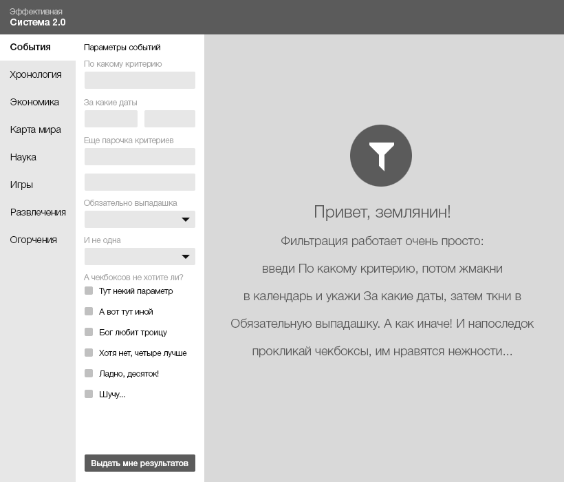
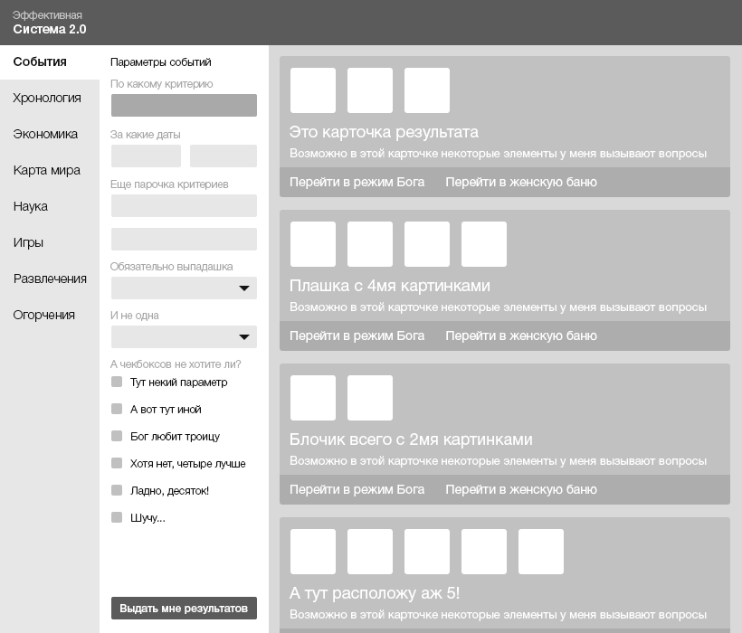
The user sees information only about filters. Since they play a major role in this section. We will assume that he read everything after having made the first click on any element in the filter. If he did onfocus in the first form, then he is ready to begin work. We believe that it is impossible to read the text and simultaneously click on the filter elements :) Still, at last he made his first click. Ready! Now is the time to show him the first results.
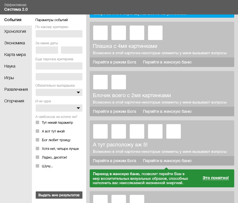
Alternative description of working with filters: show that there is content in the background. To force a hint to read to unlock content by interacting with filters. This can be considered a reward for action. A rather aggressive prompt mode that requires confirmation from the user in 100% of cases (click on “Let's go!”).
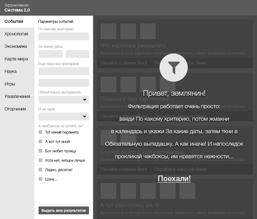
Relevant to use for cases where, without new knowledge, you do not want to allow the user to continue. Both options have their advantages. In any case, we are led to receive the first content. So, we see cards. Let's assume that there is an abstract functional below each, the purpose of which we want to clarify. This problem will be solved by a block hint located in context.
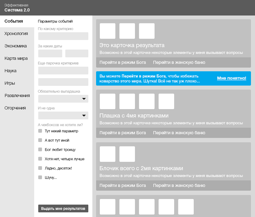
“- Well, if I need to know this right now, then thanks for letting me know and emphasizing it!” - as if mentally I say. And what if the second tool can also potentially raise questions? Then, try to be in the balance of the submission of tips and show the second just below. We start scrolling below and stumble upon the second one.
Everything. Finally this step is completed. We are given freedom in the filters. We select the criteria and get the issue. Let's assume that now we have a search field at the top. Normal search. For example, the headlines of the cards. But it is too easy. Let's assume that our search is as cool as Google. Then by clicking on the search field we will be told about how you can take advantage of the advanced benefits of the search.
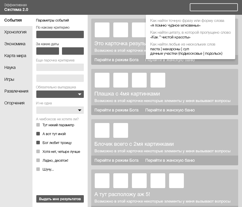
Do you see? We received a hint neither earlier nor later than the moment we needed. We have another knowledge - in this system, search like Google :) And you can also use the trick of "sudden complication." At first we are lured by a simple search form, but when entering the first characters, they are already “intimidated” by the requirement of specifics. Perhaps there is also a gain in freeing the caps from additional controls.

Thus, we indicate the system by what type of content to search. In the end, you can always click past this popup, if you want to search everywhere. And if it is needed, the onhover-action of the mouse on top of the search form will show it again. Oops. I was already carried in another direction. After all, we are now just about the tips.
Let's go now to another section. For example in “World Map”. In general, the UX of almost all cards today is identical. But if there is something special in your map that your user should know about, then this is the time to say so now.
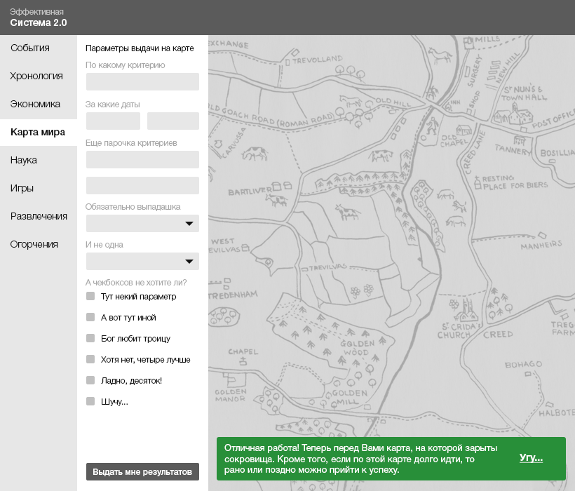
This kind of hint is optional. And it does not cancel the interaction with the card. Most likely, a click to any zone of the map will be considered a priori as a fact of our reading of the green popup and it will close. At your own risk, use the mode when you cannot interact with the card without a confirmation click. Suddenly, something must necessarily warn.
The tip can also have a timing, after which it will automatically disappear from the screen. This is an average case that is suitable for situations where you need to tell something to the user, but there is no need to interrupt his script. Let him make a click on the map. Timing hint appears on top. If there are a lot of such prompts in the system, then after several iterations an experience will be developed that the timings fall above. And if those requiring a reaction are always from the bottom, then this too can be remembered. The habit of “closing on the machine” has not been canceled.
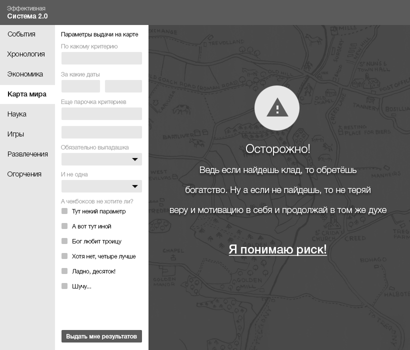
If after the first click it is important for us to clarify that there are additional combinations of script completion, then we apply a more aggressive style of hints. This approach has the right, if there are other ways to achieve the goal by the user. When they are equally good, each of them can be described. And the choice will be left to the user.
The need for this approach can be explained by the need to fully capture the user's attention after the first click. But there is a compromise and less aggressive version of execution.

Popap is contextually affected. A bunch of events is shown - click. But the opportunity to work with the card is not lost. Apparently, such a pop-up can be closed either by clicking on “OK” or by clicking on any part of the map.
Well, and so on for the entire system according to a similar logic. The main thing is not to overlook an important detail: first an event, then a hint on a specific element. So you save the binding context. The event can be both onclick and onhover. The second is to apply in cases where you have maximum confidence that when reaching for an element, the user will most likely click. It is also worth keeping balance. Focus attention on important system details that will help users more effectively achieve their goals. Any animation effects increase engagement against the background of a completely static interface.
Let us now generalize the types of hints that I described above. I propose to arrange them in ascending order from the most loyal, to the most aggressive. The degree of aggressiveness will be measured in our desire to involve the user in exploring the contents of the tooltip.

Hint timing. The most loyal way. Does not require user involvement to close it. When the timer expires, the prompt itself disappears. Does not require the user's attention to move the cursor to get rid of it.
Pop-tip. The average degree of loyalty. It will allow to involve the user more strongly if the spawn occurs at the scene of the event, for example, the popup near the click It requires the user to close the action by clicking on the confirming button or by clicking outside the popup.
Hint block. Allows you to inform the user in the mode of medium aggressiveness. It does not interfere with the interaction with the system functionality, but on the other hand, often requires the user to take an action to hide the prompt.

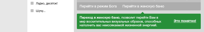
Blocking hint. The most aggressive mode of presenting information. It is used on top of the necessary functionality, followed by blocking it, until a confirmation action from the user follows.
The “learning by interaction” mode is certainly optimal when compared with the all-and-immediately mode. You do not overload the user with information, showing hints strictly contextually to the potential first interaction.
Depending on the importance of the hint, you can use different ways to attract attention: from the most loyal to the most aggressive (when you do not get content or functionality without a forced click).
PS: Yes, and do not forget to “hang up” pop-up tooltips about onhovere to the elements requiring this. Who at least remembers this, that makes our World better!
In the article below, I will look at the concept of “learning by interaction” on the example of an abstract web system. This approach can be well explained by an example from the modern game world. First you go through the tutorial. You do not immediately hang kilotons of training material on your shoulders. You are led through an early stage of the game, giving out hints at the right time. For example, when you first interact with a new game object. Positive experience accumulates. You are learning to interact. I would venture to suggest that most likely you consider yourself an advanced user when it comes to applications. Like most of them, you instantly click on the “Skip” / “Get Started” button ...
By the way, if you use Figma , I recommend paying attention to our ready-made design systems . They help freelancers complete more orders per month, programmers can create beautiful applications on their own, and the Timlids run sprints faster using ready-made design systems for teamwork.
')
And if you have a serious project, our team is ready to deploy a design system within the organization based on our developments and tailor it to specific tasks using Figma. Web / desktop, and any mobile. We are also familiar with React / React Native. Write to T: @kamushken
In fact, I also almost always immediately press the “Skip” button. This is normal, because at the moment I am not ready to memorize a lot. And after pressing, I sometimes regret about the sodyan)) And in exactly the same way as the girl above, I start to “wonder at the screen.” Therefore, the “all-at-once” training mode before starting to work with the system is ineffective. Fortunately, not all systems require training. There are fairly obvious (airbnb), and there are those with whom you have to tinker first (bitrix). This does not mean that such a system is bad. This means that it solves such complex tasks that it leads to a complex interface. You just need to spend your time to get comfortable. Maybe you will realize later that this is “really convenient” ...
Let's look at several potential prompting scripts using the abstract web system interface as an example.
The user is logged in. Let's say your goal from the main page is to engage the user in an action. If there is a lot of data, then perhaps you want to first get an experience of interacting with filters. And you think that they are complex, then the right side can be used for help.
The user sees information only about filters. Since they play a major role in this section. We will assume that he read everything after having made the first click on any element in the filter. If he did onfocus in the first form, then he is ready to begin work. We believe that it is impossible to read the text and simultaneously click on the filter elements :) Still, at last he made his first click. Ready! Now is the time to show him the first results.
Alternative description of working with filters: show that there is content in the background. To force a hint to read to unlock content by interacting with filters. This can be considered a reward for action. A rather aggressive prompt mode that requires confirmation from the user in 100% of cases (click on “Let's go!”).
Relevant to use for cases where, without new knowledge, you do not want to allow the user to continue. Both options have their advantages. In any case, we are led to receive the first content. So, we see cards. Let's assume that there is an abstract functional below each, the purpose of which we want to clarify. This problem will be solved by a block hint located in context.
“- Well, if I need to know this right now, then thanks for letting me know and emphasizing it!” - as if mentally I say. And what if the second tool can also potentially raise questions? Then, try to be in the balance of the submission of tips and show the second just below. We start scrolling below and stumble upon the second one.
Everything. Finally this step is completed. We are given freedom in the filters. We select the criteria and get the issue. Let's assume that now we have a search field at the top. Normal search. For example, the headlines of the cards. But it is too easy. Let's assume that our search is as cool as Google. Then by clicking on the search field we will be told about how you can take advantage of the advanced benefits of the search.
Do you see? We received a hint neither earlier nor later than the moment we needed. We have another knowledge - in this system, search like Google :) And you can also use the trick of "sudden complication." At first we are lured by a simple search form, but when entering the first characters, they are already “intimidated” by the requirement of specifics. Perhaps there is also a gain in freeing the caps from additional controls.
Thus, we indicate the system by what type of content to search. In the end, you can always click past this popup, if you want to search everywhere. And if it is needed, the onhover-action of the mouse on top of the search form will show it again. Oops. I was already carried in another direction. After all, we are now just about the tips.
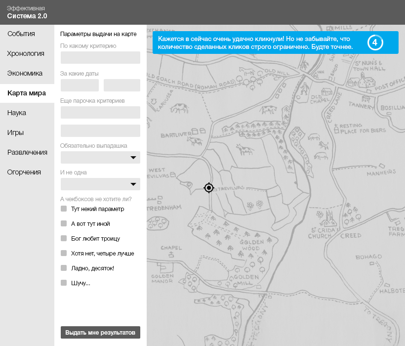
Let's go now to another section. For example in “World Map”. In general, the UX of almost all cards today is identical. But if there is something special in your map that your user should know about, then this is the time to say so now.
This kind of hint is optional. And it does not cancel the interaction with the card. Most likely, a click to any zone of the map will be considered a priori as a fact of our reading of the green popup and it will close. At your own risk, use the mode when you cannot interact with the card without a confirmation click. Suddenly, something must necessarily warn.
The tip can also have a timing, after which it will automatically disappear from the screen. This is an average case that is suitable for situations where you need to tell something to the user, but there is no need to interrupt his script. Let him make a click on the map. Timing hint appears on top. If there are a lot of such prompts in the system, then after several iterations an experience will be developed that the timings fall above. And if those requiring a reaction are always from the bottom, then this too can be remembered. The habit of “closing on the machine” has not been canceled.
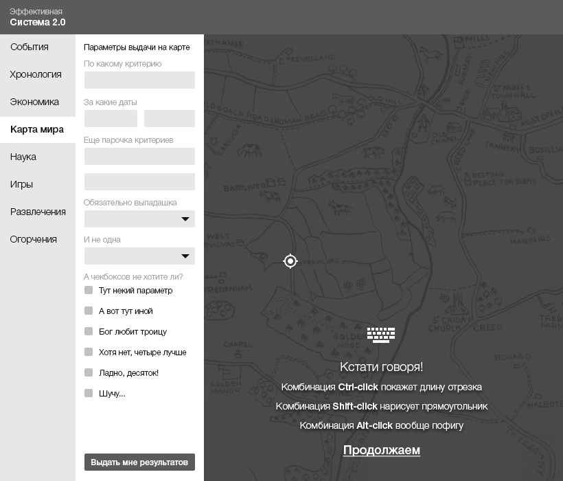
If after the first click it is important for us to clarify that there are additional combinations of script completion, then we apply a more aggressive style of hints. This approach has the right, if there are other ways to achieve the goal by the user. When they are equally good, each of them can be described. And the choice will be left to the user.
The need for this approach can be explained by the need to fully capture the user's attention after the first click. But there is a compromise and less aggressive version of execution.
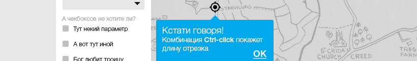
Popap is contextually affected. A bunch of events is shown - click. But the opportunity to work with the card is not lost. Apparently, such a pop-up can be closed either by clicking on “OK” or by clicking on any part of the map.
Well, and so on for the entire system according to a similar logic. The main thing is not to overlook an important detail: first an event, then a hint on a specific element. So you save the binding context. The event can be both onclick and onhover. The second is to apply in cases where you have maximum confidence that when reaching for an element, the user will most likely click. It is also worth keeping balance. Focus attention on important system details that will help users more effectively achieve their goals. Any animation effects increase engagement against the background of a completely static interface.
Let us now generalize the types of hints that I described above. I propose to arrange them in ascending order from the most loyal, to the most aggressive. The degree of aggressiveness will be measured in our desire to involve the user in exploring the contents of the tooltip.
Hint timing. The most loyal way. Does not require user involvement to close it. When the timer expires, the prompt itself disappears. Does not require the user's attention to move the cursor to get rid of it.
Pop-tip. The average degree of loyalty. It will allow to involve the user more strongly if the spawn occurs at the scene of the event, for example, the popup near the click It requires the user to close the action by clicking on the confirming button or by clicking outside the popup.
Hint block. Allows you to inform the user in the mode of medium aggressiveness. It does not interfere with the interaction with the system functionality, but on the other hand, often requires the user to take an action to hide the prompt.
Blocking hint. The most aggressive mode of presenting information. It is used on top of the necessary functionality, followed by blocking it, until a confirmation action from the user follows.
Conclusion
The “learning by interaction” mode is certainly optimal when compared with the all-and-immediately mode. You do not overload the user with information, showing hints strictly contextually to the potential first interaction.
Depending on the importance of the hint, you can use different ways to attract attention: from the most loyal to the most aggressive (when you do not get content or functionality without a forced click).
PS: Yes, and do not forget to “hang up” pop-up tooltips about onhovere to the elements requiring this. Who at least remembers this, that makes our World better!
Source: https://habr.com/ru/post/307674/
All Articles