HelloHome Case Study
HelloHome is an application for finding neighbors created by the Tinder model.
HelloHome Case Study
On the market there has long been an unresolved question of the qualitative search of neighbors, but it has not yet been able to be resolved properly.
The main problems in this area were and remain the following:
The niche is narrow, there are not many offers on the market.
- As a rule, the search for a neighbor is a lottery, you never know what kind of person you will get until you communicate or live with him personally. This problem significantly delays the search in time.
In the HelloHome application, we tried to solve these basic problems.
1. The problem that the application solves
There are a sufficient number of applications, services and sites, but they all have many similar problems:
- a small number of profiles;
- questionnaires contain little information about the owner;
- services are more like bulletin boards than people search services;
- complex search which does not save user requests;
- complexity of communication, as a rule, there are no built-in instant messengers in the services;
- the need is constantly in search;
- the lack of notifications about new and suitable questionnaires.
In order to solve most of these problems, we made an application in which we combined two models, a standard housing search model and the Tinder dating application model that is being collected all over the world in which all the questionnaires are made with cards. This helped solve several problems at once:
- since there are always not a lot of suitable questionnaires, we made sure that the user saw them all, the questionnaires are displayed by cards in turn, as in Tinder;
- having once specified a search, the application will always search for suitable profiles;
- the questionnaires are detailed enough to make a first impression about a person;
- with all suitable applicants you can quickly communicate in the messenger and make a decision, which will be enough to meet and talk in life;
- The application will notify you when new profiles or profiles that match your search appear.

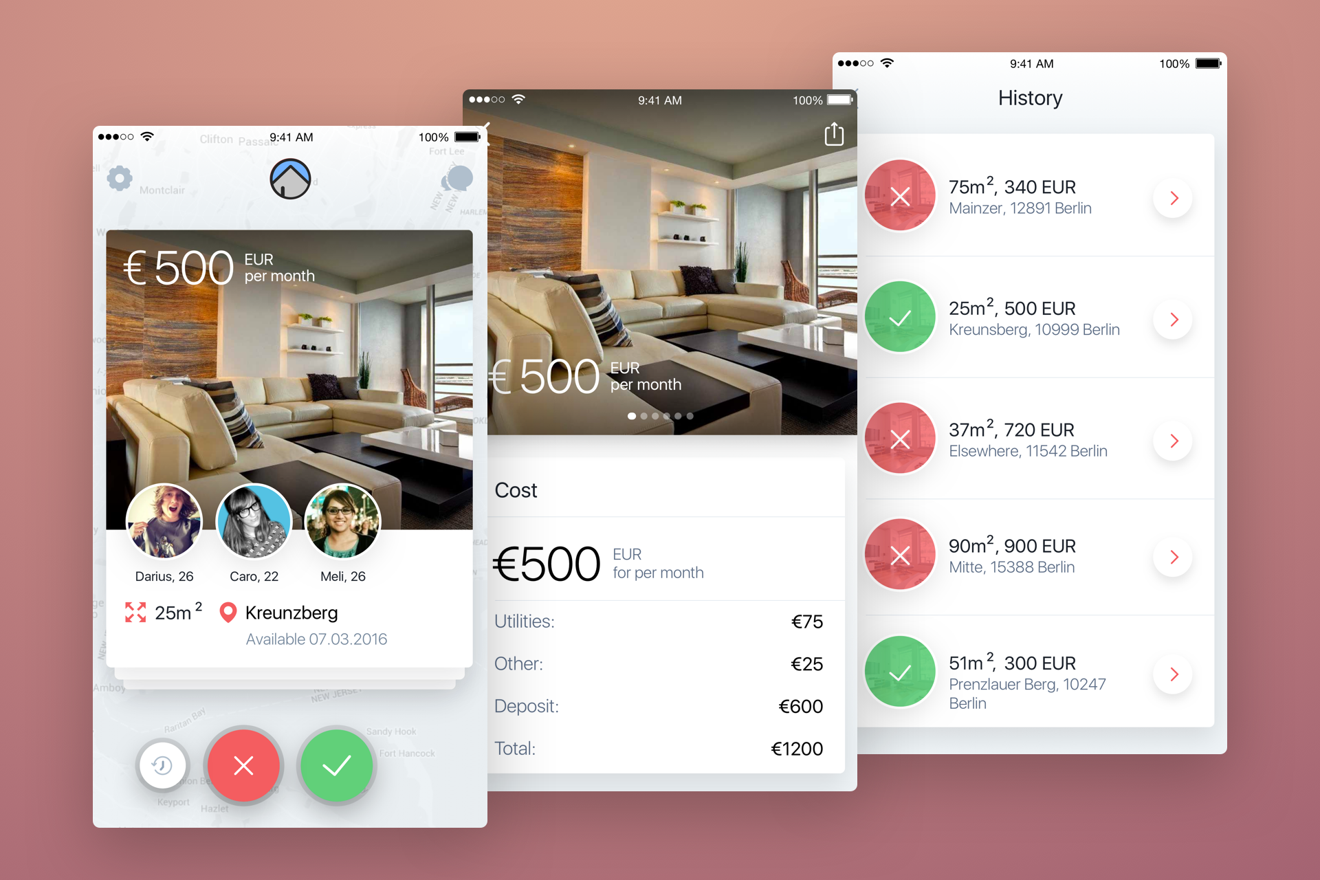
Screenshot from match screens
2. Application structure
The application consists of two types of users, people who are looking for an apartment and apartment owners who are looking for a neighbor. Accordingly, in HelloHome it was necessary to make two types of questionnaires, in contrast to Tinder in which only one type of questionnaires for all users is implemented. These factors needed to be considered when designing an application. In the design process, we tried to take into account all the details, you can see it in the prototype at invisionapp.

Screenshot apartment card and user
3. Design
Unfortunately, in this project we did not make a full-fledged prototype in Flinto or Pixate, so for us it was important to work out the details in the invisionapp. It was necessary to see the general logic in the application even without dynamics, and also all the small scenarios were designed.
Application Features
- At the design stage, we got a long registration funnel, this is due to the fact that we decided not to take long forms, but to take small steps in which entering information did not require the use of a keyboard. Having tested several options in Lookback to the closest friends, the current version turned out to be the most effective.
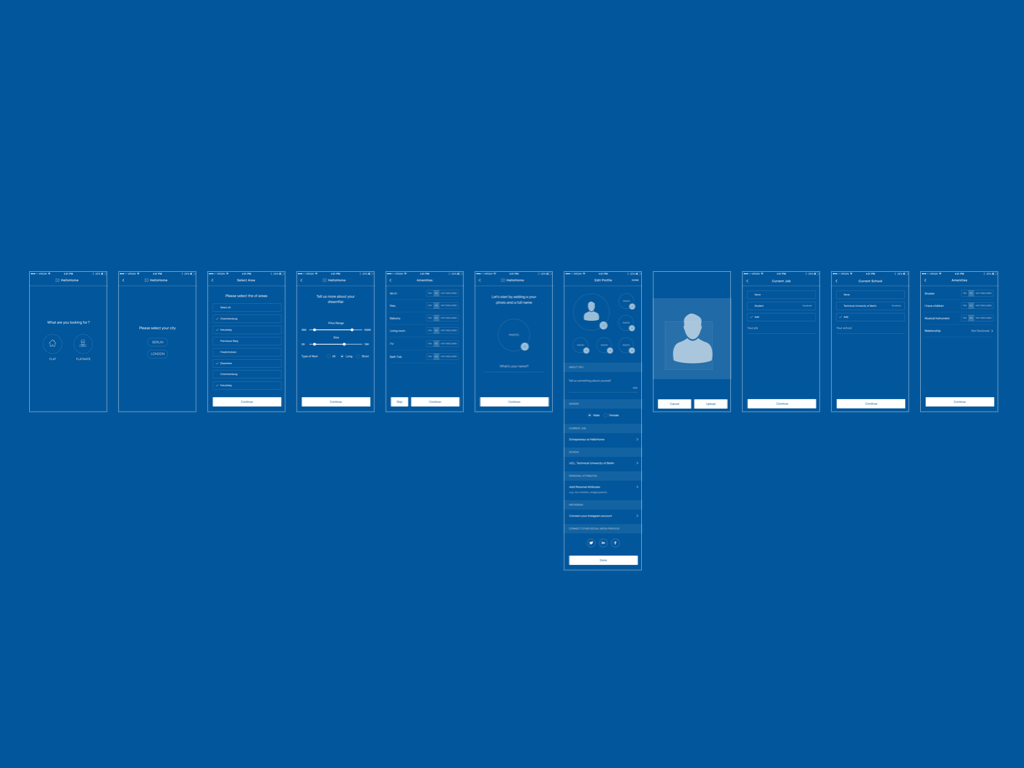
Screenshot with steps in wireframes with registration funnel
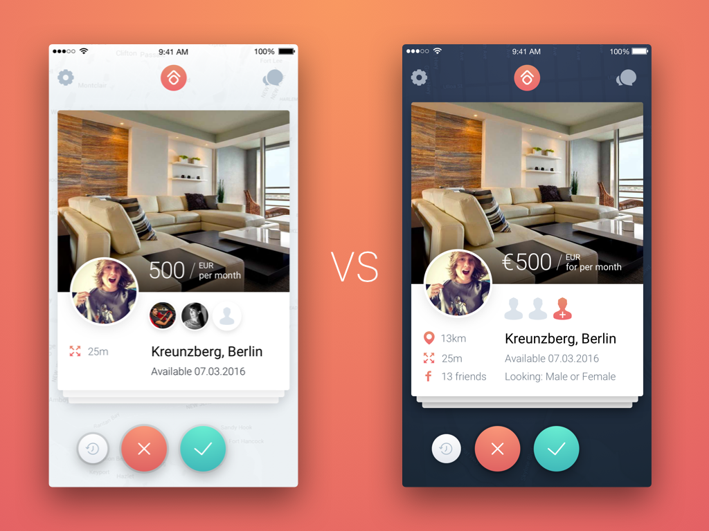
- Several times at the design and design stage, the apartment questionnaire page was redone and implemented.

Screenshot with multiple options profiles
4. Design
It was decided to make a unique design that would be remembered and associated with this application. It was necessary to do something of their own and that the design does not look 1 in 1 as Tinder. This decision was argued that the style of the application should be stored in the user's head, and if the user shares the application with friends, in a nutshell it should have sounded like “It's like Tinder only for finding neighbors.” We also decided to move away a bit from the guidelines.
Long shadow
In the design, we used Long Shadow, because this style gives the most complete picture of the controls and navigation, understanding where to tap, where the clickable elements and zones are located.
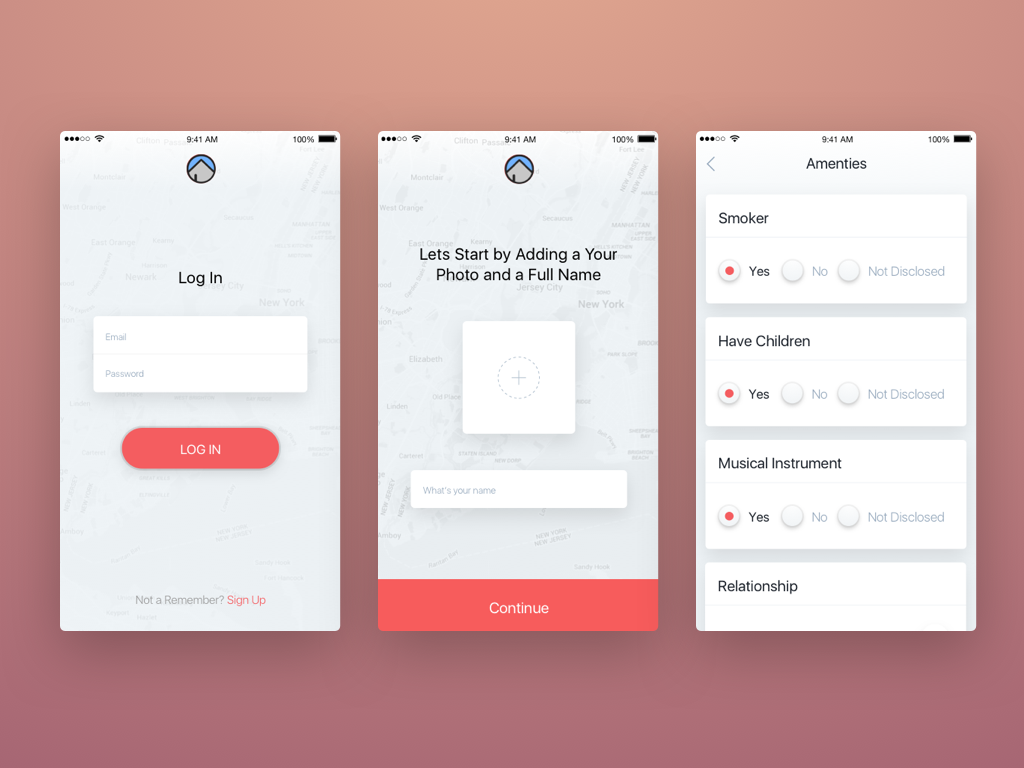
Screenshot with Long Shadow
Registration funnel
As we wrote earlier, we got a long registration funnel.
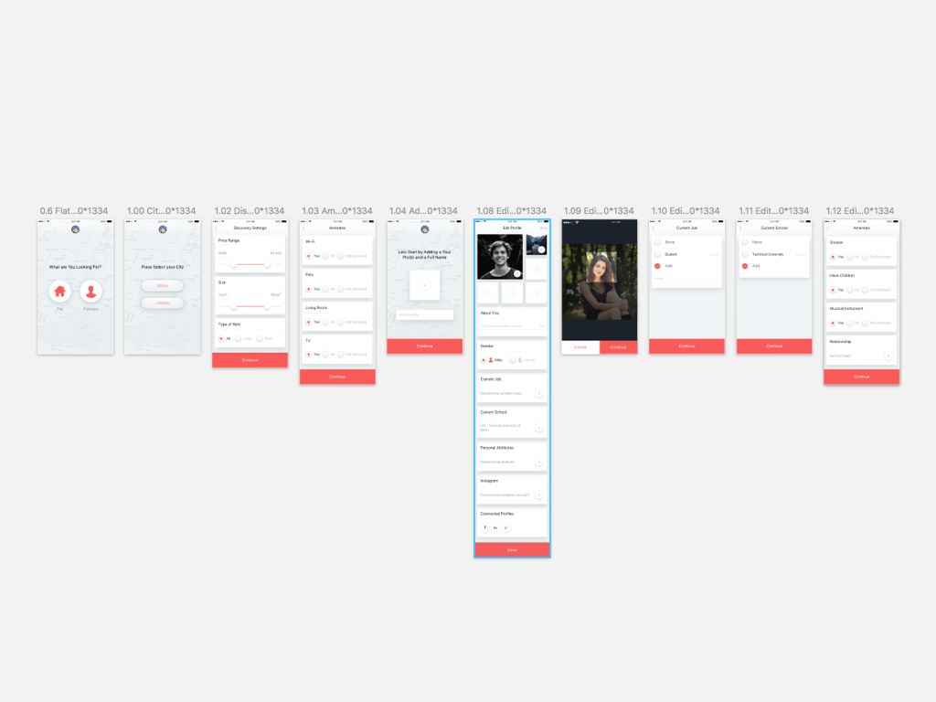
Screenshot with registration funnel
Tour Screens & Sucsess Screens
In order that the user is not very annoyed about the registration, we decided to insert a few more screens in the form of Tour Screens.

Which would give the initial goal, as well as a couple of Succsess Screens to lift the mood.
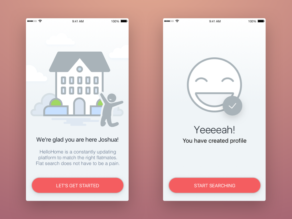
Screenshot from succsess screens
Now, unfortunately we cannot say how effective this solution is, but the tests will show and we will fix this point in the second version.
Amenities
As the customer knew a lot about the information about his future users, he helped us to compile a detailed list of amenities for the questionnaires.

Screenshot with Amenities
5. Conclusion
It was originally supposed to make 8 screens, later the application has grown to 53.
Actually, what happened can be seen in our project on invisionapp and dribble.
The application can be downloaded from the link.
We will be glad to hear from you feedback.
')
Source: https://habr.com/ru/post/307646/
All Articles