The book "Logo and corporate identity. Designer's guide. 2nd ed. "
 Hello! We decided to write a review of the second edition of the new book by David Airy:
The first edition of this book was published in 2009 and was translated into 10 languages. During this time, much has changed, and now, finally, comes a completely redesigned full-color second edition of the legendary book Logo and Corporate Identity.
More examples, more sketches, more logos, more customer service tips and more practical information - this is the only way you can understand “how to”.
')
David Airy will help to go the way of developing a cult brand from the very first ideas to their final realization, using the experience of the most famous designers. Learn how to create effective briefs, generate ideas, discuss the cost of work and communicate with customers.
Design of corporate identity. Who needs it? All companies of the planet. Who will do it? You.
But how to get famous customers? And how not to lose the position? Design - a profession forever evolving. If you are like me, one of your goals as a graphic designer is to constantly improve your skills in order to attract the desired client. Therefore, it is vital to learn and grow over yourself.
The purpose of this book is to share with you all that I know about corporate identity design in order to motivate and inspire you and so that you, being well informed, can make sensible decisions looking for customers and working with them.
But who am I and why do you need my advice?
For almost 10 years I have been sharing design projects on a blog named after me at davidairey.com, and then on sites logodesignlove.com and identitydesigned.com . Readers viewed different stages not only of my identity projects, but also projects of talented designers from around the globe. I focused on how to make deals with customers, how to interpret the details of design briefs and how to reach a consensus with the client, before finally approving the idea.
If my Google Analytics is not lying, my websites currently generate one million monthly views, hundreds of thousands of designers visit them regularly. Readers admit to me how valuable it is for them to see the backstage of the design process and how difficult it is to feel the inspiration anywhere else. That is, they make me understand that the content that I publish is useful and inspiring (and money has nothing to do with it).
If you look through the portfolio of the most successful design agencies and bureaus, you can find examples of completed work in abundance. Some portfolios may even present one or two alternative concepts. But almost nowhere can you read about what really happens between designers and customers: the questions that designers ask to steer the project in the right direction, how ideas are born after creating and studying the brief, how to present your work in order to win customer approval. Such details for the designer - golden sand.
This is how the idea of this book was born.
The first edition was published in 2009, now it is available in 10 languages, and the English version has been repeatedly printed. Five years later, it became clear that I could improve in the book. The result is this new edition, which has absorbed my new experience, new special cases and new insights in the design field.
When you finish reading this book, I hope you will be well prepared to go to win customers and create your own iconic corporate identity. If I knew about everything that is written here, when I began to work on graphic design, I certainly would have saved a lot of sleepless nights.
Elements of Cult Design
Anyone can come up with a logo, but not everyone can come up with just the right logo. A successful design can meet the goals indicated in your brief, but the brilliant design should also be simple, appropriate, durable, memorable and easily adaptable.
It may seem that to meet all these requirements is difficult, and this is true. But remember that in any creative work in order to successfully break the rules, you must at least know them. The chef of the highest class does not take the ingredients from the ceiling, but adapts the tried and tested recipe and only in this way creates his own signature dish. The same applies to the creation of brand names. The main elements of classic logos are the ingredients of our recipe, so let's take a close look at each one of them before you go to win your own awards.
The simpler the better
Often the simplest solution is at the same time the most effective. Why? Yes, because the simplicity of the logo helps to meet the other requirements for the design of logos.
Simplicity allows design to be more versatile. The minimalist approach makes it possible to use your logo almost everywhere - on business cards, billboards, badges and even on site icons.
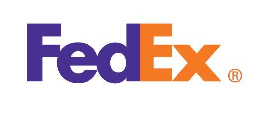
In addition, simplicity makes it easier to recognize your logo, thereby increasing its chances of durability, independence from the trends of time. Remember the logos of large corporations like Mitsubishi, Samsung, FedEx, BBC, etc. They are simple and therefore recognizable.
Simplicity helps people remember your design. Think about how consciousness works and how much easier it is to remember one detail, such as Mona Lisa’s smile, than five: the clothes of the same Mona Lisa, the location of her hands, the color of her eyes, the background, the name of the artist (Leonardo da Vinci - but you already knew that, not really whether?). Look at it like this. If you were asked to draw the McDonald's and Mona Lisa logo from memory, which drawing would be more accurate?
Let's look at another example.
The National Health Service (NHS) logo is one of the most frequently found in the UK; in 2000 it was even used as the emblem of the British public health program.
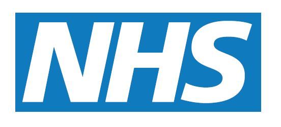
Originally created in 1990 by Moon Brand Studio, this logo includes a simple, pure color palette and the same font. The fact that the design has not changed in twenty-five years testifies to its success.
“We deliberately made the design simple for three reasons: to make it easy to execute, to hold on for as long as possible without being noticed by the British media, which are often seen by such brand promotion programs as wasteful taxpayer money,” says agency director Richard Moon. “According to NHS’s own calculations, the branding program has saved tens of millions of pounds through the use of this practical, individualized symbolism.”
Nothing inappropriate
Any logo that you design must correspond to the industry of the business for which it is created. Do you work for a lawyer? Then no jokes. Is this a TV show about winter resorts? No beach balls, so please. Cancer Control Organization? The satisfied physiognomy will be out of place. The list goes on, but the general idea is clear.
Your design should be relevant to the industry, customer and target audience. In order to combine all this, deep research is necessary, but the time spent on it pays for itself. Without a solid knowledge of the world of your client, you cannot hope to create a design that successfully demarcates your client’s business and its closest competitors.
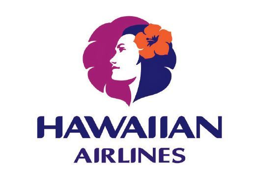
However, remember that the logo does not have to literally represent what the company does. For example, the BMW logo is not a car at all. And the Hawaiian Airlines logo is not an airplane. But both logos are out of competition and at the same time highly relevant in their respective industries.
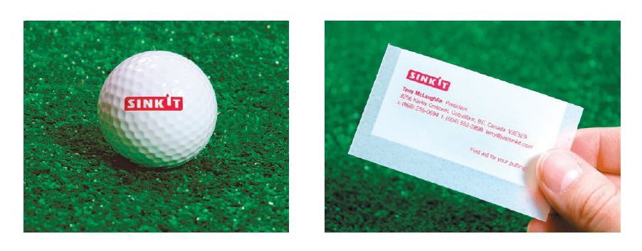
Vancouver studio smashLAB has become famous for its brilliant brand and the accompanying design for Sinkit, a device that helps golfers get the ball in the hole.
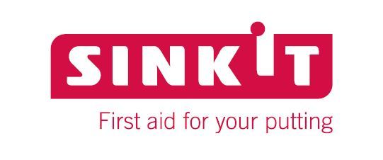
“To understand the logo, it’s important to see it in context,” says Eirik Kardjaluoto of smashLAB. - We realized that we were dealing with real golf assistance, and not with a luxury product, which determined the whole design process. We felt that only a few would become owners of this device, while others would only use it in certain circumstances. In fact, this is the thing that you can give to a friend jokingly who has problems getting into the hole. ”
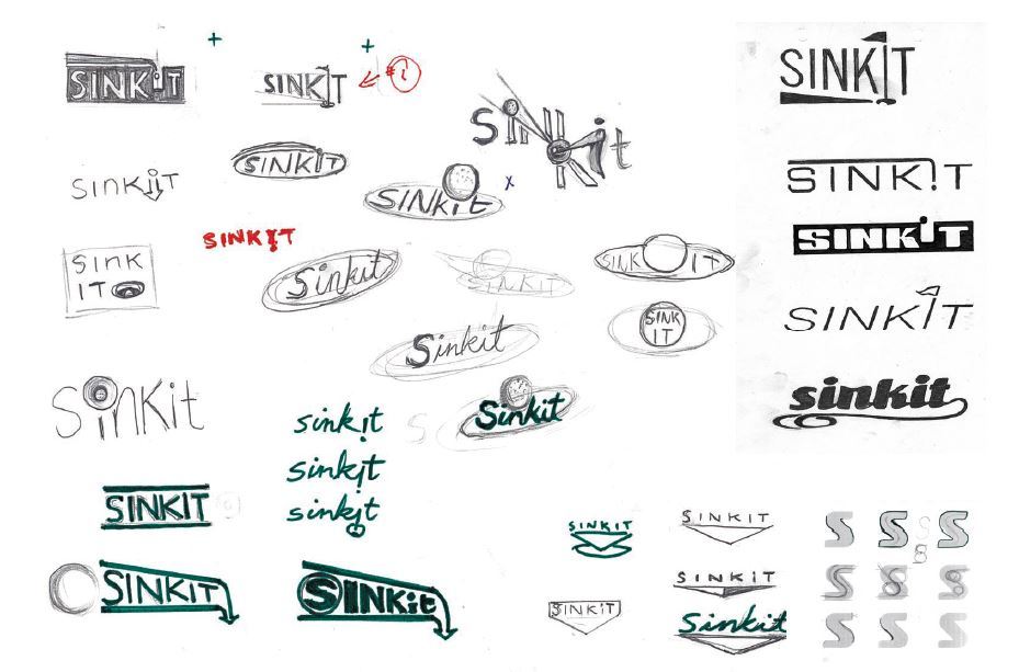
The smashLAB favorites of the adaptive direction became the basis for the interpretation of the destination and the color palette, uncharacteristic for most golf equipment stores. On translucent paper, a minimalistic red and white logo suggested an idea of medical services. Given the characteristics of the product and its innovativeness on the market, smashLAB wanted to distance it from more traditional golf packaging.
“There were certain technical difficulties in the process of creating the logo,” notes Eric. - One was to spread the words sink and it in order to avoid misreading the sin kit. We solved the problem by lifting the letter i and shifting the point above it, which turned into a golf ball, ready to roll into the hole. This gives rise to anticipation and excitement, the viewer expects the ball to fall. ”
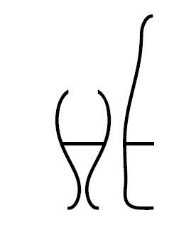
In some cases, negative space allows you to create a completely exclusive sign. The monogram "HE" is one of two options that I presented to the French wine producer Henri Ehrhart in 2009.
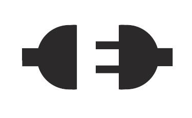
In 2008, Josiah Jost from Siah Design in Alberta (Canada) worked with Ed's Electric, a local electrical company, on its new corporate identity. Josiah not only created the appropriate logo, but also made it so that it would be difficult for most to see it, thanks to the skillful use of negative space.
The logo of the Dolphin Square residential complex from the London-based studio ico is a good example of what is not here, just as important as what is there.

Another design, born within the walls of the Moon Brand studio, this time for Vision Capital, embodies this idea of the relevance of trademarks. During the long discussions with the client, even before the start of any creative work, the designers of Moon Brand found out that the company is not only engaged in capital, but also creates funds for investors, using a strategic approach when buying a portfolio of other companies. And they decided to beat this idea: "not only", "more than."
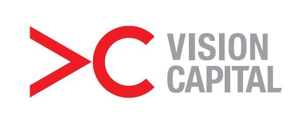
The result is a logo that artfully conveys this presentation. The letter V laid on its side, the first in the word “vision”, becomes the mathematical symbol “more”, making it possible to read something like this subtext: “more than capital”, while the initials of the company are preserved and quite recognizable.
Even if you create a logo related to the seemingly boring market of finances, this does not mean that he himself cannot be dynamic and multi-valued.
More information about the book can be found on the publisher's website.
Table of contents
Excerpt
For Habrozhiteley 25% discount coupon - Logo
Source: https://habr.com/ru/post/307492/
All Articles