Minimally viable UX: SaaS (service application) design
I offer the readers of Habrakhabr a translation of the article “Minimum Viable UX: A Guide for SaaS Design” . Posted by: Benjamin Brandall.
Creating a SaaS application (wiki: English software as a service - software as a service ) you probably think more about functionality and features, target market, absence of bugs in the final product. And although today user experience (UX) is recognized as important - and sometimes it directly determines success or failure, its development is often overlooked.
Remember the classic work programs? These inflated databases, like in Excel under Windows 95 - today it is hardly possible to run an advanced business with their help. Why? Yes, because they are not friendly to use.
We are already getting used to using smoother applications. After Gmail, we almost got rid of Outlook. We use beautifully optimized Trello, Dropbox and Asana. Over time, tools that have more rough edges than we are willing to tolerate are replaced by those that are more user-oriented. Because there is no doubt that bad UX slows down work processes at times.
')
It’s not just that people have to follow a steep learning curve, but also that some tools simply don’t work as expected. I cite Microsoft as an example because, although they started off quite well, they later began to ignore user testing, they respond with minor corrections to major, essential problems. Now they are surpassed by small companies in terms of innovative solutions, because the latter cannot afford the luxury of distributing their products into the world's most popular operating system by default.
In this article, I will summarize the most basic key principles that should be followed when developing user experience for a SaaS application.
Beginners wishing to enter the service are constantly faced with at least the following:
People coming into the application want to immediately benefit from its use, and when you ask for more from them than you give in return, you end up in the Dying Cycle of the product , as Andrew Chen called it. It looks like this: on the graph below vertically - the number of users and users, horizontally - first first visit, then registration, return to the application, and then - the days (first, seventh, tridate ...).

( Image source )
This chart reflects the funnel that your audience goes through. Almost 80% of those who saw your title do not make a coveted click, and another 80% who hit the site do not complete registration. The remaining, after several sessions of using the application, almost "die out" by a factor of ten. Why it happens?
You can write (and already written) many books about this, but one of the basic principles is that the profitable side of your product does not become obvious to new users and users in the shortest possible time. Too many gestures and not enough reward.
Try this:
The app in which all this is perfectly implemented is Slack. You can read a complete analysis (in English) of its user adaptation process, but the point is that it’s nice to take all the steps and, let's say, fun (registration, profile filling, entry, training).
Considerable time is devoted to careful thought out and design of such moments. For example, have you ever considered simplifying a password from a mobile device? And in Slack, you can instead get a “magic link” to the email.
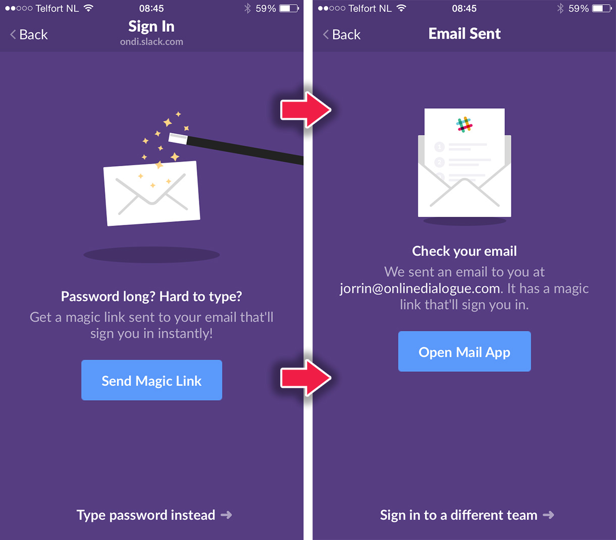
( Image source )
Of course, this is obvious, but seeing many applications you want to repeat it again and again. I'll take Excel as an example again, because Microsoft has been criticized :). Well, unlike Apple, it was never supposed that their software would "just work."
I recently canceled my subscription to Office 365. I used it only for Excel, but then I came to the conclusion that the disadvantages of UX eat up a lot of my time. The problem was that Excel could not adequately import CVS ( comma separated values), values separated by commas . To explain to the program that my CSV file was comma-separated, I had to either tweak the file in a text editor, or use an awesome wizard to import.

There was no option that would allow just a click to open the file and display it normally. Therefore, I unsubscribed from MS Office and returned to the tables in Google , which, however, are much less powerful. This is a good example of custom routine due to poor UX, and not a functional shortage.
If your service has a common use case or a set of actions, make a separate label or button for them, without forcing people to walk in labyrinths for routine actions that they would be happy to perform in one or two clicks.
Of course, it is not always obvious exactly how to use your application. Especially if it is a tool for very different tasks. This makes it very important to have well-organized support , and incoming requests for functions and features should regularly fall into the task lists for developers.
From time to time we are all attracted to the magnificent texts on the landing pages of services and their beautiful design. Here we begin to present the picture, as it is convenient and pleasant for us to use it, and quickly leave the application if it is very at odds with reality.
There is a special rule of least surprise (wiki):
Simply put, we expect the chair to look and function like a chair. If it happens otherwise, then this is a bad design, creating an extra shock for us.
Everything - from interaction on social networks to branding and screenshots - all this gives us a certain idea of what this application will give us. Those. including user experience.
As well as we align marketing materials with the UX of the submitted application, it is possible to significantly soften the upcoming schedule of the “learning curve” by eliminating unnecessary surprises (see above Principle of least surprise).
It does not matter what you have for the application - people have to somehow learn to use it. You can simplify this process using familiar design incentives. It has been proven that recognizable icons , menus and interactions make the interface intuitive, just as we understand what to do with a sock or a mug, because we are already familiar with these items.
Because the UX is so important, and many of its aspects are monstrously overlooked, well-designed applications gain more attention and recognition, while uncomfortable and non-obvious are naturally superseded.
We are still in the “gray zone” of UX even 16 years after the publication of the textbook by J. Garrett “Elements of Interaction Experience” (available in Russian). But it seems that the thoughtful design still takes its place, and small but innovative SaaS-development is more confidently pushing corporations.
Keep these simple principles in mind, and do things that “just work” (and “work simply” - translator's comment ).
Creating a SaaS application (wiki: English software as a service - software as a service ) you probably think more about functionality and features, target market, absence of bugs in the final product. And although today user experience (UX) is recognized as important - and sometimes it directly determines success or failure, its development is often overlooked.
Remember the classic work programs? These inflated databases, like in Excel under Windows 95 - today it is hardly possible to run an advanced business with their help. Why? Yes, because they are not friendly to use.
We are already getting used to using smoother applications. After Gmail, we almost got rid of Outlook. We use beautifully optimized Trello, Dropbox and Asana. Over time, tools that have more rough edges than we are willing to tolerate are replaced by those that are more user-oriented. Because there is no doubt that bad UX slows down work processes at times.
')
It’s not just that people have to follow a steep learning curve, but also that some tools simply don’t work as expected. I cite Microsoft as an example because, although they started off quite well, they later began to ignore user testing, they respond with minor corrections to major, essential problems. Now they are surpassed by small companies in terms of innovative solutions, because the latter cannot afford the luxury of distributing their products into the world's most popular operating system by default.
In this article, I will summarize the most basic key principles that should be followed when developing user experience for a SaaS application.
Minimize body movement
Beginners wishing to enter the service are constantly faced with at least the following:
- Fill in 10,500 fields
- Go through compulsory education (or all sorts of tips for newbies)
- Complete your profile
People coming into the application want to immediately benefit from its use, and when you ask for more from them than you give in return, you end up in the Dying Cycle of the product , as Andrew Chen called it. It looks like this: on the graph below vertically - the number of users and users, horizontally - first first visit, then registration, return to the application, and then - the days (first, seventh, tridate ...).
( Image source )
This chart reflects the funnel that your audience goes through. Almost 80% of those who saw your title do not make a coveted click, and another 80% who hit the site do not complete registration. The remaining, after several sessions of using the application, almost "die out" by a factor of ten. Why it happens?
You can write (and already written) many books about this, but one of the basic principles is that the profitable side of your product does not become obvious to new users and users in the shortest possible time. Too many gestures and not enough reward.
Try this:
- Reduce the number of required fields in the registration form (in Process Street, in the first step, we do not ask for anything except email)
- Learn to use the product in the course of real work, and not through the mandatory step-by-step instructions
- Give information gradually, do not throw people in dozens of tips in a row
The app in which all this is perfectly implemented is Slack. You can read a complete analysis (in English) of its user adaptation process, but the point is that it’s nice to take all the steps and, let's say, fun (registration, profile filling, entry, training).
Considerable time is devoted to careful thought out and design of such moments. For example, have you ever considered simplifying a password from a mobile device? And in Slack, you can instead get a “magic link” to the email.
( Image source )
Spend more time designing key features.
Of course, this is obvious, but seeing many applications you want to repeat it again and again. I'll take Excel as an example again, because Microsoft has been criticized :). Well, unlike Apple, it was never supposed that their software would "just work."
I recently canceled my subscription to Office 365. I used it only for Excel, but then I came to the conclusion that the disadvantages of UX eat up a lot of my time. The problem was that Excel could not adequately import CVS ( comma separated values), values separated by commas . To explain to the program that my CSV file was comma-separated, I had to either tweak the file in a text editor, or use an awesome wizard to import.
There was no option that would allow just a click to open the file and display it normally. Therefore, I unsubscribed from MS Office and returned to the tables in Google , which, however, are much less powerful. This is a good example of custom routine due to poor UX, and not a functional shortage.
If your service has a common use case or a set of actions, make a separate label or button for them, without forcing people to walk in labyrinths for routine actions that they would be happy to perform in one or two clicks.
Of course, it is not always obvious exactly how to use your application. Especially if it is a tool for very different tasks. This makes it very important to have well-organized support , and incoming requests for functions and features should regularly fall into the task lists for developers.
Reconcile the reality of your application with user expectations
From time to time we are all attracted to the magnificent texts on the landing pages of services and their beautiful design. Here we begin to present the picture, as it is convenient and pleasant for us to use it, and quickly leave the application if it is very at odds with reality.
There is a special rule of least surprise (wiki):
... in ergonomics: if the purpose of an element or combination is unclear, then its behavior should be the most expected from the users.
Simply put, we expect the chair to look and function like a chair. If it happens otherwise, then this is a bad design, creating an extra shock for us.
Everything - from interaction on social networks to branding and screenshots - all this gives us a certain idea of what this application will give us. Those. including user experience.
As well as we align marketing materials with the UX of the submitted application, it is possible to significantly soften the upcoming schedule of the “learning curve” by eliminating unnecessary surprises (see above Principle of least surprise).
It does not matter what you have for the application - people have to somehow learn to use it. You can simplify this process using familiar design incentives. It has been proven that recognizable icons , menus and interactions make the interface intuitive, just as we understand what to do with a sock or a mug, because we are already familiar with these items.
As a conclusion
Because the UX is so important, and many of its aspects are monstrously overlooked, well-designed applications gain more attention and recognition, while uncomfortable and non-obvious are naturally superseded.
We are still in the “gray zone” of UX even 16 years after the publication of the textbook by J. Garrett “Elements of Interaction Experience” (available in Russian). But it seems that the thoughtful design still takes its place, and small but innovative SaaS-development is more confidently pushing corporations.
Keep these simple principles in mind, and do things that “just work” (and “work simply” - translator's comment ).
Source: https://habr.com/ru/post/307474/
All Articles