Does the mobile version? 5 common problems that adaptive layout solves. Yandex experience
Since 2007, the number of smartphones in the world has been growing very rapidly. Among other reasons for the surge in popularity several years ago, buyers were attracted by the ability of these devices to display sites as they appeared on computer screens. But, having bought a smartphone and started using it, people noted that in order to read individual blocks of text on a relatively small screen, they had to constantly scale the page. Plus, many site controls turned out to be inconvenient to use. This happened because the pages were not designed to be controlled by touching the screen and often required a computer mouse or other manipulator. To solve these problems, separate versions of sites began to appear, designed exclusively for devices with a small screen. At the same time, users did not need to know the addresses of mobile sites. Instead, the server reads the device information from the request addressed to it and determines which version is preferable to give to the visitor.
Soon, it became clear to many that developing a separate mobile version is long and expensive to maintain. In addition, it contradicts the ideology of the web, which implies that the markup document is universal and can be read on almost any output device. To resolve this discrepancy, the Media Queries standard has been added to CSS. There are new opportunities to determine the features of the device, in particular, the opportunity to apply different page designs for arbitrary window sizes.
Now site visitors have many different devices, from mobile phones to televisions. A convenient mobile version of the site allows you to achieve the following benefits:
- Priority position in the mobile search results compared to traditional versions of sites.
- Increase service profit by improving the usability of the interface on any device.
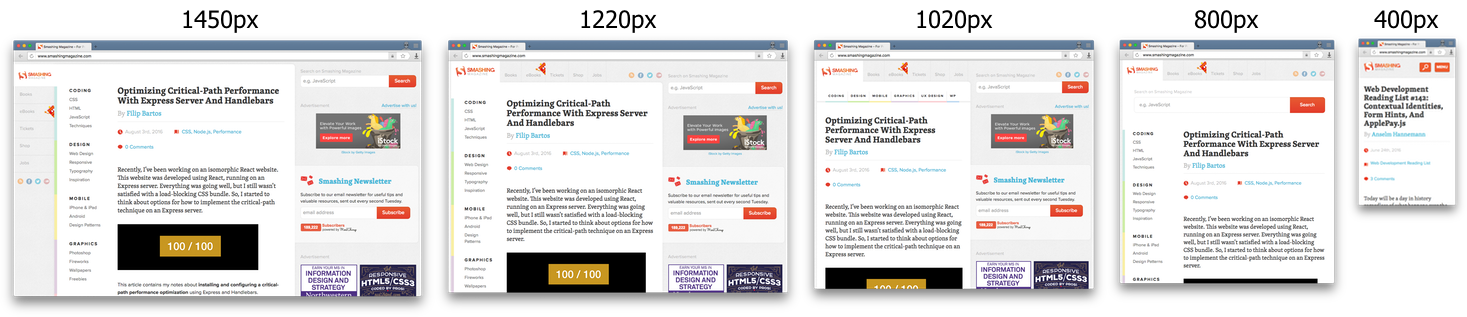
Adaptive layout is the dynamic change of CSS-styles with different sizes of the browser window. Often it takes into account the width of the window. A good example of adaptive layout can be seen on smashingmagazine.com, where the page adapts to five intervals of the browser window, each time maintaining maximum comfort for reading.
There are two approaches to the implementation of adaptive layout:
- From a smaller screen to a larger one (progressive enchancement or mobile-first)

- From a larger screen to a smaller (graceful degradation)

We will focus on the second approach, when you already have a regular desktop site that needs to be adapted for mobile devices.
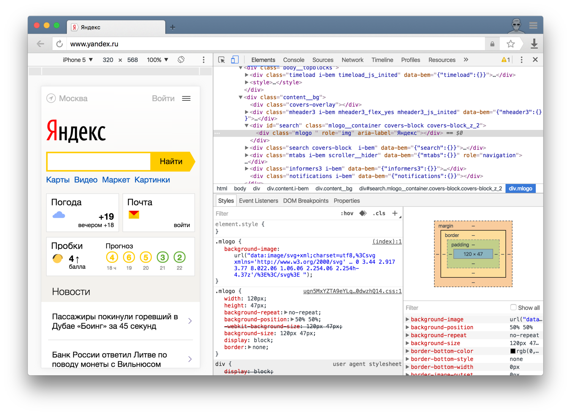
To check the results of our work, you can simply resize the browser window. But there are tools specifically designed for this — for example, emulation in the Chromium component inspector:
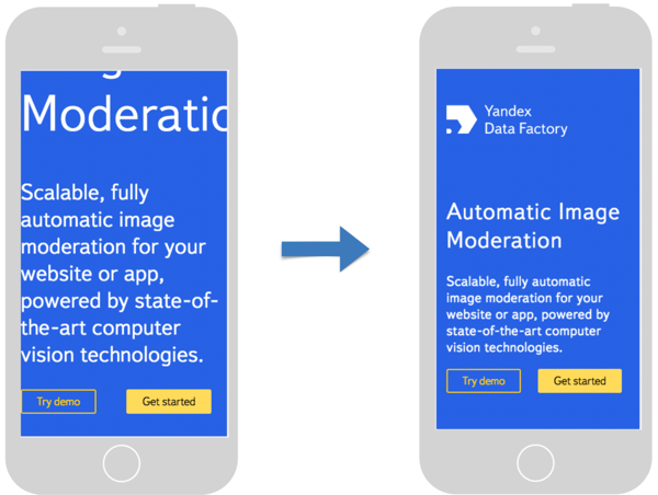
As an example, take the site Yandex Data Factory, demonstrating the technology of automatic moderation of images - imagemoderation.yandexdatafactory.com . It was originally designed for large screens, but once it took a mobile version. Let's consider what problems this site had on mobile devices and eliminate them step by step.
1. Problem: small controls and poorly distinguishable text
If you open any website for a desktop computer on a mobile phone, it is difficult not to pay attention to the inconvenient interface with a mass of poorly distinguishable small elements. Once on this site, a person immediately increases the scale of the page.
Let's set a comfortable scale right away; all you need to do is add one tag to the <head> :
<meta name="viewport" content="width=device-width,initial-scale=1" /> 
We changed the browser's viewport - the visible area of the page, the dimensions of which change when the browser window is scaled. We changed the width and initial viewport scale.
Without a meta tag, the page has been cropped to the width of the standard viewport browser:

After we added a meta tag that sets the width of the visible area of the page to the optimal value determined by the device manufacturer:

The main properties of the viewport meta tag are:
width- the width of the visible area. Recommended value:device-width.
Accepts a natural number or thedevice-widthkeyword, which sets the optimal viewport width for the device. The table of values for various devices can be viewed on the website mydevice.io/devices .height- the height of the visible area.
It works in the same way aswidth, only thedevice-heightkeyword is used.initial-scale- the initial scale of the page. Recommended value:1.
Takes a number from 1 to 5.minimum-scale- minimum page scale.
Accepts a natural number, which ideologically should be less than or equal to theinitial-scale.
A value of1prevent page scaling.maximum-scale- the maximum page scale.
Accepts a natural number, which ideologically should be greater than or equal to theinitial-scale.
A value of1prevent the page from zooming.user-scalable— disables or enables page scaling.
Acceptsnooryes. Scaling is also disabled when specifying the sameminimum-scaleandmaximum-scalevalues.
There is a draft in the CSS standard that describes the special @viewport rule, which today is almost not supported by browsers . Meta tag with similar functionality was coined by Apple and is now supported by all modern mobile browsers, so in practice we use it.
2. Problem: not all elements fit on the screen, horizontal scrolling appeared
Now our page has a comfortable scale, but some elements no longer fit on the screen, which is why horizontal scrolling appears. Viewing this site is inconvenient.
The fact is that for mobile layout, elements cannot be set to a larger fixed width.
It is better to use the max-width property instead of width :
.section__content { max-width: 1200px; /* width: 1200px; */ } 
Now the content is stretched to the width of the screen, and on a large computer screen, the width is limited to the same value.
3. Problem: Too large text on a mobile screen
The text on the page is already clearly distinguishable and completely fit into the screen, but for comfortable perception of information it remains to reduce the font of the title. Consider two ways to implement.
3.1. Media queries
Reduce the font size of the header from 72px to 36px for screens whose width is less than or equal to 400px , for this we use the following media expression:
@media all and (max-width: 400px) { .header__title { font-size: 36px; } } .header__title { font-size: 72px; } Using this tactic for other elements on the page, you can achieve beautiful results:
Media expression syntax:

The main types of media:
all- all types, default value.screen- screens of desktops, tablets and modern mobile phones.print- printers.speech- speech browsers used by people with disabilities.
The most commonly used media features are:
width (min-width, max-width)- the width of the browser window.min-widthmeans that styles will be applied with a width equal to or greater than the specified one.max-widthmeans that styles will be applied with a width not exceeding the specified one.
height (min-height, max-height)- the height of the browser window.device-width (min-device-width, max-device-width)- the width of the device screen (may be greater than the width of the browser).device-height (min-device-height, max-device-height)- device screen height.orientation- takes the values oflandscapeorportraitto define landscape and portrait orientations, respectively.
When using media expressions, the question immediately arises - what intervals of widths and heights to use? The answer to it is better to approach individually for each element of the site, smoothly resizing the browser window. When the layout starts to look unacceptable, this will be a signal to the need to use media expressions.
Media expressions are well supported by browsers and provide ample opportunity to determine the parameters of the device used. More information about them can be in the directory .
3.2. Media Queries + Rem
There is another technique that allows you to change the font size on the entire page at once - this is a rem (root em) size unit, which is similar to em , but instead of a complex chain of dependencies on the parent elements, it is calculated only based on the font size of the <html> element.
For convenience, you can use a basic font size of 10px . Thus, when changing the font size of the root element, all sizes specified in rem change proportionally:
html { font-size: 10px; } .header__title { font-size: 7.2rem; /* 72px */ } .header__sub-title { font-size: 4.2rem; /* 42px */ } @media all and (max-width: 400px) { html { font-size: 5px; /* .header__title → 36px .header__sub-title → 21px */ } } The rem size is well supported by modern browsers.
This approach is less flexible than specifying the dimensions for each individual element, but with it we can change the size of all elements at the same time.
4. Problem: narrow elements of the horizontal list
Now our page looks good on the mobile screen, but there is still something to work on. Horizontal lists that look good on a desktop computer screen, it becomes inconvenient to read on a vertical screen of a mobile device. The optimal solution is to transform horizontal lists into vertical ones. Let's look at several ways to do this.
4.1. Min-width
Adding the minimum width for the list item, we will get a good result:
.item { float: left; width: 33%; min-width: 265px; /* . */ } 
However, this method has drawbacks: the elements of the list are not stretched to the full width available and an indication of the minimum width can cause an extra horizontal scroll bar.
4.2. Flexbox
There is another, more universal solution - Layout with the Flexbox. This CSS feature is well-suited because we have a separate component on the page consisting of a container and elements:
.list { display: flex; /* Flex-. */ flex-wrap: wrap; /* . */ } .item { flex-basis: 260px; /* . */ flex-grow: 1; /* . */ max-width: 360px; /* . */ } As a result, we get almost the same result as with min-width , but without its drawbacks: the list elements are stretched to the full available width (with a limit of 360px ) and the appearance of a horizontal scroll bar is excluded.
Now the list already looks quite good, but there is another idea - to arrange the icons of each element to the left of the text, so that they are used as markers. It is important that such a layout should only be on mobile screens:
.item { flex-basis: 260px; flex-grow: 1; max-width: 360px; display: flex; /* , , Flex-. */ flex-direction: column; /* . */ align-items: flex-start; /* . */ } @media screen and (max-width: 400px) { /* . */ .item { flex-direction: row; /* . */ } } 
The Flexbox may seem complicated, but in reality it opens up tremendous opportunities. Using only CSS styles, we can change the order of the blocks! Finally, in CSS, you can easily declare vertical centering.
The best way to deal with the Flexbox is to start using it, and the complete guide and cheat sheet will help.
Flexbox support coverage in modern browsers is quite good, with the exception of IE11, where there are implementation standard bugs.
5. Problem: photos are ugly fit into the screen
The final touch - a little work with the graphics. Beautiful images on the site - it's very cool, but if we have photos that are inconvenient to watch, the whole effect disappears.
So on the mobile screen will look like a big picture without any styles:
Thanks to the new size unit vh (viewport height), we can easily set the height of the image to be equal to the screen height:
Now let's write the picture on the screen width:
Due to the limitation of the maximum width, the image is distorted, flattening its width. This can be corrected with the new object-fit property:
As a result, it is possible to inscribe a beautiful picture into a mobile screen with just three properties:
.image { height: 100vh; /* , . */ max-width: 100%; /* . */ object-fit: cover; /* . */ } New sizes in CSS:
vw- 1% of viewport width.vh- 1% of the height of the viewport.vmin- 1% of the smaller side (width or height) of the viewport.vmax- 1% of the larger side (width or height) of the viewport.
Finally, in CSS, you can easily specify the relative vertical dimensions! Support for modern browsers is quite good, with the exception of IE11 and Edge14, where vmax does not work.
The object-fit property makes it easy to control the scale and aspect ratio of images, but both width and height must be specified. We can say that this property is a kind of background-size property, only for ordinary images, not background ones. Support for modern browsers is also high, with the exception of IE11 and Edge13.
Conclusion and useful links
We reviewed a number of practical techniques that will help you quickly make a regular website responsive to any screen size. Adaptive layout - it is convenient for both the user and the developer, who eventually will look at the design immediately from the point of view of screens of various sizes. This approach is easy to maintain and looks decent even in comparison with a separate mobile version.
There are a number of tools that facilitate the task of building adaptive layouts. They introduce uniform code-writing conventions, which can be useful in medium and large teams. The most popular of them are:
')
Source: https://habr.com/ru/post/307064/
All Articles