It doesn't matter if you are big or small. The main thing is not small. Stuffing Material Design
As in the conditions of the design tyranny of Google and its loyal developers to circumvent the rules for the benefit of users.
In HeadHunter design, before going into inprogress, many instances pass. First you need to prove to the development team that the decisions are not taken from the ceiling, and you are not "an artist, I see that." And sometimes the Rexons 24/7 have to be protected in the most unexpected place.
')
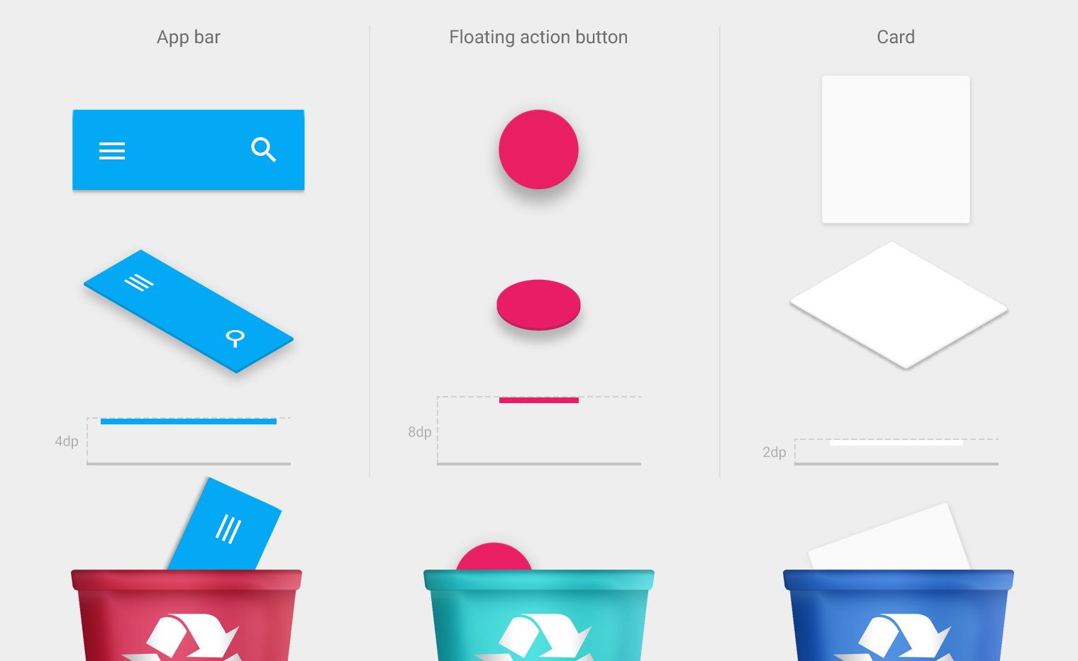
The developers of the Android version of the HeadHunter application adore Material Design and jealously guard their guides. Material should be laboratory, without impurities, and inserted from the first pixel.
I like it too. But its excessive thoroughness makes it use with caution when solving problems other than designing calculators, music players, social networks, mail clients and other instant messengers.
Google writes: “Indent from edges - 16px”. This is absorbed by the developers. Single pickets start when I need an indent of 20px, and at the mention of the 15th point people grab forks.
In iOS 10, they officially made it clear that the guides are hints, and the application can have its own character.
iOS provides a camera, lenses, gives recommendations on their use, but, in fact, does not insist on anything. Android offers a ready-made movie script. In addition to the storyboard, shooting locations, the director and the leading cast.
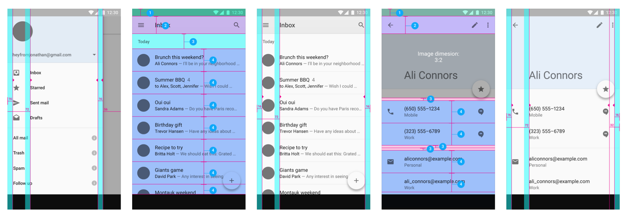
I was interested in checking out a couple of screens. The guys were eager for another vaccine against Android KitKat . Forward - towards the adventures, the new aesthetics and convenient interaction!
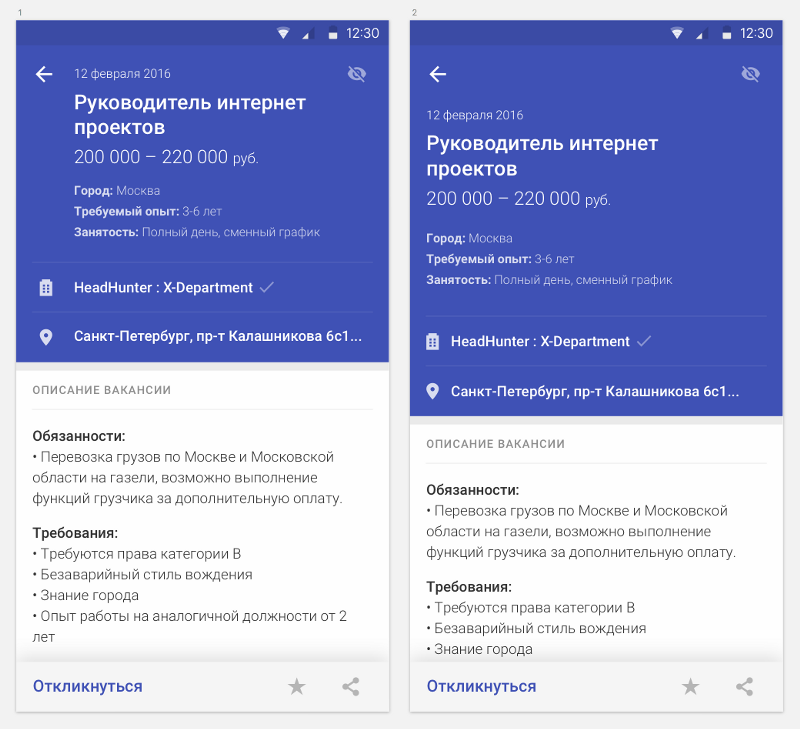
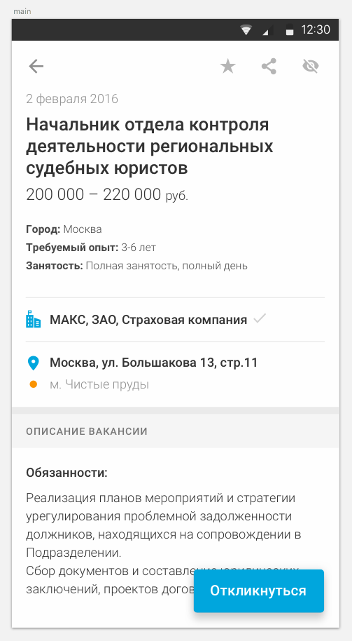
Started with a job screen. So it looks now:

I disassembled the screen into blocks and got into the guides to get inspiration and find the most suitable solutions for our task.
I went to Narnia for doping. Narnia is a kingdom of frivolity regarding any guidelines. This universe is a billion light-years from everyday reality and gray everyday life. Here ponies eat rainbows and poop with butterflies.
Let's return to reality. According to the results of the drawing, one single example fit the composition and logically. I pushed him away.

Pikanul color, unfolded info. 2 variants were born:
In the first one there are more guides, but the vertical of reading was confusing. And the eye is strained when moving from a color block to the description of a vacancy, and the indent is somewhat uncertain. Plus, with this amount of text, I was scared to use the recommended indentation - the usable space should be protected.
In the second version, everything was on the same vertical, the guides were ghostly visible on the horizon, and a strange feeling of emptiness followed. In the appendage, I remembered that all the data is fake and I should look at all this on real content.
Well, something like that.
Gained courage, made indents on the guides, filled the screens with real data and started looking at:
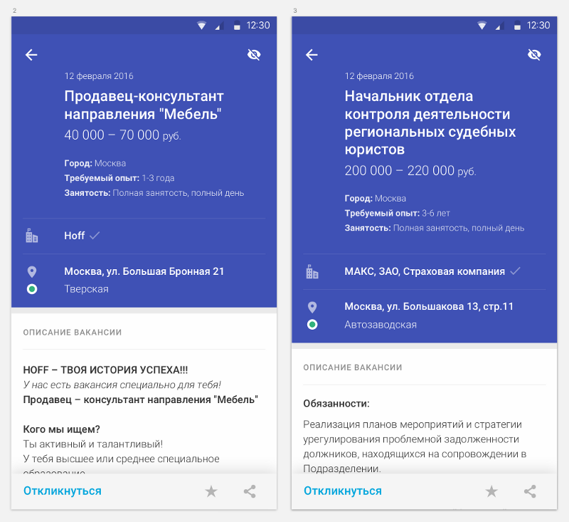
The indent became confident and did not cause suspicion, the feeling of emptiness was gone, the guides stuffed with guides — everything seemed to be ok. I decided to dwell on this option and settle down colors according to the company's internal standards.
He showed the concept to the team and art director - the team is satisfied, from the artistic director - apruv.
Began searching for a shade of blue. Used in the application is well suited for buttons and color selections, but categorically did not suit as a background. Objective: to get the right contrast and not get away from the visual nature of HeadHunter products, Material Design guidelines and common sense.

Options with gradients to the team did not even show
avoid physical violence for garages.
For this case, I spent more than one hour, and then covered.
I realized that I wanted to take my eyes, put them on the shelf and not use them for a while. They were sick, and it was strange. Not tired, but it hurt. Why ?!
In search of answers, I decided to once again analyze the layout and attach it to the real environment, and to the eyes - plantain.
From internal statistics, I remembered that during one session, an average person views 20 vacancies. On average, viewing one vacancy is 2 minutes, during which time a decision is made: to respond or move on. Average.
In this scenario, in our case, the perception is most influenced by 2 factors: the vertical and the inversion .
Jumping vertical perception worsens, but is tolerable. A person sees 50% of the information of the upper block in extradition. He either immediately goes to the description, or responds / adds to favorites.
The inversion is fashionable, it is a fat accent, it is good in small volumes and in statics. This is indicated by studies of the physiology of perception of inversion and inverse reading. But with frequent inverse reading it is not compatible with the visual organ. This means that somewhere in the third vacancy the first signs of atherosclerosis will appear. For the user's eye, every transition from a color block to a description would be like 150 kg from the chest.
So so ux.
Interrupted by a dream.
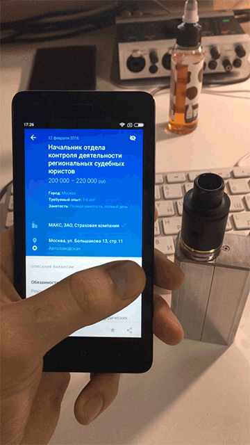
Updated the screen with the new introductory, scored a dozen of real vacancies and began to scroll / read:
It became definitely more austere, the guides “were lying somewhere, I cannot find it”, but there was no pain, comfortable reading, everything was simple and transparent.
Discussed with the guys: it is a pity that not Material. But everyone agreed with the arguments and was pleased with the result.
Win-Win.
“Only,” they say, “there is a small remark.”
Icon balls put last, as it is least used.
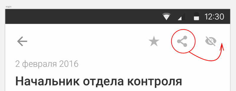
I answer: “Therefore, it is there”.
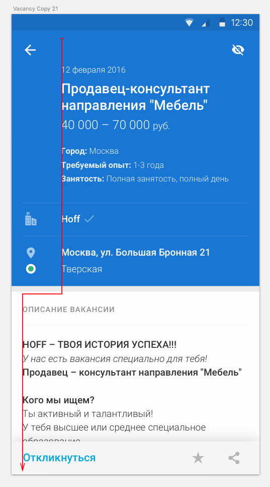
Extreme icons get easier. Less concentration to aim: on the one hand empty space, on the other - the edge of the screen.
Agreed with me, just to be left behind. But I firmly decided to visually reinforce my argument and sent them this screen:
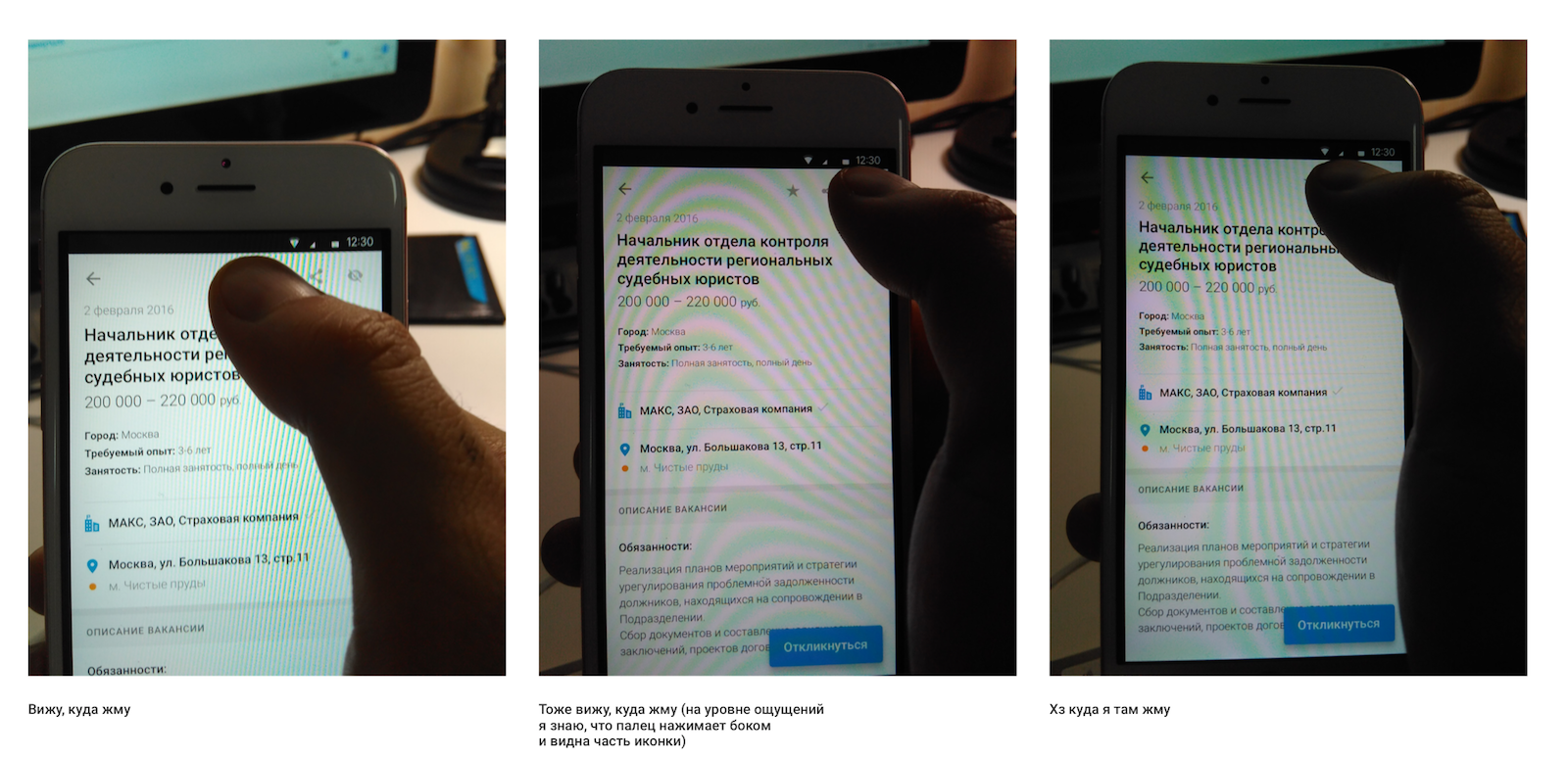
That's how I prove to the team that I am engaged in UX, and not hell understand what .
Conclusion: # think_ as_designer_act_ as_inventor. Morale is not.
Since it doesn't matter if you are big or small. The main thing is not small.
Sorry for the attention.
Source: https://habr.com/ru/post/306908/
All Articles