Bottom navigation
When developing a design, first of all, it is necessary to understand that we are developing it for living people. Machines can look under the shell, search bots can build a semantic scheme of your content and find it even with incredibly confusing navigation. But people can only understand what they see. And do not assume that they immediately understand everything that is presented to their eyes.
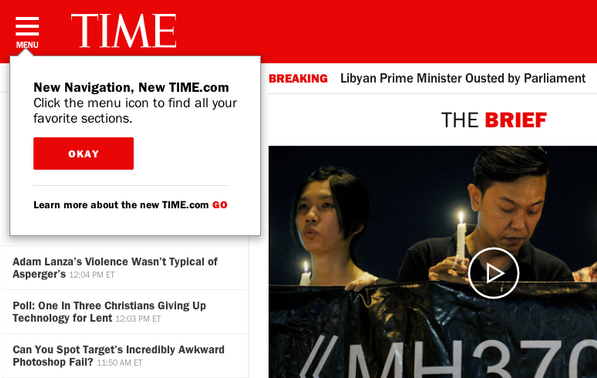
Also, it must be remembered that the phased correction of a flaw is sometimes a bad idea. So, for example, when TIME.com made their mobile web application, they added pull-out navigation (or “menu-hamburger”), then added the text “MENU” under the navigation open button , then another pop-up window pointing to this button. And all this in order to educate the user to interact with the application.
')
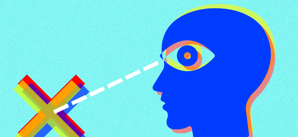
Many web designers and developers believe that the pull-down menu is not the best option for navigation. It is bad because it hides important information from the user.
Of course, you can argue that not the menu, but the content is the main component, and this is true. But, nevertheless, an important part of the information influencing the formation of the user's experience is his awareness of other available content. This is especially important for people who see your application for the first time, because such information immediately gives them to understand what they can get from the application.
Although nowadays the majority of users have become accustomed to the hamburger menu, still, there are still quite a few people left who are still not familiar with such a navigation system.
Do not hide the controls just because they do not match the design. You can, of course, try, but you will see how much user activity falls. But this indicator is actually our main goal.
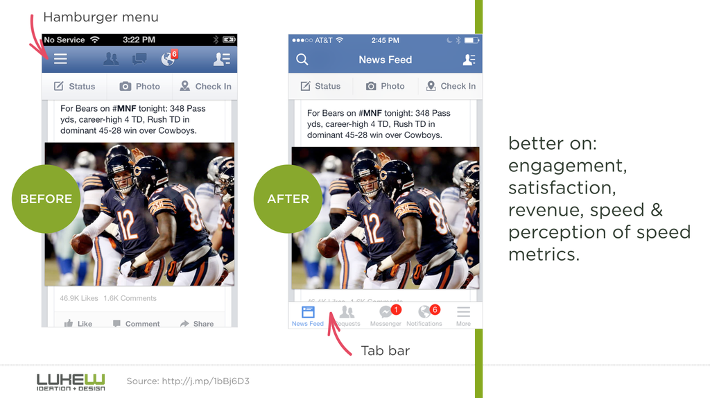
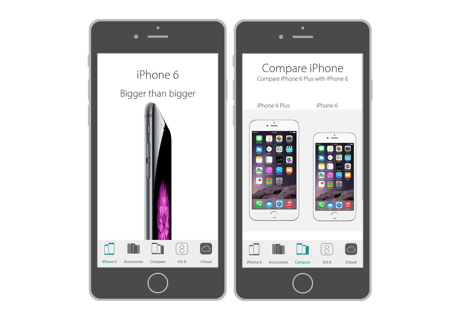
So, instead of hiding the menu to save space, it is better to select its most important components and find a place to place them. This can be a tab, a segmented control, or a lower navigation bar.
Why is this principle so good? The fact is that with this approach, the required functions are always in sight, which is useful for two reasons: - The user is immediately intuitively aware of what actions are available to him; - This principle provides quick access to those areas of the application that would have been hidden under the need for additional interactions, be it pressing the menu-hamburger, or opening the drop-down menu and then pressing the button of the necessary action.
As a rule, it makes sense to install the buttons in such a way that only 3-5 of them can be seen at a time. These should be your top navigation items. Provide actions that people will constantly perform. So that the user does not become confused by the large number of possible functions of your web service, focus only on actions relevant for working on a mobile device. Try to briefly describe the functions of important icons. Allocate enough space for each icon on the screen to make it easy for people to access the navigation controls. And do not forget to highlight specific elements on the general background.
If more than five options are available, use the more button instead of the last item in the list. Clicking this button should display the remaining available actions. Under the "more" button is to hide the least popular actions.

Another way to distribute too many actions is to make the navigation bar scrollable. In this case, you need to think about the appearance of the panel, in which the user will have just a quick glance so that it becomes obvious that it can be scrolled. It is important that the interaction model is completely understandable to the user.
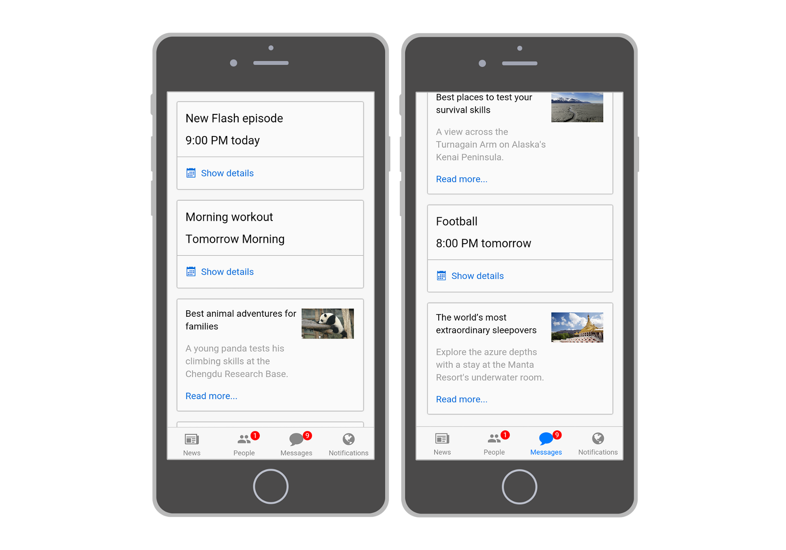
When you need to display additional information, such as the number of items that can be viewed, for example, the number of friend requests, use the icons on the action icons. This will instantly give the user an idea of what he will see after clicking on the icon.
Simple navigation should be your priority. Because just how easy it is for a user to find the information he needs and how convenient it is to use your application directly affects the likelihood that he will return again. Obviously, this is your main goal, so help your users — simplify interaction with your application.
Source: https://habr.com/ru/post/306732/
All Articles