Important user experience lessons from the development of the combat HUD for the Dreadnought game
Foreword
User interfaces (UI) for games with action-based gameplay, such as Overwatch and Battlefield, are unique in that they are required to provide the player with all the crucial game information, while not distracting it from the gameplay. In this article I will describe the user experience lessons I learned in creating a combat HUD for the Dreadnought game. By and large, this essay examines in detail ways of modifying widely known approaches to analyzing user experience patterns, such as Fitts's law, for use in HUD action games.
Before starting a detailed review, I must mention the prerequisites for you to better understand the observations I have made in the last two or three years. I will often refer to the concept invented by Jeff Raskin , a legendary computer interface specialist; in his terrific book “The Humane Interface” he introduced the concept of “locus of attention”, which I will use without shame of conscience so as not to confuse you with other related terms.
In short, the locus of attention determines the physical object or place to which your brain currently pays full attention, both consciously and subconsciously. Most other terms, such as "focus" (focus) or "target" (target) to a large extent imply making a conscious decision to pay attention to a particular place or object. This is an important difference, because the game UI should allow the user to change the player’s locus without forcing him to do it consciously.
I sincerely recommend reading the book of Jeff, because despite her age and new technical improvements, she still carries many discoveries that the user interface designer or user experience can use in modern digital interfaces.
')
For gaming HUDs, you can use the Fitts law in a modified form.
If you are not familiar with the Fitts law , then this is one of the most fundamental scientific methods for estimating and forecasting for almost any interactive element, both physical and digital. Accordingly, it allows you to make relatively accurate predictions about the practicality of using the UI element, even without using it in menu or game design.
The formula defines an easily calculated complexity index ID; essentially, it means that interface elements requiring the user to travel a greater distance (indicated by amplitude A) and also having a smaller size (indicated by width W) are more difficult to use, i.e. they have a higher complexity index, and vice versa, a low efficiency index. Similarly, shorter distances and larger element sizes result in a lower complexity index. According to the Fitts law in the formulation of Shannon [1] ID is calculated by the following formula (see Fig. A).

Fig. A: The Fitts Act in Shannon wording.
I recommend a detailed explanation in this video [2] , which illustrates the law well.
The wording of Shannon is more focused on active, conscious use of the interface, physical (device or instrument buttons, levers, etc.) or digital (all standard UI components, such as menus, buttons, sliders, scroll bars, etc.). It is less suitable for assessing how effectively the UI works passively, providing information to the user's mind, since the player may not actively search for this information. However, as I describe below, this can also be achieved by making quite simple changes and modifications to the original equation. It should be noted that further I define both types of UI respectively as interactive (the user presses buttons, etc.) and only informational (the user passively consumes information).
To make meaningful modifications to the Fitts law, it is useful to observe how the user interacts with interactive and only informational UIs. On the one hand, with active use of the UI that requires mouse input, the user actually shifts the locus of his attention to the UI element that he chose to interact with. For example, pressing a button or opening a submenu always requires a certain degree of conscious effort, i.e. the required attention shift begins directly by the user. On the other hand, in order to use only the information gaming HUD, the user attention shift must be triggered by the UI itself. For optimal performance, we first of all strive to create a UI with elements positioned in such a way that, if necessary, they themselves quickly attracted the player’s locus of attention to themselves, but allowed him to easily return to the gameplay after receiving all the necessary information for the game.
In essence, the change in complexity index proposed by me for only the information game UI determines how the considered element UI is able to shift the locus of attention and transmit information quickly enough and efficiently so that the player can use it.
It is important to note that I talk about action-oriented games such as Dreadnought, whose locus of attention has traditionally focused on the center of the screen. This is a critical aspect that needs to be considered when developing this type of UI, especially since our brain sifts out information along the edges of the visual field; the location of the UI elements on the edges of the screen may lead to a possible reduction in the user's attention compared to what the designer was aiming for.
Now I dive a little deeper into the actual modification of Shannon's formulation and its applications. In order for Fitts' law to be able to predict usability through the complexity index, in the case of only the information UI, we need to replace the initial amplitude value. To create our field of vision, the eyes move so quickly and randomly that we can ignore the physical distance as a factor; we will replace it with a compound variable that is more focused on the structure of the informational UI only .
The amplitude A in this case will determine the strength of the visual indication or signal change. It is useful to think of this amplitude A as a way of describing the signal-to-noise ratio of our brain. The stronger the change in the appearance of an element, the more likely it is the locus of attention to shift to it.
It also explains why A is defined as a composite variable consisting of several parameters and variables: because the brain's interest in visual input signals can be activated by changing the size, color, movement, noise, etc. object. For example, in the case of HUD, A may include factors such as the percentage of contrast, the increase, decrease, or difference in color or brightness change, or simply the size change within the HUD; anything that can lead to an increase or decrease in visual stimulation and is a measurable action that, in turn, can attract the user's attention.
All of these factors can be multiplied to provide a better understanding of their actual effect on the element complexity index. If greater accuracy is required in determining which of the visual indicators introduce the largest changes in amplitude, the same formula can be applied with only one isolated parameter as amplitude. This, in turn, will allow us to determine the weight of each variable affecting A.
Along with amplitude, it is necessary to introduce a new variable into the formula: distance D, which is the distance from the main locus of attention of the game to the element in question. The main locus of attention is the chosen area of focus, to which the player must pay full attention most of the time. In games of the FPS and TPS genres, this is likely to be the center of the screen. To obtain predictable results that correspond to the accuracy of the original formula, we need to divide the distance by the composite amplitude.

Fig. B1: A modified formulation of the Fitts Act for use in gaming UIs.
So we get two important benefits. Using empirical measurements, we can conclude that UI components located closer to the main locus of attention attract temporal shifts of the locus of attention much better. In addition, the closer this widget is to the current locus of attention, the more we reduce the actual amplitude for registering the widget with the visual cortex of the brain, which allows the player to stay focused on the gameplay.
In fact, there is a very simple experiment that allows you to experience these effects yourself. All that is required for it is time and one assistant. The experiment will require your full attention focused on one subject or task, so that you two can try it while you work. The assistant must wait for you to fully focus on the task you have chosen. Then he should begin to shift your locus of attention with a low amplitude. You will come to the conclusion that when an assistant tries to get your attention with a low amplitude, being on the periphery of your field of view, it may take some time to get attention. However, if it is closer and its amplitude is huge, it may even scare you. Therefore, there is an optimal zone of the best perception in which your UI elements should be created with respect to position and amplitude.
In order to more vividly illustrate this rather boring topic, I will demonstrate two vivid examples in which the Dreadnought combat UI greatly benefited from reworking the UI components to reduce the complexity index. The first elements I want to talk about are the two most critical elements of the UI of the entire HUD: the “health” and energy of the player’s ship. In our original prototype, we placed both elements at the bottom of the screen. We did this by striving not to drift too far away from the patterns familiar to players in FPS; also due to the proximity to the locus of the player’s attention, the elements were better seen in the heat of the fight. (see Fig. C1)

Fig. C1: The original layout of the UI components for "health" and weapons.
But our internal testing made us doubt that the element was sufficiently visible. Members of our team began to ask the indicators to move to a place more familiar to the “health” indicators in first and third person shooters, namely to the lower left and right corners of the cone of visibility. So we realized that, despite our hopes for an improved layout of UI elements, we did not get the expected result; they were not good enough to become stronger than the habits of experienced players.
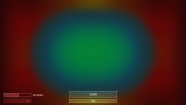
Fig. C2: Approximate area requiring increased amplitude levels to shift the locus of attention. Green and blue are the areas that the player is actively looking at during intense gameplay, red is the area in which they most likely will not notice the changes.
This made our team think about a more careful assessment and prediction of the effectiveness of the elements of the informational UI only , which led us to the conclusions indicated in this article. In particular, we began to solve the problem by testing ways of locating the UI elements so that they overpower the habits of experienced players and provide improved user experience for casual or completely inexperienced players.
We stopped at a solution that supported the feeling of commanding a large spacecraft, both thanks to a stronger visual style and enhanced usability. Moving the elements to a place where they are always visible gave us the opportunity for a short time to change the locus of attention from the battle itself, without degrading the quality of the game. In a nutshell, we placed two arcs in the area in which the ship's moving sight is in the most intense moments of the battles. (see Fig. D1)
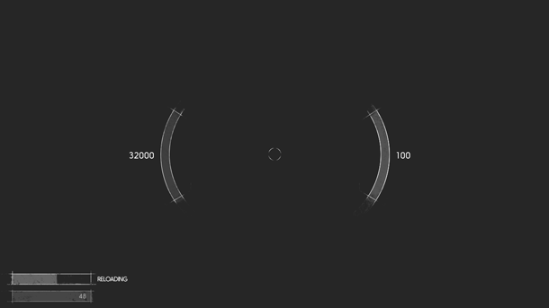
Fig. D1: Improved health and energy widget.
This allowed us to greatly reduce the actual size of the elements, because now they still most of the time are much closer to the player’s attention circle; we also increased the signal-to-noise ratio using color arcs to better signal a critical decrease in “health” or energy. This, in turn, helped bring the amplitude closer to the required levels without straining the player’s vision; we managed to bind an element to a region in the minimum distance from the main locus of attention. In addition, users were able to quickly respond to certain situations in battle. (see Fig. D2)
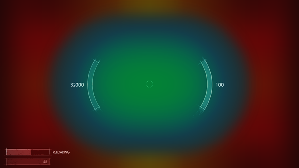
Fig. D2: Improved components are located closer to the center of the main locus of attention.
As shown in Fig. D3, we managed to significantly reduce the complexity index. Improvements of at least 400% were achieved by a combination of an amplitude improvement of about 4.5 times compared with the amplitude used for the old component, as well as optimization of the location.
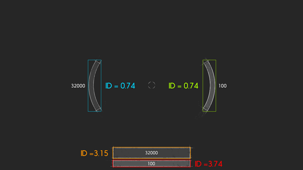
Fig. D3: The relative values of the complexity index of old and new components of "health" and energy. The lower the values, the better.
The third component was the display of weapons. We used a similar approach to correct it; Finally, we got a HUD, which has become balanced in terms of better visual display, as well as more efficient transfer of necessary information to the player.
First, we placed it in the lower right corner, as is the case in many games. Many of the players in the alpha version, testers and developers reported that they do not know exactly why the weapon begins to reload at a certain point in time; It also took a long time to check the remaining ammunition. This greatly reduced their ability to win the current battle.
To increase the efficiency of the component, we decided to divide the UI of the main and additional weapons into separate visual areas; we put them right next to the indicators of "health" and energy, which I wrote about above.

Fig. E1: New weapon display layout.
In addition, we no longer constantly show the name of the weapon, only when switching weapons or spawning during the game. This allowed freeing up about 60% of the space occupied by the source components, as well as providing the opportunity to constantly inform the player about the current state of both sets of weapons; it is now much easier to determine which one is active; We also achieved an increased signal amplitude when displaying messages about reloading any weapon.

Fig. E2: All components are clearly located in the optimal visibility cone we have chosen.
And finally, we made it possible for players to react more quickly to signals when they select the weapon’s “sniper sight” mode. Since it reduces their visibility in the game, we wanted to give them more information about the current state of their ship. To do this, we moved all elements located around the locus of attention, even closer to the center. Now even sniper-class players can react faster than ever to possible threats nearby.

Fig. F1: “Sniper Sight” mode, which increases the readability of information in high focus situations.
Honestly, I have not had this equation yet when we applied the last iteration of our HUD; however, I don’t want to discredit the value of our assumptions, as we clearly see improvements in player convenience after these changes.
However, I was always worried that our understanding of this problem was very limited, to say the least. Therefore, I began to look for possible scientific explanations. I think that the knowledge gained will make the planning and design stages of the next projects less tedious and most likely lead to predicted results.
And the last thing I wanted to mention: the search for a good balance of layout and size is crucial. Of course, the increased amplitude and size of the components will lead to increased usability of these components, but this, in turn, may reduce the usability of the others; it is a delicate balance, although the tools I mentioned can ease the path to good results.
Habit, you know where the door is! But do not forget to come back later!
It should be noted that the material in this section is based on my own experience, and there are many different views on this topic, they all have their pros and cons. I will not have for you answers to all questions related to the informational UI only .
Often the location of quite important UI elements is based on the usual patterns that have been formed. This is not necessarily very bad, but habits can greatly hinder the introduction of improved UI / UX patterns and their adoption by the wider community of game developers. With the help of such patterns, we can easily parallelize tasks that would otherwise take much longer. However, this is a double-edged sword: users can greatly benefit from the use of improved user experience patterns, but if developers decide to stick to inefficient, but common UX standards, we will see how players mastering the new genre have more difficulty than usual.
I strictly adhere to a reliable rule: if an experienced and experienced game developer can adapt and master a new pattern very quickly, experienced players will also hardly experience problems with it. The worst mistake you can make is to assume that your users cannot handle it. Never consider them stupid or even stupid. Just by watching how many multiplayer-games have amazing moments when players find ways to play in a way not intended by developers, you can understand that this is the best example that shows the willingness of players to such difficulties. In the end, we simply strive to make the game more accessible to all players, and new players benefit the most from UX improvements.
To give an example from practice, I will use the most striking case, which, in my personal opinion, is one of the biggest failures in the oldest genre of video game history: the health bar in first-person shooters.
In many, if not most, of old and new FPS creators place a health display in the lower left or lower right corner of the screen; As we found out in the first part of this article, this greatly complicates the shift of the locus of attention to this widget in the context of intense action-gameplay.
As you see (Fig. G1), they are clearly located outside the "cone of attention", which we accepted as conventionally optimal for our game (see Fig. C2). I by no means want to say that this is necessarily a bad place, but you should always think about the consequences of using such a provision, and also check whether this provision meets the requirements that you set together with the game developers.

Fig. G1: UI health widget in popular FPS games.
It is necessary to take into account that very often a meta-solution is used to reduce interference: think about post-effects at the edges of the screen — for example, blood drops on the “camera lens” when health drops to a critical level; You can see examples of this in Fig. G2.Depending on their strength, this can lead to other problems: negatively affect the perception of the game by users with physical disabilities, such as color blindness. Meta-solutions, such as the above, generally work quite well, but also raise the question: are they more convenient than the health bar itself? and if so, is this indicator necessary at all? It seems that popular games such as Call of Duty confidently answer this question "no." However, if you need it, you can think about your own location and the size of the strip of energy.

Fig. G2: Meta-solutions for displaying low health in modern FPS.
I invite all game developers, UX experts and UI artists to collect all the elements that have popular uses or familiar patterns in other games; the fact is that they can intersect with the type of game you are developing; analyze these elements, be honest and open, if you find flaws in the examples of their use.
If you have doubts about compliance with the requirements of the component's performance level, assign another iteration of the design to it. Be patient and adamant, use your knowledge of the Fitts law and other UX patterns to find a way to create a component with a lower complexity index. If you have reached the prototype stage, have your team check it out. Very often, elements have popular solutions, so at first a new design may first cause rejection. This feeling can even affect you: it is very easy to fall into the trap "it is always done this way!". Try to resist the desire for a simple return of the old component, and first experiment a little.
I watched this effect last year when we iterated the development of a display of weapons. I think it contains one of the important aspects for finding a better UX pattern, as well as for faster adaptation of users to UX patterns.
The most important part - is an attempt to outwit the brain and force it to partially abandon the usual. By testing two versions of the UI element in parallel, we were able to remove the entry barriers mentioned above. Ensure that the testing cycle randomizes the use of one of the options. This will lead to the fact that our brain will not be able to constantly apply the skills learned earlier, due to the different requirements of the UI player.
The key indicator will now be to check how long the process takes the player to return to his usual behavior; Usually the best UX pattern is the one to which the player returns more easily and reaches the comfort zone much faster than a weak design. This is a fairly simple and fast way to find the best solution optimized for the requirements of your own game.
Prototypes are vital
This may seem elementary for many of us, but I still think that prototypes are an underused tool in game development, so I want to make a couple of hints about why you should try to introduce them into your development cycles.
I can't express how important it is to have a working HUD prototype as soon as possible if these elements are applied in your gameplay. This is a great way to determine the cutoff point of the data required by the player: “more” does not always mean “better” when it comes to the extremely fragile ecosystem of the space-limited UI screen. Early prototypes can give you a clear and precise indication of what helps or what confuses your user base.
Early prototypes are by far the best tool at your disposal when it comes to creating a good UI. Reach the installation to your team that the prototype should function functionally in accordance with the requirements, but not as refined as the final product. Although this is obvious, I often had situations where employees believed that they needed “final art” for prototypes; it's pretty silly: employees who create certain parts of the game should have more than enough abstraction skills to understand that the part works without completely polishing all the icons and elements. Smoothing blemishes at this stage should be relatively simple compared to a UI that is close to its final form. The ability to quickly make changes until your games are perceived as perfect,in the end it will be very important for the players.
Conclusion
In conclusion, I want to say: I am glad that we have created such a functional and understandable HUD, despite the fact that sometimes it needs to display a lot of data. Although I did not have much knowledge to support it, because it was my first experience in this genre of games, I am pleased with the tools I received in future projects.
I also realize that not every genre can and is capable of accepting such optimizations for a game UI; However, I’m quite sure that every game developer and UX expert can draw certain conclusions from himself for these tools, which will improve the player’s perception of both the UI and the game itself.
Links
[1] Bits per second: model innovations driven by information theory
[2] Mouse Pointers & Fitts's Law - Computerphile
Source: https://habr.com/ru/post/306638/
All Articles