Functional animation in UX design. What makes it effective?
I propose to readers of Habrakhabr a translation of the article “Functional Animation In UX Design: What Makes a Good Transition?” By Nick Babich.

Functional animation is a neat animation that has a clear, logical purpose. It reduces cognitive load, focuses attention on changes and makes spatial relationships more comprehensible. But there is one more. Animations animate the interface.
')
Movement can breathe life into the workspace, multiplying and dividing it, changing its shape and size. You need to use functional animation to smoothly transition the user between the various functions of the application , explaining changes in the arrangement of elements and strengthening the hierarchy of objects .
A good animation design has the following six features:
Visual response is extremely important. It works, because it appeals to the natural desire of the user to receive confirmation of his actions . In real life, controls react to interactions with them, and this is exactly what people expect from them.

The interface must respond quickly to user actions, strictly in the place where the user initiates them , and show the connection between the new areas and the element or action that created them. It's great when you know exactly what will happen.

Objects properly respond to user actions.
Associate the newly created elements with the elements or actions that created them. The association logic helps the user to understand the changes that have just occurred and what caused them.
Below are two examples of switching to the menu. In the first case, the menu appears far from the call point, which destroys communication with the menu itself and the way it is called.

Poorly.
In the second, the menu appears right from the touch point, which creates a strong connection between them.

Good.
Another example is the action button, whose functionality changes under certain conditions. “Play” and “Stop” are most likely the most common example of switchable buttons. Converting one button to another means that these two actions are connected, and clicking on one makes the other visible. You must animate such transitions so that they are smooth and inseparable.

A smooth transition to the playback control informs the user about its function, and adds a bit of magic to the interaction process.
Avoid unexpected transformations. Every movement must correspond to reality. In the real world, acceleration and deceleration depends on the coefficient of friction and body mass. Similarly, the start and end movement of elements in a good user interface should not occur instantaneously.
Below you can see a good example where the user selects an item from the list in order to enlarge it and see its more detailed view. A compressed object begins to move in an arc to the final point, while turning to the full.

Good. In the movement of the element up the screen should be felt effort during acceleration.
Direct attention to the right place at the right time. Movement of elements in the user interface is of the highest importance. Neither text nor static image can compete with it. Good animation helps the user to move to a new level of interaction.
The new user can not predict what would entail that other action, but the correct animation helps him to avoid disorientation with a sharp change in content.
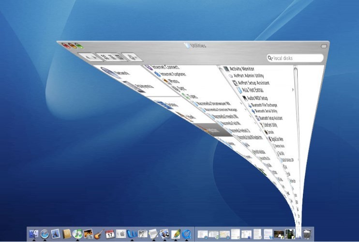
MacOS uses functional animation while minimizing the window. This animation links one window state to another.
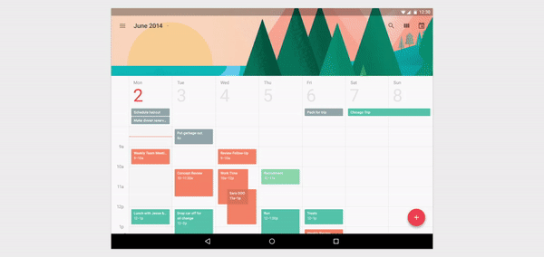
Another good example of a transition is that a user selects an item from the list and then converts it into a more detailed view. This technique allows the user to save context.
When elements change their position or state, moving them should be fast enough not to wait for it to end, but also slow enough for the transition to be understood correctly.
Do not use slow animations, they create unnecessary delays and increase the duration.

Poorly.
The oscillation and deceleration of the movement of many elements can also increase the duration.

Poorly.
The animation should be fast enough that the user does not have to wait for it to end.

Good.
Make the transitions short, as users will see them often. The duration of the animation must be 300 milliseconds or less .

Good.
Animation should not be complex and complex, since moving and intersecting several elements in different directions can be confusing.

Poorly.
Transitions should be clear, simple and clear. For animation, quality has a higher priority than quantity. Therefore, we should focus only on its practical properties.

Good.
First of all, the movement of elements should not be random. Every action must have a goal. Animations should help achieve them and focus the user's attention on the result. Regardless of which application you are developing, using the principles described above will allow you to provide a clean and connected interaction.
Design with care. Attention to every detail is the key to creating an easy to use application.
Functional animation is a neat animation that has a clear, logical purpose. It reduces cognitive load, focuses attention on changes and makes spatial relationships more comprehensible. But there is one more. Animations animate the interface.
')
Movement can breathe life into the workspace, multiplying and dividing it, changing its shape and size. You need to use functional animation to smoothly transition the user between the various functions of the application , explaining changes in the arrangement of elements and strengthening the hierarchy of objects .
A good animation design has the following six features:
1. Responsive
Visual response is extremely important. It works, because it appeals to the natural desire of the user to receive confirmation of his actions . In real life, controls react to interactions with them, and this is exactly what people expect from them.
The interface must respond quickly to user actions, strictly in the place where the user initiates them , and show the connection between the new areas and the element or action that created them. It's great when you know exactly what will happen.
Objects properly respond to user actions.
2. Associative
Associate the newly created elements with the elements or actions that created them. The association logic helps the user to understand the changes that have just occurred and what caused them.
Below are two examples of switching to the menu. In the first case, the menu appears far from the call point, which destroys communication with the menu itself and the way it is called.
Poorly.
In the second, the menu appears right from the touch point, which creates a strong connection between them.
Good.
Another example is the action button, whose functionality changes under certain conditions. “Play” and “Stop” are most likely the most common example of switchable buttons. Converting one button to another means that these two actions are connected, and clicking on one makes the other visible. You must animate such transitions so that they are smooth and inseparable.
A smooth transition to the playback control informs the user about its function, and adds a bit of magic to the interaction process.
3. Natural
Avoid unexpected transformations. Every movement must correspond to reality. In the real world, acceleration and deceleration depends on the coefficient of friction and body mass. Similarly, the start and end movement of elements in a good user interface should not occur instantaneously.
Below you can see a good example where the user selects an item from the list in order to enlarge it and see its more detailed view. A compressed object begins to move in an arc to the final point, while turning to the full.
Good. In the movement of the element up the screen should be felt effort during acceleration.
4. Intentional
Direct attention to the right place at the right time. Movement of elements in the user interface is of the highest importance. Neither text nor static image can compete with it. Good animation helps the user to move to a new level of interaction.
The new user can not predict what would entail that other action, but the correct animation helps him to avoid disorientation with a sharp change in content.
MacOS uses functional animation while minimizing the window. This animation links one window state to another.
Another good example of a transition is that a user selects an item from the list and then converts it into a more detailed view. This technique allows the user to save context.
5. Fast
When elements change their position or state, moving them should be fast enough not to wait for it to end, but also slow enough for the transition to be understood correctly.
Do not use slow animations, they create unnecessary delays and increase the duration.
Poorly.
The oscillation and deceleration of the movement of many elements can also increase the duration.
Poorly.
The animation should be fast enough that the user does not have to wait for it to end.
Good.
Make the transitions short, as users will see them often. The duration of the animation must be 300 milliseconds or less .
Good.
6. Understandable
Animation should not be complex and complex, since moving and intersecting several elements in different directions can be confusing.
Poorly.
Transitions should be clear, simple and clear. For animation, quality has a higher priority than quantity. Therefore, we should focus only on its practical properties.
Good.
Conclusion
First of all, the movement of elements should not be random. Every action must have a goal. Animations should help achieve them and focus the user's attention on the result. Regardless of which application you are developing, using the principles described above will allow you to provide a clean and connected interaction.
Design with care. Attention to every detail is the key to creating an easy to use application.
Source: https://habr.com/ru/post/306348/
All Articles