11 design projects that "blew up" the world
A really good design is designed to convey the essence of the idea in the very first moments. A truly magnificent design project, with skillful use, can influence the opinion of many people and even push them to commit certain actions. And all this is done through their perception of the world and through their way of life.
Accordingly, many designers believe in the importance of their role and see the purpose in creating something truly worthy. It doesn’t matter whether it is a persuasive political poster, a defining era of a magazine cover, or a charitable organization with advertising, sometimes the design is in fact capable of changing the world - and I would like to hope for the better. Below is a selection of 11 inspiring examples of really strong design.
')
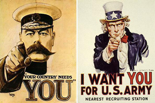
Posters of the First World War, designed to mobilize the masses in Britain and America
At the beginning of the 20th century, especially during World War I, posters were the most popular form of propaganda, drowning the military economy on both sides of the Atlantic. On a large-format newspaper sheet, a win-win combination of powerful illustration and a strong-willed, direct appeal to millions of young people to follow to the nearest recruiting station was used.
The impressive figures of the British military leader Kitchener (Kitchener) and Uncle Sam himself, surrounded by patriotic paraphernalia and their fingers pointing directly at the beholder, look quite convincing.
The introduction of military service before the beginning of World War II helped to use common recruiting posters in campaigns conducted by specialized services to increase productivity in other areas. This was especially true of the work of women in the industrial and agricultural sectors.

During the Second World War, a certain shift was observed in campaigns for the mobilization of the population: from universal coverage to the development of specific approaches for various groups

Fitzpatrick provided an open-access poster with Che Guevara to spread around the world.
When Irish artist Jim Fitzpatrick drew his red and black print based on a photograph of Alberto Korda, depicting a famous revolutionary leader, he did not expect that this poster would become a cult. In 1967, Fitzpatrick received a copy of a photograph from a Dutch anarchist group that allows you to make an image for a magazine.
After the murder of Che Guevara, the artist presented the image as a commemorative poster created on the basis of a negative on photographic paper and printed it in black and red. He painted the yellow star by hand. Fitzpatrick waived copyright and allowed revolutionary groups to freely use and distribute the poster throughout Europe. However, over the past decade, this revolutionary symbol has become commercial property. Now he adorns the walls of many students who are accustomed to rebellion against parents and teachers rather than to the struggle against the repressive regime.

Poster design by Saatchi & Saatchi was simple, but effective to brutality
This is one of two political announcements included in the Campaign Magazine Hall of Fame. And, definitely - this is one of the most iconic, key and influential electoral posters that have ever decorated British billboards. Amazingly, for the promotion of the 1979 Campaign “Labor Isn't Working” (“Labor does not work”) on behalf of the Conservative Party, Saatchi & Saatchi depicted on their poster only a long line of people looking for work .
As part of the design of the poster is quite simple. But the idea hooked a powerful public sense of discontent, which helped bring the conservatives to power for 18 years in a row. The poster spawned a number of subsequent campaigns that lasted for many years. Including 2012 “Labor Isn't Learning” (again turning to conservatives) and British Uncut Austerity Isn't Working . In the same year, the Republican Party copied the design for the US presidential election with the slogan "Obama Isn't Working" . But unfortunately for the Great Old Party (GOP), such actions did not have a sufficiently effective influence.

Powerful headlines on Time magazine covers resonate around the world.
Perhaps, in addition to Time, there are not many publications that can become defining for their era. The stellar cover of the above-mentioned journal was the one that summarizes the achievements of fantastic heights in various fields. His close-ups on the cover, in conjunction with the long-running “Man of the Year” competition, for decades made the magazine and the cover a kind of litmus test for culture.
Of course, the weekly magazine, which was launched in 1923, has since gathered an impressive archive. And this archive is a rich chronicle, which effectively reflects the last 90 years of world history. The publication had a tremendous impact on the formation of the public perception of certain events.
Since 1927, Time has only departed four times from the concept of the red frame framing the cover: after September 11, 2001 (the frame turned black); edition dedicated to Earth Day (the cover turned green); a commemorative issue 10 years later on September 11 (metallic-silver frame); to mark the person of Barack Obama after the 2012 election (silver reuse).
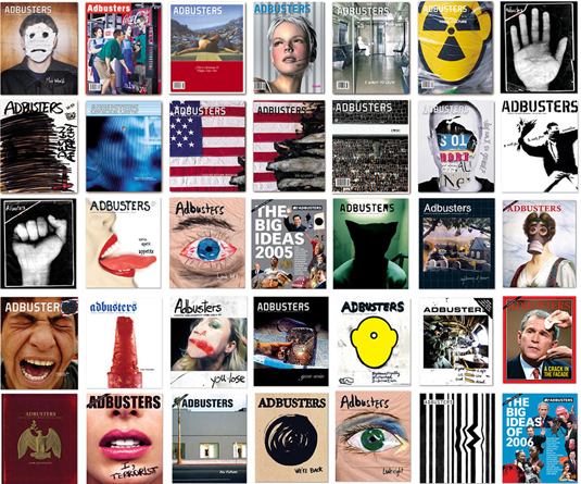
Adbusters initiates initial protest of "Occupy Wall Street"
Founded in Vancouver (Canada) in 1989, the Adbusters Media Foundation, a nonprofit organization, takes a fierce anti-consumer stance and is fighting for environmental protection. According to the statement, the organization’s efforts are aimed at awakening “a global network of artists, activists, writers, students, teachers and entrepreneurs who want to promote a new movement of social activists of the information age”.
Design plays a key role in the organization’s manifestations. And the implementation of ideas is carried out with the help of Adbusters magazine, which openly opposes capitalism and mercantilism. The principle of the journal is called "Culture jamming". On its own pages, as well as through the publications of other countries, Adbusters challenges and tries to change public opinion about the status quo. In the course are parodies, satire and other vigorous activity.
The organization also launched global campaigns such as Buy Nothing Day , TV Turnoff Week and most notable Occupy Wall Street . Perhaps it was the last campaign that became the most discussed protest movement in the West.
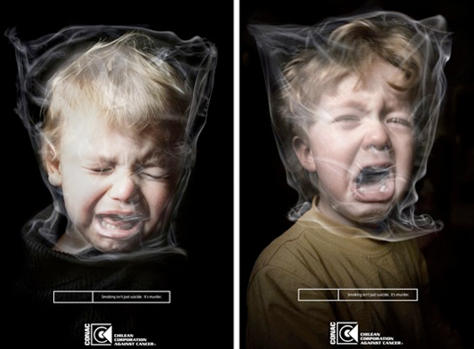
Anti-smoking advertisements are becoming more colorful, shocking and powerful.
Smoking and advertising were just the same "sweet couple." Stylish movie stars with cigarettes in their lips; harsh and muscular cowboys in the desert, sweetly addicted to cigarette smoke; In the films, propaganda of smoking was carried on. How has everything changed.

The power of design is used to potentially save thousands of lives.
The scale of the problem and the general excitement led to the launch of shocking campaigns aimed at combating smoking and calling on smokers around the world to get rid of their addiction before it causes irreparable harm. And in this case, a poster is a powerful design tool that can influence the human mind. It does not matter whether it will be a refutation of the opinion that smoking makes you cool or visualizing all the consequences of a bad habit (illness, infertility, death).
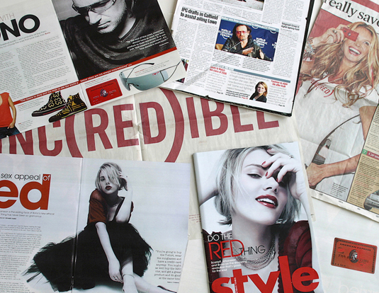
The "(RED)" campaign to raise funds for charity recently crossed the $ 200 million mark
The project was launched in 2006 and since then it has successfully demonstrated the real impact of design on society. In this case, he brought together all the power of the largest world brands to help in the fight against AIDS in Africa.
With a unique brand architecture, which represented its recognizable logos "'to the power of (RED)", the organization attracts partners in the caliber Amex, Converse, Emporio Armani and Gap.
By 2013, she raised more than $ 200 million. This makes the organization the largest private sector charity activist in contributing to the Global Fund to Fight AIDS ( The Global Fund ), along with major partners like Apple, Coca-Cola and Starbucks, who added their own Banners to this company.

The campaign, which began with the film "Inconvenient Truth" and acquired an unexpected, exciting form of its design
“Inconvenient Truth” (2006) - a documentary by Al Gore (Al Gore), which tells about global warming. This exciting adventure, created by Push-Pop Press and Melcher Media, acts as a pioneer of the new mode and demonstrates a different user interaction with the digital book. Based on the film that preceded the book, Gore conducted an in-depth analysis of the causes of global warming, shared innovative insights and suggested potential solutions to the problem.
All this is presented to the user in the form of an inspirational package of photos, interactive infographics, animation and documentary shots. The application is equipped with an advanced touch interface that helps to correlate book operations with intuitive user schemes, and also allows you to increase and decrease windows with various information, play with them and explore their rich content. This is an excellent example of how a great design can deliver an important message in an attractive way.
Hope Poster was created in just one day
Born in South Carolina, illustrator and graphic designer Shepard Fairey made a name for himself in the late 80s thanks to the work of Andre the Giant Has a Posse . But it was participation in the presidential elections of 2008 in the USA that brought him to the top of fame and presented him with world recognition.
The epochal portrait of Barack Obama created by Fae consists of four colors: beige (portrait frame), and also red, light and dark blue (in which the senator himself is painted). The poster created in one day also had different variations with the slogan: in addition to the chosen “HOPE”, such options as “CHANGE” and “PROGRESS” were considered. Having begun his life as a screen poster (which was sold almost immediately), this designer product filled the entire territory of the United States and that the virus spread throughout the world. The poster has become a symbol of what American politics could potentially become.
Parodies of the poster Barack Obama "Hope", made by the same Fae. The left poster was created for the international branch of the Occupy Wall Street protest movement and contains the message "Mr. President, we HOPE that you are on our side." Right poster is dedicated to satirical political candidate Honest Gil Fulbright
The next year’s great revelation was that Shepard Fairy’s poster was based on a photograph of Manny Garcia, the Associated Press photographer, without any permission. In a subsequent litigation, the designer admitted that he had destroyed evidence of theft. He was assigned correctional work and a fine for a very round sum. Today in design circles this work has become not only an exemplary example of political iconography, but also a symbol of copyright infringement. But whatever the circumstances of the creation of the poster, the power of his influence on the election campaign of 44 US President is undeniable.

In Greenpeace, held a competition among designers aimed at undermining the credibility of the brand BP
Like Adbusters, Greenpeace has earned a reputation as a zealous, socially active organization. In 2010, an accident occurred that resulted in the Gulf of Mexico got half a million gallons of oil seeping into the water every day. The international organization for the protection of the environment helped prevent an environmental catastrophe, but it also organized an anti-campaign against the oil giant.
Greenpeace opened a design competition, in which three categories of people took part: professional developers and students of specialized universities, specialists from other areas and children under 18 years of age. Participants were required to do some kind of rebranding of the BP brand (the logo was developed a decade before the oil incident. It emphasizes the company's green orientation). The technical task was simple: "Show that the company does not comply with the slogan" more than oil "- it is completely mired in tar sands and deep-sea drilling." To which the contestants literally flooded the Internet with a variety of parodies of the BP logo.
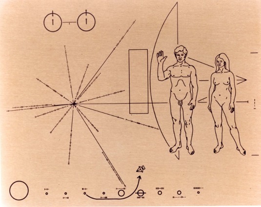
Plate of anodized aluminum with symbolic information about man, the Earth and its location
In the early 70s, people stood at the center of everything that exists. The landing on the moon (1969) and the photograph of the rise of the earth during the Apollo 8 mission - popularized the idea that our world is just a small grain of sand in a vast universe. From which it followed that in space there can be many other civilizations.
In 1972, NASA launched Pioneer 10 (an automatic interplanetary station), which was the first spacecraft to explore Jupiter and the heliosphere. Together with all the necessary tools to explore the largest planet of the solar system, a small plate of anodized aluminum went into space.
The project was developed by Carl Sagan and his wife Linda Sagan in just three weeks. The album acted as a message from humanity for possible alien civilizations. The figure depicted a man, a woman and the ship "Pioneer" in one scale. To their left was the Sun, the rays showing the location and distance of the 14 nearest pulsars and the center of the Galaxy.
Will the alien ever find the message they sent? Will they translate it? Hardly. At the moment, Pioneer 10 is heading for Aldebaran. And it will take him about two million years to reach this star.
Accordingly, many designers believe in the importance of their role and see the purpose in creating something truly worthy. It doesn’t matter whether it is a persuasive political poster, a defining era of a magazine cover, or a charitable organization with advertising, sometimes the design is in fact capable of changing the world - and I would like to hope for the better. Below is a selection of 11 inspiring examples of really strong design.
1. Recruitment posters of the First World War
')
Posters of the First World War, designed to mobilize the masses in Britain and America
At the beginning of the 20th century, especially during World War I, posters were the most popular form of propaganda, drowning the military economy on both sides of the Atlantic. On a large-format newspaper sheet, a win-win combination of powerful illustration and a strong-willed, direct appeal to millions of young people to follow to the nearest recruiting station was used.
The impressive figures of the British military leader Kitchener (Kitchener) and Uncle Sam himself, surrounded by patriotic paraphernalia and their fingers pointing directly at the beholder, look quite convincing.
The introduction of military service before the beginning of World War II helped to use common recruiting posters in campaigns conducted by specialized services to increase productivity in other areas. This was especially true of the work of women in the industrial and agricultural sectors.
During the Second World War, a certain shift was observed in campaigns for the mobilization of the population: from universal coverage to the development of specific approaches for various groups
2. Poster of Che Guevara
Fitzpatrick provided an open-access poster with Che Guevara to spread around the world.
When Irish artist Jim Fitzpatrick drew his red and black print based on a photograph of Alberto Korda, depicting a famous revolutionary leader, he did not expect that this poster would become a cult. In 1967, Fitzpatrick received a copy of a photograph from a Dutch anarchist group that allows you to make an image for a magazine.
After the murder of Che Guevara, the artist presented the image as a commemorative poster created on the basis of a negative on photographic paper and printed it in black and red. He painted the yellow star by hand. Fitzpatrick waived copyright and allowed revolutionary groups to freely use and distribute the poster throughout Europe. However, over the past decade, this revolutionary symbol has become commercial property. Now he adorns the walls of many students who are accustomed to rebellion against parents and teachers rather than to the struggle against the repressive regime.
3. Poster "Labor Is Not Working"
Poster design by Saatchi & Saatchi was simple, but effective to brutality
This is one of two political announcements included in the Campaign Magazine Hall of Fame. And, definitely - this is one of the most iconic, key and influential electoral posters that have ever decorated British billboards. Amazingly, for the promotion of the 1979 Campaign “Labor Isn't Working” (“Labor does not work”) on behalf of the Conservative Party, Saatchi & Saatchi depicted on their poster only a long line of people looking for work .
As part of the design of the poster is quite simple. But the idea hooked a powerful public sense of discontent, which helped bring the conservatives to power for 18 years in a row. The poster spawned a number of subsequent campaigns that lasted for many years. Including 2012 “Labor Isn't Learning” (again turning to conservatives) and British Uncut Austerity Isn't Working . In the same year, the Republican Party copied the design for the US presidential election with the slogan "Obama Isn't Working" . But unfortunately for the Great Old Party (GOP), such actions did not have a sufficiently effective influence.
4. Time magazine covers
Powerful headlines on Time magazine covers resonate around the world.
Perhaps, in addition to Time, there are not many publications that can become defining for their era. The stellar cover of the above-mentioned journal was the one that summarizes the achievements of fantastic heights in various fields. His close-ups on the cover, in conjunction with the long-running “Man of the Year” competition, for decades made the magazine and the cover a kind of litmus test for culture.
Of course, the weekly magazine, which was launched in 1923, has since gathered an impressive archive. And this archive is a rich chronicle, which effectively reflects the last 90 years of world history. The publication had a tremendous impact on the formation of the public perception of certain events.
Since 1927, Time has only departed four times from the concept of the red frame framing the cover: after September 11, 2001 (the frame turned black); edition dedicated to Earth Day (the cover turned green); a commemorative issue 10 years later on September 11 (metallic-silver frame); to mark the person of Barack Obama after the 2012 election (silver reuse).
5. Adbusters campaigns
Adbusters initiates initial protest of "Occupy Wall Street"
Founded in Vancouver (Canada) in 1989, the Adbusters Media Foundation, a nonprofit organization, takes a fierce anti-consumer stance and is fighting for environmental protection. According to the statement, the organization’s efforts are aimed at awakening “a global network of artists, activists, writers, students, teachers and entrepreneurs who want to promote a new movement of social activists of the information age”.
Design plays a key role in the organization’s manifestations. And the implementation of ideas is carried out with the help of Adbusters magazine, which openly opposes capitalism and mercantilism. The principle of the journal is called "Culture jamming". On its own pages, as well as through the publications of other countries, Adbusters challenges and tries to change public opinion about the status quo. In the course are parodies, satire and other vigorous activity.
The organization also launched global campaigns such as Buy Nothing Day , TV Turnoff Week and most notable Occupy Wall Street . Perhaps it was the last campaign that became the most discussed protest movement in the West.
6. Anti-smoking advertising
Anti-smoking advertisements are becoming more colorful, shocking and powerful.
Smoking and advertising were just the same "sweet couple." Stylish movie stars with cigarettes in their lips; harsh and muscular cowboys in the desert, sweetly addicted to cigarette smoke; In the films, propaganda of smoking was carried on. How has everything changed.
The power of design is used to potentially save thousands of lives.
The scale of the problem and the general excitement led to the launch of shocking campaigns aimed at combating smoking and calling on smokers around the world to get rid of their addiction before it causes irreparable harm. And in this case, a poster is a powerful design tool that can influence the human mind. It does not matter whether it will be a refutation of the opinion that smoking makes you cool or visualizing all the consequences of a bad habit (illness, infertility, death).
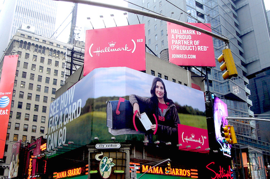
7. (RED) branding
The "(RED)" campaign to raise funds for charity recently crossed the $ 200 million mark
The project was launched in 2006 and since then it has successfully demonstrated the real impact of design on society. In this case, he brought together all the power of the largest world brands to help in the fight against AIDS in Africa.
With a unique brand architecture, which represented its recognizable logos "'to the power of (RED)", the organization attracts partners in the caliber Amex, Converse, Emporio Armani and Gap.
By 2013, she raised more than $ 200 million. This makes the organization the largest private sector charity activist in contributing to the Global Fund to Fight AIDS ( The Global Fund ), along with major partners like Apple, Coca-Cola and Starbucks, who added their own Banners to this company.
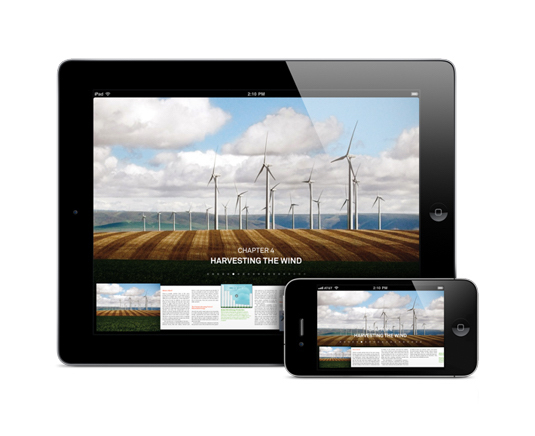
8. Our Choice
The campaign, which began with the film "Inconvenient Truth" and acquired an unexpected, exciting form of its design
“Inconvenient Truth” (2006) - a documentary by Al Gore (Al Gore), which tells about global warming. This exciting adventure, created by Push-Pop Press and Melcher Media, acts as a pioneer of the new mode and demonstrates a different user interaction with the digital book. Based on the film that preceded the book, Gore conducted an in-depth analysis of the causes of global warming, shared innovative insights and suggested potential solutions to the problem.
All this is presented to the user in the form of an inspirational package of photos, interactive infographics, animation and documentary shots. The application is equipped with an advanced touch interface that helps to correlate book operations with intuitive user schemes, and also allows you to increase and decrease windows with various information, play with them and explore their rich content. This is an excellent example of how a great design can deliver an important message in an attractive way.
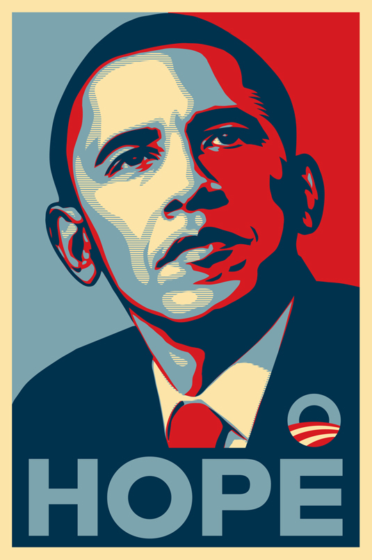
9. Barack Obama on the Hope poster
Hope Poster was created in just one day
Born in South Carolina, illustrator and graphic designer Shepard Fairey made a name for himself in the late 80s thanks to the work of Andre the Giant Has a Posse . But it was participation in the presidential elections of 2008 in the USA that brought him to the top of fame and presented him with world recognition.
The epochal portrait of Barack Obama created by Fae consists of four colors: beige (portrait frame), and also red, light and dark blue (in which the senator himself is painted). The poster created in one day also had different variations with the slogan: in addition to the chosen “HOPE”, such options as “CHANGE” and “PROGRESS” were considered. Having begun his life as a screen poster (which was sold almost immediately), this designer product filled the entire territory of the United States and that the virus spread throughout the world. The poster has become a symbol of what American politics could potentially become.
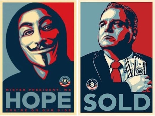
Parodies of the poster Barack Obama "Hope", made by the same Fae. The left poster was created for the international branch of the Occupy Wall Street protest movement and contains the message "Mr. President, we HOPE that you are on our side." Right poster is dedicated to satirical political candidate Honest Gil Fulbright
The next year’s great revelation was that Shepard Fairy’s poster was based on a photograph of Manny Garcia, the Associated Press photographer, without any permission. In a subsequent litigation, the designer admitted that he had destroyed evidence of theft. He was assigned correctional work and a fine for a very round sum. Today in design circles this work has become not only an exemplary example of political iconography, but also a symbol of copyright infringement. But whatever the circumstances of the creation of the poster, the power of his influence on the election campaign of 44 US President is undeniable.
10. Caricature of Greenpeace on BP’s brand
In Greenpeace, held a competition among designers aimed at undermining the credibility of the brand BP
Like Adbusters, Greenpeace has earned a reputation as a zealous, socially active organization. In 2010, an accident occurred that resulted in the Gulf of Mexico got half a million gallons of oil seeping into the water every day. The international organization for the protection of the environment helped prevent an environmental catastrophe, but it also organized an anti-campaign against the oil giant.
Greenpeace opened a design competition, in which three categories of people took part: professional developers and students of specialized universities, specialists from other areas and children under 18 years of age. Participants were required to do some kind of rebranding of the BP brand (the logo was developed a decade before the oil incident. It emphasizes the company's green orientation). The technical task was simple: "Show that the company does not comply with the slogan" more than oil "- it is completely mired in tar sands and deep-sea drilling." To which the contestants literally flooded the Internet with a variety of parodies of the BP logo.
11. Plate of alien civilizations
Plate of anodized aluminum with symbolic information about man, the Earth and its location
In the early 70s, people stood at the center of everything that exists. The landing on the moon (1969) and the photograph of the rise of the earth during the Apollo 8 mission - popularized the idea that our world is just a small grain of sand in a vast universe. From which it followed that in space there can be many other civilizations.
In 1972, NASA launched Pioneer 10 (an automatic interplanetary station), which was the first spacecraft to explore Jupiter and the heliosphere. Together with all the necessary tools to explore the largest planet of the solar system, a small plate of anodized aluminum went into space.
The project was developed by Carl Sagan and his wife Linda Sagan in just three weeks. The album acted as a message from humanity for possible alien civilizations. The figure depicted a man, a woman and the ship "Pioneer" in one scale. To their left was the Sun, the rays showing the location and distance of the 14 nearest pulsars and the center of the Galaxy.
Will the alien ever find the message they sent? Will they translate it? Hardly. At the moment, Pioneer 10 is heading for Aldebaran. And it will take him about two million years to reach this star.
Source: https://habr.com/ru/post/306344/
All Articles