3 tips on proper use of fonts in emails
Have you ever wondered why the font you selected for the email did not appear in the mailbox? It probably happened because your font was not “safe”, and the device on which the letter was opened did not support it. In this article, we will look at the concept of “web security” of fonts, methods of using standard and non-standard fonts, as well as the best examples of their use in email newsletters .
Of course, one of the most important elements of design is printed text. A graphic design and text style is called typography. With the right approach, typography can transform your emails. However, the problem is that not all fonts are displayed in all mailboxes and on all devices. First you need to determine the boundaries of "web security."
')
Unsafe fonts and how to use them
Certain fonts will be correctly displayed absolutely on all devices and in all email clients. These are the so-called “web safe” fonts:
- Arial
- Courier
- Georgia
- Helvetica
- Lucida Sans
- Tahoma
- Times new roman
- Trebuchet ms
- Verdana
And since they are displayed everywhere, you can safely use them in your email-marketing campaigns. The only drawback of these fonts is their very limited number.
In that case, what is left for the interface designers? Fortunately, there are several ways to solve this problem.
First, with proper layout of letters, you need to use not only fonts, but also images, indents, spaces, work with text, etc. We’ll talk about this later.
Secondly, it is possible to go beyond the limits of "web security" by typing text with non-standard fonts. One of the popular ways is to use web fonts that are downloaded when opening a message, for example, from the Google web fonts service . The formation of "CSS font stacks" allows the device to switch to a more common alternative font.
Now let's get back to designing emails and typography. To get the right font for your email marketing campaign, 3 tips will help you.
Tip number 1: Choose the right font for the main text of the letter
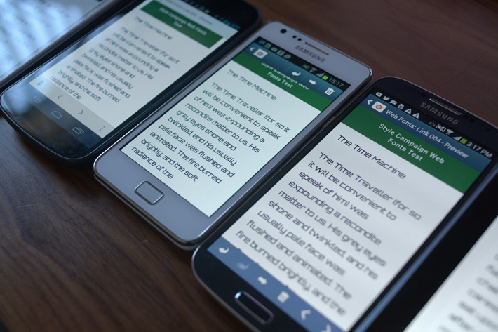
Last year, an article entitled “The font of your letters ruins your life” was published on the Bloomberg website. The author came to the conclusion that fonts such as Arial and Helvetica are not very suitable for reading letters on the go [we already translated this material into our blog - you can read it here - approx. trans.]. Why? Because the shapes of some letters — such as p, b, q, d — are too similar to each other, and it is difficult for the reader to distinguish between them. “You should use a font in which the letters do not merge with each other,” the type design professor Gerry Leonidas offered advice. The serifs characteristic of serif fonts give each letter a unique character. We remind you what letters with and without serifs look like:

Image taken from w3schools.com
What fonts are recommended to use when creating emails as an alternative to Arial and Helvetica? Georgia or Verdana. “As for emails, we usually look at a couple of paragraphs,” the article says. “The wide spacing between letters speeds up reading ... And the serifs help distinguish the letters between themselves.”
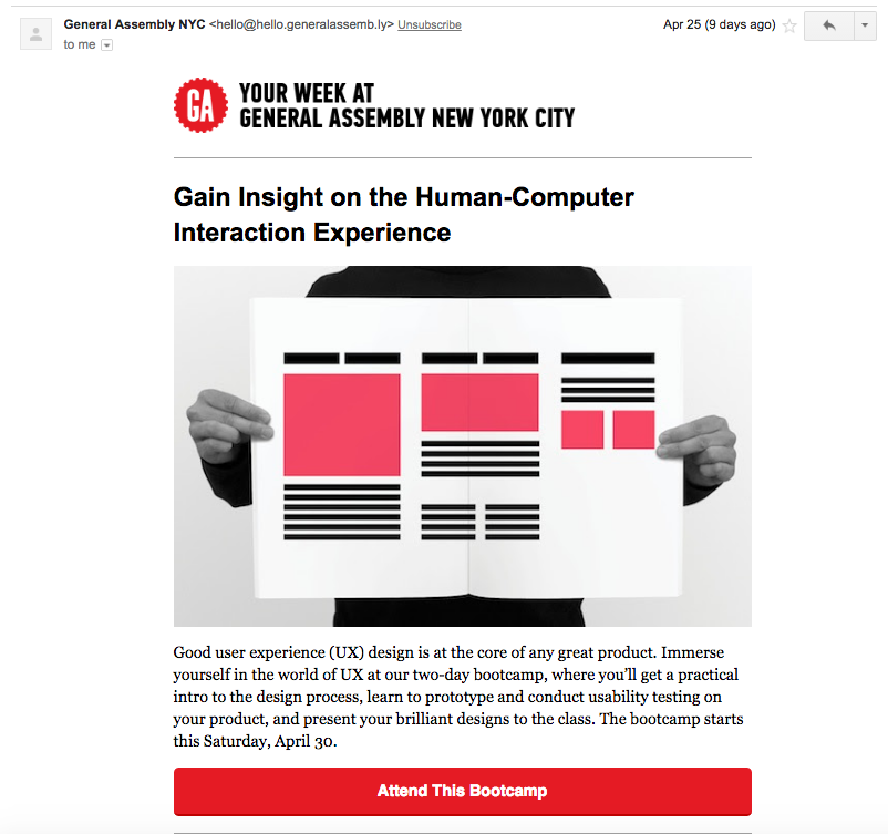
In our inbox we found some good examples of using serif fonts. General Assembly Global Education Company, as a rule, uses the Georgia font for the main text of the letter:
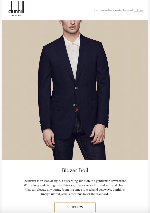
The British company Dunhill, specializing in the production of men's luxury goods, also prefers Georgia:
And the culinary site The Kitchn makes a choice in favor of the Georgia font:

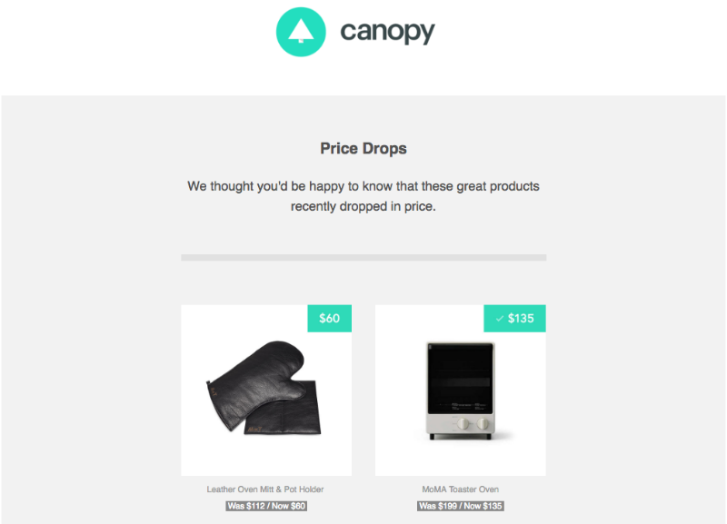
But we also found many letters in which the sans serifs family fonts were used. Most often, sans serif fonts are chosen for small blocks of text (1 or 2 lines) or large headings, as in this letter from the Canopy website:
American premium sportswear brand Lululemon also favors sans-serif typefaces:

findings
As a general rule, if the main text of the letter consists of long blocks, use serif fonts. Georgia and Verdana fonts make text easier to read. However, sans-serif fonts are more suitable for short letters and single text passages.
Tip # 2: Select the title by combining fonts or changing the font style
The headings define the structure of the letter, break the text into sections, and the content into separate elements. With their help, the reader is easier to view and internalize your message. Highlight the title and make email more readable in several ways:
a) For the title, use the same font as for the main text of the letter, but with a larger size (and / or apply a different color and style, for example, by highlighting it in bold or typing it in capital letters only).
Using the same font for the title and content makes the letter simple and straightforward. This uniformity makes the brand recognizable, provided that your headings are visually different from the main text in size and / or font style or are separated by a space. In addition, your email will be displayed correctly in any email client.
The font size of titles should be at least twice the font size of the main text, with the title and content blocks separated by a blank line to improve readability. It is on this principle that Canopy, The Kitchn and Lululemon draw the headings of their letters.
b) For the title, select a font that is different from the font of the main text of the letter (and / or apply a different color and style, for example, by highlighting it in bold or typing in capital letters only).
The difference in the font of the header and the main text of the letter creates a pleasant visual contrast. “The most popular principle for combining fonts is the combination of a chopped-up font for a headline and a serif font for the main text,” Smashing Magazine reports. “Using this classic combination, it’s almost impossible to make a mistake.” The secret is not to combine fonts that differ in many unique characteristics. This can lead to undesirable conflict in typography. As a rule, "web-safe" fonts are not too flowery, so you can easily combine almost any font of the serif family with a minced font.
Web-safe serif fonts include:
- Courier
- Georgia
- Times new roman
Web-safe, sans-serif fonts include:
- Arial
- Helvetica
- Lucida Sans
- Tahoma
- Trebuchet
- Verdana
Even when combining different fonts, the font size of the title should still be at least twice the font size of the main text (it may also differ in color or saturation). The aforementioned General Assembly email is a great example of the combination of the Arial font in the header and Georgia in the main body of the letter.
c) Type the heading in a non-standard font and paste it into the letter in the form of a picture.
Many brands use logos and letter headers as an opportunity to present their corporate identity. Their typography may be so unique that they prefer to place fonts in letters as images rather than text. A non-standard font in this case is recommended to be inserted into images, as otherwise it may not appear in some email clients. On the other hand, when writing a letter, you should not rely entirely on images, as some mailboxes by default block their loading. However, some companies take this risk based on the content of their letters and audience. So, for example, the online store of designer interior items Sight Unseen, places in its letters images with a corporate heading:

findings
Give your brand individuality by simply placing your brand logo and a non-standard font at the beginning of the message, and use the “web safe” font for the rest of the headings and the main text of the letter.
Rule number 3: Correctly make links
One of the advantages of adding images to email is that they can all be tied to the landing pages. Thus, following the links in the letter, readers can get additional information or make a purchase. Companies that prefer to use fonts instead of images in letters can improve navigation by applying “smart linking” technology. It is not necessary to underline links or make them blue! You can “repaint” the hyperlinks in the color of your brand, but you can not emphasize them or not select them at all.
Lululemon took this approach when composing its letter. Its title, narrative, and call-to-action button are linked, so readers can click on almost any element of the letter to get more detailed information. Despite the fact that the links are not visually highlighted, an instinctive click redirects subscribers to the Lululemon website. Thus, the letter is not overloaded with underline or new colors, and the design remains simple and elegant.
Conclusion
Experimenting with the design of the links in your letters, try to find a balance that fits your brand and emphasizes its aesthetics. Make sure that the links in your letter are extremely simple and concise.
In Conclusion: Best Practices
- For the main text of the letter, select the "web safe" font. If the letter has a lot of text, try using a serif font.
- Use a sans serif font for the title. The font size of the title should be greater than the font size of the main text.
- Increase the effectiveness of links by attaching as much information to the letter as possible without disturbing the design.
Other materials on the Pechkina blog:
- How to write a good text for a site or email-letter: WIIFM technology
- Email, social networks, instant messengers: What does the media influence and how to choose them
- How to create email-auto-answers: Analysis of 100 applications to support services of IT companies
- Working with email: How to reduce the number of incoming messages to zero
- Why spam is so hard to beat
- Email and Security: Is it possible to protect email correspondence?
Source: https://habr.com/ru/post/306082/
All Articles