Improving colors on the web (for eplofilov)
This is a translation of the publication in the Web Kit blog.
The past few years have seen a significant improvement in display technology. At first it was an upgrade to higher resolution screens, started with mobile devices, and then transferred to desktops and laptops. Web developers had to understand what it means for them to have a high value in DPI, and to know how to design pages that use such high resolution. The next revolutionary display improvement is happening right now: improved color rendering. In this article, I would like to clarify what this means, and how you, developers, can identify such displays and provide better interaction for your users.
Take a typical computer monitor — a type that you have been using for over a decade — the sRGB display. The latest Apple designs, including the Retina iMac (late 2015) and iPad Pro (early 2016), can display more colors than the sRGB display. Such displays are called wide-gamut displays (an explanation of the terms “sRGB” and “color gamut” will be given below).
Why is this useful? A system with a wide color gamut often provides a more accurate reproduction of the original color. For example, my colleague by the name of Hober has some catchy sneakers.
')

Bright orange hober sneakers
Unfortunately, what you see above does not convey how impressive these sneakers are in fact! The problem is that the color of the sneaker material cannot be represented on the sRGB display. The camera that captured this photo (Sony a6300) has a matrix that perceives more accurate color information, and the corresponding data is available in the original file, but the display cannot show them. Here is a variant of the photo, in which every pixel that has a color that goes beyond the border of a typical display is replaced with a light blue:

The same bright orange Hober sneakers, but here all the pixels that go beyond the boundaries of color, replaced by blue
As you can see, the color of the material of the sneakers and a large part of the grass goes beyond the border of the sRGB display. In fact, only less than half the pixels are accurately represented. Being a web developer, you need to reckon with this. Suppose you sell such sneakers through an online store. Your customers will not know exactly what color they ordered, and may be surprised when their purchase comes to them.
This problem is reduced when using a display with a wide color gamut. If you have one of the devices mentioned above, or something similar, here is a photo version that will show you more colors:

The same bright orange Hober sneakers, but added a color profile
On the display with a wide color gamut you can see sneakers of a brighter orange color, green grass is also more varied in color. If you, unfortunately, do not have such a display, then you most likely see something very close in color to the first photo. In this case, the best I can offer is to color the image, highlighting the areas you lose in color.
In any case, this is good news! Wide-gamut displays are brighter and provide a more accurate representation of reality. Obviously, there is a desire to make sure that you can provide your users with an image formation in which this technology will be useful.
Below is the following example, this time with the generated image. Users on the sRGB display can see a uniform red square below. However, this is in some way a trick. In fact, there are two shades of red in the image, one of which can only be seen on displays with a wide color gamut. On this display, you will see the pale WebKit logo inside the red square.

Red square with a pale WebKit logo
Sometimes the difference between a normal image and an image with a wide color gamut is very subtle. Sometimes it is expressed much more sharply.
On the sample page, you can compare different versions of images, as well as see where the image contains pixels that are beyond the sRGB display color border. There is also a more interactive version , showing a number of different images.
The following is a brief explanation of terms commonly used in color discussions.
Color space. Color space is the environment in which you can set and compare colors. There are several types of color space, each of which uses a different set of parameters to describe colors. For example, a gray color space has only one parameter that controls the level of brightness in the transition from black to white. You are probably familiar with RGB-type color spaces, which use red, green, and blue as parameters, which are added together on the display to create the desired color. Printing processes often use CMYK-type color spaces, where the ink color is composed of cyan, magenta, yellow, and black.
Color profile. In 1993, a group of suppliers formed the International Color Image Processing ( ICC ) Consortium to set a standard describing color spaces. A color profile is data that defines the color space of a device, and can be used to transition between different color spaces. The most common are names like sRGB (or more formally, IEC 61966-2-1). My use of the above sRGB name now makes more sense: such a display can show colors that match the sRGB color space. A color profile can be recorded in some file or embedded directly in the image, which allows the computer to understand what the values for color in the image actually mean.
Color gamut. Color gamut is a spectrum of colors that a device can process or that can specify a color space. The color gamut for a computer display is all the colors that the display can accurately display. The concept of rendering color gamut seems somewhat more difficult, but it is a bit like the color pickers found in the developer's software. Imagine a palette of all possible colors, superimposed on the surface, with primary colors at several points of extremes. When moving to the red extreme, the color becomes more red. When moving to blue - more blue, etc. The color gamut is an area on an imaginary surface in question, indicating how much the color of a given device can be shifted in one direction or another. The color gamut can be understood on the basis of the chart below; here the colored surface shows a palette of colors perceived by the human eye. A white triangle is an area of the sRGB color space (as you can see, it is substantially smaller than the eye sees).
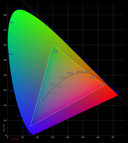
Chart showing sRGB color gamut
These charts can be a bit disorienting because they show you colors that you can clearly see, and then tell you that the color gamut does not contain those colors. However, they provide a good way to compare the size of different color gamut. Note also that here you see a two-dimensional representation of the surface of the color gamut, when in reality it is located in three- or four-dimensional space (all this is quite difficult - we are now trying to give a simple introduction to the topic).
Wide color gamut. This term informally operates in the industry to describe devices or color spaces that have a color gamut greater than that of sRGB (which almost all computer displays used in the last ten or so years possess) have. Displays with a wider color gamut have already been available on the market for some time, but they were limited mainly by professional use. Now they are available for ordinary consumers, which means that there are more colors available. Sometimes a wide color gamut is called extended color rendering. Modern Apple displays support the Display P3 color space, which is about 25% wider than sRGB.
Depth of color. Computers can use different levels of accuracy or depth to represent colors. This is not the same as the color gamut describing the color palette. Rather, it is the number of individual colors within the color gamut that can be specified. Web developers usually know CSS
The example below shows how insufficient color depth causes banding, although all colors between the end points are within the color gamut (this is a somewhat artificial example to enhance the effect).
The reduced color depth shows distinct transitions between similar colors.

Gradient from light red to dark red with distinct stripes
As the color depth increases, the transitions become much less noticeable.

Gradient from light red to dark red without pronounced stripes
After this introduction, we will take a closer look at the color on the web and the latest improvements in WebKit that help develop content with an improved understanding of color-related issues. We will also provide information about some of the features we introduced in the W3C that will enable you to get even more value from this new display technology.
The network often tries its best to process colors correctly. I’m sure there are those among the readers who remember the pain of safe web colors with pain! As we walked away from this, we still have limitations, such as working HTML and CSS only in the sRGB color space. As in the example with the Hober sneakers above, this means that there are many colors that your CSS, images and canvases cannot reproduce. This is a problem if you are trying to show your family spring flowers blooming in your garden, or shopping for a bright red sports car that will certainly help in resolving your mid-life crisis.
So, when we show a photo of the sneakers above, the sRGB display compresses all colors outside of the sRGB color gamut into colors that it can show. But a display with an extended gamut, such as Display P3, does not make such a shift to the sRGB palette. In the figure below you can see the difference between the sRGB color space and Display P3.
SRGB and P3 color range comparison
The colored triangle is the sRGB space. The white triangle shows the display space P3. It is much larger than that of sRGB, especially in the areas of the most saturated colors - red, yellow, violet and green. The black outline shows the capabilities of a typical human eye.
Remember the red square with the pale WebKit logo? The image was created in the Display P3 color space, filled with 100% red
Note. I saw on Twitter that a small misunderstanding arises here, so let's try an alternative explanation. Basically, all completely red values between 241/255 and 255/255 in the Display P3 color space do not differ when viewed in sRGB. This does not mean that the red 241 in Display P3 is the same as the red in 255 in sRGB — unfortunately, it is not so simple here, and I would not like to go into details in this introductory article. For those who are interested: in macOS there is an application Color Sync Utility, which allows you to convert color spaces in different ways, as well as compare color coverage.
So, now you understand why you need to know deeper the situation with color and that this technology should be used to provide users with better interaction. What has been said above is the basis - now let's talk about what it means for WebKit.
It was mentioned above that the network is “sharpened” under the use of sRGB. WebKit / Safari on Mac has been working in this color space for many years, providing the user with consistent colors on various displays (by the time of this writing, most of the other browser cores work in the so-called color space of the device, i.e. until they go through the display hardware).
WebKit color coordinates all images in both iOS and macOS. This means that for an image with a color profile, you can be sure that the color on the display is correct, regardless of whether it is a normal display or a display with a wide digital coverage. This is useful because many digital cameras do not use sRGB in their original format, which is why simply interpreting the values of red, green and blue as such is unlikely to give the correct color. Usually the user does not want to do anything to obtain this color matching. Almost all image processing software allows you to embed a color profile into an image; Many programs do this by default.
In the examples shown above, you can see this color matching action on Safari from OS X 10.11.3 and above, as well as on iOS 9.3 and above (Retina devices). All I had to do was make sure the images contained an appropriate color profile.
If the image does not carry a profile, then WebKit assumes that sRGB takes place. This makes it easy to match your designations in CSS (for example, a frame or background images). This means that the CSS value of
Note. The assumption that an image that does not carry the corresponding tags (about a color profile) should not necessarily be attributed to sRGB requires some comment. The reason why we do this is explained above: this approach allows for matching colors in the image with CSS colors on the page.
The situation is normal for display technology used in the last ten years. But now, when there are displays that support extended color gamut, there is a desire to more fully control the way in which your content appears.
It was explained above why it is preferable to submit images with a wide color gamut to the same display. If an image with a wide gamut comes to a regular display, then WebKit, matching the colors of the images, will show it in sRGB space. However, this conversion to sRGB can be done in several ways, and there is no guarantee that it will run the same on different browsers or platforms. An experienced web developer has the desire to be able to convert images offline to better control what the end user will see. In addition, embedding a color profile slightly increases the file size. There is not always a desire to send these special data if they are not required.
The best solution is to provide an image with a wide color gamut, when the user has such a display, and an sRGB image with a different display. This situation is one of the directions of adaptive images and shows exactly what elemental and media queries should handle.
WebKit now supports (new to CSS Color Level 4) media query for color gamut . The following shows how to use it:
This query can also be used inside the style sheet:
Or as a script:
The color gamut request takes the values of
Since media queries have a robust recovery system, you can start using color gamut immediately to give users wider color gamut better colors, allowing users who do not yet have the corresponding browsers or hardware to work.
Providing and rendering images with a wide color gamut are relatively simple processes, but what if you need to combine some image with other page elements, such as background color, or enter an image into a canvas element? These are some of the problems that standardization bodies face, and I would like to talk about what can be expected here.
It was shown above that
The following describes what WebKit project participants proposed for CSS. The idea is to add a new function, called
In practice, it would probably be used with the rule
Note. I originally made a typo, showing the syntax as
The CSS will set some well-known color profile names, making it easy to find the desired color values. There is still some discussion about the permission of authors to refer to external profiles or perhaps indicate an image that has a built-in profile.
Additionally, CSS can make a decision to determine values beyond 0-255 (or 0-100%) in an existing function
Another suggestion is to set the color space for the entire document and interpret regular CSS color values in it. For external images with embedded profiles, color matching will occur accordingly.
These discussions are under way in the W3C CSS working group for the time being. Your opinion interests us - the group needs to know more what web developers think. If you are interested in participating, then pay attention to e-mail messages with a topic starting with "[css-color]" inWWW-style email list .
WebKit hopes to implement these properties when we are sure that they are justifiable.
Although CSS works with most views of HTML documents, there is one important area in which this color space does not work: the canvas element. Both 2D and WebGL canvases assume that they work in the sRGB color space. This means that even on displays with a wide color gamut it is impossible to create a full-color canvas.
As a solution, it is proposed to add an optional flag to the function
In this case, there are some points to be considered, for example, how to create canvases with increased depth of color. For example, in WebGL you can use half-float textures that give an accuracy of 16 bits per color channel. However, even if such deeper textures are used in WebGL, you will be limited to 8-bit precision by embedding this WebGL image into the document.
It is necessary to give the developer a method for setting the depth of the color buffer for the canvas element.
This is achieved in a more complex way by combining functions
Such discussions are currently on the WhatWG website.and will be continued soon in the W3C. And again we invite you to join.
Wide-gamut displays have entered the market and are the future of computing devices. As the number of users of these magnificent displays grows, developers will be more and more interested in mastering the stunning palette of colors offered and in providing users with an increasingly attractive interaction with the network.
WebKit software provides developers with great opportunities to improve color characteristics by matching color and detecting the gamut of colors available today from Safari Technology Preview, as well as from macOS Sierra and iOS 10 betas. We are also interested in the beginning of the implementation of more advanced color characteristics, such as setting a wide color gamut in CSS, the introduction of profiles into canvas elements and the use of increased color depth.
The past few years have seen a significant improvement in display technology. At first it was an upgrade to higher resolution screens, started with mobile devices, and then transferred to desktops and laptops. Web developers had to understand what it means for them to have a high value in DPI, and to know how to design pages that use such high resolution. The next revolutionary display improvement is happening right now: improved color rendering. In this article, I would like to clarify what this means, and how you, developers, can identify such displays and provide better interaction for your users.
Take a typical computer monitor — a type that you have been using for over a decade — the sRGB display. The latest Apple designs, including the Retina iMac (late 2015) and iPad Pro (early 2016), can display more colors than the sRGB display. Such displays are called wide-gamut displays (an explanation of the terms “sRGB” and “color gamut” will be given below).
Why is this useful? A system with a wide color gamut often provides a more accurate reproduction of the original color. For example, my colleague by the name of Hober has some catchy sneakers.
')
Bright orange hober sneakers
Unfortunately, what you see above does not convey how impressive these sneakers are in fact! The problem is that the color of the sneaker material cannot be represented on the sRGB display. The camera that captured this photo (Sony a6300) has a matrix that perceives more accurate color information, and the corresponding data is available in the original file, but the display cannot show them. Here is a variant of the photo, in which every pixel that has a color that goes beyond the border of a typical display is replaced with a light blue:
The same bright orange Hober sneakers, but here all the pixels that go beyond the boundaries of color, replaced by blue
As you can see, the color of the material of the sneakers and a large part of the grass goes beyond the border of the sRGB display. In fact, only less than half the pixels are accurately represented. Being a web developer, you need to reckon with this. Suppose you sell such sneakers through an online store. Your customers will not know exactly what color they ordered, and may be surprised when their purchase comes to them.
This problem is reduced when using a display with a wide color gamut. If you have one of the devices mentioned above, or something similar, here is a photo version that will show you more colors:
The same bright orange Hober sneakers, but added a color profile
On the display with a wide color gamut you can see sneakers of a brighter orange color, green grass is also more varied in color. If you, unfortunately, do not have such a display, then you most likely see something very close in color to the first photo. In this case, the best I can offer is to color the image, highlighting the areas you lose in color.
In any case, this is good news! Wide-gamut displays are brighter and provide a more accurate representation of reality. Obviously, there is a desire to make sure that you can provide your users with an image formation in which this technology will be useful.
Below is the following example, this time with the generated image. Users on the sRGB display can see a uniform red square below. However, this is in some way a trick. In fact, there are two shades of red in the image, one of which can only be seen on displays with a wide color gamut. On this display, you will see the pale WebKit logo inside the red square.
Red square with a pale WebKit logo
Sometimes the difference between a normal image and an image with a wide color gamut is very subtle. Sometimes it is expressed much more sharply.
Demo images
On the sample page, you can compare different versions of images, as well as see where the image contains pixels that are beyond the sRGB display color border. There is also a more interactive version , showing a number of different images.
Definitions
The following is a brief explanation of terms commonly used in color discussions.
Color space. Color space is the environment in which you can set and compare colors. There are several types of color space, each of which uses a different set of parameters to describe colors. For example, a gray color space has only one parameter that controls the level of brightness in the transition from black to white. You are probably familiar with RGB-type color spaces, which use red, green, and blue as parameters, which are added together on the display to create the desired color. Printing processes often use CMYK-type color spaces, where the ink color is composed of cyan, magenta, yellow, and black.
Color profile. In 1993, a group of suppliers formed the International Color Image Processing ( ICC ) Consortium to set a standard describing color spaces. A color profile is data that defines the color space of a device, and can be used to transition between different color spaces. The most common are names like sRGB (or more formally, IEC 61966-2-1). My use of the above sRGB name now makes more sense: such a display can show colors that match the sRGB color space. A color profile can be recorded in some file or embedded directly in the image, which allows the computer to understand what the values for color in the image actually mean.
Color gamut. Color gamut is a spectrum of colors that a device can process or that can specify a color space. The color gamut for a computer display is all the colors that the display can accurately display. The concept of rendering color gamut seems somewhat more difficult, but it is a bit like the color pickers found in the developer's software. Imagine a palette of all possible colors, superimposed on the surface, with primary colors at several points of extremes. When moving to the red extreme, the color becomes more red. When moving to blue - more blue, etc. The color gamut is an area on an imaginary surface in question, indicating how much the color of a given device can be shifted in one direction or another. The color gamut can be understood on the basis of the chart below; here the colored surface shows a palette of colors perceived by the human eye. A white triangle is an area of the sRGB color space (as you can see, it is substantially smaller than the eye sees).
Chart showing sRGB color gamut
These charts can be a bit disorienting because they show you colors that you can clearly see, and then tell you that the color gamut does not contain those colors. However, they provide a good way to compare the size of different color gamut. Note also that here you see a two-dimensional representation of the surface of the color gamut, when in reality it is located in three- or four-dimensional space (all this is quite difficult - we are now trying to give a simple introduction to the topic).
Wide color gamut. This term informally operates in the industry to describe devices or color spaces that have a color gamut greater than that of sRGB (which almost all computer displays used in the last ten or so years possess) have. Displays with a wider color gamut have already been available on the market for some time, but they were limited mainly by professional use. Now they are available for ordinary consumers, which means that there are more colors available. Sometimes a wide color gamut is called extended color rendering. Modern Apple displays support the Display P3 color space, which is about 25% wider than sRGB.
Depth of color. Computers can use different levels of accuracy or depth to represent colors. This is not the same as the color gamut describing the color palette. Rather, it is the number of individual colors within the color gamut that can be specified. Web developers usually know CSS
rgb() syntax, which has 0-255 values for red, green, and blue. This gives a depth of 8 bits per channel - a total of 16,777,216 colors. If you add the fourth color component / degree of transparency, you can save the color in 32 bits. If a depth of 8 bits per channel is used, then only the same number of colors can always be reproduced, regardless of the color space used - there will be just another set of colors. If you select 16 bits per channel, the space will be deeper, and you can get more colors inside the same color gamut. A good example is to draw a gradient between similar colors: banding can be seen when the computer and the display do not have the required depth to show a smooth range of colors between the end points.The example below shows how insufficient color depth causes banding, although all colors between the end points are within the color gamut (this is a somewhat artificial example to enhance the effect).
The reduced color depth shows distinct transitions between similar colors.
Gradient from light red to dark red with distinct stripes
As the color depth increases, the transitions become much less noticeable.
Gradient from light red to dark red without pronounced stripes
After this introduction, we will take a closer look at the color on the web and the latest improvements in WebKit that help develop content with an improved understanding of color-related issues. We will also provide information about some of the features we introduced in the W3C that will enable you to get even more value from this new display technology.
Colors on the web
The network often tries its best to process colors correctly. I’m sure there are those among the readers who remember the pain of safe web colors with pain! As we walked away from this, we still have limitations, such as working HTML and CSS only in the sRGB color space. As in the example with the Hober sneakers above, this means that there are many colors that your CSS, images and canvases cannot reproduce. This is a problem if you are trying to show your family spring flowers blooming in your garden, or shopping for a bright red sports car that will certainly help in resolving your mid-life crisis.
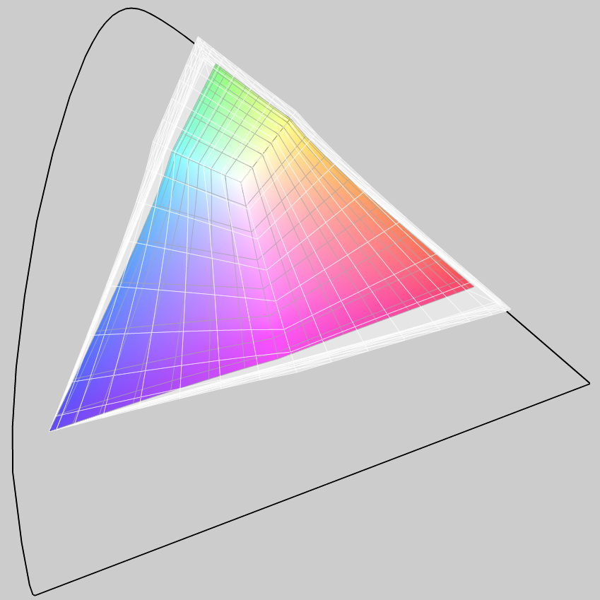
So, when we show a photo of the sneakers above, the sRGB display compresses all colors outside of the sRGB color gamut into colors that it can show. But a display with an extended gamut, such as Display P3, does not make such a shift to the sRGB palette. In the figure below you can see the difference between the sRGB color space and Display P3.
SRGB and P3 color range comparison
The colored triangle is the sRGB space. The white triangle shows the display space P3. It is much larger than that of sRGB, especially in the areas of the most saturated colors - red, yellow, violet and green. The black outline shows the capabilities of a typical human eye.
Remember the red square with the pale WebKit logo? The image was created in the Display P3 color space, filled with 100% red
rgb(255, 0, 0) , and then the logo was entered with a slightly different red rgb(241, 0, 0) color rgb(241, 0, 0) . The sRGB logo is not visible on the display, since all red values above 241 in Display P3 are above the uppermost red border in sRGB; red 241 and red 255 are perceived as one color.Note. I saw on Twitter that a small misunderstanding arises here, so let's try an alternative explanation. Basically, all completely red values between 241/255 and 255/255 in the Display P3 color space do not differ when viewed in sRGB. This does not mean that the red 241 in Display P3 is the same as the red in 255 in sRGB — unfortunately, it is not so simple here, and I would not like to go into details in this introductory article. For those who are interested: in macOS there is an application Color Sync Utility, which allows you to convert color spaces in different ways, as well as compare color coverage.
So, now you understand why you need to know deeper the situation with color and that this technology should be used to provide users with better interaction. What has been said above is the basis - now let's talk about what it means for WebKit.
Color matched images
It was mentioned above that the network is “sharpened” under the use of sRGB. WebKit / Safari on Mac has been working in this color space for many years, providing the user with consistent colors on various displays (by the time of this writing, most of the other browser cores work in the so-called color space of the device, i.e. until they go through the display hardware).
WebKit color coordinates all images in both iOS and macOS. This means that for an image with a color profile, you can be sure that the color on the display is correct, regardless of whether it is a normal display or a display with a wide digital coverage. This is useful because many digital cameras do not use sRGB in their original format, which is why simply interpreting the values of red, green and blue as such is unlikely to give the correct color. Usually the user does not want to do anything to obtain this color matching. Almost all image processing software allows you to embed a color profile into an image; Many programs do this by default.
In the examples shown above, you can see this color matching action on Safari from OS X 10.11.3 and above, as well as on iOS 9.3 and above (Retina devices). All I had to do was make sure the images contained an appropriate color profile.
If the image does not carry a profile, then WebKit assumes that sRGB takes place. This makes it easy to match your designations in CSS (for example, a frame or background images). This means that the CSS value of
rgb(255, 0, 0) will correspond to the corresponding value for full red in sRGB.Note. The assumption that an image that does not carry the corresponding tags (about a color profile) should not necessarily be attributed to sRGB requires some comment. The reason why we do this is explained above: this approach allows for matching colors in the image with CSS colors on the page.
The situation is normal for display technology used in the last ten years. But now, when there are displays that support extended color gamut, there is a desire to more fully control the way in which your content appears.
Display detection
It was explained above why it is preferable to submit images with a wide color gamut to the same display. If an image with a wide gamut comes to a regular display, then WebKit, matching the colors of the images, will show it in sRGB space. However, this conversion to sRGB can be done in several ways, and there is no guarantee that it will run the same on different browsers or platforms. An experienced web developer has the desire to be able to convert images offline to better control what the end user will see. In addition, embedding a color profile slightly increases the file size. There is not always a desire to send these special data if they are not required.
The best solution is to provide an image with a wide color gamut, when the user has such a display, and an sRGB image with a different display. This situation is one of the directions of adaptive images and shows exactly what elemental and media queries should handle.
WebKit now supports (new to CSS Color Level 4) media query for color gamut . The following shows how to use it:
<picture> <source media="(color-gamut: p3)" srcset="photo-wide.jpg"> <img src="photo-srgb.jpg"> </picture> This query can also be used inside the style sheet:
.main { background-image: url("photo-srgb.jpg"); } @media (color-gamut: p3) { .main { background-image: url("photo-wide.jpg"); } } Or as a script:
if (window.matchMedia("(color-gamut: p3)").matches) { // Do especially colorful stuff here. } The color gamut request takes the values of
3 and rec2020 as values that are intentionally inaccurate terms to specify a palette of colors supported by the system, including the browser core and the display hardware. By default, since almost all displays support sRGB, there is no need to check for such functionality.But a typical modern display with a wide color gamut can support all or almost the entire color palette included in the DCI P3 space and will correspond to the media query. For example, the Display P3 space mentioned above is one of the DCI P3 options. The value of rec2020 indicates that the system has a display that supports an even wider color gamut, such as that defined by the Rec space . 2020 (at present, it is quite rare to meet on the network with hardware that, in fact, supports Rec. 2020, you should not worry about it for now).Since media queries have a robust recovery system, you can start using color gamut immediately to give users wider color gamut better colors, allowing users who do not yet have the corresponding browsers or hardware to work.
Future directions
Providing and rendering images with a wide color gamut are relatively simple processes, but what if you need to combine some image with other page elements, such as background color, or enter an image into a canvas element? These are some of the problems that standardization bodies face, and I would like to talk about what can be expected here.
Wide color gamut in CSS
It was shown above that
rgb(241, 0, 0)in Display P3 is the same as rgb(255, 0, 0)in sRGB. What needs to be done if you need a color that is set in CSS, enter it somehow in an image with a wide color gamut? We can't set these colors in CSS.The following describes what WebKit project participants proposed for CSS. The idea is to add a new function, called
color(), which may contain a color profile, as well as parameters that define the color: /* NOTE: Proposed syntax. Not yet implemented. */ strong { color: color(p3 1.0 0 0); /* 100% red in the P3 color space */ } In practice, it would probably be used with the rule
@supports: strong { color: rgb(255, 0, 0); /* 100% red in the sRGB color space */ } @supports (color: color(p3 0 0 0)) { strong { color: color(p3 1.0 0 0); /* 100% red in the P3 color space */ } } Note. I originally made a typo, showing the syntax as
color(p3, 255, 0, 0). This is one of the disadvantages of the existing function rgb(). The new function color()will accept floating-point numbers as parameters, not 8-bit integers.The CSS will set some well-known color profile names, making it easy to find the desired color values. There is still some discussion about the permission of authors to refer to external profiles or perhaps indicate an image that has a built-in profile.
Additionally, CSS can make a decision to determine values beyond 0-255 (or 0-100%) in an existing function
rgb(). For example,rgb(102.34%, -0.1%, 4%)the color will be slightly more red, a little less green and a bit more blue. The difficulty here is that understanding these values can be difficult (for example, what does a negative green color mean?).Another suggestion is to set the color space for the entire document and interpret regular CSS color values in it. For external images with embedded profiles, color matching will occur accordingly.
These discussions are under way in the W3C CSS working group for the time being. Your opinion interests us - the group needs to know more what web developers think. If you are interested in participating, then pay attention to e-mail messages with a topic starting with "[css-color]" inWWW-style email list .
WebKit hopes to implement these properties when we are sure that they are justifiable.
Wide color gamut in HTML
Although CSS works with most views of HTML documents, there is one important area in which this color space does not work: the canvas element. Both 2D and WebGL canvases assume that they work in the sRGB color space. This means that even on displays with a wide color gamut it is impossible to create a full-color canvas.
As a solution, it is proposed to add an optional flag to the function
getContextthat sets the color space to which the canvas should be adjusted. For example: // NOTE: Proposed syntax. Not yet implemented. canvas.getContext("2d", { colorSpace: "p3" }); In this case, there are some points to be considered, for example, how to create canvases with increased depth of color. For example, in WebGL you can use half-float textures that give an accuracy of 16 bits per color channel. However, even if such deeper textures are used in WebGL, you will be limited to 8-bit precision by embedding this WebGL image into the document.
It is necessary to give the developer a method for setting the depth of the color buffer for the canvas element.
This is achieved in a more complex way by combining functions
getImageData/putImageData(or the equivalentreadPixelsin webgl). With today's 8 bits per channel buffer, there is no loss of accuracy when entering and outputting to the canvas. Conversion can also occur efficiently, both in performance and in memory, since the canvas and program data are of the same type. If the color depth is different, then it may be impossible. For example, the WebGL half-float buffer does not have an equivalent type in JavaScript, which means either forced some data conversion when reading or writing, as well as the use of additional memory during their storage, or the need to work with the original array buffer and perform cumbersome mathematical operations with bitwise masks.Such discussions are currently on the WhatWG website.and will be continued soon in the W3C. And again we invite you to join.
findings
Wide-gamut displays have entered the market and are the future of computing devices. As the number of users of these magnificent displays grows, developers will be more and more interested in mastering the stunning palette of colors offered and in providing users with an increasingly attractive interaction with the network.
WebKit software provides developers with great opportunities to improve color characteristics by matching color and detecting the gamut of colors available today from Safari Technology Preview, as well as from macOS Sierra and iOS 10 betas. We are also interested in the beginning of the implementation of more advanced color characteristics, such as setting a wide color gamut in CSS, the introduction of profiles into canvas elements and the use of increased color depth.
Source: https://habr.com/ru/post/305842/
All Articles