Projecting Google Material Design onto the desktop system ... (part four and final)
This will be the final part about the redesign of the internal CRM “Chronos”. I will describe the remaining sections and draw some conclusions about the work done. Those who just missed the first three parts, I invite you to follow the links: first , second and third . Those who are already tired of my writing on this project - go make some coffee, the rest can proceed deeper into the subcategory ...
By the way, if you use Figma , I recommend paying attention to our ready-made design systems . They help freelancers complete more orders per month, programmers can create beautiful applications on their own, and the Timlids run sprints faster using ready-made design systems for teamwork.
And if you have a serious project, our team is ready to deploy a design system within the organization based on our developments and tailor it to specific tasks using Figma. Web / desktop, and any mobile. We are also familiar with React / React Native. Write to T: @kamushken
Task Manager
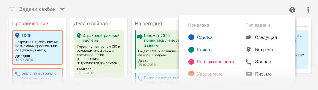
In the system for each transaction is always supported by a list of tasks. The status of the implementation of which can be judged on how well the transaction goes. The first attempts to approach the elaboration of this section ended with a completely standard kanban with a three-column: overdue task / task for today / task for tomorrow:

')
Each task had a binding to the category, which was indicated by its color. For example, a pale red background mug meant “firing”. While dark pink suggested a reference to the “deal”. It was assumed that after a certain time employees would learn about the color bundle and it would be easier for them to determine the type of task, barely noticing the circle with the icon in the corner.
On the layout above in the right corners of each task there are too many pencils. On the production of pencils should appear when onhover'e:

This is a good trend in recent years in the design of interfaces. If your system contains many of the same type of controls, then it makes sense to unload it a little and buy small things. Hide until you need to show it again. Then, resorting to the onhover event exactly in the place of the system with which the same type of controls are connected, we show the user an obvious relationship. Example: we hover the mouse over the block, show small icons only in this block - it means that by clicking on them the user will get an extended effect only on this block. An additional plus is the unloading of the interface from visual noise.
GMD is slyly silent about how to draw drag'n'drop in accordance with the specifications (no matter where it comes from on mobile devices?), So I had to get out, relying on my experience:

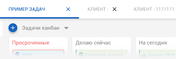
A little later, it turned out that most of the employees use Trello. Fine! Now there is an understanding that if we bring the task manager to similar functionality, then there will be a solid profit. No, we are not talking about creating your own counterpart inside Cronos. It is enough just to introduce the 4th column and a few trifles. No sooner said than done:

Let some time to get used up at the top will be able to peep the "cheat sheet" onhover:

The colors of this whole “disco” clearly require improvements in a more corporate range:

It would look like a click on a specific task, for example, for editing:

The study of the task manager interface was the last stage of all the work. I have excluded from this chapter all the same type screens of other sections of the system. In their placement there is no special meaning, because their general form and principles of interaction are based on the same approach that I considered in previous chapters. The most difficult and important in such work is to think over the very first steps in the prototype. And everything else already falls on the approved scheme and in some way becomes a routine.
Conclusion
So after all, are there any advantages to using Google Material Design when developing web / desktop interfaces? I believe that purely stylistic - there are no pluses. This is an ordinary tribute to fashion and trends. Rather, on the contrary, as I mentioned in the first chapter, this is a creative dead end for an independent designer. Imagine that he will start creating all his projects and subsequent ones using exactly the same styles, fonts, techniques. Everything just slips into a routine! A person who enjoys his work cannot turn it into a routine.
Absolutely strictly following the rules of GMD, which apply only to mobile devices, in the desktop interface, inefficiencies can occur. A sensitive reader in previous chapters has already expressed outrage because of the floating button. I totally agree - this is against logical user experience. The “+” button should not be lonely hanging out in the lower right corner, as if “not of this world”. Its place to be close to the interface element, in the context of which the creation of a new object takes place. Returning to the last screens of the task manager ... When first contacting the system, the user, seeing the floating button in its rightful place (according to Google's version), most likely will be inclined to assume: “Probably with this button I will create a new task, but I have to click to become 100% confident. ” While if the “+” button were located closer to the upper title, the user might think: “I am 99% sure that this button will lead to the creation of a new task”:
GMD was developed mainly to optimize the work with touch-screens of smartphones. The main tool here is still a finger. And all the severity of proportions and indents follows from this. While working, for example, in anyone in a web office, we still operate the mouse. Therefore, 16x16 icons still have the right to life in this case. There are no strict dependencies in the indents, layout and behavior of elements, as stated in the GMD rules. You just need to make the desktop interface so that it is understandable and convenient.
This is all about style. Quite different is the situation with the logic of the arrangement of elements and dynamic objects in planes. Here, GMD took a huge step forward, trying to give users more sensations of the real world, which is material. An experienced interface designer should adopt these rules. For example, working with shadows to indicate the priority and position of dynamically-generated objects. Or the rules of animation and micro-iterations in transitions or clicks on interface elements. The general logic of behavior, for example, forms or drop-down lists is also well formulated. All this makes sense to build on the rules of Google in the design. It definitely improves the user experience ...
Thank you all for your attention and patience. Thank you Performance Lab for an interesting project and a new experience.
Source: https://habr.com/ru/post/305660/
All Articles