Projecting Google Material Design onto the desktop system ... (part three)
Summary of the second part : redesign of the “Transactions” section (sales funnel), selection of colors for all stages, indents - air - freedom ... Oops ... Client, are you serious? Now take everything and push it all at 1370x768?! .. Farewell “indents - air - freedom” ... I had to switch to the “squeezed” style.
So, those who have an interest in continuing to review the work done - I invite under the cat. And those who believe that GMD for the desktop system, a complete failure - I invite more aggressively (who knows, maybe in conclusion you will hear what you want to hear).
By the way, if you use Figma , I recommend paying attention to our ready-made design systems . They help freelancers complete more orders per month, programmers can create beautiful applications on their own, and the Timlids run sprints faster using ready-made design systems for teamwork.
')
And if you have a serious project, our team is ready to deploy a design system within the organization based on our developments and tailor it to specific tasks using Figma. Web / desktop, and any mobile. We are also familiar with React / React Native. Write to T: @kamushken
To begin with, I will devote a little attention to the reduction of texts for each stage of the tasks. Yes, to the attentive reader an abundance of three dotted eyes hurt. Descriptive lines did not want to fit even a little bit. Even without regard to the tertiary character of the text in terms of importance (as you remember from the second part: first a number, then an employee, then a description of the transaction). This emerged particularly strongly after the statement of the problem: “put 6 columns into 1366 or die”.
Then it turned out that a person is tertiary. The name of the transaction was the second in importance, after its value. Okay. Let's say. But what to do with cropped headers and descriptions that contradicted another task “to stack 4 visible transactions for each of the 6 columns”?
A click is both a solution and a compromise! We decided that we’ll do this so that on click the card will be dispersed, fixed and lifted by a shadow (reference on the GMD version of Google Plus ):
Potentially, this same event could be outweighed on onhover. But this is a very thin line. It is necessary to be constantly in touch with users in order to prevent a situation where mouse movement over the columns and the dynamics of the appearance of enhanced shadow and cell height increase can cause negative experience. UX testing and only UX testing in such cases!
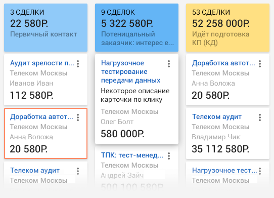
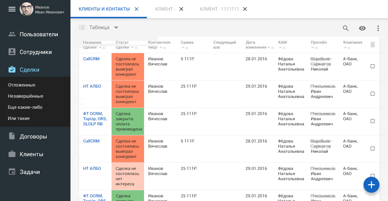
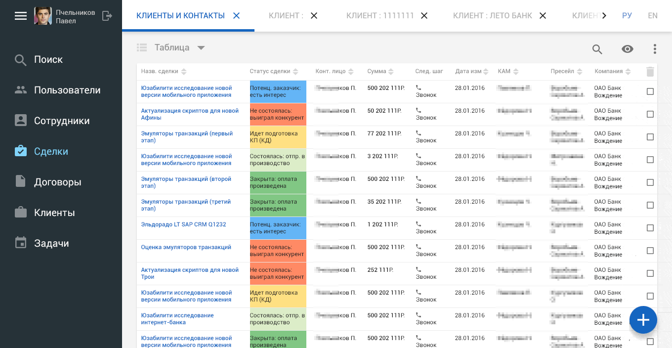
Tabular view
It's time to talk about an alternative version of the display of data in CRM “Chronos” - tabular. The potential for this kind has already been laid in the old version:
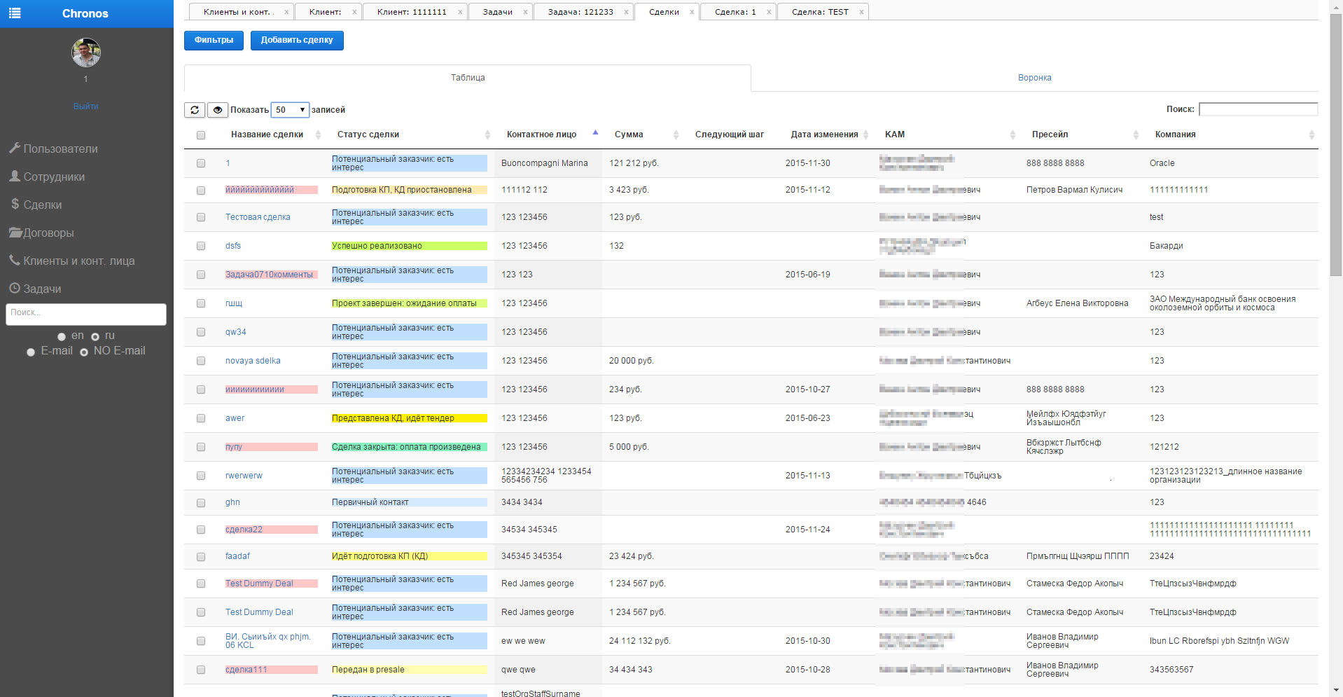
Do not forget that this picture was taken on a monitor with a resolution of 1920 pixels wide and a priori fits more data. This is where I’ll have to go into the space without losing the old functionality:
Traditionally tried to start with impressive indents. If we could not let air into the “Deals”, then we will try to saturate the tables with them:

The tabular view has its advantages. First of all, this is a classic type of information display, especially for conservative users. Secondly - the information is displayed in a broader sense.
By following the steps in a simple gif storyboard below, I began to explain to the client the experience of interacting with the elements in the table. For example, a local search is available for a table:
Storyboard on the response "basket" on the selection of any line:

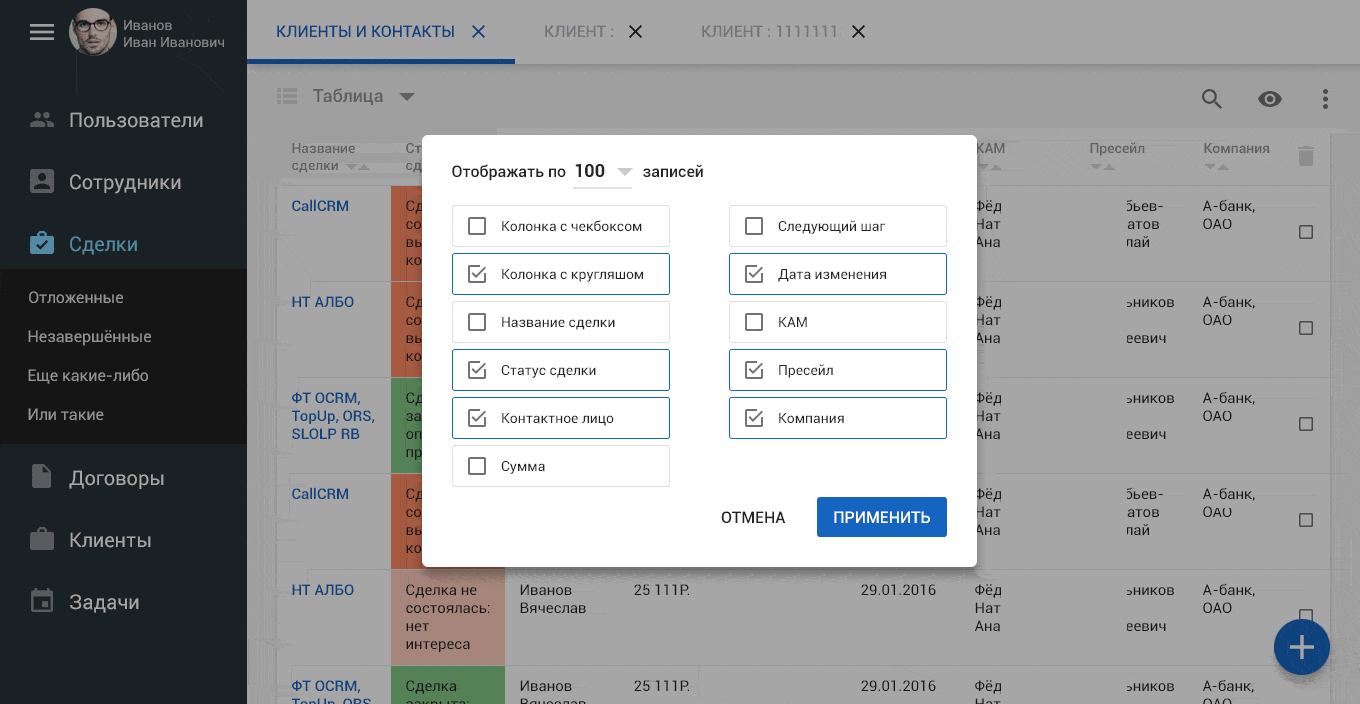
The column display settings should certainly be:
Looking ahead, I will say that the tabular view was especially important for this system. Since in this format, the display in Chronos will need, in addition to transactions, to show employees, and contracts, and customers, and much more.
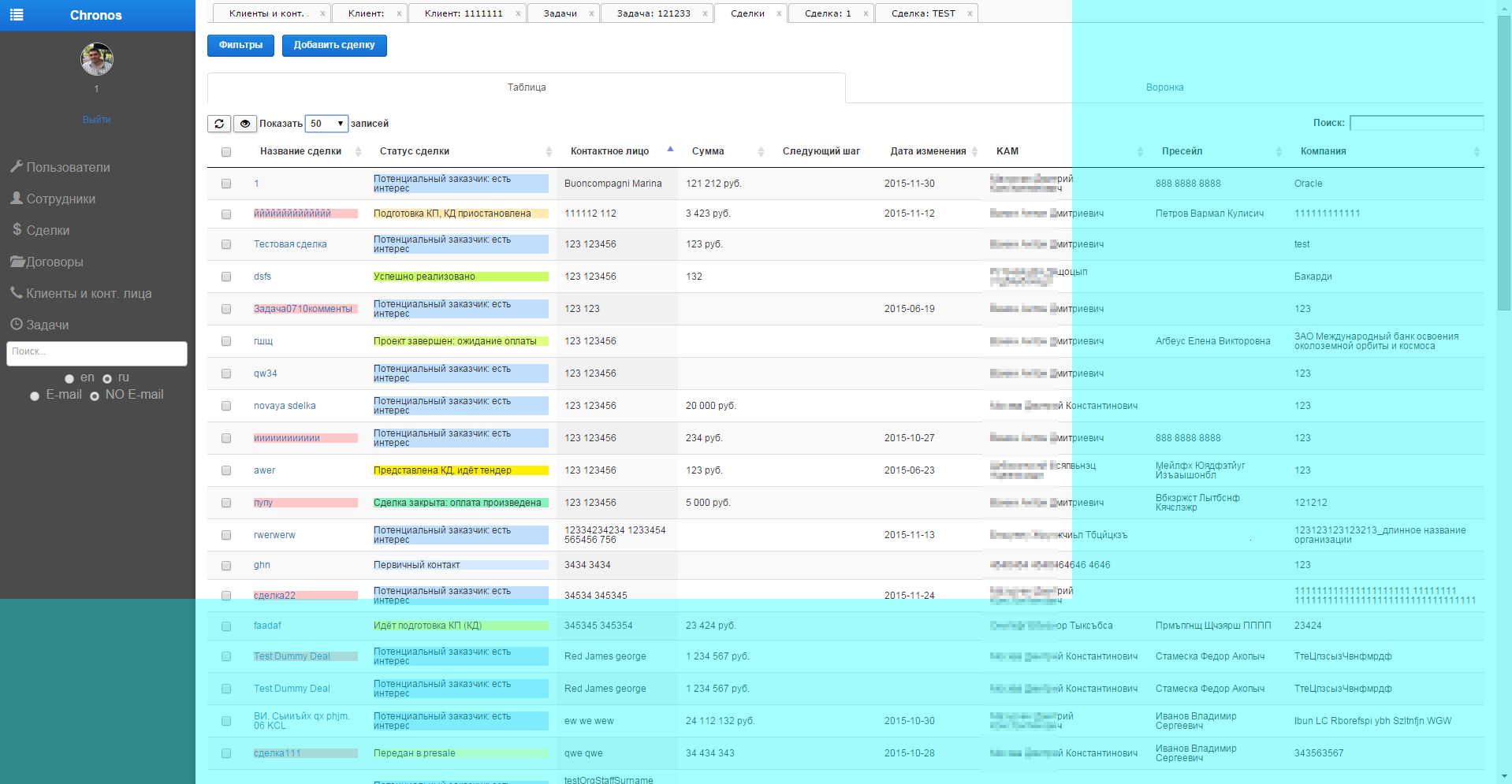
And at the end of the works on the tables it’s already traditional (sad smiley) “we are evacuating the air” from the layout ...:
Noticed as “Search” topped the menu now? It turned out that in CRM-ke it is necessary to give the search a slightly higher priority. The decision to give the left menu area for search results I find very ergonomic and efficient. A simple storyboard-clikoemitation:

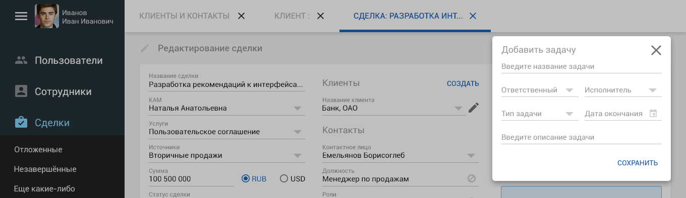
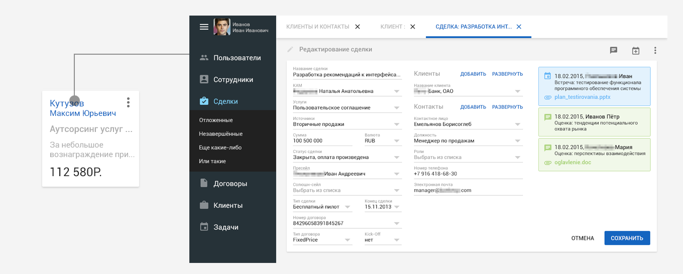
Editing a deal
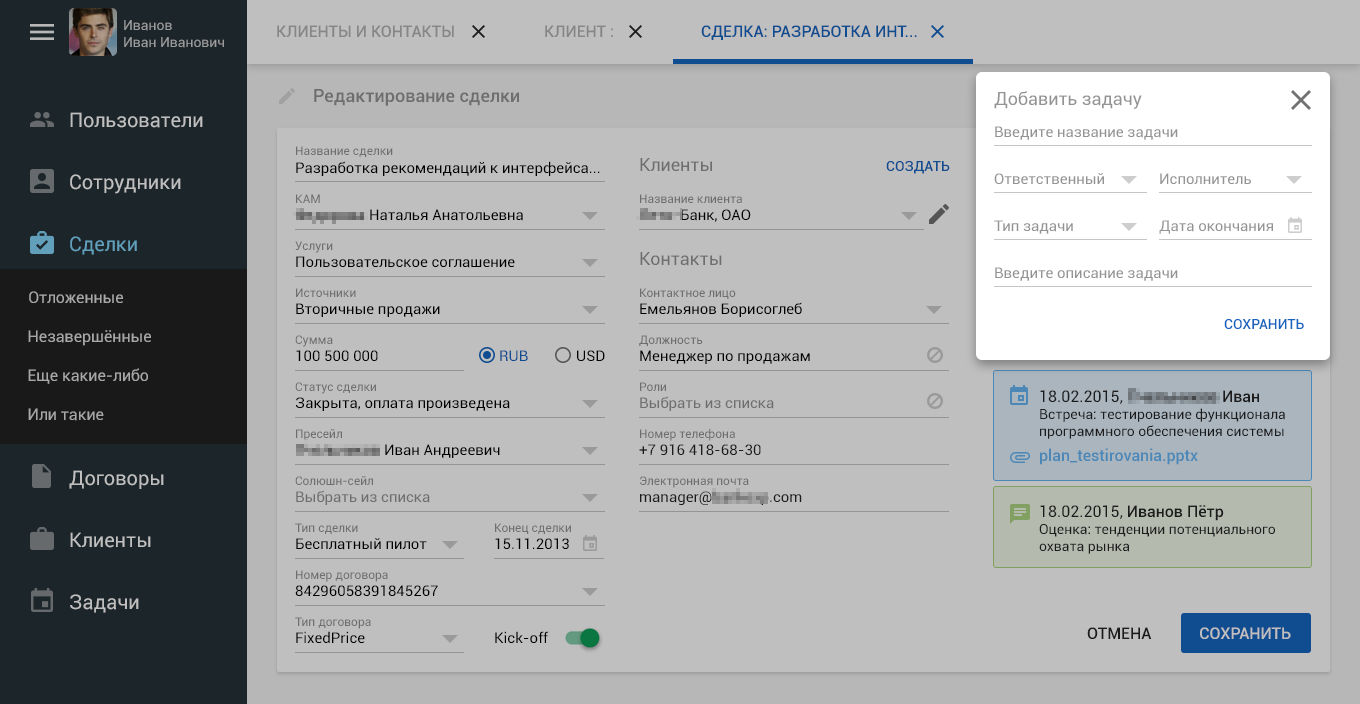
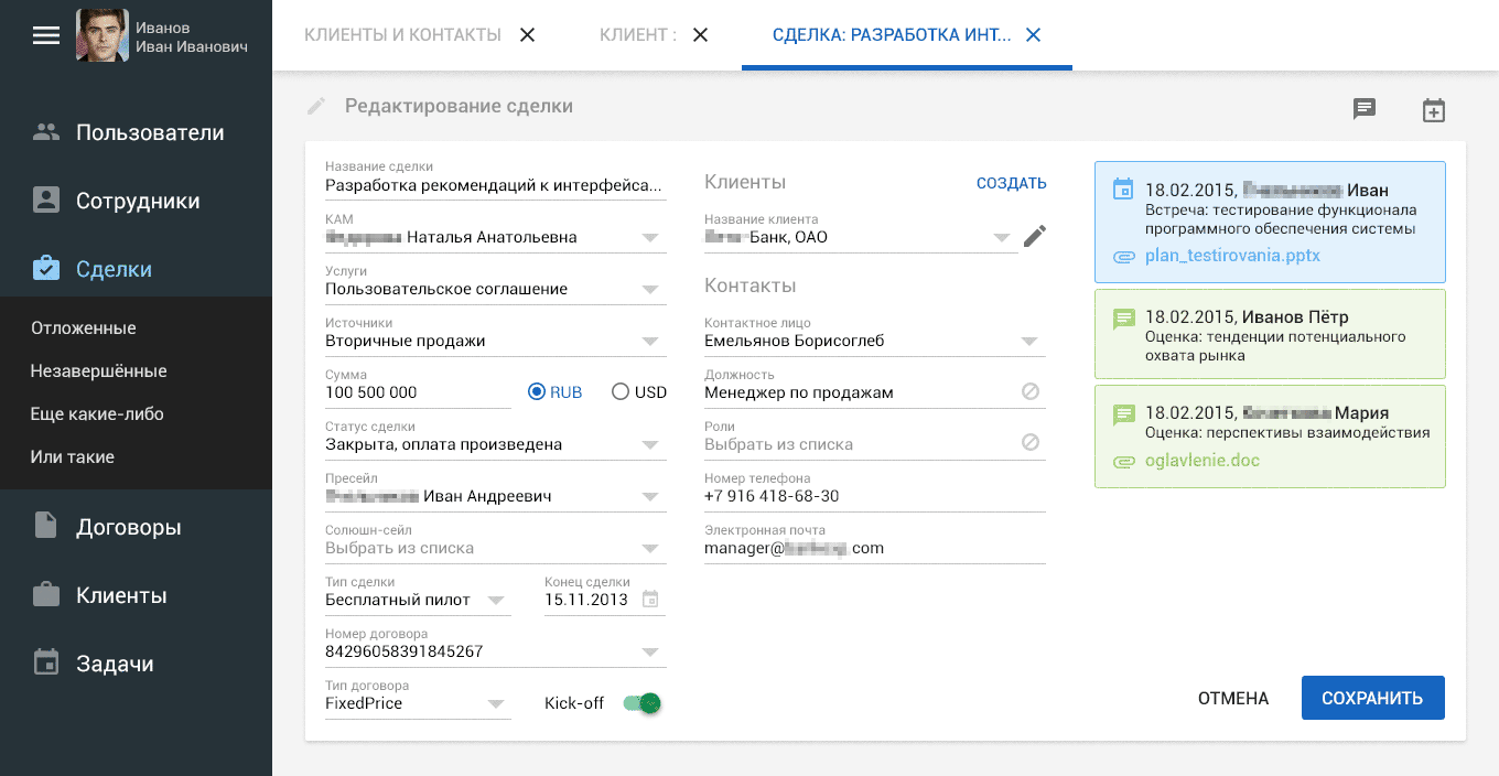
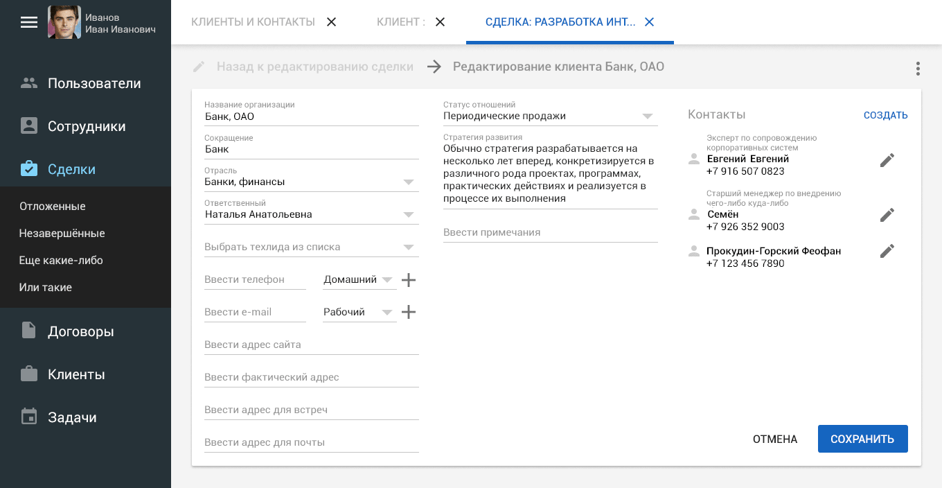
Abundance and many forms in various sections of the system - an inevitable necessity. Any transaction inside CRM is accompanied by a volume of data that the employee manually enters:
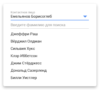
Basically, in each drop-down list there is data for selection that has already been entered into the system: employees, services, transaction types, etc. ... For convenience of finding the necessary data from the set, you can use the search inside the list:
In addition, for each transaction, the last task and comments are immediately visible (for example, the green ones are comments, the blue ones are tasks). Right from this screen, an employee could create a new task for this transaction:
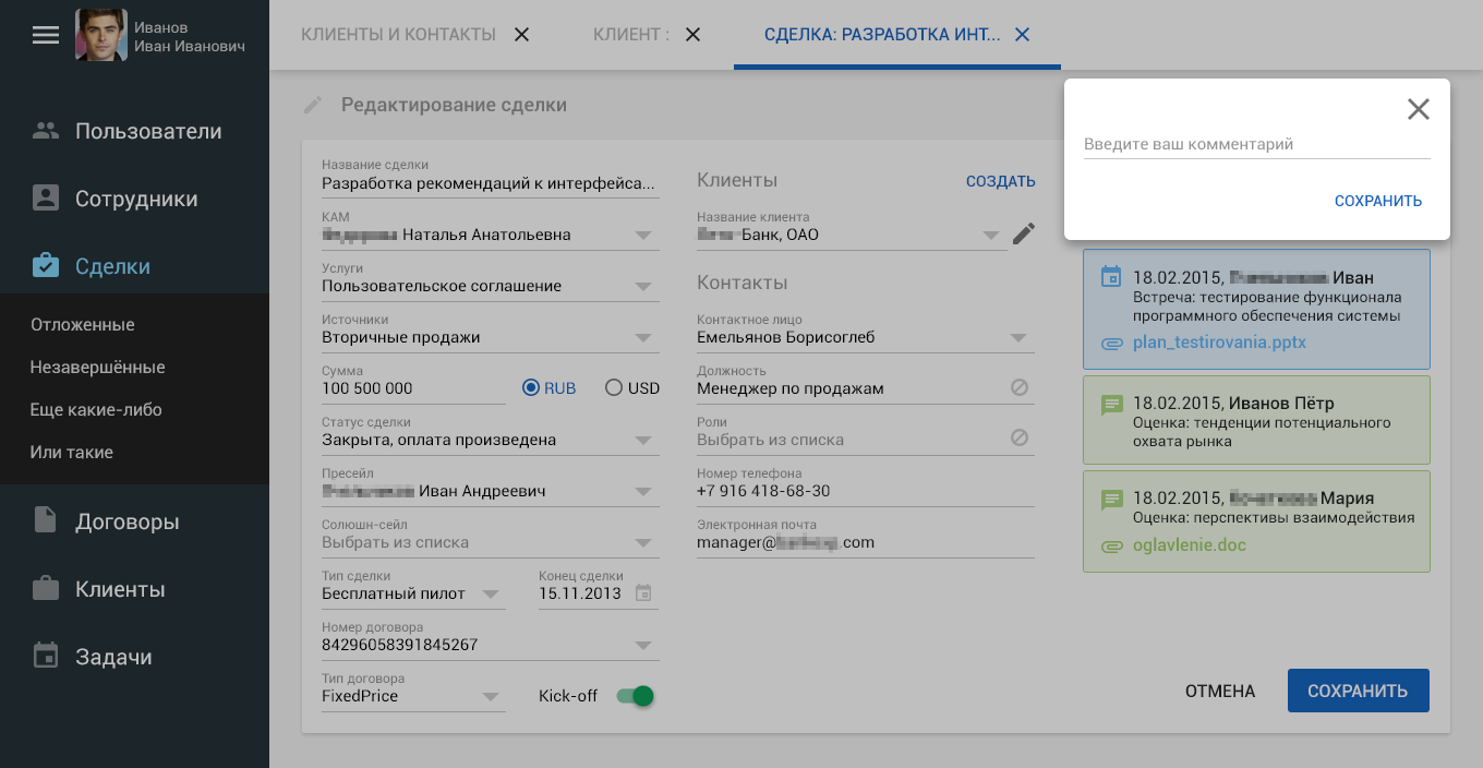
Or just leave a comment for colleagues:
Building a custom script
According to one of my “ Rules for Designing a Good Interface ”, I recommended to the client that the popup for entering a new task or comment be generated in the same area where other similar elements are located. Thus, we create an offshoot of the user scenario, focusing on the new event, “deactivating” the entire background with a translucent fill. The popup popup shouldn’t have to overlap the most recent task / comments, so at the moment of opening they moved down. A simple animated cartoon below will show you the correct spawn of a pop-up directly in the click zone:
Client editing
A little later it turned out that it might be necessary to take care of editing the client when editing / creating a transaction. The “edit” link has been added, it led to a new screen to achieve this goal:

This is a micro-branch of the user script. Now we need to make sure that the user does not lose the logical chain of actions, i.e. somewhere, it was necessary to keep a reminder that “hey, you actually edited the deal, just now you turned aside to achieve the subgoal”. It was made like this:

Ie, we show that he has now plunged deeper, but he can always return by clicking on “back to editing a deal”. According to Onchover, this link should darken, so that we eliminate the prejudice of non-clickability.
General view of the client editing screen:
This screen also implied the generation of popups to achieve micro-goals. In this case, they are the creation and editing of the client. In the gif-animation below, the logic of the appearance of pop-up windows is clearly shown:
Honestly speaking, saying above “it turned out a little later that it might be necessary to take care of editing the client” - I heard that. I knew this from the beginning. The problem of the previous interface was not only in design, but also in complete chaos of transitions between screens, the generation of pop-ups, etc. ... Employees were simply confused and often did not understand their current position in the system relative to their previous actions. Received negative user experience and peace with him, alas ...
Therefore, my task before was to subordinate all the transitions between the screens in Chronos to the same rule! Schematically, I would reflect it something like this:
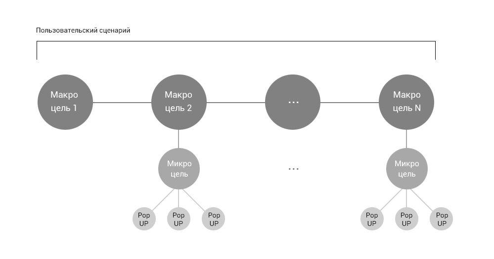
If we create a situation for a user to go to a micro goal from a macro goal, then we have the right to open it in a new screen, leaving the reference to go back. And in order not to create too deep levels in the system, any micro target is executed only by a generated popup that would not overlap the entire screen.
Unfortunately, no matter how much I wanted to do this with the description of the entire work in three chapters, it turned out that there are already too many screenshots and explanations. I would not like to overload the reader with information, so the continuation, end and conclusions are waiting for you already here ...
How can I be useful for your web / mobile application? I develop interfaces for any systems and platforms. Provide usability consulting services. I apply design thinking to solve any problems of interaction between the system and users. I use the engineering-italian approach to building optimal user scenarios. I have the innate ability to put myself in the place of users and identify possible non-optimalities of their future experience. Write to Skype: creativiter / or by mail: kamushken@gmail.com
I regularly run the “Useful to Designer” rubric, in which you will find fresh utilities, plug-ins and tools for designer productivity.
Subscribe to this channel in Telegram to quickly get interesting links that will help improve your workflow
Source: https://habr.com/ru/post/305396/
All Articles