Projecting Google Material Design onto the desktop system ... (part one)
KDPV from google.images
Illuminated by the rays of inspiration, I want in this article to finally embrace the experience of developing an intracorporate CRM interface for the Performance Lab company. A feature for me personally in this project was, above all, in the approach to the guidelines - the basis was taken by the concept of Google Material Design.
So, if you, like me, give preference to the Roboto font, rich pre-installed color palettes, well-defined rules for the behavior of elements ... And, like most developers, you corny developers prefer Android, then welcome to Cat. However, iOS fans are not prohibited either :)
By the way, if you use Figma , I recommend paying attention to our ready-made design systems . They help freelancers complete more orders per month, programmers can create beautiful applications on their own, and the Timlids run sprints faster using ready-made design systems for teamwork.
And if you have a serious project, our team is ready to deploy a design system within the organization based on our developments and tailor it to specific tasks using Figma. Web / desktop, and any mobile. We are also familiar with React / React Native. Write to T: @kamushken
')
I will not reveal the secret if I say that: gain in flexibility and preservation of neutrality, after all, in the end, a professional should know the guidelines of those and other platforms.
First contact
It was this winter. The phone rang. The girl introduced herself as a personnel officer from the Performance Lab company. Hearing the words “for the project” and “remotely”, I mentally already “started drawing something with it”, as soon as the telephone conversation had time to end. The phrase “test task” did not pass by my ears, either.
Looking ahead, I will say that in this story “puzzle formed”. Especially for me. Just at that time, I was fascinated by Google’s material design concept. And on the phone, the girl managed to hint that 70% of users of the future CRM are IT people. Perfectly! Since I blindly believe that most of us prefer Android, it was a great coincidence - to warm up! First: I will sharpen the skill and understanding of Google's “legalization” design. Secondly: I will give habitual IT people habitat and predictability in the behavior of certain elements.
In brief about Google Material Design
No no, by no means quotes from their official source . In short and in your own words. First of all, this is the answer of the opposition! Beat intensity on refined Apple styles. You know how The Beatles once were considered cute boys. But the public wanted anti-heroes. Bad guys. And this may have led to the success of the Rolling Stones. Returning to the guidelines, can anyone imagine that the font in the sign of the speed limit becomes Helvetica, even if it is Regular? This sign will be read only at a distance, when it may be too late to read it ... Very soon, the intensity in the design of applications found its fans!
This is also the first attempt to systematize the rules for developing interfaces. Attempt to draw a line “total” under the trend of flat (flat) designs. This and speech that the shadows - again well and necessary. This is an attempt to justify the connection between the screen of the phone and the real world. And link the behavior of objects together. I have the right to speak only about the visual component, but I feel that the developers also benefited in some way thanks to this standardization.
So, as mentioned above, as a UX designer, I have two goals: “predictability” and “habitual habitat”.
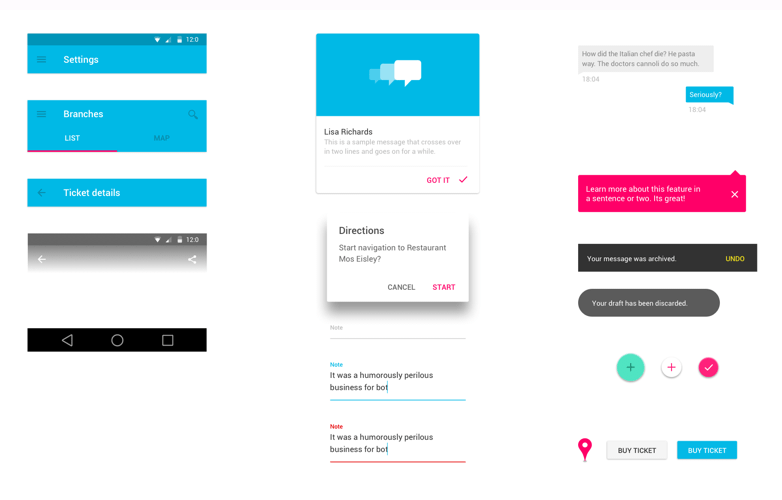
As a test task, I received several screens to choose from and the go-ahead “show how it will look like in a new form”. I chose the screen
Do we have a reason to worry with you?
This question is mainly addressed to my colleagues (ui / ux). Will this standardization take away our bread with you? I mean those hepatitis that from now on the creation of many interfaces will be automated. That all standard elements will be placed according to a predetermined scheme, which was announced by Google. I'm sure not! Noticed the word "standard" a little higher? Exactly! While the interface designer is able to solve non-standard tasks, his work cannot be automated. Because the solution to such a problem is likely that he will need to go beyond the rules of Google Material Design (only without fanaticism :)
Today, this thought has evolved so much over the past six months, that I began to give diversity to the style of external elements in my regular projects, but at the same time maintain the material behavior according to Google laws. I will tell you about these projects in the next issues ...
For me, this is some creative variety. You do not slip into a routine, performing the same type of styling elements for your other customers. Of course, if you are a fan of these guides. You can always come up with a new UI-kit for a desktop project, but you save all the logic of the behavior of the elements, as stated in the rules. Secondly: at least, those who prefer Android will be satisfied. And if the further development of the trend shows that Google was right, then many more users will be satisfied! I do not know if there is any know-how in my approach, but if someone comes in handy ...
Personally, I have recently been convinced that those products that give users a sense of the real world in the behavior of elements on the screen will succeed on the market. The very feelings that give them emotions. Swipes, swipes, card behavior, logical animation for the brain, micro-interactions, etc. ... If the application gives such emotions when interacting - we can assume that half of the work is done ....
In general, I rolled them out just such a picture and waited for an answer ....
Continued in the second chapter ...
Source: https://habr.com/ru/post/304724/
All Articles