How we helped a big Brazilian bank deal with the effects of the denomination
 The newest history of monetary circulation in Brazil is a series of denominations, the first of which was carried out in 1942, and the last in 1994. By 1994, the national currency of Brazil — Cruzeiro — was so weak that prices were set in stores in arbitrary units, the word “real” —the “real” price — was written next to the numbers. In 1994, they decided to get rid of the extra zeros, and the word “real”, to which everyone was accustomed, became the name of the new currency - the real (however, Brazil’s monetary unit until 1942 was the same name).
Today we will tell how one of our products - ABBYY FineReader Engine helped the largest private Brazilian bank to cope with the consequences of the denomination. Can you imagine how this could be? Welcome under cat.
When the denominations of the late 80s occurred, the zeros "disappeared" not only from the banknotes - the amounts in the bank accounts of citizens were also adjusted - of course, in favor of the banks. At that time, these were such insignificant amounts that no one demanded damages from banks. In 2007 (that is, eighteen years later), one enterprising Brazilian citizen thought that, taking into account interest, for a half dozen years, the “missing” amount was not so small, and applied to the bank for payment of interest, the bank refused and the citizen filed a claim to court. The court declared the requirements lawful and ordered the bank to pay damages.
')
At that moment it became clear that there would be a lot of such appeals. Information about the account status (such a document is called the Bank Statement) at the time of denomination was required to go to court, and banks were required to provide this information to the account holders.

During the period when the denomination occurred, all information about the state of bank accounts was printed, photographed and transferred to microfiche ( microfiche ).
The films were stored in the archive, and it was clear that if thousands of people came for this data, all the other work in the bank would arise - the staff’s working time would be enough just to go to the archive, search for the necessary film and issue certificates to customers. The bank decided that it was necessary to transfer the information from microfiche to electronic form - and here we were useful.
It was necessary in the shortest possible time to scan all the microfiche on a special scanner (used scanners Wicks and Wilson and Kodak), extract the data - the client's name, account number and amount - and put it all into a database (Microsoft SQL Server). The scans were to be processed by one of our products - ABBYY FineReader Engine using templates made in ABBYY FormReader.
The scheme of work in this project was more or less standard: scanning - recognition and data extraction - saving data in the database - verification:

Before recognition, images were processed: distortions, “noise” were removed.
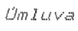
Since microfiches were stored for almost 20 years in the archive, their condition was average, the quality of the scans, respectively, too, but the complexity was not only that. The fact is that the Bank Statement was printed either on dot-matrix printers or typewriters, and a special technology is used to recognize such documents and it makes sense to talk about it in more detail. May the reader forgive us - as examples we will cite not Brazilian pictures, but images from our test database.
There are several types of text recognition in our products. Of course, you can recognize everything in standard mode, but on texts printed with non-standard fonts, the quality can be poor. In this case, you can choose one of the special modes: in our case there are separate modes for both the dot matrix printer and the typewriter.
At a minimum, different types of text differ from each other by different standards - that is, each type of text has its own character pattern. The characters of the matrix printer are very different from the usual, so for them there are special, separate standards. We tried to build a library of fonts from different printers. For better recognition, we add a number of ordinary ones to the base of “matrix” standards - for example, the symbols from the courier font in the monospaced Courier New.


In addition, in the code, different data types are processed differently. Both the matrix printer and the typewriter use monospace fonts — in such fonts, the width of each familiarity is constant, unlike many other fonts, and the characters in the adjacent lines are placed one above the other.

As you remember , one of the stages of recognition is the selection of lines. When we select lines on texts printed with monospaced fonts, we first of all try to impose a grid on the text - so that each character is in its place.
In addition, lines are highlighted with parameters that are different from those used when selecting lines on ordinary fonts — for example, in a regular matrix printer, letters with diacritics (both uppercase and lowercase) in any case fall entirely into familiarity.

It turns out that it is not necessary to process the diacritics separately and stick to the common lines.
Another task is to correctly determine which spaces should be considered as spacing between words, and which spaces as spacing between letters. In monospace fonts, there is a lot of space between the i and l characters, and our algorithms can take them as spaces.


Allocation of gaps in our country mainly occurs as follows: we look at the histogram, we consider all the white gaps. It usually turns out that large gaps are the distance between words, small spaces between letters, and in the example described, the distances are average and the program can make a mistake by breaking the word into two where it does not need to be done. But if we note the type of text “Dot Matrix Printer”, a grid will be superimposed on the text, and it will be seen that this gap of medium size falls into the gap between adjacent cells - so we understand that this is not a space between words (a space is a whole empty cell) . There are cases when the matrix printer prints badly, the letters overlap, and the grid cannot be built. Or if the ribbon in the typewriter is pulled, and the lines are printed with a shift.


In such cases, the grid is difficult to impose and we use conventional recognition algorithms.
The next difficulty is related to how the character itself is printed.
Dot matrix printers are different. This is quite a good dot-matrix printer; you can even try to recognize such text as usual.

But this text is printed on an old printer - in the letters you can see separate points and distances between them.


If we have specified the “Matrix printer” text type, the program can choose one of two modes by itself. One is when we try to use the standards we have. The second - the so-called “draft mode” - when the distance between the points inside the symbol is filled. This helps a lot when working with symbols in which the distance between points is large - if it is not filled in, our algorithms can decide that there are not one letter, but two; will begin to check and look for matches for two separate parts.


By several parameters, the program decides whether it is necessary to try to apply the “draft mode”. For a start, on several fragments, lines, we are convinced that the best hypothesis is “draft”, if so, we begin to fill in all the other symbols. If the best hypothesis is not a “draft”, then we, in principle, can launch this mode, but only on separate symbols, when one of them is very poorly recognized.
In addition to the poor quality of character prints, there is another difficulty - at the time when matrix printers were used, they often saved paper and printed in condense mode (narrow font, small spacing between letters).

In a typewriter, the complexity is the same - with a few exceptions. Typed texts are characterized by very large letter defects. The tape fades, paint, garbage, etc. adheres to the letters.


There is also a lot of “garbage” between lines and between letters, which complicates recognition.

Another subtlety in working with such texts is superscripts and subscripts. In printing presses, to print the index, the caret is shifted up or down by a half-line. At the same time, the font size remains the same, but with our usual recognition it is considered that the font of the indexes should be smaller - this is provided in the “Typewriter” mode.

Even in the texts typed, there may be uneven distances between the lines.

Well, actually, all the differences.
In conclusion, the traditional project statistics. In just 3 months, about 2.4 million documents were processed - and the bank successfully coped with the influx of citizens.
Co-written with João Rotta, Business Development Manager, ABBYY Brazil
Source: https://habr.com/ru/post/304716/
All Articles