Phased Icon Creation Guide
The article was published on smashingmagazine by Scott Lewis .
Finding inexpensive, high-quality icons and vector images is not difficult - for this purpose there are websites such as Iconfinder (where the author of this article works). Designers have thousands of premium icon sets at their disposal, and hundreds of sets are available for free download.
')
This article provides a guide to the design of vector icons, which includes six steps. We will consider these stages after we analyze the basic principles of successful icon design. These principles are well known and discussed in detail in such works as the John Hicks Icon Design Guide, as well as in the Google Guide Material Design in the development of system icons. The six stages that we will consider in this article should be taken as recommendations, and not as dogmas. The ability to feel where you need to follow the rules, and when it’s better to break them, is an important quality that every good designer should develop, and we will demonstrate this clearly.
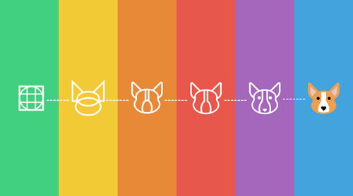
All stages will be disassembled on the example of the correction of the icon with the image of a dog (meet, this is Corgi). The icon was not bad, but did not reach our high standards. Our experts gave the author a few simple tips, and after finalizing the image was approved. Below are images of Corgi before and after corrections. Further in the article we will analyze in detail how this transformation took place.

The image on the left is the original version. The image on the right - the icon after making corrections in accordance with the principles described in the article
It is worth noting that, despite the fact that we are talking about icons for the Internet, these recommendations also apply to icons for printing. The standard resolution used for printing is 300 dpi, so if you are a designer of printed materials, you should omit those sections where we will talk about working with pixels.
Three components of effective icon design
All qualitatively made icons are united by the unity of the three components of an effective design: form, aesthetic integrity and recognizability. When you start to design a new set of icons, you need to consider all three components, going from the general (form) to the private (recognition). Even if you are developing just one icon, these three indispensable attributes are still applicable.
Of course, effective design is not limited to these three concepts, however, they are ideally suited to begin, and are written out in the framework of a single article.
The form
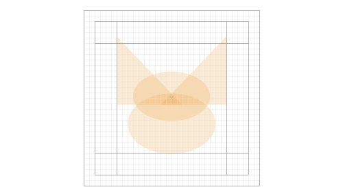
A form is a structure on the basis of which the icon design is made. If you omit the details and circle the main shapes that make up the icon, what will it be: square, circle, rectangle, triangle, or smoother outlines? Basic geometric shapes, such as the circle, square and triangle, are a stable, visually balanced base for icon design. In our example, the dog's head consists of two triangles and two ellipses. Here you can draw an analogy with the drawing - just as when drawing, the designer begins with large basic forms, and then works on the details, adding as much as is necessary and sufficient to transfer your idea.
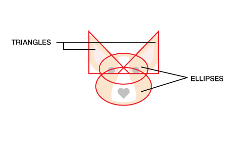
Red lines outline the main geometric shapes that form the icon
Aesthetic integrity
Under the aesthetic integrity refers to a set of elements that are repeated among the icons from one set. These can be rounded or square corners, as well as their sizes (for example, 2 pixels, 4 pixels, etc.); line thickness; (for example, 2 pixels, 4 pixels, etc.); style (flat, contour, filled with color, glyph); color palette and so on. The aesthetic integrity of a set of icons is a well-followed sequence of various elements and design techniques that make it possible to perceive all the icons as a whole. In our example with the dog Corgi, it is possible to name among such elements the same rounding radius, eyes of the same size and shape, and also a nose in the shape of a heart.
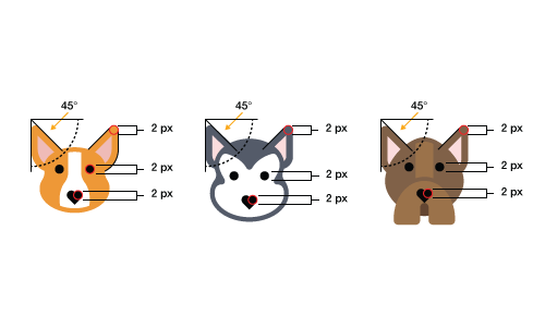
These three icons can be called aesthetically complete, because they use the same elements and techniques.
Recognizability
Recognition is a derivative of the meaning of the icon, that is, what makes it unique. Whether an icon fulfills its purpose depends on how well the user understands which object, idea or action this icon represents. Recognition can be achieved by displaying some of the qualities characteristic of the designated object, or by using some unique element, for example, as Corgi's nose. Remember, recognition refers not only to the understanding of what object, idea or action is represented by your icon; This property, which highlights your set of icons. In this sense, the concepts of recognition and aesthetic integrity intersect. In the pictures below, thanks to the distinctive features of the breed, we recognize the dogs Corgi and Huskies, and we also see that they are part of the same set of icons - due to the similarity of the design and the elements used.

The individual qualities of each dog make each one recognizable, while similar design and used elements indicate that they are part of the same set.
So, we have dismantled the three main components of an effective icon design. Now let's take a closer look at how to implement these three components in six stages.
Six stages
Always start with the grid
The advantages of grids of different sizes are a matter of individual conversation; we will use a 32x32 pixel grid. On our grid are also located auxiliary lines that will help us create the basic shape of each icon.
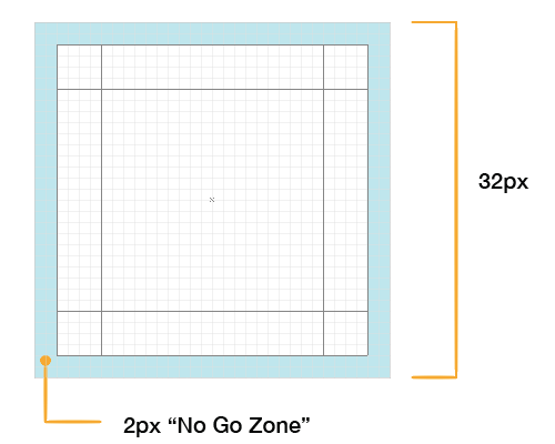
So, we have a 32-pixel grid with 2 pixel wide borders that we leave blank. We call this space a free zone, and it serves to give the icon some space. Elements should not be located within this zone, unless it is absolutely inevitable.
The shape of the icon begins with the main shape and orientation. If you draw a line around the outer borders of the icon as a bounding box, it will have the shape of a square, circle, triangle, or rectangle.
Round-shaped icons are located in the center of the grid and, as a rule, touch all four edges, without entering the free zone. The most common causal factor for the violation of the integrity of the free zone is the need to place outside the circle of any element that is necessary to maintain the integrity of the design, as shown in the picture below.
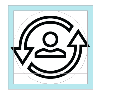
Alignment of round icons relative to the grid and main lines
Square icons are also aligned at the center of the grid, but, as a rule, they do not reach the borders of the working area. To maintain uniformity with round and triangular icons, most rectangular and square icons are aligned along the main line in the middle (orange area in the figure below). The decision on which main line the icon should be aligned is made on the basis of its appearance, and the feeling of which size to choose in each individual case is developed by practice. The three concentric squares discussed above are marked in blue, orange and light green in the figure.
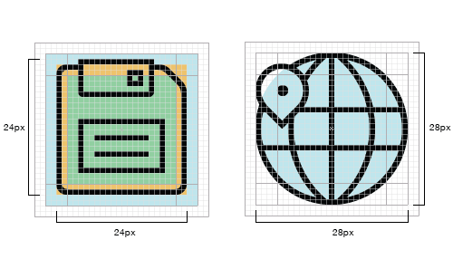
Alignment and selection of the size of the round and square icons relative to the grid
In the following pictures inside the 32x32 pixel grid, you will notice rectangles measuring 20x28 pixels that are oriented horizontally or vertically - depending on the design of the icon.

Align and size vertically and horizontally oriented icons
Diagonally oriented icons are aligned along a circle inscribed in the workspace. Please note that the extreme points of the saw are only approximately at the points along the circumference; greater accuracy is not required here.
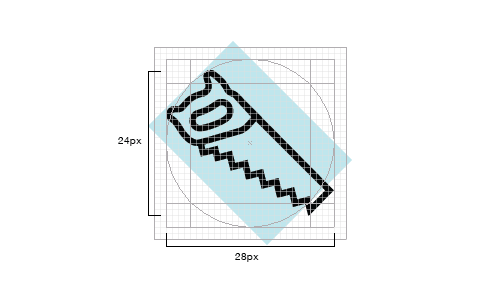
Alignment and size selection of diagonally oriented icons
Remember that you do not have to strictly follow the described location of the icon relative to the grid and auxiliary lines. The grid is only an auxiliary tool; if you have a choice, do something truly original, or stay within the rules, the rules can be ignored. However, this should be a deliberate step. As Hemmo de Jong, known under the pseudonym Dutch Icon, said:
“The individuality of the icon outweighs the need to respect the uniformity of the icon set.”
Start with simple geometric shapes.
Start the design of your icon with a rough outline of the basic shapes, using circles, triangles and rectangles. Even if you are planning to create an icon with smooth natural shapes, start with the “Figure” tool in Adobe Illustrator. When it comes to icon design, this is especially true of drawing small-sized icons on the screen, manual drawing inevitably leads to small imbalances along the edges, and this makes the icon look very losing. If you start with simple geometric shapes, it will help to get clear identical edges (especially in the places of rounding), as well as simplify the choice of the size of various elements and their orientation relative to the grid and main shapes.
The base of the Corgi icon is simple geometric shapes: two triangles and two ellipses.
Everything is repaired: edges, lines, angles and curves
When performing edges, roundings and corners, it is necessary to strive for mathematical precision, but not to such an extent that the design looks dull and unnecessarily “mechanical”. In other words, do not rely on the eye; maintain exact dimensions, because not uniform performance of these elements negatively affects the quality of the icon.
Corners
In most cases, it is advisable to use angles of 45 °, or multiples of this value. Smoothing irregularities at a given angle value is uniform (the active pixels fit well together), and the result is clear and concise. In addition, 45 degrees is an ideal diagonal, pleasant to the eye. The consistent use of such a familiar configuration allows you to get a complete picture of each individual icon, and the entire set. If your chosen design requires a violation of this rule, it is better to divide by two (22.5 °; 11.25 °, etc.), or use angles multiple of 15 °. Each situation is individual and requires the same individual approach. The advantage of using angles of a multiple of 45 ° is that with such values, the best smoothing of irregularities during transitions is obtained.

Close-up of smoothing contour at an angle of 45 °
Curves
One of the most eye-catching elements that can significantly reduce the quality of the icons, clearly showing the difference between the professional and the amateur - these are curves. While the human eye clearly catches the slightest discrepancy of the form, our coordination does not allow us to achieve the same accuracy when drawing by hand. Therefore, when creating curves, it is recommended to use the ruler and form tools in the program, instead of relying on your hand. When you don’t get away from drawing by hand, use the restriction modifier key (for example, Shift in Adobe Illustrator), or, even better, use Astute Graphics VectorScribe and InkScribe - these tools allow you to get the best result when creating curves.

Hand-drawn lines are of poor quality.
In the original version of the Corgi, the irregularities of the lines made by hand are clearly visible; this immediately affects the entire design.
These ideal curves are created in Adobe Illustrator with the help of the Bezier curves tool.
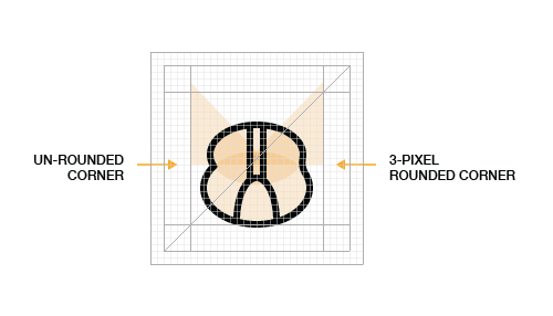
Corners
The most common size for corner rounding is 2 pixels. For an icon with a size of 32x32 pixels, such a radius value gives a clearly visible rounding, and at the same time does not “soften” the corners too much (which leads to a “blurred” look). The size of the radius depends on the character that you want to betray your design. The decision whether to use rounded corners is based on an analysis of the aesthetic appeal of the whole set.

Exactly rounded corners
Returning to our Kogri: starting from geometrically complex delineated shapes, we proceeded to rounding the corners using the shape tool, using the radius of 2 pixels. Appearance has become better.
The first stage of the alteration Corgi
The main idea of the new design is already visible: rounded corners and smooth curves.
Pixel optimization
Perfect pixel alignment is especially important when working with small sized icons. Smoothing edges on small sized icons may result in blur. The space between the lines, which is not aligned with the grid, is smoothed and will look blurry. Aligning the icon to the grid will give clearly defined edges on straight lines, and also add clarity to the corners and curves.
As already mentioned, the ideal is an angle of 45 ° (of course, after straight lines), because the pixels are located relative to each other strictly diagonally. The same can be said about corners and curves: the more mathematically they are executed, the better result you will get when smoothing. It is worth noting that the optimization of pixels does not give tangible results for large sizes and for high-resolution displays, such as Retina.
Line thickness
If we talk about the thickness of the lines, the ideal value is 2 pixels, but sometimes 3 pixels is better. Here, the goal is to ensure the required hierarchy and diversity, but not to get carried away, so as not to violate the integrity of the icon set. Line widths of more than 3 pixels cause the set to lose integrity. The advantage of using 2 and 4 pixel lines is that they are easily scaled from one to another. In most cases, the use of very thin lines should be avoided, especially for glyph and flat style icons. In general, if it is not your intention to create an icon in the outline style, you should rely on light and shade, rather than on the line, to indicate the shape.

This iPhone icon shows an example of weighted thickness line usage.
Consistently use different elements and do not shift accents within the same series of icons.
Hemmo de Jong (Dutch Icon) spoke about this aspect of the icon design at the Icon Salon 2015 conference. Hemmo and his partner have been developing badges for the Danish government for two years now, and their cutout style has become their corporate identity. Notch is not present on all icons, but on most of them. This accent applied to the entire series links the icons together and makes them recognizable among thousands of others.

Using common design elements
In our dog example, we used a single stylistic element in the shape of a nose in the shape of a heart. This element not only connects all the icons with each other, but makes them special, causing additional sympathy for these cute creatures.
Common elements used to design icons with dogs
In many cases, even if the icons within the series are very different from each other in appearance, such elements help to preserve the aesthetic integrity. This is clearly seen in the picture below: we created the same glyph-style dog icons, but they still look holistic and interconnected.
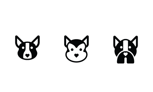
Using the same elements in a different style.
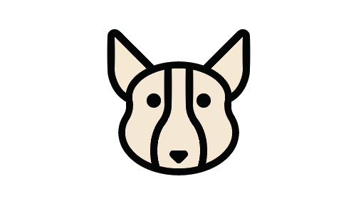
Moderate use of parts and decorative
The icon should clearly convey the meaning of the object, idea or action. An excessive amount of small details make the icon not so informative, especially when it is small. The number of small parts in each individual icon also greatly affects the aesthetic integrity and recognition of the entire series. The implicit rule for determining the number of parts and elements in an icon is the use of the necessary minimum to convey meaning.
The minimum amount of detail effectively conveys meaning.
In the version in the picture above, we are already close to the final version. The black lines around the ears turned into wool, and the lines of circumference of Corgi's face were gone, although there was a hint of them in the form of a 2-pixel line above the white spot. You undoubtedly noticed that we still have some old elements, such as a smooth nose. Let's talk about it in the next step.
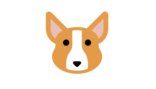
Make the icon unique
It seems that the number of talented designers who create high-quality icon sets (and many of them are free) is constantly growing. Unfortunately, many of them unduly rely on the credibility of existing trends formed by popular designers. As professionals with a creative approach, in search of new ideas, we must turn to sources outside of computer design - to architecture, typography, industrial design, nature, and other areas. Many icon sets look alike, so making your design unique is extremely important.

The unique design of Corgi is in the shape of his nose.
As a final touch, which gave Corgi a special charm, novelty and lightness, we used the shape of a nose in the shape of a heart.
The steps described should be considered recommendations and not mandatory requirements. There is no one true way to create icon designs. In this article, the authors described their approach and techniques, but other designers, of course, may have alternative options. The best way to improve your qualifications is to familiarize yourself with as much reference material as possible, to constantly make sketches (carry a notepad with you wherever you go), and practice, practice and practice again.
The image on the left is the original version. The image on the right - the icon after making corrections in accordance with the principles set forth in the article
Conclusion
We have described the fundamental principles for creating high quality icons. These principles are nothing but skills, that is, everyone can master them if they practice. Remember that it is best to start with the general (form) and move to the particular (recognition). Do not forget that integrity and uniformity must be observed, both within one icon and for the whole series. After mastering the technical basics, you will be able to direct all your energy and abilities to the development of a creative approach and the search for unique solutions.
Source: https://habr.com/ru/post/304684/
All Articles